
I was shocked to realize that I had regressed last week, after having absorbed, I thought, the teachings of Steven Assael, this thought having been based on the successful portrait of Margaret three weeks ago. More Blue, more blue, was his mantra. Instead, last week, I saw red in the shadows of “Shadow Side”. And painted red.
Here are the Work in Progress from two weeks ago, then the “finished” RedVersion from last Tuesday (camera phone), and finally, the corrected version:

WIP No. 5 with camera

Red version

The Shadow Side of Rebecca 20×16
Fortunately, I saw my horrific error the same day, last Tuesday, and left the painting out on the cold (brrr!) porch so that the paint would not dry. Saturday I took it with me to work on while I was sitting gallery at East Colony. To amend the skin tone, I used Michael Harding’s “Kings Blue” and kind of massaged it into the skin with sable and fan brushes, little by little. You can imagine with what trepidation I embarked on this voyage, but I had determined that the painting was a total loss without this correction, so I had to give it a try.
I wonder why it is so hard for me to see the blue in what’s before me. Before I had my right-eye cataract surgery, I had never seen the blue and purple in shadows. I had been taking it on faith, assuming it was a convention adopted by artists, that making shadow colors cool was the true path. Imagine my amazement when I saw my first purple shadow on my street. Wow! So maybe the left-eye cataract is hampering my ability to see cool colors in living flesh tones. Why not in the paintings? People who are “color-blind” are so both in reality and in illustrations–I assume.
A number of weeks ago, I did a nice portrait of Nancy, my daughter. It was done practically in the dark. She was lit, but my easel and palette were not. Nevertheless, I am pleased with the likeness and the expression. Nancy has been through a lot of hard stuff, and something of that shows on her face, although it remains as beautiful as ever.

Pensive Nancy
I delayed photographing this painting because it generates impossible glare. Even as dry as it is now, I cannot find any angles or lighting that eliminate glare. I used my blemish retouch tool in iPhoto to smear away a lot of it, but the result is disappointing. Yet another puzzle for me to sort out. Life is good.
The most recent painting is from our Friday Life Group session.
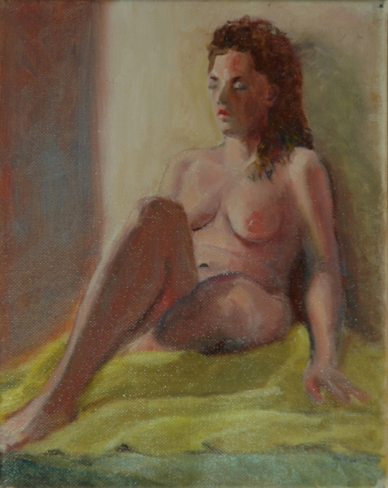
On Yellow Drape
By this time I had acquired a little clip-on easel light. For a change, I could see what I was painting in the East Colony studio. (We have been keeping overhead lights off so as to increase the drama created by our spotlight on the model.) I had intended to paint another portrait, but was charmed by the pattern of light and shadow on her body. Full figure on a tiny canvas (10×8).
If you are reading this blog posting in a timely fashion, you are probably like me, a Christmas downplayer. At this stage of my life, I resent complications that distract me from the art and other appointed tasks. I will be so glad when it is over, and with two days to go, I am still pondering what I should do for my loved ones. Their walls must be reaching saturation point with the paintings I shower upon them. But I do truly wish all of you the best experience possible during these challenging days.
Aline Lotter is currently exhibiting:
at the Hatfield Gallery and the East Colony Fine Art Gallery in Manchester (both are in Langer Place, 55 S. Commercial St., Manchester, NH); at the Bartlett Inn in Bartlett; at the Red Jacket Inn in North Conway; at the law offices of Mesmer and Deleault at 41 Brook St in Manchester; in the Community Gallery at the Currier Gallery in Manchester; at the Manchester office of Congresswoman Carol Shea Porter; at the Studio 550 Art Center in Manchester NH, as part of the annual 6×6 show of the Womens Caucus for Art; and at her studio by appointment (email: alotter@mac.com).

Ars longa, Xmas brevis.
LikeLike
True, that. Deo gracias.
Sent from my iPad, Aline Lotter http://www.PaintingsbyAline.com http://www.EastColony.com
>
LikeLike
All of these are just wonderful. Your corrected red version is PERFECT.
LikeLike
I hope you mean the final, bluer version! Thank you. To use a word like “perfect” is so radical, and you yourself are such a superb artist, I can only bow gratefully.
Sent from my iPad, Aline Lotter http://www.PaintingsbyAline.com http://www.EastColony.com
>
LikeLike
Hi Aline! For me the red version is not a ‘horrific’ mistake at all. The blue makes the figure a bit icy whereas the warmer shadows give a very realistic look. The first image with lots of loose blue reminds me of Renoir!
LikeLike
Love that description–“loose blue”.
LikeLike