Just one painting to talk about this week. It’s a portrait. One of my colleagues opined that it was the best thing she had seen me do. She has a fine critical eye, so I was happy to hear that. But later in the week, I was able to take in the special exhibit (titled, A European Artist Seduces America) at the Isabella Stewart Gardner Museum in Boston. The European artist was the Swede, Anders Zorn. The exhibit includes many of his portraits. Seeing them reminded me of how far I am from achieving the quality that I admire in Zorn’s work. Reminded? No, that word is way too mild. It whacked me over the head!
First, for context, the result of my effort this week:
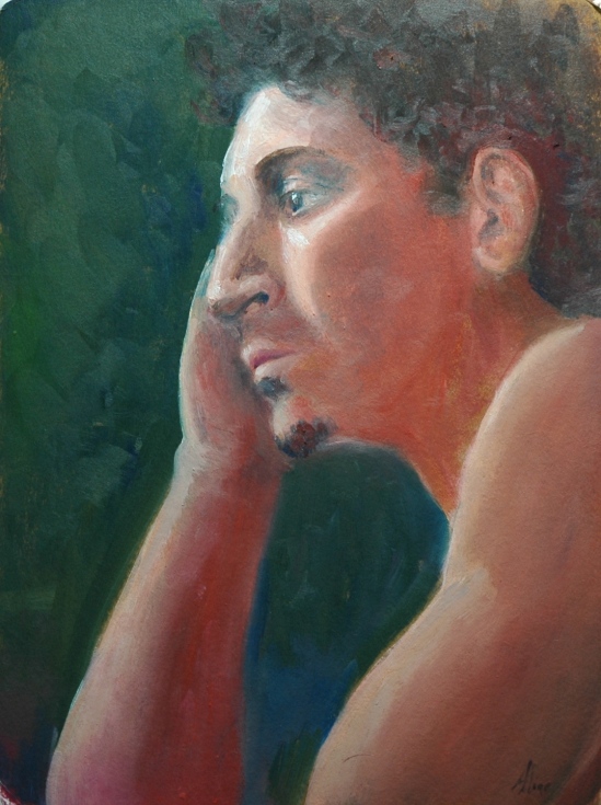
Face and Hand
One of Zorn’s:
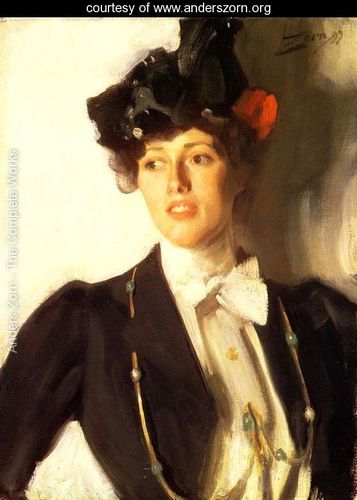
Martha Dana
Many artists avoid dealing with the open mouth because depicting the teeth can look ridiculous. Not a problem for Zorn, of course. Look at that bow! I would have labored over the thing; he just swipes a loaded brush, right, left, right and done.
Many of my nonartist friends, when I told them about the Zorn exhibit, said they had never heard of Zorn, which is completely understandable since I hadn’t either until I started painting back in 2005. At that time, I was working on landscapes only, and Zorn’s name came up in the context of the limited palette that he had espoused. “Limited palette” means just a few colors (hues), and the limited palette for which he was known consisted of cadmium red, ivory black, white and yellow ocher. Using those hues, he could even make gray look blue. But while he did some spectacular impressionist landscapes, mostly as backdrops for nudes, his principal claim to fame is his portraits. He rivaled Sargent, literally. One of the portraits in the Gardner exhibit, according to the story accompanying it, was created in response to a challenge by the sitter’s husband to make a portrait of her that was better than the one Sargent had done. I think it was this one.  White gown, overhead view–both to mimic Sargent’s version. I also think he probably met the challenge, but in the world of art, such comparisons are invidious.
So what is so great about Zorn? In a word, his deftness. He could describe a hand, a nose, a cheekbone with a few strokes, and when they was done, he let them be. Or not–in one painting (the next one shown) large, rough strokes surround the figure, but the figure itself is soft and blended. 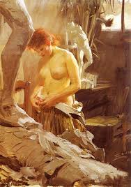
His nudes all tend to be smooth and soft, and are usually surrounded by an impressionistic landscape including water. His water was much admired too. Here’s a taste:

Opal
Here, in The Omnibus, is another example of his deft strokes–look at the hands:
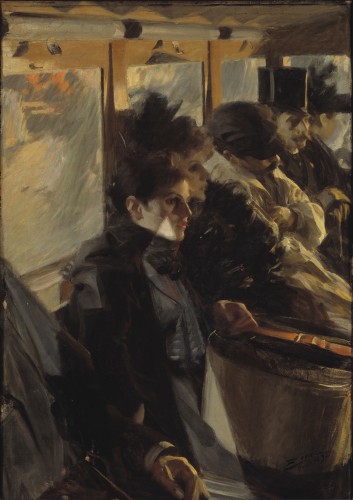
I think I may try to copy this painting.
The ability to convey much with very little definition is something I have admired in a contemporary artist, Carolyn Anderson (see descriptions of my struggles here and again here), and I wonder how much she has been influenced by Zorn. His portrait of Gardner herself, in Venice, is considered a major tour de force, because of its liveliness, resulting in no small measure from the looseness and blurriness that also characterizes Anderson’s works:
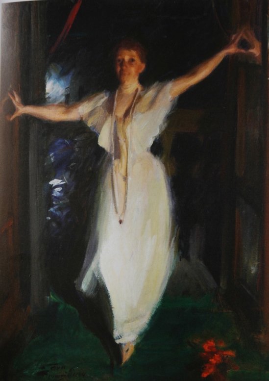
Her mouth is open, but you can hardly tell.  This painting should be an inspiration for all figure artists who desire to capture movement and spirit in a gesture. I wonder if there is anything written anywhere about how Zorn put this painting together. Clearly Isabella did not pose for more than a minute or two.
If you want to see more, here are two links that I found useful. The Gardner Museum website. The Complete Works of Anders Zorn. I also found a review of the Gardner exhibit here, and an exposition of the Zorn limited palette here.
Aline Lotter is currently exhibiting:
at the Hatfield Gallery in Manchester (Langer Place, 55 S. Commercial St., Manchester, NH); at the Bartlett Inn in Bartlett; at the Red Jacket Inn in North Conway; at her law offices at 41 Brook St in Manchester; and at her studio by appointment.
Through March 29, you can also view (and purchase–of course!) my 6×6’s at the Artstream Gallery in Rochester, NH.

I like your painting.
LikeLike
You are so kind to say so, in the face of all that Zorn beauty.
LikeLike
It is a real joy to see some of Zorn’s paintings up close, especially since he uses such a very limited palette. Saw some of his works when I was in his homeland country, and they were wonderful especially the portraits.
LikeLike
Did you notice he went all out in Isabella’s portrait–viridian!
LikeLike
The Omnibus reminds me very much of Manet’s work which is on show at the moment at the Royal Academy in London.
LikeLike
I agree–is it the subject matter, do you think? Plus dark palette, although Manet uses more hues. Zorn’s composition is more inventive, I think.
Sent from my iPad
LikeLike