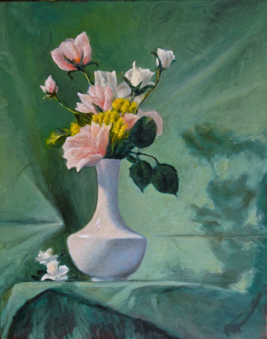
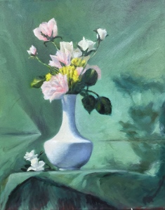
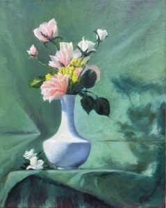
The third and final painting from the Floral Painting course. (Taught by Deirdre Riley at the NH Institute of Art) Deirdre set up two compositions for our choices. The other one was too similar to the setup for my Floral Painting No. 2, although its colors I would have preferred to this one. This is so green! Front, back and center–all the same green. But I liked the dramatic shadow and decided I could vary the greens enough between light and shadow to keep the eye interested.
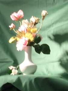
The hardest object to portray was the yellow flower. In my mind, anyway. However, Deirdre had me repaint the foreground rose innumerable times and I’m honestly not sure it got better each time. Perhaps we can tell by looking at the progress shots! First, this is a photograph of the actual setup:
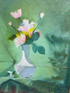
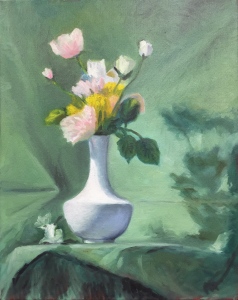
Then, in sequence from hour 1 to hour 6:
I forgot to take progress shots during the final three hours. The differences between the final (9-hour) version and the version at six hours is color. Pinks were added or intensified in the vase and the pink flowers, respectively; greens to the right of the vase were yellowed to get rid of the chalkiness that bothered me, and to assimilate some of the shadows that were too blue; white sparkly highlights were stroked in. The topmost rose, which had boasted a translucency that I liked, gained more heft with the extra red. I’m torn as to which treatment I like better. I suppose the more red, the better–to counteract all the green.
Oh, yes, I almost forgot–the value of the shadow behind the vase on the left went from where it was the week before to a very dark, shocking dark, and then moved back toward neutral until I could stand it again. The purpose of darkening the background at that point was to enable a deeper value for the white vase. The purpose of using a darker value on the vase was to enable the white highlights to show up better. Speaking of the vase, I altered its shape slightly. The bottom is wider and the top longer and more slender than the original. It just looks more elegant than a squat vase, to my eye. And the taller shape contributes more to the composition.
The roughest section (in the sense of least “finished”) is the underskirt. During the first session, I had applied some fierce (and satisfying!) strokes, thinking to deal with it more responsibly later, but later decided I liked it as is. Deirdre said nothing about it, but she was always concerned primarily with the flowers. Until those blossoms were perfect in her eyes, she had no eyes for anything else. The flowers had to GLOW–and take form as a cup shape–before she was satisfied. It’s hard to see a cup in an open blossom because the spotlight passes through it, illuminating all sides, and you need to be true to that illumination to create the glow. I felt sometimes like Alice in Wonderland, negotiating an imaginary landscape.
I loved this course and would take it again from Deirdre. I worry that her compositions/setups were critical to my success. Will I be able to do florals successfully on my own? Stay tuned.
Aline Lotter is currently exhibiting:
at the East Colony Fine Art Gallery in Manchester (Langer Place, 55 S. Commercial St., Manchester, NH); at the Bartlett Inn in Bartlett; at the Bernerhof Inn in Glen; at the Red Jacket Inn in North Conway; and at the law offices of Mesmer and Deleault at 41 Brook St in Manchester.
As usual, you may view paintings with prices and order prints, iPhone cases and the like at my Fine Art America page. If the painting you are interested in is not there, or if you prefer to bypass that experience, you may contact me by email to alotter@mac.com.
If you want to add a public comment to this blog, go to the bottom of this page where it says “Leave a Reply”, and enter your comment in that box. I love to get public comments, so don’t be shy!


Lovely work – you have such a realistic style! Great to see how the painting changes through the hours, though to be honest I liked it immediately from the first hour 🙂
LikeLike
Thank you so much! I think that proves how important the composition is to the final result. (Referring to the fact that you liked it after hour 1)
Sent from my iPad, Aline Lotter http://www.PaintingsbyAline.com http://www.EastColony.com
>
LikeLiked by 1 person
really really good work! especially considering the challenge of depicting variations i the greens. really well done! congrats with yo course!
LikeLike
Wow! Thanks for your voicing your appreciation. The green was a challenge, but turned out to be an enjoyable one.
Sent from my iPad, Aline Lotter http://www.PaintingsbyAline.com http://www.EastColony.com
>
LikeLiked by 1 person
I love this! One of your best I think.. the drama of the light is what makes it and you have skillfully depicted the values to create a stunning piece. It had good “bones” to start with.. the value structure and basic abstract design were pleasing, and you draped the color over that very nicely…. 🙂
LikeLike
Thank you. I love your phrase “draped the color”. Actually a lot of the color got scumbled over the bones, even kind of glazed. Whatever it takes to reach the right value, warmth and chroma.
Sent from my iPad, Aline Lotter http://www.PaintingsbyAline.com http://www.EastColony.com
>
LikeLike
Love, love the final version. That deep shadow really pushes back and creates the illusion of real depth. I gasped.
LikeLike
That’s the highest compliment–a gasp! Thank you.
Sent from my iPad, Aline Lotter http://www.PaintingsbyAline.com http://www.EastColony.com
>
LikeLike
Aline, What a marvelous painting. I think flowers are so hard. Harder than the figure. You’ve done a remarkable job. Thank you for sharing with us. Hope all is well.
LikeLike
Thank you! I’ll bet you could paint amazing flowers. Have you done any?
I still think figures are harder. People don’t keep still, as you know. With the flower setup, lighting might change from session to session, and live blooms start to droop — but they don’t change position, bless them!
Sent from my iPad, Aline Lotter http://www.PaintingsbyAline.com http://www.EastColony.com
>
LikeLike
The flowers, vase and shadows make for a wonderful composition.
LikeLike
It’s so nice to see you here. Thank you for commenting.
Sent from my iPad, Aline Lotter http://www.PaintingsbyAline.com http://www.EastColony.com
>
LikeLike