Don’t bite off more than you can chew. That was Lesson No. 1 this week. To rephrase in artist’s terms, don’t try to paint/draw larger than you can take in at a glance, unless you are able to move away from the easel frequently to judge what you are doing. Another way of not biting off more than you can chew is to “sight-size” your drawing. I learned this at least once before, I’m sure, but perhaps it just doesn’t sink in until all the other obstacles to good drawing have fallen away. I prefer to think of my recidivism that way, so that it appears I am making progress, not just the same mistakes time after time. I will explain, elaborate, and, to quote the Car Guys, obfuscate:
At Tuesday life group, we are starting to attract more artists that I originally would have thought we could fit into our studio. Last Tuesday, I decided to forgo the paint and try to complete a charcoal portrait of our model. I got up real close to the model. That is supposed to be a good idea for doing portraits. I work sitting down because my legs and back start to hurt if I stand for very long. Because I was low and close to the model, I had artists working on either side of me and behind me. I was pretty much trapped in place.
From my perspective, the portrait was looking pretty good. It was larger than what I could see, so not “sight size”. “Sight-size” means drawing the image exactly the same size as the image being read by your brain. You can hold your drawing up next to the model to check how your are doing. If you are not doing “sight-size”, the smaller your drawing, compared to what you see, the easier it is to judge the accuracy of your drawing. Think of it as a built in “back up”. Obviously for someone like me, who has to sit close to her drawing most of the time, drawing sight-size or smaller is the way to go. Going big is tricky–the more you enlarge on the image that is hitting your brain, the more scope for error. Proportions become especially hard to judge.

Portrait in Charcoal
Only when I got my Tuesday portrait home did I realize how far off the mark I was. You may not be able to judge how disappointing this was as a portrait, because you don’t know the model. This is not the first portrait I have done of her, however, and all of the others were more faithful to her likeness, so if you have been following along for a while now, you know this model too. Examples here. The hair looks good though.
Lesson No. 2. Maybe not so much a lesson as an insight: I’m getting hooked on paint. I usually love working in vine charcoal, but Tuesday, as I smeared my charcoal around, I wanted to mix color, not shades of gray. It didn’t help either that I was drawing on relatively slick Bristol board instead of my usual Strathmore Charcoal paper, which has a texture that is characterized as “laid”.
Lesson/Insight No. 3. Laid paper is laid (textured weave) for a reason. Exactly what it is that makes “laid” so appealing is hard to articulate. I should probably look it up to see what other artists have said but I really want to try to come up with something intelligible myself. The weave definitely contributes to the look and feel of the drawing . . . the charcoal settles into the nooks and crannies–or not, depending on how much smearing the artist does. Does this satisfy some kind of primal artist hunger for the unexpected result? When the unexpected happens and not in a good way, fixing is easy. When unexpected happens but in a happy way, artist takes credit. Note to self: do not use vine charcoal on Bristol board again. I used charcoal pencil on Bristol board once, to good effect with a no-smear technique (getting it right from the first mark). See here.
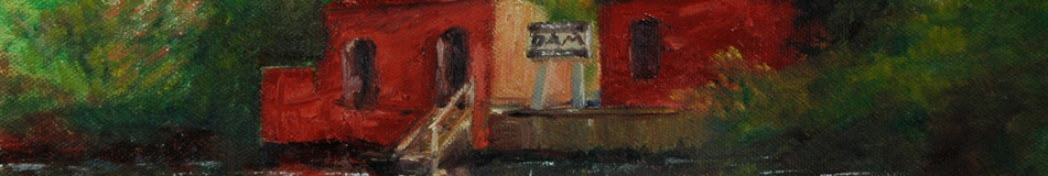
Lesson No. 4. Worrying about why your painting does not sell in the wet paint sale after a paintout is a waste of time and psychic energy. You can’t change what you do, so don’t try to analyze why two terrific paintings got left on the table. Hmmm. The table. Maybe it would have made a difference if the paintings were upright, as on an easel! Darn, I forgot to bring the pieces of cardboard that would make an easel out of my Art Cocoons. What a dummy I am! Here are the paintings:

South Corner, Forbes House

View of Boston from the Forbes House Driveway
The location of our paintout was the Forbes House and Museum in Milton, Massachusetts. My first painting took some liberty with the color of the Greek Revival house, in that I added orange to the tan because there was a pinkish cast bouncing off the house when the sunlight hit it. The pink glow under the soffit was really there, so the house had to have pink in it, right? (In the interest of full disclosure–I am going in for cataract surgery next week, and I’ve heard that colors will look different after I get my new eyes.)
The second painting is the view across the road from the Forbes House. I liked how the two fruit trees framed the distant city skyline. I finished this painting so fast, that I filled my remaining time until the wet paint sale by cleaning my palette. It was good to have a clean palette. It was good to have two plein air paintings that I am happy with. So it was a good day even if my offerings were shunned.
UPDATE: The Women’s Caucus for Art has two exhibits going on: “Flowers, Interpreted” at the Epsom Public Library; and “On Target,” at the Bedford Public Library (going up at the end of this month). In earlier blogs, I discussed each of my contributions: Starry, Starry Night for On Target, and for Flower, the brown fairy called Iris, Interpreted. Even if you don’t remember those discussions, you might enjoy these exhibits. Many different media will be represented, with special emphasis on photography in the Flowers exhibit. Given the parameters of “On Target,” I’m expecting some crazy stuff. Certainly my contribution is nothing like anything else I have ever done. Also at the Bedford library is my “Enchanted” painting on view for the summer, per “Artist of the Month” vote by the Manchester Artists Association.
Aline Lotter is currently exhibiting:
at the Hatfield Gallery in Manchester; at the Bartlett Inn in Bartlett; at the Epsom Public Library in Epsom; at the Bedford Public Library, in Bedford; and at her studio by appointment.

So that same sight size principle should apply to plein air paintings as well – doing larger paintings gives one more room to get things out of proper scale … unless it’s a huge vista that fills the 16×20 or larger canvas!
Don’t fret over the unsold paintings … yes, frustrating when there were so many sales BUT I’m not sure ANY of the paintings that were laying on the table in the front room sold (mine didn’t either and I’m also happy with both of mine) AND the paintings that sold were mostly in the $100 range … some ridiculously underpriced.
LikeLike