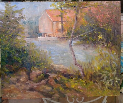
Rockport Harbor, November 2011
Last Monday, I took the day off to go painting, making a gift out of the chore of picking up an unsold painting at the Rockport Art Association in Massachusetts. Accompanying me were my friends, Jackie and Clint. We explored the entire downtown area before settling on a location across from the T Wharf where Clint and I had painting a month ago. It was a magnificent day, at least until the sun disappeared behind the buildings.
Drawn again by the fish house known as Motif No. 1, I also had Van Gogh in mind in my depiction of the drying shrub. At the start, the boats were necessary to the scene, but not necessarily the focus of the painting. But boats have a way of stealing your attention, of grabbing the eye. So I give up, and let it become a painting about the boats and not at all about the now-annoying drying shrub in the foreground.
A few days ago, I read another blog exhorting artists to keep all their older work so that they can see and appreciate the progress they are making. I keep pictures of most of my paintings, and the rendering of boats is particularly difficult. I searched everywhere to find the first boats I remember having painted; the only images I could find were embedded in an Excel file. (I used to keep track of all my paintings in an Excel file, but after 100, it got to be too cumbersome.) The struggle to find a way to include these two proofs of my early ineptitude has taken me all morning. I finally figured out that if I transfer each image from the Excel file to a Word file, then save the Word file as a web page, the images get converted to jpg images that I can import into iPhoto. Then I export the images from iPhoto to my desktop, from whence I can upload them into WordPress. Whew! Not sure the effort was worth it.
These two paintings were plein air, on Monhegan Island, during a workshop with Stan Moeller:

Monhegan Harbor from Fish Beach

Lobster boats, lobster pound
Kind of clunky, right? But not bad as a start. Bear in mind the damn things are constantly moving and changing their orientation as the tides move under them.
In my search through the archives, I stumbled upon three paintings from another Moeller workshop that also contained boats, earlier than the Monhegan boats by about two weeks:


These three are views from La Napoule on the Mediterranean coast of France. The boats in these three paintings are too distant, too small to qualify as boat paintings, but I thought they were worth including since they are the very first boats to appear in any painting by me.
Apparently, I went without boats of any kind for two years after that. The next grouping is two Rhode Island paintings, again plein air, that I painted in the summer of 2009:

Working Boats at Rest 8×10

Marina at Allen Harbor, Rhode Island 12×16
I was very pleased with these two paintings, which were done in the same afternoon from virtually the same spot. The conditions were uncomfortable–very windy, cold, I think, yet sunny. I just remember being miserable during the first painting and rushing to finish it. It’s not hard to see progress between the Monhegan boats and the Rhode Island boats.
Most of my boats are plein air experiences, but there is one prominent exception. I painted a large (for me, then) portrait of a waterfront in Portsmouth, New Hampshire, and toward the end, stuck in a boat to break up the waterline and add interest:

Portsmouth Waterfront 16×20
That is a real boat–it belongs to someone who lives in one of those buildings. This boat “portrait”, painted from a photo reference, undoubtedly helped me in depicting my favorite plein air boat, “High and Dry”, from 2011 below.
My Rhode Island successes had given me the courage to go for boats on my next trip to Florida; in 2010 I choose this orange catamaran.

Catamaran
The double hulls made this a complicated project. I was not thrilled with the resulting portrait. So I tried again with this one, looking for the magic I seemed to have found in Rhode Island:

Boat Slip
This painting is not about the boat in the background, but about the reflections in the water of the pilings. But it’s still a boat so it has to count for something. The boat is certainly better than the Monhegan boats–not as clunky. But I don’t love it the way I love my Rhode Island boats. Perhaps I have a bias in favor of working boats.
That Fall (2010) I painted my first New Hampshire boats, but in a way that the painting cannot be assigned a place the scale of good, better or best boats. These were impressions of boats from a distance, much like my La Napoule boats:

Sunset over Massabesic Lake
The point of this painting, obviously I guess, was the sunset. The boats are mere window dressing, silhouettes against the light. Around about the same time, I painted from a photograph taken in Ogunquit, Maine, the following scene:

Reflections
Another case of the boat being window dressing.
This brings me to the most recent predecessors of Rockport Harbor: two paintings from Florida in March of this year; and one from Wells Harbor in June.

One-story home with Boat

High and Dry (but still perky)

Wells Harbor
Of these three, only “High and Dry” is all about the boat. “High and Dry” is, in my opinion, my best boat ever, but it should be:– unlike all other boats, my model for this painting was perfectly stationary. It’s hard enough drawing or painting a moving object, much less one that demands a level of accuracy approaching portraiture.
Finally, Rockport:

Rockport Harbor, November 2011
Three boats of diminishing size to show perspective, of diminishing detail to show distance, a scene so perfectly matched to the beginning (Monhegan boats) that a comparison is easy. There has been progress! But wait–what about progress since Rhode Island boats? That is far from certain, to me at least.
Aline Lotter is currently exhibiting:
at the Gallery at 100 Market Street in Portsmouth; at the Sage Gallery in Manchester; at the Hatfield Gallery in Manchester; at the Bartlett Inn in Bartlett; at the Red Jacket Inn in North Conway; and at her studio by appointment.
Link to website: www.paintingsbyaline.com