A Splurge of Cats

It so happens that I undertook an obligation to fill a small table with salable artwork (by me) in the NH Institute of Art holiday sale.  Mostly I paint large, unsalable items.  As a result, I had a stack of small canvases and panel just awaiting to discover their purpose for being.

Meanwhile I have been in another slump.  I knew I needed to do some painting, if only for this sale, but Inspiration was hiding somewhere over the hill and far away.  The only solution was to paint cats.  I live with five cats, and with their help, I have amassed a number of interesting feline images.  For cats, one needs no Inspiration.  Cats are per se Inspiring.

So last Friday and Saturday I painted six little cat portraits.  They will be dry for the sale, which occurs on Sunday December 3.  (Ugh!  I can’t stand it–winter already!  Christmas shopping already!–if only all my friends and family members were as nuts about cats as I am.  But then I’d have to find something else to sell next Sunday.)

In addition to the six new cat portraits, I’ll offer a portrait that I painted as a demonstration last summer at the Art Jam on the Bridge in Manchester.  I used as reference a photo of my cat Isis, who is not what you’d call “sociable”, although she feels entitled to most of my attention.  She really wants to live in an one-cat household, and after eight years she still makes up to new people coming into the house as if hoping for a rescuer.  Because of her imperious attitude with me, I have dubbed her “My Diva”:

My Little Diva

My Diva, 12×9, $400 oil on treated carton paper; unframed; $450 framed

I love My Diva (the painting, not so much the model) so much that I paid $35 for a new iPhone cover with this image on it from Fine Art America.  So worth it.

The six new cat portraits range in size from 3.5 x 2.5–(calling card size)  magnetized for sticking to refrigerators and the like, to 6×8.

Do Not Disturb

Do Not Disturb, 2.5×3, $45, on magnetized canvas panel.

Worried Kitten

Worried Kitten, 6×6, $75; oil on gessoed panel hangable without frame

Ninja Cat

Ninja Cat, 6×6, $75, oil on gessoed panel hangable without frame

Playing "Gotcha"

Playing “Gotcha”, 8×6, oil on stretched canvas; $175 unframed

Clowning Around

Clowning Around, 7.7×6, oil on gessoed panel, $150 unframed

Somethin's Moving Over There

Somethin’s Moving Over There, 7.7×6, oil on gessoed panel, $150 unframed

I’ll be adding the series of flopped cat based on my Milo, and a 6×6 portrait closeup of Milo.  I discussed the series here, and I guess the price will be $250 each or $200 if multiples are purchased.  The higher price I am asking for the 9×12 of My Diva represents the degree of my unwillingness to part with it.

In addition to all available feline paintings, I’ll select the best landscapes that are 9×12 or smaller, and offer them at rock bottom prices.

It would be really nice if  you could come check out my wares.  Here are the specifics:

HolidayFair_11x17

And the day after, in virtually the same space, I will be officiating at the Manchester Artists’ Association monthly meeting, which is another interesting event that is open to the public:

Rhonda McCune Poster December 2017

After that, I will retreat back into my hermit hole with my 5 cats.

On Photographing Oil Paintings

I have, from time to time, complained about fog or glare appearing in my photographs of artwork.  I tried to eliminate glare by cutting down on lighting, but it didn’t always work.  The larger the painting, the harder it was to eliminate glare.  When I started, I didn’t have a lot to photograph so I would take the artwork outdoors to a spot where the lighting was indirect.  As I accumulated piles of panels to photograph, I wanted to be able to run through them relatively quickly–indoors and at night.  I would flood the studio with full-spectrum artificial light.  Instead of aiming lights at the artwork, I would bounce light off the ceiling, through a mirror, etc.  I thought the only solution was to avoid the light that rakes across the surface of a painting.  Yet my research on the internet kept producing advice to set up lamps aimed at 90 degrees from the artwork.

The result of my low lighting solution to glare was unsatisfactory color capture.  I started using my iPhone instead of my once expensive, leading edge digital SLR Nikon D70.  But all that is in the process of changing, since I attended a short workshop at the NH Institute of Art, conducted by the chairman of its Photograpy Department, Gary Samson.  I learned a new concept:  polarization.  I’m no scientist, as Republican climate-change skeptics are so fond of saying, so the explanation that follows may read like a Mother Goose tale to someone who actually understands the physics of light.

Rays of light have direction, and bounce off surfaces like oil paintings.  To polarize these bounces is to neutralize them, or counteract them, with filters that somehow deflect the bounces before they reach the camera.  You need a filter for the camera lens.   You also need filters between the light source and the art object.

I started by acquiring a filtering lens for the Nikon, and rephotographing some recent works that had troubled me.  Despite the fact that I could not figure out exactly what I was supposed to see through my new circular filter, the photographs did improve.  Compare the original hazy image with the new polarized image.

John Brown as gardener

John Brown, posing as gardener or farmer (FOG FROM REFLECTED LIGHT)

john-the-gardener02854

John the Gardener  (NO MORE FOG; COLOR ALSO MORE ACCURATE)

But then I tried to rephotograph a painting that I had varnished with a high gloss varnish.  I could not get rid of the glare.  So I rummaged around Amazon and then eBay until I found affordable gizmos to hang filters from the spotlights, and a large sheet of polarizing film from which to cut out sheets to hang from the gizmos.  I don’t think it mattered whether the film’s polarity was circular, as with the camera lens, or parallel.  Circularity was necessary for the camera so that the camera could still autofocus.  I take that on faith since I don’t understand it.

Alas, the filters for the spotlights did not solve the varnish issue.  I am so sad.

Two other advances in my photo technique have resulted from that workshop:  I set the Nikon to take the photos in RAW format.  That’s super-large format to accommodate enormous amounts of data for the purpose of manipulating the data in the finished version (jpeg) of the photo; and I bought a photo manipulating program better than “Photos”, which comes free with all my Apple devices.  Adobe Lightroom, about $145 from Amazon, compatible with Macs and IOS.  Headache!  Powerful software equals massive learning curve, and hey,  I hated learning how to operate the remote control on my DVR.

As a result of all this upheaval, my diligence with blogging faltered over the past couple of months.  I’m hoping that by the end of January, I’ll have all the bugs worked out.  Meanwhile, here is a decent photo of a 16×20 painting that I did over the summer–from a reference photo I took in my neighborhood.

02856-jpg

Russell Street Roofs

Reminder for folks in the Chesapeake Bay area: see two of my animal portraits at the Annmarie Sculpture Gardern and Art Center in Solomons, Maryland.   The exhibit’s theme is “Fur, Feathers, and Fins–Our Faithful Pets”.   It will run  through January 29.

Other places where you might catch a few of my paintings are:

  • NH Antiques Coop in Milford NH
  • Ellis River Art Gallery in Jackson NH  (in January 2017)
  • Bartlett Inn in Bartlett NH
  • Red Jacket Resort in North Conway NH
  • Bernerhof Inn in Glen NH
  • Mesmer & Deleault Law Firm in Manchester NH

As usual, you may view paintings with prices and order prints, phone cases, pillows and the like at my Fine Art America page. If the painting you are interested in is not there, or if you prefer to bypass that experience, you may contact me by email to alotter@mac.com.

If you want to add a public comment to this blog, go to the bottom of this page where it says “Leave a Reply”, and enter your comment in that box. I love to get public comments, so don’t be shy!

Six Years of Incubation

In order to keep something going on my easel, I am taking a summer class at the Institute with an instructor new to me.  Stuart Ober is leading a course called “Independent Explorations in Oil Painting”,  a scope broad enough to cover just about any subject matter and any style.  If I want to, I can switch between new abstraction experiments and long-shelved  realistic projects.

First up:  a double portrait that I started maybe six years ago, before my first class with Cameron Bennett.  I had been using a photograph as reference, and so lost interest in it after being introduced to the joy  and challenges of painting from life.  But it was a quite large canvas, gallery-wrapped too, so not something to be discarded.  It had haunted my studio from the window sill, and one of the cats had thrown up on the top, so the dried up vomit cascaded down the front of the canvas.  Charming.  My first job was cleaning off the vomit.

I do have photographs of a small study I finished all those years ago, when I was still more of a fumbler, and the start of the larger painting.  You’ll have to imagine the vomit for yourself.

DSC_0934

Study, 9×12, of Two Girls

DSC_0948

Charcoal start to large painting of Two Girls

The girls are my two granddaughters, Tabitha on the left and her younger half-sister Natalie on the right.  At the time of the photograph, Natalie was about 13 years old, yet she looks older than her 22-year old sister.  Photographs do lie.

DSC_0833

Photo of two sisters on Newbury Street

Newbury Street in Boston was the location of the photo.  I had taken the two girls down to Boston for a First Friday tour of the South of Washington art scene (SOWA)*.  To get them to accompany me, I had to promise a nice dinner out on Newbury Street.  The wall between the restaurant and the street had been removed. We were lucky to get a table next to the sidewalk.  Over their shoulders you are seeing the lights of street activity.

At this point, I have spent two classes attempting to bring the large portrait to a conclusion.  It is so much better than it was when I cleaned it off, and even if I never get around to perfecting it, I’m not embarrassed by it.

Two Sisters, on Newbury Street

After photo taken in Newbury street restaurant; Tabitha and Natalie, probably 2009

But I long to “finish” this painting in the academic sense, examining every edge.  Too hard?  Too soft?  There is no deadline.

*Originally I had written (erroneously) “Market” for Washington, lapsing back to the days when I haunted San Francisco, where the Market Street delineated the artsy area from the more commercial areas of the downtown.  SOMA is San Francisco, SOHO is NYC (South of Houston St.) and SOWA is Boston (South of Washington Street).  SOWA is to be distinguished from the higher rent artsy district found on Newbury Street in Boston.

Aline Lotter is currently exhibiting:

At the Bartlett Inn in Bartlett;  at the Bernerhof Inn in Glen; at the Red Jacket Inn in North Conway;  at the New Hampshire Antique Co-op in Milford;  at the Norris Cotton Cancer Center in Manchester, part of the Healing with Art program; at the Bedford Library; at Bentley Commons in Bedford;  and at the law offices of Mesmer and Deleault at 41 Brook St in Manchester.

ONLY A WEEK AWAY:   Wednesday, June 22 is the reception at Labelle Winery in Bedford for the Petals 2 Paint show whereat floral designers create live flower arrangements inspired by a painting by participating East Colony artists.  This has been an annual event of the East Colony Fine Art artists for many years.  Since the live flowers last only a few days, you might as well plan to come for the reception (5-8 Wednesday), but the paintings and their floral complements will be on view the next day.

As usual, you may view paintings with prices and order prints, phone cases, pillows and the like at my Fine Art America page. If the painting you are interested in is not there, or if you prefer to bypass that experience, you may contact me by email to alotter@mac.com.

If you want to add a public comment to this blog, go to the bottom of this page where it says “Leave a Reply”, and enter your comment in that box. I love to get public comments, so don’t be shy!


Who Am I?

I’m still in a funk.  Not depressed–I am very active, working 20+ hours each week in gainful employment (preparing tax returns); going to classes, art receptions, movies; picking up and delivering artworks for exhibiting; playing bridge one afternoon of each week; cooking and cleaning (as minimally as possible); watching way too much TV.  But I haven’t picked up a paint brush for weeks.  Months.

Nevertheless, every waking moment not required by the above-mentioned activities I ponder, to paraphrase Gauguin: Who Am I, Where Am I Going?

This concern over direction started long ago but I have suppressed it, hoping I suppose that the answer would eventually reveal itself without any extra effort by me.  In December I took a 2-day workshop on how to behave as a successful professional artist, and the difficulty I had in composing an Artist’s Statement brought home to me the quandary in which I find myself.  I paint landscapes en plein air.  I paint figures and portraits from live models.  I paint animals from photographs.  I paint impressionistically.  I paint realistically.  I paint post-impressionistically.  Every now and then I even try to paint abstractly.  I struggled to find a common theme that doesn’t fall back on metaphysical or philosophical musings.  There isn’t one.

At this point, after some months into aforesaid hard pondering, I see myself with one toe in the Realistic Realm and a whole foot in the Van Gogh Wannabe Realm.  Is it time to lift that foot with the toe in Realistic Realm and swing it around to plant it perhaps beyond Van Gogh–perhaps as far beyond Van Gogh as . . . Tommy Thompson?  Eric Aho?  Just as soon as I try to imagine that happening, I start to regret my animal portraits, my nude figures, my painted portraits, all that I love about capturing a real life moment.

Clearly, nothing can happen until I pick up a paint brush again.

Meanwhile, I am keeping fit by continuing the class with Deidre on Advanced Figure Drawing.  Three hours a night, once a week on Tuesdays.  Here is my output since the last blog:

The Guard Unclothed

The Guard, Unclothed

The Guard Unclothed was  a 2-week pose, and I used the extra time to perfect the modeling of his body and to describe the background.  Standing poses are the most challenging to me, perhaps because I would prefer a pose that no model could hold for more than ten minutes.  Standing poses are academic and boring, which may be why I worked so hard on the background.

Two Views — of another pose that spanned two weeks.   Two Views are not a matched pair.  The paper is different, true, but they differ mostly in my handling of the modeling and background.  One has background but little modeling.  I have no title for it yet.  The other, which I am calling “The High Priestess”, has no background and a lot of modeling.  I think I prefer the first, rougher version, but that might be my preference for a back view.  Breasts are so complicated.  I love the head and shoulders in Priestess.

Next time, there will be another pairing of two views of one pose, as I finished this week’s drawing (below) and next week will move to the other side of the podium, whence I might avoid the breasts by doing a head and shoulders portrait.  At least it’s not a standing pose:

IMG_1210

Aline Lotter is currently exhibiting:

At the Bartlett Inn in Bartlett;  at the Bernerhof Inn in Glen; at the Red Jacket Inn in North Conway;  at Twiggs Gallery in Boscawen;  at the Audubon Massabesic Center in Auburn, as part of an exhibit of Manchester Artists Association paintings and photographs;  at the Norris Cotton Cancer Center in Manchester, part of the Healing with Art program; and at the law offices of Mesmer and Deleault at 41 Brook St in Manchester.

As usual, you may view paintings with prices and order prints, phone cases, pillows and the like at my Fine Art America page. If the painting you are interested in is not there, or if you prefer to bypass that experience, you may contact me by email to alotter@mac.com.

If you want to add a public comment to this blog, go to the bottom of this page where it says “Leave a Reply”, and enter your comment in that box. I love to get public comments, so don’t be shy!

Dazed and confused

I’m finding it harder and harder to keep all my balls in the air.  The blog ball is usually the first to hit the floor.  As my years pile up, I seem to slow down.  All too often, I tell myself, “You deserve a break.”  “Deserve” maybe, but “can afford”, not so much.   Could the train of artistic success be slowing down to the point where it may become sidelined altogether?  (I can’t resist mixing up a few metaphors.  Trains, jugglers, they seem to go together OK, as in a circus somehow.)

Maybe it’s time to focus on the good stuff that has happened.  Thinking . . .  Well, I got into a regional juried exhibit at the Center for the Arts (CFA) in New London.   To be more accurate, one of my paintings got into the exhibit (as an exhibitionist, I was always a nonstarter).  The chosen painting is “Enchanted”, a 4-foot tall gallery-wrap.  [You can see it on my page titled “Studio Landscapes.]  I painted Enchanted quite a while ago, and it has hung at Hatfields, and at Kimball Jenkins, then briefly at East Colony, where I noticed how warped it had become.  I knew I had to do something to correct that issue before taking it up to New London, so I decided to mount it on a larger, stiff board, like plywood.  But plywood that large would be quite heavy.  So I am using instead a large piece of foam insulation board, which I painted dark brown.

Enchanted, on foam board

Enchanted, on foam board

The board, for all its stiffness and success in correcting the warp, is kind of a fragile surface. That’s worrisome, and I am now debating whether to glue on some thin slats as to mimic a frame, which would protect the edges.  Such a project it has become!

frame added


The reception for the CFA exhibit is this coming Friday, November 7, 5-7 p.m. at the New London Inn, 353 Main Street, New London, NH.  Unfortunately, there’s little chance I will get there.  That Friday is one of my Boston Symphony Orchestra Fridays, and we rarely get back to Manchester before six p.m., and New London is another 45 minutes North.  But if you are in the vicinity of New London next Friday night, do check it out and let me know what I missed.

Another upcoming date to be hyper-aware of:  Saturday and Sunday, November 8 and 9, are NH Open Doors.  My personal studio is not participating, but I will be at East Colony Fine Art Gallery on Sunday, demonstrating my painting.  The hours for East Colony are 10 to 4, both Saturday and Sunday.  The address is 55 South Commercial Street, Manchester NH.

I have two new figure studies to show you.  One is Margaret, clothed in a striped shirt.  The second is Nancy, clothed in a different striped shirt.  Nancy is one of us artists, but graciously filled in when our scheduled model couldn’t get there on Monday.  Nancy usually sets up the pose and lighting for us, so when it came to setting up herself and lighting herself, she was handicapped by not being able to judge how it looked.  Looked pretty good, I guess.  I’m happy with my result.  I do love stripes! Why to people assume I’m being sarcastic when I say that?)

Margaret Sept 2014  16x12

Margaret Sept 2014 16×12

Nancy as Substitute Mode

Nancy as Substitute Model

Although it looks as if I had more time with Nancy, and therefore she must be on a smaller canvas, both paintings are on 12×16 panels.  I was forced to paint in a background around Nancy because I was painting over an earlier painting, and I hadn’t covered it up with a neutral ground the way I had done for the Margaret panel.  When forced, I can stretch.

But the Margaret was a struggle, and I wasn’t sure I wanted to show it on the blog.  It does look better “in person”.  (Note to self, must come up with better term to express personhood of a painting.)  But today I couldn’t resist juxtaposing the two poses and their stripes.

Here is a Mark Your Calendar alert:  The NH Institute of Art is holding “Art and Soul“, its 4th Annual Auction in Portsmouth this year.  Thursday, November 13, 6-8:30, at Discover Portsmouth, 10 Middle Street, Portsmouth, NH.  I have donated my Lotus Studies to the cause  (see it on Studio Landscapes page), and the family of my recently deceased friend and law partner, Hilda Fleisher, has donated something from her large collection of contemporary NH art.  I can’t wait to see what it is, out of all the pieces with which I became familiar during her life.  This event is always fun, with great music and food, and artwork.  Tickets cost $45–worth it!–and all proceeds go to fund student scholarships.

Aline Lotter is currently exhibiting:

at the Hatfield Gallery and the East Colony Fine Art Gallery in Manchester (both are in Langer Place, 55 S. Commercial St., Manchester, NH); at the Bartlett Inn in Bartlett and the Bernerhof Inn in Glen; at the Red Jacket Inn in North Conway; at the law offices of Mesmer and Deleault at 41 Brook St in Manchester; at the Manchester office of Congresswoman Carol Shea Porter; at the Norris Cotton Cancer Center in Manchester (but access is limited to patients and health care workers). Two Lowell Cemetery paintings  are on view at the Arts League of Lowell, 307 Market Street, Lowell, Massachusetts. In a few days, Enchanted can be see at the New London Inn (address above).  And in Portsmouth’s Levy Gallery, you can find 8 of my newest 6×6’s as part of the annual Women’s Caucus for Art 6×6 show.

You may also view paintings with prices and order prints at my Fine Art America page. If the painting you are interested in is not there, or if you prefer to bypass that experience, you may contact me by email to alotter@mac.com.

If you want to add a public comment to this blog, go to the bottom of this page where it says “Leave a Reply”, and enter your comment in that box. I love to get public comments, so don’t be shy!

Not quite through with Vermont

Last week’s blog describes my painting weekend in Vermont, and refers to the then upcoming Demo Day at East Colony Fine Art Gallery.  My demo time slot was 1 to 3.  (The gallery closes at three p.m. on Saturdays.)  Perfect timing, because it meant I was able to attend the Saturday Life Group as usual, which ends at 12:30.  Fifteen minutes to pack up and get from the Institute, across some major intersections, to the Gallery, another fifteen minutes to get set up at the Gallery.  One tiny glitch.  I had dropped my smart phone in the toilet the day before, and I had to order a new phone ASAP, but I had no phone from which to make any calls to my provider (Credo).  I had to use the Gallery phone and my setup time to do that.  Since everything I do anymore seems to take me twice as long to accomplish, compared to when I was younger, I estimate that I didn’t get going on my demo until 1:15, at the earliest.  I didn’t have any way to check the time, since I have become habituated to relying on my phone for that too.  Whatever, whatever. . . . Sigh.

I did get organized beforehand for the demo.  Which only means I printed out a photo of the subject I intended to paint (unless something more inspiring came up at SLG–it didn’t), and taped a piece of oil-primed linen to a board, a la Richard Schmid.  For my subject, I decided to paint a view of Waits River, Vermont.  Apparently it is oft painted.  It is perhaps as well known in Vermont as Motif No. 1 is in the Northeast.  I wasn’t aware of that fact until several of the visitors to the Gallery on Saturday were able immediately to identify my painting as Waits River.   One commented that “It’s on every calendar”.  Okay.  Well, I did two versions of Motif No. 1, so I’m  not opposed to painting icons.

Even though I had less than two hours to work on WR, in public, with conversations, I finished it before three o’clock.

Here is the photo I worked from, and the painting that resulted:

Waits River, the place

Waits River, the place

Waits River, the painting

Waits River, the painting

Note that I changed very slightly the location of some elements.   I believe that was my compositional instinct working.  If I had had more time to work on the painting, with the knowledge that the scene is something of an icon, I might have tried to be more accurate, and the painting would probably have suffered.

Aline Lotter is currently exhibiting:

at the Hatfield Gallery and the East Colony Fine Art Gallery in Manchester (both are in Langer Place, 55 S. Commercial St., Manchester, NH); at the Bartlett Inn in Bartlett and the Bernerhof Inn in Glen; at the Red Jacket Inn in North Conway; at the law offices of Mesmer and Deleault at 41 Brook St in Manchester; at the Manchester office of Congresswoman Carol Shea Porter;   at the Norris Cotton Cancer Center in Manchester (but access is limited to patients and health care workers).  One painting is still hanging in the Boston Arboretum visitor center, another is on display for the month of October at Manchester’s Radisson Hotel–selected as Manchester Artist Association Artist of the Month.  My two cemetery paintings (seen here) are on view at the Arts League of Lowell, 307 Market Street, Lowell, Massachusetts.  And in Portsmouth’s Levy Gallery, you can find 8 of my newest 6×6’s as part of the annual Women’s Caucus for Art 6×6 show.

You may also view paintings with prices and order prints at my Fine Art America page. If the painting you are interested in is not there, or if you prefer to bypass that experience, you may contact me using the private feedback form below.

If you want to add a public comment to this blog, go to the bottom of this page where it says “Leave a Reply“, and enter your comment in that box. I love to get public comments, so don’t be shy!

.

Double courses, Double helpings

I’ve been painting so much lately that I have not had time to blog.  Today’s blog, therefore, will cover a lot of activity.  On the menu are three pure landscapes and three figures in the landscape.  You have seen earlier versions of two of the latter, so we’ll start with those even though my changes to the originals represent my most recent activities.

The Black Kimono, Take 2

The Black Kimono, Take 2

I felt I had to fix the arm in Black Kimono.  That is kind of a dangerous thing to do, especially since I had no photo reference, or if maybe I did take one, I forgot to look for it.  I just plunged ahead, building a right arm where I felt it should be, given where the left arm was.  The right arm still disappears behind her thigh, but the angle is more natural, and the plumpness of the forearm conveys the message better.  I am not declaring Black Kimono “done” yet because I am considering whether to add some pale streaks of lights reflecting off the kimono, so as to better delineate the leg underneath.  I hesitate because the result will be gray, and that can just look messy.

I have not had much experience with black.  In fact, I used to not carry a tube of black with me at all.  If I needed black, I would just mix the darkest available colors, usually ultramarine blue and burnt umber.  I learned that in one of the first courses I took at the Institute.  Peter Dixon was teaching color theory and Renaissance painting, and combined both of them in the same room at the same time.  So I picked up basic color theory along with grisaille and glazing.  Black was not used for either course.  Since then, I have encountered many other teachers who make “black” with their own combination of darks.

Yesterday morning we met again in the Lessard garden with our nude model.  You’d think with another three hours to work on something that seemed really close to finished after the first three hours, that it would be perfect now, and I even could have started a second painting.  Alas, not so.  I’m less happy with it now than I was last week.  Maybe happiness is a function of the number of hours expended on something.  Longer generates higher expectations, perhaps higher than achievable.

White Floppy, Take 2

White Floppy, Take 2

Her new face is what bothers me the most, but I also see background “errors”.  And one of the reasons for spending the extra time–improving the patterns of light and shadow on the figure–just don’t dazzle like I hoped.  It seems that just when I feel I am making significant progress of that ladder of artistic proficiency, I come up short and get knocked back a peg or two.  Did I just mix a metaphor?  How embarrassing!  I used to be so good with the English grammar stuff.

While we are looking at figures in the landscape, let’s check out the Last Pose of Summer–the last one in David Curtis’ garden.  Our model Mary Ann brought a costume reminiscent of Gibson Girls–between Victorian and the Roaring Twenties.  On top of her filmy white gown, she wore a dusty pink lace coat.  Dusty pink is close to the color of skin in shade.  How hard will that be to depict!

The Last Pose of Summer

The Last Pose of Summer

I kind of think I nailed it.  I would have liked to capture more definite leg shapes, but it was windy and the fabric kept swirling around her so as to prevent any sort of definitive anything.  Go with the flow, I say.  So I did.

For the pure landscape selections, we have another local back yard, one to dream of, a trip southward to a vista of brackish marshes, and tree portrait from the Boston Arboretum.  However interesting these scenes might be to a viewer, to this artist they felt dreary for the lack of a human presence.  Or even a dog presence.  I have become quickly spoiled by my good fortune in David Curtis’ garden.  Still it is good to be outside painting:

Elaine's Back Yard

Elaine’s Back Yard

This really is in the back yard of a fellow artist, Elaine Farmer, who just moved to Amherst and invited us over to paint on her fabulous garden.  But we can’t resist water.  And there was a little foot bridge over the stream, whence I painted.

Cox Reservation

Cox Reservation

The Cox Reservation is located in Essex, Massachusetts.  David Curtis and a group of his followers meet up there regularly to paint.  I have actually painted this scene before, when Sharon Allen and I were exploring the Essex National Heritage Area.  As I was driving down, I resolved not to get sucked back in with this vista, but rather to find something interesting, preferably with flowers, to paint close up.  So much for resolutions.  I hate vistas.  They are so hard!   When I started on this one, there wasn’t even any water to paint, but as the tide rose, it got better.  But why was I even there?  I don’t know.  Something in my afterlife must have required it.  No, I have it!  I just compared it to the earlier one (linked above), and it seems my vistas have improved somewhat since 2012.  Yea!

Smoke Bush at Arboretum

Smoke Bush at Arboretum

Finally, the Smoke Tree.  I had to deliver a painting to the Arboretum anyway, so I decided to make a day of it and paint something.  No vistas this time.  I went looking for flowers, and found mostly flowering trees, which is not something very common at the end of summer.  This bush (“tree” is reserved for bushes that grow a lot higher) was located at the top of Bussey Hill.  Luckily, there was a road to get me there.  (They let me have a driving permit because I couldn’t carry my gear all that way, and I do have handicapped privileges due to the arthritis in my back.)  I labored over the Smoke Bush so much harder than I should have had to, and I suspect that is because I had the time to do so.  Had a model been present to paint, the tree gets abstracted in the background.

Aline Lotter is currently exhibiting:

at the Hatfield Gallery and the East Colony Fine Art Gallery in Manchester (both are in Langer Place, 55 S. Commercial St., Manchester, NH); at the Bartlett Inn in Bartlett and the Bernerhof Inn in Glen; at the Red Jacket Inn in North Conway; at the law offices of Mesmer and Deleault at 41 Brook St in Manchester; at the Manchester office of Congresswoman Carol Shea Porter;   a single painting is on view for one more week at the Radisson Hotel in Manchester; at the Norris Cotton Cancer Center in Manchester; and at her studio by appointment (email: alotter@mac.com). You may also view paintings with prices and order prints at my Fine Art America page. If the painting you are interested in is not there, or if you prefer to bypass that experience, you may contact me using the private feedback form below. If you want to add a public comment to this blog, go to the bottom of this page where it says “Leave a Reply”, and enter your comment in that box. I love to get public comments, so don’t be shy!

.

Garden Magic

I get so caught up in my narrative blog content that I always forget the marketing bits, where I would be announcing I got into this show or that, and sold this painting or that.  Such a waste of those small, ephemeral moments of triumph!  Meanwhile I’ve been moaning about failures.  Wallowing in failures.  I hereby resolve hereafter to “accentuate the  positive,” starting right now:

  • My painting of “Margaret and her Nook” has been published in an online mag called “Art and Beyond”; here is the link to the magazine; you will need to click forward to find my page.
  • 5 of my paintings were accepted in the “Healing with Art” exhibit at the Norris Cotton Cancer Center in Manchester.  (reception Tuesday Sept 9, 5:30-7:00)
  • My painting of “Fur” has found its forever home, after being on exhibit for only a few hours at the Bedford Library.
  • My painting of “Willow Path in Winter” has been accepted in the annual JPOS (Jamaica Pond Open Studios) exhibit at the Arnold Arboretum in Boston.   Reception Thursday Sept 18, 6-8.
  • My application to apply to the Copley Society in Boston has been accepted–allowing me to apply for Professional Artist Membership, which requires a long checklist of images and written materials that I need to produce before a January deadline.  Checklists?  No problem for a former tax lawyer.

Listing the good things maybe once a month will at least boost my spirits, even if it doesn’t have any noticeable effect on sales.  Sales are the ultimate boost in spirits.  Nothing says “I love your painting” quite like the handing over of real money in exchange for the painting.  One of my teachers had a standard reply to anyone who said “I love your painting”: . . . “It’s for sale.”  But we can’t all buy all the paintings we love.  I know that all too well.  So it’s OK to keep telling me when  you love my painting even if you can’t buy it.

So, down to the real business, that of creating beautiful paintings, maybe to sell.  I spent two afternoons last week in a garden full of little nooks and pathways and whimsey.  This garden is hidden behind an ordinary house in an ordinary neighborhood.  It was created by colleagues of mine, a photographer/painter-husband/wife combo–although credit for the garden has to go principally to the husband.  The wife, Dee Lessard, paints beautiful still lifes but has little experience with plein air painting (or gardening).  Her husband, Guy Lessard, was pretty pleased to find Dee and me at our easels in his garden, immortalizing  the beauty he had built.

Magic Garden No. 1

Magic Garden No. 1

If you follow the path marked by the stepping stones, into the darkness beyond,  you come upon a pool full of dappled sunlight and brilliant koi.  I longed to see (and paint) a figure leaning into her reflection here.  But saving that one for when I have a model, I chose this simple scene that melds so delightfully a  half dozen different plant varieties.  I completed this one in a two-hour afternoon, just before the skies opened up in buckets of water.

A few days later, we went back out, Dee to continue working on the one she had started and me to find another magical place.  No. 2 is to the right and down a slight slope from No. 1, looking back at another path to get to the koi pond.

Magic Garden No. 2

Magic Garden No. 2 (before adjustments)

The Fairy Chapel

The Fairy Chapel  (Magic Garden No. 2, after adjustments in color and value)

Guy rescued the little church birdhouse in an antique store with steeple intact.  But adverse elements had obliterated the steeple over time, so I was painting what could have been a New England meeting house when Guy came over and requested that I add the steeple.  I was only too happy to oblige.

For both garden paintings, I had started with a surface toned dark, mostly with burnt umber.  Very little of the toned surface still shows, but where it does, it enhances the contrast that makes a painting interesting.

Aline Lotter is currently exhibiting:

at the Hatfield Gallery and the East Colony Fine Art Gallery in Manchester (both are in Langer Place, 55 S. Commercial St., Manchester, NH); at the Bartlett Inn in Bartlett and the Bernerhof Inn in Glen; at the Red Jacket Inn in North Conway; at the law offices of Mesmer and Deleault at 41 Brook St in Manchester; at the Manchester office of Congresswoman Carol Shea Porter; two paintings are hanging at the Bedford Library as part of the Womens Caucus For Art exhibit “Summer Bounty”;  a single painting is on view at the Radisson Hotel in Manchester for the summer; and at her studio by appointment (email: alotter@mac.com). You may also view paintings with prices and order prints at my Fine Art America page. If the painting you are interested in is not there, or if you prefer to bypass that experience, you may contact me using the private feedback form below. If you want to add a public comment to this blog, go to the bottom of this page where it says “Leave a Reply”, and enter your comment in that box. I love to get public comments, so don’t be shy!

.

Afterglow; Exhaustion

My show was Sunday.  Many of you remembered that, and succeeded in getting there, for which I am most grateful.  Others of  you may have tried to come, but gave up when you couldn’t find a parking spot.  If so, I apologize.  I never thought to check my reception date against the schedule for the Fisher Cats games.  I won’t ever overlook that detail again!  [Fisher Cats is the name of a AA minor league baseball team, farm team for the Toronto Blue Jays; its stadium is pretty close to the building where East Colony Gallery lives, and its parking lot becomes a Fisher Cats parking lot on game days.  The building owners tried to save us prime spots in the front of the Gallery; unfortunately, the normal signs there declare “Do Not Park”, so, in the absence of guidance, people were probably afraid to park there!]

Nevertheless, we had a decent turnout for our party, and I got to reconnect with some people I had not seen in a long time.  Alas, I did forget to take pictures, but this was because I was too busy talking, so that was a good thing.  Usually, at these shindigs, I am too shy to engage people in talking about my paintings.  Having people there whom I already knew was such a blessing!

Meanwhile, I had an extremely busy week of painting:  five-day workshop with Sean Beavers on figure painting; one night class with Deirdre Riley on the same subject; two paint outs, one in Exeter, New Hampshire, and the other in Goffstown.  And the Monday life group met as usual  yesterday morning.  I’m sure it was good, in the abstract, to be painting so much, but it may not have been beneficial for the output.  I was spreading myself too thin, especially as exhaustion began to take its toll.  I must accept the fact that, at my age, I can’t keep performing day after day at the same high energy level.

The workshop paintings fared better than the landscapes.  For Sean’s class, we had one model in the morning, doing one pose all week; and another in the afternoon, doing his same pose all week.  Two completed paintings emerged, plus one half-done portrait:

Figure and Detail

Figure and Detail

After spending three days on the figure, I developed an urge to paint the model’s portrait.  Since I had space on the same piece of canvas, and needed to fill that space with something, my decision to lay it down next to the figure was a no-brainer.  Only problem was, I was really too far from the model to paint a decent portrait.   I couldn’t see any nuances in the facial features with my uncorrected eyes from a distance of 15 feet.  Moving my easel was not an option because (a) I would have obstructed views of the artists on either side of me, (b) my spot was my spot for the afternoon painting, and that would have meant two moves, and (c) let’s not kid ourselves–this is only for practice.  The fact that I ended up doing close to the same thing for the afternoon painting just means I’m consistent.

Competing Lights

Competing Lights

For this pose, Sean set up a spotlight with red cel in front of the model, and one behind the model with a blue cel, emulating sunlight.  The effect was quite dramatic.  Fun!  I spent four days on this painting, and so had only one day to fill with a practice portrait:

Portrait version

Portrait version

Again, my inability to see detail that far away, and the shortness of time remaining to me, meant I could not produce a finished portrait, but I got the big pieces right.  Sean was actually impressed!  But bottom line, the face in my figure painting is more interesting that this “forced” portrait. (To me.)

The paintout on Saturday in Exeter ended with a wet paint sale to benefit the American Independence Museum, which had organized the event.  We had a gorgeous day.  Every other day last week it rained at least a little bit.  My goal for this event was to paint something pedestrian but so well that someone would want to own it.  I failed.  Not in the pedestrian part but in the wanting part.

Exeter River with Japanese Maple

Exeter River with Japanese Maple

I’m not sure the name of the river is Exeter.  I got many complements on the beauty of this painting, but no one wanted to own it.  For the second one, I went even further Out There–Ashcan School?:

Municipal Parking

Municipal Parking

This painting quite simply failed to be beautiful for some reason that I can’t quite put my finger on.  (If I could have identified the failing, I would have fixed it.)

Winding up the week, yesterday I did a figure in the morning and a landscape in the afternoon.  Both will be getting more attention–we will repeat the Monday pose next week.  Same is true of Deirdre’s class from last Tuesday.   And the landscape, well, you’ll just have to wait for that report because, with luck, I shall have time during the week to bring it to a new level of Van Gogh-ness.

Aline Lotter is currently exhibiting:

at the Hatfield Gallery and the East Colony Fine Art Gallery in Manchester (both are in Langer Place, 55 S. Commercial St., Manchester, NH); at the Bartlett Inn in Bartlett and the Bernerhof Inn in Glen; at the Red Jacket Inn in North Conway; at the law offices of Mesmer and Deleault at 41 Brook St in Manchester; at the Manchester office of Congresswoman Carol Shea Porter; and at her studio by appointment (email: alotter@mac.com).

You may also view paintings with prices and order prints at my Fine Art America page. If the painting you are interested in is not there, or if you prefer to bypass that experience, you may contact me using the private feedback form below. If you want to add a public comment to this blog, go to the bottom of this page where it says “Leave a Reply“, and enter your comment in that box. I love to get public comments, so don’t be shy!

.

Hung!

image

Frontispiece

Frontispiece

I should have posted as soon as I got the pictures uploaded, but I wanted to expound on the process a little.  Unfortunately, life, or more accurately, death, got in the way.  Not a member of my family, rather the man who rented the room upstairs from me.  I had to find the body, which was an unsettling experience.  He will be missed around here for sure.

Meanwhile, my show is up.  My colleague, Larry Donovan, and I had to agree on the arrangement on our shared wall, the wall that you see as you walk in the door.  That is the photo I called “Frontispiece”.  You can tell which are mine.

The longest wall is next to the entry, and I managed to hang 13 of my paintings on it, allowing Larry the remaining three, smaller walls.  I had prepped 21 paintings with about five that I considered “must see”, but one of them didn’t make the cut.  Freckles, my cat portrait, just didn’t look like it belonged with all those nudes and faces.  In the end, what looked best on the wall determined which paintings won a place on the wall.

One of my new jobs for East Colony, which as a collaborative does require each member to take charge of one or more tasks needed to run a gallery, is as the keeper of the customer database.  So as that person, I had to print out our postcard labels; then as the Featured Artist I applied half of the labels to postcards (Larry did the other half), bought my postcard stamps and applied those to my postcards, and put them in the mail, all of which I accomplished Tuesday.  Now all I have to do get ready for the day itself: bring in a flower arrangement (one of the other artists volunteered to bring another one in), make sure I have enough wine at the ready (Larry’s goddaughter, a baker, is preparing eating treasures), figure out what to wear, and get there early enough to set up.  I think I can handle it.  Whew!

Next week my blog will include the half-done paintings from a workshop I have been taking with Deirdre Riley and possibly a plein air painting from Saturday, but the forecast is rain, so no promises.

Aline Lotter is currently exhibiting:

at the Hatfield Gallery and the East Colony Fine Art Gallery in Manchester (both are in Langer Place, 55 S. Commercial St., Manchester, NH); at the Bartlett Inn and Bernerhof Inn in Bartlett; at the Red Jacket Inn in North Conway; at the law offices of Mesmer and Deleault at 41 Brook St in Manchester; at the Manchester office of Congresswoman Carol Shea Porter; in the lower level of the Bedford Public Library, Bedford, NH; and at her studio by appointment (email: alotter@mac.com).

You may also view paintings with prices and order prints at my Fine Art America page. If the painting you are interested in is not there, or if you prefer to bypass that experience, you may contact me using the private feedback form below. If you want to add a public comment to this blog, go to the bottom of this page where it says “Leave a Reply”, and enter your comment in that box. I love to get public comments, so don’t be shy!

.

Just Practicing

I got my head spun around this week by a glimpse into the perspective of another kind of artist, the kind that has found a home in the world of “contemporary” art.  I am using the word “contemporary” here in the sense that has come to be associated with it in the art world, namely, nonrepresentional art.  Plenty of contemporary (in the original meaning of the word) are painting representational pictures, elegantly and successfully, but it seems like few of them are represented by tony NYC galleries or being acquired by museums.   There’s a bias in favor of abstract.  All the buzz goes to the unconventional.  Something called a “concept” has become more important (perhaps) than the skillful execution.   What I have been working on these past nine years is skillful execution, and I’m not even there yet.  But if only I could reorient my brain in the direction of coming up with concepts, I might not need to get any better with the representational skills.

This particular angst is nothing new for me.  What is new is the spin, the perspective, the insight.  I was at a gathering of students celebrating the last class with a party.  At Bea’s, of course.  I had taken the same class last semester.  It was the Explore, Express, Exploit class, triple E we call it–the class in which I tried very hard to do something different.  See, e.g., prior blogs here and here.  The party included a critique, not just by the class instructor (Patrick McCay), but by all present, students and professors.  Tongues had been loosened by copious supply of wine, and the critiques soon dissolved into many conversations occurring simultaneously and uproariously.  Being on a diet, my wine intake was limited to one glass, so I was able to observe and be entertained by the chaos.   It was such good sport that, when they ran out of paintings to critique, demand was made for me to submit two of my paintings from last semester to the withering analyses.  (I had the two outside in my car because they were on their way in the a.m. to the Institute for hanging in an exhibit.)  So, yes, they were framed, and clearly “finished”.  Nevertheless, many potential improvements were found by half the crowd and denigrated by the other half, all good fun and maybe a little educational, and the party was about to come to an end, its ostensible purpose having been fulfilled, when a visiting dignitary, the dean of something and second in command at the Institute, demanded to know what direction I was going, given that one of my paintings had ended up representational and the other did not.  (That may be the longest sentence I have ever written!)  I tried to dodge the question, which was not difficult since everyone else in the room was still talking all at once, but he silenced the room and insisted that I provide an answer.  Ahhhgh!  I confessed that I had no idea where I might be headed, that in fact my usual MO was plein air painting and working from the live figure.  Both, I didn’t have to say, being totally representation.  So he said, and I quote, “That’s just practice.”

I don’t really disagree–what I have been doing is a lot of practicing, but toward what?  For the first time, I wondered if there is a chance for me to see over the fence into that field of unconventionality, that field seeded with new concepts.  One needs a goal, and I guess the one I had set for myself was to become a portraitist.   But I haven’t been working very hard toward that goal lately, and maybe that is the fault of my goal, not of me.  If  portraiture is not the right goal for me, then I can’t stay excited about it.  It may be time for me to Explore more deliberately an Expression that is beyond representational.  Exploitation, what’s that?

Meanwhile, I am still practicing.  Last Tuesday’s figure session produced this one:

Beard with Hands

Beard with Hands

His forehead is too high, but I can fix that.

Friday I had a simultaneous committee meeting and the need to drop off those two paintings competing for my attention, so I took in my charcoals.  In the first 20 minutes I produced a drawing that I liked so much that I could not bring myself to touch it after the break.

Ghost Face

Ghost Face

My start-over produced this drawing.

Becky, A Head Shot

Becky, A Head Shot

Her nose is too long.  Damn!  Too-long nose cannot be fixed without resizing the whole bottom half of the face.  [I fixed a problem with the shape of her left eye–on our right–that I only noticed after posting the image to my blog.]

Today, I decided at the outset not to obsess over any details, to try to be conceptual instead of representational–just as I have decided at many outsets before this.  Today, however, I have the added consideration of last Thursday’s critique.  Sure, I had that Friday as well, but it was too new then.  Hadn’t sunk in.

Sweet Thinking

Sweet Thinking

Is it, in terms of direction, an inch or two away from my usual?  I kind of think so.

Aline Lotter is currently exhibiting:

at the Hatfield Gallery and the East Colony Fine Art Gallery in Manchester (both are in Langer Place, 55 S. Commercial St., Manchester, NH); at the Bartlett Inn and Bernerhof Inn in Bartlett; at the Red Jacket Inn in North Conway; at the law offices of Mesmer and Deleault at 41 Brook St in Manchester; at the Manchester office of Congresswoman Carol Shea Porter; in French Hall (the main building) of the New Hampshire Institute of Art in Manchester, NH; and at her studio by appointment (email: alotter@mac.com).

You may also view paintings with prices and order prints at my Fine Art America page. If the painting you are interested in is not there, or if you prefer to bypass that experience, you may contact me using this feedback form.

Back to Figure School

A major disappointment to me was the cancellation of a workshop with Dan Thompson at the Institute.   It was to be on the subject of painting the portrait from observation.  I took an earlier portrait class with Dan Thompson and I wrote about it in this blog.  (here)  So instead of advancing my practice of portraiture, I was dealing with a broken furnace that week.  It was a cold week, too.  I may have mentioned being too cold to sit very long in my computer room.  Lots of stuff got wait-listed that week, a fact whose relevance is hinted at below.  (Ending a sentence with two prepositions!  Exciting times!)

Our weather has shown dramatic improvement lately.  For instance, I haven’t been wearing a coat.  What have I been doing with my time?  Not painting.  Paperwork.  Meetings.  Reports.  Nothing you would want to hear about assuming I were free to tell.  I found only two recent paintings that you have not yet seen, and one of them I never intended anyone to see.  I dislike it for being too dark and sultry.  But in my desperation I have reconsidered, and hope it looks no worse than work that I have seen better artists display proudly.  To some, dark and sultry is a virtue.

Dark and Sultry

Dark and Sultry

No, it’s no good.  I still don’t like it.  Ironically, this is the same model whose face I tormented in the Dan Thompson workshop mentioned above.

My other painting I like quite a lot, just not sure why.  It’s accurate, it has good lights and darks I think, proportions good, skin tones good, composition good, etc.  But what’s it about?  Can I show it?  What the heck do I title it?  As you can see, for now the title refers to the light source.

Overhead Lighting

Overhead Lighting

The painterly quality may be what I like most about this painting.

The overhead light source is thanks to Jack, our newest member.  Jack retired from a career as a filmmaker and photographer, so he has some great equipment that he shares with us.  If I recall correctly, the overhead light is composed of 400 watts of illumination, covered by a diffuser so it doesn’t blind the artists

Well, tomorrow is another day, isn’t it? Scarlett was right.  But literally, tomorrow is Tuesday, another life group day, and I might, I just might do something worthwhile.  It keeps me going back.

Aline Lotter is currently exhibiting:

at the Hatfield Gallery and the East Colony Fine Art Gallery in Manchester (both are in Langer Place, 55 S. Commercial St., Manchester, NH); at the Gallery at 100 Market Street in Portsmouth; at the Bartlett Inn and Bernerhof Inn in Bartlett; at the Red Jacket Inn in North Conway; at the law offices of Mesmer and Deleault at 41 Brook St in Manchester; at the Manchester office of Congresswoman Carol Shea Porter; and at her studio by appointment (email: alotter@mac.com).

You may also view paintings with prices and order prints at my Fine Art America page. If the painting you are interested in is not there, or if you prefer to bypass that experience, you may contact me using this feedback form.

<a href=”http://fineartamerica.com/art/all/nude/canvas+prints&#8221; style=”font: 10pt arial; text-decoration: underline;”>nude canvas prints</a>

3 drawings and a painting

I confess–I haven’t done much art in the past month, since my return from Florida.  I might be suffering a little bit of burnout.  Or discouragement:  I received yet another rejection from the Oil Painters of America.  Will I ever paint a picture good enough to win OPA’s seal of approval?  If I live long enough, and then only maybe.  Perhaps I should switch to painting still lifes.  I met an artist older than I who entered the field later than I, taught himself from materials found on the internet, and concentrates on paintings of one kind of object in still life paintings.  Not a beautiful object per se, but so lovingly and beautifully rendered by this artist that he wins prizes, and gets into OPA exhibits.  I long ago resolved to stick to the one medium so as not to spread myself too thin, but perhaps I should also have chosen to stick to one, still, subject matter. I’ve always had a serious tendency to bite off more than I could chew.

Then there was the weather:  My answer to the cold and snowy conditions was to favor drawing to painting–lugging around the oil paints and easel is that much greater a burden when you are slipping on ice or slogging through snowdrifts.  In a related story, not at all helping to get me out of this funk, was the loss of heat for a week, last week.  Oh, the irony!  I had an automatic generator installed after the freak October blizzard shut everything down in 2011, yet lost heat earlier this year due to an electrical problem.  This second loss of heat was due to a malfunction in the furnace, but we screwed around for days trying to solve the issue without going to the pro.  Lesson learned.  Go to the pro immediately, damn the expense.

On a more upbeat note, recently I was in the news!  In a good way.  The Bernerhof exhibit got some publicity, and the reporter used the material that I had written up for my contributions very carefully and accurately.  Stellar job!  Here is a link to the article.   Bernerhof article  The stuff about me appears on the third page.  I’m confident there will never be a better article written about my painting.

Between the Tuesday Life Group, the Friday Life Group and the Saturday Life Group, I did get in some art making.   I have picked out my favorites over the last month to show you.  I believe, despite the judgment of the odious OPA, they are, you know, kind of, like, OK.

Margaret in B&W

Margaret in B&W

Dennis, Shirtless

Dennis, Shirtless

I managed to rein in all urges to polish his face, humming a mantra in my head “Carolyn Anderson”.  (She who can suggest all with a single stroke.)

Georgia, Reclining

Georgia, Reclining

Shelley's Back

Shelley’s Back

On the last two, because they presented a simplified view of the figure (no breasts!), I was able to spend time on representing the quality of the flesh and drapes more accurately.  Each of those two poses lasted about 50 minutes.  In 50 minutes,  you are lucky to just get the drawing close to accurate.  In hindsight, I particularly appreciate how I rendered that draped pillow under Georgia’s head, and particularly regret leaving that clump of hair looking so stiff.

Aline Lotter is currently exhibiting:

at the Hatfield Gallery and the East Colony Fine Art Gallery in Manchester (both are in Langer Place, 55 S. Commercial St., Manchester, NH);  at the Gallery at 100 Market Street in Portsmouth;  at the Bartlett Inn and Bernerhof Inn in Bartlett; at the Red Jacket Inn in North Conway;  at the law offices of Mesmer and Deleault at 41 Brook St in Manchester; at the Manchester office of Congresswoman Carol Shea Porter; and at her studio by appointment (email: alotter@mac.com).

You may also view paintings with prices and order prints at my Fine Art America page.  If the painting you are interested in is not there, or if you prefer to bypass that experience, you may contact me using this feedback form.

Duality Continues

Before I get into certain issues involving the EEE class, check out these pretty decent likenesses I achieved  using charcoal on Mi-Tientes pastel paper.  First, from the Friday life group, here is Rebecca.

Portrait, Rebecca December 2013

Portrait, Rebecca December 2013 (12×9)

I truly cannot count the number of times I have tried to do a portrait of Rebecca, with varying degrees of success.  I posted a bunch of them in this blog (“A Month of Beckys”) about 7 months ago; over a year ago I included the very first one here in a blog titled simply “Becky”.  Despite the annoying texture of the pastel paper (I chose the more highly textured side by mistake),  the one I just completed is the best.  That’s encouraging since it means I am still improving and have not yet hit my limit, if there is one.

My other likeness attempt came as part of the Saturday Life Group’s meeting.  A popular male model whom we have not seen for many months was back in NH, and one pose gave me the opportunity to try for a likeness of his face.  Looks pretty accurate to me, but I may be biased.  Here are both of the longer poses from Saturday–the first one, as you will see, did not afford any view of the face–and I remembered to use the smoother side of the paper:

Mike No. 1

Mike No. 1

Mike No. 2

Mike No. 2

Drawing a man who is “ripped”, as they say, is a lot of fun, and just what we needed after so many months of rounded flesh.

Putting all that likeness stuff aside, we can get to the bigger issue: can Aline come up with a paintable abstract concept, and go on to paint it appealingly?  Jury is still out, but hope has not stopped springing.  The two that I am going to show you are both from the EEE class, of course.  Thursday was our last class.  Many of my classmates intend to take it again in the Spring.  I, however, am putting my money on the Master Portrait Workshop with Dan Thompson and don’t feel I can afford the luxury of taking two courses in a single semester.  But I stray from the main story:  the EEE class adjourned halfway through our allotted time at the Institute to regroup at Bea’s place, to eat, drink, be merry, and critique each other’s works.  First up was my now-familiar abstracted landscape evoking stained-glass windows and Monet.  Patrick stood by his initial eval, but my classmates objected strenuously to the light-colored wedge, which they felt was distracting.  Peter Clive was present as well, so I asked for his opinion.  He advised repeating the wedge shape in the lower right corner.  Classmates seemed happy with that solution.  Therefore, on Sunday, after having endured a few restless nights trying to make sense of that advice, I dutifully inserted Wedge Minor into the masterpiece (please hear that with ironic inflection).   This smaller echo remains  as unexplained as the original Wedge Major.  Fortunately, it being abstract, I didn’t have to justify it in terms of a representing a recognizable object.  Most important, the new element has to blend into the scene as if it had always been there.

DSC_0005

This is your first view of this piece as translated through my Nikon SLR, so this version looks better simply because of that.  I had the devil of a time getting an image without glare inasmuch as I had ladled on the paint and parts of the painting will reflect glare no matter where you set up the light sources.  My solution was to go with less light and increase “exposure” in the editing room.  Details got lost, however.  There are more of the red dots in the middle background, for instance.

My last EEE project, started Thursday after a lot of planning, is complicated.  Shiao-Ping Wang presented a program at the recent meeting of the Manchester Artists Association, a program that I had, as program director, requested of her.  “How do you translate an abstract concept into a work of art?”  She showed us how she did it, explaining how her love of water became represented by a specific shape that she repeated in many inventive ways.  A few days after that, I saw a call for art for an exhibit on the theme “Love”, to be juried by Eric Aho, an abstract landscape artist whom I admire. Here is a short video with Eric, which gives you an idea of what he does as an abstract landscape painter.  Because of the juror and because of Shaio Ping, I decided to make an abstract painting for the show, based on something I love, namely, cats.  And fur is what I particularly love about cats.  Patrick had shown me years ago his painting of white chickens using a brayer instead of a brush.  The breasts of those chickens looked unbelievably soft and downy.  So what I intend to make is a painting about cats, using furriness as the symbol and perhaps deploying a brayer in my quest for irresistible texture.  But yet another influence out of the Contemporary Gallery of the Currier Museum led me to plan a hidden image of a larger-than-life cat face in the background of my abstract, furry foreground.  So far, I have completed only that background.  I have to let it dry now, before attempting the more difficult task of layering on the furriness without totally obliterating the face.

Love and Fur wii (20x16)

Love and Fur WIP (20×16)

(By the way, as the party was breaking up, Patrick told me that I had all of the other aspects of art making under control–I just needed more help with the conceptual aspects–advice that suggests I should reconsider my decision to take the portrait workshop instead of another dose of EEE. )

Aline Lotter is currently exhibiting:

at the Hatfield Gallery and the East Colony Fine Art Gallery in Manchester (both are in Langer Place, 55 S. Commercial St., Manchester, NH);  at the Bartlett Inn in Bartlett; at the Red Jacket Inn in North Conway;  at the law offices of Mesmer and Deleault at 41 Brook St in Manchester; in the Community Gallery at the Currier Gallery in Manchester; at the Manchester office of Congresswoman Carol Shea Porter;  at the Studio 550 Art Center in Manchester NH, as part of the annual 6×6 show of the Womens Caucus for Art; and at her studio by appointment (email: alotter@mac.com).

Up and Down, Back and Forth

Well, I committed an unforgivable sin last week.  I forgot to go the EEE class!  Forgot!  Such a quixotic thing the brain is–simply because I had no Docent Training class in the morning (finally graduated), my brain relaxed, dozed off, and failed to remind me that I had the class Thursday evening.  I need a calendar that punches me in the arm a half hour before I’m supposed to be someplace.   But instead of class I had an nice dinner out with my daughter, who really needed to get some food in her system.

I had big plans for that EEE class, the next to last class in the course.  Now I have only one left and no time to make up for the lost Thursday. . . because everything takes longer that it should, and  so many unexpected chores keep popping up with regularity.   Now I am going to have to execute on my big plans without the help of the EEE class.

And by “the class” I  include not only the instructor but also my fellow students.  Here’s why.  A few weeks ago I posted a work in progress along with the finished version and cryptically (some might say “coyly”) asked you to ponder their merits before I commented myself.  Well here is my comment:  I was sitting at my easel trying the wrestle something out of the WIP version–my effort to go abstract with landscape, remember?  Not feeling it, frankly.  In an effort to achieve more drama, I was applying black paint (gasp!  I used to not even own black paint) to the areas that had drawn my mind’s eye, and then kinda went nuts with the black, finding patterns to outline all over the place.  Suddenly, I heard whisperings behind me, classmates talking about something they were admiring.  I ignored, continued my Van Gogh-like thrashing.   The classmates behind me moved in to stop me, called for Patrick to see what I was doing.  The whole class stopped and watched as the piece was placed on an easel for all to consider, and Patrick immediately without much thought at all declared it to be an “award-winner.”  I am virtually certain that now he has had a few minutes to think about it, he would take that pronouncement back.  Anyway, I was not allowed to work on it anymore, and frankly, that was OK with me, because I was sick of it.  It’s still in the classroom, left to dry, then there was Thanksgiving, then the class that I forgot.  So my image is from the phone:

Imaginary Elements

Imaginary Elements

My classmates enjoyed the stained glass feeling.  I was enjoying (somewhat) the process of applying thick, dramatic paint, but when it was over, I did not get that singing-heart feeling that some of my paintings give me.  Maybe abstract is not meant for me.  Patrick already told me not to try pure abstract.

Meanwhile, on an entirely different track, I am trying to duplicate the success of last week’s “Margaret with her Nook.”  Here is another look at Nook, with the background cleaned up:

Final--Margaret and her Nook

Final–Margaret and her Nook

Yesterday I started on the Shadow Side of Becky, and remembered to take progress pictures with my phone.  Next Tuesday, I hope to complete this painting, which is a large 20×16 oil on linen:

WIP No. 1

WIP No. 1

WIP NO. 2

WIP NO. 2

WIP No. 3

WIP No. 3

WIP No. 5 with camera

WIP No. 5 with camera

chose to be in the dark for this painting in part because I have enjoyed chiaroscuro effect that comes with drawing the figure out from darkness.  Also because I have learned that to make a figure rounded, I needed to find a bigger range of light and dark.  So far, I am liking it lot.  I just hope I find it within me to bring it to the same level of finish as I found with Nook.

Reminder to those of you within driving distance of the Currier Museum:  I have a painting hanging in the Community Gallery and you can get into the entire Museum for free if you arrive before noon on a Saturday.

Aline Lotter is currently exhibiting:

at the Hatfield Gallery and the East Colony Fine Art Gallery in Manchester (both are in Langer Place, 55 S. Commercial St., Manchester, NH);  at the Bartlett Inn in Bartlett; at the Red Jacket Inn in North Conway;  at the law offices of Mesmer and Deleault at 41 Brook St in Manchester; in the Community Gallery at the Currier Gallery in Manchester; at the Manchester office of Congresswoman Carol Shea Porter;  at the Studio 550 Art Center in Manchester NH, as part of the annual 6×6 show of the Womens Caucus for Art; and at her studio by appointment (email: alotter@mac.com).

Only People

I am still trying to paint an abstract landscape in the EEE class, but the current effort is kind of a mess and I left it behind to dry in the classroom.  Fresh eyes this Thursday will, I hope, inspire me with what to do to make it something I can be proud of.

Meanwhile, I’ve been working hard on the figurative side of representational art.  Some nude, some clothed, some full figure, some portrait.  I am happier with the the painted ones, but I’ll start you off with the drawings –selected drawings.  Some of them are disappointing and I don’t want the world to see how uninspired I can be.  Here’s my favorite:

Map of the Back

Map of the Back

Graphite, charcoal pencil and charcoal on drawing paper–not an ideal combination.  I was feeling my way with the media.  But I like the result moderately well.  The next pose was a standing one, with the model’s head silhouetted against the bright window.  Hard to see well enough to represent.  I tried, but am sparing you the result.  We (the Saturday Life Group which meets at the NH Institute of Art) are now drawing in a studio with side windows, instead of the studio with the overhead skylight.  I prefer the side light, but it’s hard to take when it’s in  your face.

Grumpy takes a cup of tea

Grumpy takes a cup of tea

“Grumpy” because he prefers to pose in the nude plus he can’t really enjoy that tea while posing.  We promise not to make him keep his clothes on again.

Dennis in his clothes

Dennis in his clothes

It was cold in the studio that day, so we had to let Dennis stay dressed.  He was happy about that.

Map of a different back

Map of a different back

Mike is a new to us, relocated here temporarily from California.  He’s a real pro, when it comes to modeling–comfortable and inventive with his props, like the pole and the “stool” he was sitting on.  For the next pose, I chose to draw a portrait of him:

Portrait of Mike D.

Portrait of Mike D.

At last, we’ve reached the paintings!  There are two of them, both painted in the workshop studio behind East Colony Fine Art’s gallery.  The challenge again is the lighting, but not from windows–either there’s too much fluorescent overhead, or you can’t see what you are doing.  We are wising up and bringing task lights that clip on easels, or hang around artists’  necks.

Leaning against the wall

Leaning against the wall

Challenging circulation

Challenging circulation

Well, that’s a stupid name for a painting.  Sigh.  Yes.  Do you know how hard it is to distinguish one nude (painting) from another by its title?  So many nudes, so many standing, so many sitting, so many reclining.  Then you try identifying by the color of the drape.  So many blues, so many reds, so many yellows, etc., etc.  The major distinguishing feature of the last painting was the fact that Margaret’s leg kept falling asleep.   Of course it did–what else could we have expected?  But that became my idea for a title.

The first one is of a new model and I’m not sure she would be comfortable with being identified by name, which makes titling the painting even harder.  The elements of this painting just came together so beautifully, and I quit working on it before I spoiled it.  Always a good thing.

Both paintings were done in oil, on the brown carton paper sold by Judson’s Fine Art Outfitters, with very little medium.  Does it appear to you as if I were working in pastels, not oils?  I think it’s that combination of the dry paper with the unmodified paint.  The paint drags across the surface of the paper.  When you stop to think about it, that’s what pastels are: pigments without the oil binder.  So when the paper soaks up the oil and leaves the pigment sitting on top, you get the pastel effect.

Aline Lotter is currently exhibiting:

at the Hatfield Gallery and the East Colony Fine Art Gallery in Manchester (both are in Langer Place, 55 S. Commercial St., Manchester, NH);  at the Bartlett Inn in Bartlett; at the Red Jacket Inn in North Conway;  at the law offices of Mesmer and Deleault at 41 Brook St in Manchester; in the Community Gallery at the Currier Gallery in Manchester; at the Manchester office of Congresswoman Carol Shea Porter;  at the Studio 550 Art Center in Manchester NH, as part of the annual 6×6 show of the Womens Caucus for Art; and at her studio by appointment (email: alotter@mac.com).

Fixing up and the Start of a Bushwhack

Thanks to everyone who appreciated the drawings last week.  Black and white can be boring, especially when not brought to a polished finish.  It is fun for me to go back through them occasionally, hopefully to discern some progress being made, and drawing is the backbone of (most) painting.  I will show you perhaps an exception at the end of this post.  (latest project being painted mostly from my head without references)

And today’s post is full of color!  I made small refinements to three deserving plein air pieces.  The first goes back to Castine, Maine, on the pier facing the student (Maine Maritime Academy) ship, the U.S.S. Maine with its tug.  I had allowed the lit facet of the yellow tug to brown down, which sacrificed drama, and more importantly the contrast that had attracted me to the scene in the first place.  So here’s the original, and after it, the new and improved version:

The State of Maine (with tugboat)

The State of Maine (with tugboat)

DSC_0003

My second redo is actually a finishing up.  A Spring painting of the valley behind Franconia Notch in Sugar Hill was interrupted by showers, and the sky was left as blank white canvas.  One of my closest friends and admirer of paintings begged me not to touch it as he thought it perfect as is.  Do I listen to such pleas?  Well, I hung back for yea these many months but decided I had to fill in that emptiness–without violating my friend’s sensibilities.  I concluded that what he liked was the extra crisp edge of the mountain range line, so I made sure to keep that sharp, and the high contrast between sky (light) and mountains (dark), so I maintained that contrast as well.  While there, I punched up some of the other small lit areas–meadow, roof top.  Here’s the before and after:

DSC_0001

Franconia Notch, May 2013

Franconia Notch, May 2013

Finally, I applied the advice that I had received at the Manchester Artists Association meeting last month, to my first painting of Clark Pond (link to that post here):

Clark Pond in Auburn WIP

Clark Pond in Auburn WIP

DSC_0001

Clark Pond will now be framed and readied for exhibit somewhere.  (Probably East Colony Fine Art Gallery, where I just took down my figurative show and put up landscapes that are dearest to my heart.  Each show lasts for two months.)  I was excited to learn that the Currier Museum is allowing us docents-in-training to exhibit one of our own pieces in the Museum (basement) for the month of December, but I have another project in mind for that particular honor.

And that project is the one I am calling a bushwhack, since I don’t have a trail to follow, and have no clue how to reach my rather amorphous goal–to paint an abstracted landscape inspired by Tom Thomson.

Here’s the scoop:  I am painting in Patrick McCay’s EEE class with a start from the photo of the cloud shadows.  (posted here)  In addition to experimenting with the idea of abstract landscape, I was influenced by a book that Bruce Jones brought to Bartlett for the getaway weekend–a book full of the paintings of Tom Thomson, a Canadian artist working during the earliest decades of the last century.  Thomson painted juicy, blocky abstractions of landscapes and used the complementary colors of dark blue and orange to great effect.  Here is a stunning example:

West Wind by T. Thomson

Sunset by T. Thomson

I wanted to paint something that had that same impact.  My painting looked like this when I left off a week ago Thursday:

Bear Notch WIP

Bear Notch WIP

Something about my painting wasn’t working.  Patrick suggested that it evoked a forest fire with the dark spots represented charred remains of forests.  In theory I didn’t care what it evoked since abstraction was my principal goal.  But it wasn’t working as a whole, so last Thursday, I abandoned the abstraction goal and transformed my painting into an identifiable landscape that I hope will have almost the same impact as the Thomson.  You will have to wait until next week to judge.  (I forgot to photograph it before I left the class studio.)

Aline Lotter is currently exhibiting:

at the Hatfield Gallery and the East Colony Fine Art Gallery in Manchester (both are in Langer Place, 55 S. Commercial St., Manchester, NH);  at the Bartlett Inn in Bartlett; at the Red Jacket Inn in North Conway;  at the law offices of Mesmer and Deleault at 41 Brook St in Manchester;  at the Epsom Library in Epsom, NH; at the Manchester office of Congresswoman Carol Shea Porter;  starting Nov. 9, at the Studio 550 Art Center in Manchester NH, as part of the annual 6×6 show of the Womens Caucus for Art; and at her studio by appointment.

Health Matters, yes it does!

You may not have noticed, but I did not publish my usual post the week of September 30, or the week of October 7. Before Friday evening, I had been drafting a post  in my head;  I planned to use it to mull over the phenomenon of retirement generating more “optional” stuff to do and the psychology of slowing down anyway just because the pressure of earning a living has been lifted.  Thinking philosophically or finding excuses, whichever you prefer.

But before I could commit those weak ramblings to the ether, an event occurred that provides a better explanation of my inability to perform at peak levels for the past weeks–perhaps the past few months, even.  Unsurprisingly, I am all over that new, more concrete excuse, like a rat diving on cheese, and say in celebration, hail to the UTI and its curability with antibiotics.

How it all went down:  I had been feeling kinda crummy for a few days, and even had a spell of faintness, but nothing interfered with my performance of essential tasks.  I got to appointments, shopped for pet food, cooked, etc.  Suddenly, late Friday afternoon, in the middle of trying to reconcile a bank deposit for one of my nonprofit organizations, I started to feel really chilly.  I suspended that banking task and went to prepare an early dinner.  I turned on the central heat and plugged in a space heater.  I kept getting colder.  By the time my hamburgers were ready to be served, perhaps only ten minutes, I was shaking uncontrollably–paroxysms might be the right word.  I couldn’t talk, much less drive.  Ambulance was called–by my 17-year-old granddaughter.  Big scare put into family.  Not so  much me– I could not focus on anything except my desire to get warm.  After a few hours of hydrating and testing in the ER, Good News!  I was in terrific health but for this one thing, a UTI (urinary tract infection), curable with the right antibiotic (Cipro).  The doctor said something about the infection being well-established, suggesting it had been present in my system for a while.  That got me thinking of a health event that occurred on my way to Castine, back in July, which I could not explain.  I looked up the symptoms (vomiting with lower back pain), but didn’t follow up with my doctor because  the symptoms evaporated.

This morning I was infused with a microburst of energy, which resulted in the images that I will be sharing with you below.  In the past three weeks, I have been more prolific than would appear from this meager supply of five images.  The weekend of the Blackstone Valley Plein Air Competition resulted in four paintings.  I forgot to photograph any of them, and had to leave them there for another month.  One has been sold, and if the other three are too, we shall be at the mercy of the buyers for decent reproductions.  It was a marvelous weekend, and I will go again next year if invited.  I’ll save the details for when I actually have visuals to go along.  Two additional paintings are at the Institute, drying.  They are from my fall semester class with Patrick McCay, called “Explore, Express, Exploit”.  They should be ready for photographing next week.

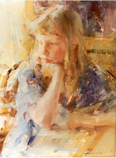
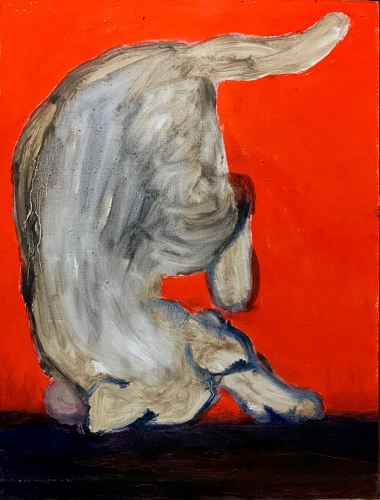
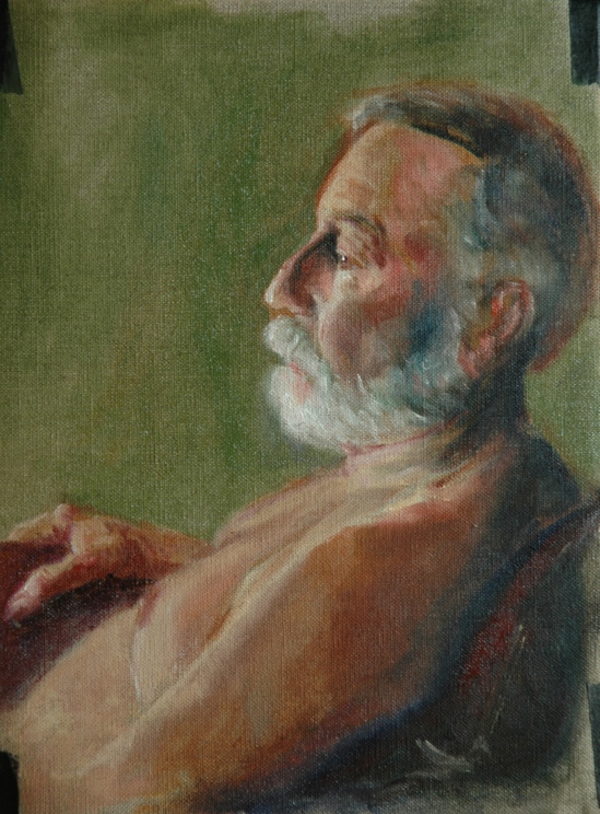
Here is the painting I made of Dennis on the Tuesday before Blackstone Valley:

Dennis in Plaid Shirt

Dennis in Plaid Shirt

I complained a lot about the plaid shirt, but I secretly was enjoying the challenge.  Looking at it now, from a new perspective, I admire the casual but effective depiction of his feet.

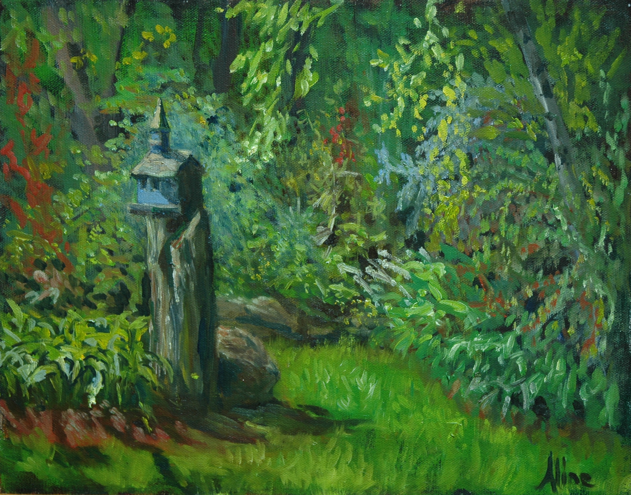
After Blackstone, I hit the ground running.  Well, painting.  I met up with the Cornwall Four (including me, four of us who took Cameron Bennett’s “Inspired by Cornwall” workshop in August) at a new water location in Auburn.  I identified it today from a map as Clark Pond:

Clark Pond in Auburn

Clark Pond in Auburn

The scene had everything–almost too much–bridge, the start of fall foliage, water, reflections, lily pads.  Yet I added the rock formations on the left; really, they added themselves.  The lily pads raft together to form little islands, which may confuse the eye.  One of the first lessons that I learned in my first landscape painting experience, from Stanley Moeller in 2005, had to do with water lilies.  He told me to underline them with “black”  (darkest of pigment, which was not necessarily black) to indicate the shadow they cast upon the water.  I couldn’t see but the thinnest of shadows, but he said “Trust me” and I did.  And do.  Still heeding his advice, I added the most delicate and unobtrusive of shadows under my pads.  This painting came under critical review by Peter Clive last Monday at MAA and when I am more of myself, I will be making some perfecting changes–playing down the reflections of tree trunks in the water; playing up the light on the rocks and bridge; settling down the water on the other side of the bridge, which doesn’t recede like it should.

The next day being Tuesday, I did a figurative of new model (to us) Michael, but I don’t like it, so I’m not showing it to you.  Wednesday, I was back to Clark Pond:

Clark Pond in Auburn

Clark Pond in Auburn

What a difference two days made!  We have liftoff!   (Fall foliage is a Big Deal here, where tourists flock jus to stare at our trees.  How strange is that?)
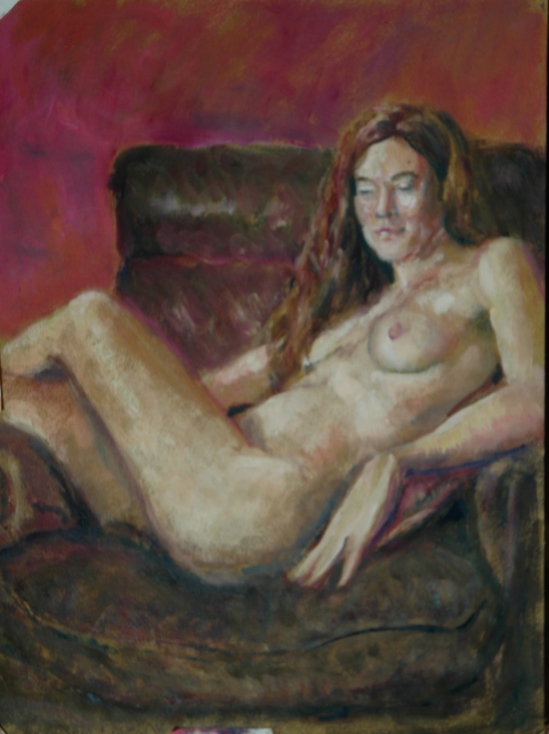
Margaret

Margaret

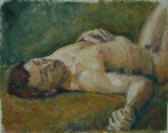
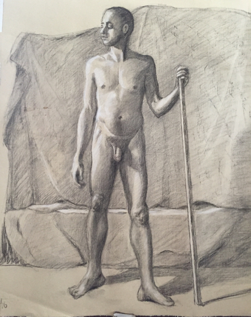
I wasn’t feeling too great last Tuesday, when I painted this new figurative featuring Margaret.  I get a lot of kidding about how fast I paint, so Tuesday, someone commented that I wasn’t going as fast as usual.  I felt that too, and hoped the slowing down was for the better.  I concentrated on the flesh tones, trying to get them just so, a la Steve Assael.  Now I’m wondering if it was just the UTI manifesting itself in sluggish behavior.

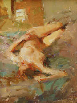
Friday morning we got together in the back of East Colony Fine Art Gallery to try it out as a location for figure study.  The podium is quite high since it started life as a work table.  The lighting is abominable since it consists of fluorescents over a worktable.  But there was room enough for my core group of artists, and plenty of easels.  Along with Margaret posing nude, my daughter Nancy posed clothed.  Nancy was “shadowing” Margaret to see if modeling is something she could do.  Naturally, I chose to paint Nancy:

My Daughter Nancy

My Daughter Nancy

Another plaid shirt.  She has my mother’s admirably straight nose.  We had the fluorescents off and a small spotlight on our models.

That night, of course, was the night of the ER, and I have been recovering ever since.  Now that I know what symptoms I should have noticed before, I am noticing them, but my fatigue should never have been overlookable.   I suspect the paroxysms of shivering took a lot out of me.  On the bright side, the back pain I have been putting up with for weeks has subsided–not arthritis after all!

Bottom line, I have been shirking all but the most imperative of duties.  One of those duties: I took upon myself a viewing of “Gravity” 3D on the iMax screen.  I heard it should not be viewed any other way, and I was worried I would miss out if I didn’t act today.  I can now report that the advice was justified, and worth the prioritizing.

The rest of this week will be taken up with Tuesday Life Group, trip to Boston to collect my painting at the Arboretum, and bridge–all on Tuesday, Adrienne’s Fall Figure Marathon all day Wednesday, docent training at the Currier and my Triple E class with Patrick, Thursday, then a drive to Bartlett for the 3-day Fall Artists’ Getaway Weekend.  Glad I found out what ails me before all that went down!

Aline Lotter is currently exhibiting:

at the Hatfield Gallery and the East Colony Fine Art Gallery in Manchester (both are in Langer Place, 55 S. Commercial St., Manchester, NH);  at the Bartlett Inn in Bartlett; at the Red Jacket Inn in North Conway;  at the law offices of Mesmer and Deleault at 41 Brook St in Manchester;  at the Epsom Library in Epsom, NH; at the Manchester office of Congresswoman Carol Shea Porter;  and at her studio by appointment.

Inspired by Cornwall

All last week I was preoccupied with my participation in the workshop with Cameron Bennett, which he titled “Inspired by Cornwall” because it was. . . inspired by his time living in Cornwall and becoming familiar with such artists as Alfred Munnings and Laura Knight–the Newlyn School.  We were to paint the figure in landscape, en plein air, because that is what the Newlyn painters did.  Their history has been made into a movie, “Summer in February”, which is being described with such terms as “complex”, “wild”, “incendiary”;  our assignment, to re-create the that atmosphere, was a departure from the usual workshop fare.  Every day was threatened with rain, but we must have had the luck of the Irish with us because the sun shone for us each day.  Until Friday.

Monday, Cameron handed out an essay written by him on the Cornish painters, treated us to a slide show of representative paintings, and demonstrated his own approach to the subject at the location–Pretty Park– and with the model that we would use the next day–Margaret.

Image

Tuesday and Wednesday, we painted at a local cemetery with Dennis (he of the portrait that I did a few weeks ago) in the morning, and with Margaret at Pretty Park in the afternoon.

Dennis, bridge in Pine Grove Cemetery

Dennis, bridge in Pine Grove Cemetery

Margaret in Pretty Park

Margaret in Pretty Park

Thursday we went to the Seacoast and spent most of the day on this pose.

Grace at Odiorne, with Big Hat

Grace at Odiorne, with Big Hat

When the sun seemed about to leave us, and the wind picked up, Cameron set us up on the edge of the beach with only 40 minutes to paint, and like a drill sergeant, prodded us on to finish a gestural study.

Grace, standing at edge

Grace, standing at edge

Friday, we were all but comatose and welcomed the excuse of potential rain to retreat into the Institute to paint a figure in an interior setting.  I never quite got around to the setting.

Grace, another profile--red shirt

Grace, another profile–red shirt

It’s not good as a portrait, but  I like it as a figure study.

Cameron showed more slides to remind us of what we were supposed to be learning.  I hope I absorbed the learning by osmosis because my brain was pretty drowsy by that time.  At the end of Friday, we staggered out of the building into a gorgeous late afternoon, too tired to notice.

About the Currier Museum poster competition that I may have mentioned once or twice in the past:  I made it into the semifinals, and as a result, I have a piece of my artwork hanging in the Museum.  Yea!  ( I didn’t win.)

Aline Lotter is currently exhibiting:

at the Hatfield Gallery and the East Colony Fine Art Gallery in Manchester (Langer Place, 55 S. Commercial St., Manchester, NH); at the Kimball-Jenkins Gallery in Concord, NH; at the Bartlett Inn in Bartlett; at the Red Jacket Inn in North Conway;  at Stella Blu , an American Tapas restaurant in Nashua; at the law offices of Mesmer and Deleault at 41 Brook St in Manchester; at the Norris Cotton Cancer Center in Manchester (part of the Healing with Art program); and at her studio by appointment.  Two paintings are also hanging in the Manchester office of Congresswoman Carol Shea Porter.  And a poster at the Currier Museum!

A Cloudy Day on Top of Cannon Mountain

Cannon Mountain is a ski mountain, owned and operated by the State of New Hampshire as a State Park.  During the summer, one of the ski lifts, a tramway, takes tourists up to the top–and down again–to enjoy the view from the top and the sights along the way.  Today I was lucky to be on the tram that passed over mama bear, grazing in the path of the tram.  Ordinarily the views both from the tram and the top are of distant mountains in Maine, Vermont, Northern New Hampshire, and Canada.  Today, those views were momentarily available on my ride down.  Down, after enduring the wind and chill of the summit, trying to make a painting.  Good thing I don’t really like to paint long-view vistas, because the only objects visible were those located within 100 yards.

For photos of what it could look like from the top of Cannon Mountain, check out the website here.

For how it looked today before the clouds completely enveloped the summit:

Cannon skilift

Housing for a Cannon ski lift (or, what I could see before clouds completely socked in)

I tried another painting when I got back down to parking lot level, but really dark and threatening clouds came rolling in our direction and we hied it out of there.  We drove over to Crawford Notch prospecting for sunlight, stopped by the Bartlett Inn to make sure our October Artists Weekend reservations were in, and, failing to discover any better weather, ate our way home.  (Stopped for supper at the Yankee Smokehouse in Ossipee and for ice cream at Morrisey’s in Wolfsboro.)

Most of last week I spent laboring, still laboring, in the effort to whip my files at the law office into submission.  On Friday, however, I took a break to attend my portrait class with Dee Riley, and produced this drawing of new model, Dennis.

Portrait of Dennis in charcoal

Portrait of Dennis in charcoal

I did not think (and neither did Deirdre)  until today that his ear looks awfully small.  Maybe he has small ears.  The class will be spending two more sessions on this pose.  I will miss the next two classes because this Friday I will be in Maine for the Castine Plein Air Festival, and next Friday I will be at a plein air with figure workshop with Cameron Bennett.

Cameron taught portrait drawing and painting at the NH Institute of Art before moving to England  last year.  He is offering this workshop at short notice to coincide with his visit back  home to New Hampshire.  Most of his old (previous, some also like me, old) students are excitedly looking forward to seeing him again, getting the scoop on practicing art in England, and sopping up all the learning he acquired in the byways of Cornwall, because the title of the workshop is “Inspired by Cornwall”.

As we are already nearing the end of July, let me alert you to Trolley Night coming up on August 1.  Trolley Night, a/k/a Open Doors, consists of trolleys providing free transport between the art venues of Manchester, starting with Langer Place, where East Colony Fine Art Gallery is located.  Trolley Night in Manchester  used to happen four times a year, then it was three times a year.  Now, only twice.  So don’t pass this one up.  The East Colony Gallery puts on a special show just for Trolley Night, in addition to the regular exhibit:  Picnic! is the theme of the special show.  So come Thursday, August 1, between 5 and 8.  The food is great, the people welcoming, and the art fantastic.

If you have voted in the Currier poster contest at my behest, thank you (whether you voted “correctly” or not).  If you have not done that yet, here is the link to the Museum’s home page: Currier.  Look there for the link to the poster contest.  This may work better for those of you who had trouble with my link to the contest site.

Aline Lotter is currently exhibiting:

at the Hatfield Gallery and the East Colony Fine Art Gallery in Manchester (Langer Place, 55 S. Commercial St., Manchester, NH); at the Kimball-Jenkins Gallery in Concord, NH; at the Bedford Library in Bedford; at the Bartlett Inn in Bartlett; at the Red Jacket Inn in North Conway;  at Stella Blu , an American Tapas restaurant in Nashua; at the law offices of Mesmer and Deleault at 41 Brook St in Manchester; at the Norris Cotton Cancer Center in Manchester (part of the Healing with Art program); and at her studio by appointment.  Two paintings are also hanging in the Manchester office of Congresswoman Carol Shea Porter.

Steven Assael workshop, conclusion

This is my third and final installment about the Steven Assael workshop.  The first two installments dealt exclusively with the demo that Steve started as the Monday session, 10 to 5.   I think he liked it so much that he wanted to finish it with the model.  Or perhaps he like US so much he wanted to spend extra days with us.  Or maybe it’s a combination of the two.  He had 16 students in the workshop, two of who are teachers at the Institute.  Most of the rest of the class were young current BFA candidates or youngish BFA graduates from the Institute, but we had one stray up from Delaware (his home base) and Florida (his art college).  Then there were the three of us older figure students, me and my buddies Bea and Elizabeth.  It was a very compatible and committed group of artists.  So maybe he just liked us.

Enough with the progress images of his demo.  Here is the last one that I caught before I had to leave, followed by close ups:

3:50

3:50

3:50 detail-head

3:50 detail-head

3:50 detail-feet

3:50 detail-feet

He dabbed away at that red fabric (a soft shiny material, perhaps silk) from time to time throughout, and the daubs became more purposeful as the end of time neared.  Suddenly, the fabric on the model stand became the fabric in the painting.  Like a hungry, prowling predator, he circles his subject, getting closer and closer until Wham!  there it is captured to perfection, pinned to his canvas.  (I don’t know what predator behaves like that in reality, but doesn’t it sound right?)

When I left at 4:30, he was scrubbing the background.

I hate to follow that with my own pitiful effort  to emulate him.  But I know  you are curious.  Here’s the disaster I spent two days on:

Becky, last version

Becky, last version

I must have wiped that out nine times, trying to find my way.  I refused to let him paint ON my painting, so he painted this as inspiration to get me over whatever was blocking my creativity:

Becky by Assael

Becky by Assael

But it wasn’t the start that I was having trouble with; it was the finish.

Thursday I changed rooms (we had two rooms going with a model in each) to paint Margaret.  Here is my start, before any input from Steve:

Margaret before

Margaret before

Not enough blue!  This time I allowed him to go at it on my painting:

Margaret After

Margaret After

Notice how he lost all my carefully drawn edges?  As he left, he said “Now you can correct the drawing.”  So I corrected the drawing:

Margaret, drawing corrected

Margaret, drawing corrected

And then I added the red lamp to my painting.  When he saw this version and complimented me, I wasn’t sure whether he liked the lamp specifically, but when he later incorporated the red glow in his own painting, I imagined it might have been inspired by my red lamp:

with the red lamp

with the red lamp

Saturday was a day of Drawing with Steven Assael, 9 to 5.  He did not come around to critique or help us, but we could watch what he was up to and ask him questions.  Margaret was our model.  This is Steve’s drawing of Margaret, executed with Stabilo pencils on silverpoint paper:

Margaret by S. Assael

Margaret by S. Assael

Don’t you love the decision to let her stomach disappear into the paper?  And she wasn’t really sitting on her hand.  So what if the likeness isn’t there!  He couldn’t care less about a likeness, although he  usually does get one, even of Margaret.  I have another image to prove that but too tired to add now, which is technically no longer Monday.

This is my portrait of Margaret, in which I really do get her likeness.  I was able to show it to Steve when nine of us went out to dinner with him, and I ended up in the seat next to him.  He liked it, he really liked it!

Margaret, profile, in graphite

Margaret, profile, in graphite and charcoal pencil

Two criticisms that he shared with me:  I should carry the shadows of her jawline and cheekbone into the hair so that the hair does not look so flat.  I will do so when I have a couple of artmaking minutes to put together.  I expect the improvement to be so subtle that you won’t be able to identify it, but you will think it’s better.  It’s also the way he paints–the subtle attention to nuance that brings living flesh and muscle into his painting.

The other criticism had to do with my composition.  I had included Margaret’s breasts, but when they became too prominent in the composition,  I scribbled them out.  However, the scribbles still appeared to be part of the drawing.  In a related point, the design of the hair masses need to be considered, not blindly rendered.

Exhausting, exhilarating, frustrating, inspiring–all that you might expect in seven days with a Master.

Aline Lotter is currently exhibiting:

at the Hatfield Gallery and the East Colony Fine Art Gallery in Manchester (Langer Place, 55 S. Commercial St., Manchester, NH); at the Kimball-Jenkins Gallery in Concord, NH; at the Bedford Library in Bedford; at the Bartlett Inn in Bartlett; at the Red Jacket Inn in North Conway;  at Stella Blu , an American Tapas restaurant in Nashua; at the law offices of Mesmer and Deleault at 41 Brook St in Manchester; at the Norris Cotton Cancer Center in Manchester (part of the Healing with Art program); and at her studio by appointment.  Two paintings are also hanging in the Manchester office of Congresswoman Carol Shea Porter.

Steven Assael workshop, cont.

I posted a mid-week report on this figure painting workshop, which you should check out before reading this post.  The workshop was supposed to be five days, from ten a.m. to five p.m.  That schedule was amended at the end of the first day, Monday, because Steve’s demo was turning out so good that he wanted to finish it before he left New Hampshire.  Well, that’s my educated guess as to his motivations, which were really pretty transparent.  First he determined that his model for the demo, Becky, was not available Saturday, so arrangements were made for her to come in Sunday!  Saturday was therefore to be a group drawing day, with Margaret as our model.  Margaret also modeled for the class Tuesday through Thursday.  Monday and Friday and Sunday were given over to the “demo”.  Plus we started at nine a.m. instead of ten, every day after Monday.  I am wiped out and all I had to do was stay awake and focussed.  (If I let my focus wander, I started to nod off.)  Steve seemed to be running low on steam towards the end, but would not stop painting.  Becky was released at 4:00 and I had to leave at 4:30, while Steve was putting finishing touches on the background.  I hope they were the finishing touches.

As a result, I have so much material to show you and discuss that I could probably fill a week of posts.  I will leave my own work out of the discussion for now.

Before the pictures, a commercial:  please go here to vote for my poster if you can.  The top 30 or something vote getters (that actually might be all) go on to another round of voting.  It’s all too complex for my poor tired brain tonight.  Just go there and vote!  (Please)

The following four pictures were taken during the Friday “demo”.

Image 15 Image 14 Image 16 Image 18

The thing to notice about these “progress” pics is that he rather cavalierly blurs previously articulated shapes in the course of finding the hue and value he is looking for.  Also notice how he uses the painting itself as an auxillary palette.  The black and red drapes were added to break up the expanse of blue, but not much attention was given to painting them.  Yet.

The rest of the pictures are from today.  I have captioned each with the time I took the photo to give you some idea of the passage of time between one and another.  You might understand better why it was hard to stay focussed:

10:30

10:30

The first thing he did was get rid of the blue drape altogether by covering it up with a brownish patterned one.  I’m quite sure that if he had another couple of days to work on  this painting, the pattern would be beautifully represented.

11:00

11:00

He cleaned up the background–uh, palette–and placed a red crescent about where the red lamp shone.  Take note of that because I like to think something I did on Thursday may have inspired this bit.

See a little bit of patterning in the brownish drape?  And her face is back–sort of.  The black parabola emerging in the background has us all wondering.  The black drape is so subtly beautiful that I’m afraid you can’t see it.  Steve is a wizard with black.

1:23

1:23

Sunday’s session was supposed to end at one o’clock.  Becky agreed to stay on and, I presume, the Institute agreed to foot the bill.

2:23

2:23

Not quite sure but I think the reflection of the black drape on her back and continuation of the red drape towards the background are new.

I have a few more images that I would like to show you, but I think I have exceeded some kind of daily limit–Wordpress is not accepting any more uploads.  I will try again tomorrow.

Aline Lotter is currently exhibiting:

at the Hatfield Gallery and the East Colony Fine Art Gallery in Manchester (Langer Place, 55 S. Commercial St., Manchester, NH); at the Kimball-Jenkins Gallery in Concord, NH; at the Bedford Library in Bedford; at the Bartlett Inn in Bartlett; at the Red Jacket Inn in North Conway;  at Stella Blu , an American Tapas restaurant in Nashua; at the law offices of Mesmer and Deleault at 41 Brook St in Manchester; at the Norris Cotton Cancer Center in Manchester (part of the Healing with Art program); and at her studio by appointment.  Two paintings are also hanging in the Manchester office of Congresswoman Carol Shea Porter.

Thumbs down and thumbs up

The poster competition deadline was today.  I submitted last week, after much fruitless agonizing.  I’d been obsessing over the lettering issue.  I was seesawing between disliking formal lettering and being horrified by small misalignments of hand lettering.  Here is where I got to toward the end.

poster, next to last version

poster, next to last version

As you might notice, the word “and” leaves a lot to be desired.  I just couldn’t leave it like that, which meant I had to paint it out yet again.  In desperation, I went out and bought multiple sets of stencils and stickers, hoping one of them would solve my problem, but none did.   Without really knowing where I was going, I started to paint out the latest version of “and” when I realized that you can still read the letters when they are partially obscured.  Clouds, I thought.  One of my followers had actully suggested that, and now I was ready for that solution.  Which resulted in this:

poster--final version

poster–final version

Am I happy?  No, I realized I was never going to please myself, and I had just better stop messing with it.  So in it went.  I cringe when I focus on the lettering at the top, and just hope I don’t get laughed out of a competition where most of the entrants know exactly what to do with lettering.

On a more upbeat note, the painting (or study) that I created Tuesday  turned out  really well.  I think so, and Peter Clive, our mentor, said about it something to the effect that it was one of my best, and in addition, it showed feeling.

Fletch, in profile

Fletch, in profile

Every day this week I am immersed in a workshop with Steven Assael at the NH Institute of Art.  If I can ever get the photos from my phone onto my computer, I will post the progress pictures from his demo.  All I can say for now–amazing.  I think I have found a kindred spirit.  Stay tuned for a shift in my style.

Aline Lotter is currently exhibiting:

at the Hatfield Gallery and the East Colony Fine Art Gallery in Manchester (Langer Place, 55 S. Commercial St., Manchester, NH); at the Kimball-Jenkins Gallery in Concord, NH; at the Bedford Library in Bedford; at the Bartlett Inn in Bartlett; at the Red Jacket Inn in North Conway;  at Stella Blu , an American Tapas restaurant in Nashua; at the law offices of Mesmer and Deleault at 41 Brook St in Manchester; at the Norris Cotton Cancer Center in Manchester (part of the Healing with Art program); and at her studio by appointment.  Two paintings are also hanging in the Manchester office of Congresswoman Carol Shea Porter.

Living Free in New Hampshire

This week’s obsession is a poster contest announced by our gem of a museum, the Currier Museum of Art, in Manchester.  First,  if you are not already familiar with New Hampshire’s notorious motto, here’s a little background.

State Emblem

“Live Free or Die.”  The motto achieved its national notoriety after the NH legislature determined that it must  be written on our license plates.  Some uppity commie liberal type objected to having such an inflammatory statement attached to his personal motor vehicle, and sued all the way to the U.S. Supreme Court to get it removed.  Well, that’s the story my memory came up with, but I know better than to trust my memory anymore, so I looked it up on Wikipedia, and it seems the offended motorist was a Jehovah’s Witness, who reacted not by suing but by covering up the “or Die” portion of the motto because death for a political cause was unacceptable in his religion, and the Supreme Court got involved because he was prosecuted under a criminal statute for defacing the license plate.   His conviction was overturned under the First Amendment to the U. S. Constitution–the State could not force him to express a sentiment with which he did not agree.

Although that was something of a slap down, the motto remains on the license plate.  I had to look to be sure.  NH license
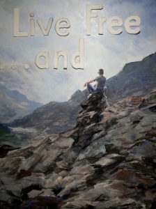
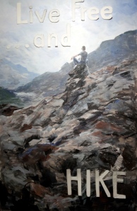
New Hampshire does live by the motto:  seat belts are not mandated for adults; helmets are not required of motorcyclists; soda cans do not come with a refundable deposit; and taxes, at least those that would reach a broad segment of the population, are abhorrent.  Cigarettes, fireworks, gambling and liquor are encouraged.  They generate revenue.  When we say “free”, we don’t mean “tax-free”.  For a comedic take on New  Hampshire’s philosophy,  see Juston McKinney’s YouTube analysis.

In defense of free living, New Hampshire was an early adopter of same-sex marriage, thereby proving it is an independent thinker.  I believe there is also a law on the books to the effect that gun-toters must be allowed to enter courtrooms and legislative chambers with their guns on board.   In that last case, the death resulting from living free may not be that of the free liver lover.  So you see we have a lot of scope for comedy here.

Anyhoo, the Currier  has a contest going for the best poster on the theme of “live free AND _______”—you fill in the blank.   The idea is to describe or celebrate something wonderful about New Hampshire, where you may live free and also do some constructive things, things other than killing yourself on the highway.

I had an immediate super-brilliant idea and decided to compete, ignoring the fact that I have zero experience or training as a graphic artist.  I ordered ten poster boards from Dick Blick, mostly because you can’t order just one.  Extras would be good because I would surely mess up the first few attempts.  Then I explored the internet for some  hints on how to go about painting on poster board.   There wasn’t much out there to help me, but I did learn that applying oil paints directly to the board would not be advisable.

Luckily, I keep some acrylic paints on hand, so I planned to paint a base of acrylic, which would seal the surface and prepare it for the eventual painting in oil.  The base would coordinate with my background colors.  Once I got going, very confidently since I thought I was still just painting the base, the whole thing just sprang to life.  My first acrylic painting.  I was stunned.  And happy.

Then began the process of lettering.  OMG.  I proceeded with great care (and concern).  Again I conceived a plan:  The letters are to consist of their outlines only, because I wanted the background painting to show through.  I drew the my letters freehand.  I did not want mechanical-looking letters but I did some measuring.  I cut them out with an Exacto knife.  Not as easy as it sounds.  Hard, in fact.  I stuck them  onto my poster with museum putty to see how they looked.  I repositioned them.  I redid  “. . . and” to make that piece smaller than the “Live Free“.  I outlined them using a pen.  I painted around the outlines.  The unevenness bothered me.  I didn’t want it to look professional but I wasn’t going for sloppy either.   I tried blurring/bleeding edges with my medium (I was using oil paints at this point).  Kind of liked that.  Wiped out the word “Free” because letters were too crowded together.  Painted with acrylic paint over the wipe-out to create fresh, clean surface for next go ’round.

And that’s where I am.  Today I am researching the kinds and uses of stencils, vinyl lettering etc.  Should I give up on the outline plan?  Guess I am going to have to show you in order to get any feedback.

Image 3

The above is a close up or detail of the painting, showing paper letters positioned where I planned to outline them.  I wished I knew how to make the letters look as if they were actually hanging in front of the poster.

Image 4

Above is the whole thing, with all of the letters positioned; I must have corrected “HIKE”‘s position  before penning its outline in red ink.

Image 2

Above is the state of the poster before I darkened the upper outlines and before I whitened the “HIKE” outline, and yes, before I got up in the middle of the night to remove the crowded letters forming “Free”.  I like “HIKE” now, but am worried about “Live Free”.  All of my options for stenciling or applying letters involve letting go of the open outline design.  What do you think I should do?

As for the subject image, if you have been reading for a while (over a year). you will recognize it from a 9×12 study that I did for a Patrick McCay course at the Institute called “Explore, Express, Exploit”.  I published it in this blog from October 2011.  Here is the original inspiration:

The Lone Looker

The Lone Looker (photo)

I am well and truly exploiting that image of the guy on the rock outcrop that I photographed at 2011’s bike race up Mount Washington, thus fulfilling the promise of that course.

Aline Lotter is currently exhibiting:

at the Hatfield Gallery and the East Colony Fine Art Gallery in Manchester (Langer Place, 55 S. Commercial St., Manchester, NH); at the Bartlett Inn in Bartlett; at the Red Jacket Inn in North Conway;  at Stella Blu , an American Tapas restaurant in Nashua; at the law offices of Mesmer and Deleault at 41 Brook St in Manchester; at the Norris Cotton Cancer Center in Manchester (part of the Healing with Art program) and at her studio by appointment.

A Milestone Reached

Last week, without really thinking about it yet fully conscious of it, I produced something, finally, that I have been aspiring to for many years now.  Here it is:

Jon, supine pose

Jon, supine pose

This aspiration started with a class that I took with Patrick McCay at the Institute–a course called Explore, Express, Exploit.  At that time, what I had in mind was achieving a style that was loose as opposed to tight.  Following Patrick’s course, I took Painting the Contemporary Portrait with Cameron Bennett.  Cameron gave us a list of portrait artists, “portrait” being loosely defined and the artists being avant garde, and suggested we look them all up to find one who could inspire our own modern and unique take on portraiture (again, loosely defined).  I glomed onto Carolyn Anderson, American artist living in Montana, somewhat obscurely.  She seems to be an artists’ artist–known to and collected by fellow artists but not yet collected by museums.

Since then, her work has always been in the back of my mind, even when I am producing the hard-edged, detailed works that seem to come out of me unbidden.

You’ve seen a few nudes from me.  Here is the only one I found on Anderson’s website:

Anderson nude

Anderson nude

And here is one of her portraits, lovely beyond words to describe:

Anderson portrait

Anderson portrait

By comparison, I know, my big breakthrough seems heavy-handed. But it occurred–bloomed– quite naturally that Tuesday morning, without a trace of the manipulation that I felt I was guilty of when painting loosely for effect.  “Loosely” implies something casual, effortless, airy–not something forced or faked.  Here is one of my earliest efforts, and it’s not horrible, but still you can feel the strain it put on me:

Translation into Oil

Translation of life drawing into Oil

I know from past experience that this reaching a new level, slightly closer to the high level occupied by my hero, does not mean I am permanently raised on that new level.  On Friday I tried not to slip back too far.  I worry about being too self conscious about it.  A Catch-22.  You can only succeed by not trying so damn hard.

So here is Margaret, the model with whose limbs I have recently struggled in vain to organize*.  I got a break when we posed her with her hair covering up one of her shoulders.

M on brown recliner, WIP

M on brown recliner, WIP

*”organize” is the word used by Robert Liberace to describe the first stages of a drawing or painting, which the parts are sized and fitted together–the jigsaw puzzle stage.  It’s so the right word that I am adopting it.

Aline Lotter is currently exhibiting:

at the Hatfield Gallery in Manchester (Langer Place, 55 S. Commercial St., Manchester, NH); at the Bartlett Inn in Bartlett; at the Red Jacket Inn in North Conway;  at Stella Blu American Tapas restaurant in Nashua; at her law offices at 41 Brook St in Manchester; and at her studio by appointment.

Slacker!

I only painted thrice last week, and it’s  thanks to my Tuesday and Friday morning life drawing sessions and the Saturday Life Group that I accomplished that much.  It made me realize how little time I have been putting in on studio projects, and on painting in the great outdoors.  I used to be a pretty decent, very enthusiastic plein air painter.  Without actually counting, I would bet I produced over 50 plein air paintings in 2011, compared to 25 this year.   I miss it.  But so much of my artistic energy has been absorbed by the figurative and portrait sessions that I haven’t been carving out time for plein air outings.  Now the weather is getting nasty outside.  My New Year’s resolution, adopted early, is to find more opportunities to get outside to paint–starting with our first ever Bartlett Artists Winter Getaway in January, followed by a visit to Mary on Marco Island, probably in February.

Meanwhile, the story of this week:  Since our Tuesday model and our Friday model and our next Friday model is the same person, those of us who do both Tuesday and Friday decided to make it a repeating pose, enabling a total of 9 hours on one pose for those who wanted it.  I will probably the only one of us who will use all three sessions on a single painting, although I expect not to use the entire final session on this painting.

"Huis Clos" ("Inside closed doors" or "no exit"?) WIP after 2d of 3-session pose

“Huis Clos” (“Inside closed doors” or “no exit”?) WIP after 2d of 3-session pose

One of the more interesting aspects of this painting is the background architecture.  I had recently watched a video, part 1 of Dan Thompson painting a figure, in which he recommended painting in the background, at least temporarily, in order to use it as a roadmap.  It works.  Before I drew in the Exit door on the left of the painting, I had drawn the figure’s arm too close to his body.  By situating the frame of the door where it intersected the body, I uncovered the drafting error in the arm.  The cubicle on the right (it’s the bathroom) helped me with sizing the figure’s left leg (leg on the viewer’s right).

Because I knew about the extended pose, I started this painting on a 16×20 sheet of primed linen.  I intended it to be a whole body pose, but allowed my impulsive first blocking in to change my mind.  What you see is the product of two sessions, and it is almost finished.    Some tinkering with the facial features and decisions on the background are needed next week.  When it is finished, I will roll it up and stash it away with so many other paintings on which I have lavished hours of time and effort.  And love.  Paintings that, unlike landscapes, no one else is likely to savor.

At  SLG (Saturday Life Group) I continued the experimentation with compressed charcoal that I had started in Larry Christian’s class at the Institute.  Here is the final pose of the session:

40-minute pose, view of the back

40-minute pose, view of the back

Yes, I do like backs.

There is another  drawing, from a 20-minute pose, that I wanted to include today, but for some reason, the photo I thought I took of it did not turn out.  Too bad.  It was a good one, and different from the one above.  I will include it next week if I can work it into next week’s topic, whatever that might be.  I hope next week’s topic will include work in my studio, inspired by the successful completion of my reorganization exertions.  Yes, that’s my excuse for no studio painting:  I have been laboring on moving stuff, and removing stuff, to create more space in my bedroom/studio for the studio portion.  Books, heavy books, had to be carried downstairs to make room for just art books on the studio shelves.  Underbed storage units had to be emptied to make room for  clear bags, saved drawings and such art-related, seldom-accessed items.  Dust bunnies had to be captured and disposed of (sneeze!).  Furniture had to be rearranged and some of it relegated to the guest room.  Today, I ache all over.  Well, that’s nothing new.  Arthritis.  Really slowing me.  Down.

Aline Lotter is currently exhibiting:

at the Hatfield Gallery in Manchester (Langer Place, 55 S. Commercial St., Manchester, NH); at the Bartlett Inn in Bartlett; at the Red Jacket Inn in North Conway;  at the Soo Rye Art Gallery in Rye NH; at her law offices at 41 Brook St in Manchester; and at her studio by appointment.

The Struggle (with compressed charcoal)

I’m pleased to report that I did not chicken out.  Monday a week ago, I proclaimed my intent to deploy compressed charcoal in Larry Christian’s life drawing class, and on Tuesday I did just that.  I had prepared myself by acquiring a large bag of cots.  What is a cot, you ask?  They are little rubber caps for fingers.  They look like condoms.  Larry said they would fit his dog’s, well, you know.  I thought I would need only one cot, for the third finger, which I favor for smearing soft willow charcoal.   I soon discovered that compressed charcoal attaches itself to fingers that merely touch the stick.  By the end of the class, I had one cot on every finger of my right hand, because all of them were handling the stick.  My thumb is fatter than my other fingers, and all my cots were medium-sized to fit my other four fingers, so my poor thumb suffered mightily from the constriction of blood flow; after all that, my thumb still got covered in dust because of a pinhole leak in the tip of the cot.

Smearing, the technique that I love to use with ordinary, vine charcoal, is not a good technique for compressed charcoal.  You can’t soften a mark left by compressed charcoal–you can only make it look messy.  You’ll see.

I started with a test sheet of mark-making.

A test of handling

My sticks were square, but not precisely square.  One side of a square might produce a perfectly even application of charcoal, while the side next to it will produce streaks of darker lines at the edge.  Unless you were expecting and planning for those streaks, this would be quite upsetting.  Because THERE IS NO CORRECTING OF MARKS MADE BY COMPRESSED CHARCOAL.  You can start light and get darker, but you can’t reverse direction.   If you try to erase, you’ll probably sink the boat.

Gestures, no. 2

Upper left–that’s what happens when you try to smear or spread the mark left on the paper by compressed charcoal.  Yucky!

Gestures, no. 1

gestures, no. 3

Gestures, No. 4

Gestures, No. 5

Gestures, No. 6

You’ll notice that I am not drawing with lines.  Instead, I am trying to create form by darkening the space around it, or by filling in form with a darker value.  Given the size of the charcoal stick, details can’t make it into the picture.  You can probably deduce from a few stray boobs that our model was not a man.

The magic of the compressed charcoal comes from its revelation of the grain of the paper.  Almost anything you do can look cool.  To the extent that these gesture drawings are successful, it is probably because I didn’t have time to find ways of spoiling them.  The more time I got with a pose, the harder it became for me to adjust to the unique properties of the compressed charcoal, as these next three poses demonstrate.

Struggle no. 1  Where do you go when you can’t draw the face or fingers?

struggle no. 2 still trying to complicate things

Struggle no. 3 Falling back on lines

Too black, too soon, those last two.  I resolved thereafter to slow down, tread softly.  Restraint is key.

Stuggle no. 4

Finally, I feel I am getting somewhere.  Can you make out the smudges from my fingertips (actually from the cots on my fingertips)?  By this time, my finger cots were layered in thick, greasy, black soot.

Struggle no. 5–close, or there?

Because the back view is my favorite, or maybe because this was our last pose of the night, whatever, I finally produced something of which to be proud.  My light, early marks that were “wrong” (too wide buttocks) did not detract from the beauty of the final drawing.  The paper I was using was low-quality sketch paper.  I can’t wait to see how these marks will look on some decent “laid” charcoal paper.

Isn’t it ironic that a drawing that looks as though it were born of wild abandon is actually born of restraint?

P.S.  Larry was quite pleased with me.

Finding a Face

My day has started out badly.  My camera misbehaved in a way that has me stumped.  I was taking photos of three paintings that I intended to show you, trying out all kinds a strategies short of standing on my head to get one without glare.  I finally figured out that I had to get farther get away from the painting to avoid the shine, and zoom in on it.  But the camera went into some kind of zombie mode wherein the painting showed up as a blank gray canvas.   I loaded the images into iPhoto and increased the exposure, to reveal a ghostly image of the painting.  Scratching my head.  Did I change a setting by accident?  It’s a Nikon D70, if anyone out there has an idea.

underexposed

Meanwhile, moving on:  “finding a face” refers to the process involved in painting a portrait.  I contrast the two nudes with faces attached that I worked on earlier in the week, with the stubbornly unphotographable portrait with body attached that I worked on over the weekend.    Here are the bodies:

From Head to Foot

Larger copy of earlier pose

These faces are sketched in–not carelessly but not with any refinement either.  A little dot of paint placed in the right spot pretty much does the job.  Since the paintings are pretty rough overall, a refined face would look out of place anyway.  These paintings are in line with the fast and loose style toward which I am reaching.

Enter Dan Thompson.  I took a two-day workshop at the Institute with this painter, who hails from New York City (“the South”, as he refers to it) where he teaches at the Art Students League.  There were no beginners in this workshop.  In fact, two of the Institute’s teachers were taking part.  Whereas I have been mostly concerned with getting the features placed in the correct spot, Dan’s primary focus was on the shapes of things.  For example,  in Sunday morning’s lecture/demo, we explored, in great detail, every nuance of the nose, ears, mouth and eyes–in that order.  Before the demo of each feature, we received a lecture with diagrams. The following two photos show his roughed in portrait from Saturday’s morning demo/lecture, with the nose developed in the first one, and the ears in the second:

Nose

Ears

For the nose and ears, I made notes in my sketchbook.  Then I got a little savvier, and took pictures of the diagrams.  Here are his diagrams with lists of terms, one  for the parts of a mouth and the other for the eyes, followed by his demo of each:

Somewhere under all the arrows and embellishments, there was an outline of a mouth.

mouth

eyes

eyes

I loved it.  Every little bitty stroke had its own reason for color and direction, yet the product does not look overworked.  No blending.  I went back and examined my own work in progress from Saturday and was depressed; I didn’t even have the features in the right spots.

WIP– Halfway there?

But I pulled myself together and applied the thinking Dan had just demonstrated to us, and it got better–yet another portrait of Becky.  (For a few earlier portraits of Becky, see my blog titled “Becky”.  On his last go-round, he complimented me mildly, saying “nice job” as he left my station for another, and I have stored that memory in the place where I keep similarly encouraging statements, a place that I revisit whenever I think this whole striving to be great is just a foolish pipe dream.

umpteenth portrait of Rebecca

Aline Lotter is currently exhibiting:

at the Hatfield Gallery in Manchester (Langer Place, 55 S. Commercial St., Manchester, NH); at the Bartlett Inn in Bartlett; at the Red Jacket Inn in North Conway;  at the Soo Rye Art Gallery in Rye NH; at the law offices at 41 Brook St in Manchester; and at her studio by appointment.

Catching the Odd Perspective

I haven’t mentioned it before, but I have been taking a figure drawing class at the Institute with Larry Christian.  Larry’s approach to drawing the figure is the opposite of academic drawing.  He pushes us to  draw quickly, intuitively, expressively.   The techniques are familiar ones, but to please Larry, we must apply those techniques more fluidly and expressively to create an image that is unique.

I took this course with Larry before, in the spring of 2006, when I was just getting started as an artist.  At that time, I was obsessing on landscapes, particularly plein air painting.   Now that I have done a 180 on that preference, and also come to admire Larry’s drawings, I was motivated to retake the course, hoping to find out how Larry achieves his dramatic effects.  For the only images of his work I could find online, click here.  By way of contrast, look at Anthony Ryder’s drawing, so meticulous, and also lovely, but definitely academic in style.

Most of our work product in Larry’s course is not fit for public view.  We bring nothing  to completion.  We produce pages and pages of gesture drawings, 30 or more of them each week, and then do our exercises on the technique du jour.  One week it was drawing shapes instead of lines.  The next week, drawing negative shapes.  The week after that, creating form with darker values for shadows.  Most recent week, creating form by wiping out darker values to create light.

Last week did produce a few showable drawings.  And one of them contributed to the title of this week’s blog.

Bent

We applied charcoal evenly over the paper in order to create a non-white ground, and then erased that charcoal to bring out the shape of the model.  I got lucky in my angle on the crouching pose–the simplicity of the shape and the shadow distinguish this drawing.  The one before it was a more traditional pose, more complicated, yet less interesting.

Seated

Now that the course is winding to a conclusion, I have a pretty good idea of what I will be practicing in order to emulate Larry Christian:  Use compressed charcoal;  draw negative spaces; and my shadow areas will be all in one value.  That last point was a revelation.

The other example of an odd perspective is my painting from yesterday, Sunday.  I brought a larger canvas (12×16) and had less time (we didn’t get started until 45 minutes into our 3-hour session with the model), so perhaps that inspired me to paint more with the larger, simpler shapes.  Or maybe I was influenced by the success of my crouching pose above.  In any event, here it is:

Pillowed

In evaluating this painting, I remembered one from a month or so ago, which, by consensus of my friends, I had ruined by smoothing out the shapes within shapes.  It’s very hard to restrain oneself.  Right now I’m looking at that light patch on her forehead, thinking it should be smoothed.  But I had a light patch like that on her breast at one point, and it disappeared and I don’t even remember doing it.  That’s how hard it is to restrain oneself.

Following up on the Soo Rye Gallery opening last Saturday, I’m hoping you are dying to see my photos taken at the reception.

Totem displayed in Soo Rye Art Gallery

High and Dry on exhibit at Soo Rye

Lotus Studies, on exhibit at Soo Rye

Bea’s drawing, displayed in Soo Rye Gallery

Bea’s portrait of Becky

Aline Lotter is currently exhibiting:

at the Hatfield Gallery in Manchester (Langer Place, 55 S. Commercial St., Manchester, NH); at the Bartlett Inn in Bartlett; at the Red Jacket Inn in North Conway;  at the Soo Rye Art Gallery in Rye NH; at the law offices at 41 Brook St in Manchester; and at her studio by appointment.

The Week of “Super Storm”

Haven’t  you heard enough about Sandy already?  New Hampshire is one of the suffering states, but I got off pretty easy.  Looks like I’m going to have to pay for a new roof without help from the insurance company.  Being unscathed myself, I insisted on  holding the Tuesday life group.  It was, after all, a pretty nice day, weather-wise, a little rainy but hardly any wind to speak of.  But most of the other artists were dealing with one storm-related problem or another and couldn’t get here for the group.  So it was just the model, another unscathed artist, and me.

We set up in the window side of the studio and had our model lounge on the familiar old brown leather sofa.  We found ourselves looking down on him, which felt strange at first.  The model stand that we usually use puts the model at my eye level or above.  (I sit to paint.)  We also forewent any supplemental lighting inasmuch as the sun was streaming right in at our backs (yes, SUN).  No dramatic shadows to fall back on for creating interest.  But as it turned out, I didn’t need any drama from lighting.  I accepted a full-on frontal foreshortened pose with the model’s feet practically in my face.  (Of course that’s an exaggeration–I did say “practically”.)  I was super pleased with this development because it furnishes a response to a taunt from  one of my colleagues who, upon viewing last week’s blog, complained that I was not giving enough attention to feet.  Since he is also one of our models, I suspect it is HIS feet he want more attention paid to.  Nevertheless, feet are feet:

The Feet Have It

I have to point out that it is not often that you get to depict the wrinkles on the sole of a foot.  Having recently watched a documentary on Lucien Freud, I also felt as if I were channeling him every so slightly, as I tried to paint the effect of hairy legs.

On Friday, four of us  met with Peter Clive for a quasi-workshop session.  Peter had during the summer been attending our Tuesday group whenever he could, but currently his teaching schedule at the NH Institute of Art kept him there on Tuesdays.  So he offered to come instead on Fridays and critique work in progress, when corrections are possible.  In the course of the summer and now the fall, Peter has seen quite a few of my paintings.  He compliments me by saying something like “That’s a nice study,”  or even “That’s a great study.”  He said that about The Feet.  Noting his use of the word “study”, I had reconciled myself to the reality that a serious artist does not go around producing a finished painting in three hours (actually less when you consider setting up time and break times).  The fact that I consider these paintings as complete if not completely wonderful just shows how far I am from being a serious artist.  There is a whole level of professionalism up there that I can only imagine.

However, the work that I did Friday was, at the end of the three hours, pronouced a “painting” by Peter, “not just a good study”.  Yes, he actually said those words.

An Actual Painting

He liked the composition, which I admit, I  had worked out early in the process. before paying much attention to the figure.  So that was unusual.  Perhaps because of that, a certain painterly quality emerged for the whole painting.  But when I got home, I noticed that the right leg was too short, both as measured against her left leg and as measured against her torso.  So I “fixed” it.  I tried to duplicate  the original foot before I covered it up, but the new foot  (FEET again!) doesn’t look right.   I may have botched this painting by correcting one errant part of it that may not have mattered in the big scheme of things.    All is not lost, however–the same model is returning in two weeks for the same pose, and I will get another crack at that foot.  I am also hoping to paint a larger version from the same pose.

Totem, 11×14, $300

Lotus Studies 13×13 $265

High and Dry, 11×14, $300

A plug for the Soo Rye Art Gallery opening on November 10, reception from 5 to 8 p.m.  The address is 11 Sagamore Road, Rye, NH.  All the artworks being exhibited are priced no higher than $300.  I contributed “Totem”, “Lotus Studies”, and “High and Dry”, three of my all-time favorite paintings.  If you can’t get to the opening, the show  continues through the end of December, but I expect that a lot of the art will be sold at the opening.

Here is some history for these three paintings:

Totem was accepted in a regional show juried by Don Stone for the Rockport Art Association (Massachusetts, not Maine).  I painted Totem on the coast of Rhode Island, near Narragransett, with my artist friend, Mary Crawford Reining.  The totem, actually more accurately called a cairn, in the painting really did exist exactly as I painted it.  Other cairns had been built by person or persons unknown, but this one was the most adventurous.  It was more than a cairn–so I titled it Totem.  Earlier in that morning, I had painted another, more complex view of this rocky beach, and had an hour left over.  Only much later did I  realize until later what a successful painting Totem was.

Lotus Studies won Best in Show at a Manchester Artists Association exhibit, about a year ago when the MAA had a gallery of its own, but I created it at least a year before that for the Women’s Caucus for Art annual 6×6 show.    That had been my first year in the WCA, hence my first 6×6 show.  I had easy inspiration from photographs taken at the lotus pond in Wickford, Rhode Island, again visiting Mary.  The next year we tried plein air painting at the pond, but my output was worthless.

High and Dry has no  distinction to report, but it deserves an award, in my humble opinion, for oozing the most charm.  I have Mary Crawford Reining to thank again, for High and Dry:  this time I was a visiting her Marco Island home for perhaps the third year in a row.  None of my Florida paintings had amounted to much until this one, and I still consider it the Prize of my Florida collection.  Funny thing is, Mary had had her eye on this boat for a long time, wanting to paint it but never having got around to it.  So I swoop in and steal her subject as it were, and make it one of my best from Florida.

Only in the writing of these descriptions did I notice the huge debt I owe Mary Crawford Reining for guiding me to these three inspiring subjects.

Aline Lotter is currently exhibiting:

at the Hatfield Gallery in Manchester (Langer Place, 55 S. Commercial St., Manchester, NH); at the Bartlett Inn in Bartlett; at the Red Jacket Inn in North Conway;  at the Soo Rye Art Gallery in Rye NH; at the law offices at 41 Brook St in Manchester; and at her studio by appointment.   Also, if you want to plan ahead, on December 1-2, a two-day show  of unframed works at Adrienne’s studio on the 4th floor of  Langer Place, 55 S. Commercial St., Manchester, NH; the artwork will be priced no higher than $150!  At least six artists are participating in this sale.

Roaa

Pretty in Pink

Roaa is a young (14 or 15) Sudanese girl now living in Manchester.  She is a Muslim, I am told, but lucky for us, not opposed to being painted or photographed.  We have painted two other Sudanese women, but they were not Muslims.  So we felt very honored that Roaa was allowed to pose for us on the last two Sundays.  On the right is my piece as completed that first Sunday, in about two hours.  I had marked off a 9×12 section of canvas from a pad to use as my surface.   Subsequently, I took it to an informal critique, and made a few improvements.  Here is the new, improved version.

Roaa No. 1, finished

The changes were so subtle that they may get lost in the translation to digital photographs.

Covering 9×12 in two hours is a lot easier than covering 16×12, as I was remindedyesterday at our second Sunday with Roaa.  I decided to paint bigger, intending to go for more of a head portrait.  But when she got situated in the light with her hands again cupping each other, I could not resist another half-figure portrait.  Naturally, with the enlargement came complications, and I could not achieve the likeness that I had captured the week before.  I am going to have to find a way to stand (as opposed to sit, as I usually do) for the painting of larger portraits.  When I stand, I can more readily back away to get a better perspective.  Or I must at least remember to use my reducing glass.  The catch is, while I am working, I’m not thinking about whether I need to check my work.  During the process of painting, I may not be “thinking” at all.  So every now and then, I should stop painting and tell myself to think.  So annoying.

Roaa No. 2, in Peach

The wrap that she wore for this sitting was a peach, almost pink, but at the end I decided to lay over some cadmium yellow, from the tube I got from Michael Harding.  It’s so vivid, I love it.  Why do I still call it “peach”?  It’s the color of the insider of a real peach, isn’t it?  Anyway, this is an unfinished portrait, but I’m not going to develop it any further.  Roaa thought it looked more like her mother than herself, and that may be because I got the nose too long.  Again.

In a parallel theme, I am taking a course with Larry Christian at the NH Institute of Art.  It’s the same course that I took  back in 2006 when I first started on this art track, but today  I’m jumping in at an advanced level.  As luck would have it (good luck), nobody in the class is a beginner.  Larry encourages–no, demands— his students to loosen up.  I like to work fast, so it’s kind of liberating for me.  I dug out my compressed charcoal, ready for anything.  Saturday, at SLG, I tried to apply the new thinking, with three pretty different results.  Bet you can’t tell which one took 20 minutes, which took 40 minutes, and which took 50 minutes.

Getting the Angles Right

Out of the Fog and Mist

Blackest Black

But I know you can tell where I used the compressed charcoal!  It’s a bit like finger painting, and it took two days of scrubbing to get the stuff completely off my fingers.  Badge of honor.

Aline Lotter is currently exhibiting:

at the Hatfield Gallery in Manchester; at the Bartlett Inn in Bartlett; at the Red Jacket Inn in North Conway;  at the Pantano Gallery in the Shapiro Library at Southern NH University; at the Derry Public Library; at the law offices at 41 Brook St in Manchester; and at her studio by appointment.

Improvements

DSC_3049

Above is a new and improved version of the Rockport Harbor painting from last week.  I’m hoping you might be curious to see what can happen to a plein air painting after the artist gets to stare at it in the studio for a while.  It all started when I decided that the shape of the red fish house was not quite right.  Perspective errors are the worst–they haunt me forever unless I fix them.  And once I dive into a painting to make one correction, chances are pretty good that I will find other ways to improve on a painting, even a painting that started out not so bad.   (With a bad painting, I’m like a dog with a bone–I won’t give it up.)  So, after correcting the shape of the fish house, I made the following changes:

Sky:  horizon color–greener

Red fish house: adjusted values of lighted and shaded sides

Blue fish house: changed color of  roof

Boats:  added clean whites to sun-struck surfaces

Water:  brought up reflections of boats, toned down reflection of red fish house

Stone abutments:  eliminated highlights, contrast

Rockport Harbor WIP

After making those changes, I submitted the painting to Patrick McCay’s critical gaze in my EEE class, and, following his advice:

Foreground shrub: added darker shadows, to better compete with the dark in the middle boat

Middle boat:  inserted lighter shadows into the deck , so that the boat stopped attracting the eye

Red fish house: grayed down the red on the fish house–to comport with aerial perspective rules.

I think it’s done now.  Unless something else starts to bother me about it. But I am deep into more studies for the Mount Washington bike race painting and unlikely to give Rockport Harbor another going over.

Here are two Mt. Washington studies, one finished (maybe) and the other, not quite finished–hope you like them!

View of race with vista

At the Finish (WIP)

Aline Lotter is currently exhibiting:

at the Gallery at 100 Market Street in Portsmouth; at the Sage Gallery in Manchester; at the Hatfield Gallery in Manchester; at the Bartlett Inn in Bartlett; at the Red Jacket Inn in North Conway; and at her studio by appointment.

Link to website:  www.paintingsbyaline.com