Exhibiting

I haven’t written a blog for two months.  I have thought about it a lot, but what to write about?

(1) It’s winter, and dreary sunless winter most of the time.

(2) I can’t go to Florida for my usual reinvigoration because I’m working at tax returns in order to support my art habit.

(3) As I get older, it seems as if everything I do has to take longer.  Five times longer.  I have turned into a snail.

As a result of all those factors, forget about blogging. . . I haven’t even been painting!

Two months–that’s December and January, and little bit of February, assuming I finish this start and publish it today or tomorrow.  During those months I was busy with a different aspect of the profession of art making.  I was exhibiting.  So I’m hoping that’s a subject that might be amusing for artists and non artists alike, especially since so much of that was compressed in that stretch of time.

There are two kinds of exhibiting:  juried and not juried.  For the juried ones, the process starts with the application or “entry”.  The artist obtains decent photographs of the artwork and sends the images electronically to the juror(s).   For the unjuried ones, the artist usually need only identify each piece by title and size.  For all of them, the artist must consider the logistics of getting artwork to the place of exhibit, and then getting pieces back home at the end of the exhibit.

Entering multiple exhibits requires some basic record keeping.  You don’t want to put forward the same painting in different, overlapping exhibits.  You can’t deliver paintings to two locations at the same time.  You can’t deliver paintings when you are tied up at work either.  Friends and families are helpful in this regard.

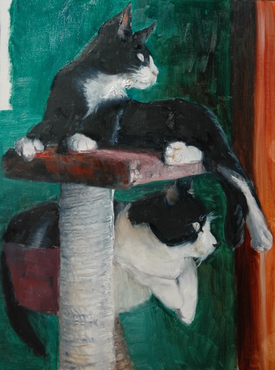
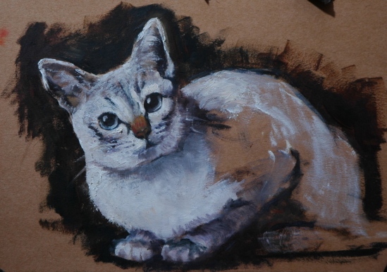
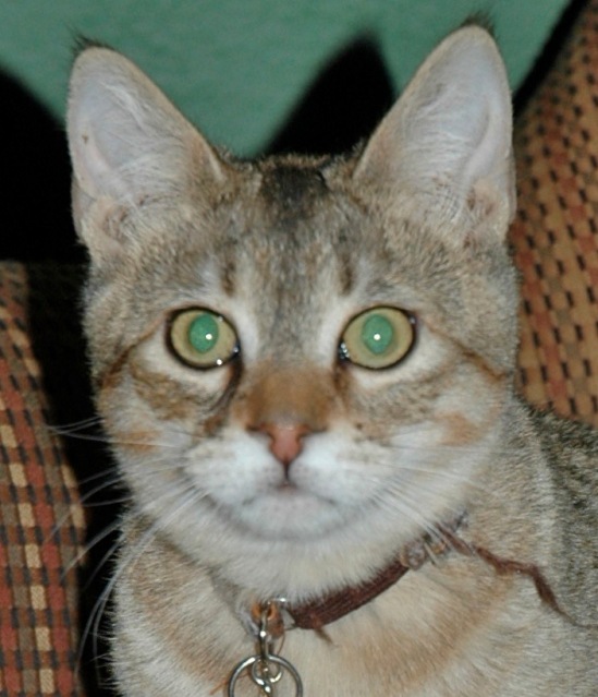
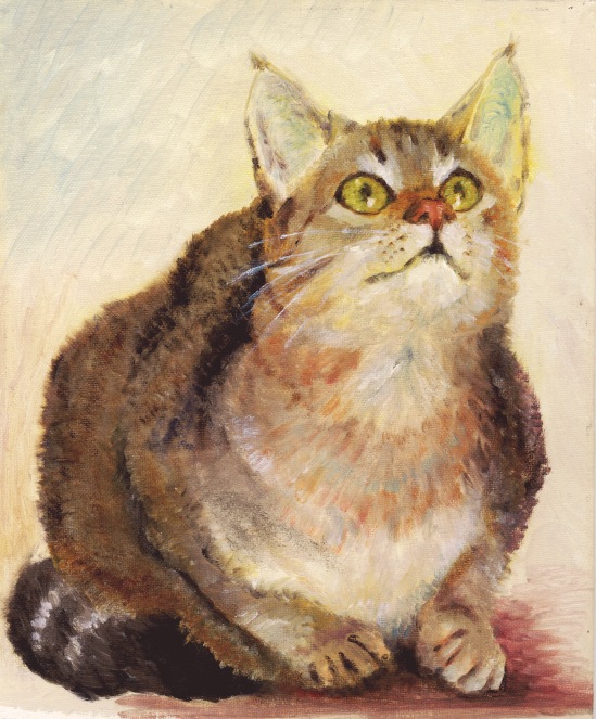
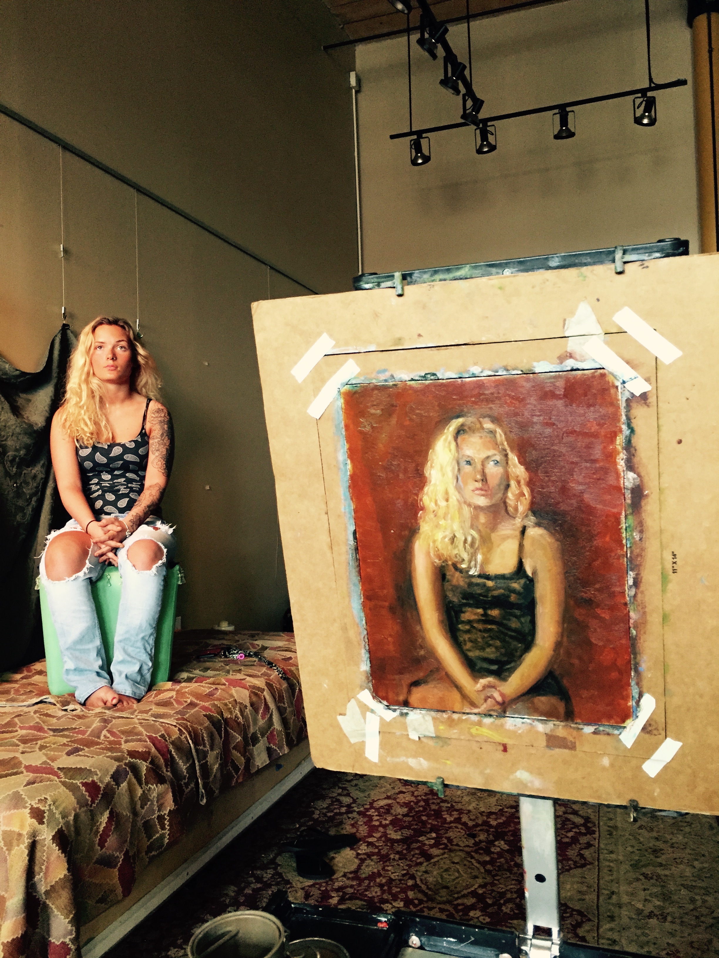
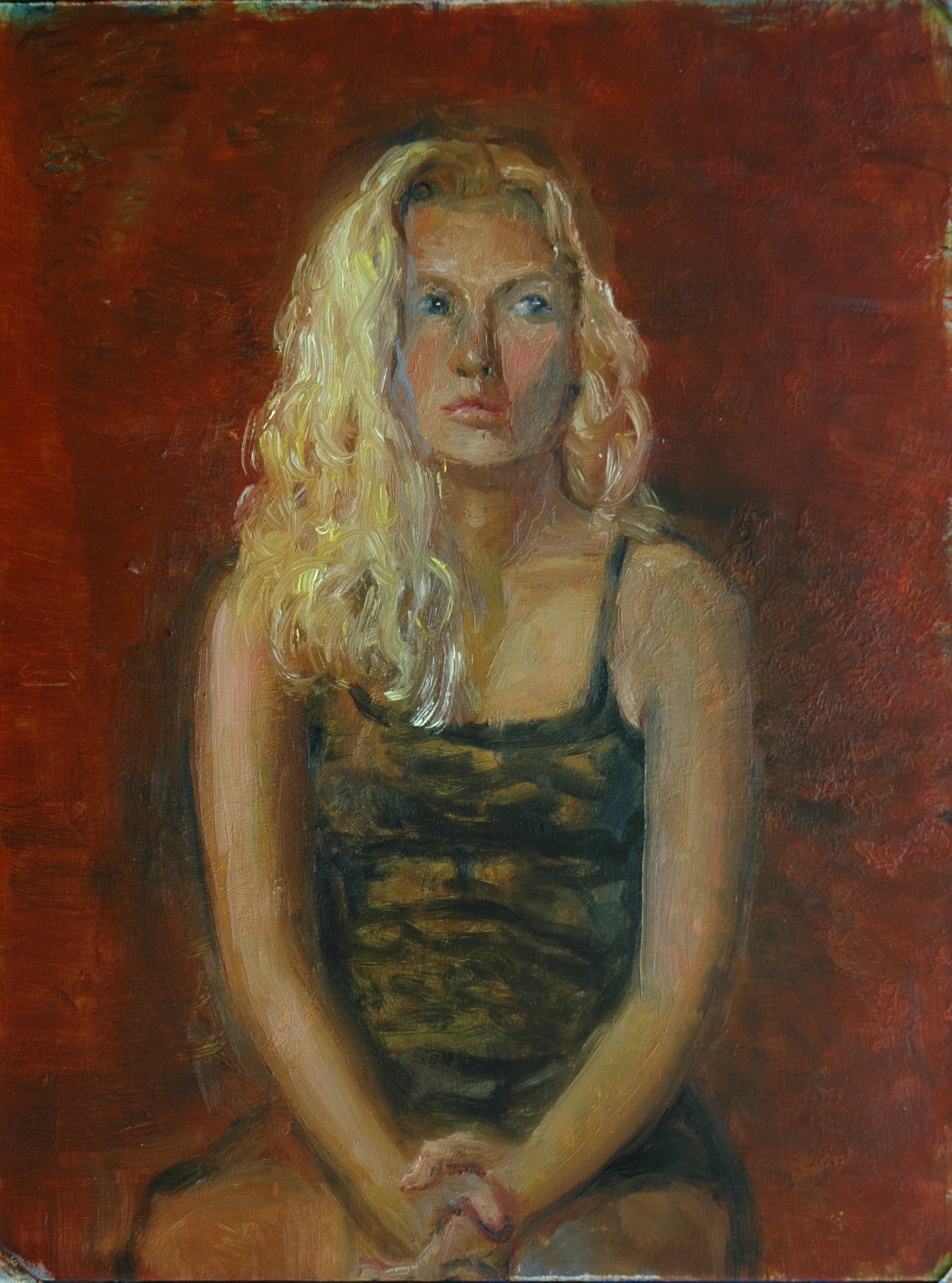
I was particularly busy with the business of art these past few months.  Maybe because  I was not getting many rejections, a turn of events devoutly to be thankful for.  The effort required for me to keep all my exhibit balls in the air sapped my energy to actually keep painting–with the exceptions of commissions of pet portraits and the re-creation of lost paintings.  Yes, on two occasions I submitted photographs of paintings that I could not find!   But let’s go back to the beginning.

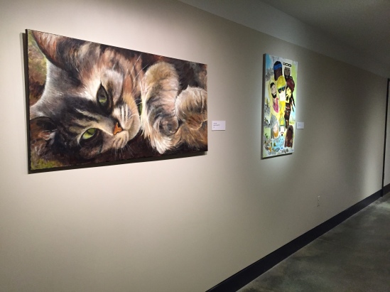
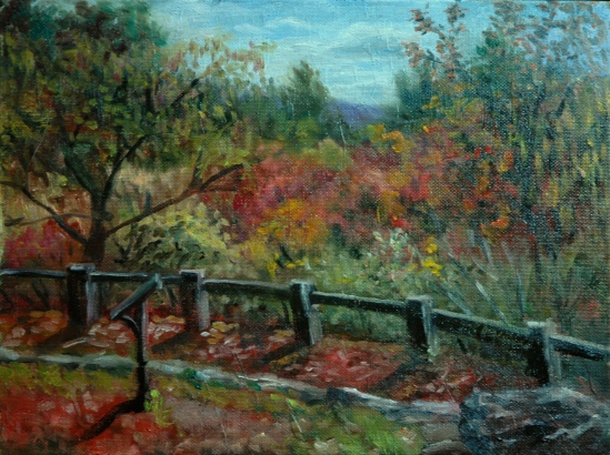
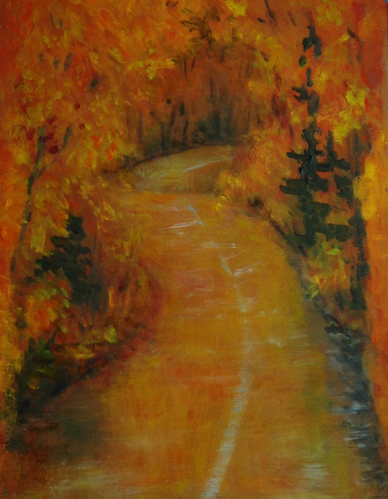
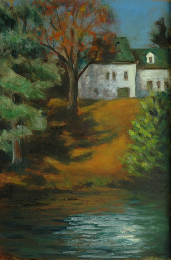
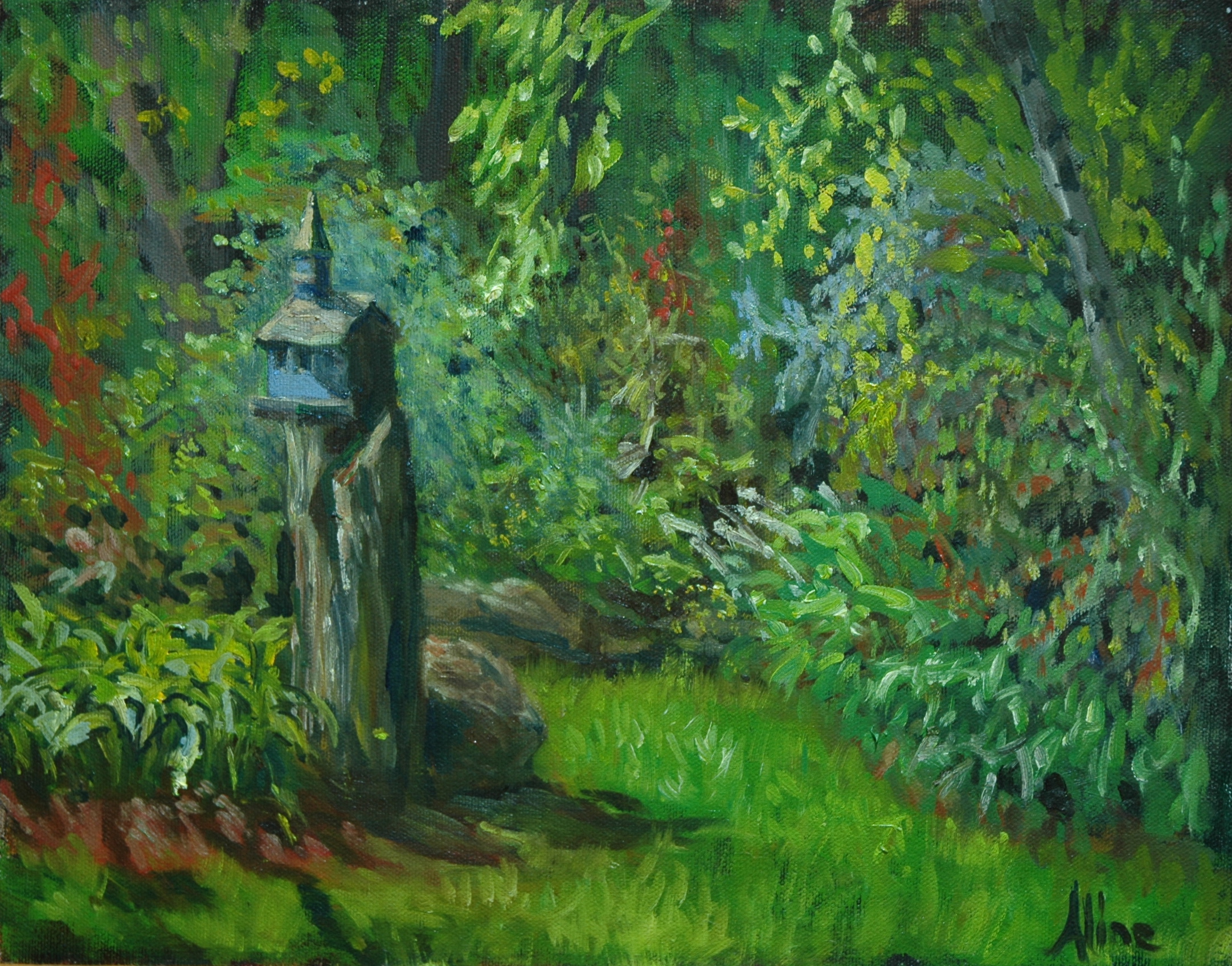
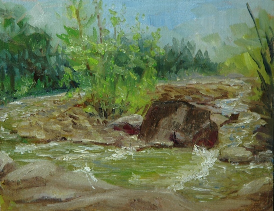
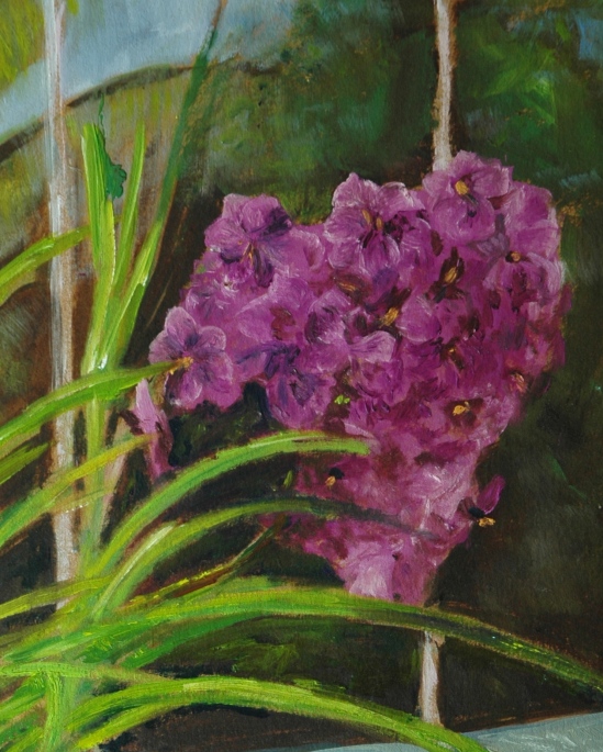
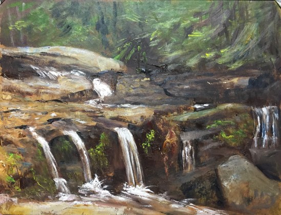
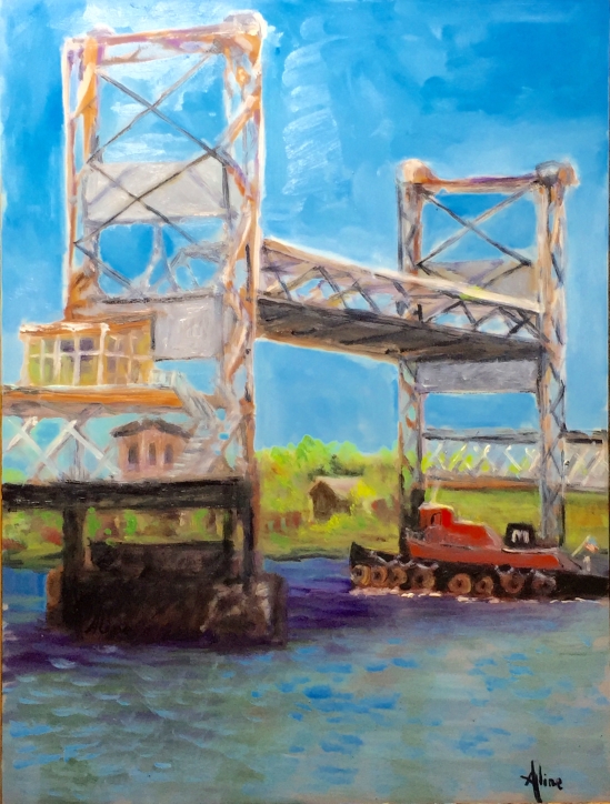
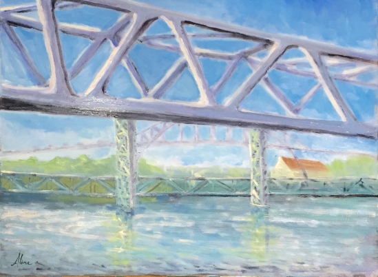
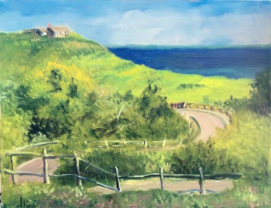
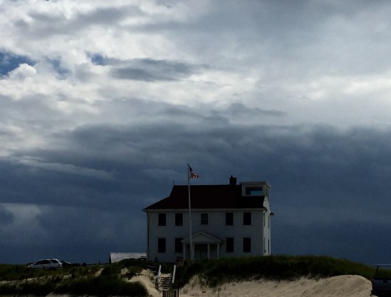
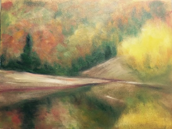
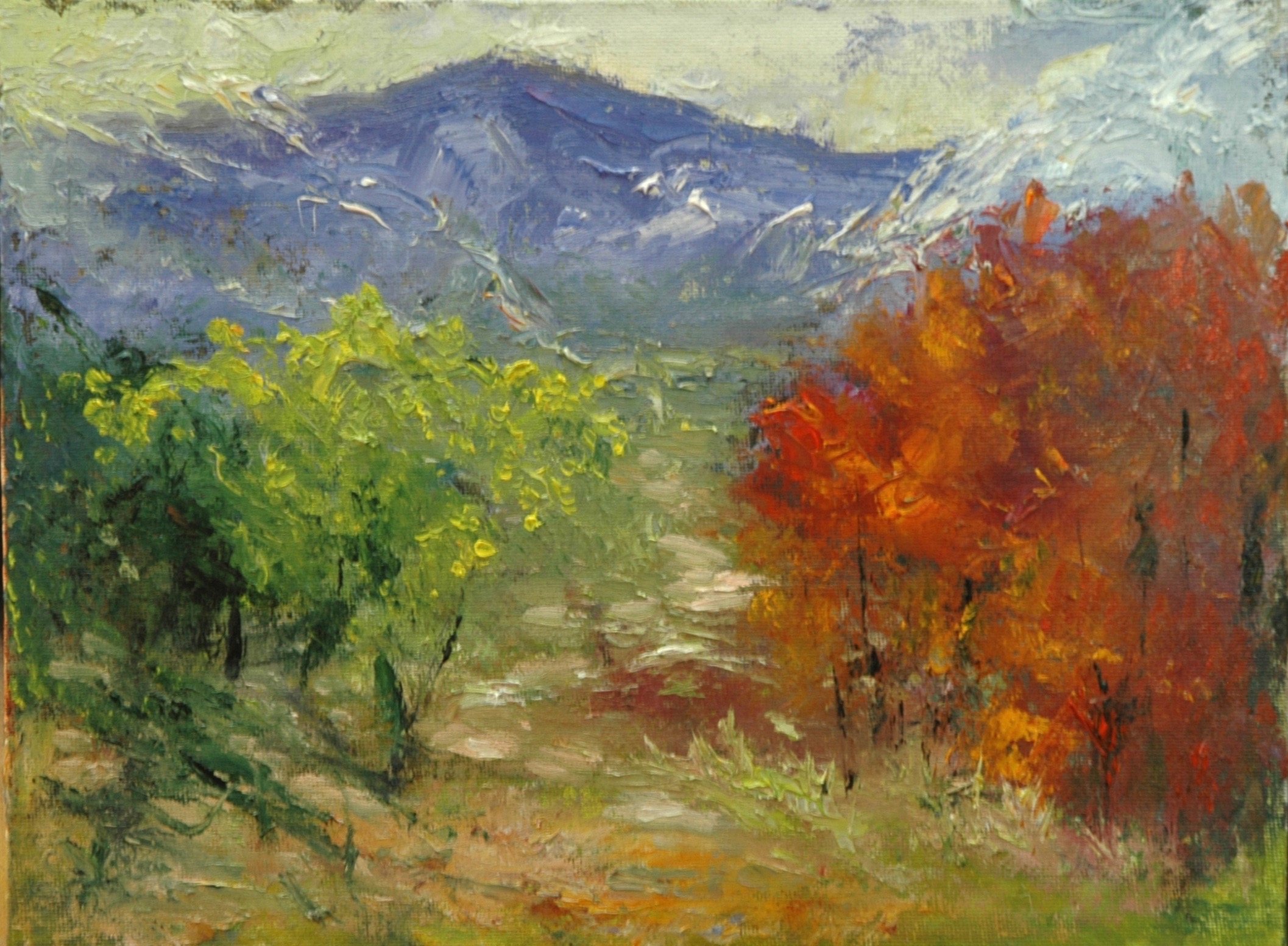
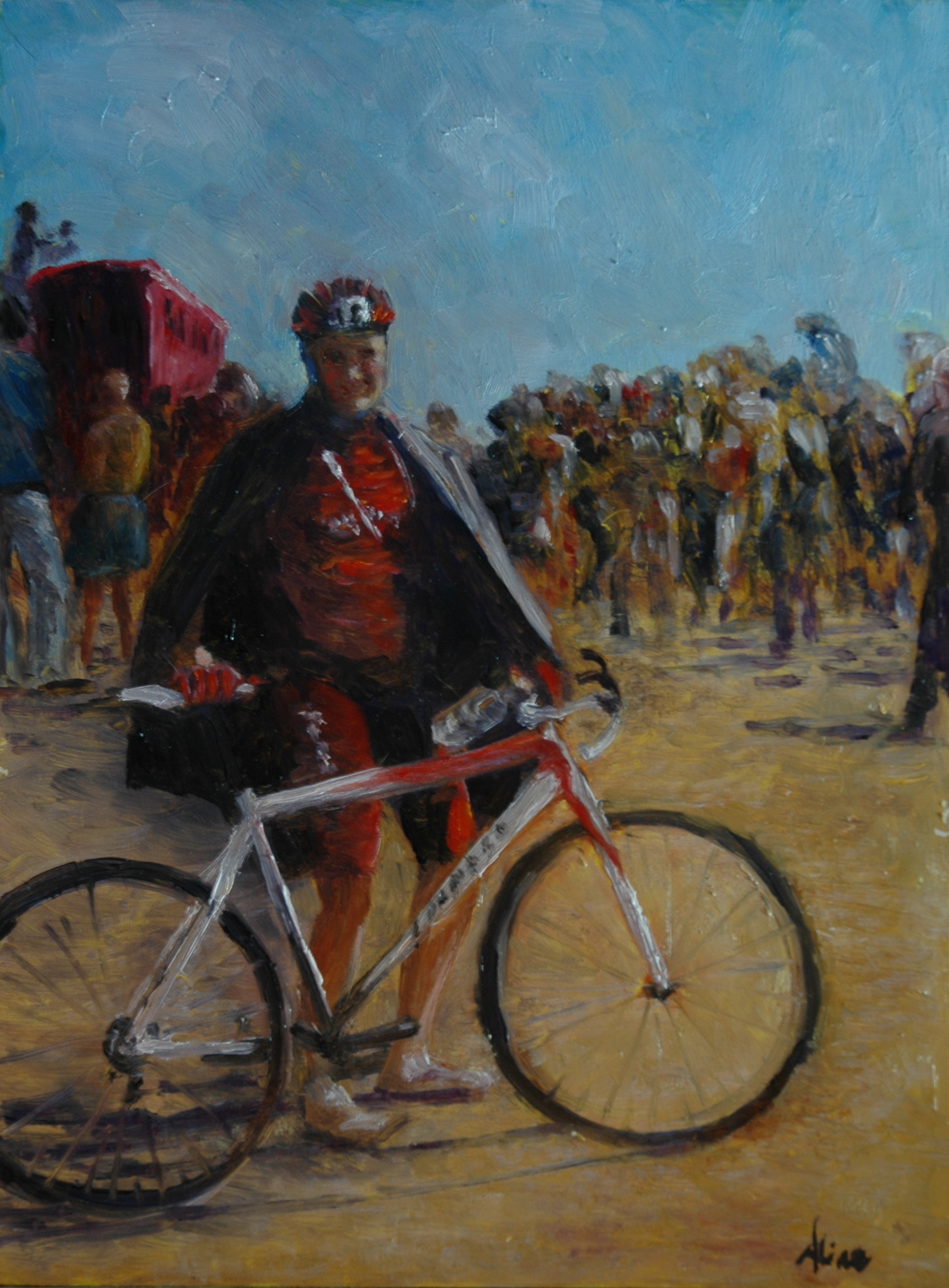
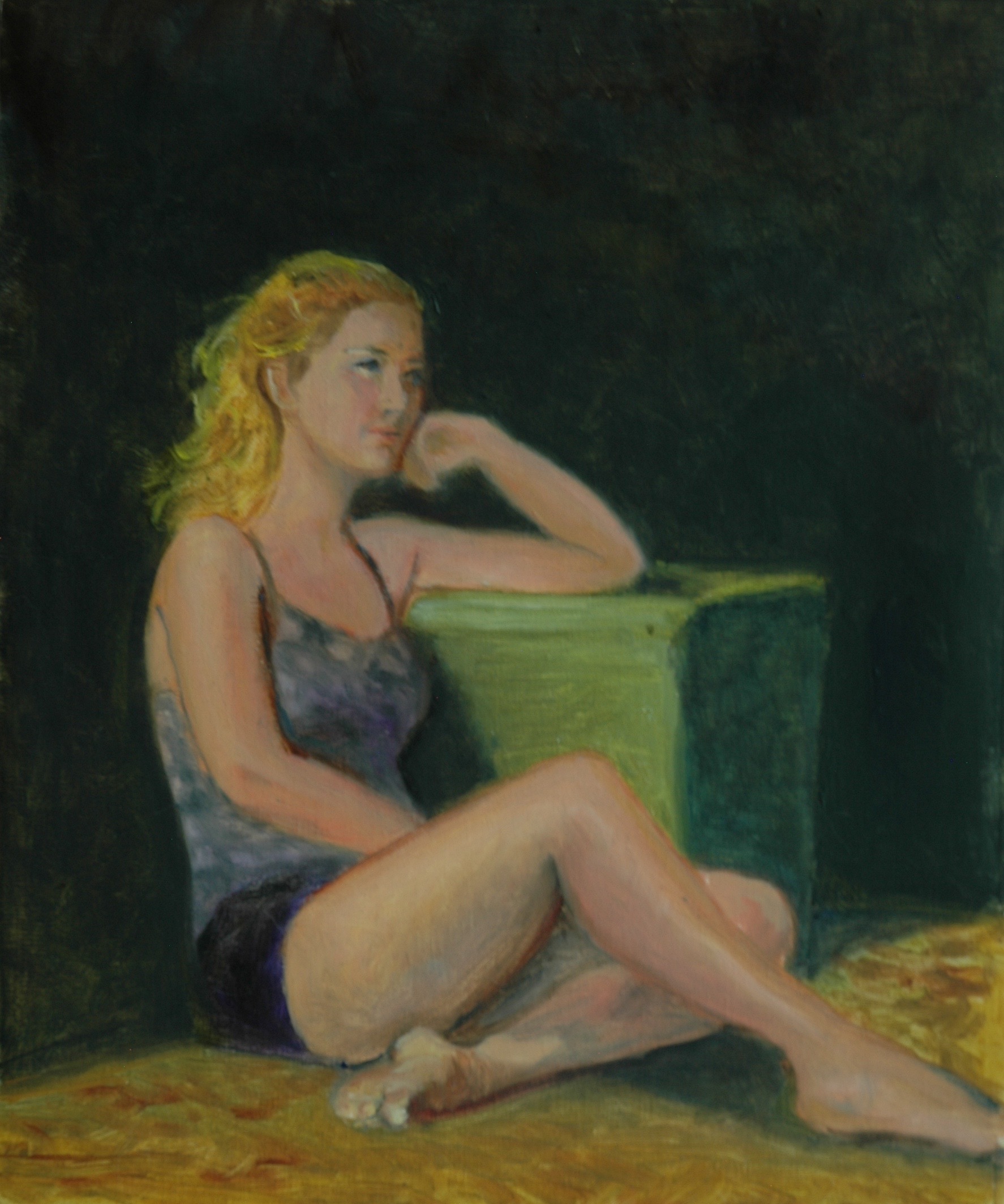
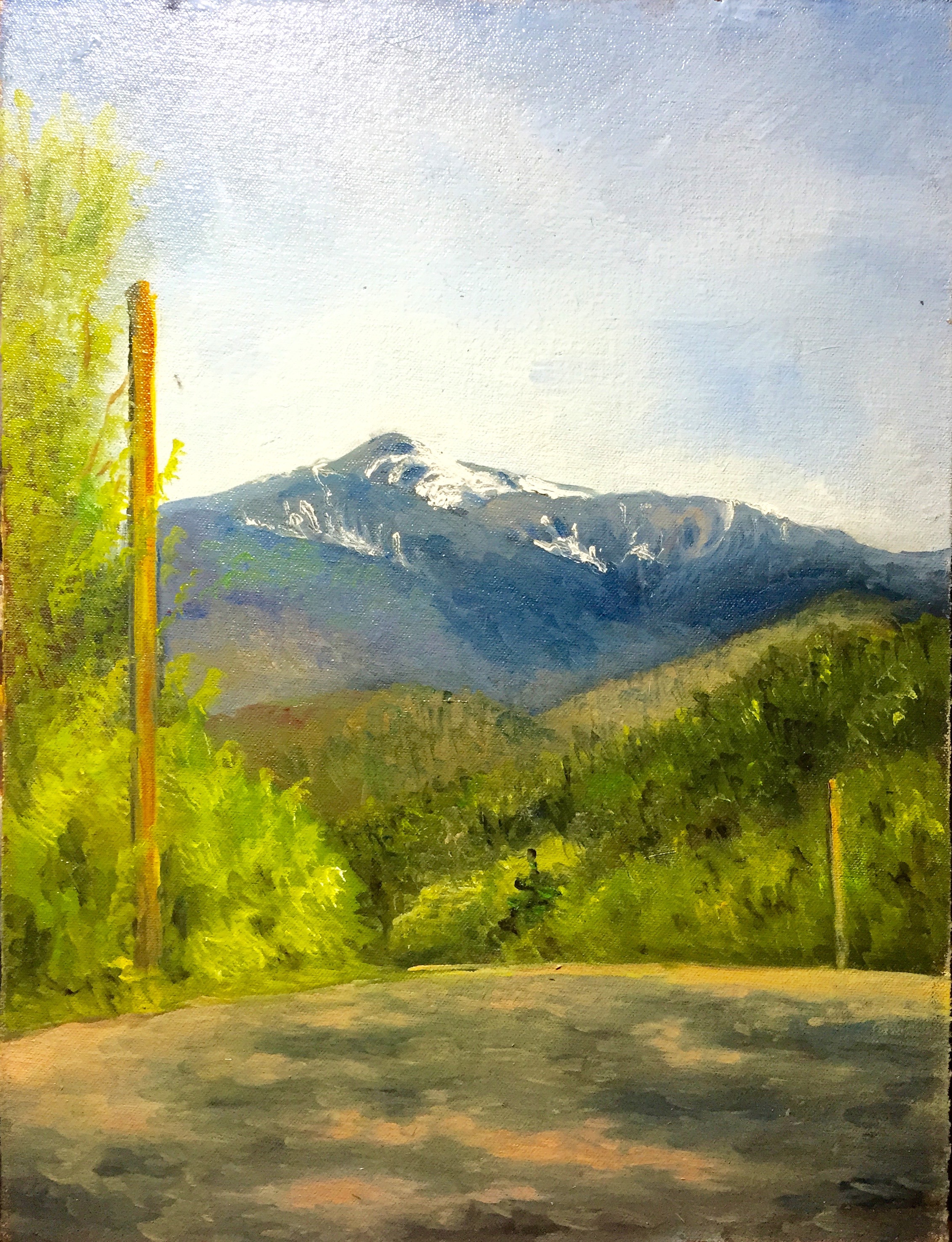
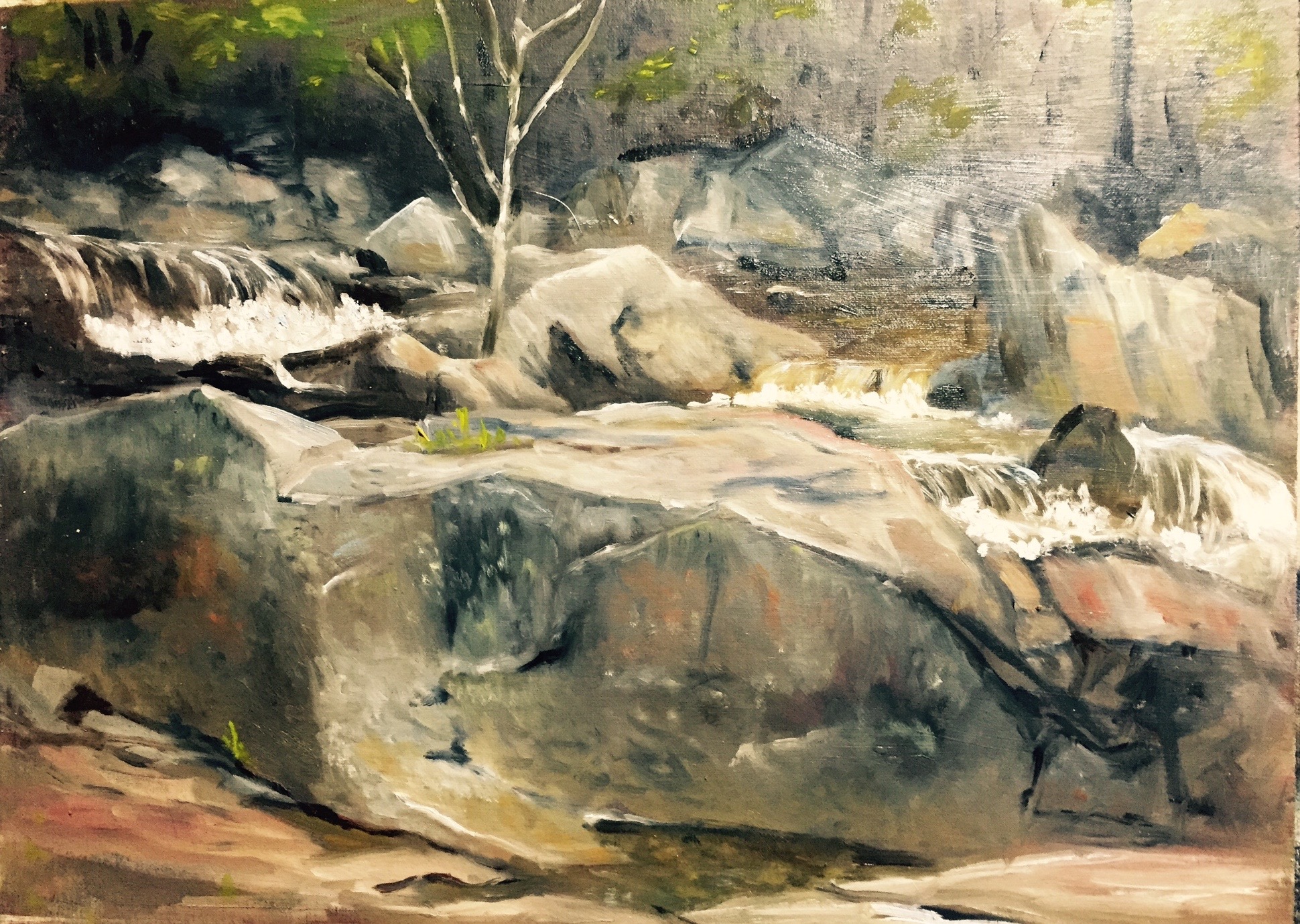
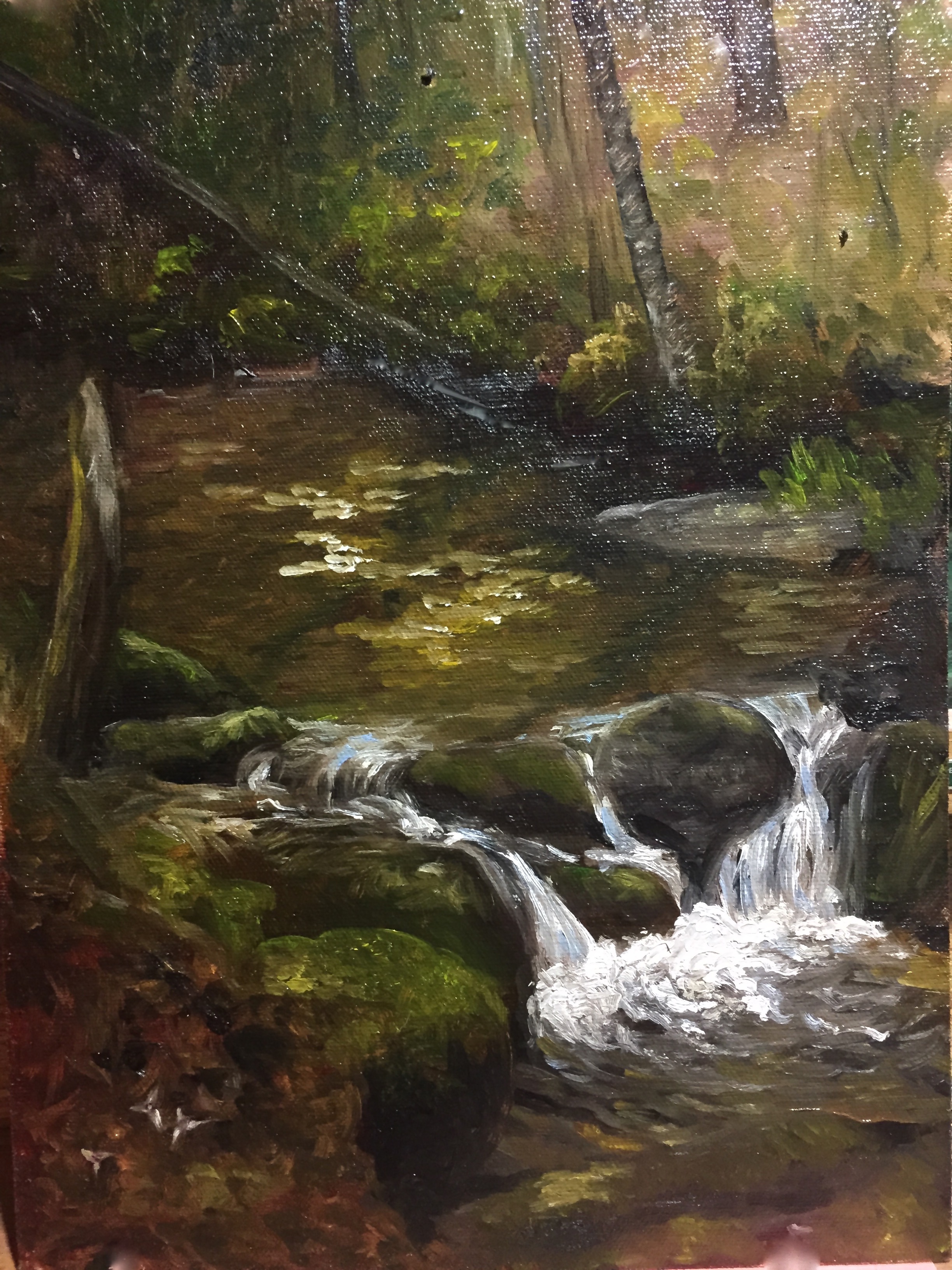
In November, I responded to a call for art from a Boston gallery, the Bromfield, for smallish pieces to go in their annual Winter Show.  I have never exhibited in Boston before, so I decided to go for it.  Of 4 images submitted, 2 were accepted.  Both were 8×10 rather abstracted landscapes involving water.  Lake’s Edge, which was on my wall and on my business card; and Water Layers, which I distinctly remember seeing when I was offering 8×10’s for $100 each in Littleton’s Art Festival.  But I could not find Water Layers in any of my home places for stacking older paintings.  Thank goodness I tried to find it right after getting the acceptance, because that barely gave me enough time to paint a copy of it from my photograph of it.  Oil dries slowly.

DSC_2618

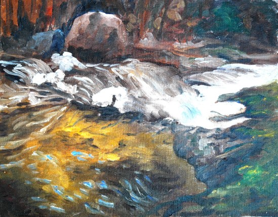
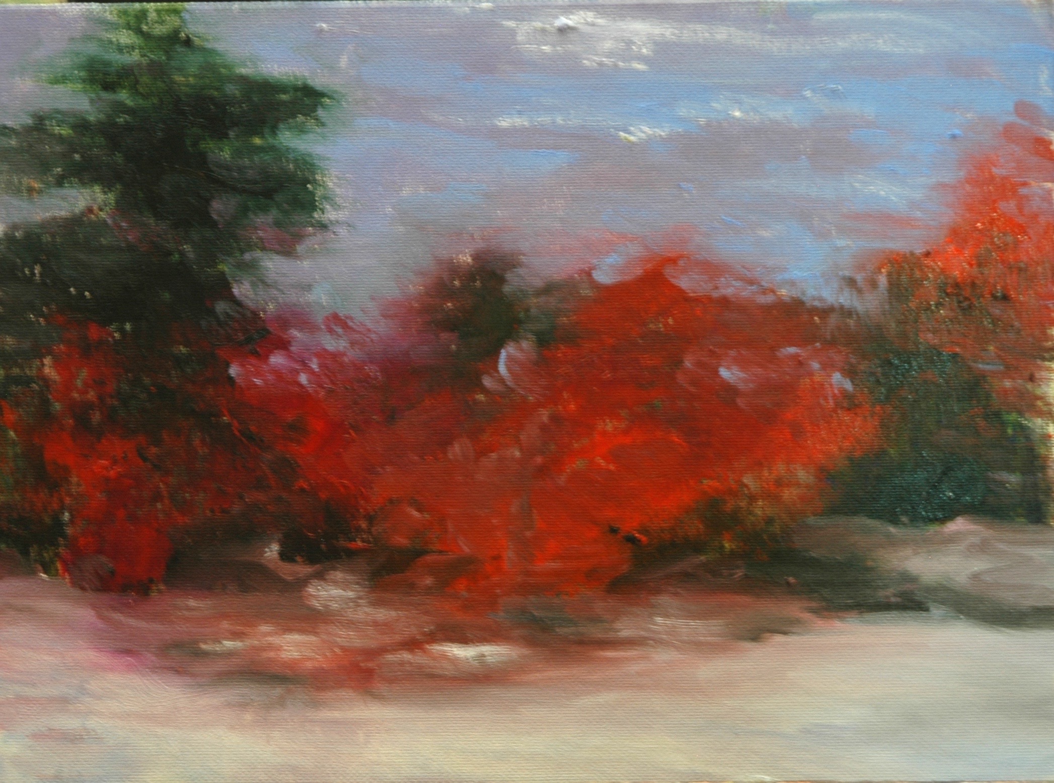
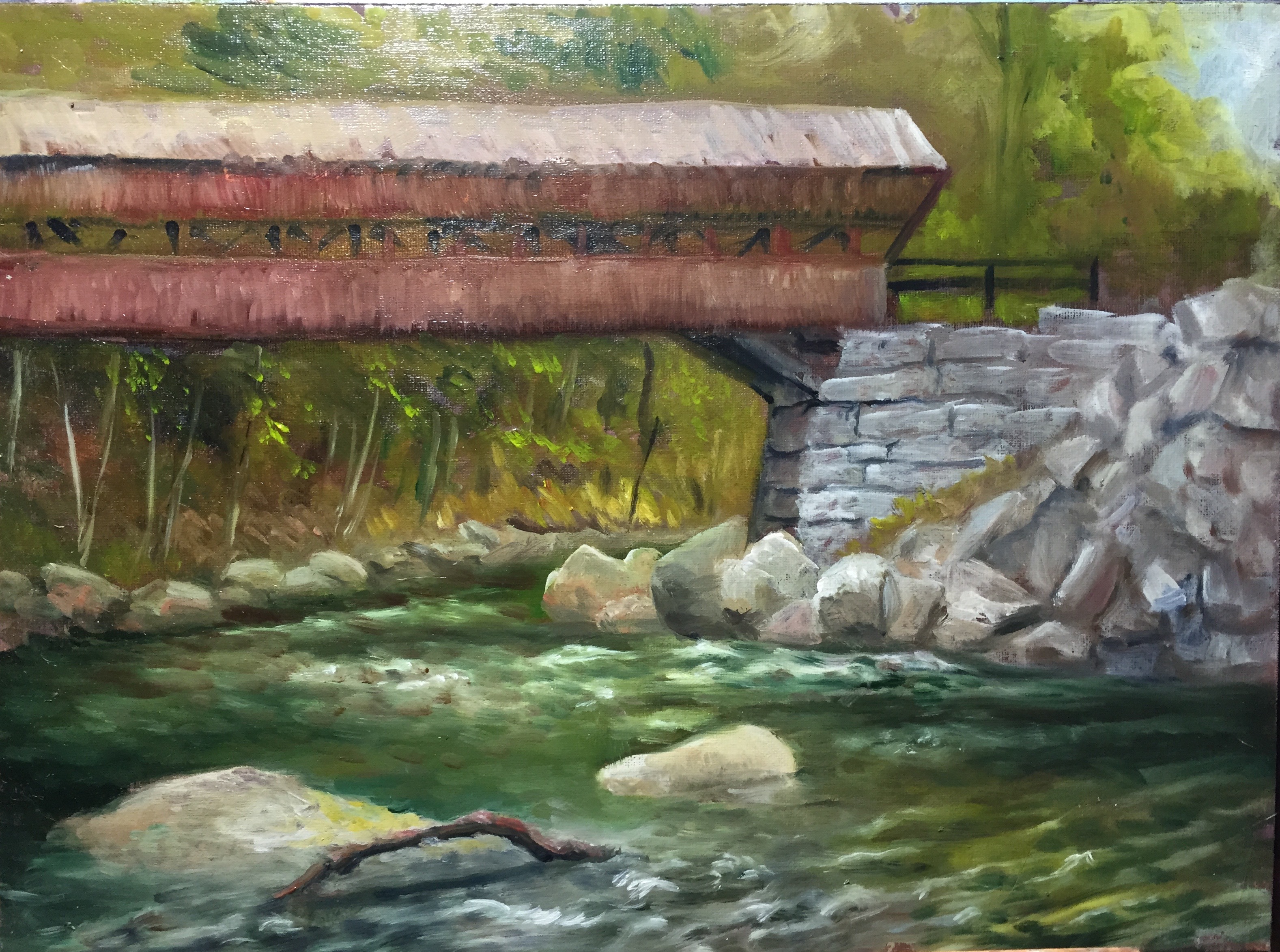
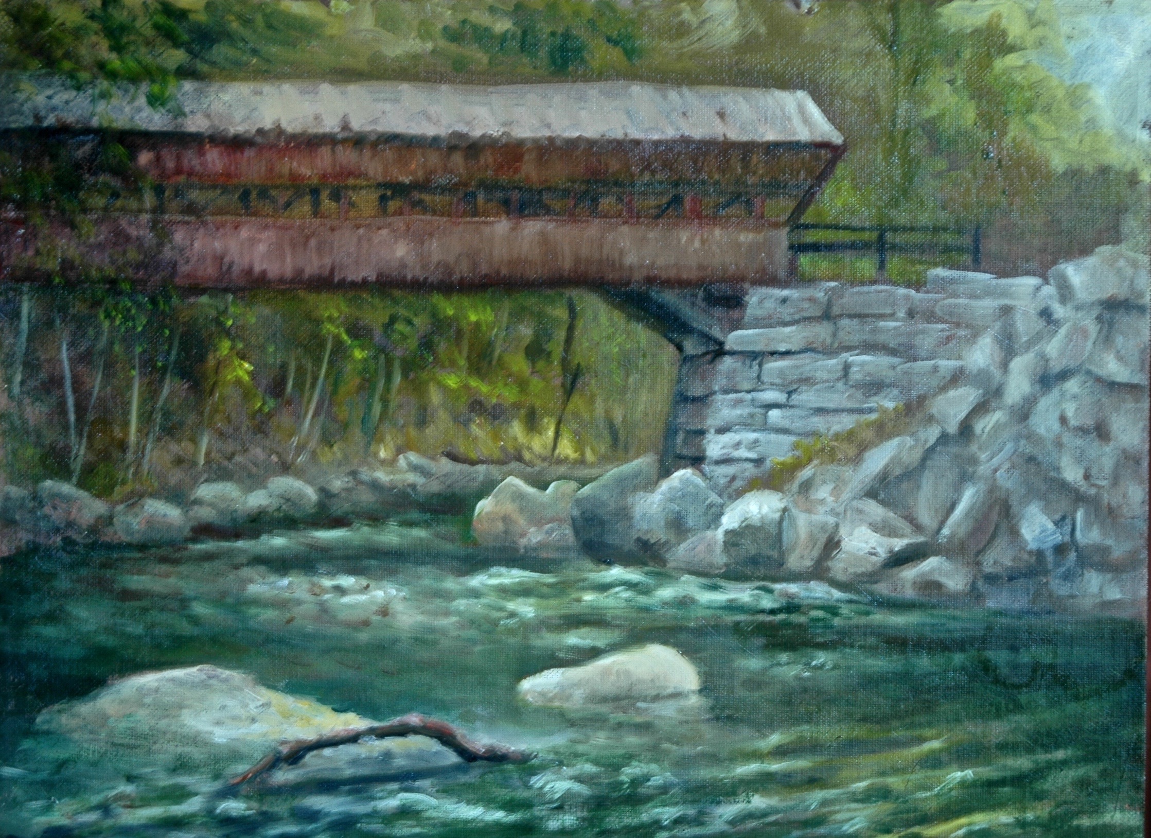
Water Layers, 8×10, plein air, half hour painting at Baboosic Brook in Merrimack NH

The exhibit at the Bromfield Gallery required three trips to Boston:  one to deliver; one to attend the opening; and one to pick up at the end of the show.  I took a friend with me each time because venturing into SoWa (South of Washington) arts district alone  intimidated this boondocks artist.  Yvonne, another artist, accompanied me on the first and third trips.  It wasn’t the neighborhood that intimidated me; it was the traffic and fear of accidentally getting on the Mass. Turnpike, because that has happened to me before when trying to find something in the South End.  Parking in the neighborhood of the Gallery was also a challenge better handled with another person riding shotgun.   Alas, all of our good luck in finding the place and scoring a parking place got washed out by a blowout of one of my snow tires as I was pulling into a dubious corner space.  I had rammed my poor tire into a sewer grate.  AAA to the rescue.  Yvonne missed a delivery of a turkey to her front porch back in Manchester.  Come to think of it, I guess I owe her a turkey.  Just glad I was not alone!

The middle trip, the one to the opening, was pretty darn delightful.  My friend from grade school in Wilmington Delaware, Jackie, accompanied me.  There was a Christmas crafts fair going on, and all of the galleries at 450 Harrison Street too, as was usual on the First Friday of a month.  As soon as we got here, about five o’clock, Jackie and I allowed ourselves to be seduced by a restaurant called 500 in Italian.  Cinquecento.  As we were investigating the menu posted outside, passersby stopped to encourage us and even advised which meal to order.  Since we did not have a competing agenda, we went for it and ending up spending a boatload of money, mostly for a carafe of wine that cost $35.  Good time, great meal.  Girls night out.  Christmas shopping got done too–later.

Let this be enough to whet your appetite for more show war stories.  Now that I have a toe in the water (to mix metaphors), I shall be more likely to wade on in.

Places where you might catch a few of my paintings are:

  • NH Antiques Coop in Milford NH
  • Bartlett Inn in Bartlett NH
  • Red Jacket Resort in North Conway NH
  • Mesmer & Deleault Law Firm in Manchester NH
  • McGowan Gallery in Concord NH
  • Armory Cafe Gallery in Somerville, MA
  • Great Bay Community College in Portsmouth NH
  • Currier Art Museum in Manchester NH
  • Ellis River Art Gallery in Jackson NH

As usual, you may view paintings with prices and order prints, phone cases, pillows and the like at my Fine Art America page. If the painting you are interested in is not there, or if you prefer to bypass that experience, you may contact me by email to alotter@mac.com.

If you want to add a public comment to this blog, go to the bottom of this page where it says “Leave a Reply”, and enter your comment in that box. I love to get public comments, so don’t be shy!

New Crop of “Figure in the Landscape”

For a third Summer in a row, I participated in the David Curtis offer of a model in his garden garnished with the light touches of his guidance and that of my fellow artists.  This year, we had July Sundays in addition to the August Sundays, plus an errant June Sunday to get us in the proper mindset.  We got rained out only once, giving me a total of eight Sundays, eight figures, eight paintings.   David’s home and garden is in Gloucester, an hour and a quarter drive from my home.  This year I had company on the trip.  I persuaded Cynthia Arieta to try it out; she prefers figurative painting too, and we met during Cameron Bennett’s Cornwall workshop a few summers ago.  She’s now as hooked as I am.

For models, we started with David’s wife Judy, dressed up as a Guitar-playing Gypsy.  This was the June Sunday.  The Rhododendrons were no longer in bloom, but David suggested I add blooms to the painting anyway, so of course, I did.

Judy with Guitar and Rhododendrons

Judy Curtis, wife of David Curtis, posing in their Gloucester garden

The order in which I painted the middle ones might not be accurate, but who cares about that, right?  I believe the second one was the Basketful of Flowers, featuring artist Marianne as our model.  For both of these first two paintings I used a 20×16 Raymar panel.  In the previous two summers, I had painted smaller, on 12×16 panels.  I had been easily able to complete those 12×16 paintings in the three hours allotted, so this year I thought I would challenge myself by going bigger.  As a result, the background of Basketful of Flowers was unfinished when I left that Sunday.  I worked on it at home and brought it back the next week for comments from the others.

2016-07-20 14.29.42

Basketful of Flowers

Not particularly happy with my first two paintings, I concluded that 20×16 was perhaps too large for me to complete in three hours, and I switched back to 12×16 for number three.  I call this one  Diamond Bracelet.  My titles are mostly hooks to remind me which painting I am talking about.  I could not use the dress color to identify this painting because, as you will see, another blue-green dress is coming up.

Diamond Bracelet

Diamond Bracelet

David objected to the downsizing idea:  As long as I was getting enough information on the larger canvas to finish at home, I should keep working in the 20×16 format.  Subsequently I also took pains to prepare the panels that I used with a dark ground.  Dark brown or rusty red were my usual choices for the ground color.  Without the pressure to cover up white grounds, I could get closer to completion each Sunday.  If I remember correctly, the ground for White Wicker Settee (number four) was close to black.

Reader on White Settee

White Wicker Settee

Our model, another artist,  for White Wicker furnished the settee herself and of course chose her costume.  David declares repeatedly, “Artists make the best models”, and surely their choices of accessories is a big component in their success.  He tried to recruit me to model next year, but I am reluctant to sacrifice my painting time.

Number five.  The next model is the daughter of one of us artists.  I had to fake the rhododendrons again.  From Gloucester to Manchester, we have been suffering from an extreme drought, and Judy Curtis, who is in charge of the garden, stands on principle in refusing to water her garden–ever.  So the rhododendron blooms would not be the only flowers we had to invent or exaggerate as the drought worsened over the summer.  Tablecloth and vase is the one of the eight that I am least satisfied with.

Reader at table with vase of flowers

Tablecloth and Vase

After the fact, I decided I should have filled the canvas with the figure instead of letting “figure in the landscape” govern my composition choices.  For future sessions, I resolved to get closer to the model and even, gasp, allow body parts to get cut off by the edge of the panel if necessary.  Meanwhile, David encouraged me to paint in the pattern on the tablecloth in order to create something interesting going on.  One of the most common praises he heaps upon me is that I “tell a story”.  I don’t really understand what he is talking about, but hope I can keep on doing it.

The next two paintings did not require me to cut off any limbs, but I did allow  major accessories to get cut off.  The first, George Martin, Painting (number six), started on a blackish ground.  Notice how his easel slides out of frame on the right?  The part I had the most trouble with was his eyeglasses.  The lenses caught quite a glare from the bright sun and sky above, but when I painted them like I saw them, it was too startling and distracting.

George Martin painting

George Martin, posing with his brush and easel

John Brown is a regular on Sundays and has posed in the past on Sundays when I could not be there.  I had envied the results I had seen, so was looking forward to his portrayal of Farmer John (number seven).  (Or should it be Gardener John?  Doesn’t have the right ring.)  I believe I can detect a red ground for this one.  His wheelbarrow leaves the frame on the right.  This painting was my favorite (and David’s favorite) up to that point, but there was one more week to go.  Could I top Farmer John?

John Brown as gardener

John Brown, posing as gardener or farmer

In this number eight, the last painting of the summer, the red adirondack chair makes its third appearance over the last two summers.  The model is engaged to marry David and Judy’s son.   Her names escapes me right now–so sorry.  But she also modeled for us last summer in a navy blue dress holding a red parasol–my least favorite painting from any of the summers.  So when she appeared again in navy blue, my heart sank.  I prepared myself for a disaster of a painting.  But surprise, Navy Blue with Red and White proved to be a winning combination!  And to celebrate, I cut off her feet!

Combining red chair with white parasol

Navy Blue, Red and White

A major contribution to the success of this painting is the shadow pattern on the parasol.  The sun and the tree gave me what I needed to tell that story, whereas the shadow pattern in Diamond Bracelet was, well, no pattern at all.  I may have to go back and fix that.

Reminder for folks in the Chesapeake Bay area, if any there are: see two of my animal portraits at the Annmarie Sculpture Gardern and Art Center in Solomons, Maryland.  Opening reception will be October 7, which I cannot attend.  Alas.  Maybe I will make it down there before the exhibit ends in late January.  The exhibit’s theme is “Fur, Feathers, and Fins–Our Faithful Pets”.   It will run from October 7 through January 29.

Other places where you can catch a few of my paintings are:

  • NH Antiques Coop in Milford NH
  • Ellis River Art Gallery in Jackson NH
  • Bartlett Inn in Bartlett NH
  • Red Jacket Resort in North Conway NH
  • Bernerhof Inn in Glen NH
  • Mesmer & Deleaut Law Firm in Manchester NH

As usual, you may view paintings with prices and order prints, phone cases, pillows and the like at my Fine Art America page. If the painting you are interested in is not there, or if you prefer to bypass that experience, you may contact me by email to alotter@mac.com.

If you want to add a public comment to this blog, go to the bottom of this page where it says “Leave a Reply”, and enter your comment in that box. I love to get public comments, so don’t be shy!

Catching up–Bartlett Style

I have been not performing, blog-wise, up to the standards I set for myself this summer.  If I had met those standards, two topics would have been set before you already and the third would have been pulled together for today.  The problem, as often happens, is just when I gather my thoughts and my photo illustrations, I notice something in one of the paintings that I must, MUST fix.  Then after the fix, a new photo must be taken.  It has been a summer of revisions and regrets.

One topic was to have been:  best and worst plein air (marine) painting of the summer, covering  why I thought one was good and the other not–but wondering how I could have rescued the one that was awful.  A second topic was to have been the rest of the works resulting from the Stuart Ober course–you’ve seen the portrait of Sparkle, but I did a bunch of other stuff that never would have got started but for the impetus of taking a course called “Explorations in Oil Painting.”   One of them could have been a topic in itself, as I worked on a 12 by 36 of “Impressions of Manhattan from the Whitney Museum”, a complex skyline with streetscapes that can always be improved or added to.  I’m still adding.

This week, I hoped to be posting all the Figure in the Garden paintings from David Curtis’ garden, 2016 edition.  Those paintings are finished, but the last one still needs to be photographed.  I scaled up to 16×20, making the photographing more challenging.

And now, as topics pile up, I just got back from a workshop up North with Michael Chesley Johnson, for which blog I made promises.  I feel a little like Mickey Mouse must have felt in the “Sorcerer’s Apprentice”.  (Disney movie “Fantasia”)

I am going to take the advice I always gave my tax delinquent clients:  do current returns first, then the past-due ones.  Therefore, today without further ado, without messing about, I am posting photos of the three plein air paintings from the last two days, showing what I can accomplish in the approximately two hours available for each, before stopped by lunch and/or rain.  Raw footage, as it were.

Excuse me while I go snap photos of each one with my iPhone.

.  .  .  .

Eight students gathered at the Bartlett Inn in Bartlett NH to learn plein air painting from Michael Chesley Johnson, of Campobello and Sedona, for perhaps the shortest workshop ever–two days.  We were lucky with the weather, in that the rain held off Tuesday afternoon and Wednesday morning until I was able to get one painting each time close to completion.  I produced a third painting during the Wednesday rain. . .storm is too strong a word.  Rain Event. More of that later.

Tuesday morning MCJ opened with a demo of how to paint rocks.  We piled into a gazebo near the Jackson Historical Museum– it was shaded, just the right size for 8 students and a teacher, next to a rock-filled Wildcat River, and near our next stop: a preview of the museum’s upcoming show.  Then lunch at a local deli, then back to the Wildcat, a river responsible for the phenomenon known as Jackson Falls.  We got some sun, but mostly clouds, so we got experience with painting en plein air on overcast days.  How to find a “hook” when there are no lights and shadows to create drama?  Well, falling water is always interesting.  Unfortunately, New Hampshire has been suffering a record drought, so instead of impressive, thundering cataracts of water, we got meandering trickles.

(MCJ photographed me working at the Falls and posted it to Facebook, if you are interested.  I was wearing my usual distinctive hat, so everyone who knows me recognized me.  I could probably link to it, but I don’t have time to learn how to do that!  Got to get this post done.)

img_1988

Jackson Falls, v. 5 or 6

Day Two, or Wednesday as most people know it, we headed down into the Valley to experience the location of Albert Bierstadt’s  “Moat Mountain, Intervale, New Hampshire”.  That is why I have titled this painting Bierstadt Meadow.  Most of us chose to paint the ledges that are to the right of my scene, but I’ve a bee in my bonnet all summer about the pinky-purplish grass that shows up at this time of summer.  It is most prevalent along highways.  It was not present in this meadow, but there were other plants sporting colors in the same family, so I thought I would try to fake it.

img_1989

Bierstadt Meadow with Bluebird House

We were treated to very little sunlight, but the weather forecast did not include rain.  Nevertheless, Sharon (Sharon Allen, who organized this workshop and spends half her life painting around Mt. Washington Valley) “felt” it would rain and urged us to move to a sheltered location–under a bridge in Conway from which we could paint a red covered bridge from below and to the side.  When we got there, most of the river (Swift and Saco merge near here) was, well, absent.  We were going to get more practice painting rocks.  However, a puddle under the bridge reflected the red covered bridge, and I chose to make that the subject of my painting.

img_1987

Under the Bridge, of Another Bridge

All of my paintings were painted on the carton paper sold by Judson’s plein air supplier.  The paper slows me down a little because it absorbs paint, making it harder for me to cover the surface.  But once my surface is juicy with paint, I can go to town.  The geometric shape on the right is the stanchion [is that correct term?] of the overhead bridge.  When the rain blew in [is Sharon  a witch?], it disturbed the puddle and handicapped me.  Oh, well.  Had to fake it.

Since I probably will not get to the topic, best and worst marine painting, and I cannot NOT show you the best, I will now show the best.  Two “tall ships” came to the Portsmouth area.  August 12 was the day I chose to visit them.  One docked in Portsmouth for people to tour.  The other docked in New Castle for people to ride.  I would have bought a ticket to ride if my timing were better, but as it was, I had to wait for the “Harvey Gamache” to return to port before I could grab a photo of it.  Meanwhile, I painted its expected path from New Castle’s Grand Island Park.  In my studio at home, I added the sailing ship using my photo as reference.

Harvey Gamache passing into New Castle

The Harvey Gamache Passing into New Castle

I have some happy news:  two of my pet paintings will be part of a nationally juried exhibit in a museum!  The museum is the Annmarie Sculpture Garden and Arts Center in a place called Solomons, Maryland.  The Sculpture Garden is affiliated with the Smithsonian!  The two honored paintings are “Sparkle”, which had been sold but the owners have agreed to lend the painting for this exhibit; and “Partners in Crime”–the two tuxedo cats on a cat tree.  IMG_1568

Partners in Crime

Partners in Crime


The exhibit’s theme is “Fur, Feathers, and Fins–Our Faithful Pets”.   It will run from October 7 through January 29.

Other places where you can catch a few of my paintings are:

  • NH Antiques Coop in Milford NH
  • Ellis River Art Gallery in Jackson NH
  • Bartlett Inn in Bartlett NH
  • Red Jacket Resort in North Conway NH
  • Bernerhof Inn in Glen NH
  • Mesmer & Deleaut Law Firm in Manchester NH

As usual, you may view paintings with prices and order prints, phone cases, pillows and the like at my Fine Art America page. If the painting you are interested in is not there, or if you prefer to bypass that experience, you may contact me by email to alotter@mac.com.

If you want to add a public comment to this blog, go to the bottom of this page where it says “Leave a Reply”, and enter your comment in that box. I love to get public comments, so don’t be shy!

The Prodigal Cat Returns

In 2004, before I even started painting, I read an article in a cat magazine, while I was waiting in the veterinarian’s office, about what a great cat this newly recognized breed, the Pixie Cat, was.  Smart, friendly and almost dog-like in the way they connect to people, Pixie Bobs look like a small version of a wild bobcat:  short tails, spotted markings, tufted ears.  I was intrigued, and set about looking for a breeder in New Hampshire.  I found just one, and as luck would have it, she had a kitten with a “bad” tail that was in need of a good home.  The tail was bad because it was too long and ended in a crook.  I reimbursed her for her veterinarian fees and took title to the little fellow.  He was about 10 weeks old.  He had been named “Winchester” but we were not about to call him that.  My granddaughter decided his name should be “Freckles”, for the little spots on his muzzle.

Freckles as kitten

He came to me already microchipped.  We had at least two cats already, and there was a cat door available for free travel in and out.  The other cats weren’t much into going outside.  Freckles, however, was an adventurer.  Once, a neighbor, who happened to be a firefighter, had to climb up a tall pine tree to retrieve him.  Another time, he went missing for a whole week, so I posted laminated posters all over the neighborhood with his picture and a description of the crooked tail.  Almost immediately, I got a call from an ex-neighbor who had just come to check out the vacant property she had for sale–he was stuck on her roof! She was ready to take him to her new home when she noticed the poster.

Frequently he could be found chilling’ on the rocker on the porch of a house up the block; they wanted to claim him as theirs too, but fortunately he had already acquired a rep and most neighbors knew where he belonged, even if they didn’t know me.  He enjoyed car rides and would hop right into one without invitation.  But I figured he was safe, because of  his microchip.  Sadly, I now know that for a microchip to work, it has to be looked for.

Freckles was one of my very first attempts at a cat portrait, and that painting is still one of my most successful, if you measure success by how quickly viewers fell in love with the subject.  I had used that portrait as him Missing Cat poster photo.

Freckles_Cat - Version 2

Then in December of 2010, when Freckles was six years old, he got caught outside in a snowstorm.  I never saw him again–until last week.  All these years, I had hoped that he simply accepted a car ride with someone who decided not to check him for a microchip.  (Vets do not routinely scan new patients for microchips.  Asked why not, one vet answered that it would appear distrustful of the pet’s guardian.)  But I realized he more likely was dead.  I would look up at that portrait of him and feel my loss every time.  He was my most special cat, the only one I ever sought out to buy from a breeder.

Monday morning I got the news that someone had scanned a stray cat in Nashua (about 20 miles South) and come up with Freckles’ contact information.  None of my phone numbers was still good, but the fax number went to the firm I practiced law with–the firm that had often been visited by Freckles because I liked to take him everywhere with me.  By one p.m. the responsible cat owner who searched for his true owner, she’s my hero, Belinda, met me in a parking lot and turned over to me a somewhat confused Freckles.  He seemed content being with her and not very interested in coming home with me.  But being Freckles, he accepted it.  He did, after all, enjoy car rides.  Here is a photo that Belinda shared with me, of Freckles napping in her daughter’s bed.

IMG_1781

I had to quarantine him away from my other cats until we were sure he wasn’t carrying any contagious disease or parasites, but the vet declared him amazingly healthy for a senior cat on his own.  Actually, amazingly healthy for a cat of any age.  Even his teeth were good.  The cat door has not been openable from the outside ever since he disappeared six years ago, but he is getting enough stimulation from the four younger cats occupying my house.  He does seem to remember the house, not to mention the cat door, and he is warming up to me.  He seems to want to be in the same room with me.  The other four cats are showing him great respect, as is his due.  He has only to look at them, not even a stare, just a look, to claim his lofty position as No. 1.  His favorite perch, when we (my follower cat Milo and I) are in the TV room/art gallery is the top of a leather chair like the one that I sit in, so that we are on the same level.

IMG_1887

Note the painting hanging in the background.

Two more photos:  one to compare to his kitten photo and the other to mark his privileged occupation of my otherwise cat-free computer sanctuary.  He has found the printer-scanner-copier combo to be a good place to hang out.

IMG_1792IMG_1811

I’m not sure what all this has to do with my painting.  It’s just a tale I needed to tell.  A love note for my special cat.

Aline Lotter is currently exhibiting:

At the Bartlett Inn in Bartlett;  at the Bernerhof Inn in Glen; at the Red Jacket Inn in North Conway;  at the New Hampshire Antique Co-op in Milford;  and at the law offices of Mesmer and Deleault at 41 Brook St in Manchester.

As usual, you may view paintings with prices and order prints, phone cases, pillows and the like at my Fine Art America page. If the painting you are interested in is not there, or if you prefer to bypass that experience, you may contact me by email to alotter@mac.com.

If you want to add a public comment to this blog, go to the bottom of this page where it says “Leave a Reply”, and enter your comment in that box. I love to get public comments, so don’t be shy!

Portsmouth Paintings

Since my last post, I feel as though I have been feverishly busy, but most of the painting time has been studio time.  Not  many of my plein air landscapes have come inside without need for improvements.  I am enjoying the process of making improvements–well, I hope what I’m doing improves the paintings,–but worry about why the need.  Am I getting pickier?  Am I getting slower?  What’s up with all this tinkering, etc.?

I hope I’m getting smarter, that I see more ways to improve when I get the painting home and can assess its defects dispassionately, without being influenced by reality.  I suspect I am also getting a lot slower in painting, as in everything else I do.  I can’t even get dressed in the morning without straying off the rails into some distracting musing.  Maybe that’s late onset of attention deficit disorder, but when I am painting, I am able to keep my focus on the painting and the scene.

So, last weekend–oops, two weekends ago!–I participated in the annual Portsmouth paintout put on by the NH Art Association, which is a Portsmouth outfit.  I believe that makes the fourth year of my participation and I haven’t missed a year yet.  I couldn’t complete the event on Sunday because of my commitment to Sundays in the Gloucester garden of David Curtis, but I managed to produce three 12×16 paintings, which is pretty large for plein air.

The first painting took me from about ten in the morning until about two in the afternoon.  The heat was enervating.  I had a good concept for my painting:  under the drawbridge with the drawbridge raised to allow a tugboat to pass through.  My brain wasn’t working in top gear, however, so it took me a while to realize that if I took a photo of the raised drawbridge, I wouldn’t have to wait for it to be raised to see how that changed the elements.  The product as “finished” in those four hours (a pretty long time for me to need for a plein air painting) had good bones, but it was rough–very rough.  The sky paint did not even cover the gray ground.

The second painting was from the same vantage point but a different perspective–closer to being under that drawbridge, which is called Memorial Bridge, with a view of the other two bridges from Portsmouth to Maine:  another drawbridge and the elevated highway bridge even farther back.   Someone called me on the phone about one o’clock and commented that I did not sound well.  Interesting.  Did I mention it was very hot that day?  I told her I was fine.  As fine as someone who has become dehydrated without being aware of that fact.  It was a hint, and eventually I took it– I got the elements of those three bridges down in an hour and then quit.  As you would expect, with all those excuses, I had to do a lot of improving when I got the two back in my hands.  Here are the finished versions:

Comin' Through (Memorial Bridge, Portsmouth)

Comin’ Through

3 Bridges, Portsmouth

Three Bridges, Portsmouth NH

For my third Portsmouth painting, conditions were better.  I didn’t even try to get started before noon.  I spent only two hours.  I was in the shade.  There was a breeze.  For those reasons, perhaps, I have not felt the need to tinker with the painting produced at the Elks Club of Portsmouth:

At the Elks Club

At the Elks Club in Portsmouth

Just a few days ago, I went back to Cape Cod to pick up the painting that had been shown at the Addison Gallery’s show “Found my Park”, and to paint something new somewhere on the Cape.  The old painting looked better than I remembered it, so there’s another example of getting ‘er done outside, but it was 11×14, much smaller than the Portsmouth ones.  Here is what I’m talking about:

IMG_1666

View from Salt Pond Coast Guard Station

To find another good spot for painting, we watched for likely signs–to beaches or parks.  We chose to explore Nickerson State Park in Brewster.  An amazing and huge tract of wildness.  No ocean, no dunes anywhere, but glimpses of water.  I finally went online with my iPhone and found a map that got us to Cliff Pond and Fisherman’s Landing.  There was nobody there when I set up my easel, but soon we were inundated with children and dogs.  I had a dog with me myself.  It wasn’t a problem, but I did not feel inspired.  After I got home and had a chance to sleep on it, I knew what I had to do.  I had to add stronger dapples of shade and sunlight throughout, including on the figures of my companions.

Sun-Dappled Afternoon

Sun-Dappled Afternoon

I have to confess that my dappling in this painting may have been influenced by my recent trip to the Peabody Essex Museum’s exhibit of Childe Hassam’s Isle of Shoals paintings.

I want to thank all of my followers who took me up on the offer of free paintings.  I am grateful because can you imagine the humiliation if I couldn’t even give away my paintings?  Ouch!  But it’s just a drop in the bucket, so if you have been hesitating because of some reluctance to take advantage, the offer is still good.  I am limiting to paintings 11×14 or smaller, simply for ease in mailing.  The priority mailing cost is $12.00.  Stake your claim!

Aline Lotter is currently exhibiting:

At the Bartlett Inn in Bartlett;  at the Bernerhof Inn in Glen; at the Red Jacket Inn in North Conway;  at the New Hampshire Antique Co-op in Milford;  and at the law offices of Mesmer and Deleault at 41 Brook St in Manchester.

As usual, you may view paintings with prices and order prints, phone cases, pillows and the like at my Fine Art America page. If the painting you are interested in is not there, or if you prefer to bypass that experience, you may contact me by email to alotter@mac.com.

If you want to add a public comment to this blog, go to the bottom of this page where it says “Leave a Reply”, and enter your comment in that box. I love to get public comments, so don’t be shy!

A Spate of Painting Leads to Opportunities for Rescues

The clouds have lifted, the sun is shining, and I find myself back in the groove of painting. It’s a good feeling.  I’ve ordered in a huge supply of panels.  If I fill them all with paintings, my problem of finding homes for them is going to be exacerbated.  This problem is similar to the problem of cat and dog overpopulation.  On the one hand, puppies and kittens are so lovable.  On the other hand, dogs and cats take up space and require some minimal maintenance.  Curbing the reproduction of the animals via spay-neuter programs is the solution to that problem.  Will I have to curb my production of artworks?

I am painting for the joy of it, not expecting to make a living at it.  Once the painting is finished, my happiness does not depend on keeping it nearby.  In fact, I’m happiest when I find a loving forever home for my artworks.  If  you would like to give a home to one of my puppies, let me know.  I ask only that you pay for the shipping.  Of course, exceptions will have to be made for certain special projects, ones that I want to give to family members or submit to an exhibit or prize competition.

My latest crop (litter?) includes a bunch of plein air paintings and the still unfinished Manhattan Project, which I had hinted at in the last blog.  (Surely that term is not copyrighted after all these years.)  I’ll delay discussion of the Manhattan Project until it has been completed.  I just hope the final result justifies the suspense that I am building.  Suspense is building, right?

Continuing the practicing for a weekend paint out in Portsmouth, I painted this street scene, which truly was empty of people and cars most of the time:

2016-07-20 14.23.46

Bottom of Court Street, Portsmouth

I added the telephone wires after the painting had dried.  I discovered that if the brush left a glob of excess paint, I could pick it up with the brush and my medium (Gamsol), thereby thinning the line and keeping it wispy.  I won’t be able to do that during the paintout since the underlying paint will not be dry enough, so I’d better pick a different scene for the paintout.   This fact is disappointing because my other choice involves lots of little lines–bridges.  Maybe I can come up with another fine-line technique because once I get a subject into my head (inspiration strikes), nothing else will be good.

Last week, Sharon Allen, Betty Brown and I responded to a call for artists to paint the Cape Cod National Seashore in celebration of the 100-year anniversary of the National Park System.  We found a charming B and B in Eastham to put us up two nights.  Of our three days on the Cape, only two halves were dedicated to serious painting.  The rest of the time we were reconnoitering.  And eating.  Good place to visit if you like seafood.  Duh!  Just before we headed up North homeward bound, we stopped to paint at a town landing which didn’t qualify for the national park paintout.  So I have a total of three paintings to show for the trip.  My “best” one got left there at the Addison Gallery for the big reception.  It was also the first one I painted:

IMG_1666

View from Salt Pond Coast Guard Station

My eye had been drawn to the drama of the light green sea grass (that’s what I am called the grass that grows in the dunes down there, and around the salt water pools) against the deep blue sea.  Add the interesting group of buildings perched (precariously, I am told) atop a high dune, and you’ve got solid inspiration.  I set up in a traffic island in front of the Coast Guard Station.  To my right and way down a hill (guess that’s obvious) there’s a beach full of people and umbrellas.  That was a second choice for a subject, despite the view  being severely limited.  Sharon nevertheless took it on.  Betty, meanwhile, climbed the fire escape and perched herself with her easel up there to create a semi-abstract rendering of marshes and pools.

My second serious painting portrays another Coast Guard Station, this one at Race Point.  The perspective bothered me so I tried to correct for it, but I’m still dubious.  I had intended the front of the building and all lines parallel to it to be level with the horizon, which is what appeared to be the case. But now I think I should have superimposed an imaginary vanishing point off to the left–that is what my eye was reaching for, demanding, despite the evidence of my level.

2016-07-20 14.25.47

Race Point Coast Guard Station

Here is a reference photo that I took of the same building, showing the way I really wanted to paint it.  I’ll do it too, but on a larger canvas:

IMG_1660

Doesn’t that evoke Hopper?  Edward Hopper lived on the Cape and painted many of the buildings.  I haven’t been able to find that he painted this building, but I’ll bet he did.  How could he resist?  Yes, I moved the flagpole.  Had to be done.

The little quickie I did on our way out of town owes its life entirely to the lavender color of the turned-over boat I spied.

2016-07-20 14.24.34

Orleans town landing: Readiness

The other thing that is going on here is the attempt to convey the peekaboo effect of the foreground tree, hanging over the two boats.  It’s not easy.  You can’t really paint each individual leaf, but you can’t mass them together too solidly either.  I’m not sure I got the balance correct here.  If only the sun had been coming in another direction, I could have had shadows of leaves on the boat.  That would have been cool!

The other thing I’ve got going on is Figure in the Landscape, like last year.  Every Sunday in David Curtis’ Gloucester garden.  I will wait until I have four accumulated and do a separate blog about them.  The trouble with painting a lot is it leads to writing a lot in the blog.  I coulda been paintin’ instead!

Aline Lotter is currently exhibiting:

At the Bartlett Inn in Bartlett;  at the Bernerhof Inn in Glen; at the Red Jacket Inn in North Conway;  at the New Hampshire Antique Co-op in Milford;  at the Norris Cotton Cancer Center in Manchester, part of the Healing with Art program;  and at the law offices of Mesmer and Deleault at 41 Brook St in Manchester.

As usual, you may view paintings with prices and order prints, phone cases, pillows and the like at my Fine Art America page. If the painting you are interested in is not there, or if you prefer to bypass that experience, you may contact me by email to alotter@mac.com.

If you want to add a public comment to this blog, go to the bottom of this page where it says “Leave a Reply”, and enter your comment in that box. I love to get public comments, so don’t be shy!


Abstracting the Landscape, Part 2

Having recently come off a weekend devoted to abstracting the landscape (see previous post), during which we painted from photograph, imagination, memory, music and purely abstract concepts, I resolved to apply my newly acquired abstracting skills to actual landscapes.  No, more correctly expressed:  I resolved to TRY to apply those abstracting skills to actual landscapes.  I knew it wasn’t going to be easy.  The spread of nature’s delights is so seductive that it is almost impossible to reduce a painting to a few good non abstract ideas.

The photo on the left is the result of my painting for two hours at Upper Ammonoosuk Falls, getting sucked into the whole nature thing, trying to capture all the rocks and water rivulets.  Fighting with myself.  Until finally I heard myself remarking to another artist, by the way of encouragement, that depicting falls, boulders, etc. was hard because of the clutter.  Clutter.  Such an important non abstract concept.  I went back to my painting and swept the water down over all my clutter.  And it worked.  So what if the scene never looked quite like that!

This morning I went over all four of my weekend paintings to see if any adjustments were needed.  In the photo on the right you can maybe detect minor but important touches:  the large rock slab in the virtual center was grayed back so as not to compete with the white of the falling water; the indeterminate brown area in bottom right was darkened and sharpened so as to clarify that it sits higher and in front of the falling water.  I also added a few strokes of white water to the cascade, just to gild the lily.  (By the way, while spell-checking Ammonoosuk I discovered YouTube videos of this spot, featuring reckless youths diving into the pools.  Here is one of them.)

But did I really abstract my landscape?  I did a better job than usual in reducing details.  It’s a start.  Maybe I’ll do better on the next one?

The next one turned out to be a panorama of intensely green fields dotted with intensely  yellow dandelions, backed by periwinkle mountains, covered by gray clouds threatening rain.  Because of the high chance of rain, we had driven south to Conway, where there is a bridge overpass that could provide us shelter from the rain while giving us a river’s edge view of an old-fashioned covered bridge.  But we each of us got sucked in by the dandelions, and set about creating rain shelters within which to paint.  I was riding with Sharon, so we had to find two ways to create painting studios out of one SUV.  She had the tailgate.  She also had the bright idea of creating a shelter for me out of my big yellow poncho and the two doors of her vehicle.  Here’s a photo of me getting set up  under my yellow tent.  20160513_152644

The tent cast such a strong yellow light over my painting (but not my palette), that I thought I was losing my mind when every time I scooped up a big blob of white paint to use in the sky, it turned yellow as soon as it hit the sky.  The  yellow tent had to have affected the rest of my painting as well, but it was only obvious in the sky.  As a result, I had not much of a good idea of how my painting was coming along.  This is not a good situation to be in, for a painter.  However, I was trying to be abstract, so maybe, I thought, hue doesn’t matter.  I blocked in the elements I wanted:  the intense green pasture, the intense yellow dandelions, the intense blue mountains.  Added a few tree and shrub features.  Still a result not so abstract, but the important thing was, I was thinking abstractly.

The one on the left is the painting as it was on Friday afternoon; the one on the right received some help today.  It needed more  yellow in the dandelions since it no longer had the benefit of a yellow poncho glowing all over it.  I cleaned up the sky a bit.  The photos do not do justice to the yellows and greens.  Oh, well.  Just keep in mind ALWAYS–the original looks so much better than the photo.

For my third painting, I was fortunate to be able to pick the group’s subject of the morning, and paintings always go better when one is inspired by the subject.  There is a railroad that goes from North Conway north through Crawford Notch to a station near the base of the Cog Railway that climbs Mt. Washington.  To get through the Notch, the train must travel on rails cut into the granite sides of the pass, and in this particular place, also bridge a gap in the rock face.  Especially with the morning light casting a shadow of the rails onto the granite, the tracks create a pattern both arresting and intriguing.

On the left side is what I got done on site.  We were painting from a parking lot surrounded by growing things in various stages of greening (the trees budded out almost before our eyes–not just overnight but over lunch), so my view of the area below the trestle was obscured.  I had installed rough representations of that obscuring growth, but I was bothered by the fact that you could not tell how far away the trestle was, nor how high it sat on the side of the granite face.  So I scrubbed the growing things and tried to transform them into rock face.  At home, today, I tried to improve on that aspect, as well as the rock formations above the trestle.  I’m not convinced that my changes improved the perspective.

For our last outing, we chose a spot not far from our home base (the Bartlett Inn).  As before, I resolved to think abstractly, just capture the shapes and colors that represented the site.  The color for this one was blue.  Intensely blue sky, intensely blue water reflecting the sky.  A nice snaky curve in the waterway, good aerial effects for the more distant mountains.  Simple elements that I should be able to use for an abstract landscape.  Alas, the landscape had other ideas.

As an abstracted landscape, a pretty miserable failure.  But more than passable as a normal plein air landscape, so I forgive myself.  The changes I made this morning to the earlier version on the left were mostly in the light greens and the sandy shores.  I don’t understand why the blue of the water looks so different now.  I think there might have been too much contrast in the first photo.  You can tell I have played around with the photo’s color cast, trying to match up with the original painting.  The truth of the water lies somewhere between the two versions.

My companions for the weekend were my roommate, Betty Brown; chauffeur, Sharon Allen; colleague from Snow Camp, Suzanne  Lewis of Rhode Island; young artist Stephen S from Hooksett; new members Leslie and Paul, from Massachusetts, and of course, the esteemed organizer of this semi-annual Getaway Weekend, Byron Carr of Contoocook.  Some if not all of these people have websites where their paintings of the same scenes may or may not be posted.

If you are a regular reader, you have noticed I am employing a different format for the paired photos.  WordPress has added new options, and I am learning  how to use them.  You can click on the above photos to enlarge them and to read their captions.  Do you like this format?

Aline Lotter is currently exhibiting:

At the Bartlett Inn in Bartlett;  at the Bernerhof Inn in Glen; at the Red Jacket Inn in North Conway;  at the New Hampshire Antique Co-op in Milford;  at the Norris Cotton Cancer Center in Manchester, part of the Healing with Art program; and at the law offices of Mesmer and Deleault at 41 Brook St in Manchester.

Please save the date of Wednesday, June 22 for a reception at Labelle Winery in Bedford of the Petals 2 Paint show whereat floral designers create live flower arrangements inspired by a painting by participating East Colony artists.  This has been an annual event of the East Colony Fine Art artists for many years, but this 2016 show seems likely to be our last as a group.  Since the flowers don’t last more than a couple of days, you might as well plan to come for the reception.

As usual, you may view paintings with prices and order prints, phone cases, pillows and the like at my Fine Art America page. If the painting you are interested in is not there, or if you prefer to bypass that experience, you may contact me by email to alotter@mac.com.

If you want to add a public comment to this blog, go to the bottom of this page where it says “Leave a Reply”, and enter your comment in that box. I love to get public comments, so don’t be shy!

Kickstart

I have continued to be Very Bad and Unrepentant.  Finding oneself takes time.  I had to write an artist’s bio last week, and instead of reciting biographical facts about myselves, I skipped merrily over past incarnations to state affirmatively–I’m all mixed up but happily so.  Here is how I put it:

Pursuing a profession in the arts is inevitably a struggle because excellence is never actually attained. One is always reaching. Aline has found herself reaching in more than one direction at a time, which for a long time has confused her and perhaps worried her followers. But she now has decided to embrace the diversity of her subject matter and styles and celebrate each on its own terms. Her style ranges from loose and impressionistic to refined and deliberate. Meanwhile, she has served notice that she will be experimenting with abstracted landscapes as well.

And indeed I do today have something to show for that last bold statement.  I attended a three-day workshop on Abstracting the Landscape with Barbara Danser, who teaches at the NH Institute of Art but last weekend (yes, including Mother’s Day) was teaching for the Currier Art School (an offshoot of the Currier Museum of Art, which I serve as a docent).  Barbara started us off slow, with a photograph that we chose from many that she had ready.  Then she had us paint the same scene without referring to the photo.  I believe the purpose might have been to divorce us from the details and focus us on the big picture  (so to speak).  Also to this end, I believe, she imposed time limits as a way of weaning us away from detail in our paintings.  In the beginning, the limit was fifteen minutes for each effort.  Later on, she allowed us 30 minutes, perhaps even more when she saw us close to accomplishing something.

IMG_0025

From Photo

IMG_0024

From memory of photo

After that one use of a photo for inspiration, Barbara gave us “Prompts” as inspiration.  The first one involved a female walking on a beach in the mist.

IMG_0018

Beachwalker in the mist (6×6)

For the next one, she played some music.  I wish I could remember what it was–classical for sure.  Debussy?

IMG_0021

From a musical prompt

I deployed my palette knife more than usual because that is a faster way to lay down lots of paint.  Once I had the paint on the panel, I could move it around.  I had been using paper to paint on, but with the one above, I used a panel that I had previously painted on.  There is no trace of the original painting showing through.

After lunch on the first day (Friday), Barbara gave us another photo to work from:  that of a wave.  We had a choice of waves.  I chose the more dramatic of the two:

IMG_0026

Wave from photo

Naturally, we then had to paint the same wave from memory:

IMG_0016

Wave from memory

After the wave, we got no more photos to use as references, but we examined the works of other abstract landscapists to get us in the mood.  I also found myself mentally referring back to paintings I had painted years ago, which was a little spooky.

The sequence of the next seven paintings, and the specific prompts for each one, has gotten a little muddled in my mind.  What I can remember about each one I have put in the caption, which I believe you will be able to read if you click on the image.  All of them were either 8×10 or 9×12, but I have accepted WordPress’s suggestion for varying the apparent sizes.

Aline Lotter is currently exhibiting:

At the Bartlett Inn in Bartlett;  at the Bernerhof Inn in Glen; at the Red Jacket Inn in North Conway;  at the New Hampshire Antique Co-op in Milford;  at the Norris Cotton Cancer Center in Manchester, part of the Healing with Art program; and at the law offices of Mesmer and Deleault at 41 Brook St in Manchester.

And save the date of Wednesday, June 22 for a reception at Labelle Winery in Bedford of the Petals 2 Paint event whereat floral designers create live flower arrangements inspired by a painting.  This is an annual event of the East Colony Fine Art artists and seems likely to be their last show as a group.  The flowers don’t last more than a couple of days, so  you might as well plan to come for the reception.

As usual, you may view paintings with prices and order prints, phone cases, pillows and the like at my Fine Art America page. If the painting you are interested in is not there, or if you prefer to bypass that experience, you may contact me by email to alotter@mac.com.

If you want to add a public comment to this blog, go to the bottom of this page where it says “Leave a Reply”, and enter your comment in that box. I love to get public comments, so don’t be shy!

Who Am I?

I’m still in a funk.  Not depressed–I am very active, working 20+ hours each week in gainful employment (preparing tax returns); going to classes, art receptions, movies; picking up and delivering artworks for exhibiting; playing bridge one afternoon of each week; cooking and cleaning (as minimally as possible); watching way too much TV.  But I haven’t picked up a paint brush for weeks.  Months.

Nevertheless, every waking moment not required by the above-mentioned activities I ponder, to paraphrase Gauguin: Who Am I, Where Am I Going?

This concern over direction started long ago but I have suppressed it, hoping I suppose that the answer would eventually reveal itself without any extra effort by me.  In December I took a 2-day workshop on how to behave as a successful professional artist, and the difficulty I had in composing an Artist’s Statement brought home to me the quandary in which I find myself.  I paint landscapes en plein air.  I paint figures and portraits from live models.  I paint animals from photographs.  I paint impressionistically.  I paint realistically.  I paint post-impressionistically.  Every now and then I even try to paint abstractly.  I struggled to find a common theme that doesn’t fall back on metaphysical or philosophical musings.  There isn’t one.

At this point, after some months into aforesaid hard pondering, I see myself with one toe in the Realistic Realm and a whole foot in the Van Gogh Wannabe Realm.  Is it time to lift that foot with the toe in Realistic Realm and swing it around to plant it perhaps beyond Van Gogh–perhaps as far beyond Van Gogh as . . . Tommy Thompson?  Eric Aho?  Just as soon as I try to imagine that happening, I start to regret my animal portraits, my nude figures, my painted portraits, all that I love about capturing a real life moment.

Clearly, nothing can happen until I pick up a paint brush again.

Meanwhile, I am keeping fit by continuing the class with Deidre on Advanced Figure Drawing.  Three hours a night, once a week on Tuesdays.  Here is my output since the last blog:

The Guard Unclothed

The Guard, Unclothed

The Guard Unclothed was  a 2-week pose, and I used the extra time to perfect the modeling of his body and to describe the background.  Standing poses are the most challenging to me, perhaps because I would prefer a pose that no model could hold for more than ten minutes.  Standing poses are academic and boring, which may be why I worked so hard on the background.

Two Views — of another pose that spanned two weeks.   Two Views are not a matched pair.  The paper is different, true, but they differ mostly in my handling of the modeling and background.  One has background but little modeling.  I have no title for it yet.  The other, which I am calling “The High Priestess”, has no background and a lot of modeling.  I think I prefer the first, rougher version, but that might be my preference for a back view.  Breasts are so complicated.  I love the head and shoulders in Priestess.

Next time, there will be another pairing of two views of one pose, as I finished this week’s drawing (below) and next week will move to the other side of the podium, whence I might avoid the breasts by doing a head and shoulders portrait.  At least it’s not a standing pose:

IMG_1210

Aline Lotter is currently exhibiting:

At the Bartlett Inn in Bartlett;  at the Bernerhof Inn in Glen; at the Red Jacket Inn in North Conway;  at Twiggs Gallery in Boscawen;  at the Audubon Massabesic Center in Auburn, as part of an exhibit of Manchester Artists Association paintings and photographs;  at the Norris Cotton Cancer Center in Manchester, part of the Healing with Art program; and at the law offices of Mesmer and Deleault at 41 Brook St in Manchester.

As usual, you may view paintings with prices and order prints, phone cases, pillows and the like at my Fine Art America page. If the painting you are interested in is not there, or if you prefer to bypass that experience, you may contact me by email to alotter@mac.com.

If you want to add a public comment to this blog, go to the bottom of this page where it says “Leave a Reply”, and enter your comment in that box. I love to get public comments, so don’t be shy!

Sabbatical?

Bless me Father, it has been three months since my last confession.  Forgive me please?  (My Catholic upbringing surfaces at the weirdest times!)  Or maybe we can just say I was on Sabbatical.  Artists are notoriously moody, say some people.  I’m not sure that’s true–or appropriate under the circumstances.  After all, this was my first Sabbatical in ten years.  Heck, I’m not even sure I can call myself an artist at this point.

However, I am sure of one thing:  when people create something they like to call “art”, they desperately want to share it, unless they fall into a very small category of Hermit Artists (I’ve only known one in person).  Trouble is, in sharing their creations with others, artists become vulnerable to failure of reception, even rejection.  Take me, for instance.  Ten years working hard toward greatness, not there yet, not even close– must be due to a lack of talent.  That no-talent suspicion caught up with me last December.  I didn’t stop all creating.  I slowed down, and I didn’t feel much like sharing any of it online.  It didn’t seem important anymore.  I considered becoming a Hermit Artist. That is still an option.

Two other changes have impacted my ability to blog:  First, I’m working the tax season at H&R Block, preparing tax returns.  When I was still practicing law, preparing tax returns was what I did to relax–it was nice to have a moderately challenging puzzle to put together and call it complete.  But the hours working are hours I can’t create either art or blog entries.

Second, I’m obsessed with solving a problem faced by all artists–display opportunities.  East Colony Fine Art is virtually kaput, although we will go out with gusto, putting on a final Petals to Paint at LaBelle Winery in Bedford, sometime in April.  We (East Colony) couldn’t keep our gallery open because the artists had to cover expenses such as rent and utilities, but, after nine years of experience, it became clear that the sales were not sufficient to justify the expense for artists, not all of whom had trust funds to support them.   Something was fundamentally wrong with that whole model.  Artists should not have to pay to display their works, however much they crave to do so.  The display of artworks–not only those by famous artists in museums but also those by the local artists–benefits the community.   Such public benefits should be supported by public means.  I am working on a model (working on it only in my head so far), and am investigating grant possibilities.  Just don’t have enough time right now to formulate a concrete proposal.

Meanwhile, to pick up where we left off in December, perhaps you would like to see what became of the Work in Progress I was calling “After the Wedding”.  It is currently to be known as “Two Takes.”

Two Takes

Weeks had gone by without an opportunity to complete “After the Wedding”, so when we went to paint Natalie in a new pose in the same chair, I decided to place her in the foreground of “After the Wedding”.  I kept my strokes quick and intuitive so as not spoil the spontaneity that I had enjoyed in “After the Wedding.”  I now have an unusual product for me, one trending toward the loose, barely suggested, portraits of Caroline Anderson, which I admire so much.   (Mine leaves a lot less to the imagination than hers does.)  It has been suggested that I darken the hand and chair on the right side of the picture, to keep eyes focussed on the actions in the center.  What do you think?

Here’s a charcoal drawing I did last night in Deidre Rilely’s class at the Institute (NH Institute of Art), Advanced Figure Drawing:

IMG_0002

New model (Jon), new paper (Niddegen), and dramatic lighting combined to inspire a pretty good job of it.  So that kind of brings you up to date.

Aline Lotter is currently exhibiting:

At the Bartlett Inn in Bartlett;  at the Bernerhof Inn in Glen; at the Red Jacket Inn in North Conway;  at the Audubon Massabesic Center in Auburn, as part of an exhibit of Manchester Artists Association paintings and photographs;  at the Norris Cotton Cancer Center in Manchester, part of the Healing with Art program; and at the law offices of Mesmer and Deleault at 41 Brook St in Manchester.

As usual, you may view paintings with prices and order prints, phone cases, pillows and the like at my Fine Art America page. If the painting you are interested in is not there, or if you prefer to bypass that experience, you may contact me by email to alotter@mac.com.

If you want to add a public comment to this blog, go to the bottom of this page where it says “Leave a Reply”, and enter your comment in that box. I love to get public comments, so don’t be shy!


Practice, Practice, Practice!

This week I have hardly painted at all.  I’ve had three doctor appointments, several projects left over from when I was a tax lawyer (translation:  I’m still preparing tax returns for old clients), and various minor household emergencies to deal with.  Nevertheless, I do have something to put out there for your consideration.

I have been messing around with older paintings that never made the grade.  On two of them, I painted an abstract landscape over, and inspired by, the painting underneath.

Red Leaves against Early Snow

Red Leaves against Early Snow

Purple Mountain Majesty

Purple Mountain Majesty

On yet another, which had failed to excite because it was a party scene with no people in it, I set about inventing people.  Seems to me that I should be able to come up with a method for faking believable people in a loosely painted scene. I have looked at some of Sargent’s paintings of his friends logging about on picnics and such, and I observe that there are many spots in his paintings that are totally undefined.  Sargent could paint loosely with confidence.  I am thinking that if I start by just getting figures in the frame, I can worry about developing a confident style later, after I have the general technique down.  This attempt is actually my third; several years ago when I was on my-bike-race-up-Mt-Washington kick, I included crowds of people in the backgrounds of two paintings.  Both attempts were highly successful.  Both were largely abstract.  It should also be noted that I had photographic references for both.  I am pleased to show you:

Andy with bike

My son, the biker.

Fans

Fans

This, my third attempt, could not be abstract because the people are the foreground and the building in the background is pretty sharply delineated.  The buildings started out as the focal point, and now I’m trying to plop these figures in front of it and have it come out looking kind of reasonable. I made up my mind that this exercise did not have to result in a successful painting.

I started with an ocherish color on my brush, and painted in silhouettes of plausible figures.  I found it hard to invent animated gestures.  Maybe that will get easier with practice.  Then I painted other colors, representing clothes and hair, on the silhouettes.  I threw in a few floppy hats and one striped striped.  Here is the result:

Lawn Party at Exeter Inn

Lawn Party at Exeter Inn

I hate to admit this, but I also tinkered with a couple of paintings that I had deemed presentable enough to post on this blog as decent achievements.  With the tinkering I have spoiled them.  I would go back and restore what was obliterated, but I am afraid the paintings will never get back the freshness that made them so pleasing to begin with.  What can I say?  Lesson learned.  Oh, you want to see?  Here is the saddest one–I did have to fill in the background, which is what got me started with the tinkering.  First the original posted version, then today’s:

Natalie 2

Natalie 2

Natalie after Retouches

Natalie after Retouches

All I can say is, thank God I didn’t touch the hair.  But isn’t it curious that by toning down the natural redness of her cheek, chest and arms, I drained the life from her.  Surely that is another important lesson:  let the color chips fall where they will.

Aline Lotter is currently exhibiting:

At the Library Arts Center in Newport, NH;  at the Bartlett Inn in Bartlett;  at the Bernerhof Inn in Glen; at the Red Jacket Inn in North Conway;  at the Firefly American Bistro on 22 Concord Street, Manchester; and at the law offices of Mesmer and Deleault at 41 Brook St in Manchester.

As usual, you may view paintings with prices and order prints, iPhone cases and the like at my Fine Art America page. If the painting you are interested in is not there, or if you prefer to bypass that experience, you may contact me by email to alotter@mac.com.

If you want to add a public comment to this blog, go to the bottom of this page where it says “Leave a Reply”, and enter your comment in that box. I love to get public comments, so don’t be shy!

Ah, Youth!

There must be a trick to it, one as yet still being kept secret from me:  How to portray youthfulness?  I have hear it posited that the facial features of children fit into a smaller area of the head.  As we age, the features enlarge and spread out.  But what about a teenager?  When do their features settle down in the spots preordained for their adult selves?  Why is it so hard to portray rosy young woman without making her look like a made-up hussy?  I guess it’s really the same old issue, that of getting a likeness, just with the added complexity of pinpointing an age range.

Monday’s model was my nineteen-year-old granddaughter.  This is how the camera renders her.

Natalie in pose

Natalie in pose

For most of Natalie’s life, and certainly all of my [ten-year-old] life as an artist, I have been trying to capture her on paper.  Every time I try, I fail.  She always comes out looking older, more sophisticated than her much-older sister.   Monday was my first opportunity to paint her from life and I sure hoped that would make a difference.  One issue seemed to be the length of her nose (as I was presenting it), so I shortened it by bringing down the level of her eyes.  That did help.  Note that this adjustment is consistent with the theory that  children’s features are closer together.

As I griped throughout the session, Laura opined that youthful features are best barely suggested as opposed to carefully implanted.  It certainly did work for her painting.  And now, in hindsight, I can think of some great paintings of children where that is certainly true–e.g., virtually all of Sargent’s paintings of children.   Sigh.  Sometimes it is harder to do less.  No, it is always harder to do less!

Towards the end of our session, she asked me for a photo of her posing next to my painting, for her to send to her social networking sites:

Natalie as model

Natalie as model

And here is the final.  I would not dare to try to correct anything at this point, so glad I am to have got this close to the goal.

Study for Portrait of Natalie

Study for Portrait of Natalie

Aline Lotter is currently exhibiting:

with the East Colony  artists for the rest of June at 163 (167) Water Street, Exeter, NH; at the Bedford Public Library; at the Bartlett Inn in Bartlett;  at the Bernerhof Inn in Glen; at the Red Jacket Inn in North Conway;  at the Sharon Arts Center in Peterborough, NH; at the Buttonwoods Museum in Haverhill, MA; and at the law offices of Mesmer and Deleault at 41 Brook St in Manchester.

As usual, you may view paintings with prices and order prints, iPhone cases and the like at my Fine Art America page. If the painting you are interested in is not there, or if you prefer to bypass that experience, you may contact me by email to alotter@mac.com.

If you want to add a public comment to this blog, go to the bottom of this page where it says “Leave a Reply”, and enter your comment in that box. I love to get public comments, so don’t be shy!

Mt. Washington Valley in May, 2015

Last weekend was the annual spring artists’ getaway to the White Mountains of New Hampshire, and I was happily present.  This time I took some larger panels to paint on, instead of those 9×12 carton paper supports I have been relying upon lately.  I’m a big girl now and I want to paint bigger.  I took three 12×16 panels, one 9×12 panel, and as back up if I needed them, a small stack of the carton paper sheets.

There were eight of us, not very many but very select.  Walt and Ann from western Massachusetts; Suzanne from Rhode Island; Helene, my roommate, from Nashua, NH; Betty from Wolfeborough, NH; and of course the stalwarts and leaders of this plein air event, Sharon Allen and Byron Carr.   It was a great weekend, with the weather cooperating for the most part–rare for a New England spring.  Weather forecasts for rainy Saturday afternoon sent us off course in search of meaningful nonpainting pursuits, none of which really panned out (the museum in Jackson was closed), whereas the weather stayed lovely and would have been ideal for painting.  [virtual teeth gnashing]  I made up for it on Sunday and the good thing is, I never had to dip into the reserve supports of carton paper.

My first painting Friday morning was this one from Pear Mountain Road.

View of Mt. Washington from Pear Mt. Rd.

View of Mt. Washington from Pear Mt. Rd.

I added the telephone wiring after I got home.  I did not want to smudge my lovely blue sky by trying to add the wires into wet paint; besides, at home I had some new tools called “French curves”.  I don’t know the proper method of deploying them, but I picked out an appropriate curve and used it as a guide for my brush.  The resulting lines are almost too confident.  These wires wee a necessary element of this painting.  Here is what it looked like before I added the wires.  The greens in this cell phone version are more accurate than the ones in the expensive SDLR Nikon version above.  (more whining complaint below.)

View of Mt. Washington wip

View of Mt. Washington wip (cell phone photo)

After lunch four of us gathered at Jackson Falls.  I have painted various versions and aspects of Jackson Falls over the years.  How to make this one better?  Feature a big rock instead of all that white water.

Portrait of Big Rock at Jackson Falls

Portrait of Big Rock at Jackson Falls (cell phone photo–because Nikon version too dark)

Since I was working large, I had no trouble filling each half-day stint with just one painting.  I was pretty happy with how things were going so far.  The next day we went looking for a covered bridge because of the Stupid Weather Forecast.  The one we chose is not open to traffic, and usually we would have been content to paint it or paint from it at road level.  This day, however, my painting buddies discovered a way to get underneath the road with a view up at the bridge.  This created a curious problem, one I did not recognize until I had already committed to my vantage point.  Damn covered bridge is essentially four stripes of almost equal width running across the top of painting–that is, if you want to show the water too.  Nothing more monotonous.  I struggled with the size of the stripes.  I messed with the edges.  I toned down the red so as to push the thing into the background.  Still awful.  When I got home, I decided it couldn’t hurt to try scrumbling shadowy darks over the left edge of my bridge, and I think that may have saved it from the scrap heap.  Here are the before and after:

Convergence of Saco and Swift Rivers (before)

Convergence of Saco and Swift Rivers (before)

Convergence of Saco and Swift Rivers (after)

Convergence of Saco and Swift Rivers (after)

OK, the colors don’t match.  For some reason, photographing all of these paintings has been unusually frustrating.  The new Photos app that Apple has forced on me does not give me a way to adjust the level of yellows, blues and reds.  I am not coping well!

That accounts for my three large format, 12×16, panels.  Sunday morning, after the usual fabulous breakfast at the Bartlett Inn (but no rancho huervos this year–I forgot to complain about that!), Sharon and Betty and I followed Byron up a road off Route 3 between Twin Mountain and Franconia Notch:–white water, moss-covered rocks, deep pools.  For the best spot, you needed to be pretty adventurous, but I found a tidy little version close to the road and fought off Sharon for it.  I included some Trillium at bottom left because I saw some on the slope to adventure spot.  This may be my favorite from the weekend.

Woodland brook

Woodland brook 9×12

Aline Lotter is currently exhibiting:

one last week at the East Colony Fine Art Gallery in Manchester (Langer Place, 55 S. Commercial St., Manchester, NH); at the Bartlett Inn in Bartlett;  at the Bernerhof Inn in Glen; at the Red Jacket Inn in North Conway; at the Library Arts Center in Newport, NH; at the Sharon Arts Center in Peterborough, NH; at the Buttonwoods Museum in Haverhill, MA; and at the law offices of Mesmer and Deleault at 41 Brook St in Manchester.

As usual, you may view paintings with prices and order prints, iPhone cases and the like at my Fine Art America page. If the painting you are interested in is not there, or if you prefer to bypass that experience, you may contact me by email to alotter@mac.com.

If you want to add a public comment to this blog, go to the bottom of this page where it says “Leave a Reply”, and enter your comment in that box. I love to get public comments, so don’t be shy!

Ups and Downs

Yes, it has been a few weeks since I last posted.  No, I have not got sick again.  But I have been floundering a wee bit.  It almost seems that as I practiced my landscapes and learned my florals, I forgot how to paint a portrait.  That disappointment cast a pall over all my work.  But I’m following my own advice, the second major rule of art-making:  Don’t Give Up.  (I guess the first rule would have to be:  So Try Already.)

It helps that I have a second successful floral painting to show off–what a high it is, to create something that surprises you with its beauty:

Floral Painting No. 2--Roses

Floral Painting No. 2–Roses

This floral is the second of three projects that will eventually emanate from the Floral Painting course I am taking at the NH Institute of Art with Deirdre Riley.  I missed three classes because of the Florida sojourn, but I needed only the two weeks remaining to me for this painting.  Two weeks equals six hours of painting.  I could actually paint a living floral arrangement and get it done before the flowers started to wilt.  But I’m not that energized anymore.  My batteries only last three hours.

Coincidentally, the annual Petals to Paint event comes this week–TOMORROW actually, to East Colony Fine Art.  About 20 floral designers are designing and putting together a (live) flower-based sculpture inspired by the painting that each chose a month ago.  One of the designers chose my “Nap, Interrupted” (the very large cat portrait) as her inspiration.  If I had a six-hour battery, I’d be able to go in after hours at the Gallery and make a painting of her creation.

The reception for Petals to Paint is Thursday from 5 to 8 p.m., but the exhibit will remain up for the next two days.  The address is 55 South Commercial Street in Manchester, NH.   I’m very sorry to report that this will be the last P2P at this location, and one of the last receptions for East Colony at this location.  We decided not to renew our lease because not enough of our artists were willing to commit to the continuance of the Gallery.  On May 14, we will host our last reception, a kind of farewell party. Our last day will be May 30.

The portraits that I have been wrestling with are mostly of Margaret, although I have to confess my last portrait of Aubrey was no keeper either.  I was trying so very hard to get a likeness of Margaret in two 3-hour sessions, that I lost my perspective over the works as entire pieces.  I was going to post pictures of these failures but I lost my nerve.  Just trust me–you don’t need to see them.

Of course, my response has been to try harder.  At SLG (Saturday Life Group) we had a new model, a very young tall lanky guy named Andrew.  I had wanted to concentrate on portraiture, but all I got was the back of his head for the first long pose (“long” in this group means 45-50 minutes).

The Back of Andrew

The Back of Andrew

The last pose gave me the opportunity I sought.

Generic Head

Generic Head

The problem with this “portrait” is that it is largely invented.  He held his head in this position for perhaps five minutes, then it started dropping, dropping, until finally his chin was on his chest.  I continued with my original version, filling in what I already knew about faces, treating it as some kind of memory exercise.

This Monday, in order to conquer the whole problem of Margaret, I announced she was in it for a two-week pose.  All I needed was more time, was my reasoning.  But when I saw the pose, I could not resist included her gesture and the yellow dress.  This is my Work in Progress:

Girl in Yellow (WIP)

Girl in Yellow (WIP)

Aline Lotter is currently exhibiting:

at the East Colony Fine Art Gallery in Manchester (Langer Place, 55 S. Commercial St., Manchester, NH); at the Bartlett Inn in Bartlett;  at the Bernerhof Inn in Glen; at the Red Jacket Inn in North Conway; and at the law offices of Mesmer and Deleault at 41 Brook St in Manchester.

As usual, you may view paintings with prices and order prints, iPhone cases and the like at my Fine Art America page. If the painting you are interested in is not there, or if you prefer to bypass that experience, you may contact me by email to alotter@mac.com.

If you want to add a public comment to this blog, go to the bottom of this page where it says “Leave a Reply”, and enter your comment in that box. I love to get public comments, so don’t be shy!

Marco Island Part 6 (final): Kooky, Experimental

At long last I get to complete the report.  I seem to have caught the same bug that laid me low for the month of February–probably from the plane home–and just hope that after only 8 days, I’m getting over this iteration of it.

I left  you in my previous blog with 4 paintings to be posted.  The first two are from one location on Collier Boulevard, farther South from our usual haunts.  I discovered South Beach when we went in search of the beach wedding, and conceived the idea of one daylight painting showing the colorful, tree-lined boulevant with high-rise condo buildings behind, and a later one showing what happens at night, with lights lining the street and dotting the windows of the high-rises.  Mary had other stuff to do that afternoon, so I was dropped at my chosen spot, by her always obliging husband, Frank.  I set up in the swale between the boulevard and the sidewalk on the right side of the street.  I got lots of welcome attention from low-rise residents from my side of the boulevard as they strolled by on their way to the beach.  A few voiced a guess that I was painting the big, pink building that was my backdrop because I lived there.  If only!

South Beach Residential

South Beach Residential

It certainly wasn’t a beautiful building, but it was an interesting building, and it was representative  of the many such buildings lining the South Beach.  (By the way, I decided to take these photos with my iPhone in order to be consistent with the ones already posted, but they didn’t come out as well as the ones that were photographed in the South Florida light.  I was able to manipulate them so what you are seeing is pretty accurate–by reducing exposure, increasing contrast and saturation, and increasing red and yellow.  Go figure!)

Mary came to pick me up after about 2 hours and we grabbed a quick supper at a nearby restaurant.  By the time we had returned to the site, we had about 1 hour before sunset.  I composed my picture by moving farther away and including more of the buildings on my left.  I had basically a black and blue scene.  Then the lights started to come on.  Not in the pink building but on the grounds–Christmas-like lights wound around the three palm trees, fountains sprouted under spotlights, and walls and landscaping got their share of the drama.  There were a few glows issuing from a few of the balconies, but very few.


South Beach Nocturne

South Beach Nocturne

Mary observed that many owners of condos on Marco spend only a few weeks at the time there since they tended to have many desirable locations to call home.  It’s also possible that the windows are glazed with impenetrable coatings, like limos get.  Anyway, the painting was my very first “nocturne”, which is what artists call a painting that depicts a night scene. Most nocturnes are painted in the studio, I’ll wager, but there are plein air nocturnists.  I don’t know how they do it–shifting focus from darkened scene to lit painting seems impossible to me.  I quit pretty soon after sundown.  In order to pack up my gear, I deployed my cell phone flashlight, and one of my strolling admirers held it for me while I gathered up stuff.  It was fun.

The next day was Tuesday, the day before my flight home.  Every since I had been visiting Mary on Marco (2009),  she had been mentioning her desire to paint a certain bridge.  She already had one really good painting of it, but felt she could do even better one day.  I asked her to make that day that Tuesday.  So off we went, toward the Everglades, a road not heavily trafficked.  I set up close to the road, so I got more of the dust blown our way by big trucks.  It was a little unnerving to have the trucks barreling right at you, for we were on a curve.  I have lived to tell the tale.  It’s just what plein air painters have to do, you know, risking life and limb for their art!


Bridge to Everglades

My Bridge from Everglades, looking North

Here is Mary’s version in watercolor:

Mary's Bridge

Mary’s Bridge

Since my flight wasn’t scheduled to take off until after 5 p.m. on Wednesday, we were able to meet up with the Wednesday Painters again, this time inside a private, gated community with its own beach and wildlife area.  A marshy area caught my eye–the reflections mostly, but with a stray clump of marsh grass providing a great focal point.  I set up with a view of the clump, next to the railings, and decided to include the railings in my composition.  I suspected that the framing of the reeds by the fence contributed to my decision to paint the reeds.

Watery Home

Watery Home

Compare a cropped version without the railings:

Watery Home-Detail

Watery Home-Detail

So was I right?  Or is the Detail better?  Because I paint on paper, I can easily crop the painting for best presentation.

Here is a photo Mary took of me just before I started to pack up my gear–sorry about the absence of reds–fault of her iPhone sending, or mine receiving.  The two wet paintings were ensconced in their Art Cocoons there to my right.

IMG_0635

Aline Lotter is currently exhibiting:

at the East Colony Fine Art Gallery in Manchester (Langer Place, 55 S. Commercial St., Manchester, NH); at the Bartlett Inn in Bartlett;  at the Bernerhof Inn in Glen; at the Red Jacket Inn in North Conway; and at the law offices of Mesmer and Deleault at 41 Brook St in Manchester.

As usual, you may view paintings with prices and order prints, iPhone cases and the like at my Fine Art America page. If the painting you are interested in is not there, or if you prefer to bypass that experience, you may contact me by email to alotter@mac.com.

If you want to add a public comment to this blog, go to the bottom of this page where it says “Leave a Reply”, and enter your comment in that box. I love to get public comments, so don’t be shy!


Encore Performance

Another no-show model, after what seems like an eternity without Monday Life Group, so once more into the breach I sprang.  This is great for everyone except me;  last time was very popular with readers of the blog; the artists mostly love me as a model for some inarticulable reasons.

The artists were only four in number this week, but such interesting works!

Fletch Goes Big

Fletch Goes Big

Fletch’s forte is the small pencil drawing.  Here he not only deploys oil paint, he does it on a fair-sized canvas!  You need to know that Fletch is bored by clothing and would not have come had he known we would not have the usual nude model.  Plus he volunteered to do the modeling and let me use his equipment (I knew ahead of time that the model wouldn’t be coming so I left my gear at home), but I felt responsible for the glitch and was determined to take my medicine.  I guess my point is, he was probably unhappy with with the situation yet he captured my gesture so well!

Jan Fills the Canvas

Jan Fills the Canvas

I do have a big head, but not sure if it is this big!  But I love her confident brush strokes.  Was it mean of me to make sure there would be a hand for the artists to cope with?  I think Jan did a great job with the shadows, and making that dent in my cheek where I rest it on those fingers!

Nancy C Tiptoes into Color

Nancy C Tiptoes into Color

Only recently has Nancy C started to bring her paints on Monday morning, in lieu of her charcoals.  Her same blocky approach, emphasizing the shapes and values, is working particularly well in this painting.  Isn’t the hair wonderful?

Portrait in Pastel by Nancy H

Portrait in Pastel by Nancy H

If I had to pick a favorite, it would probably be this one–because it looks so much like me!  The right eye and the hand are so beautifully suggested.

Aline Lotter is currently exhibiting:

at the East Colony Fine Art Gallery in Manchester (Langer Place, 55 S. Commercial St., Manchester, NH); at the Bartlett Inn in Bartlett;  at the Bernerhof Inn in Glen; at the law offices of Mesmer and Deleault at 41 Brook St in Manchester; at the McGowan Gallery in Concord, NH.

As usual, you may view paintings with prices and order prints, iPhone cases and the like at my Fine Art America page. If the painting you are interested in is not there, or if you prefer to bypass that experience, you may contact me by email to alotter@mac.com.

If you want to add a public comment to this blog, go to the bottom of this page where it says “Leave a Reply”, and enter your comment in that box. I love to get public comments, so don’t be shy!

Snow Camp 2015

I’ve been “absent” for a few weeks, in part because of Stapleton Kearns’ “Snow Camp 2015”, which took place at the Bartlett Inn in Bartlett, NH.  Stapleton started with Snow Camp in 2010 and repeated it annually thereafter at the Sunset Hill Inn in Sugar Hill, NH.  But last year, Sunset Hill Inn closed its doors.   Stape booked the workshop at the Bartlett Inn, which a few of us had been urging upon him from the beginning as it is home base for the Great semi-annual Artists Getaway Weekend.  When I learned of the relocation, I jumped to sign up for it despite my 2012 decision not to spend any more workshop dollars on landscape painting.  Besides, “Have boots, will paint [outdoors in the winter].”  Meaning:  I spent the big bucks back in 2010 for my duck hunting boots and the only time I use them is when I am painting outdoors in the winter–a pretty rare occasion.  I was a little concerned by the fact that I am now five years older than I was when I first braved the conditions of frigid temps and difficult terrain underfoot.  Regardless of any other measure of the workshop, mere survival was this year going to equal success.

I did survive–maybe!  Four of our company had been nursing various cold-like symptoms, and Wednesday night after being back home, my own version of the ailment announced its arrival with a sore throat.  I have taken the previous three days off to rest and recuperate, getting nothing done.  Still no recuperation in sight, alas!   I still have a wretched sore throat, along with other miseries.  My resilience was probably compromised by those five years of aging, not to mention the daunting weather conditions we braved over the weekend:  temps in the minus column before calculating the wind chill; fierce wind gusts; and on the last day (Monday),  a new layer of snow falling gently.  I was very happy to stay over at the Inn an extra night.

Miriam and Nick (the Innkeepers) kept the kettle on all day for tea and cocoa and if the timing was right, an artist could go inside to find warm brownies or ginger cakes awaiting.  We stayed on the grounds of the Inn to paint, same as we had done in Sugar Hill.  Sunset Hill Inn had a spectacular view of Cannon Mountain and Franconia Notch, but at the Bartlett Inn we enjoyed a different kind of subject matter:  trees, buildings, roads, all covered in snow.  No vistas.  That suited me fine.

Snow as a painting subject is surprisingly complicated.  In earlier days, before I knew any better, I’d painted a lot of snow scenes from photographs, which doesn’t even get near the problem. My blog of 2010 and 2011 talked about some of the issues, but when I migrated that blog to this site, I never reposted the photographs of those paintings.  I am remedying that oversight now, but I’ll post those earlier paintings here too.  In chronological order:

Hammock in Winter 2010

Hammock in Winter 2010 (despite the title, it’s really about the shadows)  11×14

Plein Air Artists 2010

Plein Air Artists 2010  11×14

Franconia Notch 2010

Franconia Notch 2010 (footprints were inserted back at home, I think)  16×20

Alone on the Trail 2011

Alone on the Trail 2011 (yes, it snowed on our Snow Camp that year)  16×20

Franconia Notch 2011

Franconia Notch 2011  (what happened to the stone wall?) 16×20

Stape always does a demonstration painting in the morning.  It’s harder to deal with the cold when you are not absorbed in your own painting, but at least you can keep your hands warm.  I spent both afternoons of the first two days working on one scene.  The first afternoon was largely wasted:  I had “toned” my panel to cover up an old painting underneath, and the paint I had used refused to dry.  As a result the toning color (tan) was muddying up the new composition.  And it was so cold that I couldn’t even squeeze my white paint onto my palette.  Stape had to do that for me.  And the paint was so stiff that I couldn’t mix it or spread it.  Stape told me to wipe it down to get rid of the bad underpaint, then use a lot of Liquin to soften up and dry the new paint.  The next morning, I went straight to work, forgoing the demo.  Because of the conditions, I quit pretty early, about 2:30 in the afternoon that Sunday.  Today I cleaned up the faults still remaining in the painting, and this is the result:

Last Scrap of Light at the Bartlett Inn

Last Scrap of Light at the Bartlett Inn

Whereas the 2011 workshop had been about getting all the primary hues into the snow, this year the problem was getting the values right.  I had to make sure that no spot in the snow bank was as light as the lit edges, and I darkened all the shadows in the foreground so as to heighten the drama.  The scene is of the cottages next to the Inn itself.

The next day, it was snowing all day.  I watched Stape’s demo in the morning and started a smallish (12×16) painting in the afternoon.  Most of us felt limited to whatever we could grab as subject matter from the shelter of the porch; I was right on the edge of the cover.  Light, flaky snow accumulated on my palette during the course of the afternoon.  I didn’t worry about it though, because Michel (hearty and hardy Nova Scotian) set up down at the road with only an umbrella to shelter himself.  Here’s my view from the porch of the Inn:

Driveway into the Bartlett Inn

Driveway into the Bartlett Inn

In addition to Michel and the usual assortment of NH and Mass. artists, we had artists from Houston, Texas; Baltimore, Maryland; and “an imposter” from Huntington, West Virginia.  “Imposter” because he was not a painter at all, but an author, engaged in research for his new novel featuring an artist.  You can buy his first novel, about a musician, from Amazon:  Song for Chance by John Van Kirk.  I downloaded it to my iPad but haven’t been up to reading it yet.

Snow Camp 15 - 31

In the background you can see the cottages that I featured in my first painting.  The tall guy in the orange hat is Stapleton Kearns.  It’s the same hat he was wearing in 2010.  The guy in the red hat is James, who has not missed a year of Snow Camp since it started.  The guy in the light gray parka is Byron Carr, who initiated the Artists’ Getaways as the Bartlett Inn–back in 2005, I think.  From left to right:  me; Michel; Jack; Jason; Gina Anderson (fellow artist at East Colony); James; Suzanne; Stape (in back) and Holly (in front); Gary; Dave Drinon (buddy from many classes at NHIA); Byron; John the Imposter, and Debbie (the organizer par excellence!).  Wonderful collection of people!

Aline Lotter is currently exhibiting:

at the East Colony Fine Art Gallery in Manchester (Langer Place, 55 S. Commercial St., Manchester, NH); at the Bartlett Inn in Bartlett;  at the Bernerhof Inn in Glen; at the law offices of Mesmer and Deleault at 41 Brook St in Manchester; at the McGowan Gallery in Concord, NH.

As usual, you may view paintings with prices and order prints, iPhone cases and the like at my Fine Art America page. If the painting you are interested in is not there, or if you prefer to bypass that experience, you may contact me by email to alotter@mac.com.

If you want to add a public comment to this blog, go to the bottom of this page where it says “Leave a Reply”, and enter your comment in that box. I love to get public comments, so don’t be shy!


Fun and Struggles; Struggles are Fun?

Here is this week’s output of my Monday morning life group:

Paint, not charcoal

Paint, not charcoal

Strong shapes have always been Nancy C’s forte, conveyed in charcoal.  The big news here is that Nancy  brought her oil paints for the first time, starting out by doing a grisaille painting of the model, just as Jan did when she first started with us.  (“Grisaille” means painted in monocolor, usually black but it can be any color.)

Jan's version

Well, Jan is certainly into color now!  Bold, vibrant colors, strong shapes and brush strokes.  . . . Interesting foot.  (More on that below.)

Waiting Nymph

Waiting Nymph

Nymph is mine.  I had in mind “sleeping nymph” when we were setting up the pose, but she is clearly not asleep.  The body part that I had the most difficulty with was her left arm.  Getting the width of it just right doesn’t sound like rocket science, but for some reason, my brain does not always perform correctly.  It’s important not to give up when that happens.  Because I spent so much time fussing with the drawing of the shape, the painting of the shape fell a little short.  But I still rate the painting as successful.  Perfection cannot be the goal when you only have three hours minus breaks to complete a figurative painting from life.

Nancy and Jan were having a lot of difficulty getting the figure’s right foot looking like a foot, because it was so foreshortened from their angle that on the canvas it was coming out looking like a club foot.  So we photographed it, and they are supposed to be working hard at home to render a believable foreshortened foot.  Here’s the photo they are working from:

Pesky foot

Pesky foot

I’m not sure, but I believe if you can get the toes to read like toes, the rest of the foot will become viable.  I can’t wait to see if Nancy and Jan succeed, and they better bring in the paintings this Monday to show us!

Aline Lotter is currently exhibiting:

at the Hatfield Gallery and the East Colony Fine Art Gallery in Manchester (both are in Langer Place, 55 S. Commercial St., Manchester, NH); at the Bartlett Inn in Bartlett;  at the Bernerhof Inn in Glen; at the New London Inn in New London; at the law offices of Mesmer and Deleault at 41 Brook St in Manchester.

Very, very soon, the annual Love, Lust and Desire show at the McGowan Gallery in Concord opens!  January 30 (Friday) 5-7 p.m. is the reception.  Over 70 artists are participating.  Unfortunately, I can’t be there because I signed up for another Snow Camp with Stapleton Kearns.  (Concerned that I may be getting too old and fragile for such shenanigans?  Me too.)  I have ten pieces in the McGowan show, mostly nudes, all 8×11, all priced at $150 each.  These are original oil paintings for only $150!  So check it out if you like my nudes.

As usual, you may view paintings with prices and order prints, iPhone cases and the like at my Fine Art America page. If the painting you are interested in is not there, or if you prefer to bypass that experience, you may contact me by email to alotter@mac.com.

If you want to add a public comment to this blog, go to the bottom of this page where it says “Leave a Reply”, and enter your comment in that box. I love to get public comments, so don’t be shy!

Beginning Anew

First of all, it’s hard to get started.   I’ve been dragging my feet for over a week, avoiding my first post of the new year.  Second, it’s hard to be original.  New Year’s Resolutions for artists come in two packages:  Plan A:  Get Better.  Plan B:  Get Better Known.  The “How” of each?  That’s what used to be known, before inflation, as the $64 question.

How to get better for painters:  paint more?  paint different?  read more books?  take more classes and workshops?

How to get better known (“do better marketing”):  write a blog?  send out a newsletter?  join a gallery?

These two big objectives are basically incompatible unless you hire someone else to do the marketing for you.  A spouse comes in handy!  For a colleague’s summary of possible resolutions for an artist’s new year, see the blog of Sharon Allen.  Now I don’t have to think about it anymore!  Instead, I will press the Restart button next month when I have a convenient birthday.  The older, slower, and lazier I get, the harder I must work just to keep up.

This week, I photographed all the works from our Monday life drawing/painting session; everyone seems to enjoy that.  Our model this week was actually one of my patrons, one who buys my nude paintings, prints and drawingsof other people, and wanted one of herself.  She had had a double mastectomy and wanted to record that achievement.  She was a great model, and is pleased with the painting that I did of her, so “Mission Accomplished!”  The following photos were taken with my iPhone, so the quality of reproduction might not be up to what we are used to from my Nikon D70.  (I sure hope so!)  After this array, I am including some stragglers, which should have been included in previous blogs but weren’t.

The Charcoalist

The Charcoalist

The Pastellist

The Pastellist

The other oil painter

The other oil painter

My painting

My painting

We all agreed on the color of her hair.   Only mine has the egregious shine.  The shine may be caused or aggravated by a mixture that I use as my medium, which includes Liquin.  Oil paints lose their natural glossiness when they dry, but the Liquid helps to reduce that effect, but it also makes the paint when wet super glossy.

The stragglers are three from a week when I never got around to posting at all, or I posted on other subjects.

Bursting with Life

Bursting with Life

Isn’t she glorious?  I see at least flaw that I want to correct–wrist of her right hand looks suddenly too narrow because of a stray blob of dark paint.  Gwen has been extremely popular with the artists, but alas, we will not be seeing her for a while, at least for the duration of her pregnancy.

For the Monday between Christmas and the New Year, we painted Aubrey again, also a very popular model who happens to be an artist herself.  I did not photograph the artworks that day, but our Pastellist (Nancy Healy) was good enough to bring her drawing back this week to show off how great it was, so I got the photo then, again with my iPhone.  Nancy had taken a photo of Aubrey and worked on the facial features at home in order to get them just right.

IMG_0541

My own painting was this head and shoulders version:

2015-01-02 15.47.54

I perhaps got too fascinated by the turquoise pendant.  But isn’t it interesting how similar the two faces are.  Almost as if we were both on the same painting spot.  We were pretty close.  I was lower down since I sit to paint, and Nancy stands.

Aline Lotter is currently exhibiting:

at the Hatfield Gallery and the East Colony Fine Art Gallery in Manchester (both are in Langer Place, 55 S. Commercial St., Manchester, NH); at the Bartlett Inn in Bartlett;  at the New London Inn in New London; at the law offices of Mesmer and Deleault at 41 Brook St in Manchester; at the Norris Cotton Cancer Center in Manchester (but access is limited to patients and health care workers).  Very, very soon, the Love, Lust and Desire show at the McGowan Gallery in Concord is coming!  January 29 is the reception.

You may also view paintings with prices and order prints, iPhone cases and the like at my Fine Art America page. If the painting you are interested in is not there, or if you prefer to bypass that experience, you may contact me by email to alotter@mac.com.

If you want to add a public comment to this blog, go to the bottom of this page where it says “Leave a Reply”, and enter your comment in that box. I love to get public comments, so don’t be shy!

Follow Up

As a result of my previous blog featuring myself as a model, which everyone seemed to enjoy more than my paintings of other people, I have resolved to try to show more artwork that is not my own, and to do a fresh self-portrait, if only to assure myself that my skills have improved in the last three years.  So this week, I present such a self-portrait, and even more exciting . . . well, truly exciting . . . a video of another artist’s painting of our Monday morning model.  You will see what I painted that day plus what is in effect a demo of what Tony Luongo did that same day.

Starting with the self-portrait, I have to say I am a little surprised that it looks so similar to my 2011 pencil portrait.  That is to say, I haven’t aged a bit in three years.

Self Portrait 2014

Self Portrait 2014

I hope you agree I did a better job on the nose this time.  Comparing a pencil portrait to an oil painted portrait may be unfair to the pencil, so for purposes of evaluating my skills, I will show you another selfie painted in an early portrait class (2008) that I took with Adeline Goldminc-Tronzo.  Bear in mind that the earlier portrait was developed over several sessions and helped by the observations of the teacher.  It was the best thing I did in that class.

Self-portrait_1

Same hair, same eyes, but younger lips and less saggy around the jaw.  Oops, there I go again, concentrating on the wrong thing!  Six years of practice have gone into a more courageous handling of the paint and a more accurate portrait (I think).  And I did the new one in only a few hours.  Credit is owed, however, to my colleague Dee Lessard, with whom I was painting that day, for her observations.

For our Monday painting last week, Aubrey was our model again.  This is what I produced:

DSC_0004

Tony set up his easel on Aubrey’s other side.  I worried that he was not getting a good angle or enough light, but as you will see, he didn’t seem much bothered by such details.  I never noticed that he had set up his smart phone on some kind of rack and set it to record his every move.  After he got home, he sped up the action so that the final video takes only ten minutes or so. http://www.youtube.com/user/luongoart

In an interesting coincidence, it turns out that Tony also modeled for Cameron Bennett’s master’s thesis painting.  Tony shared with me a photo of that painting in progress, and I wish I could share it with you, but since it was a work in progress at that time, I would need the artist’s permission first.  The painting was a crowd scene, with me and other volunteers playing our roles as members of an audience to two mysterious floating figures furnished by paid models.  Either the models or Cameron are magicians.

Aline Lotter is currently exhibiting:

at the Hatfield Gallery and the East Colony Fine Art Gallery in Manchester (both are in Langer Place, 55 S. Commercial St., Manchester, NH); at the Bartlett Inn in Bartlett;  at the New London Inn in New London; at the law offices of Mesmer and Deleault at 41 Brook St in Manchester; at the Norris Cotton Cancer Center in Manchester (but access is limited to patients and health care workers). And for the month of December, at the Currier Museum of Art, Manchester NH.

You may also view paintings with prices and order prints, iPhone cases and the like at my Fine Art America page. If the painting you are interested in is not there, or if you prefer to bypass that experience, you may contact me by email to alotter@mac.com.

If you want to add a public comment to this blog, go to the bottom of this page where it says “Leave a Reply”, and enter your comment in that box. I love to get public comments, so don’t be shy!

My Life as a Model

I was forced (gently) to pose for my Monday life group because our scheduled model just did not show up.  That happens rarely, but often enough so that we know how to cope.  The organizer, unless someone else volunteers, has to step up and be the model.  Not necessarily nude.   It was too cold Monday in the studio for a nude model anyway.  Having nothing much else to think about while I was posing, I  plotted to snap photos of everyone’s interpretation of me and use them for my blog post.  And Monday was not my first rodeo, so I decided to incorporate all of my experiences as a model.  It’s a theme.

Back in 2011 when the model was late to Peter Clive’s class on drawing with color, I sat for maybe 20 minutes while Peter did a demo.  Peter gave me the sketch:

IMG_0176

Peter has a new website here.

Then a few years later, Cameron Bennett asked me to pose for a project that constituted his Master’s thesis in the MFA program at Lesley University.  (He got his BFA from Massachusetts College of Art.  The many art colleges in Boston confuse me–are there some with alternate identities?)  I knew I could do it since (they said) I had sat so very still for Peter.  The duration of Cameron’s pose might have been as much as two hours.  After many months –while Cameron worked on the very large painting that utilized, as one smallish element, his charcoal drawing of me–I received my “payment”–the charcoal sketch itself.  Alas, his large painting  cannot be found on his website here.  I think he liked the charcoal study  better than the finished product; he seemed reluctant to hand it over to me.  It is pretty awesome.  Note the length of the nose–it’s right on!  (This becomes relevant later on.)

IMG_0029_2

Finally, what you have been waiting for:  the six pieces created/inspired by my recent gig–a full three hours.  Well, actually 2 and 3/4 hours since we spent 15 minutes waiting for the scheduled model.

Those who voiced any opinion at all thought I did good, especially praising my choice of colors when I got dressed that morning (lime green and cobalt blue).  Even one who does not draw or paint in color appreciated the color scheme.

IMG_0167Pencil


IMG_0016

Watercolor

IMG_0017

Charcoal

IMG_0173

Oil

IMG_0172

Pastel

IMG_0171

Charcoal

I didn’t attach names, only media, because at least one did not want to be identified with her product.  Contributors are:  Barbara, Nancy C, Jan, Cavaleen, Laura, Nancy H.  Somehow Louise got away before I could get a photo of her piece.

And just for good measure, here is my most recent self-portrait:

DSC_0003

Not very recent though–2011 is the date on the photo.  I was still doing long noses then.  Otherwise, I daresay it looks mostly like me, staring in a mirror with unprecedented concentration.  Note the same earring shows up in Peter’s sketch.  Those were my 2011 earrings.  I have moved on, albeit reluctantly.

Aline Lotter is currently exhibiting:

at the Hatfield Gallery and the East Colony Fine Art Gallery in Manchester (both are in Langer Place, 55 S. Commercial St., Manchester, NH); at the Bartlett Inn in Bartlett; at the Red Jacket Inn in North Conway; at the Bernerhof Inn in Glen; at the New London Inn in New London; at the law offices of Mesmer and Deleault at 41 Brook St in Manchester; at the Norris Cotton Cancer Center in Manchester (but access is limited to patients and health care workers). And for the month of December, at the Currier Museum of Art, Manchester NH.

You may also view paintings with prices and order prints, iPhone cases and the like at my Fine Art America page. If the painting you are interested in is not there, or if you prefer to bypass that experience, you may contact me by email to alotter@mac.com.

If you want to add a public comment to this blog, go to the bottom of this page where it says “Leave a Reply”, and enter your comment in that box. I love to get public comments, so don’t be shy!

Celebrating Humanity?

In the context of the highly publicized current national and international events, humanity may not deserve a ticker-tape parade.  On the macro level, humanity has little to brag about.  But in the micro scale, the artist’s scale, things of beauty can still be found.  Three different nuggets have tumbled together in my brain to form this topic.

Nugget No. 1:  Have you ever stopped to consider what goes into the creation of a magnificent work of music?  I was listening to the broadcast of a Beethoven symphony last week when the enormity of the achievement struck me:  first, humans had to invent and perfect and pass down instruments; then an individual human had to come up with an arrangement of notes to be played on the instruments all together, only to be achieved after many years of practicing and learning and experimenting; then humans had to learn how to play the instruments and then how to play the notes as arranged by the composer,  which required many years of practicing and learning and experimenting; then it all had to be pulled together so that the individual musicians played a complex composition as if they were a single organism.  To bring the glorious sound to me, there’s the recording technology, the broadcasting technology . . . .  My mind boggled.  One symphony is an enormous human achievement–but an achievement by individuals working alone and together, all of the pieces contributing to the magnificent end.

Nugget No. 2:  For marketing purposes, I have lately been mulling over and over a catch phrase to use to describe my own artistic output.  Seeker of beauty?  Finder of beauty?  I was looking for some way to express the idea that I paint stuff that exemplifies beauty of everyday life, perhaps small stuff that ordinarily gets overlooked.  No messages, no “concept” other than beauty.  Sure, I’m an environmentalist, a landscape painter, convinced that we are hurtling toward our own doom by destroying our atmosphere, but I have no urge to paint, say, an oil refinery as a villain.  If I were to paint an oil refinery, it would be to discover the beauty of the shapes, lines, and values to be found there.  I went back to the mission statement offered to me by Cameron Bennett where he used the phrase “preserving humanity”.  I think he means preserving a record of humanity, since I do not know of a way for art to actually keep us safe.  Is there a dark thought inherent in the idea that such record might one day be needed?  No, I rejected such a gloomy interpretation.   Perhaps the combination of “preserving humanity” and “discovering/revealing beauty” could be expressed as “celebrating humanity”?

Nugget No. 3:   last night I attended the reception for a show of works by Peter Granucci.  The show is called “Memorial to Lost Species”.

Peter Granucci, Alone in Grief

Peter Granucci, Alone in Grief

The drama and anguish exhibited in the above image is repeated in perhaps 20 paintings, all with a human figure and many with the skull of a nonhuman creature. Peter created frames for each piece, which extend the grittiness and turbulence of the backgrounds of the paintings.  The captions on the paintings are pointed references to the losses of species, and the grief we, mankind, ought to be experiencing as a result–   humanity grieving for the species destroyed, grieving for the world lost, grieving, ultimately, for its own viability.  Peter certainly had a message, and he wasn’t satisfied with just one painting to convey that message.  Before inspiration took him into this deep dark place, four years ago, he was like me, painting beauty.  He celebrated the beauty of the female form.  His drawings of the female form are simply exquisite.  But when an emotion overtakes an artist, the output has to reflect it.  Think Picasso’s “Guernica”.  Now think Granucci’s “Memorial”.  The show will be up for the rest of December at the Art Gallery in New England College, Henniker, New Hampshire.

So I am a little shaken by Peter’s message.  And the events on the news.  How can I thank about “celebrating” humanity when humanity does so much that is wrong?

Nevertheless, I share with you the last two weeks’ of Monday life painting:

Better than Climbing Trees

Better than Climbing Trees

The title is a reference to the fact that, after modeling for us in the morning, Robbie was off to climb trees in the process of cutting them down.  That was the Monday before Thanksgiving, and that Wednesday we got hit with lots of wet, heavy snow that felled a lot trees over power lines–my family went without a Thanksgiving dinner this year.  Just thinking, a little adumbration perhaps?

A Lovely Nude

A Lovely Nude

We think this new model might be the answer to Rebecca’s “retirement” (have you missed Becky?).  Interesting how she and Robbie are in almost identical poses, leaning against the wall.

If you remember my very large painting of a cat awakening from a nap (“Nap, Interrupted”) that I started last summer but shied away from finishing because I was afraid of the whiskers . . .

Nap, Interrupted

Nap, Interrupted

here she is with whiskers.  I had to finish her because I promised her to the Currier Museum for the month of December.  Here is how she looks on the wall of the Museum’s Community Gallery, on the lower level where the classrooms and auditorium are:

IMG_0153

Aline Lotter is currently exhibiting:

at the Hatfield Gallery and the East Colony Fine Art Gallery in Manchester (both are in Langer Place, 55 S. Commercial St., Manchester, NH); at the Bartlett Inn in Bartlett; at the Red Jacket Inn in North Conway; at the Bernerhof Inn in Glen; at the New London Inn in New London; at the law offices of Mesmer and Deleault at 41 Brook St in Manchester; at the Norris Cotton Cancer Center in Manchester (but access is limited to patients and health care workers). And at the Currier Museum of Art, Manchester NH.

You may also view paintings with prices and order prints at my Fine Art America page. If the painting you are interested in is not there, or if you prefer to bypass that experience, you may contact me by email to alotter@mac.com.

If you want to add a public comment to this blog, go to the bottom of this page where it says “Leave a Reply”, and enter your comment in that box. I love to get public comments, so don’t be shy!


New Muse

In Saturday Life Group this morning, we had a new model.  Her name is Gwen.  About halfway through the morning, I realized why she seemed so familiar to me:  She had modeled for the figure painting class I took with Sean Beavers last June.  You can see the results of that class here.  I had recruited her for my Monday group, but, after collecting all her contact information, I forgot her name.  What good is contact information if you can’t remember the name of the person you want to contact?

Anyway, everyone there this morning was just thrilled with her.   “So graceful” was how Nancy put it.  “Beautiful . . . everything about her is beautiful”, observed Steve, “even her pregnancy,”  Gwen’s baby is due in February, so she is not all that large with child yet, but we will see her again in January, I hope.

For my part, I haven’t had this good an SLG session for months.  I usually don’t bother looking at my sketch pad after I get home.  Today I not only looked, I “fixed” (sprayed with fixative to prevent smearing of charcoal dust) them and removed a few from my pad in order to prep them for framing!  Here they are, in order of importance, low to high:

Gwen in Five Minutes

Gwen in Five Minutes

Gwen in Ten Minutes

Gwen in Ten Minutes

Gwen in Twenty Minutes

Gwen in Twenty Minutes

Gwen in Forty Minutes

Gwen in Forty Minutes

The Ultimate Gwen (50 minutes)

The Ultimate Gwen (50 minutes)

Aline Lotter is currently exhibiting:

at the Hatfield Gallery and the East Colony Fine Art Gallery in Manchester (both are in Langer Place, 55 S. Commercial St., Manchester, NH); at the Bartlett Inn in Bartlett; at the Red Jacket Inn in North Conway; at the New London Inn in New London, NH; at the law offices of Mesmer and Deleault at 41 Brook St in Manchester; at the Norris Cotton Cancer Center in Manchester (but access is limited to patients and health care workers). Two Lowell Cemetery paintings are on view at the Arts League of Lowell, 307 Market Street, Lowell, Massachusetts.

You may also view paintings with prices and order prints at my Fine Art America page. If the painting you are interested in is not there, or if you prefer to bypass that experience, you may contact me by email to alotter@mac.com.

If you want to add a public comment to this blog, go to the bottom of this page where it says “Leave a Reply”, and enter your comment in that box. I love to get public comments, so don’t be shy!


Three Pies on One Finger

The three pies are:  Landscape en plein air; animal portraiture from photo; and human portraiture from life.  I am happy with all three.

First, the landscape happened when I went down to Boston to collect the painting that was on exhibit at the Arboretum.  A week ago, Thursday, October 30, was a beautiful day–yet another beautiful autumn day in New England–if this is climate change, it’s hard to root against it!  Not willing to devote the trip solely for pickup, I brought my painting gear.  The Arboretum allows me, because I hold a handicapped designation (walking disability–I can walk, but not real far, and even less far with my painting gear on my back), to drive into the garden and park wherever I need to for the sake of art.  The top of Bussey Hill would have been inaccessible to me if I had to rely on my legs to get me there.

On Bussey Hill (in the Boston Arboretum)

On Bussey Hill (in the Boston Arboretum)

From Bussey Hill, the highest point in the Arboretum, you can see the skyline of Boston, and that view was my original target.  But when I got up there, the skyline view was mostly obscured with trees still hanging onto leaves, so I found a better one.  The distant blue mound is probably Blue Hills, to the west of Boston.  Painting foliage in this way is what I consider to be my forte.  So far, the world has not beaten a path to my doorway in response, so maybe I need to find a new forte.

For portraiture, I have two examples since I have had two meetings of the Monday Life Group after my last posting.  The model who posed pregnant and nude for us a few months ago has delivered of her baby, a little fellow named Montain.  That’s a heavy name for such a small scrap of humanity, so I think of him as Monty.  At only a few weeks old, he participated in his mom’s modeling gig.  He was very well-behaved, but he did squirm.  It was an extreme test of the artists’ ability to memorize gestures and get them down so as to create a recognizable babe in arms, not just a blob in swaddling clothes.

Introducing Monty

Introducing Monty

He lost a sock at one point, which delighted me.  He actually sucked on a pacifier most of the time, but I managed to suggest a face without pacifier.  Perhaps I should have gone with the pacifier?  Inasmuch as it felt a little bizarre to have mom nude while the babe was fully clothed, we asked her to return next week prepared to pose for us clothed.  The next image is the result:

Take Two: Mother and Son

Take Two: Mother and Son

Monty’s head is a bit misshapen, so this one must be taken as a work in progress.  Funny how I never noticed that strange shape until I saw this image.

Finally, something different.  I love cats.  I own two female cats, and I live with another two male cats, which one of my granddaughters left behind when she moved out.  The boys are quite young.  Lively.  Pushy.  I have resorted to keeping them separated from the girls, who are exceptionally intimidated by them.  The boys leave no stone unturned in their effort to make sense of the world around them.  Causing stuff to fall to floor is one of their favorite experiments.  But they have stolen my heart.

Partners in Crime (WIP)

Partners in Crime (WIP) 16×12

Blue, the one on top, is just turning one year old this month.  Milo is probably one and a half.  Milo is more respectful of my space.  Blue respects no one’s space, but he does not aggravate the girls as much as Milo does.  Blue will leap on me without warning and just cling onto me until I cradle him.  Bad habit acquired when he was more of a kitten.

I only have a little bit of work left to complete this painting, after which I will have giclees made of it since I have heard that animals sell.  Whether the granddaughter gets the original or a giclee for Christmas remains to be decided.

Aline Lotter is currently exhibiting:

at the Hatfield Gallery and the East Colony Fine Art Gallery in Manchester (both are in Langer Place, 55 S. Commercial St., Manchester, NH); at the Bartlett Inn in Bartlett; at the Red Jacket Inn in North Conway; at the New London Inn in New London, NH; at the law offices of Mesmer and Deleault at 41 Brook St in Manchester; at the Manchester office of Congresswoman Carol Shea Porter; at the Norris Cotton Cancer Center in Manchester (but access is limited to patients and health care workers). Two Lowell Cemetery paintings  are on view at the Arts League of Lowell, 307 Market Street, Lowell, Massachusetts.

You may also view paintings with prices and order prints at my Fine Art America page. If the painting you are interested in is not there, or if you prefer to bypass that experience, you may contact me by email to alotter@mac.com.

If you want to add a public comment to this blog, go to the bottom of this page where it says “Leave a Reply”, and enter your comment in that box. I love to get public comments, so don’t be shy!

Dazed and confused

I’m finding it harder and harder to keep all my balls in the air.  The blog ball is usually the first to hit the floor.  As my years pile up, I seem to slow down.  All too often, I tell myself, “You deserve a break.”  “Deserve” maybe, but “can afford”, not so much.   Could the train of artistic success be slowing down to the point where it may become sidelined altogether?  (I can’t resist mixing up a few metaphors.  Trains, jugglers, they seem to go together OK, as in a circus somehow.)

Maybe it’s time to focus on the good stuff that has happened.  Thinking . . .  Well, I got into a regional juried exhibit at the Center for the Arts (CFA) in New London.   To be more accurate, one of my paintings got into the exhibit (as an exhibitionist, I was always a nonstarter).  The chosen painting is “Enchanted”, a 4-foot tall gallery-wrap.  [You can see it on my page titled “Studio Landscapes.]  I painted Enchanted quite a while ago, and it has hung at Hatfields, and at Kimball Jenkins, then briefly at East Colony, where I noticed how warped it had become.  I knew I had to do something to correct that issue before taking it up to New London, so I decided to mount it on a larger, stiff board, like plywood.  But plywood that large would be quite heavy.  So I am using instead a large piece of foam insulation board, which I painted dark brown.

Enchanted, on foam board

Enchanted, on foam board

The board, for all its stiffness and success in correcting the warp, is kind of a fragile surface. That’s worrisome, and I am now debating whether to glue on some thin slats as to mimic a frame, which would protect the edges.  Such a project it has become!

frame added


The reception for the CFA exhibit is this coming Friday, November 7, 5-7 p.m. at the New London Inn, 353 Main Street, New London, NH.  Unfortunately, there’s little chance I will get there.  That Friday is one of my Boston Symphony Orchestra Fridays, and we rarely get back to Manchester before six p.m., and New London is another 45 minutes North.  But if you are in the vicinity of New London next Friday night, do check it out and let me know what I missed.

Another upcoming date to be hyper-aware of:  Saturday and Sunday, November 8 and 9, are NH Open Doors.  My personal studio is not participating, but I will be at East Colony Fine Art Gallery on Sunday, demonstrating my painting.  The hours for East Colony are 10 to 4, both Saturday and Sunday.  The address is 55 South Commercial Street, Manchester NH.

I have two new figure studies to show you.  One is Margaret, clothed in a striped shirt.  The second is Nancy, clothed in a different striped shirt.  Nancy is one of us artists, but graciously filled in when our scheduled model couldn’t get there on Monday.  Nancy usually sets up the pose and lighting for us, so when it came to setting up herself and lighting herself, she was handicapped by not being able to judge how it looked.  Looked pretty good, I guess.  I’m happy with my result.  I do love stripes! Why to people assume I’m being sarcastic when I say that?)

Margaret Sept 2014  16x12

Margaret Sept 2014 16×12

Nancy as Substitute Mode

Nancy as Substitute Model

Although it looks as if I had more time with Nancy, and therefore she must be on a smaller canvas, both paintings are on 12×16 panels.  I was forced to paint in a background around Nancy because I was painting over an earlier painting, and I hadn’t covered it up with a neutral ground the way I had done for the Margaret panel.  When forced, I can stretch.

But the Margaret was a struggle, and I wasn’t sure I wanted to show it on the blog.  It does look better “in person”.  (Note to self, must come up with better term to express personhood of a painting.)  But today I couldn’t resist juxtaposing the two poses and their stripes.

Here is a Mark Your Calendar alert:  The NH Institute of Art is holding “Art and Soul“, its 4th Annual Auction in Portsmouth this year.  Thursday, November 13, 6-8:30, at Discover Portsmouth, 10 Middle Street, Portsmouth, NH.  I have donated my Lotus Studies to the cause  (see it on Studio Landscapes page), and the family of my recently deceased friend and law partner, Hilda Fleisher, has donated something from her large collection of contemporary NH art.  I can’t wait to see what it is, out of all the pieces with which I became familiar during her life.  This event is always fun, with great music and food, and artwork.  Tickets cost $45–worth it!–and all proceeds go to fund student scholarships.

Aline Lotter is currently exhibiting:

at the Hatfield Gallery and the East Colony Fine Art Gallery in Manchester (both are in Langer Place, 55 S. Commercial St., Manchester, NH); at the Bartlett Inn in Bartlett and the Bernerhof Inn in Glen; at the Red Jacket Inn in North Conway; at the law offices of Mesmer and Deleault at 41 Brook St in Manchester; at the Manchester office of Congresswoman Carol Shea Porter; at the Norris Cotton Cancer Center in Manchester (but access is limited to patients and health care workers). Two Lowell Cemetery paintings  are on view at the Arts League of Lowell, 307 Market Street, Lowell, Massachusetts. In a few days, Enchanted can be see at the New London Inn (address above).  And in Portsmouth’s Levy Gallery, you can find 8 of my newest 6×6’s as part of the annual Women’s Caucus for Art 6×6 show.

You may also view paintings with prices and order prints at my Fine Art America page. If the painting you are interested in is not there, or if you prefer to bypass that experience, you may contact me by email to alotter@mac.com.

If you want to add a public comment to this blog, go to the bottom of this page where it says “Leave a Reply”, and enter your comment in that box. I love to get public comments, so don’t be shy!

New Hampshire’s Fall Foliage

Last weekend was the annual Fall Artists’ Getaway Weekend to the White Mountains, based at the Bartlett Inn in Bartlett, New Hampshire.  We had some rain, but we also had some glorious, warm sunshine.  If only the wind hadn’t accompanied the sun, we would have had little to complain about.  As it was, Byron Carr flourished, creating one of his most spectacular paintings (and that’s saying a lot) under threat of rain.   Unfortunately, and as usual, taking a photo of it never occurred to me when it counted.  So you’ll just have to take my word for it.

I have my own version of a cloud painting.  This was my first painting of the weekend, Friday morning’s painting.

Pumpkin Patch under Cathedral Ledge

Pumpkin Patch under Cathedral Ledge

It was actually raining when we set up.  Umbrellas intended for use against the sun turn out to serve also against the rain.  Who knew?  Gradually the clouds rolled away leaving the Ledge exposed, but I stayed with my initial impression, with the Ledge almost totally obscured.  The green patch is surrounded by pumpkins but appears itself to have been freshly sowed in something growing bright green–a cover crop perhaps.  The intense green is unusual at this time of year, but trust me, I even downplayed it a little.

Although I had driven up to Bartlett the day before, Thursday had been a solid, hard rain day.  I left Manchester kind of late (around two o’clock) and arrived at Bear Notch Road about four o’clock, in no hurry, enjoying the views without any urgency to paint them.  Bear Notch Road connects the Kancamangus Highway (a famed scenic highway) to Route 302 at the center of Bartlett–a great shortcut through the hills and woods.  Bear Notch is a two-lane road with overhanging trees.  The trees were still in full leaf, orange, red, and yellow.  The rain was unrelenting.  I felt as if I were floating through an orange cocoon, what with the rain slick on the road reflecting back at me all the oranges, red, and yellows of the trees.  I studied the effect as best I could, trying to memorize the elements.  But I didn’t stop to photograph it.  Story of my life, right?  (Well, it was raining pretty hard.)  So, to get to the point of Bear Notch Road description, when I finished the Pumpkin Patch before my companions were ready to move on, I started a painting of my memory of the orange cocoon.  I continued to refine and improve on it over the weekend, and again today.  I added the white line, although Bear Notch has none, in order to facilitate identification of the ribbon as a road, not a river.  My problem then was getting across the idea that what you are seeing on the road is water reflecting trees, not just fallen leaves.  Only you can tell me if I succeeded.

The Orange Cocoon

The Orange Cocoon

Friday afternoon we relocated to Jackson, all the way around to the other side of what I think of as the Mount Washington wilderness.  There are the two routes leading northward out of North Conway:  302 runs to the west of Mt. Washington, and 16 to the right.  Eventually, each route gives access to Mt. Washington.  The western route offers the Cog Railway.  The eastern route has the Auto Road.  All weekend we got no farther North than Bartlett on the West and Jackson on the East.  This was kind of strange, but the weather did limit our painting time somewhat, so we tended to stick closer to home base.

In Jackson, the Jackson Falls are always a big draw for artists.  But we had another motive:  reception at five in the Jackson Historical Museum, for exhibit opening and sale of White Mountain paintings, both old and contemporary.  Yes, there were many Champneys for sale.  Here is proof.  Upstairs in the Museum are paintings from its permanent collection, grouped by the area of the Whites being depicted.  In the center of this room is a topographical map with the locations identified.  A treasure.  Downstairs I discovered that I really like the works of Edward Hill, but could not afford to buy any.  Upstairs, I discovered I really like William Henry Hilliard, especially this work of his called Eagle Cliff.

Eagle Cliff, by W.H. Hilliard

Eagle Cliff, by W.H. Hilliard

I have my own version of Eagle Cliff from Profile Lake, which I call “Profile Lake”, the cliff being not a prominent feature in my painting.  See it here.

The food at the reception was outstanding, by the way.

Ah yes, my Jackson painting.  Sharon and I set up in the parking lot of the Museum, in part because there were good views of the town center and of the river that flows down from the Falls, and in part because we’d be on the spot, parked and ready for the reception at five o’clock.  I chose to paint a small section of the river where artfully arranged boulders create happy little rapids.

DSC_0006

This is actually a cropped photo.  I will be cutting the painting down as cropped, which I can do because it was painted on paper.  Guerrilla Painter “carton” paper.  The top part of the painting is distracting and irrelevant, and I shouldn’t have wasted my time or paint on it.

Saturday we revisited May Kelly’s.  My idea.  Last Spring we painted in the back of May Kelly’s, an Irish pub-type restaurant.  My painting was of the back of May Kelly’s.   See it here.  Around me, other artists had been painting a terrific view of the valley with the Saco River with White Horse Ledge looming over all.  Shortly after I got home in May and photographed my painting, the May Kelly painting went missing, never to turn up again.  Perhaps one disadvantage to painting on paper.  Anyway, having lost the earlier version, I was eager to paint another version of the back of May Kelly’s.  As before, other artists’ attention was focused on the valley view.  We got rained out, and headed indoors for lunch and reconnoitering.  Terrific lunch!  By the time we finished eating, the rain had let up a little, but instead of finding a new location, we went back to the Inn and worked on our unfinished paintings.  I had taken a reference photo of the back of May Kelly’s just before the rain hit (finally, I remembered to take a picture), so I was able to finish that painting  using the photo.  In fact, the photo was enormously helpful because it revealed to me how wrong one of my angles was.

May Kelly's, v. 2

May Kelly’s, v. 2

After finishing May Kelly, I worked on Orange Cocoon some more, getting advice from anybody who was willing to give it, about how best to convey the rain reflections.  Saturday night, per our tradition, we got pizza in for supper and reviewed all the paintings that we had created over the weekend.  Byron as usual and as appropriate (he organizes the weekend) had the most, and one of the best.  Byron Carr.  Link here to his website.   Other great artists participating:  Elaine Farmer from Amherst, Sharon Allen from Derry, Bruce Jones from Exeter, Diane Dubreuil from Connecticut, Penny (sorry, can’t remember her last name) from Maine, and Phil Bean from Milford.

Sunday I meandered my way home, looking for a spot that needed painting.  I didn’t find it where I expected to, along Route 153 through Eaton and Purity Springs.  But on a whim I left the main road (I think I was on Route 28 at this point) to explore up a hill to a place called Moultonville, and happened on just the right spot:  an eye-catching scene accompanied by place to park and another place to paint, all without risk to life, limb or property.  According to one of the interested residents who stopped to engage me in conversation, the subject of my painting is owned by an artist, last name unknown.

Moultonville Home

Moultonville Home

So another productive weekend in the company of some of my favorite people comes to a close.  You can’t ask for better.

Aline Lotter is currently exhibiting:

at the Hatfield Gallery and the East Colony Fine Art Gallery in Manchester (both are in Langer Place, 55 S. Commercial St., Manchester, NH); at the Bartlett Inn in Bartlett and the Bernerhof Inn in Glen; at the Red Jacket Inn in North Conway; at the law offices of Mesmer and Deleault at 41 Brook St in Manchester; at the Manchester office of Congresswoman Carol Shea Porter;   at the Norris Cotton Cancer Center in Manchester (but access is limited to patients and health care workers).  One painting is hanging this last week in the Boston Arboretum visitor center.  My two cemetery paintings (seen here) are on view at the Arts League of Lowell, 307 Market Street, Lowell, Massachusetts.  And in Portsmouth’s Levy Gallery, you can find 8 of my newest 6×6’s as part of the annual Women’s Caucus for Art 6×6 show.

You may also view paintings with prices and order prints at my Fine Art America page. If the painting you are interested in is not there, or if you prefer to bypass that experience, you may contact me by email to alotter@mac.com.

If you want to add a public comment to this blog, go to the bottom of this page where it says “Leave a Reply“, and enter your comment in that box. I love to get public comments, so don’t be shy!

Not quite through with Vermont

Last week’s blog describes my painting weekend in Vermont, and refers to the then upcoming Demo Day at East Colony Fine Art Gallery.  My demo time slot was 1 to 3.  (The gallery closes at three p.m. on Saturdays.)  Perfect timing, because it meant I was able to attend the Saturday Life Group as usual, which ends at 12:30.  Fifteen minutes to pack up and get from the Institute, across some major intersections, to the Gallery, another fifteen minutes to get set up at the Gallery.  One tiny glitch.  I had dropped my smart phone in the toilet the day before, and I had to order a new phone ASAP, but I had no phone from which to make any calls to my provider (Credo).  I had to use the Gallery phone and my setup time to do that.  Since everything I do anymore seems to take me twice as long to accomplish, compared to when I was younger, I estimate that I didn’t get going on my demo until 1:15, at the earliest.  I didn’t have any way to check the time, since I have become habituated to relying on my phone for that too.  Whatever, whatever. . . . Sigh.

I did get organized beforehand for the demo.  Which only means I printed out a photo of the subject I intended to paint (unless something more inspiring came up at SLG–it didn’t), and taped a piece of oil-primed linen to a board, a la Richard Schmid.  For my subject, I decided to paint a view of Waits River, Vermont.  Apparently it is oft painted.  It is perhaps as well known in Vermont as Motif No. 1 is in the Northeast.  I wasn’t aware of that fact until several of the visitors to the Gallery on Saturday were able immediately to identify my painting as Waits River.   One commented that “It’s on every calendar”.  Okay.  Well, I did two versions of Motif No. 1, so I’m  not opposed to painting icons.

Even though I had less than two hours to work on WR, in public, with conversations, I finished it before three o’clock.

Here is the photo I worked from, and the painting that resulted:

Waits River, the place

Waits River, the place

Waits River, the painting

Waits River, the painting

Note that I changed very slightly the location of some elements.   I believe that was my compositional instinct working.  If I had had more time to work on the painting, with the knowledge that the scene is something of an icon, I might have tried to be more accurate, and the painting would probably have suffered.

Aline Lotter is currently exhibiting:

at the Hatfield Gallery and the East Colony Fine Art Gallery in Manchester (both are in Langer Place, 55 S. Commercial St., Manchester, NH); at the Bartlett Inn in Bartlett and the Bernerhof Inn in Glen; at the Red Jacket Inn in North Conway; at the law offices of Mesmer and Deleault at 41 Brook St in Manchester; at the Manchester office of Congresswoman Carol Shea Porter;   at the Norris Cotton Cancer Center in Manchester (but access is limited to patients and health care workers).  One painting is still hanging in the Boston Arboretum visitor center, another is on display for the month of October at Manchester’s Radisson Hotel–selected as Manchester Artist Association Artist of the Month.  My two cemetery paintings (seen here) are on view at the Arts League of Lowell, 307 Market Street, Lowell, Massachusetts.  And in Portsmouth’s Levy Gallery, you can find 8 of my newest 6×6’s as part of the annual Women’s Caucus for Art 6×6 show.

You may also view paintings with prices and order prints at my Fine Art America page. If the painting you are interested in is not there, or if you prefer to bypass that experience, you may contact me using the private feedback form below.

If you want to add a public comment to this blog, go to the bottom of this page where it says “Leave a Reply“, and enter your comment in that box. I love to get public comments, so don’t be shy!

.

Plein air painting in Vermont

What a glorious weekend it was!   We (Sharon Allen and I) took the scenic route to Bradford, Vermont,  to stay with Nancy Griswold, an artist who recently relocated to Vermont after living in New Hampshire and Connecticut.  She didn’t know me at all, and had met Sharon only once before, yet opened up her newly restored farmhouse to us as an “artist retreat.”  Women artists’ retreat.  I can’t say enough about the classy accommodations and the welcome she gave us.

I hadn’t painted in Vermont since July 2008, when I took a workshop with Albert Handell in Putney.   I was so new to painting then, so green.  It has been a long journey in only six years.  Nancy has had a longer (lifetime?) career as an artist, but hadn’t been out painting en plein air, or even in her studio, for many months due to the press of other urgencies.  Sharon, of course, is also known as Plein Air Gal, and runs our NH Plein air group, and shows up at practically every outdoor event on our calendar.

Fall foliage had arrived in Vermont seemingly just in time to meet us there.  Color blazed up in vivid patches against backdrops of shifting shades of green:  a crazy quilt of purples, roses, vermillions, reds, oranges, ochres, lemon yellow, yellow green, emerald green, sap green, with stitches provided by white birches–not better than New Hampshire’s foliage feast, but earlier. Whereas New Hampshire scenic views tend to be mountain- and waterfall- focussed,  the Vermont locations relate to farms.

Though separated only by the Connecticut River, the two states are surprisingly unlike each other.  And not even that separated either.  Bridges between the two were plentiful–seemingly more plentiful than the bridges New Hampshire erects over, say, the Merrimack River.  (Manchester is divided between the East side of the Merrimack and the West side, with only three bridges to connect the two.)  Vermont has no city of comparable size on the Connecticut River, but it seems as if every little Vermont town has a road to New Hampshire.

Nancy had arranged for the three of us to spend a day with Robert Chapla, an artist now of Newbury–a few miles north of Bradford–but formerly of San Francisco.  Robert is a magnificent colorist–for example:

Directed Crossings, by Robert Chapla (his San Francisco collection)

Directed Crossings, by Robert Chapla (his San Francisco collection)

Robert is restoring the farmhouse and barn and outbuildings on a large, hilly stretch of land overlooking his neighbor’s pond and green grass.  I chose for my first painting that pond, viewed from the road.  For my second painting, I went back up the hill to capture one of the outbuildings and the “driveway”.  A truly bucolic version of a driveway.  Sharon chose it for her second painting too.

Sharon and Aline, painting the driveway

Sharon and Aline, painting the driveway

Me and my two Chapla paintings

Me and my two Chapla paintings

For better views of the paintings, look for them on my “New England Landscapes en Plein Air”.

On our way home Sunday, we stopped by a store in Quechee, Vermont, called “Scotland by the Yard”.  By way of illustration, I guess, they keep a flock of sheep in the front, between the highway and the store.  After stocking up on Christmas presents for our Scottish family members, Sharon and I set up our easels and painted a landscape with sheep.  Here is my version:

Sheep

Sheep

This Saturday I will be demonstrating how I paint as part of the East Colony Fine Art “Demo Day”.  Eleven of our artists have agreed to show how they do what they do.  Here is a copy of the postcard we are sending out to advertise the event.  Image 6

Aline Lotter is currently exhibiting:

at the Hatfield Gallery and the East Colony Fine Art Gallery in Manchester (both are in Langer Place, 55 S. Commercial St., Manchester, NH); at the Bartlett Inn in Bartlett and the Bernerhof Inn in Glen; at the Red Jacket Inn in North Conway; at the law offices of Mesmer and Deleault at 41 Brook St in Manchester; at the Manchester office of Congresswoman Carol Shea Porter;   at the Norris Cotton Cancer Center in Manchester (but access is limited to patients and health care workers); and at her studio by appointment (email: alotter@mac.com).  One painting is still hanging in the Boston Arboretum visitor center.  And in Portsmouth’s Levy Gallery, you can find 8 of my newest 6×6’s as part of the annual Women’s Caucus for Art 6×6 show.

You may also view paintings with prices and order prints at my Fine Art America page. If the painting you are interested in is not there, or if you prefer to bypass that experience, you may contact me using the private feedback form below.

If you want to add a public comment to this blog, go to the bottom of this page where it says “Leave a Reply“, and enter your comment in that box. I love to get public comments, so don’t be shy!

.

Aftermath. What is the value of a painting that you love?

So, last Saturday was Art in the Park, which I was anticipating in my previous post.  The weather “cooperated” beautifully.  I chose this unfinished oil painting on paper (9×12) to offer for my (free) raffle.

Grey-eyed cat (wip)

Grey-eyed cat (wip)

You might remember Grey-eyed cat as one I painted during the Art in Action event last April.  The raffle rules were, to be eligible to enter, you had to answer this question, “What medium did I say in my blog I tried last week for the first time?”  The answer was on my website,  so anybody could look it up on their smart phone.  A few did.  A few guessed (wrong).  A few didn’t bother with that detail.  One little girl was so determined to win the painting that she got her mom to take her home to look it up on their computer.  I’m happy to report that her extra effort was rewarded!  Congrats to Rebecca; I know my Grey-eyed Cat will have a loving forever home.

My tent was situated across the path from the Entertainment:  three musicians playing folk songs together and performing solo.  I had brought my plein air painting gear, so I set up and painted a scene of the musicians.  Mind you, the only one who stayed in one position for any length of time was the middle one, Michelle.  It was a test of my memory and experience.

The AITP Musicians

The AITP Musicians

The aftermath of this painting was a little weird.  The next day, or maybe it was later Saturday night, Michelle posted on Facebook that she wanted to buy the painting and asked the price.  I replied, on Facebook, that I wanted her to have it, but we should discuss it privately, via email.  Unbeknownst to me, she jumped to the conclusion that I was going to give her the painting and spread that all over Facebook.  Meanwhile I tried to find out what she would be comfortable paying, and I thought we had reached a resolution (half the usual price, payable over five months), but she later backed out, saying she couldn’t afford it.  No counter, no hint as to what she could afford, so I guess her original offer to buy was impulsive.  It just makes me sad –after being so happy.  I don’t mind giving a painting away to a friend who appreciates it, but I feel that a stranger who is not  willing to put up some bucks does not really value it.

What is the value of a painting anyway?   To the artist, a painting’s value has little to do with “market” value.   [I’m not talking about “investment” grade paintings here–a subject absurdly foreign to the experience of most living artists.]  The paltry few hundreds of dollars on a painting’s price tag doesn’t go far toward covering an artist’s costs when you take into account the years of learning and practicing.  A painting is created with joy, and you could say once created, it has no further value to the artist.  It becomes the remembrance of joy.  Sure, it could be exhibited, perhaps win an award, enhancing the artist’s reputation, etc.  None of this has anything to do with a “market” value for a painting.

I had a similar inquiry recently from the exhibit of my paintings at the Cancer Center–a patient would have bought a particular painting if the price I quoted was within his/her expectations.  I guess it wasn’t, even though I knocked a hundred off the usual price.  I can imagine the patient’s disappointment to learn that the painting was not “affordable”.  But why not?  Why not negotiate with the artist, try an installment plan?  What is it about paintings that they are so little valued, even when loved passionately?

Before I started making my own paintings, I bought other people’s paintings.  I remember how hard it was, especially in the beginning, to screw up the courage to spend hundreds of dollars on a painting that I fell in love with.  When you consider how much can be spent on a restaurant dinner these days, isn’t it ridiculous to expect a painting, which lasts forever, to be cheaper than a gourmet meal for two couples?  I never regretted what I paid for paintings, or for the cost of framing them (usually more than the painting!).  But that is hindsight.  How to convey this perspective of value to someone who has never before thought about paying for a painting?  I have no clue.

To offset that glum discussion, I want you to see two paintings from the Monday group, last week and this week.  Last week, we asked my daughter to pose clothed in Dee’s garden, and we enjoyed the experience of working from the clothed model so much that we had Robbie keep his clothes on yesterday:

Poolside

Poolside


Sneaker

Sneaker

This weekend I am off to Vermont for a weekend of plein air painting in the Upper Valley, with Sharon Allen and others.  The result should be a bunch of new paintings to love.  And value, perhaps.

Aline Lotter is currently exhibiting:

at the Hatfield Gallery and the East Colony Fine Art Gallery in Manchester (both are in Langer Place, 55 S. Commercial St., Manchester, NH); at the Bartlett Inn in Bartlett and the Bernerhof Inn in Glen; at the Red Jacket Inn in North Conway; at the law offices of Mesmer and Deleault at 41 Brook St in Manchester; at the Manchester office of Congresswoman Carol Shea Porter;   at the Norris Cotton Cancer Center in Manchester (but access is limited to patients and health care workers); and at her studio by appointment (email: alotter@mac.com).  One painting still at the Boston Arboretum.

You may also view paintings with prices and order prints at my Fine Art America page. If the painting you are interested in is not there, or if you prefer to bypass that experience, you may contact me using the private feedback form below. If you want to add a public comment to this blog, go to the bottom of this page where it says “Leave a Reply”, and enter your comment in that box. I love to get public comments, so don’t be shy!

.

Art in the Park

Before I get caught up in narratives of what I’ve been doing in the recent past, allow me to tout the upcoming event, “Art in the Park”, this Saturday, September 20, at Veterans Park in Manchester NH (rain date is the next day, Sunday, September 21).  This is an annual art show from the artists of the Manchester Artists Association.  We put up tents;  we put up racks; we cover said racks with artworks.  We wait. . . for people to come by and ooh and aah and maybe buy a piece or two.  Many cards and prints will also be on sale.  I am sharing my tent and racks this event with Linda Feinberg, who writes poetry to go along with her cards and other artworks.   This year The MAA is also sponsoring a children’s art show in conjunction with our own, in order to support the value of art making in the schools and to encourage potential artists to carry on.   If at all possible for you to visit us at this event, I beg you to do so.  It’s important for not just me, but for all the constituencies involved–artists in Manchester, artists in New Hampshire, school children, and the general public– who need more art in their lives!  To encourage high attendance, I am going to give away a piece of art–probably a drawing–via something like a raffle (not really a raffle because no payment will be required).  To qualify for the gift, you might have to answer a question about the artwork I am about to post in this blog.  So pay attention now!

Mostly what I have been doing this past week is tweaking the paintings of the past month, hopefully for the good, but I have also been drawing at my life groups.  The Monday life group has a new model, Robbie, whose face I found to be more interesting than his body, and I tried out a new medium:  pastel pencils.

New model, Robbie

New model, Robbie

Robbie, 2

Robbie, 2

Our Saturday group got together for our first meeting of the Fall, for our standard short poses followed by a few longer poses (but not long poses by the standards of Monday’s group).   I used charcoal.

5-minute pose

5-minute pose

10-minute pose

10-minute pose

20-minute pose

20-minute pose

40-minute pose

40-minute pose  (my favorite)

40-minute pose

40-minute pose (wish the edges were more interesting)

Finally, here is your first view of “Nap, Interrupted”.  I started it a month ago, then had to leave it alone while I pursued my landscape paintings.  Yesterday I tweaked it a little, but not so much as to make it worth another round of photos.

Gracie Portrait, WIP

Nap, Interrupted  (WIP)

This painting of my smallest cat, Grace, who, by the way, has an earlier post entirely devoted to her (see it here), was prompted by (1) the sale of my other gigantic cat painting called “Fur” (hmmm, I thought, cats sell!), (2) a great photo of Grace I had been saving to paint, and (3) a 2 by 4 foot canvas (dimensions that match the photo) just lying around.  Also in my mind was something Paul Ingbretson said, to the effect that you should paint every painting with the hope that  your painting will be the one to first draw the eye of anyone who enters in an exhibit space.  I am certainly doing the hoping here.  Whether the hope is ever realized . . . , well we can only hope.

Aline Lotter is currently exhibiting:

at the Hatfield Gallery and the East Colony Fine Art Gallery in Manchester (both are in Langer Place, 55 S. Commercial St., Manchester, NH); at the Bartlett Inn in Bartlett and the Bernerhof Inn in Glen; at the Red Jacket Inn in North Conway; at the law offices of Mesmer and Deleault at 41 Brook St in Manchester; at the Manchester office of Congresswoman Carol Shea Porter;   at the Norris Cotton Cancer Center in Manchester (but access is limited to patients and health care workers); and at her studio by appointment (email: alotter@mac.com).

You may also view paintings with prices and order prints at my Fine Art America page. If the painting you are interested in is not there, or if you prefer to bypass that experience, you may contact me using the private feedback form below. If you want to add a public comment to this blog, go to the bottom of this page where it says “Leave a Reply”, and enter your comment in that box. I love to get public comments, so don’t be shy!

.

Continuing the Garden Binge

Encouraged by the success of the red parasol painting, I returned to the David Curtis garden in Gloucester two more times.  I have provisionally titled these two by the most prominent prop–a reflecting ball and a black kimono, respectively.

The reflecting ball was, to me, an annoyance, but I had to deal with it.

The Reflecting Ball

The Reflecting Ball

David advised us to paint portraits rather than a figure in the landscape, but as you can see, I ignored his advice.  Two weeks prior, I had already committed to painting that tree in the background.  Plus, the less real estate I needed for the reflecting ball, the better.  David praised (I think it was intended as praise) it as telling a story.   Why does mine tells a story and the others not?   A women in gypsy outfit gazing at a reflecting ball?  Must be a story in that, right?  The answer lies in the fact that I painted a figure in the landscape, not a portrait.  To tell a story, you have to back off a bit, gain some perspective.

Last Sunday we gathered around our model decked out in a black kimono and holding a fan.

The Black Kimono

The Black Kimono

This one I enjoyed a lot, almost as much as the red parasol.  It was allegedly the easiest of the Curtis Garden Series.  Certainly it presented nothing as complicated as that red parasol and cupid statuette;  the fan? –not even close.  Then why, when I could complete the Red Parasol with 15 minutes to spare, am I dissatisfied with Black Kimono?  Something about her right arm doesn’t look correct.

Yes, our model actually held that fan up for twenty minutes at a time (she braced the elbow against her side), but her feet would fall asleep.  Whenever the timer signaled her break, she would forget that fact about the feet, try to take a step, and collapse in the grass.  Gracefully.

We all enjoyed ourselves very, very much–including David, I guess — he invited us back next Sunday.  Since Bea is going out of town for Labor Day weekend, I shall have to drive down alone.

The Ultimate Opportunity in figure painting  occurred on Monday, when our life group left the studio to meet with our model in the Lessard garden.

The White Floppy Hat

The White Floppy Hat

We will meet again next week to work on the same pose.  I could almost call the painting finished, but it would be a pretty rough finish.  I think I can do better:  The head is slightly too large.  Some of the spots of light on her could be more delicious–meaning more contrast between light and shadow on her.

All three of these garden paintings demonstrate the benefit of using a dark (mostly burnt umber) ground.  I’ve been using previously painted-on panels, having sanded them down first.  The ground helps to hide the remnants of the original painting, which might otherwise be distracting.  The darkest ground provides the best cover, but my real reason for choosing a dark ground is the lovely foliage depth that occurs so effortlessly.  I can leave the ground showing behind her in the whole upper right section.

All that help, still not “finished”.  What magic took over when I painted Red Parasol?  And how do I get that magic back???

Aline Lotter is currently exhibiting:

at the Hatfield Gallery and the East Colony Fine Art Gallery in Manchester (both are in Langer Place, 55 S. Commercial St., Manchester, NH); at the Bartlett Inn in Bartlett and the Bernerhof Inn in Glen; at the Red Jacket Inn in North Conway; at the law offices of Mesmer and Deleault at 41 Brook St in Manchester; at the Manchester office of Congresswoman Carol Shea Porter;   a single painting is on view for one more week at the Radisson Hotel in Manchester; at the Norris Cotton Cancer Center in Manchester; and at her studio by appointment (email: alotter@mac.com). You may also view paintings with prices and order prints at my Fine Art America page. If the painting you are interested in is not there, or if you prefer to bypass that experience, you may contact me using the private feedback form below. If you want to add a public comment to this blog, go to the bottom of this page where it says “Leave a Reply”, and enter your comment in that box. I love to get public comments, so don’t be shy!

.


Essay on Composing Pictures

(Almost) No pictures this week, but lots of words.  My two CF card readers both died on me, so I can’t transfer my camera photos to the computer.  Luckily, I had on my mind that I should write something about the workshop I took last month with Paul Ingbretson, on the subject of Composition . . . of paintings, of course, but I decided that the material applied equally well to photography.  So I use the word “picture” throughout the essay.  At the end, for purposes of illustration, I’ll include a painting that I corrected a few weeks ago at Paul’s recommendation.  Yesterday, Paul met with us again to see what, if anything, we had retained from the workshop, so this is a good time for me to review and reconstruct my thoughts on the subject of composition.

I have written this up not from the outline Paul gave us, not from the notes written up by a former student of his and handed out at the workshop, not even from the notes I produced myself (radical happening, that–I never take notes).  No, this is mostly a mergence, a convergence, of what I absorbed from what Paul was trying to get across plus a few elements from my own experiences.  I hope it makes sense and somewhere in the prose produces a lightbulb of understanding for someone, an understanding that had not previously existed.

Composition of Pictures in a Nutshell

(Thoughts after taking workshop on “Composition” with Paul Ingbretson)

 The composition of pictures involves the harmonization of elements with respect to:

Arrangement/placement of shapes/objects

Color (hue—red, blue and yellow) given to the shapes and the background

Value (light, dark, all gradations in between) given to the shapes and the background.


The goal of good composition is to achieve Unity AND Variety—and to help get across the idea or mood that the artist wants to express.  It is VARIETY that makes the picture interesting, but UNITY is necessary to create harmony, loveliness, and the chosen mood.

Beginning with your choice of a subject and your selection of elements to incorporate in your picture, you are making compositional decisions. What colors, for example, and why?


ARRANGEMENT

After choosing a subject, and after selecting the objects or elements (or shapes) that you wish to incorporate in that subject, your next task is to arrange those elements or objects so as to distribute them in the picture harmoniously and interestingly.   Your decisions will have to be informed by the colors and values of the objects. Therefore, you have to be thinking about all three major concepts—arrangement, color, value—at the same time.

[Arrangement choices while painting en plein air in a landscape do exist, albeit limited by reality]

Rules: Create overlaps; avoid tangents. Avoid same sizeness of objects or distances between them. Avoid boring!

Placement of the arranged object(s) within the picture frame  involves cropping the picture for best effect—should the center of interest be in the middle, up, down, right, left, etc.?   Consider zooming in, or out.

Subtopic: LINE

However, the most important effect of arranging  is the line or lines that will be created thereby—of the objects AND the values (see below). The dominant line or “thrust” may be symmetrical or asymmetrical, simple or complex, straight or curved; can form a geometrical shape like a triangle or circle, or can meander, like the letter “s”. The dominant line had better not be boring!  Subordinate or counterlines add interest as well.

[One of the few rules–to be broken at your own risk–is: Do not place an interesting element close to the edge of the picture where it might distract from the intended focal point.]

Rule:  For the sake of unity, patterns need to be repeated, but for the sake of variation,may not  be duplicated exactly.  Patterns need to harmonize with one another.


COLOR

The initial selection of subject and objects/elements already goes a long way toward determining a color scheme.   However, you will need to think about a dominant color, and make sure that the placement of that color will unify (harmonize) the picture.

[Outdoors, the dominant color is blue. We don’t “see” it because our eyes seek out the reds and yellows.]

Weaving or spotting of one color throughout the picture tends to unify the picture. Discordant colors, like discordant music, if used, can succeed only if they are well placed and mean something. Background color is critical to harmonize the picture and to set off the subject.

Although one primary color should dominate throughout the picture, variations on the other two primaries should be represented. A monotone is (usually) not very interesting. That is not to suggest that any of the colors need to be high in chroma. Subtlety can be more fascinating than stridency.

If a color is used only once in a picture, that object tends to stand out in importance. Even if subtle variations of the color are “smuggled” elsewhere in the picture, that singular object will remain the most important one in the picture.

Rule of threes: repeat a particular color three times (in three different places) and repeat pattern three times (but don’t duplicate!)

VALUES

The distribution of values in a picture creates abstract patterns that intrigue the mind of a viewer. The eye jumps to an area of high contrast, or to the lightest area in the picture.

Silhouettes are example of extreme values—light and dark with little mid values.

Spotting of values (lights or darks) may create or support lines.  Hence the compositional element of “Value” is actually a subtopic of Arrangements.  Perhaps everything is a subtopic of Arrangement and we circle back to the concept that composition means Arrangements–of shapes, lines, colors and values?


MOOD

The mood of a picture is the narrative that the artist wants to express or explore. All elements of composition must be geared to serve the mood.

The End.  For now.

The corrected painting I have to show you is an example of the importance of color and the rule of avoidance of a singular color.  You have seen this painting several times before, as I struggled with colors and values in an effort to “make it work”.  The basic layout was pleasing to me, so I could not figure out why I was not totally happy with the painting.  Paul told me why.  Here is the most recent but not final version of “Three Turrets”:

Three Turrets, v1.3

Three Turrets, v1.3

Here is the latest, corrected version:

Three Turrets, updated

Three Turrets, updated (from the porch of the Currier Museum’s art school)

Do you agree that the added patch of green in mid left harmonizes the painting with the previously singular patch at bottom right?

Aline Lotter is currently exhibiting:

at the Hatfield Gallery and the East Colony Fine Art Gallery in Manchester (both are in Langer Place, 55 S. Commercial St., Manchester, NH); at the Bartlett Inn in Bartlett and the Bernerhof Inn in Glen; at the Red Jacket Inn in North Conway; at the law offices of Mesmer and Deleault at 41 Brook St in Manchester; at the Manchester office of Congresswoman Carol Shea Porter; two paintings are hanging at the Bedford Library as part of the Womens Caucus For Art exhibit “Summer Bounty”;  a single painting is on view at the Radisson Hotel in Manchester for the summer; and at her studio by appointment (email: alotter@mac.com). You may also view paintings with prices and order prints at my Fine Art America page. If the painting you are interested in is not there, or if you prefer to bypass that experience, you may contact me using the private feedback form below. If you want to add a public comment to this blog, go to the bottom of this page where it says “Leave a Reply”, and enter your comment in that box. I love to get public comments, so don’t be shy!

.

Garden Magic

I get so caught up in my narrative blog content that I always forget the marketing bits, where I would be announcing I got into this show or that, and sold this painting or that.  Such a waste of those small, ephemeral moments of triumph!  Meanwhile I’ve been moaning about failures.  Wallowing in failures.  I hereby resolve hereafter to “accentuate the  positive,” starting right now:

  • My painting of “Margaret and her Nook” has been published in an online mag called “Art and Beyond”; here is the link to the magazine; you will need to click forward to find my page.
  • 5 of my paintings were accepted in the “Healing with Art” exhibit at the Norris Cotton Cancer Center in Manchester.  (reception Tuesday Sept 9, 5:30-7:00)
  • My painting of “Fur” has found its forever home, after being on exhibit for only a few hours at the Bedford Library.
  • My painting of “Willow Path in Winter” has been accepted in the annual JPOS (Jamaica Pond Open Studios) exhibit at the Arnold Arboretum in Boston.   Reception Thursday Sept 18, 6-8.
  • My application to apply to the Copley Society in Boston has been accepted–allowing me to apply for Professional Artist Membership, which requires a long checklist of images and written materials that I need to produce before a January deadline.  Checklists?  No problem for a former tax lawyer.

Listing the good things maybe once a month will at least boost my spirits, even if it doesn’t have any noticeable effect on sales.  Sales are the ultimate boost in spirits.  Nothing says “I love your painting” quite like the handing over of real money in exchange for the painting.  One of my teachers had a standard reply to anyone who said “I love your painting”: . . . “It’s for sale.”  But we can’t all buy all the paintings we love.  I know that all too well.  So it’s OK to keep telling me when  you love my painting even if you can’t buy it.

So, down to the real business, that of creating beautiful paintings, maybe to sell.  I spent two afternoons last week in a garden full of little nooks and pathways and whimsey.  This garden is hidden behind an ordinary house in an ordinary neighborhood.  It was created by colleagues of mine, a photographer/painter-husband/wife combo–although credit for the garden has to go principally to the husband.  The wife, Dee Lessard, paints beautiful still lifes but has little experience with plein air painting (or gardening).  Her husband, Guy Lessard, was pretty pleased to find Dee and me at our easels in his garden, immortalizing  the beauty he had built.

Magic Garden No. 1

Magic Garden No. 1

If you follow the path marked by the stepping stones, into the darkness beyond,  you come upon a pool full of dappled sunlight and brilliant koi.  I longed to see (and paint) a figure leaning into her reflection here.  But saving that one for when I have a model, I chose this simple scene that melds so delightfully a  half dozen different plant varieties.  I completed this one in a two-hour afternoon, just before the skies opened up in buckets of water.

A few days later, we went back out, Dee to continue working on the one she had started and me to find another magical place.  No. 2 is to the right and down a slight slope from No. 1, looking back at another path to get to the koi pond.

Magic Garden No. 2

Magic Garden No. 2 (before adjustments)

The Fairy Chapel

The Fairy Chapel  (Magic Garden No. 2, after adjustments in color and value)

Guy rescued the little church birdhouse in an antique store with steeple intact.  But adverse elements had obliterated the steeple over time, so I was painting what could have been a New England meeting house when Guy came over and requested that I add the steeple.  I was only too happy to oblige.

For both garden paintings, I had started with a surface toned dark, mostly with burnt umber.  Very little of the toned surface still shows, but where it does, it enhances the contrast that makes a painting interesting.

Aline Lotter is currently exhibiting:

at the Hatfield Gallery and the East Colony Fine Art Gallery in Manchester (both are in Langer Place, 55 S. Commercial St., Manchester, NH); at the Bartlett Inn in Bartlett and the Bernerhof Inn in Glen; at the Red Jacket Inn in North Conway; at the law offices of Mesmer and Deleault at 41 Brook St in Manchester; at the Manchester office of Congresswoman Carol Shea Porter; two paintings are hanging at the Bedford Library as part of the Womens Caucus For Art exhibit “Summer Bounty”;  a single painting is on view at the Radisson Hotel in Manchester for the summer; and at her studio by appointment (email: alotter@mac.com). You may also view paintings with prices and order prints at my Fine Art America page. If the painting you are interested in is not there, or if you prefer to bypass that experience, you may contact me using the private feedback form below. If you want to add a public comment to this blog, go to the bottom of this page where it says “Leave a Reply”, and enter your comment in that box. I love to get public comments, so don’t be shy!

.

New (to me) Teacher: David Curtis

Yesterday Bea Bearden and I drove down to Gloucester, Massachusetts, to attend a plein-air-with-figure workshop in a garden attached to the home of David Curtis.  Although David, as we are encouraged to call him, is an anointed master painter (member of the Boston Guild of Artists), I had not been acquainted with him, his work, or his teaching before Friday, when I got the call from Bea and signed up for the workshop.  I feel extremely lucky to have got the opportunity.  For the past few years, I have not been signing up for plein air workshops (unless they involved the figure somehow).  I’ve taken so many plein air workshops in my short career as an artist, and done so many plein air paintings, that I had begun to feel I could not learn anything new.  (“Know it all” syndrome.)  Besides, it is the figure that I wanted to concentrate on now, so that’s where my workshop budget went.  However, in one casual Sunday afternoon (three hours) David Curtis conferred upon me new insights into plein air painting.  The kind of insights where you might say, oh, yeah, why didn’t I see that before!  Maybe you did see it, but I hadn’t, not consciously at least.

Here are my two favorite insights:

  • First:  On an overcast day (that’s what we had yesterday), the light comes from overhead, not at any angle.  Hence the tops of flowers, e.g., are catching the most light.  Duh! you say?  I know.  Obvious when you think about it.  But I had never thought about it before.
  • Second: Did you notice, in the Sargent exhibit at the Boston MFA a few months ago, that there were very few skies showing?  The absence of sky, usually the lightest element in a landscape painting, allows there to exist in the painting a different lightest object–one not at the top of the painting, which is, after all, a damn awkward place to suffer a focal point (unless you are focussing on clouds).  From this opportunity to create a lightest spot elsewhere on the canvas comes  the power to be unusual, to be dramatic,  to capture the viewer.  We all want to capture the viewer, and hang onto her.  Now we have a new tool–eliminate the sky as an element of the scene.

We were a group of nine students in Gloucester, all quite accomplished painters.  On the way home, Bea and I congratulated ourselves on the fact that we held our own in this company.  We will join them again for two more Sundays later in August, and I am so looking forward to it!

Due to the speed with which I work, my painting was completed within the three hours of the workshop.  Even better, it is one with which I am very happy.  The flowers gave me the opportunity to paint just the kind of landscape that I like best, and the lovely model with her coral dress and orange-red parasol were a feast for the eyes.  Thank God I brought my cadmium orange and cad red light.  And my perylene red and quinacridone magenta.  All were needed for the many reds and pinks in this painting.

Did you speak?

Did you speak?

I made sure that my angle on the stone cupid showed off his best side too.  Can you tell that the flowers inside the ring of granite stones are impatiens?  The dabbing technique to simulate flowers and leaves is something I adopted back when I was first studying landscapes with Stan Mueller, and he encouraged it.  It’s not something I can always work into landscapes vistas, and maybe that’s why I prefer not to do vistas.  I began this painting with a burnt umber ground, applied to cover up the Campobello Island seascape underneath.  (I’m getting more and more ruthless in my painting demolitions.)  The dark ground helped me speed toward completion.

Today I worked on another portrait of my daughter Nancy.  The Group (Monday Life Group) agreed that we wanted to paint the blue patterned kimono that she uses as a coverup between poses.  My parents had brought this kimono back to me from Japan in 1966 or thereabouts, and after five decades  it is finally coming into its own!  However, it was not possible to deal with the pattern in the time given to us.  Moreover, the wet blue paint did not allow for adding fresh whites and pinks where needed.  So this is a Work in Progress.

Nancy wearing a kimono

Nancy wearing a kimono

After the kimono dries, I will add the patterns using this photo I took with my phone.

Nancy in the blue kimono

Nancy in the blue kimono

I don’t know if I really missed the tilt of her head as much as the photo suggests, but someone did tell me recently (Paul Ingbretson, I believe) that we humans have a hard time overcoming an innate desire to untilt heads.  I have noticed as much in myself before, so I was trying extra hard this morning to counter that tendency.  Sigh!  Regarding the size of her irises, that was a deliberate decision to exaggerate them in order to get across how one perceives Nancy’s eyes.  They come across as large.

Last week Nancy had posed for us nude, but wearing quite a deep tan–from walking the dog, she claimed.  Her droopy eyelids of last week caused me to bring her a large iced coffee this morning in the hope that we not get the sleepy look again.

Nancy wearing a tan

Nancy wearing a tan

I almost want to hide this one from you, because I feel I butchered the nose.  Still, it’s interesting as a study of skin tones.

Aline Lotter is currently exhibiting:

at the Hatfield Gallery and the East Colony Fine Art Gallery in Manchester (both are in Langer Place, 55 S. Commercial St., Manchester, NH); at the Bartlett Inn in Bartlett and the Bernerhof Inn in Glen; at the Red Jacket Inn in North Conway; at the law offices of Mesmer and Deleault at 41 Brook St in Manchester; at the Manchester office of Congresswoman Carol Shea Porter; two paintings are hanging at the Bedford Library as part of the Womens Caucus For Art exhibit “Summer Bounty”;  a single painting is on view at the Radisson Hotel in Manchester for the summer; and at her studio by appointment (email: alotter@mac.com). You may also view paintings with prices and order prints at my Fine Art America page. If the painting you are interested in is not there, or if you prefer to bypass that experience, you may contact me using the private feedback form below. If you want to add a public comment to this blog, go to the bottom of this page where it says “Leave a Reply”, and enter your comment in that box. I love to get public comments, so don’t be shy!

.

Hands and Feet

Last week, I hadn’t done much new in the painting department, so I looked for a topic that I could discuss using past doings.  I came up with “hands and feet”, and even got started with this text.  But then my computerized photo library went kerfluey, and as you probably know, kerfluey computers tend to soak up all available time until they are fixed.  “Fixed” has still not occurred, but in the meantime I found the time to produce new art–because I sent the recalcitrant Mac Mini to the geniuses at the local Apple store.  Luckily, I was in a position to repossess an iMac I had loaned to a granddaughter–I am very much into Redundancy, and it has worked for me.

So I will complete what I wanted to say originally about hands and feet, and seque into a somewhat more moments issue, one that has less to do with drawing and more to do with an entire approach to painting.

This will not be my first discussion of hands, but I am shocked to see that it has been so long since I first addressed that subject.  I thought maybe 18, at most 24 months.  But it was over 45  months ago!  See that earlier blog from October of 2010 here. My overall strategy when trying to depict hands and feet with paint is to first swipe in the larger shape and then try to array the fingers and toes with quick, unlabored strokes.  If the strokes work, then I push the paint around a bit, add light and dark values, toying with the elements–before wiping them out and starting over.  If the first strokes don’t work, or the toying with them loses the first good strokes, I don’t give up hope.

[Not giving up is the most important part of painting.  Eventually, if you keep trying, it comes together, more or less.  Mine have come together before, so I know the next one will too– eventually, as long as I keep trying.]

Let’s examine a few efforts:

Large quickie of a pose

Large quickie of a pose

These are perfect examples of what I always TRY to do–get the shape and size correct, let my strokes suggest fingers if I am lucky.  Below are some hands I had been working on the last two weeks–first are the “draft” ones, then the finished ones:

Detail, Week 1 of Pose

Detail, Week 1 of Pose

DSC_0007

After second week, I’m not exactly proud because there is little improvement.  Sometimes that happens too–I keep trying to find the magic, and I keep getting the pedestrian.

Take a look at yesterday’s hand:

29 Weeks

29 Weeks

As I worked on her hand, I was consciously applying what I knew I was going to write about in the blog.  We can only speculate whether that helped.  I painted that hand at least five times, not changing anything really, just varying the contrast, the values.  But I did that very same thing to the entire body.

This was a first-time model, recruited by one of our regulars when she learned that we value the opportunity to paint a pregnant woman.  We have her for next Monday’s session too, but I think I am content with this effort and so plan to work on a portrait next week.

I set up the lighting for “29 Weeks” to create maximum contrast between the light hitting her directly and the shadows behind her.  But even while planning to paint a “light and shadow” version, I was pondering whether I am more attuned to “local tone” painters, as one of my DVD experts, Quang Ho, terms it.  Van Gogh, for instance.  Van Gogh paints relatively flat colors, representing the actual color of the object without showing the effect of light or shadow.  To separate elements one from another, he often outlines them in a dark line.  To create texture and interest in large shapes, he makes patterns.  No gradation, no atmospheric perspective.  Here’s a good example:

A Meadow in the Mountains Le  Mas de Saint-Paul 1889Paul (1889), by Van Gogh

A Meadow in the Mountains Le Mas de Saint-Paul 1889Paul (1889), by Van Gogh

Imitating Van Gogh gives me a instantaneous rush of pleasure–it could be the thick paint, the permission to abandon shading, the richness of color.  Whatever, I feel good even when the painting turns out not so good.  Achieving a quality result result after hours of laboring over the core shadows, the half tones, the reflected light, etc, etc, leaves me with a feeling of accomplishment, but no real “high”.  As I painted “29 Weeks” I was thinking about that even as I painted light and shadow.  Maybe, for next week, I should try the Van Gogh approach and see how it comes out.  And see if it gives me a “high”.

Aline Lotter is currently exhibiting:

at the Hatfield Gallery and the East Colony Fine Art Gallery in Manchester (both are in Langer Place, 55 S. Commercial St., Manchester, NH); at the Bartlett Inn in Bartlett and the Bernerhof Inn in Glen; at the Red Jacket Inn in North Conway; at the law offices of Mesmer and Deleault at 41 Brook St in Manchester; at the Manchester office of Congresswoman Carol Shea Porter; two paintings are hanging at the Bedford Library as part of the Womens Caucus For Art exhibit “Summer Bounty”;  a single painting is on view at the Radisson Hotel in Manchester for the summer; and at her studio by appointment (email: alotter@mac.com). You may also view paintings with prices and order prints at my Fine Art America page. If the painting you are interested in is not there, or if you prefer to bypass that experience, you may contact me using the private feedback form below. If you want to add a public comment to this blog, go to the bottom of this page where it says “Leave a Reply”, and enter your comment in that box. I love to get public comments, so don’t be shy!

.

Two weeks of earnest painting

You know what I just realized?  Painting from photographs is way (I mean WAY) easier than painting from life.  Obvious?  Not until now.  Until I painted the Haitian boy carrying the bundle of sticks (see here),  I had not painted from a photograph for so long that I had forgotten what it was like.  I don’t remember thinking it was easy.  But then came the Haitian boy, and I just popped it out with hardly any effort, followed by a pretty decent cat portrait.  Then yesterday, after painting two successful landscapes from photographs, after being dissatisfied with two plein air efforts, it hit me.  Wow!  I’ve been doing all this the hard way.  The hardest way!  No wonder it has been a bit of a struggle.

On the other hand, I suspect that past struggles to paint from life are exactly what made painting from photographs seem easy.

I will show you first the stuff painted from life, then the recent landscapes from photographs.

Extended pose, green

Extended pose, green

This large (20×16) figurative work is unusual in that the model (yes, Becky) is standing and we had close to three full sessions of three hours each to work on it.  This was the last pose from the open studio course I  took with Deirdre Riley.

Extended pose, red

Extended pose, red (12×9)

Yet another seated pose of one of my all-time favorite male models–so I tried to Think Different, but Better.  We had two of our unmoderated Monday sessions for this pose, so I tried to get the drawing perfect, and apply the paint with gusto.  Towards the end, I wiped out the left hand (appearing to our right) and started it over after asking him to spread that pinky finger the way I remembered it originally.  Good decision.  You even get a feeling for his finger pressing into his flesh.  (By the way, because of my request, our model traced his fingers on his thigh so as to ensure consistent finger spread between breaks–I call that Above and Beyond the call of model duty!)

After the Monday morning of figure painting, I indulged in a Monday afternoon of landscape painting.  I went intending to paint a barn, but found myself seduced by a massive tree and the lavender stones at its base.  After about an hour and a half, I had the canvas covered, mostly in green and more green.  Horrible.  Yesterday I took it in hand and glazed it over in darker shades to alleviate the poisonous green.  Here is the Before and After:

Poison! (wip)

Poison! (wip)

Cured!

Cured! (12×16)

I hope you feel as if that branch is reaching out to grab you.  Takes me back to my childhood obsession with the Oz books, in which grabby trees were pretty common.

Wednesday I met up with colleagues (Fran, Cindy, Bea), whom I had last summer dubbed the Cornwall Four (here) because we were drawn together by the workshop “Inspired by Cornwall” last summer, given by Cameron Bennett.

We were in the woods next to Dorrs Pond, on a path trafficked by dog walkers, joggers, distracted school children, disabled adults, delinquent teens, delightful immigrants–and I was accessible to all of them.  My chair was uncomfortable–I had to lean forward to paint, and my back could not take it.  Enough of excuses.  I just felt dull about the whole thing.  So yesterday, I tried to pizzazz it up.  Mostly a matter of spreading darker colors over most of  it and lighter colors where I remember the light being.  It satisfies better, but I don’t think it is going anywhere.

A walk by Dorrs Pond

A walk by Dorrs Pond (11×14)

All that straining and effort to make a silk purse out of a sow’s ear.  What a contrast to the next project.  It all started a week ago Friday when Sharon Allen picked me up for a jaunt up North.  It was raining, but we were hoping that as we got father north, the sun would appear.  It didn’t.  But we were on a mission:  To paint or photograph the barns of Madison, New Hampshire.  Our effort was part of a larger event organized by the Friends of Madison Library, a fundraiser in which our paintings would eventually be offered for sale, commission to the Friends.  So we drove around photographing five barns that are part of the event, and whose owners didn’t mind having artists set up painting on their properties.  We didn’t encounter any such thing, nor did we ourselves try to paint in the rain.  Sharon had brought a tent for us to paint under, just in case we were overcome by irrational desire to paint through the rain.  Instead and more sensibly, we photographed madly, even through windshield streaming with water.

So Thursday, with my dissatisfaction with the two plein air paintings painfully in mind, I decided to tone my canvases in burnt umber.  Start dark, I  strategized, and then block with in the lighter values.  It worked!  (Chorus of hallelujahs)

Madison Barn #1

Madison Barn #1 (11×14)

Madison Barn #2

Madison Barn #2 (11×14)

I used acrylic paint for the layer of dark.  New puzzle.  Do I report the media for these two paintings as “mixed”?  Some of the dark acrylic undertone definitely shows up in the finished painting.  But if I had started on a canvas that was primed in white acrylic, and left some of the white showing, I wouldn’t call that mixed media.

Aline Lotter is currently exhibiting:

at the Hatfield Gallery and the East Colony Fine Art Gallery in Manchester (both are in Langer Place, 55 S. Commercial St., Manchester, NH); at the Bartlett Inn in Bartlett and the Bernerhof Inn in Glen; at the Red Jacket Inn in North Conway; at the law offices of Mesmer and Deleault at 41 Brook St in Manchester; at the Manchester office of Congresswoman Carol Shea Porter; a single painting is on view at the Radisson Hotel in Manchester for the summer; and at her studio by appointment (email: alotter@mac.com).

You may also view paintings with prices and order prints at my Fine Art America page. If the painting you are interested in is not there, or if you prefer to bypass that experience, you may contact me using the private feedback form below. If you want to add a public comment to this blog, go to the bottom of this page where it says “Leave a Reply”, and enter your comment in that box. I love to get public comments, so don’t be shy!

.

Afterglow; Exhaustion

My show was Sunday.  Many of you remembered that, and succeeded in getting there, for which I am most grateful.  Others of  you may have tried to come, but gave up when you couldn’t find a parking spot.  If so, I apologize.  I never thought to check my reception date against the schedule for the Fisher Cats games.  I won’t ever overlook that detail again!  [Fisher Cats is the name of a AA minor league baseball team, farm team for the Toronto Blue Jays; its stadium is pretty close to the building where East Colony Gallery lives, and its parking lot becomes a Fisher Cats parking lot on game days.  The building owners tried to save us prime spots in the front of the Gallery; unfortunately, the normal signs there declare “Do Not Park”, so, in the absence of guidance, people were probably afraid to park there!]

Nevertheless, we had a decent turnout for our party, and I got to reconnect with some people I had not seen in a long time.  Alas, I did forget to take pictures, but this was because I was too busy talking, so that was a good thing.  Usually, at these shindigs, I am too shy to engage people in talking about my paintings.  Having people there whom I already knew was such a blessing!

Meanwhile, I had an extremely busy week of painting:  five-day workshop with Sean Beavers on figure painting; one night class with Deirdre Riley on the same subject; two paint outs, one in Exeter, New Hampshire, and the other in Goffstown.  And the Monday life group met as usual  yesterday morning.  I’m sure it was good, in the abstract, to be painting so much, but it may not have been beneficial for the output.  I was spreading myself too thin, especially as exhaustion began to take its toll.  I must accept the fact that, at my age, I can’t keep performing day after day at the same high energy level.

The workshop paintings fared better than the landscapes.  For Sean’s class, we had one model in the morning, doing one pose all week; and another in the afternoon, doing his same pose all week.  Two completed paintings emerged, plus one half-done portrait:

Figure and Detail

Figure and Detail

After spending three days on the figure, I developed an urge to paint the model’s portrait.  Since I had space on the same piece of canvas, and needed to fill that space with something, my decision to lay it down next to the figure was a no-brainer.  Only problem was, I was really too far from the model to paint a decent portrait.   I couldn’t see any nuances in the facial features with my uncorrected eyes from a distance of 15 feet.  Moving my easel was not an option because (a) I would have obstructed views of the artists on either side of me, (b) my spot was my spot for the afternoon painting, and that would have meant two moves, and (c) let’s not kid ourselves–this is only for practice.  The fact that I ended up doing close to the same thing for the afternoon painting just means I’m consistent.

Competing Lights

Competing Lights

For this pose, Sean set up a spotlight with red cel in front of the model, and one behind the model with a blue cel, emulating sunlight.  The effect was quite dramatic.  Fun!  I spent four days on this painting, and so had only one day to fill with a practice portrait:

Portrait version

Portrait version

Again, my inability to see detail that far away, and the shortness of time remaining to me, meant I could not produce a finished portrait, but I got the big pieces right.  Sean was actually impressed!  But bottom line, the face in my figure painting is more interesting that this “forced” portrait. (To me.)

The paintout on Saturday in Exeter ended with a wet paint sale to benefit the American Independence Museum, which had organized the event.  We had a gorgeous day.  Every other day last week it rained at least a little bit.  My goal for this event was to paint something pedestrian but so well that someone would want to own it.  I failed.  Not in the pedestrian part but in the wanting part.

Exeter River with Japanese Maple

Exeter River with Japanese Maple

I’m not sure the name of the river is Exeter.  I got many complements on the beauty of this painting, but no one wanted to own it.  For the second one, I went even further Out There–Ashcan School?:

Municipal Parking

Municipal Parking

This painting quite simply failed to be beautiful for some reason that I can’t quite put my finger on.  (If I could have identified the failing, I would have fixed it.)

Winding up the week, yesterday I did a figure in the morning and a landscape in the afternoon.  Both will be getting more attention–we will repeat the Monday pose next week.  Same is true of Deirdre’s class from last Tuesday.   And the landscape, well, you’ll just have to wait for that report because, with luck, I shall have time during the week to bring it to a new level of Van Gogh-ness.

Aline Lotter is currently exhibiting:

at the Hatfield Gallery and the East Colony Fine Art Gallery in Manchester (both are in Langer Place, 55 S. Commercial St., Manchester, NH); at the Bartlett Inn in Bartlett and the Bernerhof Inn in Glen; at the Red Jacket Inn in North Conway; at the law offices of Mesmer and Deleault at 41 Brook St in Manchester; at the Manchester office of Congresswoman Carol Shea Porter; and at her studio by appointment (email: alotter@mac.com).

You may also view paintings with prices and order prints at my Fine Art America page. If the painting you are interested in is not there, or if you prefer to bypass that experience, you may contact me using the private feedback form below. If you want to add a public comment to this blog, go to the bottom of this page where it says “Leave a Reply“, and enter your comment in that box. I love to get public comments, so don’t be shy!

.

Matters of Life and Death

“Life”, in that painting from life is one matter;  “Death” in that painting in a cemetery is another matter.  A good balance.  First, the studies of a living person:  Becky again.  Three of them.  Done at the class I have been taking Tuesday nights at the Institute.  Deirdre Riley is the instructor.

Large quickie of a pose

Large quickie of a pose

The first week our longest pose was a comparatively short one–perhaps 40 minutes.  At the beginning of the course, one or two of the other students thought they preferred short poses, but now I think everyone is into the idea of the long pose and the possibility of achieving a polished drawing or painting.  This coming Tuesday, with luck, we may get the first of a carryover pose, repeating a second Tuesday–upon which event my product will no longer be half-done.  It’ll be seven-eighths done.  (The reason I am not finishing even a sketch in the three hours is because I am using 20×16 pieces of canvas, instead of the usual 9×12 or 11×14.)

The second two poses were each for the entire duration of one class, or three hours less break times.

Pose No. 2

Pose No. 2

Almost Standing

Almost Standing

I seem to be having trouble getting the length of Becky’s torso right.  The first one, it looks too short; the second one, too long.  But “Almost Standing” had potential, I thought.

Saturday was a beautiful, if chilly day to work outside.  I packed up my new Soltek easel for its first trip out into the field.  Flo Parlangeli and I launched ourselves southward toward Lowell, Massachusetts in response to an invitation to paint in a garden cemetery there.  The Lowell Cemetery is on the National Register of Historic Places.  It was modeled after another famous cemetery, the Mt. Auburn, in Cambridge, Mass.  The two of us were, apparently, the only New Hampshire artists there on Saturday.  In fact, when we got there we were entirely alone and thought perhaps the event had been cancelled.  But others showed up later, and I had two of them competing with me for the best take on the Ayer Lion.  I fell in love with the Lion the minute I laid eyes on it.  Hey, it’s a large putty-cat and you know how much I loves me my putty cats!  The sad and dreamy expression on his face spoke to me.  I hope I captured it in my painting.

The Sad Lion of Lowell

The Sad Lion of Lowell

My second cemetery painting was inspired by the sight of profuse white flowers emerging from the shadows around a dark and mysterious crypt-structure.  From my web search for May-blooming shrubs with white flowers, I have concluded that the genus of the plant is Spirea.

Spirea Waterfall

Spirea Fall  (as in “water fall”)

In exactly one week, Sunday June 8, I will be finished cleaning up after the reception for my and Larry Donovan’s Featured Artists show at the East Colony Fine Art Gallery.  The reception starts at two o’clock and ends at four or whenever people drift off.  My paintings look better in person, so I hope lots of my followers will be able to view the exhibit and come to the party.  If I have any scrap of presence of mind left, I will take photos and post them next week.

Aline Lotter is currently exhibiting:

at the Hatfield Gallery and the East Colony Fine Art Gallery in Manchester (both are in Langer Place, 55 S. Commercial St., Manchester, NH); at the Bartlett Inn in Bartlett and the Bernerhof Inn in Glen; at the Red Jacket Inn in North Conway; at the law offices of Mesmer and Deleault at 41 Brook St in Manchester; at the Manchester office of Congresswoman Carol Shea Porter; and at her studio by appointment (email: alotter@mac.com).

You may also view paintings with prices and order prints at my Fine Art America page. If the painting you are interested in is not there, or if you prefer to bypass that experience, you may contact me using the private feedback form below. If you want to add a public comment to this blog, go to the bottom of this page where it says “Leave a Reply”, and enter your comment in that box. I love to get public comments, so don’t be shy!

.

Hung!

image

Frontispiece

Frontispiece

I should have posted as soon as I got the pictures uploaded, but I wanted to expound on the process a little.  Unfortunately, life, or more accurately, death, got in the way.  Not a member of my family, rather the man who rented the room upstairs from me.  I had to find the body, which was an unsettling experience.  He will be missed around here for sure.

Meanwhile, my show is up.  My colleague, Larry Donovan, and I had to agree on the arrangement on our shared wall, the wall that you see as you walk in the door.  That is the photo I called “Frontispiece”.  You can tell which are mine.

The longest wall is next to the entry, and I managed to hang 13 of my paintings on it, allowing Larry the remaining three, smaller walls.  I had prepped 21 paintings with about five that I considered “must see”, but one of them didn’t make the cut.  Freckles, my cat portrait, just didn’t look like it belonged with all those nudes and faces.  In the end, what looked best on the wall determined which paintings won a place on the wall.

One of my new jobs for East Colony, which as a collaborative does require each member to take charge of one or more tasks needed to run a gallery, is as the keeper of the customer database.  So as that person, I had to print out our postcard labels; then as the Featured Artist I applied half of the labels to postcards (Larry did the other half), bought my postcard stamps and applied those to my postcards, and put them in the mail, all of which I accomplished Tuesday.  Now all I have to do get ready for the day itself: bring in a flower arrangement (one of the other artists volunteered to bring another one in), make sure I have enough wine at the ready (Larry’s goddaughter, a baker, is preparing eating treasures), figure out what to wear, and get there early enough to set up.  I think I can handle it.  Whew!

Next week my blog will include the half-done paintings from a workshop I have been taking with Deirdre Riley and possibly a plein air painting from Saturday, but the forecast is rain, so no promises.

Aline Lotter is currently exhibiting:

at the Hatfield Gallery and the East Colony Fine Art Gallery in Manchester (both are in Langer Place, 55 S. Commercial St., Manchester, NH); at the Bartlett Inn and Bernerhof Inn in Bartlett; at the Red Jacket Inn in North Conway; at the law offices of Mesmer and Deleault at 41 Brook St in Manchester; at the Manchester office of Congresswoman Carol Shea Porter; in the lower level of the Bedford Public Library, Bedford, NH; and at her studio by appointment (email: alotter@mac.com).

You may also view paintings with prices and order prints at my Fine Art America page. If the painting you are interested in is not there, or if you prefer to bypass that experience, you may contact me using the private feedback form below. If you want to add a public comment to this blog, go to the bottom of this page where it says “Leave a Reply”, and enter your comment in that box. I love to get public comments, so don’t be shy!

.

Artists’ Getaway Spring 2014

As promised, I have returned from our semiannual getaway to Mount Washington Valley with landscapes of the North Country.  Despite still feeling out of sorts, I pulled myself together enough to produce five small paintings.  I felt inadequate, so I took only 8×10 panels and a packet of 9×12 carton papers.  This morning I took the photographs, and I guess they aren’t so bad.  All were dry, already!  I use a lot of Michael Harding paints, which are slower drying than some for some artists, but for me, they dry fast.

Starting from the beginning, Friday morning, we gathered at “Fourth Iron”, a railroad bridge over the Saco River, near the highway (Route 302), with a parking lot made to order for painters and fishermen.  We had four new painters with us:  Bea Bearden, Kitty Clark, Jeri Bothamley, and Michele Fennel.  The “seasoned” painters were Byron Carr (the organizer of the weekend), Sharon Allen (the keeper of NHPleinAir artists), and Jim O’Donnell.  We were later joined by Morgan, a regular whose last name has not made it into my memory bank, and newbie Ruth Sears and her guy friend Joe.  Add to that mix the innkeepers Miriam and Nick Jacques, and you’ve got quite a lively group, ready to paint and party.

Back to the Fourth Iron.  Some of us, including me, painted the bridge; others painted the mountains; still others split off to paint nearby at the Notchland Inn, which, I learned for the first time, has a parlor designed by Gustav Stickley.  I have a painting of the Notchland Inn somewhere in my piles of landscapes, and an earlier one of Fourth Iron.  Before Hurricane Irene washed out the original road and trees, we had to hike in a little bit to get a good view of the bridge, or scramble down the riverbank to get this view we now get from the parking lot, which was created from the remains of the original road:

Fourth Iron

Fourth Iron

After lunch, we headed south to North Conway, to an area called Flat Rocks Conservation area, and found a spot on the shoulder of the road where we had nice, unobstructed views of the rocky stream flowing by.  We were interrupted by a serious rainstorm, so I never “finished” the painting.

Discovered Bridge

Discovered Bridge

After coming in for the evening, it is our custom to take in what we have been working on and lean them against whatever we can find back at the Inn, mantels, window sills, floors.  Luckily, the dog Noodles pays no attention to the wet paintings (mostly oils, a few watercolors) on the floor, and he is not a shedder (“cockapoo”–I painted his portrait as a puppy years ago).   A few artists told me they liked my “stone bridge”.  They were not, I later learned, referring to the iron bridge built on the stony embankment.  So a lousy rendition of a big rock is now officially transformed into the shadowed tunnel under an imaginary but charming stone bridge.

Saturday, Sharon and I went exploring for potential new painting spots in the valley.  We stopped at two farmhouses to interview the farmers (of alpacas and strawberries, respectively) about a mysterious road that showed up on Sharon’s GPS.  When that investigation bore no fruit, we returned to North Conway to paint behind the restaurant where we ate Thursday night.  Mary, the proprietress had told us we were welcome to paint there anytime, and it was a fantastic view across the valley with the Saco River cutting through.  I, however, turned my back on that view and took on the fantastical restaurant itself.  Ambitious.

In Back of May Kelly's

In Back of May Kelly’s

Mary brought us coffee and two huge slices of gluten-free chocolate cake, so that was lunch and so much for sticking to my diet.  We finished up about two thirty and went back to the Inn (Bartlett Inn).  A very tall, very old white birch was still standing on the grounds in front of the cabins, and it was slated for removal, so Sharon and I each painted a portrait of it, dead but still beautiful.

Last Hurrah

Last Hurrah


That evening, as is our custom, all of the artworks were produced for comment.  This is when I learned of the Stone Bridge.  When asked which of my paintings was my favorite, I said the birch.  Either the company disagreed with me, or they were anxious to help me make it better–whatever, it elicited several points of criticism:  the foreground rock was too prominent and should probably be removed totally; the background green was . . . too strong?; the tree on the left was too distracting–it should be de-emphasized by bringing in branches crossing in front, or perhaps (my own suggestion) soften its edges (that is magenta on its right edge!).  What do you think?

Sundays we usually pack up, check out of the Inn, and look for one last painting location before wending our ways home.  Thanks to Sharon the explorer, this year we collected near a marshy area south of Conway, at Dollof Pond, with a view of Mount Washington.  I looked it up on Google maps and found another pond nearby that I wish we could paint just for its name:  Pea Porridge Pond.  Oh, well, cheating not allowed.

Blue View (off Dollof Hill Road)

Blue View (off Dollof Hill Road)

Thus ended the tenth annual Spring Getaway.  I felt strangely unfulfilled.  The next morning, Monday Life Group got me out of bed and into the studio.  I brought a used panel, not even sanded down, not even toned over.  To reduce distractions from the old painting, I applied a layer of burnt sienna, then added Gamblin’s Fast Matte ultramarine blue.  Of course, these underlayers would not dry in time for me to paint over them, so I was asking for trouble, double trouble.  The photo below isn’t good either, because light catches the wet paint on all those little protrusions.  I dialed the exposure down to minimize the light bumps for  you.

Nude with Texture

Nude with Texture

Something about this painting really appeals to me.  The flesh may be a little “muddy” but color is all relative anyway, so I’m not bothered by that.  What thrills me is that her right leg looks so real, so fleshy!  Her face isn’t bad either.  If only I had just a little more time to bring all of it up to that level of accomplishment.

Now I am moving into Panic Mode over the imminence of my Featured Artist stint at East Colony.  I have to “hang” this coming Saturday!!  OMG.  But then it will be done and all I have to do is enjoy.  I am paired with Larry Donovan, an artist whose works I noticed long ago at East Colony, so I feel quite honored to be in this position.  Who’d a thunk a few years ago, when I hardly knew what was up?  We are looking forward to seeing all our friends and collectors at the reception on Sunday, June 8th, from two to four.  He wanted two to five, but I am just not up to three hours on my feet, making nice.

I am looking forward to seeing YOU if you are at all able to come, if not to the reception, then at some point between May 24 and June 28.  Let me know when you are in town and I will try to be at the Gallery.

Aline Lotter is currently exhibiting:

at the Hatfield Gallery and the East Colony Fine Art Gallery in Manchester (both are in Langer Place, 55 S. Commercial St., Manchester, NH); at the Bartlett Inn and Bernerhof Inn in Bartlett; at the Red Jacket Inn in North Conway; at the law offices of Mesmer and Deleault at 41 Brook St in Manchester; at the Manchester office of Congresswoman Carol Shea Porter; in the lower level of the Bedford Public Library, Bedford, NH; and at her studio by appointment (email: alotter@mac.com).

You may also view paintings with prices and order prints at my Fine Art America page. If the painting you are interested in is not there, or if you prefer to bypass that experience, you may contact me using the private feedback form below. If you want to add a public comment to this blog, go to the bottom of this page where it says “Leave a Reply”, and enter your comment in that box. I love to get public comments, so don’t be shy!

.

Two Sittings

Last week our regular figure study group met as usual, but at the end of our session, we all agreed to try to duplicate the post at the next session.  I had been happy enough with what I had after one session, except for one problem hand, so I planned today to fix the hand and start on a portrait, yet another of Becky.  Instead, I spent almost the entire second session “dithering” (some would say) with what I had.  I’m wondering if I have overworked and ruined what had been a decent painting.  Fortunately, I photographed the earlier version so we may compare the two:

Small work in progress

Small work in progress


After second sitting

After second sitting

I am inclined to favor the second version now that I see them together.  Certainly a lot of the elements that I worked on called for help.  The model stand has a life, yet stays back where it belongs.  Her right hand looks more like a hand.  The face is more delicately portrayed.  The dark background works better to show off her skin tones.  Does anyone have a strong opinion either way?  And what do you think of the lavender shadows?  It’s what I saw today, and I have never seen them before.  My eyes may be changing, or perhaps the way we set up the spotlights did it.  I had trouble seeing what I was doing until I brought a spotlight to aim at my painting and my palette, but then I had the bright light in my eyes, and my gaze was shifting between the model  and the painting.  Terrible conditions, really, so the lavender may have been a trick of the light.  My brain misperceived.

Aline Lotter is currently exhibiting:

at the Hatfield Gallery and the East Colony Fine Art Gallery in Manchester (both are in Langer Place, 55 S. Commercial St., Manchester, NH); at the Bartlett Inn and Bernerhof Inn in Bartlett; at the Red Jacket Inn in North Conway; at the law offices of Mesmer and Deleault at 41 Brook St in Manchester; at the Manchester office of Congresswoman Carol Shea Porter; in the lower level of the Bedford Public Library, Bedford, NH; and at her studio by appointment (email: alotter@mac.com).

You may also view paintings with prices and order prints at my Fine Art America page. If the painting you are interested in is not there, or if you prefer to bypass that experience, you may contact me using the private feedback form below. If you want to add a public comment to this blog, go to the bottom of this page where it says “Leave a Reply”, and enter your comment in that box. I love to get public comments, so don’t be shy!

.

It’s About the Paint

Don’t be confused about contemporary art dialogue. Yes, concepts are important. The concept behind your art, Aline, is painting itself. Don’t forget that. Your art is about painting. If some frou-frou contemporary artist asks you what your art is about, just say: it’s about painting, and all that painting does: it’s about being flat, it’s about creating depth, too, it’s about the illusion that paint does so well, and it’s also about representing the integrity and presence of the paint itself. The content of your paintings is not just the landscape or the figure, it’s also the paint. But, tell that person you paint the figure because you are a humanist, and you are out to preserve humanity in your art. Tell him your art is a process of preservation. Explain all the ways that painting is a human process, and that that is ultimately what you are doing with your art: representing and preserving humanity in your art, through the process and medium of painting.

Cameron Bennett, April 21, 2014

Two weeks ago, my blog described the confusion and frustration I had experienced when a nonrepresentational artist challenged my mostly representational approach to painting.  One of my favorite teachers galloped to the rescue with the above advice.  In effect,  he says, there’s no quandary; I am not “just practicing”–I am “just painting”!  He explains that the whole spectrum of artistic styles, approaches and genres, representational and nonrepresentational, boils down to the handling of paint.  And when I choose to paint a figure with my paint, I do so to “preserve humanity.”  Wow.  That makes me feel important!  I’ve never been good at memorization, but that’s one phrase I am committing to memory.

Thus reinforced, I have decided that my figurative works shall be the subject of my month as Featured Artist at the East Colony Fine Art Gallery.  They constitute the most of, hopefully my best, recent works.  I have been checking them out and filling in backgrounds and fixing flaws.  Risky business, that.  But if I spoil a painting by fixing its flaws, it just goes on the discard pile.  I will have more than enough to pick from.  The two that I did last week are candidates:

Easy Chair

Easy Chair

Girl in a Newsboy Cap

Girl in a Newsboy Cap

I filled in background for these two:

Say, What?

Say, What?

Warmth in the Shadows

Warmth in the Shadows

I considered the painting below as a candidate, if I could get rid of the “snarky” expression I objected to when I first blogged about it (here).

still a WIP

still a WIP

But to do so, I had to open her eyes, I felt.  That’s a tricky proposition since I don’t have the model to look at.  It’s hard to get the whites of the eyes in shadow without it looking weird.  So I’m not sure I will ever get the eyes right.  Maybe you don’t like it anyway.  I am going to include as many clothed figures as I can come up with, so as not to overwhelm a public more accustomed to landscapes and still lifes.

Last week, East Colony celebrated the advent of Spring in New England with its annual “Petals 2 Paint” show.  28 floral designers each chose a painting or artwork to serve as inspiration for a floral display.  It was the best year ever.  Here are a few of the most original, which includes my designer:

Cauliflower and Granny Smith

Cauliflower and Granny Smith

Grace in Profile

Grace in Profile, Abstracted in Flowers

Sally's Chinese

Sally’s Chinese

Underwater Moonshine

Underwater Moonshine

Aline Lotter is currently exhibiting:

at the Hatfield Gallery and the East Colony Fine Art Gallery in Manchester (both are in Langer Place, 55 S. Commercial St., Manchester, NH); at the Bartlett Inn and Bernerhof Inn in Bartlett; at the Red Jacket Inn in North Conway; at the law offices of Mesmer and Deleault at 41 Brook St in Manchester; at the Manchester office of Congresswoman Carol Shea Porter; in French Hall (the main building) of the New Hampshire Institute of Art in Manchester, NH; and at her studio by appointment (email: alotter@mac.com).

You may also view paintings with prices and order prints at my Fine Art America page. If the painting you are interested in is not there, or if you prefer to bypass that experience, you may contact me using the private feedback form below.  If you want to add a public comment to this blog, go to the bottom of this page where it says “Leave a Reply“, and enter your comment in that box. I love to get public comments, so don’t be shy!

.

Seeing Red

The cover story this week is my Friday painting of Becky, wherein I decided to create a bright red background to set off her figure.  Backgrounds are so often a pain in the neck.  Are there rules?  I don’t know, but I suspect there are some, and I’m pretty sure one of them is, no bright red backgrounds.  I always think of Rembrandt, who knew a thing or two about painting portraits.  All his backgrounds are dark and subdued.  You don’t notice them because you aren’t supposed to notice them.  Sargent, too.  But what about Cezanne?  He did at least one self-portrait in which the background was a quirky yellow and orange pattern of expressive shapes.

Cezanne, Self-Portrait

Cezanne, Self-Portrait

I decided to go with Cezanne on Friday, and express myself in red.

DSC_0001

I started this painting still puzzling over the “practice or paint?” conundrum, so I gave myself permission to play around.  But this is what happens:– pretty accurate portrait, rendered about as tightly as I ever get in a three-hour session.  Perhaps the red background is my inner abstract artist expressing frustration!

Saturday we had our last Saturday Life Group meeting until next Fall.  Becky was again the model.  After the quick one-minute poses, the five-minute pose and the ten-minute pose, I got a back view for the 20-minute pose.  That was OK, because it meant my side of the room would get a frontal view for the next, longer pose.

DSC_0004 DSC_0003

However, we paid dearly for that privilege with the last long pose (“long” in this group means between 40-60 minutes).  I could have moved to a different part of the room in order to get more of her body in view, but all of us in my corner went with what we got:  Half a back, a head of hair, and a draped cube.  All three of us deployed color to add interest.  I brought out the compressed charcoal to better make an impression of expression.  Compress expressive impression?  Whatever.  It’s the liveliest of the three:

Stripes with Hair

Stripes with Hair

Change of Subject:  What is majorly on my mind these days is my upcoming stint as the Featured Artist at the East Colony Fine Art Gallery.  Larry Donovan and I are sharing the spotlight for the month of June.  We have talked a little about serving up a coordinated theme, and we have picked a title that will permit just about anything from either of us: Through the Artist’s. . . [Window/Eyes/Viewpoint]–one of those words.  My dilemma is what to showcase:  portraits, nudes, landscapes, or those few abstract-y paintings I have produced.  I am so conflicted that I am ready to trash all the good advice about picking one style or facet and just put up my favorite works whether they look like they came from a single artist or not.  For example, I’d like to show this little half-hour plein-air sketch as well as the six-hour “Margaret and Her Nook“:

Water's Edge

Water’s Edge

Sometimes I discover value in a pile of forgotten panels.  I never photographed Water’s Edge before, but I did frame it and hang it on my wall, where I grew ever fonder of it.  Such a slow-growing affection is a stark contrast to Margaret and Her Nook, which I knew was going to be a successful painting before I had even finished it.

I am planning to construct a floating type frame for “Darkly” as advised by my mentors [see wailing a week ago here, and the painting here], and I am wondering–if I made similar frames for all the paintings I want to feature in June, would that unify them sufficiently to allow my public to appreciate the disparate styles?  Each painting would be mounted on a larger backboard painted black, which backboard will be framed in a simple box, also painted black.  Water’s Edge might call for a narrow gold fillet around the painting itself.  I’m thinking that is the only way I could get away with showing my crazy quilt of art.  But will Margaret shine from such a frame?

Aline Lotter is currently exhibiting:

at the Hatfield Gallery and the East Colony Fine Art Gallery in Manchester (both are in Langer Place, 55 S. Commercial St., Manchester, NH); at the Bartlett Inn and Bernerhof Inn in Bartlett; at the Red Jacket Inn in North Conway; at the law offices of Mesmer and Deleault at 41 Brook St in Manchester; at the Manchester office of Congresswoman Carol Shea Porter; in French Hall (the main building) of the New Hampshire Institute of Art in Manchester, NH; and at her studio by appointment (email: alotter@mac.com).

You may also view paintings with prices and order prints at my Fine Art America page. If the painting you are interested in is not there, or if you prefer to bypass that experience, you may contact me using this feedback form.


Just Practicing

I got my head spun around this week by a glimpse into the perspective of another kind of artist, the kind that has found a home in the world of “contemporary” art.  I am using the word “contemporary” here in the sense that has come to be associated with it in the art world, namely, nonrepresentional art.  Plenty of contemporary (in the original meaning of the word) are painting representational pictures, elegantly and successfully, but it seems like few of them are represented by tony NYC galleries or being acquired by museums.   There’s a bias in favor of abstract.  All the buzz goes to the unconventional.  Something called a “concept” has become more important (perhaps) than the skillful execution.   What I have been working on these past nine years is skillful execution, and I’m not even there yet.  But if only I could reorient my brain in the direction of coming up with concepts, I might not need to get any better with the representational skills.

This particular angst is nothing new for me.  What is new is the spin, the perspective, the insight.  I was at a gathering of students celebrating the last class with a party.  At Bea’s, of course.  I had taken the same class last semester.  It was the Explore, Express, Exploit class, triple E we call it–the class in which I tried very hard to do something different.  See, e.g., prior blogs here and here.  The party included a critique, not just by the class instructor (Patrick McCay), but by all present, students and professors.  Tongues had been loosened by copious supply of wine, and the critiques soon dissolved into many conversations occurring simultaneously and uproariously.  Being on a diet, my wine intake was limited to one glass, so I was able to observe and be entertained by the chaos.   It was such good sport that, when they ran out of paintings to critique, demand was made for me to submit two of my paintings from last semester to the withering analyses.  (I had the two outside in my car because they were on their way in the a.m. to the Institute for hanging in an exhibit.)  So, yes, they were framed, and clearly “finished”.  Nevertheless, many potential improvements were found by half the crowd and denigrated by the other half, all good fun and maybe a little educational, and the party was about to come to an end, its ostensible purpose having been fulfilled, when a visiting dignitary, the dean of something and second in command at the Institute, demanded to know what direction I was going, given that one of my paintings had ended up representational and the other did not.  (That may be the longest sentence I have ever written!)  I tried to dodge the question, which was not difficult since everyone else in the room was still talking all at once, but he silenced the room and insisted that I provide an answer.  Ahhhgh!  I confessed that I had no idea where I might be headed, that in fact my usual MO was plein air painting and working from the live figure.  Both, I didn’t have to say, being totally representation.  So he said, and I quote, “That’s just practice.”

I don’t really disagree–what I have been doing is a lot of practicing, but toward what?  For the first time, I wondered if there is a chance for me to see over the fence into that field of unconventionality, that field seeded with new concepts.  One needs a goal, and I guess the one I had set for myself was to become a portraitist.   But I haven’t been working very hard toward that goal lately, and maybe that is the fault of my goal, not of me.  If  portraiture is not the right goal for me, then I can’t stay excited about it.  It may be time for me to Explore more deliberately an Expression that is beyond representational.  Exploitation, what’s that?

Meanwhile, I am still practicing.  Last Tuesday’s figure session produced this one:

Beard with Hands

Beard with Hands

His forehead is too high, but I can fix that.

Friday I had a simultaneous committee meeting and the need to drop off those two paintings competing for my attention, so I took in my charcoals.  In the first 20 minutes I produced a drawing that I liked so much that I could not bring myself to touch it after the break.

Ghost Face

Ghost Face

My start-over produced this drawing.

Becky, A Head Shot

Becky, A Head Shot

Her nose is too long.  Damn!  Too-long nose cannot be fixed without resizing the whole bottom half of the face.  [I fixed a problem with the shape of her left eye–on our right–that I only noticed after posting the image to my blog.]

Today, I decided at the outset not to obsess over any details, to try to be conceptual instead of representational–just as I have decided at many outsets before this.  Today, however, I have the added consideration of last Thursday’s critique.  Sure, I had that Friday as well, but it was too new then.  Hadn’t sunk in.

Sweet Thinking

Sweet Thinking

Is it, in terms of direction, an inch or two away from my usual?  I kind of think so.

Aline Lotter is currently exhibiting:

at the Hatfield Gallery and the East Colony Fine Art Gallery in Manchester (both are in Langer Place, 55 S. Commercial St., Manchester, NH); at the Bartlett Inn and Bernerhof Inn in Bartlett; at the Red Jacket Inn in North Conway; at the law offices of Mesmer and Deleault at 41 Brook St in Manchester; at the Manchester office of Congresswoman Carol Shea Porter; in French Hall (the main building) of the New Hampshire Institute of Art in Manchester, NH; and at her studio by appointment (email: alotter@mac.com).

You may also view paintings with prices and order prints at my Fine Art America page. If the painting you are interested in is not there, or if you prefer to bypass that experience, you may contact me using this feedback form.

3 drawings and a painting

I confess–I haven’t done much art in the past month, since my return from Florida.  I might be suffering a little bit of burnout.  Or discouragement:  I received yet another rejection from the Oil Painters of America.  Will I ever paint a picture good enough to win OPA’s seal of approval?  If I live long enough, and then only maybe.  Perhaps I should switch to painting still lifes.  I met an artist older than I who entered the field later than I, taught himself from materials found on the internet, and concentrates on paintings of one kind of object in still life paintings.  Not a beautiful object per se, but so lovingly and beautifully rendered by this artist that he wins prizes, and gets into OPA exhibits.  I long ago resolved to stick to the one medium so as not to spread myself too thin, but perhaps I should also have chosen to stick to one, still, subject matter. I’ve always had a serious tendency to bite off more than I could chew.

Then there was the weather:  My answer to the cold and snowy conditions was to favor drawing to painting–lugging around the oil paints and easel is that much greater a burden when you are slipping on ice or slogging through snowdrifts.  In a related story, not at all helping to get me out of this funk, was the loss of heat for a week, last week.  Oh, the irony!  I had an automatic generator installed after the freak October blizzard shut everything down in 2011, yet lost heat earlier this year due to an electrical problem.  This second loss of heat was due to a malfunction in the furnace, but we screwed around for days trying to solve the issue without going to the pro.  Lesson learned.  Go to the pro immediately, damn the expense.

On a more upbeat note, recently I was in the news!  In a good way.  The Bernerhof exhibit got some publicity, and the reporter used the material that I had written up for my contributions very carefully and accurately.  Stellar job!  Here is a link to the article.   Bernerhof article  The stuff about me appears on the third page.  I’m confident there will never be a better article written about my painting.

Between the Tuesday Life Group, the Friday Life Group and the Saturday Life Group, I did get in some art making.   I have picked out my favorites over the last month to show you.  I believe, despite the judgment of the odious OPA, they are, you know, kind of, like, OK.

Margaret in B&W

Margaret in B&W

Dennis, Shirtless

Dennis, Shirtless

I managed to rein in all urges to polish his face, humming a mantra in my head “Carolyn Anderson”.  (She who can suggest all with a single stroke.)

Georgia, Reclining

Georgia, Reclining

Shelley's Back

Shelley’s Back

On the last two, because they presented a simplified view of the figure (no breasts!), I was able to spend time on representing the quality of the flesh and drapes more accurately.  Each of those two poses lasted about 50 minutes.  In 50 minutes,  you are lucky to just get the drawing close to accurate.  In hindsight, I particularly appreciate how I rendered that draped pillow under Georgia’s head, and particularly regret leaving that clump of hair looking so stiff.

Aline Lotter is currently exhibiting:

at the Hatfield Gallery and the East Colony Fine Art Gallery in Manchester (both are in Langer Place, 55 S. Commercial St., Manchester, NH);  at the Gallery at 100 Market Street in Portsmouth;  at the Bartlett Inn and Bernerhof Inn in Bartlett; at the Red Jacket Inn in North Conway;  at the law offices of Mesmer and Deleault at 41 Brook St in Manchester; at the Manchester office of Congresswoman Carol Shea Porter; and at her studio by appointment (email: alotter@mac.com).

You may also view paintings with prices and order prints at my Fine Art America page.  If the painting you are interested in is not there, or if you prefer to bypass that experience, you may contact me using this feedback form.

Oscar Night

Finishing my Oscar Night painting was a top priority when I got home after my Florida trip, along with tax returns and a report that I have to make annually to the Sierra Club regarding my NH chapter’s activities.  (I mention that nonart stuff as an excuse for not posting a blog last week, as if anyone noticed.)  The title of my Oscar painting is “Going for Gold”, and there is no longer any reason to conceal the title of the movie it represents–our Oscar Night party took place Saturday.  Nobody had much difficulty matching my painting up with “Chariots of Fire.”  Some other artists made it very hard to discern their movie, but not my favorites: Bruce Jones’ circus scene (“The Greatest Show on Earth”) and Rick Dickenson’s portrait of the ship that played the Bounty in “Mutiny on the Bounty”.  I wish I had thought to snap a picture of each of them, but I found them on our Facebook page:

Image 2 Image 3

You can figure out which is which, can’t you?  And that is a wonderful photo of Elaine Farmer laughing in front of the Bounty.  For more pictures of the event:  Facebook page for East Colony Fine Art, with photos of the shindig.    Here is a snapshot of our group, those of us who stuck it out to the end, anyway.  (I was not the only one feeling the pain.)

East Colony Artists on Oscar Night

You’d never know that we usually have a hard time finding anything to wear that is not spotted with paint, much less something fancy to wear on the Red Carpet.  We had an actual Red Carpet laid down as you approached the entrance to our Gallery, and other trappings, including champagne, of an extravagant star-studded celebration.  Popcorn too, for the unstar-studded populace.  A large, flat screen TV was playing snippets from our Oscar-winning movies, with music, but the crowds precluded us from taking it in–but crowds are a good thing.  The game of matching paintings with Oscar titles was taken very seriously by everyone, even though nobody was sure of what the prize was going to be.

And here, at long last, is the absolute final version of Going for Gold.

DSC_3658

I took it in to hang last Monday, but then realized that I did not like the frame.  More precisely, I loved the frame by itself, which was a match to the one on “Margaret and her Nook” (see next photo), but not on this particular painting.  So I took it home again, and rooted around in my frame inventory to  come up with a modest, thin frame.  I wanted black, but could only find gold.  So I added the vertical black strips on each side to simulate a black border.  (I’m sure my faulty photography is responsible for the left border  above looking slanted.)  The new borders were barely dry when I hung the painting Friday afternoon.  Here is how it looked on my wall:

Image 1

See, straight borders on both sides.  Above the Oscar painting is one I call “Athabasca Falls” because, you guessed it, it is a painting of Athabasca Falls in Alberta, Canada, as night was falling.  Long story, that.  And on the right you see Margaret and her Nook.  On the pedestal is a giclee of Freckles, a cat I used to know–and love.  That’s my browse bin with other giclees on offer.  I’m not sure who the gentleman is–he was sitting with his wife on a big ottoman and I could not ask them to move.  Behind him is a short bio and photo of me hanging in a frame.  This is my “half space” for two months.  Some “half spaces” are a little larger than this one; usually I can hang about six paintings, but then, all three of these were larger than my usual.

I have been bad at getting the word out about these events.  In June I will be sharing the Featured Artist spot with Lawrence Donovan.  He’s the guy in the front, on the right, in the tuxedo.  We are trying to work out a theme that we can both live with.  And I have resolved to beat the drum very loudly to get everyone I know out for my opening reception.  So get ready, y’all!

Aline Lotter is currently exhibiting:

at the Hatfield Gallery and the East Colony Fine Art Gallery in Manchester (both are in Langer Place, 55 S. Commercial St., Manchester, NH);  at the Gallery at 100 Market Street in Portsmouth;  at the Bartlett Inn and Bernerhof Inn in Bartlett; at the Red Jacket Inn in North Conway;  at the law offices of Mesmer and Deleault at 41 Brook St in Manchester; at the Manchester office of Congresswoman Carol Shea Porter; and at her studio by appointment (email: alotter@mac.com).

You may also view paintings with prices and order prints at my Fine Art America page.  If the painting you are interested in is not there, or if you prefer to bypass that experience, you may contact me using this feedback form.

Final and Complete Report of Marco Island Painting Binge

After a snow-impeded itinerary, I finally returned to the winter wonderland that is New Hampshire.  Another snow storm yesterday has locked me at home.  The city didn’t bother to plow my little stub of a street until it was sure it could build a barricade at the bottom of my driveway worthy of good ol’ New England complaining.  Still, I don’t mind . . . didn’t want to go anywhere today anyway, not when I have the lovely task of reliving my adventures in Marco Island, through this retelling.

All thirteen of my Marco 2014 paintings are painted on 9 x 12 carton paper, acquired from Judson’s Guerrilla Painter art supplies.  Two paintings are candidates for cropping, as you will see.  The first 8 were posted last week, using photos taken with my phone or my iPad.  Now that I have new versions taken with my Nikon Digital SLR, I will include them again.  A few have endured improvements since last week.

I would love to hear from my followers which painting(s) are their favorites.

Marco 2014 No. 1

Marco 2014 No. 1

This first painting is still one of my own favorites.

Marco 2014 No. 2

Marco 2014 No. 2

I added the sky and make other changes as planned.  I can see room for more improvement–punchier lights on the foreground objects.

Marco 2014 No. 3

Marco 2014 No. 3 – The Beach

The quickest, simplest is the favorite of many people.  I touched up the bird spots.  Several had suggested making the spots into kites (the toy, not the bird), but I was concerned about bringing in that level of detail.

Marco 2014 No. 4

Marco 2014 No. 4 – Sea Grapes

Although I wanted to improve on the definition between light and shadow, I lacked the confidence to do anything about it.

Marco 2014 No. 5

Marco 2014 No. 5

The only improvement I made to No. 5 is the color of the shadows on the building.  Less green, more blue.

Marco 2014 No. 6

Marco 2014 No. 6–Calusa Boat Yard

No changes to this one.  But when I posted it last week, I didn’t include any narrative, and it deserves a narrative.  On my right, over the railing, is a roof covering a shelf-like area where successful fishermen (women don’t seem to be into that kind of thing) can clean their fish.  There’s a water spigot and a tube into which the waste is shoved, which apparently drops the waste somewhere in the water underneath, where the waiting pelicans cannot access it.  There is a prominently posted sign forbidding the feeding of the pelicans.  But they hover nevertheless.    Because mistakes are made.  Sometimes a particularly motivated fish escapes the grasp of the fisherman and dives in the waiting maw of a pelican.

I was in that spot because of the shadow afforded by the roof.  So I was kind of in the way, but not so much as would require me to move.  One of the fisherman wanted this painting, but he was willing to pay only $100 for it.  I felt it was worth at least $200.  I hope he’s sorry now!

Marco 2014 No. 7

Marco 2014 No. 7–Pond with girl and goose

I defined the figure of the little girl to show her posture better.  She was a real little girl, but she never sat for me on the bank like that.  The Canadian goose was one of a pair cruising around with a pair of Muscovy ducks.  The walkway pavement really was a purply black.

Marco 2014 No. 8

Marco 2014 No. 8–dog walkers’ park

I reworked this painting a lot.  The bridge alone got about four repaintings.  A figure went in, came out; the original dog came out, a new one came in.  I was looking for something expressive, trying to channel Van Gogh.  Here was the previous version.

20140210-002209.jpg

Marco 2014 No. 9

Marco 2014 No. 9

Mary lives on a golf course, of course.  If you don’t live on either water or a golf course on Marco, you  are doing something wrong.  We reconnoitered the course but found nothing to inspire us to paint, but on our way back to her house, we both fell in love with this huge palm, catching light here and there, so that’s where I set up.  It was close to the back door to her lanai (screened in terrace containing swimming pool–standard equipment in Florida).  In the lanai, watching me closely, was her black cat, Tara.  So I popped her in the painting.  Jungle cat with green eyes.

Marco 2014 No. 10

Marco 2014 No. 10

Yet another park–the same where we had painted our picnic in the rain last year.  Both Mary and I decided to paint the reflections in the lake.  She draws in pencil, then paints in watercolor.  (I had intended to take pictures of her paintings too, and share with you.  But forgot until this minute.  The fog of age.)  Anyway, she takes a lot longer to complete a painting, what with all that drawing first.  I was finished with mine, grousing about the difficulties (I have a list of them with respect to reflections), and was just diddling around with it when a huge flock of ducks swooped down and started swimming furiously around in circles.  Whassup?  I thought.  A few of them climbed the bank over on the right, out of my frame, investigated, and returned to swimming in circles.  Then arrived a man and woman laden with buckets.  They dumped the contents of the buckets under the tree lately investigated by the scouter ducks, and a parade ensued.  This was what the ducks were waiting for!  Since I wasn’t doing anything important anyway, I stopped fussing over the ever-changing tree, grass and house reflections and changed up my pond to accommodate a representative grouping of circling ducks.  Are the ducks too black?  That’s how they appeared to me in that low light, silhouetted against the bright water.

Marco 2014 No. 11

Marco 2014 No. 11

Flo joined us, down from Cape Coral, and the three of us caught up with that same group of outdoor painters who go out each Wednesday to paint together at specific locations.  This week’s location, the Esplanade, includes fountains, retail establishments, boats (moored to the right in this view), and lots of people.  Rich people.  We spread out.  I chose to paint the bar because I thought it was time that I tried something really difficult.  I had my eye on the bank of liquor bottles in the background.  I spent all day on this one painting, and much of that time was spent repainting the elements, trying to get them to work together.  Perhaps I overdid it.  Does it look stilted?

Marco 2014 No. 12

Marco 2014 No. 12 – Vanda orchid

Although our weather was warm and sunny all the time I was there, one day was extremely windy.  The three of us decided the better part of valor was staying in the shelter of the lanai and painting Mary’s Vanda orchid.  I tried to mix up the color of the orchid from my various reds and blues, but it just wasn’t working–not even close–, so I borrowed some Magenta from Flo and voila!  That made me curious about magenta–why wouldn’t it mix from blue and red?  Turns out it is special; because blue and red don’t mix past purple on the spectrum of color–they don’t meet on the color spectrum.  A synthetic red called quinacridone makes possible the purply red known as magenta or fuchsia.  I am adding Magenta back to my palette and bowing respectfully to all quinacridones.

Marco 2014 No. 12 detail of orchid

Marco 2014 No. 12 detail of orchid

Flo’s version of the orchid was more of a closeup, and just like a kid, when I saw her treatment, I decided I wanted that too, so here is my cropped version.  Is it better than the one with roots in the foreground and swimming pool and palm tree in the background?  By the way, I need to thank Deirdre Riley, who paints flowers awesomely; she advises what I call the big blob attack method of painting flowers, whereby you paint in the general shape of the entire arrangement, then pick out lights and darks to form the shapes of individual flowers.  That approach stood me in good stead with this extraordinary plant with a single stem smothered with individual flowers.

Last, but certainly not least, here is the cut-down version that I prefer:

Marco 2014 No. 13 v.2 (6x12)

Marco 2014 No. 13 v.2 (6×12)

Before cropping, this is the painting:

Marco 2014 No. 13 (9x12)

Marco 2014 No. 13 (9×12)

I haven’t actually cut it up yet, so if you think I am wrong to do so, please tell me now.  Not later!

The location is the Rose Marina, where I have painted before, but this time we explored our way around the water to a residential neighborhood that has this view of the action.  Notice there is a major bow sticking its nose in at the right.  While I was painting, this ship, the Marco Island Princess, got underway with its passengers for a sunset cruise in the Gulf . . . analogous to a Mount Washington dinner cruise on Lake Winnepesaukee, but much smaller.  The foreground is a grassy knoll that drops down to the water out of your view (and mine), which complicates your understanding of what is happening.  That’s why I prefer the cropped version.  Yes, there are a couple of pelicans in the painting.

Aline Lotter is currently exhibiting:

at the Hatfield Gallery and the East Colony Fine Art Gallery in Manchester (both are in Langer Place, 55 S. Commercial St., Manchester, NH);  at the Gallery at 100 Market Street in Portsmouth;  at the Bartlett Inn in Bartlett; at the Red Jacket Inn in North Conway;  at the law offices of Mesmer and Deleault at 41 Brook St in Manchester; at the Manchester office of Congresswoman Carol Shea Porter;   and at her studio by appointment (email: alotter@mac.com).

You may also view paintings with prices and order prints at my Fine Art America page.  If the painting you are interested in is not there, or if you prefer to bypass that experience, you may contact me using this feedback form.

Heady Stuff

I’ve been saving up my heads, maybe subconsciously in order to use some cute/puny title such as the title above.  Good heads, bad heads.  The  bad heads are, it should go without saying, on me, not the model.  My progress on head-making is not as fast as I feel it should be, so I am more often than not disappointed in my output.  On the other hand, when a head turns out good, I’m taken by surprise. You could say my life is a constant trip from disappointment to surprised delight, and back again.   Its’s a trip with no Arrival.  What I ought to do is just shut up about it.  So I will.  I present these heads in no particular order, sans judgement.  Maybe you will like one or two of them.

Serious Rebecca

Serious Rebecca

I wasted a bit of time trying to convey the way her earring looked both metallic and dull.  Sigh!  What’s with me and the accessories?

Serious Margaret

Serious Margaret

My art buddy Tony would call this “trois couleurs” because he likes to throw around his French.  It started life as black and white on toned paper, but after I added white for the highlights, I thought she looked too pallid–hence the pink.  For the pink I used a piece of pastel.  My drawing box contains various types of charcoal and charcoal pencils, white pencils and white “charcoal” (who do they think they are kidding?), and stubs of pastel-like sticks in several shades of pink and one blue.  Don’t ask me why.  It just happens.

DSC_0603

This is Margaret again.  I tried to tease a little “Mona Lisa” smile out of her, so this one is captioned “Not so serious Margaret”.  Many models have a hard time keeping their eyes open.  That doesn’t matter so much when you are concentrating on painting or drawing a figure, but it becomes mighty exasperating if you are doing a portrait.

Oh, the Hair

Oh, the Hair

You are supposed to hear the title of this drawing with the same inflection as the newsman lamenting the Hindenburg disaster.  (Oh, the humanity!)  Not implying the hair is a disaster.  Au contraire (Tony, I like to do the French thing too), the hair is wonderful but daunting.  of course, in 20 minutes I could only suggest the presence of masses of hair and perhaps that is just as well.

Daydreamer

Daydreamer

Ok, this is cheating a little.  But there is more head there than body.

DSC_0605 - Version 2

Here is another example of the three colors, and another, real cheat–this is a zoom in on the head to make it fit within the topic.  Here is the whole drawing:

DSC_0605

Can you tell that she is pregnant?

DSC_0603

This is an example of going against the measurements.  Her chin and jaw as observed came across as too manly.  I think it was an effect of the angle.  I shaved it back to make her look more like herself.

While these heads are not all pleasing me, at least I have learned to get matching eyes.  Mostly.  Eyes are difficult because there are two of them.  Both should be about the same distance from the nose and on the same horizontal level.  Both should be the same shape.  But usually you are observing them from a 3/4 perspective. One eye is farther away and on the other side of the nose.  Its size,  shape and position is greatly affected that that.  Cookie cutter eyes don’t work.  Picasso was on to something when he painted eyes from two entirely different perspectives.

19533_00_picasso_woman

Picasso’s “Woman Seated in a Chair” is in the collection of the Currier Museum of Art, here in Manchester.  Since becoming a docent there, I have come to appreciate this piece more than before.

I am currently exhibiting:

at the Hatfield Gallery and the East Colony Fine Art Gallery in Manchester (both are in Langer Place, 55 S. Commercial St., Manchester, NH);  at the Gallery at 100 Market Street in Portsmouth;  at the Bartlett Inn in Bartlett; at the Red Jacket Inn in North Conway; at the law offices of Mesmer and Deleault at 41 Brook St in Manchester; at the Manchester office of Congresswoman Carol Shea Porter; at the McGowan Gallery in Concord–the all-too-short exhibit of “Love, Lust and Desire” in which both sizes and prices are severely limited; and at her studio by appointment (email: alotter@mac.com).

You may also view paintings with prices and order prints at my Fine Art America page.  If the painting you are interested in is not there, or if you prefer to bypass that experience, you may contact me using this feedback form.

Two Works Progressing

I painted a second layer on my Oscar Night piece entitled “Illustrating Heroic Effort”.  I tackled it intending only to tinker with the background, but the figure jumped under my brush.  Also, I thought I should let you know a little secret:   that painting does not come in the horizontal shape that I shared with you last week.  My composition required that horizontal format, but I didn’t want to use a large, expensive, stretched canvases for this short-term-gratification project, and I didn’t want to buy a custom frame for it.  My solution was to center the action on a 12×16 canvas and paint black voids at top and bottom so that the illustrated part looks as if it is coming to you via TV, where the wide-screen movies are presented with black bands top and bottom.

Oscar Night phase 2

Oscar Night phase 2

Here, for the sake of comparison, is phase 1:

Illustrating Heroic Effort

Illustrating Heroic Effort

The biggest change that I have made to Version 2 is the darkened background.  Peter Granucci has taught me that every well-designed painting is either mostly light, or mostly dark.  I was having trouble deciding which way I wanted to go with this one.  Version 1 is the mostly light version, with the dark accents (also necessary) being the shadow side of the figure.  This version 2 is a mostly dark version, with the highlights (again necessary) being the lit side of the figure.  However, the sky and ocean are also light.  Too much light perhaps, for a mostly dark painting.  I’m leaning toward returning to mostly light.  I think the black voids on top and bottom go better with the higher key value scheme.

After painting this layer, I received belated but good advice from Cameron Bennett, who, as an illustrator himself (which I had forgotten because all the courses I took with him were for doing portraits), took an interest in my ruminations re illustration vs. Fine Art.

Oops!  That term “Fine Art” beacons me down a detour that I eschewed last week but can no longer suppress (what?  you never mixed a metaphor?):  so many terms used in the field of art are terms that sound generalized  but that have come down to us with meanings very specific.  Fine Art is not art that is lovely or “fine” but something that is created to be sold in an art gallery or be exhibited in an art museum.  A lot of it is not lovely.  “Genre”  usually would mean a “kind” or “category” of painting; instead, it refers to a specific subject matter (ordinary people and places, daily life) for painting.  “Modern Art” doesn’t mean art that is modern, in the sense of being made today–not even in the sense of breaking away from classical traditions; Modern Art refers to a specific collection of nonrepresentational art made between 1900 and 1950, give or take.  (“Nonrepresentational” means, at least as I am using it here, without attempt or desire to accurately represent reality.)  “Contemporary Art” used to mean art that is made by living artists, but now it excludes representational art and includes dead artists, and is working its way toward meaning the nonrepresentational art of the period between 1950 and . . . ?    I wonder if this sort of morphing of general terms into terms of art (pun slightly intended) occurs in other fields as well.  I can’t think of any in the field of law.

Anyway, Cameron gave me some specific suggestions that I hope to implement before my annual Florida trip (next week).  Mainly, the hands are not sufficiently suggestive of motion.  It just looks like I can’t paint hands.  (Maybe I should insert well-painted hands in a box in the corner so as to squelch that impression.)  Version 2 might be a little better in this regard.  The increased blurriness just happened when I painted the new background over the hands.

My other Work in Progress is actually no longer in progress, but I have the in-progress photo to show you where I was with it at midpoint.  This was a  two-session pose, so I chose a larger canvas (20×16) for it.

Soft Treatment wip

Soft Treatment wip

At this point, I was intending to paint the pattern on the coverlet and was also prepared to fuss quite a bit with the yellow drape.

Formalism with Becky

Formalism with Becky

By the following week, I had lost interest in the coverlet and had become more concerned with unifying the color scheme.  So I slashed ruthlessly at the drapings.

I never did get around to painting the left side of the (unstretched) canvas.  I can cut away those two inches, but if I do, I’ll have to saw down a panel to mount it on and order a custom-sized frame for it.  I’m not sure it’s worthy of that much respect.  If only the facial expression hadn’t turned out to be so snarky!

Here’s how it would look as a 12×16:

Cropped Version

Cropped Version

Strangely, I find I miss that slashed coverlet treatment, which probably demonstrates how schizoid I am between classical representation and modernistic suggestion-of-reality representation.

Thank you for listening to me work this all out.  I see now that what I need to do is fix that snarky expression and then reevaluate the amount of respect due this painting.

Aline Lotter is currently exhibiting:

at the Hatfield Gallery and the East Colony Fine Art Gallery in Manchester (both are in Langer Place, 55 S. Commercial St., Manchester, NH);  at the Gallery at 100 Market Street in Portsmouth;  at the Bartlett Inn in Bartlett; at the Red Jacket Inn in North Conway;  at the law offices of Mesmer and Deleault at 41 Brook St in Manchester; at the Manchester office of Congresswoman Carol Shea Porter;   and at her studio by appointment (email: alotter@mac.com).

You may also view paintings with prices and order prints at my Fine Art America page.  If the painting you are interested in is not there, or if you prefer to bypass that experience, you may contact me using this feedback form.

Getting Ready for Oscar Night

Illustrating Heroic Effort

Illustrating Heroic Effort

Like Marlon Brando in “On the Waterfront,” I “coulda been . . .”– not a contender but an illustrator.  A life drawing professor  (in my senior year at Cornell I lightened up with some “gut” art courses) encouraged me to go for graduate study in illustration.  I brushed it off as totally inconceivable.  Thinking back, I’m not sure why it was so inconceivable.  Probably because my expectations of myself were so grandiose.  I intended to accomplish something globally meaningful–foreign service and diplomacy appealed to me then.  If only I had pursued illustration as a career, I would now be so much further along the road to artistic distinction.

My respect for illustrators has ballooned since I got into the art biz myself–their skills  underpin both Illustration and Fine Art.  [Aside:  one of the pointless debates prevalent in the art community is how to distinguish Fine Art from (a) Illustration and (b) from Craft.]  Many illustrators are also fine artists [i. e., makers of Fine Art].  Many of them stop pursuing commercial work altogether in order to concentrate on making Fine Art.   They have to be among the best, or slightly nuts, or both.  (I also suspect a highly compensated spouse factors into those decisions.)   Illustrators tell a story?  Illustrators paint by commission?  That’s exactly how fine artists  operated in the past. Monumental paintings depicting events and telling stories were always painted to satisfy a patron.  Like the Sistine Chapel.  Like Rembrandt’s “Night Watch”:

The Nightwatch by Rembrandt

The Nightwatch by Rembrandt

Like DeBray’s “Antony and Cleopatra”:

Jan de Bray - The Banquet of Antony and Cleopatra

Jan de Bray – The Banquet of Antony and Cleopatra

Commissioned or not, telling a story is illustration.  Why is there even an effort to distinguish illustration from fine art?  Photography–invention of–accounts for a lot of new issues besetting artists.  Photographers can tell stories, produce portraits with a lot less effort and expense.  Artists have had to find new ways, different markets, in order to survive as a full-time artist.  Hence:  abstract art.  To sum up, the existence of abstract art is a reflection of the artist’s need to find a meaning in her art that is distinct from story-telling or portrait-making, now the role of photography.  That’s how I see it, but bear in mind I have never taken a single course in art appreciation or art history.  I have no business pontificating on matters of which I am uninstructed!

But I have wandered far from my main topic.  My painting above results from an order to produce a painting that illustrates an Oscar-winning motion picture.  Oscar Night at East Colony is March 1, the day before the actual 2013 Oscar awards ceremony.  Each of the 30 East Colony artists is choosing a movie, and our patrons and followers will be invited to guess what movie is being  illustrated by each of us.  Winners will receive a cute little Oscar replica.  Oscar Night:  Saturday March 1, 4-7 p.m., at 55 So. Commercial Street, Manchester, NH.

Because of the contest, I can’t tell you what movie I am illustrating, but isn’t it all too obvious?  I feel it is obvious because the movie was one of my favorites (along with “On the Waterfront”).   Hint:  this movie would have been nothing without its music .

To create my illustration, I looked for images on the internet that matched up with the figure I envisaged as my central figure.  The blurring motion of the hands was suggested by one of those images.  It’s not a slam dunk to suggest hands without actually painting hands.  I think I got it.  Even more important to the illustration was need the feel the runner’s huge gasps for breath, and his straining to keep his speed up.  The shapes and value changes in his chest and neck achieve that, I hope.  This painting is, however, not completely done.  The background that I invented to stay in the background is nevertheless too dull– appropriately so in the story-telling sense, but a cop-out in the painterly sense.  The background should be able to stand on its own as a painting, don’t you think? I have a week to get it right.

Aline Lotter is currently exhibiting:

at the Hatfield Gallery and the East Colony Fine Art Gallery in Manchester (both are in Langer Place, 55 S. Commercial St., Manchester, NH);  at the Gallery at 100 Market Street in Portsmouth;  at the Bartlett Inn in Bartlett; at the Red Jacket Inn in North Conway;  at the law offices of Mesmer and Deleault at 41 Brook St in Manchester; at the Manchester office of Congresswoman Carol Shea Porter;   and at her studio by appointment (email: alotter@mac.com).

You may also view paintings with prices and order prints at my Fine Art America page.  If the painting you are interested in is not there, or if you prefer to bypass that experience, you may contact me using this feedback form.