Double courses, Double helpings

I’ve been painting so much lately that I have not had time to blog.  Today’s blog, therefore, will cover a lot of activity.  On the menu are three pure landscapes and three figures in the landscape.  You have seen earlier versions of two of the latter, so we’ll start with those even though my changes to the originals represent my most recent activities.

The Black Kimono, Take 2

The Black Kimono, Take 2

I felt I had to fix the arm in Black Kimono.  That is kind of a dangerous thing to do, especially since I had no photo reference, or if maybe I did take one, I forgot to look for it.  I just plunged ahead, building a right arm where I felt it should be, given where the left arm was.  The right arm still disappears behind her thigh, but the angle is more natural, and the plumpness of the forearm conveys the message better.  I am not declaring Black Kimono “done” yet because I am considering whether to add some pale streaks of lights reflecting off the kimono, so as to better delineate the leg underneath.  I hesitate because the result will be gray, and that can just look messy.

I have not had much experience with black.  In fact, I used to not carry a tube of black with me at all.  If I needed black, I would just mix the darkest available colors, usually ultramarine blue and burnt umber.  I learned that in one of the first courses I took at the Institute.  Peter Dixon was teaching color theory and Renaissance painting, and combined both of them in the same room at the same time.  So I picked up basic color theory along with grisaille and glazing.  Black was not used for either course.  Since then, I have encountered many other teachers who make “black” with their own combination of darks.

Yesterday morning we met again in the Lessard garden with our nude model.  You’d think with another three hours to work on something that seemed really close to finished after the first three hours, that it would be perfect now, and I even could have started a second painting.  Alas, not so.  I’m less happy with it now than I was last week.  Maybe happiness is a function of the number of hours expended on something.  Longer generates higher expectations, perhaps higher than achievable.

White Floppy, Take 2

White Floppy, Take 2

Her new face is what bothers me the most, but I also see background “errors”.  And one of the reasons for spending the extra time–improving the patterns of light and shadow on the figure–just don’t dazzle like I hoped.  It seems that just when I feel I am making significant progress of that ladder of artistic proficiency, I come up short and get knocked back a peg or two.  Did I just mix a metaphor?  How embarrassing!  I used to be so good with the English grammar stuff.

While we are looking at figures in the landscape, let’s check out the Last Pose of Summer–the last one in David Curtis’ garden.  Our model Mary Ann brought a costume reminiscent of Gibson Girls–between Victorian and the Roaring Twenties.  On top of her filmy white gown, she wore a dusty pink lace coat.  Dusty pink is close to the color of skin in shade.  How hard will that be to depict!

The Last Pose of Summer

The Last Pose of Summer

I kind of think I nailed it.  I would have liked to capture more definite leg shapes, but it was windy and the fabric kept swirling around her so as to prevent any sort of definitive anything.  Go with the flow, I say.  So I did.

For the pure landscape selections, we have another local back yard, one to dream of, a trip southward to a vista of brackish marshes, and tree portrait from the Boston Arboretum.  However interesting these scenes might be to a viewer, to this artist they felt dreary for the lack of a human presence.  Or even a dog presence.  I have become quickly spoiled by my good fortune in David Curtis’ garden.  Still it is good to be outside painting:
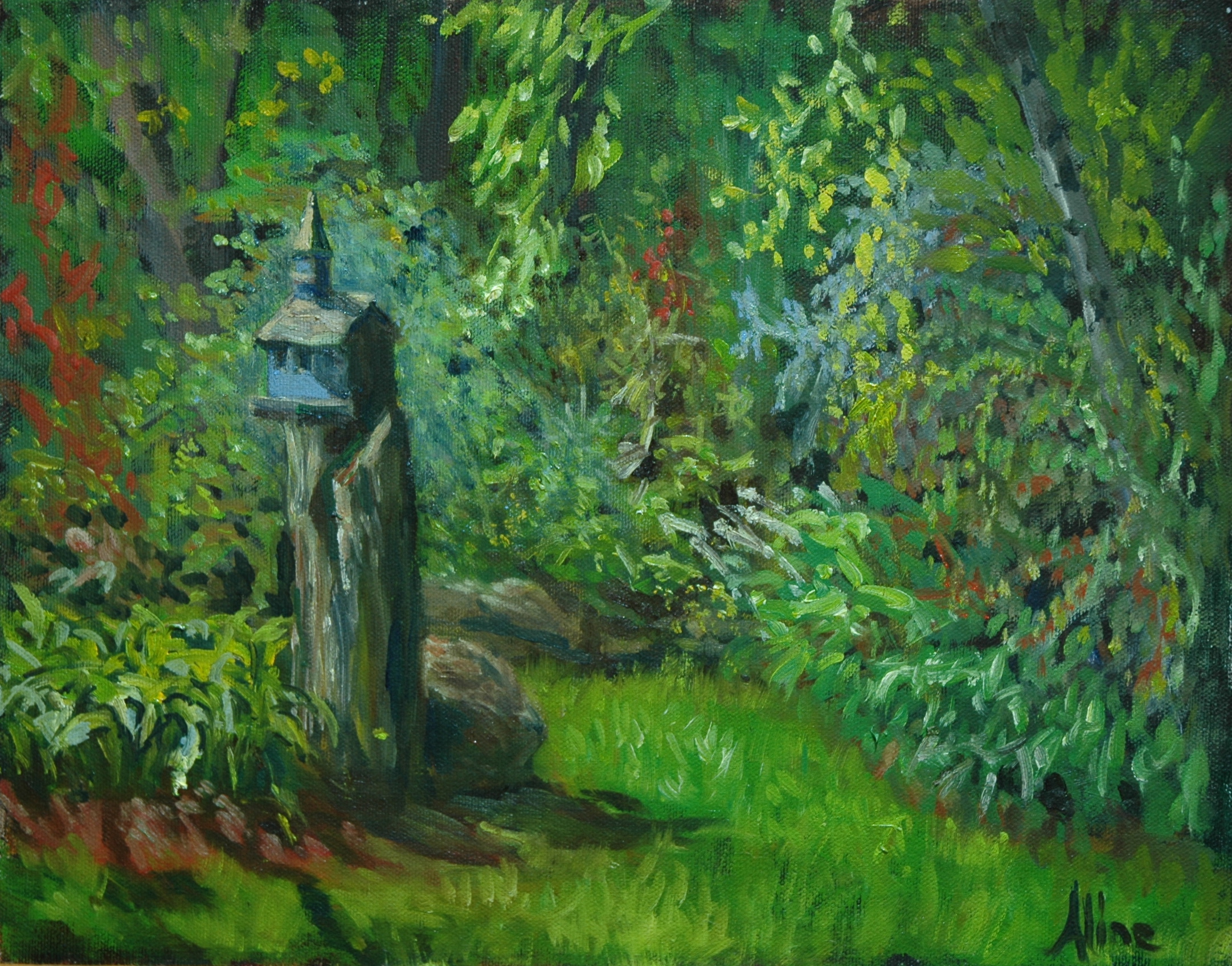
Elaine's Back Yard

Elaine’s Back Yard

This really is in the back yard of a fellow artist, Elaine Farmer, who just moved to Amherst and invited us over to paint on her fabulous garden.  But we can’t resist water.  And there was a little foot bridge over the stream, whence I painted.

Cox Reservation

Cox Reservation

The Cox Reservation is located in Essex, Massachusetts.  David Curtis and a group of his followers meet up there regularly to paint.  I have actually painted this scene before, when Sharon Allen and I were exploring the Essex National Heritage Area.  As I was driving down, I resolved not to get sucked back in with this vista, but rather to find something interesting, preferably with flowers, to paint close up.  So much for resolutions.  I hate vistas.  They are so hard!   When I started on this one, there wasn’t even any water to paint, but as the tide rose, it got better.  But why was I even there?  I don’t know.  Something in my afterlife must have required it.  No, I have it!  I just compared it to the earlier one (linked above), and it seems my vistas have improved somewhat since 2012.  Yea!

Smoke Bush at Arboretum

Smoke Bush at Arboretum

Finally, the Smoke Tree.  I had to deliver a painting to the Arboretum anyway, so I decided to make a day of it and paint something.  No vistas this time.  I went looking for flowers, and found mostly flowering trees, which is not something very common at the end of summer.  This bush (“tree” is reserved for bushes that grow a lot higher) was located at the top of Bussey Hill.  Luckily, there was a road to get me there.  (They let me have a driving permit because I couldn’t carry my gear all that way, and I do have handicapped privileges due to the arthritis in my back.)  I labored over the Smoke Bush so much harder than I should have had to, and I suspect that is because I had the time to do so.  Had a model been present to paint, the tree gets abstracted in the background.

Aline Lotter is currently exhibiting:

at the Hatfield Gallery and the East Colony Fine Art Gallery in Manchester (both are in Langer Place, 55 S. Commercial St., Manchester, NH); at the Bartlett Inn in Bartlett and the Bernerhof Inn in Glen; at the Red Jacket Inn in North Conway; at the law offices of Mesmer and Deleault at 41 Brook St in Manchester; at the Manchester office of Congresswoman Carol Shea Porter;   a single painting is on view for one more week at the Radisson Hotel in Manchester; at the Norris Cotton Cancer Center in Manchester; and at her studio by appointment (email: alotter@mac.com). You may also view paintings with prices and order prints at my Fine Art America page. If the painting you are interested in is not there, or if you prefer to bypass that experience, you may contact me using the private feedback form below. If you want to add a public comment to this blog, go to the bottom of this page where it says “Leave a Reply”, and enter your comment in that box. I love to get public comments, so don’t be shy!

.

Garden Magic

I get so caught up in my narrative blog content that I always forget the marketing bits, where I would be announcing I got into this show or that, and sold this painting or that.  Such a waste of those small, ephemeral moments of triumph!  Meanwhile I’ve been moaning about failures.  Wallowing in failures.  I hereby resolve hereafter to “accentuate the  positive,” starting right now:

  • My painting of “Margaret and her Nook” has been published in an online mag called “Art and Beyond”; here is the link to the magazine; you will need to click forward to find my page.
  • 5 of my paintings were accepted in the “Healing with Art” exhibit at the Norris Cotton Cancer Center in Manchester.  (reception Tuesday Sept 9, 5:30-7:00)
  • My painting of “Fur” has found its forever home, after being on exhibit for only a few hours at the Bedford Library.
  • My painting of “Willow Path in Winter” has been accepted in the annual JPOS (Jamaica Pond Open Studios) exhibit at the Arnold Arboretum in Boston.   Reception Thursday Sept 18, 6-8.
  • My application to apply to the Copley Society in Boston has been accepted–allowing me to apply for Professional Artist Membership, which requires a long checklist of images and written materials that I need to produce before a January deadline.  Checklists?  No problem for a former tax lawyer.

Listing the good things maybe once a month will at least boost my spirits, even if it doesn’t have any noticeable effect on sales.  Sales are the ultimate boost in spirits.  Nothing says “I love your painting” quite like the handing over of real money in exchange for the painting.  One of my teachers had a standard reply to anyone who said “I love your painting”: . . . “It’s for sale.”  But we can’t all buy all the paintings we love.  I know that all too well.  So it’s OK to keep telling me when  you love my painting even if you can’t buy it.

So, down to the real business, that of creating beautiful paintings, maybe to sell.  I spent two afternoons last week in a garden full of little nooks and pathways and whimsey.  This garden is hidden behind an ordinary house in an ordinary neighborhood.  It was created by colleagues of mine, a photographer/painter-husband/wife combo–although credit for the garden has to go principally to the husband.  The wife, Dee Lessard, paints beautiful still lifes but has little experience with plein air painting (or gardening).  Her husband, Guy Lessard, was pretty pleased to find Dee and me at our easels in his garden, immortalizing  the beauty he had built.

Magic Garden No. 1

Magic Garden No. 1

If you follow the path marked by the stepping stones, into the darkness beyond,  you come upon a pool full of dappled sunlight and brilliant koi.  I longed to see (and paint) a figure leaning into her reflection here.  But saving that one for when I have a model, I chose this simple scene that melds so delightfully a  half dozen different plant varieties.  I completed this one in a two-hour afternoon, just before the skies opened up in buckets of water.

A few days later, we went back out, Dee to continue working on the one she had started and me to find another magical place.  No. 2 is to the right and down a slight slope from No. 1, looking back at another path to get to the koi pond.

Magic Garden No. 2

Magic Garden No. 2 (before adjustments)

The Fairy Chapel

The Fairy Chapel  (Magic Garden No. 2, after adjustments in color and value)

Guy rescued the little church birdhouse in an antique store with steeple intact.  But adverse elements had obliterated the steeple over time, so I was painting what could have been a New England meeting house when Guy came over and requested that I add the steeple.  I was only too happy to oblige.

For both garden paintings, I had started with a surface toned dark, mostly with burnt umber.  Very little of the toned surface still shows, but where it does, it enhances the contrast that makes a painting interesting.

Aline Lotter is currently exhibiting:

at the Hatfield Gallery and the East Colony Fine Art Gallery in Manchester (both are in Langer Place, 55 S. Commercial St., Manchester, NH); at the Bartlett Inn in Bartlett and the Bernerhof Inn in Glen; at the Red Jacket Inn in North Conway; at the law offices of Mesmer and Deleault at 41 Brook St in Manchester; at the Manchester office of Congresswoman Carol Shea Porter; two paintings are hanging at the Bedford Library as part of the Womens Caucus For Art exhibit “Summer Bounty”;  a single painting is on view at the Radisson Hotel in Manchester for the summer; and at her studio by appointment (email: alotter@mac.com). You may also view paintings with prices and order prints at my Fine Art America page. If the painting you are interested in is not there, or if you prefer to bypass that experience, you may contact me using the private feedback form below. If you want to add a public comment to this blog, go to the bottom of this page where it says “Leave a Reply”, and enter your comment in that box. I love to get public comments, so don’t be shy!

.

Tale of Woe

. . . Snow woe?  Weather woe?  Maybe lack-of-power woe.  “Power.”  Have you ever thought about the usages of the word “power”.  We use it to describe an attribute of people who attain positions where they can control the lives of others.  Power is also an attribute of an individual who can control his/her own life.  So why does  “Power” also refer to  electrical current to run lights, furnace, phone, internet, microwave, TV, DVD, and radio, to charge cell phones and Palm Pilots?  Because without all those abilities, one is powerless.

Without power (in the technological sense) One is also cold, hungry, and sleepless.  So I write this tale of powerlessness–obviously not from home–in a state of grogginess.  For the first time in my life, I slept with a Great Dane.   I invited her into bed with me when her “mom”, my granddaughter, bailed on us to go spend the night with a friend with “power”.  Honey, the Great Dane, usually sleeps with Tabitha, my granddaughter.  Tabitha thoughtfully lent us her comforter and Honey was dressed in a woolly sweater.  I wore my thermally correct underwear and a snuggly fleece robe-type thing over that.  We were warm enough.  Well, I was warm enough.  Honey was shivering and twitching all night, while I concentrated on hanging on to my share of the bed and waiting for the sun to rise.

Actually, I wasn’t all that hungry because I got to spend a wonderful 4 to 5 hours at a party with artists earlier in the day.  Mill Brook Gallery in Concord held an opening for an exhibit that was enchanting in its originality and breadth.  http://www.themillbrookgallery.com/  I had been invited by Patrick McCay, one of the featured artists, who is my EEE teacher.  (EEE stands for Explore, Exploit, Express–in whatever medium, whatever style.)  Two of his paintings already had red dots on them when we got there.  “We” because I did not have the use of my car yesterday but got a ride with two other artists, Bea Bearden and David Wells.  Through Bea and David I also found myself welcomed to a pot luck supper after the reception.  What a pot luck supper it was!  It deserves commemoration by publication of the entire amazing menu, but I cannot do it justice on the wing with descriptions like “quiche-type thing” and “rice and beans”.  I didn’t go near the pies–no room for dessert.

So in truth I was warm enough and not hungry at all, and only sleepless now.  Yesterday, before going off and partying, I used a few daylight hours to tinker with three paintings that I had started in EEE.  The third one is my newest one, which you have not yet seen.  In order to get enough light in which to photograph it, I brought it to the office with my camera.  No tripod though, so it looks a little fuzzy.

Taking a Bow

As the cyclists arrive at the top, someone throws a gray blanket over their shoulders, which keeps them from getting too chilled after their sweaty exertion.  The top of Mt. Washington is, even in August, likely to be a chilly place.  Andy, who happens to be my son, appears to be wearing a ribbon of some sort, which I only noticed in the course of working on this painting.  Will have to find out the significance of that.

The train car in the background is part of the  Cog Railway.

In this painting, I believe I have become more of an impressionist, which is kind of  what I have set out to do in the EEE class.  My highest goal is to emulate  Sargent and Sorolla, which to me means using the brush strokes expressively.  I really enjoyed working on this painting.  It is another of the studies for the larger work I am hoping to get to, the one of the whole top of the mountain with the crowds, the cyclists, and the mountain vistas.

Aline Lotter is currently exhibiting:

at the Gallery at 100 Market Street in Portsmouth; at the Sage Gallery in Manchester; at the Manchester Artists Association Gallery in Manchester; at the Bartlett Inn in Bartlett; at the Red Jacket Inn in North Conway; at the Rockport Art Association Gallery in Rockport, Massachusetts.

Link to website:  www.paintingsbyaline.com

A 6×6 painting for $66

6 inches by 6 inches has recently become a popular size for two-dimensional art pieces because they are affordable and are highly collectible. But for the past ten years, every year, the New Hampshire chapter of the Women’s Caucus for Art has been organizing a member exhibit consisting only of 6×6 plaques prepared specifically for that purpose, and for that year. The price for each plaque is $66. Every media imaginable is represented. The plaques can even be used to create 3-D artworks as long as they can still be hung vertically.

My Lotus Studies series of four were created for the WCA event in 2009, and when none of them were sold, I combined them into this piece:

Lotus Studies

As this unit, Lotus Studies has been exhibited three times–once at the 2010 WCA “Flowers Interpreted” exhibit (another annual event), then at the Gallery at 100 Market Street in Portsmouth, and finally this spring at the Manchester Artists Association Gallery, where it won the Best in Show award. Though much admired in all these locations, it is unaccountably still available for purchase.

For this year’s 6×6 exhibit, I have decided to feature critters. I led off my blog (up above) with a half-finished study of that most endearing of critters, a sleeping cat. I’m going to call it “At Home”. Ironically, my model is Sundance, a rough, tough rescued cat who ultimately chose to rough it in the neighborhood. He relies on other suckers in the neighborhood to feed him regularly and suns himself on my deck occasionally. So although he looks really “at home” in this painting, he is dreaming anarchy (on my bed, by the way).

I have two other of my critter plaques started:

I need help with the Snowy Egret. There is a lot of empty space on the left of the plaque, which I intend to fill with written words. Poetic words. I am not a reader of poetry, so I don’t have any useful couplets filed away in my brain, but maybe one of my readers does.

This one I propose to title “Red Breasted Plover”. There is of course no such thing as a red breasted plover (this one is, I think, a black breasted plover in winter plumage). The red breast here is a reflection of the red canopy. Is that obvious enough to explain the title? Or will people think “red breasted plover” is a real species?

If you have been with me for a while, you might remember the Egret and the Plover from my trip to Florida in 2010, the year I deployed the zoom lens to such good effect. If not, you can see them here. Nineteen months later I finally got around to painting these birds!

The WCA 6×6 exhibit this tenth anniversary year will include the 6×6’s from prior years, so I guess my lotuses get out and about for the fifth time. The place of the exhibit will be in Nashua, and the length of the exhibit will be only 2, perhaps 3, days in November. A short, almost “pop up” type exhibit may generate more concentrated interest, and exhibit spaces that we couldn’t consider for a month-long exhibit become feasible. I will post more information about the exhibit when the date draws near.

Since this year we are including past works (retrospective), I will probably offer two that I recently painted on 2010 plaques, covering up what I did last year. (I hated what I painted on last year’s plaques so I didn’t submit them to the exhibit. Lack of inspiration results in worthless artwork.) You may remember these recent portraits from a previous blog entry:

A Blond Akita A Snaggle-tooth Cat
For more about the cat, search “Grace”. I adopted her last year.

I was going to post some pictures of drawings from our Saturday Life Group, but I think this is enough for now. Next week I am sure to have lots to talk about, because I will be attending a workshop with Stan Moeller, the guy who opened up the door to landscape painting for me back in the Fall of 2005. The subject of this workshop is near and dear to my heart:–how to paint people into your plein air landscapes. I have been practicing that very thing in anticipation of this workshop, and now I will learn the real scoop. . . . fingers crossed, that there is a real scoop to be had!

Details (Death to)

“It’s all in the details” — a statement considered wise when the subject matter is policy. What about when the subject is art? Recently, I visited an exhibit of Dutch and Flemish paintings from the 17th-18th century, wherein the details were really important. Before photography, paintings were valued as records; the tiniest of details were appreciated. But in this day and age, details can be a hindrance to artistic expression. Representation, as opposed to abstraction, is even looked down upon in some quarters. Abstraction is the ultimate in detail-elimination.

Only last week one of my followers commented, “Your drawings are magnificent.  Great attention to detail.  Superb!”  Alas, his approval, to the extent based on my attention to detail, may be misplaced. I have to acknowledge a contrary judgment–that in general, attention to detail is not a good thing, and that in particular, my attention to detail is more of a handicap than an ornament to the quality of my output.

Which is just a long way of saying, I expend too much energy on details.  At one point during the Red Chalk workshop, Rob Liberace asked me to dial back on the details–I was making a virtual skeleton out of our lean model.  Referring to the portrait above, “Kitsch,”  Cameron Bennett suggested last Thursday.  Ouch!

Two experts within a short time identifying the same weakness–there must be something to it.  How did I get to this pass?  Certainly my plein air painting never permitted excessive detail.  One theory–my speed in getting to a near-finished state leaves me all too ready to look for areas to refine.  Instead of reexamining the broadest strokes to make sure those are as perfect as I can get them, I start on what I used to consider the next step–developing the details.  Another theory–I am just not that good an artist.,

Take this week’s portrait from a live model, posted as the cover image for this blog.  As soon as I caught Rebecca’s likeness and properly placed and sized all her features, I spent considerable time working on the details, or what I was then considering the nuances of her features–especially her mouth and eyes.  It was at the end of that session that I got the “kitsch” remark. Ouch–that still hurts!
Here is the current portrait next to the earlier one done in black and white. Big improvement anyway. (But we had less time to work on the black and white, I think.)

At least when copying a work done by a master, I cannot be criticized for the sin of detail. The detail, or lack of it, comes already supplied. Here is this week’s homework assignment, from a self-portrait by 20th century Italian artist, Pietro Annigoni.

The whole point of copying, may I remind those of you who abhor the slavishness of copying, is to train the copyist’s eye. If I cannot see how my ear is different from the original’s ear, how can I expect to paint a good representation of a real, live ear? So there is the original, on the right, with my copy on the left. Sitting on my easel, my copy looked virtually perfect to me–I fantasized Cameron accusing me of tracing the image.

Here, not so perfect. A decent copy, but far from perfect. I gnash my teeth in frustration! How did the bloody head get so elongated in the original, with me not noticing? This is why artists resort to projecting drawings onto their canvases from photographs, a practice frowned on by purists, and one that certainly does nothing to train the eye. Fury it is that motivates them!

I hereby resign myself to getting beat up upon by Cameron this Thursday because there is no way I am repainting that ear. (In order to narrow the head, I would have to move the ear.)

But back to the topic–Death to Details. With this new anti-detail directive freshly absorbed, giving a nod to Peter Granucci here as well since he also has tried to wean me away from focusing on details when drawing from a live model, I took out a painting that had never satisfied me.  This was a painting based on a drawing made with a live model.  I had no details to refer to –the painting itself was several references removed from the original drawing since I had painted over it several times trying to find a version that pleased me. Could I solve this painting by eliminating even more details?

The only part of this painting that I liked was the hand and the drape at the bottom, so I felt free to mess with the rest of it.  I tried muting the background.  I changed the hairdo.  I refreshed the skin tones and created large splashes of light. Finally, taking a cue from the hand that I did like, I outlined the figure in black.  Suddenly, it looked interesting.  I never use black ordinarily, so this was definitely weird.  I scumbled (a technique for applying a glaze but with a dry brush) more black into the background and it got even better.

Ultimately the color, and maybe the contrast may save this painting.  But my curiosity to obliterate detail is what motivated me to revisit this painting.  Maybe that makes no logical sense, but hey, that’s left brain for you!

Meanwhile, and D, I’m talking to you, don’t praise my attention to detail.  It’ll just make me squirm uncomfortably.

This blog started out over two years ago (!) with no particular angle on my painting adventures, but has begun to develop as a chronicle of my efforts to grow as an artist. So I have come up, finally, with a name for it: Painter’s Progress–playing on the phrase “Pilgrim’s Progress”, a religious tome from a time period when details in paintings were expected and desired.

Red Chalk Drawings

I lead off today with my last red chalk drawing done in the course of last week’s workshop with Rob Liberace, “Drawing the Figure in Red Chalk”. He thought this drawing was my best from the three days, and who am I to argue with the Master. The workshop was a fabulous experience. The “students” included Sean Beavers, who was my instructor just a few weeks ago, and Larry Christian, who was my first figure drawing instructor at the Institute in 2006. I suspect that many of the faces who were unknown to me belonged to other long-established professionals as well.

The red chalk is not actually red chalk, but rather any soft red drawing material that simulates the red chalk used by the old masters. We deployed pencils and pastels of various properties, but the principal difference was softness. The harder pencil drawings work better on a smaller scale; detail is easier with a pencil while covering a large sheet with pencil is not fun. So conversely the larger the sheet you want to use, the softer is the material you choose. Obvious that should have been, yet a revelation to me.

I started with the harder stuff:

Young Woman in Red Chalk, about 18×18

With a few leftover minutes on that pose, I drew her whole figure in miniature, showing her slump so much better:

18×9

My output for Day 1 was perhaps suppressed due to my confusion about the paper. Based on information received with our materials list, I had pretreated sheets of paper with dilute amber shellac–on the wrong side. Drawing paper comes with two different surfaces–one side is rough, the other is smooth. I should have used the smooth side, not the rough side. No way to know. Then it turned out that when using the softer materials, you don’t need to treat the surface of the paper after all. Fortunately, I had some extra paper at home, and I came back on Day 2 armed with every possible configuration of treated and untreated sides.

For both Day 2 and Day 3 we had the same model, an 80-year-old guy whose body was so lean that he was practically a textbook on anatomy.

This was my best likeness of our model. Here I was using the softer pencils and little bit of the pastel stick. The duration of this pose was only an hour.

The next one was for the entire afternoon of Day 2:

When I was only halfway through,m Rob Liberace sat down and made almost imperceptible improvements to the face. Far be it from me to cover up Rob’s marks with my own improvements, hence the slightly kooky face.

Day 3 we had the same pose all day, but I was finished with my particular angle by lunchtime:

In the afternoon, I was able to move to a spot on the other side of the room. I went back to using the harder pencils:

Why was this one the favorite of Rob Liberace? He advocates using what I can only call “squirrely” lines, and in this drawing, I tried extra hard to make sure I had no straight lines. He also particularly loved the foot.

Here is a copy of one of his drawings, which shows pretty clearly what he was looking for.

The link I gave you at the top of this page should lead you to this image, and from there you can find others of his figure drawings.

It’s pretty humbling for me to see his and mine next to each other.

Profiles

Surprise! Monday blog is a day early because tomorrow I am over my head with exciting engagements that leave me no time to blog: First, workshop with Robert Liberace learning how to draw figures in red chalk as was done by the Old Masters, and we’re talking OLD old masters–Da Vinci, for example. Then Monday afternoon and evening my bridge group–our three Manchester members anyway–is heading out to Baboosic Lake for an unusually festive visit with Jackie, our Merrimack player–she’s making chili for us and taking us for a boat ride on the Lake in addition to our usually austere bridge playing.

The theme today is “profiles” because yesterday Peter Granucci had us anatomizing waves, which I am stretching to mean profiling waves, while earlier in the week, and the week before, in my Portraits class with Cameron Bennett, we started out with profiles. Cameron seems to think profiles are easier than other angles of the head. For him, maybe.

Profile #1 is a grisaille (black and white) copy of a Jacob Collins head, which we started in class and are supposed to be finishing up as homework over a two-week period.

I trust that by combining the photo original with my copy, I will meet the “fair use” exception to the copyright rules. Sorry about the glare on the wet paint. I had to blast the light from the front in order to keep the sunlit background from shining through and obliterating what I am trying to show you. Both this project and the next one are taped high up in my window where I can stare at them from time to time and where neither cat can rub up against them. Fur on a painting is not, I have found, a desirable quality.

As additional homework over the same two weeks, we had to find ourselves a profile by a master to paint, again in grisaille. I made the immediately obvious choice of Madame X, by John Singer Sargent, which in the original is pretty darn close to black and white anyway.

I can see that neither copy is perfect yet, but pinpointing the reason becomes harder and harder as I eliminate the more obvious defects. Every day, I notice something to fix. Madame X’s nose has been a nightmare. Such a unique nose but so very subtly unique that it cannot be captured casually. I knew it would be hard when I chose it.

Last Thursday, we painted, still in grisaille, from a live model:

I believe I caught a likeness, albeit not a perfect one. It is a challenge when you have only two hours minus breaks to work with the model. Mine was one of the more complete-looking efforts in the class, but a likeness must come before completeness.

At least I’m fast, which gives me more time to capture the likeness–more time to make mistakes and correct them. I am thinking that all the mistakes are necessary markers, milestones to progression. I SHALL get that nose on Madame X right by the end of the week!

Meanwhile, waves. Waves are not easy by any means, but let’s face it–you get a lot of latitude on the details as long as you get the elements right. So practicing how to paint waves Saturday with Peter Granucci and my plein air painter friends was a joyful experience. I learned the terms to apply to a wave: “base” “ridge” “eye” and, most interesting, the “dump”. The dump is the part of the wave that is crashing over. The eye is the thinnest part, illuminated by light, which I find the most magical element. The rock doesn’t really fit the theme, but Peter gave us a rock to work on at the end–dessert.

I taped all of my Saturday paintings to a hardboard to see how I might be able to fit all four into one frame. All of these were painted on canvas pads; to get three of them home, I simply closed the cover on them, which is why the thickest paint has that funny texture. (The fourth one fit into one of my “Art Cocoons”.)

I don’t quite know what to do with these four paintings of nonuniform sizes and needing mounting on something harder than air. The hardboard is one possibility. Maybe I shouldn’t try to get all four into one frame. I’m open to ideas–and offers.

Animal Portraits

“Portaits” might be slightly aggrandizing. Painting likenesses of animals is a lot of fun and not nearly as demanding as painting a portrait of a human being. That scruffy little pup above is “Justice”, with whom I share living quarters and who is my best TV-viewing buddy. He actually belongs to my granddaughter, but I feed him, let him out in the yard morning and night, and take him to the Gallery when I am sitting there. He barks at the visitors but so far, no one seems to mind. Art lovers are, for the most part, animal lovers too.

So last Saturday a week ago, when I was gallery-sitting, I painted three new animal portraits; the Justice above, on 11×14 panel, and two small ones on 6×6 blocks.

First was Grace, my crooked-jawed sweetheart who likes to squint at me. Her life apparently started out pretty hard, but I swooped into the Manchester Animal Shelter the very day she arrived there–back in August of 2010, and she has finally come to believe that my home is her home. When I paint, she comes up to me, reaches up on her hind legs, pats at my leg and speaks in her inimitable cat language, asking what am I doing and why.

So despite her tomboy appearance, she is the sweetest cat in the household. (Her only competition is the white goddess cat Isis, of whom I have spoken and painted before.)

My second 6×6 features Nora, an akita that belonged to an artist friend but who died a few months ago. I only met her once. She was unbelievably plush.

While these are paintings inspired by the animals, a few months ago I finished a true portrait. I never met this fellow but had a selection of photographs to use as a reference. I spent many hours on him:

Maximillian, from the point of view of the mouse.

After putting my animals aside, I worked on a few problem paintings, one of which is the Wells Harbor tarp painting from only a few weeks ago. I am now totally happy with it:

The big fixes were to the doors of the red shed and to the background edifices, but I spruced up the little things too, “finishing” in the best sense of that word. For the sake of comparison, here is the previous version:

With all the fixin’s and trimmings applied to make this painting more presentable, I never messed with the tarp except to increase the contrast between light and shadow. The tarp was pretty much “premier coup” or done at the first stroke. It works like that sometimes. Other times, I can do over five times before I get it right.

Anatomy of a Workshop

Five solid days of intense concentration on the drawing and painting of the human figure left me dazed throughout the following weekend. Only today do I begin to feel that I have returned to earth. The image above is the last piece that I worked on, and , I believe, represents my best work for the week, which is a Good Thing as it means I profited from the processes that preceded it.

The workshop was superbly taught by Sean Beavers at the NH Institute of Art. Sean was a terrific resource, imparting a prodigious amount of information about methodology, tools, techniques. The workshop was structured around two models, Levy and Margaret. Dark-skinned Levy took a standing pose, under a spotlight, and held that pose, with breaks of course, for the three hours of each morning. Ivory-skinned Margaret held her seated pose for the three afternoon hours, lit only by the light from the north-facing windows. Those of us on the south side of the room had trouble seeing what we were working on, so Sean arranged small spotlights to hit the wall behind us, which cast reflected light onto our easels.

Fifteen hours for one pose was an unheard-of luxury for most of us, I’m sure. Some members of the class moved around the room during the week in order to get a different perspective on a pose, while others worked a single piece for the entire fifteen hours of a pose. I produced two final pieces for each pose, but chose to work from a single spot for all four images.

Our process was something totally new to me: first we had to produce a drawing on cheap paper that was perfect enough to warrant transfer, then transfer by tracing through graphite paper onto the final paper or canvas. This process allows the artist to crop the image and alter its placement on the canvas. Here are my first two drawings:

I used a magenta pencil to trace each drawing onto the graphite paper so that I could see where I had already traced and where I still needed to trace. That treatment kind of ruins the drawing as a completed work on its own–it becomes only a way station to the final masterpiece.

I ran into trouble with the size of my drawing of Levy. When drawing, I like to fill the sheet with my subject. But my drawing pad was 24 inches high, while all of my canvas panels were 20×16. I could not accept the idea of cropping off his head or his feet, so I managed to squeeze him onto the panel with millimeters to spare. He’s about to step right out of the frame. Here are 2 images of the painting, one intermediate and one final:

The principal, perhaps only, difference between the two is the warmth in the shadow areas. For the final version, I “blued” the shadows on his body and the cast shadow behind him. Note that I placed him well to the right of the panel, giving plenty of room for his shadow, and plenty of space for him to be gazing into. I’m really pleased about that, and his toeing the edge of the picture is kind of growing on me too.

After declaring that painting finished, I decided to do a portrait of Levy. Originally, I hoped to turn it into a painting. Then I thought perhaps a charcoal drawing would be fun. In the end, I simply worked the drawing to death on my pad. Here is my start and my finish:

My first work featuring Margaret took me three days. The second one took only two days. Here is the first:

From drawing to canvas panel did not require much repositioning. I had plenty of room to keep all her toes and fingers intact.

The second pose started out with thoughts of portrait, but somehow grew beyond portrait to a half figure (I think that’s what it’s called). Here is the drawing, then my first blocking in of the painting:

And here, for your convenience and, I hope, enjoyment, is an image of the final painting again:

I love how her skin shimmers against the antique background light and shadow. Funny thing–now for the first time I notice the tan lines running up her shoulders, which somehow got automatically transferred from my eyes to the canvas without passing through my brain.

Calling up a phrase from the sixties (fifties?), that was the week that was. I wish I could live all my days being exhausted and used up like that. If you are interesting in examining these images a little closer up, you can do so on the Newest Additions page.

Saving Wells Harbor

Today’s blog follows up on the story of last week’s plein air adventures in Wells Harbor, Maine.  Nobody spoke up for my first start, which I had abandoned after the evil umbrella attacks.  Silly of me to expect anyone to dispute that the first painting was a “wipe out” (meaning, the paint should be wiped off so that the panel may be reused for a better painting).  If the artist who had been originally inspired to paint a scene can’t defend it, who could?  

Just to remind you, here is the original half-baked painting:

I felt a little tug on my heart from this sad little guy.  Wasn’t its fault that I couldn’t cope with the evil umbrella.  The composition was good, and that’s the most important element.  To try an salvage the painting, I had to invest only my time and a little paint, and even if the effort were to fail, I would learn something.   

I redrew the structural elements and played with the colors of the water in the foreground and the foliage in the background.  I added interesting details, such as the lettering on the banner on the ramp.  The salvaged version may need more work, but I am pleased enough with the progress. 

I also worked on the second painting, the one I hoped would be salvageable.  Here is how it looks today:

Here is the half-baked version:

(The tarp color was not changed–the light in which I photographed the painting changed.)  

The improvement to the second painting is not as dramatic because the painting did not start out as hopeless as the first one.  Some remaining rough spots should be simple to fix–I don’t like the doors much, and I think I might be able to improve on the way I suggest distant buildings in the background.

Meanwhile, for this whole week, I am taking a figure workshop with Sean Beaver at the NH Institute of Art–from 9 to 4:30 Monday through Friday, it leaves me little time to do anything else.  I am in heaven!  Next week you will be hearing about that in great detail.

Why NOT paint outdoors?

In the past week, I twice took off from work in order to go on a plein air painting expedition. Last Wednesday, Flo (Florence Parlangeli) and I went lupine hunting out West (Peterborough, Jaffrey). In northern NH (Sugar Hill) the natives plant lupines in every field and roadside shoulder and fence post in order to lure visitors to their Lupine Festival. But western NH natives apparently have no use for the mostly blue flower. Fortunately, we had a tip that there was a fabulous field of lupines behind an artist-friendly private home in Troy. Our hosts welcomed two complete strangers onto their beautifully landscaped property. The only hardship we endured was the annoying flies. Not the little black flies, known for their propensity for invading bodily cavities, but some large flesh-eating ones. One hardship is not enough to discourage a plein air painter.

I am pleased with the picture above. I could have chosen another angle on that field, one with Mount Monadnack in the background, but I was struck by the drama of the foreground shadows acting as a threshold to the scene beyond.

I have never been satisfied with the color of my lupines in paint, but got a clue from Michael Chesley Johnson in his recent blog on painting lupines in New Brunswick: when the blue of the flowers is applied to a surface of wet paint, the blue sinks into the paint underneath, muddying the blue; so the painter must go back after the oil paint has set up a little bit, with fresh blues to represent the glorious blue of the real life flowers. This I did, and I also blended in a tiny portion of a rose color that I don’t take outdoors with me, to achieve the purply blue lupines.

OK, so that was Wednesday. Yesterday, Monday, (sorry about being a day late with the blog if you were waiting for it with bated breath but now you know why, and it is a good excuse, right?) we took advantage of a beautiful day and an invitation from the newly organized southern Maine plein air artists to paint at Wells Harbor in Maine. I set up my big Gloucester-type easel and my big umbrella in a sandy area that was also very rocky. The wind was stiff. The umbrella would not stay put in the sandy soil, so eventually I lashed it to the easel with a bungie cord. I proceeded to work on the following painting, which is a view of Wells Harbor from across a considerable expanse of water.

My point of view was dead on straight at the buildings, which simplified the composition of a complicated collection of objects. Here is a photograph of the scene:

The panorama format as in the photo would have suited me much better, but all I had with me were squarish panels, so I limited my subject to what would fit. But composition was the least of my problems. As I mentioned before, it was windy. My umbrella had blown away twice before I lashed it to the easel.

Why all this concern over an umbrella? If I paint in the sun, the paint colors look much more vivid than they will indoors. I learned the hard way that I have to shade my palette and my painting in order to see how my work will look when it is exhibited indoors. Other painters may learn to compensate, but I just use an umbrella if I can, or turn my easel and palette away from the sun if I can’t get them in shade any other way–which means me facing into the sun. But when the sun is overhead, as it was yesterday, it is hard to find any spot where it is not shining on the painting or the palette.

“Shade Buddy” is the name given to my umbrella by its manufacturer. “Evil” is the name conferred by me after the second assault. In its first assault, it leapt over the easel striking me in the shoulder as I devoted all my attention to protecting the painting, easel and palette. I forgave, and reattached it to the easel, tightening the bungie cord so that the assemblage could not travel up the easel leg again, and got back to work. Evil umbrella was still Shade Buddy, innocent victim of windy gust. The painting required a few repairs, but no big deal. (The ultimate disaster would be a painting falling face down in the sand.)

The second assault almost had the ultimate result. I can’t even remember how it happened, it happened so fast, but the umbrella attacked me again and everything, including the painting, went flying. Not the palette–it was clamped down to the easel, which met its hype for stability by not budging. (This is a snapshot of my easel the first time I used it.) Even the open jar of turpentine was unspilled. I cursed the umbrella and gave it its new name, Evil. I closed it up and managed to maneuver the painting’s position so that no sunlight fell on it, but my heart was heavy and I gave up shortly after repairing the smears and scratches inflicted by the brutal bumbershoot. (To the painting, not to me–although I expected to suffer some aftereffects, bruising, etc., but so far, I’m okay.)

But the day was not yet over. Our whole crew (Sharon Allen, Barbara Busenback and Catherine Weeks) found our way with some difficulty to that spot across the bay or whatever I was painting, and there we all started over. I found some serious shade and plunked myself and my gear down where the sun could not get to me, and prepared to paint the only scene that presented itself:

You can make a good painting out of anything. Given half a chance, that is. It was cold in that shady spot, and it afford zero shelter from the wind that blew through there like a freight train. I have painted in adverse conditions before, once in conditions very like these, and in a similar marine environment. That time I had to cope with a fierce wind, the cold, plus some sunlight issues that had virtually forced the scene I was to paint, and that painting turned out really well. Here is that successful one:

“Working Boats at Rest” 8×10 2009 (Rhode Island)

But the wind in Wells Harbor was something else again. I had switched to using my pochade box as an easel–it takes up less of a foot print and just seemed easier to deal with overall. The box sits on a tripod that I anchor with a stone bag and my SLR camera. The painting is secured to the lid of the box, and the lid is stabilized against the wind with pins, one on each side, that fit into holes drilled into the lid and box. (This is Steve Sauter’s “All in One” easel.) The wind shook the box so much that each of the pins worked their way out of the holes and fell to the deck. I, of course, was aware that the painting was shaking. Every time I tried to apply some paint, the paint would end up not exactly where I had planned for it to end up. However, I did not notice my first pin go missing, and happened to see the second go flying just in time to catch the lid and keep it from slamming down into the palette. Well, I was cold and miserable anyway, so I was ready to write off the day as just one of those days when the painting does not make my heart sing.

Here is that second effort:

I’m thinking this one is salvageable if only for the blowing tarp, but that the first one may be a candidate for wiping out or painting over. I’d like to hear from you if you think I should salvage the first one.

Think of my story if, the next time you see a plein air artist, you are tempted to coo, “Oh, this must be SOooo relaxing!”

P.S. Barbara just emailed me a photo of me at early stages, just getting set up, before any umbrella shenanigans.

Looks so peaceful, doesn’t it? Soooo relaxing!

Comments Off on Why NOT paint outdoors? Posted in Uncategorized

O Misery!

I have not painted one bit this week. I had two full days of painting on my schedule. Saturday I had gallery-sitting duty at the Manchester Artists Association Gallery in Manchester, and I usually produce at least two paintings during an all-day stint like that. Sunday was to be plein air painting on the coast of Maine. But Thursday morning one of my eyes decided this would be a good time to act up. Itching, swelling, streaming with tears–I assumed the cause was the pollen in the air, especially when air conditioning seemed to provide some relief. At first. This morning, I was desperate enough to seek medical attention, and my doctor said the cause was neither my allergies nor an infection but my immune system reacting to the normal bacteria that inhabit my eye. I am now on steroids. That sounds so au courant. I’m peeking at the computer screen through one bleary eye.

Anyway, instead of painting Saturday and Sunday, I busied myself Saturday doing figure exercises and Sunday visiting the Currier Museum for the last day of the Jon Brooks exhibit. The weather was not so great anyway for painting outside on Sunday. The Currier has a couple of paintings by Martin Johnson Heade, the artist whose storm we copied last week. Also on display are examples of Cropsey, Bierstadt, Cole and Church, all prominent landscape painters of the 19th century, being featured on a PBS series called “Landscapes in Time”. That was my landscape “fix” for the week.

An artist’s blog without pictures is like a burger without the meat. A photo of the offending eye would be too horrific and hardly artistic. So this morning I snapped some photos of the figure drawing exercises that I produced during the workshop last Tuesday morning (eye still healthy then) and the ones extracted from my Saturday at the Gallery (with only one good eye).

At Workshop, from live model, 2 of the better ones.

What Peter is teaching is a kind of a universality. He starts us out with bean-shaped torsos and pelvises and we must observe how they connect as the body twists and turns. The process for me has become a kind of fumbling around, looking for universal truths, almost a formula for depicting movement. The fundamental idea is this: If the artist can acquire a broad knowledge base of anatomy and figure dynamics, and then apply that knowledge automatically, he/she has more time/room to figure out and portray the idiosyncracies of a particular human.

So in copying the figures from the anatomy book (Bridgman), I would apply the bean shapes first, and build from there.

As I worked through the examples, I think I started to feel the energy of the poses.

Speaking of the Gallery–I had NO visitors all day, from 10 until 4. It was raining all day, so nobody was gardening or boating or washing the car. Nope, everyone was inside watching TV or something when they could have been out and about enjoying some great artwork and supporting their local artists who only want a little bit of encouragement to keep on painting. Or sculpting. I’m really sad that the Gallery does not get more support from the community, and worried that its days are numbered. Without the traffic, artists won’t care to exhibit there, and without the artists to exhibit there, the Gallery will have to close.

So wherever you live, get out and visit your local galleries. “Starving” artists everywhere are starving for attention.

Weather

Stormy or sunny, weather is always interesting. It represents that potential for the unexpected. A tornado threatened southern NH last week, but got hung up in western Massachusetts instead. Then we had days IN A ROW of perfect June weather. Well, maybe a little breezy, but I’ll take it. The painting above–still wet– was painted indoors on one of those lovely June days, at a workshop with Peter Granucci on the subject of painting stormy weather.

I have seeing a lot of Peter these days: I organized a figure drawing workshop for a small group of us to take from Peter. Organizing a workshop means getting a certain number of interested people to come together at a specific time on a specific day. Organizing is not a favorite thing to do, but it has been SO worth it. We got started last week, and will continue on a week-to-week basis as long as we can get five or six people committed to attending. So far, it is happening Tuesday mornings.

Then Saturdays, once a month, I take a full-day workshop with Peter on a single aspect or theme of painting landscapes. June’s theme was stormy weather. First, we copied from an old master, then we painted from a photograph, adding the drama in emulation of the master’s painting. Here is my copy of the Master’s (Martin Johnson Heade) version of a coming storm:

From Heade and other examples, we learned to hype the contrast and include some bright spots. In a few hours I tossed off the sketch just above, imitating a huge painting that took Heade weeks, perhaps months, to complete.

Thunderstorm on Narragansett Bay by M.J. Heade

Then I applied those lessons to my painting with the telephone poles. If you have been following me, you might remember that I love telephones poles and wires. I’m pretty happy with my telephone poles as substitutes for sailboats.

In other news, it cost me an arm and a leg to ship Cat Contemplating Winter to California for that “Tell me a Story” exhibit. Now I am hoping it does sell so that I don’t have to pay to have it shipped back. My train engine “501” is now gracing the home page of the fan page to which I tried to refer my readers, but I garbled the address. Here is the right link: http://www.newenglandrailfan.com/ After distributing that image of my 501 painting, I made a few changes to the tender. You will probably not notice them, but for the sake of posterity, here is what that painting looks like today:

Over the Memorial Day weekend, I also touched up a few paintings from the Bartlett weekend and from the George Nick workshop. You can find them on the page titled “Newest Additions”, if you have time to inspect.

Tell Me a Story

“Tell me a story” is the theme of an exhibit to be presented by a gallery in southern California. The idea is for the artist to write a 100-word (or fewer) story to go with the submitted painting. I was intrigued, and immediately thought of the painting above, which I titled “Totem”. You may or may not remember that I painted it last summer, on the coast of Rhode Island. (Visit that blog here.) In that rocky cove, there were many cairns arranged, but none so artfully as the one in the painting. No one knew who made the cairns, or what their purpose was. The cove was private property and practically inaccessible. However, on more than one occasion, a kayaker had been observed paddling past the cove, and I conceived the theory that when the cove was deserted, he paddled in and built cairns just for the mystery of it. For the story competition, though, I wanted more pathos. I imagined a lonely child distracting himself with building cairns as high as possible, but failing. The kayaker observes, empathizes. The child stops coming. The kayaker learns that the child has died. The kayaker builds the perfect, elegant cairn in memoriam.

I considered my chances of being selected for the California exhibit to be next to nil, but on the other hand, I could bring some writing skills to the project, which might give me an edge over right-brain specialists. I spent weeks working on my “story”–it had to be poignant, mysterious, poetic, and 100 words or less. Do you know how few words 100 is? I despaired. I let the normal deadline pass. But at the very last minute of the extended deadline (you pay higher entry fee), I reconsidered, and pulled together something with exactly 100 words, but lacking in content. The child’s death, and the kayaker’s involvement, is barely implied:

Rocky beach, isolated surf-scoured cove — nearly impossible to access by land. By sea, a kayaker paddles past.

One summer, a child is seen there every day, working, playing in the rocks. Day after day, he piles stones into elegant towers that tumble before the overpowering winds and waves.

Then he stopped coming.

Yet one day there arose a stack of three stones on a boulder, so perfectly fitted that they settled into their base as if grown there, oblivious of wind and waves, an anonymous tribute to fugacious striving, a totem to the beauty of a child and nature.

My use of the word “fugacious” probably sealed its doom, but I couldn’t resist.

But here’s the really funny part of THIS story. I submitted another painting at that last minute because a friend had recently admired it, and I could submit two paintings for the same entry fee. Here is the second painting:

Cat Contemplating Winter, 12×36. (“Casey” for short)

And Remember how poetic I wanted to be? Here is the cat story that I whipped out in two minutes:

Casey the cat was an outdoor cat. He liked to play in the grass and the flowers. He liked to play in the leaves. He does not like to play in the snow, or the wet, recently plowed streets. What to do?

Of course you already have guessed the end of THIS story. Casey got in the exhibit and Totem did not. Now I have to pack him up and ship him to Monrovia California (Segil Fine Art Gallery, if you are going to be in the neighborhood), and OMG, what if he sells? I am going to get a professional photograph taken of him for the purpose of making giclee prints, just in case.

This is the third honor for this particular painting: it won second best in one of the Manchester Artist Association Gallery shows, and it was reproduced in the Winter issue of NH Bar Journal in January. (They requested a snow painting for the cover (chose one of Franconia Notch), but couldn’t resist adding Casey at the bottom of the Contents page.)

Casey himself has abandoned us and adopted another home in the neighborhood with more cats and no dogs. He visits, but does not come inside anymore. Our feelings are hurt, which is why I put a price on his painting.

Anyway, the moral of this whole experience: keep it simple, stupid!

Finishing Bartlett

Above you see completed, the painting that got rained out last week. Clearly, I cannot call this a plein air painting anymore! While gallery sitting on Friday, I spent five hours on the engine itself, and Saturday after my granddaughter opined that the background was too loose by comparison to the engine, another couple of (annoyed) hours on the trees in the background.

Because the tracks converge on the roundhouse, I’m wondering if I need to offer an explanation of that by putting a reference to the roundhouse in my title.

This engine–the 501–by the way, has a fan website of its own, I discovered, where I found this photo:

I was looking for photographs of any steam engine clad in its insulating “jacket” because I met the young man who acts as the 501’s caretaker, and he had talked as if the 501’s jacket was out for repairs, and would be back on the engine soon. Perhaps I misunderstood him–in the photo above, the 501 is not wearing a jacket, but perhaps it was posing without jacket for the sake of the photograph.

In my web search, I did stumble on one explanation of why old engines are always pictured without their jackets. The jackets were made of materials (asbestos?) that deteriorated much more quickly than the metal that forms the boiler.

Saturday and Sunday I worked on my other large Bartlett painting. Not sure whether to call it a studio painting too–I did work on it en plein air for two consecutive evenings. Moreover, although I had a photo to refer to, few of the decisions I made in the studio were based on that photo. The painting is a view of the Bartlett Inn from the side, with one of its cabins intruding from the right.

My granddaughter did not have any helpful criticisms for this painting, which is kind of nervous-making. I use her to spot the glaring anomalies, jarring errors, etc.

In other news, I finally completed my portrait of Maximillian, who lives with Jane. I held off declaring it finished for many weeks because I was concerned about the eyes, but now I am happy, and here he is in all his glory:

Yes, his paw IS that large.

Artists’ Getaway

Twice a year, a few plein air artists answer the call to “get away” from their humdrum winter lives and congregate at the Bartlett Inn in Bartlett, NH. The Spring Getaway occurs just when the outdoor temperature has risen to a point where standing outside for long hours of painting becomes more or less bearable, if you don’t mind the black flies and ticks. The spring weather is undependable though. We started this year on Thursday, which was a beautiful day, as was Friday. But Saturday threatened rain all day, and Sunday delivered on the threat.

I did some good things, which I will show you, but my Saturday disappointment is overshadowing all else right now. You see, I had looked forward to spending the whole day in one spot, working on a 16 x 20 panel, because the forecast was cloudy all day but no rain until later in the day. Clouds meant no shifting light and shadows, which created the possibility of painting one scene for more than two hours. Here is what my spot looked like when I reconnoitered the North Conway Scenic Train Station:

This photo shows the Round House pit exposed in the foreground and various cars and engines strewn about behind the train station. You can see the roof of the train station above the car on the left. Concealed behind the car on the right is a black steam locomotive that I fell in love with as soon as I laid eyes on it. Also note the clouds in the sky. Solid, but not threatening.

Happy as a clam, I set up my big Beauport easel in a spot smack in the middle of the upper photograph of the train yard and station, and got to work sketching this lovely machine with thinned out paint.

That sketch is the cover shot above, because that is as far as I got. After about a half hour, just as I got to mapping out the darkest darks, drops of water started falling. I packed away the painting and the easel and sat down to wait it out, but one of the train engineers came out to commiserate with me, and said his GPS showed the rain clouds blanketing us without any break. So I checked in with my two companions, Sharon and Sandy, who had set up to paint the front of the North Conway station. They were giving up too. We went back to the Inn, where we puttered around touching up the previous days’ paintings. The real rain did hold off until later that evening, however. We should have stood our ground at the station.

Sharon and I were staying on either sides of a duplex cabin with a roomy porch, big enough for three of us to set up easels–not my big Beauport easel, but my smaller pochade box-on-a-tripod. A piece of our cabin is in the foreground of my other 20 x 16 adventure, a view of the Inn from a point in front of our cabin:

I worked on this painting Thursday and Friday evenings, while my companions went out for dinner. The Inn serves wonderful full breakfasts, but no other meals. I played the role of Starving Artist, dedicated to my craft.

Three smaller paintings have come home in more complete condition:

Mount Chocorua. 11×14. We stopped there on our way up North. It was a boring landscape until I got to it Saturday on the porch with my dioxanine purple. Maybe I went too far? This is one that will stay in my studio until I decide whether or not to tame that purple with blue.

Fourth Iron. 14×11 Friday morning. The title refers to the identification used for this railroad bridge, located off Route 302 between Bartlett and Crawford Notch. To keep the sun off my panel and palette, I had to face into the sun with my back turned to the bridge. (I learned years ago that when you allow the sun to light your workspace, you end up with a too dark painting.)

Silver Cascade. 12×6. Friday afternoon. This waterfall is close to the Crawford Notch depot train station, but a little south on Route 302. We set up our easels in a large parking lot across the highway; the ground was anything but level. Because of the angle of the sun, I ended up facing out to the right of the scene, with my easel to my right, one leg uphill and the other downhill. After an hour of that, my body was screaming for mercy. I worked on this one again Saturday afternoon. The water cascades needed more nuance, but that dioxanine purple seems to have taken over again. The photo is blurry because I did not use a tripod to take the picture. Sorry about that. When these paintings are closer to perfect, I will retake the photos and post them on my website.

Painting with George Nick

Friday through Sunday I participated in a Master Class with George Nick at the Currier Museum of Art, allegedly the first 3-day Master Class produced by the Currier. Given that the subject of the class was plein air painting, a one-day class would be hard to conduct–plein air painters spread out all over the allowed territory, which means that the instructor spends a fair amount of time just walking between locations. (I don’t know why an instructor couldn’t ask all the painters to paint the same subject, but suspect it is because part of the whole mystique of painting en plein air is the selection of subject matter, responding to the inspiration afforded by being outdoors.)

Indeed, I saw Mr. Nick at my easel only once for the first painting, twice for the second painting, once for the third painting, not at all for the fourth, and once for the fifth and last. But, in addition to being a terrific artist, he is a professional teacher, marvelously deft at giving encouragement while spotlighting the most important thing that the student needs to work on. For me, that thing seems to be detail. Less of. That is, I need to focus less on detail and more on the big shapes. Simplify? That sounds easy enough.

The “cover” photo above is George Nick holding the painting that he completed Sunday morning, not as a demo (“I don’t do demos”, he said) but as a contribution to our experience. His painting may sell for $10,000. Why on earth would he want to spend any of his time teaching?

In chronological order, here is my production, before the corrections I now see are desirable: Friday we only had a half day of painting, in Webster Park near the Currier, and I found a tree that inspired me:

It has been simplified.

Saturday morning I headed straight for the front of the museum, prepared to jostle for a good angle on the sculpture, but it turned out that all weekend, no one else chose to paint the sculpture:

At home that night, I reduced the literalness of the reflections in the windows, and found some orange paint to rectify a problem I had trying to mix a hot orange from cadmium red and azo yellow. The azo (M. Graham) was semi-transparent, the white was opaque, and I just could not get a brilliant orange using them. (But I left the detail in the roofing, which he had criticized.)

Saturday afternoon, it rained, so we deployed to the covered porches on the back of the Art Center building, one to each floor. I chose the highest and looked down on the original art center building that now serves as administrative offices:

The detail in this painting that drew Mr. Nick’s complaint was the variation in color on the clapboards of the building. He assumed I was trying to suggest the clapboards, but I wasn’t; I was just trying to make that flat expanse of color more interesting. He didn’t sound that definite about it, so I left the variations in for now. He said nothing about the purple sidewalks, or the carefully plumbed perspective. If you check out Mr. Nick’s paintings at the website link I gave you above, you may notice that he deliberately skews perspective, or so it seemed to me. But now I can also see, comparing my photo to my painting, that perspective here required more than vanishing points on a straight horizontal line. By studying George Nick’s own works and this photograph taken from above the horizon, I may have learned more than I did from my direct contact with him.

Sunday morning I returned to that porch even though the sun was out, in order to capture these roofs (Archbishop’s residence, St. Hedwig’s Church, and the Currier admin building, in order of distance:

This painting received no criticism, but I think I should straighten the lower edge of the red roof.

Finally, Sunday afternoon, with rain threatening again, I set up on the sidewalk next to the museum to paint this lovely peach-yellow and lavender Victorian house:

At the critique of my last two paintings, the word “detail” was not mentioned, so I may have improved. What I do have to fix are the trees in the background of the Victorian house. I had tried to employ a new technique taught by Peter Granucci involving the cutting in of sky holes in order to reveal the structure of the tree. I still suck at that, and Mr. Nick zeroed right in on their deficiencies. But he said my handling of the white blossoming trees in the foreground was “masterful.” Wow! I shall dine on that for a month. He also commented on the purple roofs, but not necessarily in a negative way.

Before leaving us, Mr. Nick gave us a tour of the customized vehicle that he uses to paint in comfort (and in private) through nasty weather conditions:

The roof was raised and an extra tall window installed to allow more light; the walls and ceilings were insulated to keep warmth in. Inside he can paint on a canvas as large as 40” by 40”. Pretty nice setup. I will definitely emulate him as soon as I get $10,000 for one of my paintings. I will furnish it with a step stool to help in the getting up and down.

Comments Off on Painting with George Nick Posted in Uncategorized

How Size Matters

Above is a smallish self-portrait in pencil. I don’t know how accurate a true representation it is. I drew in each feature as I would draw a collection of objects for a still life. Peter says the eyes are too high. Sheryl says the lower jaw is too narrow. Others have in effect agreed with both, saying the face is too long. So I hit upon the cheat of uploading it into the space above, then squeezing the vertical just a little to shorten and fatten the face. Now it may look exactly like me. Below is the drawing before being manipulated:

This being my fourth attempt at a self-portrait, I wanted to blunt the usual criticism that I make myself look too stern, so I tucked in a small smile at the corner of the lips. It was hard not to feel absurd, smiling the tiny smile into a mirror at yourself. But I think it worked. . . maybe. Fewer severity complaints have been received.

The size of this drawing is smaller than my other drawings–it measures at most 9 x 12. Although many of my oil-painted landscapes are that small, I normally draw on sheets that are 11×17 or larger. Thursday was my last Drawing with Color class, and I was feeling lazy and so chose to draw with pencil only, in black and white, in the same sketchbook that I used for the portrait. Small. Our model held the same pose for almost two hours (with breaks, of course). The combination of smaller size with longer pose resulted in a pretty accurate drawing:

All of this resulted in my newest insight: if the artist can’t be stepping back from her easel before making each mark on it, she might be better off working on smaller images so that she can better see what she is doing. “Duh!” I can hear you saying, “Why isn’t that obvious?” Perhaps I can explain it better, by analogy to a computer solitaire card game (“Eight Off”) that I became addicted to decades ago. When I later got a Palm Pilot, I moved heaven and earth to get the same game loaded onto the Palm, which has, as you probably know, a much smaller screen than any computer monitor. Suddenly it seemed as if I got smarter. But it was the game getting easier for me because the smaller screen enabled me to evaluate my possible moves in one scan. On the big computer monitor, my eye would take in a section of the screen, then have to move to another, which meant that I had to retain the first scan in my memory in order to meld the two pieces of information.

So if the artist must get far enough away to see her painting or drawing in a single scan, the larger the work, the farther the artist must back off. This is one reason for the long brush handles, but you can’t paint with handles that would be long enough to allow you to sit throughout painting a large portrait or landscape. John Singer Sargent, it has been reported, would step back after every brushstroke to examine its effect on the whole. He was a genius and every brushstroke of his probably had an effect on the whole.

Fortunately, my brushstrokes carry less freight. I say fortunately, because I prefer to sit while drawing and painting. My back hurts when I stand for long periods. If I am sitting, however, stepping back to view my painting involves getting up and moving around the thing I was sitting on (except at home where I can push off with my chair on wheels). This is not something I am inclined to do after very brushstroke! Frankly, I don’t know how I have been able to do as well as I have with the big drawings. Luck, I guess.

You would think that after this discussion, the answer for me would be to stick to drawing and painting small. An added bonus: small is easier and cheaper to frame. But no. I am glad to have this perspective on the advantages of going small, but I cannot give up going big, because big has its rewards too.

If smaller works better for getting the big picture down accurately, larger works better for small distinctions and intricate details. Sometimes you just don’t have room to make your point because everything is so darn small.

Fingernails, for example. Not that I care particularly about fingernails, but you can see their potential in the drawing on the right, which was the bigger one, whereas in the smaller one (a detail from the pose above), fingernails would have been ridiculous.

Truth be told, I’m not yet aware of all the reasons why I need to continue drawing and painting larger. Those insights are in my future, I hope. But in the meantime, I am resolved to sit less and move more, which is better for me anyway, back be damned!

Last Saturday

Our Saturday Life Group met for the last time until September. Everyone seems to greet this reality with regret, but few of us try to continue the drawing through the summer. Summer weekends are for getting out of town, I guess, and summer weekdays for a lot of folks are disrupted by work schedules and kids at home. Since we ended with a male model, and one of my favorites, I am able to even the gender imbalance created by posting two weeks in a row of female nudes.

The one above is yet another back, and by now I should be getting good at backs. Backs are easier, even when they are unexpectedly populated by rib cages. Fronts always present the critical placement problem of exactly where the belly button goes. It is never where I first want to place it. Placement of the belly button just might rank up there in difficulty with placement of the nose on a face.

Luckily, our second long pose (about 50 minutes) also spared me the belly button problem:

In this pose I discovered a tiny light effect that I wanted to play up. Can you see it before I tell you?

During this pose, I noticed (for the first time) that light was reflecting off the white stripes of the material under the model. This reflected light shows up in only one area–that of his upper arm. Now that I have seen this effect once, I will be looking for it everywhere.

Friday I was gallery sitting, and I passed the time by drawing a self-portrait in colored pencil, then painting from a photo of a white birches in an autumnal forest. I forgot to photograph the self-portrait, so I will save that one for next week. And I am feeling insecure about the birches because I cannot detect a uniform light source and I am worried that they look too flat as a result:

The birches being white, they are bouncing light off each other, and there is no sunlight to clarify matters. So we have shadows here and there, but no form-shaping shadow side. Do the birches look pasted on?

I was delighted, however, by another discovery. My reference photograph shows the bright red leaves in the background as almost a red cut-out. I was struggling to get some sense of depth and form by adding shadows, adding white and yellow to the red. Then I looked at this huge pile of lavender on my palette, which I had been using for the birches, and decided to dab a little lavender into the red:

OMG! This is what the impressionists were all about, this is what Stan Moeller pointed out to me five years ago, this is what Lois Griffel was talking about two years ago. I finally got it! Intellectually I knew about juxtaposing two colors to get them to vibrate (see also “The Color of Snow” blog wherein Stapleton Kearns instructed that method to get a vibrating white), but until I came upon it independently, it was just theory. Now I think I have made it mine. Well, not really “mine”, but something I might remember to try the next time I need to break up a flat area.

More Naked Ladies

Why? You may ask. Enough with the nudes! Hey, I have not been outside to paint landscapes since early March, when I was painting in Florida, so my non-nude output is pretty much limited to my retouchings of those Florida plein air paintings.

My class with Peter Clive at the Institute on “drawing with color”, on the other hand, has become “drawing [model’s name omitted for sake of her privacy] in color”, and last Saturday I joined the Saturday Life Group after a month’s hiatus (partly because of my conflicts and partly because the Institute shut us down twice because it was hosting Open Houses for prospective students)–yes, we have been doing the SLG at the Institute for two years now–much nicer space that what we had been used to.

Plus, I got to rummaging among my recent drawings and I uncovered some overlooked ones that deserved more respect. Let no halfway decent drawing go unsung, I say! I therefore give you a trio of drawing-with-color nudes, in what I believe is their chronological order:

Colored Pencil; the disembodied foot at the bottom is the continuation of the leg that disappears off stage right. The Masters would do stuff like that, Peter advised, so I should too. So I did–just to prove, like the Masters, I can draw a foot, and the fact that the foot didn’t make it into the drawing proper had nothing to do with any reluctance to draw it. (To fully appreciate this, you need to know that figure artists are always joking about wanting to avoid hands, feet, even faces in their drawings.)

Cretacolor colored charcoal (chalk); this one is influenced by a neo-classicist Picasso drawing that I think I remember. Wish I could show you, but when I tried to find it on the internet, the closest I could get was his “Woman in White”, a mixed media painting. The one I picture is a profile outlined in dark red with blue somewhere in the drawing–either in background or on clothing.

Cretacolor chalk: The new thing here is the layering. Previously I would apply blue in the shadows, pink as a midtone, and white or yellow as the highlights, more or less, give or take. Here, every color is a little bit combined, although in different degrees. The layering makes for a richer looking image, which I like a lot.

This is a portrait of me done by Peter Clive in the Drawing with Color class. Our model had failed to show up, and Peter likes to start out with a demo, so I volunteered to act as model until we got a real one delivered. Is this what I look like? For more examples of Peter’s artwork, go to this NH Institute of Art web page.

One more from Saturday, a quickie pose (20 minutes) — I just love the attitude (this model is the same one I called energetic in last week’s blog):

This model also posed for the lead off or cover image above. The cover image represents a one-hour pose.

I think that the reason figure drawing, especially nude figure drawing, is so highly prized as a regime to improve drawing skills is the need to see and apply subtle value shifts. I can see areas where I should have been more subtle, even in the one-hour pose, but that’s OK. Perfection is not expected. It is to be sought, but not expected.

The Female Nude

In my admittedly inexpert opinion, female nudes are more challenging to draw than are male nudes. Men display more muscles, which provides a good road map. Women are softly curved, giving importance to their outlines. The slightest variation of tone within those outlines is meaningful, and can be beautiful. Perhaps it is for this reason that the female nude has been a favored painting subject throughout history. Feminists of today may take the view that female nudes were popular merely because the artists were males and the males just like to look at female nudes. I can’t dispute that, but I don’t really see anything wrong with it either. (What was and perhaps still is wrong was the squelching of artistic endeavors by women.)

I have led off with one of my last year’s nudes because it is a sweet one. Not much else to say about it, really. I don’t often get the gift of such a straightforward pose. Below is a more adventurous variation, with the same model.

Here I was enjoying the shadows cast on and by the body, which provide desirable drama. I’ll bet the sweet one would beat out the dramatic one in an auction though.

Playfulness is something you don’t often get, but here is a model that excels in that quality:

That pose lasted for only ten minutes, about as long as you can hope to get a pose with some energy in it. Even the next one below, which didn’t require any extreme twists, was probably hard on the fingers that had to grip her side so tightly.

Although I made an effort to portray her gripping deep into the fat, I did a better job portraying the back and buttocks–this is what I meant above when I suggested that the subtle tonal variations within the feminine shape were what made the female nude so beautiful. Scroll up until the hand is just out of sight and you will see what I mean. I should take scissors to this one.

Last week I mentioned losing a drawing right out of my portfolio. When I went back into that portfolio again this week, minus the urgency that had gripped me before, I found it right away. It is from my Drawing with Color class:

I do not like it as much as I remembered, so I added the black outlines where you see them. Some of the shading and coloring is nice, but I prefer it with the black outlines. My problem may be with the color of the paper–not enough contrast with the colors chosen for the figure.

During this week’s class I added a few more passable nudes, but I still believe that my SLG nudes are, on the whole, more interesting. (This has nothing to do with any input from the drawing class teacher, who pretty much leaves me alone until the end.) Here’s an exception, which sadly goes unfinished because I thought we were going to have 20 minutes for the pose and we got only ten:

I do like backs. What I particularly like about this one is how it emerges from the paper as a collection of light and shadow. The outline still reigns supreme.

Last one–my most recent nude, from the drawing class– but I left out the color. The color was becoming a distraction, I feared, so I returned to basics in an effort to produce a better example for you.

I loved the paper, contributed by the teacher–98 pounds in weight instead of the 60 I was used to. (Weight of paper is measured in pounds per 500 sheets sized 20 by 26 inches–I just had to look that up.) The charcoal seems to lie more lightly upon its laid (textured) surface, making adjustments easy, yet the paper allows intensely deep applications of blackest black as well. Who knew? I am now shopping for more of it, and not feeling at all bad about having already invested in 1,000 sheets of the 60 lb. paper since I can now use up the 60 lb. as if it were newsprint. I’ll bet the newsprint pads don’t even bother with stating weights.

I hope you enjoyed the lovely nudes, and got enough of them for a while.

This Thursday (April 14) night from 5 until 8 is Open Doors Manchester, aka Trolley Night, one of only three this year, so don’t miss it. Make two of your stops the Manchester Artists Association (MAA) Gallery 1528 Elm St (on the corner of Elm and Brook Streets) and the Framers Market at 1301 Elm Street, and look for my paintings: The Totem and Sunburst over Cathedral Ledge at MAA, and the Farmers Market at the Framers Market. For my previous discussion the Farmers Market painting, go here. (Unless you get there early, you won’t see me because Thursday is the night I have that drawing class.)

More Fun with Nudes (Males only)

One of my blog followers admitted that he just skims through most of my blogs because he doesn’t care much for landscapes. Nudes, on the other hand, are more interesting. Me too. And I do have a backlog of photos taken of my drawings from the Saturday Life Group and its offshoot, the smaller Tuesday group. I have not taken any photos of the ones from the Thursday night drawing class yet. (You may remember that we started out with still lifes in this “Drawing with Color” class, but several weeks ago, switched to drawing a nude model.)

Not many of the Thursday nudes are worthy, but I thought I finally had a good one at the end of last Thursday’s class, and guess what! I lost it! I remember stuffing it in my portfolio, thinking this kind of treatment can’t be good for it. But when I looked in the portfolio for it Friday, it was gone. I am baffled. Fortunately, I’ve got enough other material to put together a blog entry.

I need a theme. Can’t think of one. Let’s go with gender: this week male nudes; next week, female, with fingers crossed and a prayer to St. Anthony that the missing female from last week will miraculously show up in the meantime. Not that I believe in miracles.

Above, the “cover” shot, is one of my Tuesday group products–basically a portrait of our organizer/model, who took this one home with him. It was a pretty decent likeness, although he doesn’t really look that old. The photo is grainy because he had to send it to me by email. (I don’t take a camera to life drawing sessions.) I like it not just for the likeness, which pleased me enormously, but also for the hands. I am always trying to improve my hands, so to speak. See my blog in October on A Show of Hands.

This one is from February, a straight-at-you pose that is a challenge to make interesting. I prefer more foreshortening. Maybe that’s my cop-out. I’ll explain: accuracy in drawing a nude is so very, very challenging that translating the pose into Art becomes almost an afterthought. That’s true with or without foreshortening. But with extreme or unusual foreshortening, I may be hoping for a substitute for artistry. Like this one:

I can tell by its roughness that this was a short pose–ten or twenty minutes. I only had time to get in what I thought was most important. You can see I assigned no importance to the far arm and hand, but I liked the toes a lot. (That’s just not normal!)

This one is from last May and is an example of foreshortening the body out of the picture altogether. I was trying out some new pencils, I think. The foreshortening of the right upper arm doesn’t read as foreshortened, and I don’t know why.

As you might be able to see, this one goes back to October 2009. Ordinarily I don’t like the use of the staff, but this time it improves the composition by creating a verticality to offset the horizontality. I have this one taped to my closet door, a place of honor.

A little funky, don’t you think? Maybe I have departed from accuracy here in order to express some creativity? Obviously, I chose to use my time differently–instead of depicting the muscles more expertly, I diverted to putting in some color and background tones. What was up with that? I can only speculate. It is a fact that great nude art does not necessarily include elaborate muscle modeling. Not that I’m saying this is great art. Maybe a start, though. The hand is particularly good.

Such a simple pose–how to make it interesting? I concentrated on the elbow. That’s maybe my best elbow yet. See how simply it is expressed. Almost Sargent-like.

Last one: Another pole made riveting by the shadow it casts. Cast shadows can be the best part of a nude drawing–shadows cast on the body or by the body. This drawing is also another example of leaving the body relatively undefined while concentrating of the development of the accessories. Artist in charge.

I think I have learned a lot about myself in the course of writing this entry. Thank you for reading it, which gives me the incentive to do this kind of retro-intro-spection.

Comments Off on More Fun with Nudes (Males only) Posted in Uncategorized

Collection of Loose Ends

I feel as if this past week were a week of breath-catching, art-wise. I did nothing significant. I got no rush from completing a drawing or painting the makes my heart sing, or at least hum a little. Even so I do have some new stuff to show you. Many blog-weeks, you will not get to see everything I might have going on, because I try to stay on topic. But today is another “odds and ends” kind of day, wherein I pull in all those loose off-topic strands .

First and foremost, congrats to all of you who thought my painting “Farmers Market” was worthy–it has been accepted into a small exhibit sponsored by the Women’s Caucus for Art, juried by the gallery owner where the exhibit will be shown. “Dig It” is the name of the exhibit, and locally grown (art or food) is the theme. (I also submitted my Marco Island “Banana Tree” of which I am so fond, but it was rejected!!) Here is the where and when of this exhibit in case you are moved to visit it: Framers Market, 1301 Elm St., Manchester; hours Tues-Fri, 9:30 a.m.-6:00 p.m and Saturday 9:30 a.m. – 4:00 p.m. Framers Market participates in Manchester’s Trolley Nights, so the artists’ reception for Dig It will coincide with Trolley Night: April 14 (Thursday) from 5 p.m. through 8 p.m.

I also have two plein air pieces (“Totem” from Narragansett, Rhode Island and “Sunburst over Cathedral Ledge,” from North Conway) showing at the Manchester Artists Gallery, right up Elm Street (1528 Elm) from the Framers Gallery. MAA Gallery is also on the Trolley map, as is Art 3, conveniently tucked away behind the MAA Gallery on W. Brook Street. Art 3 is always generous with the wine. At the other end of the Trolley route are East Colony and Hatfield’s, both in the Langer building. In the middle of the Trolley route is the City Hall exhibit and many others. If you haven’t tried a Trolley Night in Manchester, you really should. You will need the whole three hours. The official name for Trolley Night is “Open Doors Manchester”. Unfortunately, my own enjoyment of this Trolley Night will be cut short at six p.m. by that drawing class that I am taking at the Institute.

I mentioned before that I had M. Graham paints shipped to me in Florida and that I had liked them. So much did I like them that last week I wrote to the manufacturer to find out why their paint dries glossy, as if varnished. The oil used to bind the pigment is walnut oil, instead of linseed. I thought perhaps that was the secret. After a couple of emails back and forth, I learned that the M. Graham paints are more free-flowing (which also might have caused me to think my panels were slippery), and thus need less thinning. Solvents, says M. Graham spokesperson, have a dulling effect. I try to use my solvent only to clean brushes anyway, but in Florida I may have stuck to that rule more faithfully than usual. Anyway, at this point I am so enamored of the brand that I don’t want to go back and use up my old paint, which is a considerable amount. I can’t be that profligate, so the only solution is to paint up a storm to use up the old stuff as fast as possible.

Here are two more paintings from Sierra Club calendars, painted while gallery-sitting a month ago:

Amber Waves Trillium Forest

And a still life that got lost:

Carved Eagle with Candlesticks (colored pencil)

“Carved Eagle” is from my drawing class, one of the earliest ones. I contributed the candlesticks for this setup. The same eagle-object was included in a more recent drawing posted here. I have been using colored chalk more than the pencil lately, and we have had a live model to draw instead of the crazy objects. Funny thing, as experienced and, do I dare claim “competent”?, as I am at drawing the nude figure at Saturday Life Group, nothing I have done of the model in this class has pleased me, whether in pencil or chalk. I kept none of my efforts and have no photos of them. Take my word, they were uninspired.

Finally, two of my Marco Island paintings have been “fixed”, starting with the Thai Pavilion’s better background tree and lights on the bamboo and roof supports. You can get an idea of what I mean about the glossy paint in the upper right section. No matter how I tried to keep the glare off Thai Pavilion before photographing it, I still got some shine. You can clearly see how I got the shapes of the bamboo by cutting in with the sky color. That is dry paint.

Thai Pavilion

San Marco-AFTER San Marco–BEFORE

San Marco Catholic Church was the site of the sudden fierce thunderstorm that overtook me at my easel. (Go here for original story.) Beside changing the color of the sky, I corrected perspective and added adornments. It’s better now, don’t you think? (No shine here, possibly because in changing the color of the sky, I switched from M. Graham Ultramarine Blue to someone else’s Cerulean Blue.)

I still have not photographed the ninth painting on Marco–I keep forgetting about it, poor stepchild that it is. Plus I had sworn not to post it until I had fixed its problems, but the problems don’t look so important to me now–I would be willing to show you. My current attitude is, it may not be worth my time working over this painting to make it perfect. Am I getting to the point of my artist’s life when not every painting must be worked over to perfection? What’s up with that?

Comments Off on Collection of Loose Ends Posted in Uncategorized

Farmers’ Market

I started the above painting months ago, and even discussed it in my Blog for December 28 and again on January 10. The photo references were taken last year on Marco Island and it has taken me this long to complete the project. Every week or so I would fuss a bit with it. Here is a record of my progress:

December 28 January 2

January 3 January 24

February 1 February 14-tents colored

February 21–tree added

The sides are deep, about 1 and a half inches, and the staples are on the back of the stretchers instead of the sides. That makes this piece “gallery-wrapped” and able to be hung without a frame. Catch is, the painting is supposed to continue around all four sides too, so at the end, I had that task to perform. Here is what one side–the bottom side–looks like. (Look to the left of the photo.) I deliberately made the sides out of focus.
.
I have not decided whether I like this painting or not. It reminds me of my childhood art–in grade school I won an award from the Scholastic something or other competition for a painting of cotton pickers, whom I depicted without burdening myself with historical references or pretense at authenticity. In the foreground I had one female figure sitting relaxed under a tree with a child–a theme echoed by the central figure in the Farmers Market.

If this painting has any merit, it may be in the drawing of the figures, which I do think are sprightly. My friends Mary and Jo Ellen may even recognize themselves in the crowd. But I did not do as I intended–I had intended to paint the crowd much more impressionistically, summoning up the images in the viewer’s mind with the merest suggestions of bodies in motion. Instead, as you can see, I painted them so carefully that the people may even recognize themselves.

Part, or perhaps most, of the fault lies in the amount of care and time I took to produce this completed painting. I spent hardly any time on the buildings, and I feel good about them. But the very ground under my peoples’ feet became a huge problem for me. Because my photo references were all over the place, I tried to apply logic to establish a consistent pattern of light and shade. The question of how much shadowing and at what angle tormented me. The need to consult my logical (left side) brain in order to perform an artistic (right brain) task may have deprived me of the freedom and spontaneity to just splash and smear the people onto the canvas. Sigh. I just hope the painting has some merit notwithstanding the left brain involvement.

Another issue that gave me trouble was the four umbrellas. I have been watching the webinars given by Johannes Vloothuis, and took to heart advice that triangles are bad, bad, bad! But you can’t draw tents without using the triangular form. Plus, my white tents were boring, boring, boring! If “boring” had only meant “unnoticeable”, that would have been all right. But my white tents were both boring AND noticeable, so I colored them. A friend (Stef–thank you!) suggested stripes, so one of them acquired yellow stripes. I grew a new tree to cast shadows on another.

The triangle at bottom left, though technically risky, I left in because it keys the motif of the whole scene and besides, was the only opportunity to include closeups of the luscious veggies that I had photographed.

Perhaps I should start over, repainting the scene on a new canvas without using any photo references. A noble experiment. Don’t expect anything like that until this time next year.

Marco Island and Naples

I caught the 6 a.m. flight out of the snow-blanketed, shivery northeastern part of this country on Friday morning, March 4, and returned after midnight Saturday March 12 to a wet but cleared driveway, lined with half-piles of dirty snow. Seven and a half of the eight days in between I enjoyed sparkling sunshiny southwestern Florida–Marco Island to be exact. Eight days, nine paintings.

Mary and I wasted little time getting our easels out after reaching her home on Marco Island. She suggested subjects around the perimeter of her house that had attracted her painter’s eye, and mentioned that her painting of the banana tree had won a prize. “Sold!” I exclaimed in jest, “I too want a prize-winning painting!” Here is a photo of the plant that I chose for my prize-winning painting:

I had ordered a box of paints and panels shipped to Mary’s address from one of the mail order internet suppliers–gessoed art panels and M. Graham oils in blue ultramarine, cadmium red and azo yellow, plus diozinine purple (my substitute for black), and a titanium white with alkyd for its faster drying. I had never used either these panels nor this brand of paint before. The panels were slippery compared to canvas. This effect seemed to increase as time passed, perhaps due to a drying of the paint? To overcome the slipperiness of the panel surface, I was loading my brush with extra paint. Not Van Gogh thick, but almost that thick. The paint was wonderfully creamy–yummy, really. Because I had only primary colors, I found myself doing more mixing. At one point, the entire painting seemed to be in various shades of mud.

I almost panicked, but then I reminded myself that I was in sunny Florida, having fun and damn it, this was going to be a prize-winning painting. So I took a page from the Van Gogh bag of tricks (I was already in Van Gogh mode with the thick paint) and added dark purple outlines for drama, hit a few spots with purer color, and the whole thing came together beautifully. In my humble opinion, the Banana Tree is my best work of the week, totally deserving of this prize from me at least, but then none of the others are quite finished.

My next painting, on Saturday, was also in Mary’s back yard. Two Royal Palms growing together like this was unusual and, I thought, lovely:

About the only thing I want to change in this painting is that little tower of foliage on the shrub in the background. I find it distracting and unnecessary. The paint was so thick on the leaves of the little tree next to the Royal Palms that it was still wet a week later when I packed it to come home. I haven’t had the courage to check up on it. (All of these photographs were taken before I left Florida.) Notice the sea to the horizon–the Gulf of Mexico. What a prime location!

The next day (Sunday) we went to an area or town called “Goodland”–a fishing village of small cottages and trailers, restaurants and boating stuff–acres of boat storage five stories high, boat launching areas, creeping gentrification, and wild bars (so they say). Bars as in cocktails. That’s a lot of interesting man-made material for a painting, but I couldn’t wean myself entirely from nature, so it is a combination:

The Banyan Tree. These trees drop tendrils from their adult branches and the tendrils become roots, creating quite a remarkable abstract sculpture. Two years ago, I had painted a banyan tree in Boca Grande, but considered that no reason not to try again. In the background I suggest detail but do not provide any. The one thing I want to fix on this painting is the palm tree in the midground. I should either remove it altogether, or make it less defined, less hard-edged. What you also see in the midground is a smallish marina with boats, and in the background, two-story houses not typical of Goodland’s homes.

Actually, the Banyan Tree took two days because we were chased off by threatening clouds on Sunday. Sunday was what Mary calls a “silvery” day, meaning cloudy, with subdued shadows. Monday was different–full of bright sunlight and prominent shadows. If my painting looks a little schizo, that’s why.

After Monday morning painting, we had lunch at the “Little Bar” restaurant, the only eating establishment on Goodland open for business on Mondays, after which we went off to find a more typical dwelling to paint:

“One-story House on Canal” I can’t find my reference photo, although I know I took one. I know because I remember returning my camera to the car before setting up my easel. And I’m sure of the camera being in the car because during the painting of this picture, a young cormorant was fighting with a fish, trying to get the darn thing down his too-small gullet. The struggle went on and on, and I longed for the camera, but knew if I made a move in any direction, the cormorant would carry his fish off to a new location. Life is full of regrets.

Anyway, I am going to have to study my photo to fix the architecture of this little house on the canal, because what I saw (and painted) does not make sense to me now. However, I am pleased with the light passing through the lattice somewhere in the entrance, and the light reflections from the water onto the boat. The boat–again painted as I saw it but my eyesight isn’t that great anymore–the seat back is flipped the wrong way, isn’t it? Must be flippable like that so someone could sit there while repairing the motor? Anyway, I believe that boat needs a person in it, and that is what I would most like to fix in this painting.

Tuesday: a friend of Mary’s invited me to go with her to the Naples Botanical Garden. Artists are welcome to paint in the Garden only on Tuesdays until noon, and Mary had an appointment that kept her from going with us. With all the choice plants (hibiscus to die for!) around Mary’s house to paint, I felt no need to focus on flowers. In the Asian Garden, there was an impressive bamboo collection, and behind a species known as black bamboo, stood an attractive Thai pavilion. Here is a reference photo and my painting:

I want to work on the bamboo a little more, lighting the side hit by the sun, and figure out a better way to resolve the hill on the left. You notice, I suppose, that I overstated the presence of a body of water. I like to paint water, so shoot me.

Tuesday afternoon, Mary and I went off to paint on the Esplanade, in part because Annie’s Ice Cream is close by. We lazily set up on a bench in the plaza near the bar, which was celebrating Mardi Gras. We diligently ignored all the shenanigans and stuck to our painting. Here is a reference photo, partial at best, and the painting I chose to create:

I never intended to match up frond to shadow of frond, but perhaps I went too far in ignoring reality. This painting may not be fixable–I like it better in person, so maybe it just doesn’t photograph well. The ice cream (peanut butter fudge) was good.

Wednesday: Mary had mentioned how long she had been eyeing a working boat up on blocks next to the Little Bar where we had take lunch on Monday, and I agreed that it would make an interesting subject. So back we went to Goodland to paint the boat “high and dry”, which has become the title of my painting.

This is my second favorite from the week, after the Banana Tree. Not until comparing painting to photo did I see how upturned and perky I painted my boat. I should change the name to “High and Dry but Still Perky.” But there are a couple of things I want to change. Under the boat in the center of the painting I originally had yellow like the color of the brush on the right. I covered the yellow with blue green paint to push it into the background, but now I think I should have left it yellow, to show how high this boat is off the ground. I also worry a little about how the narrow roof lip can cast such a wide shadow, but the reference photo backs me up on that point.

Thursday: I am down to two days left, since my plane back North leaves Friday at 7:15 p.m. The weather forecast says “showers” and seems to suggest “scattered” as well. Mary has another appointment to go to, so she drives me to the Catholic Church that she attends, where I will be safe to paint alone. The church is architecturally worth painting. I find an angle I like and get set up. I have the shapes outlined and am just noticing how sharply the sun and shadow planes are contrasted, when rain and darkness and wind descend upon me from my rear. Without notice of this impending hurricane, I could do nothing but hang onto my easel for dear life. Somehow I managed to get off these photos, probably when I realized I had to get the camera into a more protected spot.

So I’m thinking, a storm that moved in that fast will leave just as fast, the sun will come out and dry me off, so I will just wait it out. But then the thunder started. I somehow found a way to pack up enough to move (two trips) to the shelter of the church. Soaked to the skin I was. The only damage to my equipment was to the paper towels, which were mush. The sun never did come out and dry me up, at least not until hours later. I worked on the painting from memory:

Now that I have had a chance to compare the painting to the reference photo, I am astonished to see for the first time there is a strip of windows under that higher eave. I did not consciously omit them. I just omitted them.

The railing in the lower cupola is just a detail that did not make it to the initial drawing. I want to add it to the painting. The left side of the tower needs to be widened. Not sure whether to add the decorative molding.

Although this has nothing to do with painting, I have to report an outstanding concert experience Thursday night at “The Phil” (Philharmonic Center for the Arts) in Naples. Leon Fleisher, super pianist. Super venue. Only a very wealthy and culturally sophisticated community could support such a luxurious structure and vibrant institution. I’m thinking no wonder so many people move here to retire, and maybe not such a bad idea, hurricanes notwithstanding.

Friday. Last day. Mary asked me if there was anything I wanted to paint, and I requested a bridge over a canal. She found me one.

But since I took all my painting photos Thursday afternoon (in the lovely post-storm light), and I have had no time since getting home (long story) to photograph my start on the canal bridge, I cannot show you what a rotten job I did on the bridge, and you can be sure that I will be fixing what can be fixed before I post it. Suffice to say that it looks like a foot bridge, not a car bridge, and I got the perspective wrong on the dock. But the foliage and buildings look great!

Hope you enjoyed this maybe-too-long post. I just had to record it all for the sake of my own memory. It was a great week. Thank you Mary!

Comments Off on Marco Island and Naples Posted in Uncategorized

Newmarket

Newmarket, New Hampshire is a little town tucked away in the space between Manchester and Portsmouth, between Maine and Route 101. You don’t stumble into it on the way to somewhere else, at least I haven’t. You discover it only when it is your destination. It became a destination for me when I joined the NH Plein Air artists group. In fact, Newmarket was my first outing with that group. Four of us painted on the far side of the Lamprey River, looking back at the town. In these two of my earliest plein air paintings, I first labored over an old mill building and then the dam and bridges. I have learned a lot about painting both indoors and out since I did these, but they are still representative scenes from Newmarket:

Pretty primitive, but thank goodness I can see that now. I must be improving.

Yes, New Hampshire is blanketed with adorable little towns, but Newmarket is evolving into something of an art magnet. Artists are settling there. A new art supply store located there. Annual Old Home Days produce artists’ easels set up on sidewalks and riverside locations, accompanied by the artists themselves, painting en plein air. Two art galleries–Ampersand and Cornerstone–vie for attention. The Lamprey Arts and Culture Alliance (LACA) is based in Newmarket.

So when I was invited by Christopher Volpe to submit plein air pieces for a collective exhibit at the Cornerstone, I jumped at the opportunity. I had met Chris at last year’s Canterbury Shaker Village paint out, and greatly admired the beauty and simplicity of his work. Upshot: I have three pieces in the plein air show that begins March 12 and ends April 7. The reception will be March 12, a Saturday, between 4 and 7. I’m not sure I can be present at the reception because that same day I will be in Boston with an old friend from Germany–but maybe she will agree to visit Newmarket after I give her my sales talk.

The three pieces included in the exhibit are the Sawmill that headlines my blog, the snow scene that opens this entry, and the painting below, which depicts a suspension bridge on Davis Path, in the White Mountains near Crawford Notch.

You probably remember the snow scene from my recent blog on the snow camp.

I am posting this blog entry in advance of the usual Monday schedule because tomorrow I fly down to Florida for my third annual visit with Mary Crawford Reining, fellow plein air painter, who lives on Marco Island. Last year I discovered how to use my telephoto lens and returned with some fabulous pictures of birds. See them here and here. The long lens will travel with me yet again and I hope to return home with not only fabulous photographs but a few good plein air paintings as well.

Fun with Teapots

A while back I posted a blog entry called “Fun with Nudes”, which was delightedly received by my cohorts at the Saturday Life Group, whose motto is “I see naked people”. Teapots may not have quite the same resonance, but they are shapely. These drawings are from the NHIA class that I am taking with Peter Clive. And it really IS fun to capture the lights, reflections, shapeliness of random life objects deposited on a table with no special organization or composition. We students are spread on all sides of the table, and whatever object lands in front is pretty much what we get to draw. The one above, “Teapots against Black”, was the last one I drew and it was done very quickly. My original effort is below.

Before I started the black one, Peter Clive had suggested to me that I fill in this background with black, and I think now that would have been a good thing to do, so please imagine this one against a black background. The title will have to be “Teapots with Eagle.”

A brass horse has found its way to the table for three weeks running. I avoided it last week, but here he is from the previous two weeks.

“Brass Horse” and “Brass Horse and Mask”, respectively.

Still life has has always conjured up for me images of fruits and flowers and their containers. I have collected a fair number of fruit and flower paintings by other artists. (One of my favorites is Jelaine Faunce from Nevada.) I have never yearned to paint fruits myself, maybe because the challenge they seem to pose is the realism of the rendering–not my cup of tea. But drawing these crazy ill-composed unrelated objects with colored pencils, crayons, charcoal, inks, etc. without rules, rhymes or reasons has just been a blast.

Next week, the class will be drawing from a live person, so this may be the end of my flirtation with Still Life as a subject matter.

Just to keep them all together, here are the pieces Still Life No. 1 and No. 2 that I posted in a previous blog entry. No. 1 is a painting, not a drawing, and actually predates (I think) the beginning of the drawing class.

That suitcase has found its way into the last drawing, with which I opened this entry, the one on black background. Full circle.

Catching a Wave

Last week I brought up the subject of painting from photographs taken by someone other than the artist. I subscribe to the generally accepted principle that, given a choice, first paint from life, then paint from your own photograph, and lastly paint from the photograph of another only with permission from the photographer.

Painting from photographs, even those you took yourself, can be dangerously stultifying for an artist, but no less an authority than Albert Handell gave me permission to do so after viewing two of mine, which he admired. (Light in the Forest and The Greening of the Forest in May). Nevertheless, some of my personal favorites are ones that I painted en plein air (outside and from life, sort of) and alla prima (all at once without tinkering later in the studio). But sometimes I fall in love with a photograph, and seek permission to paint from it. You can find some examples of that in my album pages “Studio–New Hampshire” and “Eclectic Mix”. But other times, I don’t have enough information or time to get permission, which is what happens when I getting ready for a sitting stint at the Manchester Artists Association Gallery.

I’m no better than the average bear at getting my act together, so most Saturday mornings I am packing my drawing materials for SLG (Saturday Life Group), which runs from 9:30 to 12:30, and my oils for an afternoon of gallery sitting from 1:00 to 4:00. Obviously, a lunch has to be packed too. No time to print out any new photographs to paint from, or contact any photographers for permission to use theirs. So like last week, this week I popped a selection of favorite pages from old Sierra Club calendars in my oil painting backpack.

So that’s my excuse for painting the wave. When you think about it, no wave can really be painted from life. The shapes change too fast. Worse than trying to paint a sunset. I have painted surf en plein air (Rhode Island), and got a lovely feeling or impression of it, but when it comes to anatomizing a wave, you have to have a photograph of it. Once you have painted maybe a hundred waves, you can probably construct one out of your imagination, but this is my first closely observed wave.

As far as the copyright is concerned, I’m hoping that my use of the photograph qualified as “fair use” for educational purposes or that my years of service to the Sierra Club will count for something!

At the Gallery, I could only spend an hour on the wave because I needed to let the thick paint dry a little so that I could more successfully smudge it. Yesterday I spent probably another hour smudging.

But meanwhile, back at the Gallery on Saturday, I had another two hours to kill. I always bring at least two canvases (two 11 x 14’s fit in my pochade box), so I brought out some drawings from SLG. I don’t try this often, in part because the exhibit opportunities for a nude painting, (shorthand for “painting of a nude person”) are few. The general public, it appears, are not ready to see nude paintings in a public space unless the public space is a museum. I had a couple–from two different mornings, so two different models–to choose from:

Here is the resulting painting–I choose the easiest one.

Painting from Photographs–or not

I belong to an organization, The Women’s Caucus for Art, which puts on a number of exhibitions during the year, and one called “Flowers Interpreted” is coming up. Since I don’t usually interpret flowers per se, I was happy to find inspiration from a Sierra Club calendar closeup of a field of poppies and coreopsis. Painting from someone else’s photograph is a serious deviation from “best practices”, and not just because of copyright implications. But inspiration cannot be denied.

Speaking of copyright infringements: There is a school of thought that holds that artists may safely (i.e., legally) paint from others’ photographs of nature because the photographer did nothing to set up the photograph–he or she just recorded it. I’m not sure how distinguishable that would be from the AP news photo of Barack Obama that inspired Shepard Fairey’s iconic image (“Hope” poster, buttons, etc), which became the basis of a celebrated lawsuit. The AP argued that Fairey “copied all of the original, creative expression in the photograph.” Fairey argued that his use of the photograph constituted “fair use”–a copyright concept that permits the quotation of written expression. The AP and Fairey settled their dispute, so we will never have a court ruling on that matter but if Fairey did more than take inspiration from the photo, if he actually used the photograph to digitally manipulate it and transform it into his poster image, it seems to me very, very distinguishable from an artist looking at a photograph to inform the way he/she depicts the same subject matter in a painting. One of the AP statements suggests that digital manipulation is exactly how Fairey created his image. (Some artists project a photograph onto their canvases and trace the image instead of trying to draw the image–this to me seems closer to digital manipulation and therefore closer to copyright infringement.) (Reminder and disclaimer: I am a tax lawyer, not an intellectual property lawyer. But I am well trained in logic.)

In an excess of caution, however, I made changes to the contours of the hills presented by the Sierra Club calendar photograph.

Another painting that I worked on last week was painted entirely out of my head, with not a single photograph reference to help me out. As a result, I am a little nervous about its accuracy. Here is that painting:

I woke up a few weeks ago about 2 or 3 a.m., to see a snowy landscape out my window that was lighted up by a pink sky! No, NOT SKY–the snow must have been falling from such low-hanging clouds that the reflection of the city lights were amplified overhead. Each falling snowflake would also be reflecting light from the clouds.

I wanted to record this phenomenon in a painting, but not enough to get up out of bed and paint it in the moment. (Regrets.) So I had to do it from memory, which meant that I had to reason out all those important choices that I usually only have to observe. Shadows or no shadows? Should the pink of the low-hanging clouds be reflected in the snow on the ground? How light, exactly, was it?

I am looking forward to our next overnight snowstorm so that I can check on all such issues. Maybe I will haul out the paint and do it right this time.

Comments Off on Painting from Photographs–or not Posted in Uncategorized

Visit my studio

Today I have a number of paintings in progress and a few revisited paintings, but nothing new and finished. So I was casting about for a fresh story line. I’ve already done the idea of makeovers and the WIPs, and I don’t want to bore anyone, especially you, with the same painting over and over with small refinements that the photographs perhaps don’t capture. So today I thought you might like to see what my tiny studio looks like with multiple projects underway at once.

Starting from the left of the above photograph, which I took this morning just before going to work: Upside down on the drafting table you see the Farmers Market painting. I have pretty much finished the painting, but have to paint around the edges of this “gallery-wrapped” canvas so that I do not have to frame it. I started with the bottom edge, and am waiting for that edge to dry before tackling the other three edges.

Behind the lamp is a portrait I painted in 1964 of my two children, as a Christmas gift to my parents. It was the last painting I painted until I started to paint landscapes in 2005. My daughter Nancy was then almost two years old and my son Andy only a month old. The lamp contains a special bulb that gives off daylight spectrums, or some such thing. The daylight from the right is coming from the North, which is what artists want in a studio because it does not change as the sun travels across the sky from morning to night. But my north light is obstructed by the hemlocks growing outside my window. Since I am a certified treehugger (volunteer for Sierra Club), no tree removal is planned.

On the window sill are three paintings , two that I began Saturday while gallery sitting at the Manchester Artists Association Gallery. The one on the left was inspired by a Sierra Club calendar photo of a field of California poppies. The one in the middle you might recognize as one of my recent snow camp paintings, still drying on the sill. The one on the right was inspired by my awakening during last week’s snow storm to look outside and see the sky all pink. Behind the shelf unit, you may detect other paintings in waiting. These are older ones I am not satisfied with, yet. Someday I may figure out what they need and move them out for public viewing.

Under the window is my backpack and my art cart, two ways to deliver the gear to an outdoor painting spot. The cart has been handy for getting gear to a class, but the backpack works better for traversing unpaved surfaces. The floor lamp delivers wide spectrum light to supplement the north light. Also important to note are the camera on tripod, which I use for photographing final versions of paintings when I want a really good image, and my bright blue chair that allows me to scoot around the space and get some distance from whatever I am working on at the easel.

The space is too small, however, to allow for enough distance when I am painting on a 24 x 48 canvas, as I am right now. Below is a shot of the other side of my studio space, showing the easel, the palette on tripod (which I also use for plein air painting), and the current painting in progress. In the background, on my closet door, you can see three nude drawings from Saturday Life Group, which got tacked to the door last year and have never been replaced. The still life on the wall to the left is by Nevada artist Jelaine Faunce. The TV on the right was intended for displaying my digital photographs for use as painting references, but I still haven’t worked out the kinks.

In the back you can see a sliver of my bedroom, from which this space has been carved. The studio space originally was a separate bedroom, but by the time I moved in, the two rooms had merged into one huge room with windows on three sides. My Chickering grand piano had occupied this space until I recognized that art was my priority and I sold the piano, which had been mine since I was ten years old. Sometimes you just have to let go.

The studio is now separated from the bedroom space by these racks of storage:

Top Shelf Bottom Shelf

On the top shelf I keep large canvases, a few framed charcoal drawings, and an assortment of the wet panel carriers (“Art Cocoons”) invented by fellow artist, Patricia LaBrecque of Goffstown. On the bottom shelf are many panels ranging up to 16×20 in size. That red object is the back of a homemade doll house that I now use for art library storage. I have so many books describing how to paint this and draw that–if I could have only read and absorbed all of them, I could have become a great artist. A knowledgeable one, anyway.

In front of the bottom shelf you get a glimpse of the rolling caddy with brushes and media (oils and solvents) on the top. I can also set a cup of hot tea there and so far have not tried to clean my brushes in it, but once I enter the painting “zone”, I always forget about the hot tea until it has got cold.

Only one more angle remains. It looks pretty sloppy. Two sets of shelves hold backup brushes, watercolor supplies, sketchbooks galore, a binder with data about my first 100 paintings (I gave up the tracking effort after that) and lots of paint tubes. Behind the farthest unit is a covered litter box and assorted supplies. Yes, I have to share my limited studio space with the cats. The sneakers don’t belong here at all! They have probably been sitting there for weeks, unnoticed. What with the snow, I have been living in my snuggly Emu boots except when I have to don the special Snow Camp boots.

One last view is necessary to round out the picture–

The easel way in the background is used for drying paintings (the other snow painting right now) or for examining artworks that are under review. Moving forward, the light that I use to supplement the obstructed north light is another one of those all spectrum lights that is suppose to mimic daylight. I have to angle it just right to avoid having it create a glare on my painting. Beneath the light, hanging on the big rack of canvases that I showed you before, is a dandy thing with pockets to hold tubes of paint and other things. The waste basket at the bottom is important too–I have to use a lot of paper towels in the course of painting.

So there you have it. Thanks for visiting!

Snow Camp Update–The Color of Snow

Nature give me the gift of a Snow Day yesterday, and I used it to make improvements to my Snow Camp paintings. The paint was still malleable–a benefit usually denied to me because of my work schedule.

I am leading off with a close up of the first painting to help you detect the opalescent color of the snow. One of the Big Insights of the weekend was Stape’s insistance that we portray the ineffable quality of the color of snow. (“Ineffable” = incapable of being described in words.) After struggling with the concept, I would like to suggest that snow is also incapable of being depicted with paint.

But there is some science behind Stape’s opalescent idea. White, I am told, contains all colors, and thus reflects all colors back to our eyes. So Stape’s method does make sense. He asked us to lay down very pale shades of the three pure primary colors (red, blue, yellow) next to each other. The result should be a vibration of color that would come close to the true color of snow. This Big Insight was revealed to us on Day Two. I applied it to my painting of that day, but the result was a little disappointing. The snow just looked lumpy. Yesterday, however, I worked it over, lightening the colors and blending them slightly– without mixing them together (mixing would have meant death to vibrancy, as the mix would have produced gray). (Why mixing three primary colors does not produce white instead of gray is one of those mysteries like time being a fourth dimension–which I take on faith.) Here is the painting in its entirety, Day Two version against yesterday’s version:

I can’t really see it here either. You may have to trust me when I say that, in person, the effect is worth having. Here’s another closeup:

I tinkered with some other features of this painting while I was at it–of course.

The Day Three painting also had an issue with the color of snow. I mentioned yesterday–no, that was Tuesday (yesterday was the day when time stood still)–about the sun lighting up the vertical planes, which had the effect of showing the horizontal surface as if in a bit of a shadow. To appreciate the enormity of my observation, you have to have read John Carlson’s book on painting landscapes. His famous analysis holds that the sky is the lightest element (barring snow) in a painting because it is the source of light; the next lightest surface is the horizontal surface because the light from the sky hits it directly; the darkest areas are the verticals (they get the most indirect light) and in between light and dark are the slopes. All rules have exceptions, of course, and when the sun lies low in the sky, it will override the above scheme to make the lightest surface that which it hits most directly–verticals! What fun!

So here is the before and after:

Perhaps you need a close up?

The puzzlement for me was HOW to show the brightest white of the snow when all those vertical planes were facing away for me. Answer: Backlight. Cheat.

As long as we are on the subject of lit vertical elements, here is one of my early paintings which a few years ago won a place in the New England Biennial exhibit at the NH Institute of Art.

When I look back at my previous works, I am sometimes awed by the fact that I was able to produce some good paintings before I knew as much as I now know, or now think I know. Maybe knowing stuff is not the key. But knowing more about painting snow is for sure going to change my style vis a vis snow. Naivete begone! Now, what am I to do with all those old paintings of snow in shades of gray or blue?

Comments Off on Snow Camp Update–The Color of Snow Posted in Uncategorized

Snow Camp 2011

DSC_1549

The photo above is me on Day Three of a workshop with Stapleton Kearns. Days One and Two we had no sun and quite a few snow flurries–the more prudent of us stayed on the porch to paint. Stape set up in the field, however. We would start each morning by watching Stape paint. It’s called a “demo”–demonstration, not demolition. Stape is really good at narrating what he’s thinking about, and that is often not about the painting. I guess he doesn’t need to be thinking about the painting to paint a good painting. Makes painting look easy! Here is a photo of Stape setting up on Day One, and another of him critiquing another artist on the porch. Our location was the Sunset Hill House, in Sugar Hill, New Hampshire.

I worked on a single 16 x 20 painting on the first two afternoons. Between the bad lighting on the porch and the weather itself, it took me that long to find my color balance.

Alone on the Trail 2011

Alone on the Trail 2011

After Day Two

Take note of the tree on the left. It reappears in every scene–including the one with me in the foreground. The third day, we finally enjoyed sunlight and views of the mountains, although it was bitterly cold.

Franconia Notch 2011

Franconia Notch 2011

I forewent the demo and set myself up in the deep snow to paint the scene above, which is very close to what I painted on the third day last year. Here is last year’s version:

Franconia Notch 2010

Franconia Notch 2010

The stone wall was missing this year. Probably not removed, just buried. The innkeeper had remarked on this winter’s gentler winds; normal winds might have exposed the stone walls.

As happens many times, I plan to apply perfecting touches to this painting. Right at the end of my day, I realized that the horizontal surface of the snow was not white. The low hanging winter sun was catching the mounded up snow in a dazzling light that really drove the point home. So the next time you see this painting, quite a bit of the snow surface will be shaded back.

Stape wants us to eat our meals together at his workshops and enjoys his role as our leader, being entertaining and informative at the same time.
Saturday night we were joined at dinner by a person who has become something of a celebrity to Stape’s regular workshoppers–Stape’s wife Kathleen. She was entirely as likeable as Stape had declared. Here is a picture of her next to me at dinner in the “Pub”. Behind me is Nita Casey.

Nita gave me a ride to and from Sugar Hill, on her way from and to Pepperell, Massachusetts. Nita is a “Daily Painter”, and specializes in watercolors. Like me, Nita does not usually paint vistas. Quite a few of Stape’s loyal followers were not there to learn how to paint like Stape, but rather to take it all in a spirit of adventure. The power to observe colors and values can be honed in any kind of painting.

A plug for the venue: The food at the Sunset Hill House was superb this year, and, like last year, I luxuriated in a whirlpool bath each night before hitting the sack. My room had no TV (or phone), but following a day outside in frigid temperatures, then a huge dinner (with wine), and a long soak in the hot tub, who can stay awake?

Still Life No. 1

I love paintings of glass and pewter and copper and fruits, and have collected quite a few of them, but I was never interested in painting them myself. But painting is painting, so when two fellow plein air artists lured me to play hooky from the law office on a cold winter Friday, I went along for the ride. The ride included a morning spent exploring Trader Joe’s–my first trip to that extraordinary grocery store. When we returned to the hostess’s home, we used some of our recent acquisitions to set up a pretty challenging still life: two ceramic parrots — the easiest; three glass containers — doable; collection of vari-colored miniature tomatoes (from Trader Joe’s) — difficult to distinguish from other possible vari-colored round things; and vari-colored tortilla chips with corn relish (Trader Joe’s again)–impossible. Then we ran out of light since we had spent most of our day shopping and eating. (I’m not sure, but I suspect that most still lifes take a few days to paint.) I made major improvements back at home, after consulting my reference photo. Here is the original painting next to the reference photo:

It was that dark shape in the reference photo that convinced me to darken the entire background, much like I remember the Old Masters’ still lifes.

But wait! There’s more! I am taking a course at the NH Institute of Art with Peter Clive on the subject of drawing in color, and he is starting us off with still life arrangements. Here is Still Life No. 2 done in mixed media, to wit, pen and pencil:

I enjoyed this one very much. Crosshatching is fun. We were limited, in this exercise, to complementary colors, meaning we could use yellow and purple, or green and red, or blue and orange, which last was my choice. My favorite object is the pewter pitcher in the foreground–the others are mere stage dressing. I was astounded by the fact that I could convey the idea of gray metal using blue and orange pencils.

News from the Furry Folk

Today I have collected some decent photographs of my furry housemates, and in recognition of my past neglect of one of them, I lead off with his close up. Meet Justice. I did not name him that. A rescue shelter down South picked him up with female puppy on the Fourth of July and named them Justice and Liberty, respectively. We paid to have him shipped up to us via plane, truck and automobile. He is, it appears, mostly border collie and German shepherd, but his black tongue hints at a Chow somewhere in his bloodline. In any event, he is a very agreeable companion, even if a little rough on the cats. Here he is in a typical pose in a typical spot–his corner of the sofa:

You can see that he is ready to spring into action at the drop of a hat. He and Honey are BFFs, and that is Honey’s butt there at the right margin of the photograph.

I had promised photos of Grace, my latest rescue, and of Honey all recovered from her surgical trauma (promises made here and here). Getting a photo of Grace with her eyes open was difficult. Most of them turned out like this:
This was a good angle for viewing her broken jaw. But finally, I snuck up on her and got the eyes open–twice!

These photographs prove that her eyes are green. I think that may be a little unusual for a tabby cat. Look how fluffy she has become! No longer the pitiable creature who hid under the sofa, she has taken over two-thirds of the house and relegated Isis, the white goddess, to the third floor. Female cats can be quite contrary.

Honey’s eyes are as good as they are going to get. The growth on her cornea was successfully removed, but the “face lift” to correct her droopy lids was only partially successful. She seems happier now with her vision improved, and I think she would agree that all that suffering with the cone was worth the result.

The eye showing is the one with the corneal surgery.

Great Danes sleep a lot, and insist on the cushiest spots for the doing of it. But when she goes outside to play, she plays hard, tearing up the yard like a racehorse. (I used to cultivate moss in that yard. Now nothing smaller than a tall bush can survive.) And she digs. For fun! HUGE holes! Justice digs to make a tunnel to escape the yard. Honey digs for the pure joy of it.

Here are two shots of Isis, the white goddess, before she was dethroned by Grace and banished to the upper regions. In the first photo, on the left, she is in full goddess attitude, but the second photo reveals her to be a mortal pussycat after all, vulnerable to a sassy little upstart like Grace.

Back to paintings next time. I have a lot to show you.

Comments Off on News from the Furry Folk Posted in Uncategorized

Here’s to Plans, and Avoidance of Same

Last week I decided to write about planning a painting because I am working on that painting above, which I have planned, sort of. I got started on the blog entry, roughing it in and collecting a few illustrative bits. Then I dropped it. Every day I would think about it, but every day I found more compelling projects to work on. What does this mean? Not only am I averse to planning, but I am also averse to thinking about planning?

If that answer is “yes”, maybe that’s why I enjoy plein air painting. Despite the almost universal recommendation from more experienced artists to make a preliminary value study before beginning a plein air painting, most of the time I dive right in, trying out my choices right there on the canvas. After all, all wrong strokes in oil painting are correctable. Getting the canvas covered as quickly as possible seems important when you know you only have a few hours to capture all the information you need. But I have to admit, the few times that I have taken the time to start with a sketch, the painting has turned out well. Here’s an example.

On the other hand, a few days after I painted the one above, another (the one below) turned out well without any pre-sketching. OK, I have to confess that another painter had admirably captured this scene in the morning, and I decided to try the same scene in the afternoon. Does that amount to using a pre-sketch? No! Inspiration is not the same as a plan, but it comes close enough for me sometimes.

The advantages of pre-sketching, I conclude, lie in my natural reluctance to do something over after I have spend significant time on it. But since pre-sketching is no guaranty of perfection, an oil painter like me must be ready for lots of do-overs anyway.

For painting in the studio, most of the planning has gone into the selection and cropping of a photograph that inspires me. An exact copy of the photo normally does not result. Compare these two photo inspirations on the left and the paintings that resulted, on the right:

The second one is an example of inspiration alone furnishing the plan for a studio painting, somewhat like the plain air painting that was inspired by someone else choosing to paint that particular scene.

But occasionally–well, at least once–I have gone to extreme lengths to plan a painting. (“Extreme” to me is standard operation procedure for many other painters.) In this single example, I wanted to faithfully reproduce the placement of the structures in the photograph. Therefore, I employed a grid to help in the drawing. By the way, the photo on the left is not my original, gridded photograph of the scene; it is a later one that I got when I went back looking for signs of life, i.e., the boat. Thus the angles may look a little different.

2d photo w boat sketch with grid

final painting with boat and boy added

For an earlier and more extensive history of this painting, click here. I added the little boy fishing from the dock after writing that blog entry, which had asked for the readers’ opinion on whether to add a figure.

If the Waterfront painting represents one extreme of planning, the painting below represents its opposite. I started with large smears of dark greens and browns scraped on with a knife, from which I drew out the forms that more or less embodied a piece of forest photo-graphed two days before. You’ll have to take my word for it, because I have lost the photograph, but this painting is way more interesting than the photo.

My current project is the Farmer’s Market, which I mentioned a few weeks ago (here) when it was first getting underway. This is a large painting with lots of figures, and so qualifies, I think, as “ambitious.” I could not grid it like the Waterfront because there exists no single view of the scene that encompasses all of the elements I want to include. I had to piece the composition together from many different photographs. These are a few:

I wisely decided to start with a paper and pencil sketch:

There is a child in the stroller in the foreground whose hands are reaching out to its mother. I decided to make those hands my focal point, so I practiced them in the margin.

Here is where I was last week with it:

I have done some more work on it since capturing this image, and am finding deficiencies that better planning might have protected me from. But that’s OK–I’m not afraid of Do-Overs. Next Monday’s topic may well feature the Do-Overs.

Comments Off on Here’s to Plans, and Avoidance of Same Posted in Uncategorized

Loose Ends

I trust everyone did something special to celebrate the holiday generally known as Christmas. Some people still regard it as a primarily religious holiday. For the rest of us, it primarily means time off to get together with family, eat too much candy, exchange gifts. It’s the candy and gifts that make me dread Christmas. Back in the seventies, I converted to Judaism, but I still have to celebrate Christmas. Once more, I have survived, with the help of the granddaughters. One is the decorator, the other the cook. Pictured above is the decorator, Natalie, trying to stare down Honey on Christmas morning.

With all that help, I should have got a lot more art done, but somehow, that didn’t happen. I did a lot of reading and studying about art, though. I read Steve Martin’s “An Object of Beauty” novel about art as an industry, before giving it to my daughter as a Christmas present. For studying, I leafed through James Gurney’s “Color and Light” and attended online webinars by Johannes Vloothuis.

Sooo, it’s time to tie up some of the tattered ends I left dangling two weeks ago. Number 1: The course at the NH Institute of Art, “Painting Portraits in the Style of Sargent, Sorolla and Zorn” with Cameron Bennett, ended the week before Christmas. My Zorn copy, a 3-week homework assignment, garnered a score in the high eighties (for accuracy), which was what I had hoped for. Cameron didn’t like the ear, however. If you want to take another look, judge for yourself, go here.

A classmate (Ruth) produced an amazingly faithful copy of her print (a Sargent)–indisputably 90%–and I wish I had had my camera so I could share with you. Ruth spent an incredible number of hours working on her copy, whereas I was complaining every week about having to put in a few more hours on mine. I learned a valuable lesson. Just because I can capture a “good” result quickly does not excuse me from trying to achieve the best result, no matter how long that takes.

Number 2. The second 3-hour session of the live half-length portrait was not enough to produce a finished painting. I so regret now having started out with a drawing on the canvas. The drawing absorbed too much of my limited time with the model. I should have dived in right away with paint, as I did with the smaller, head portrait. Drawing with paint comes more naturally to me anyway. Here are the two of them, side by side. To see the charcoal drawing that used up the first 3-hour session, go back to that page where you found the Zorn copy (link is above).

I have started a new painting, which I will probably call “Farmers Market”. I am using assorted snapshots that I took on Marco Island when I was visiting Mary last February. I started this painting by toning a 24 by 30 canvas with Indian red. While it was still wet, I wiped out the bigger shapes. The next day I worked up the simplest shapes–the tents. They may not stay white. I took a quick photo of it this morning, so as to have something to show you. I’m afraid I lopped off the top inch or two, so the composition as presented to you is flawed. Next time you see it, it will look better if only because I took more care in the photographing.

You might object that the buildings in the background look more like Boston than Marco Island. I decided to place my Farmers Market in an urban and urbane setting so as to play off the contrast between farm and city.

Next, I think I will focus on the figures, using large printouts of my digital photos to help with the details. How I wish I had figured out how to project my photos onto my TV screen!

Revisitation

I’m leading off today with a new version of a painting that I posted here back in September. This was called the Ogunquit Roofs, and I painted it from a photograph taken while on a plein air outing. Later I added a few more details–more wires–but I was still not entirely happy with the painting. When I’m not happy with a painting, I keep it near my easel. Every time I have to move it around, I reconsider whether I am happy with it. After a while, I either try to fix it, or I decide to sand it down and cover it with another painting. When the latter occurs, it gets relegated to a select pile of losers. This is one I really wanted to save. My problem was that I could not decide what to change about it. I knew what made me unhappy–it was that flat roof in the foreground. Here is what I was looking at:

So I finally gave myself a metaphorical dope slap and said to myself, “It doesn’t matter that the roof was gray. If I think it needs to be a warmer color, I should just paint it whatever color I want it to be.” As a result of this severe talking to, the roof got warmer, all the “whites” got warmer, the reds got lighter and warmer, and maybe, just maybe, this painting will make the leap out of my studio to my gallery.

My portrait of Isis, posted a few weeks ago, is also still in limbo. The shadow on her rump is not quite right. But I still have not decided what to do about it. Meanwhile, my time was consumed by a few corrections of values to the coat worn by my Zorn copy, and the beginnings of our last project in portraits class.

Cameron has not yet “scored” the fidelity of my copy, so I had the opportunity to correct some colors and values, trying to get closer to ninety percent. This photograph reveals differences that I had not seen before. Discouraging. The most important one is . . . no, I won’t tell. Cameron reads this blog, sometimes before class, so I would like to see if he zeroes in the same flaw or finds a different one. Or maybe it isn’t so bad–maybe it’s just the angle of the photograph. Ora pro nobis.

Here is what I started on for the final project, for which we have live models for two sessions–tonight being the final session:

The canvas is quite large for me–20 x 24 I think. Monday I did nothing the whole session except draw in the head and figure. I’m usually more productive. I think I am feeling intimidated by the size of the canvas.

Perhaps influenced by the size of my portrait project, I also went big with my drawings at the Saturday Life Group. Often I will tear the 18×24 paper in half, but I left it intact for the two “long poses” below.

The paper is black, which forced me to draw with my colored “charcoal”, which is very like chalk. Not like pastels, this charcoal comes is very fat sticks, very soft– gets all over your hands before you even touch the paper with it. And it doesn’t erase too well either. I “erase” my mistakes by covering them with my black charcoal. You can just make out what appears to be a shadow behind the seated figure–that is where I “erased”. The technique is similar to painting, where you remove by painting over. I kinda like that.

That was our last life drawing session for a while. The theory is that everyone becomes too busy with the holidays to meet for life drawing. Bah, humbug!

As a result of no SLG, I will be painting and gallery sitting at the MAA Gallery for the whole day next Saturday, and would welcome visitors. The address is 1528 Elm Street, Manchester. We have paintings large and small and prints and cards for sale–gifts galore.

Break: out, away, up, with and from

This week, let’s take a break from portraiture. I’m not finished with the copy of the Zorn portrait on which I have been laboring, but I don’t think I ever will finish it up to the point where Cameron will accept it as “90%”. Ninety percent is the goal, he says, because 100% would be inhuman. Yes, you guessed it–despite my hope that I was done with the Zorn last week, we spent another three hours on our respective assignments in class, and I tinkered with small adjustments over the weekend. But today I will spare you yet another version of The Head. You have been so patient. (If it reaches 87%, I will post it again; the judgement will occur later today.)

Unfortunately, I have little else to show for my week– one appealing deer head painted from a wildlife photo while waiting for customers who never came — customers who were supposed to be clamoring for quickie portraits done in oil as Christmas presents for their loved ones. Either the advertising campaign fell completely on its face or there is no demand out there for pet portraits. Believing the latter to be false (judging from my own likes), I assume the former to be true. Hmmm, come to think of it, I did not even publicize it through my blog.

The only other event of note was the critique offered at the NH Institute of Art for its continuing education students, of which I am one by virtue of the oft-mentioned course with Cameron Bennett. I carried in three landscapes and three of the recent portraits done for Cameron, desiring to find out if I should vigorously pursue the portrait direction, or ease off the portraits and concentrate on the landscapes. I chose three landscapes that are among my personal favorites–the one that leads off this blog entry (“Griffin Mill Falls”, 8×10) and the two below.

Venite, 10×12 Sunlight on the Pemi, 9×12

The three portraits were the Zorn copy, the copy of the Lady Agnew by Sargent (posted here), and the live model portrait that you may re-view here.

The answer that emerged from my critiquers was unclear, but I got the impression that sticking to landscapes, if that’s what I most wanted to do, would not be such a bad thing. It is anyway too soon to judge my potential as a portraitist inasmuch as I have not yet drawn the attention of the dog and cat crowd. (Next time, I will post flyers at Petco and Petsmart.)

Comments Off on Break: out, away, up, with and from Posted in Uncategorized

Week of Repairs

Pleased as I was last Monday with the previous week’s paintings, the only work I accomplished in PAINT this week was the repairs to last week’s collection. (Drawing in charcoal and graphite not included.) Above is Cathedral Ledge with very little added in the way of actual paint. Dry brushing of the sun’s rays proved to be a winning technique. The only other major change was the addition of green. Before I could think about it twice, I hit that treeline in the distance with a mix of ultramarine and cad yellow. Then I stopped and considered–there could not have been leaves, certainly no green leaves–if those were deciduous trees. I remembered the line as being very dark–but were they leafless or were they evergreen? If evergreen, what I had just painted was wrong shape and the wrong color. Same is true for the shrubbery on the face of the ledge.

Unless one of my learned readers tells me why the green is totally wrong in terms of artistic values, I will leave the green as is, trusting that some good artistic instinct guided me to that place and the place is authentic.

I also had to repair the Zorn portrait. Turns out, we have yet another week on this project, and I am beginning to hate it. The head, Cameron noticed, was a wee bit to far to the left, as oriented to the hands, so I had to start over. This, my third head, is not as good as the second head–it may be in a better place, but it belongs to a different person. Judge for yourself:

FIRST HEAD SECOND HEAD THIRD HEAD
I think tonight we start on a new project, and I am SO ready!

Other repairs:

And finally–after months of agonizing, I plunged ahead to maybe ruin (temporarily) a portrait of the White Goddess, Isis, by imagining the shadow of blinds over her rump, which was so large and white an expanse that I felt compelled to break it up somehow. Success? Or back to the easel? Ideas are welcome!

A Good Week of Painting

For starters, we had a live model in portrait class Monday night, and I am pleased with my painting. The portrait is as close to completion as I could hope for, after only 2 and a half hours. My fellow life drawing folks will, I hope, recognize the model.

Then on Tuesday and Wednesday, after work, I diligently worked on the Zorn portrait that I was copying for homework, to bring it up to the point that you can see at the top of this page. Turned out I had an extra week for this project, thank God! But I was taking off the weekend for plein air painting in Bartlett, NH, so I knew I had to fix the Zorn at night after work. The biggest change is a new head (did you notice how small the head was before?).

OLD HEAD NEW HEAD

It could have used more work, but I had no more time since I had to pack Thursday night and drive up to Bartlett from work on Friday, in the company of Sharon Allen and Sandy Garrigan, from the NH Plein Air group.

In Bartlett, we joined with Byron Carr and a group from the Keene area, all followers of Peter Granucci, at the Bartlett Inn, where the walls are covered by paintings from the diverse collection of plein air artists who manage, from time to time, to get up there for an informal artists’ weekend. A number of those lured by Peter from Keene were new at painting en plein air. To encourage us all, Peter conducted a workshop Saturday morning, and gave us a slide show Saturday night. The weather on Saturday morning did its best to intimidate us, but even the first-timers hung in there. Sunday was our reward.

I worked on three scenes, and each one might be something I either finish or use as a study for a larger painting. First, during the worst of the cold, windy weather, I hurried to record an impression of blasts of sunlight breaking through far off clouds before the clouds overhead dumped all over me. The view is of Cathedral Ledge from the meadow at the bottom of Balcony Seat Road, in North Conway:

After lunch, I set up on the tailgate of Sharon’s Jeep, and painted up the road we took to get to that spot: Balcony Seat Road:

Sunday morning we drove over to Eagle Mountain House in Jackson, and we all three (Sharon, Sandy and I) landed at this scene across the road from the hotel:

I had to change a few things–the building in the valley was actually white and the birch on the right was actually leaning to the right instead of left–insignificant details compared to the moving of mountains done by some famous names. The birch log barricade was the item that first attracted both me and Sharon to this spot, but I see now that I was way too casual in the placement of logs and supports. To be corrected.

These three panels are of slightly unusual size: 10 by 12 instead of the usual 9 by 12. Since I have an ample supply of frames of that size, I ordered some RayMar panels to go with the frames. But I’m not sure I like the almost-square-ness of these panels. They do suggest enlargements though. Is that a function of the shape itself, or did the shape result in more complex compositions suitable for a larger format? Yet again, I end with a question.

Comments Off on A Good Week of Painting Posted in Uncategorized

Special Edition: Honey Report

My last blog update (yesterday’s) was met with a torrent (2 or 3) of demands for an update on Honey’s surgery, which occurred last Wednesday. So last night I took some photos of her and selected a pretty pathetic one with which to lead off. Mouth turned down, ears folded against the plastic collar, she appears to be so depressed that she won’t meet my eye. By the time I had about ten flashlit shots of her, she was feeling assaulted by the camera. Here is how she looked then. Longsuffering.

However, she has perked up considerably since Sunday, after the second anesthesia wore off (story below). You get a sense of perkiness here, maybe because she found a better angle in the cone for her ears.

The cone has been hard for her to get used to. She caught one of my framed charcoal drawings, a big one, and crashed it to the floor sending shards of glass everywhere. Luckily no one was injured and the drawing survived. Here she is, standing in front of the work of art with her tail between her legs.

The cone also failed to protect her eye from her efforts to scratch it Friday morning. Somehow, we know not how, she tore out the stitches and had to be brought back to the veterinary hospital in Portsmouth (an hour away) for repairs. Wouldn’t you know, repairs are not free!

We need to watch her every minute, but there are times when Tabitha has to be in class. Perhaps I will bring her to work. Stay tuned.

Comments Off on Special Edition: Honey Report Posted in Uncategorized

Slogging through quicksand

Sometimes I feel as if I am working really hard just to stay in place and (hopefully) not lose ground. The past two weeks have had that flavor. I worked really hard to make my studio and gallery space presentable and uncluttered for the NH Open Doors event. I worked really hard to organize a garage sale for Honey on the same weekend. I worked really hard to complete two copies of Sorolla portraits for my class with Cameron Bennett that same weekend. I did not even try to post a blog entry that Monday–or Tuesday, Wednesday or Thursday for that matter. I did get my own tax returns filed . . . finally!

But the only thing that really matters is the art. If I can produce something to be proud of, I feel good. If I can’t do that, I get that feeling of slogging in place–or worse. Even if this week I have nothing to crow about, I can feel virtuous about making a lot of effort, and sharing with you all those little mini-victories, which is sort of like celebrating getting out of bed.

Be that as it may, I have gathered evidences of effort: photos of my homework for the portrait course, report on a trip to the museum, and a landscape that resulted from a workshop on painting rocks and other textures. I will compare the new stone wall with one I painted last winter–will it show improvement?

But first, the portraits. I led off at the top with a shot of last night’s work on a copy of a Zorn portrait. I don’t feel good about it. To bring it to the point where I felt good about it, I would need more time. Plus I decided to use the Zorn palette of red, black, ochre and white, but I experimented with Perylene Red instead of Cadmium Red, just to see what would happen. What a surprising difference! Perylene Red is close to pure red. Cadmium Red has more yellow in it. Zorn, by using Cad Red, was actually cheating a little–it is as if he added a fifth color to his palette, that of cadmium yellow. The kind of black (ivory) I use may also make a difference.

Working backward in time, the day before yesterday (Saturday) I met with Peter Granucci and three other artists for an in depth study of the painting of rocks. Below is the stone wall that resulted, next to the stone wall from last January’s “snow camp” with Stapleton Kearns.

Not a fair comparison, I guess, since the January wall was covered in snow. Below is a natural stone wall running along the side of Jackson Falls, done in my carefree, untutored way:

Well, you know it’s a stone wall, right? And it was a plein air stone wall and thus may be forgiven much. The point made by Peter though is that, before you are done with a stone wall, you should be able to view each stone in three dimensions, with lighted side, dark side, and half-light side clearly delineated. And I have to admit, that kind of attention does make for a beautiful stone wall.

Friday I revisited the Sargent drawings on exhibit at the Boston Museum of Fine Arts, in order to reinspire my drawings of hands. I discovered that the Sargent charcoal drawings I had posted here were not the same drawings. Perhaps I made a mistake (relying on memory, after all) or perhaps the MFA changes out the exhibit of Sargent drawings from time to time–they have over 5,000 of them! You can view them all here.

It would have been comforting to suppose that Sargent at the height of his skills still needed to practice hands. However, you can see from these sketches that he was not practicing; he was trying to decide the angles and placements of the hands and fingers, how they would grip a bow and arrow or the reins of a steed. (Gods mount steeds, not horses.)

If you are still with me, here are the homework portraits that I completed during the slow times of NH Open Doors. Both are copies of Sorolla portraits. I had intended to provide images of the originals found online, instead of nasty photos of the copy I had to work from, but I couldn’t find them online. You therefore get no chance to compare. Better for me!

Comments Off on Slogging through quicksand Posted in Uncategorized

NH Open Doors–My Open Studio

I am participating for the first time this weekend (November 6 and 7–Saturday and Sunday) in NH Open Doors. To find out more about this statewide event, go to www.nhopendoors.org. where you can get a list of all participating artists (under the “Crafts” category) in this region (Merrimack Valley) and a map showing how close (or far) they are from each other. My participation consists of throwing open the doors to my home, wherein can be found my studio and all my artworks that are not hanging elsewhere as part of an exhibit or private collection.

If you are a rummager, you will have much to explore: boxes, browse racks, and just leaning against the wall, lots and lots of drawings, watercolor paintings, prints, framed and unframed oil paintings. Framed and hanging on my walls, amongst my own collection of art by other people, are many of my oil paintings. Practically any of it can be bought for the right price.

For fun and also out of necessity, I will be working on my homework for Cameron Bennett’s course on painting portraits in the style of Sargent, Sorolla and Zorn. Pictured above is last week’s homework, a partial copy of Sargent’s portrait of Lady Agnew. Here is a very poor photograph of the print I was working from. The glare is terrible on both my painting and this print. I tried to angle my painting so as to catch less of the light on the glossy surface, and I think you can at least judge the likeness or lack there of between the two.

Although not so obvious in Lady Agnew’s face, I seem to have a problem with noses. I often make them longer than they should be. I have a hard time seeing and correcting the discrepancy before it’s pointed out to me. I have resolved in the future to strive to make all noses shorter than I believe they should be. Then maybe they will come out right.

Below is an example of my long nose syndrome imposed upon a Zorn portrait, which is interesting for another aspect: Anders Zorn, a Swedish painter, liked to limit the colors on his palette to white, black, ocher and cadmium red, so in copying him, we too used only those colors. Green results from mixing black and ocher. I think Zorn snuck in some blue for the stripe in that scarf though. Zorn is on the left and my copy is on the right.

The hours of my Open Studio are noon to five on Saturday, noon to four on Sunday. But Saturday morning, from seven to noon, is a new garage sale to benefit Honey (see previous post here), so come early for a real rummage and stay on for the more artistic and gentile exploration of my studio and gallery inside the house.

Directions: First find Salmon Street in Manchester, then find its intersection with Hawthorne Street (east of Elm Street). My house is on the Southwest corner, and the entrance to both garage and studio is from the Hawthorne street driveway. Frankly, the Salmon Street front door is no longer accessible to normal people: — because of the dogs, we have fenced it in with an extremely cranky gate which only the most determined visitor will mess with. And I don’t bother giving you the street number because no one notices it on the boulder next to the front walk anyway. Oh, okay–the number is 227. That might help your GPS find the right corner.

Last but not least, for those of you who are interested in Honey’s welfare: The surgery has been scheduled for November 10, and we have about $2,700 toward the cost of $3,000 ++. Thank you to all who have donated. And may you be blessed in turn when you are in need.

Comments Off on NH Open Doors–My Open Studio Posted in Uncategorized

What happens to plein air paintings when they go home?

I have no idea if anyone cares about the answer to this question, but I am hard up for images today and here is one that I have. If you have been following along for a while, you might recognize this as the scene that I painted for International Plein Air Painters day, back in September. I made some improvements to it in the studio–improvements that please me, but you might not agree. Here is the original:

Although the water has changed hue, I swear I did nothing to the water except work on the visiting duck. The change in hue must have something to do with the digital manipulations that these photos experience.

What I did do: I lightened up on the dark shadows because they struck me as too . . . well, they STRUCK me and that ain’t good. Then, as I mentioned before, I tried to bring that duck to life. Finally, I added more texture and definition in the foliage by stippling in lighter leaves. The middle ground is now more clearly in front of the background. The trees on the right side of the middle ground have more character.

Altogether, these changes do not amount to much, but I am happier with this painting than I was before.

For those of you who have not been following along, this scene is of a wetland that empties into Lake Massabesic in Auburn or Manchester, New Hampshire. The size of the painting is 16 by 20 inches. The water was rippling like that because of the wind. I prefer to paint reflections in the water, which requires relatively still water, but this was fun for a change.

Comments Off on What happens to plein air paintings when they go home? Posted in Uncategorized

A Show of Hands

Last Spring when I was visiting the Boston Museum of Fine Arts, I spent a long time staring at some studies of hands by John Singer Sargent. Probably these, which I found online:

I felt as if I had never really seen hands before. Thus inspired, at the following Saturday life drawing session, I produced the best hands of my life. See above for the best example.

Sorry to say, that insight seemed to fade over the intervening months, but confident that it must be still in my brain somewhere, I have redoubled my efforts to draw good hands. Just this last Tuesday, I began to reconnect with the Sargent inspiration. Before judging my newest hands, remember that I am drawing studies of a whole figure, not just the hands, in only twenty, thirty or forty minutes. My hands are sketchier than Sargent’s.

Above is where I started in September, when the Saturday Life Group reconvened after the summer break. Servicable hand, but not as wonderful as the Sargent hands. I hope you agree that Tuesday’s hands (20, 20, 40, 30 minutes, in that order) are improvements:

The most helpful points that I take from the Sargent studies are (1) the fingers and the knuckles are considerably distant from one another, and (2) the fingers are not wedded together but have a space analogous to webbing at their base.

Facts are good things to acquire, but when it comes right down to producing a drawing, you are supposed to reproduce what you see, not what you know is there. So, like everything else worth doing in life, it’s complicated.

Honey

This is Honey, as painted by me a few years ago when she was barely full-grown. Sometimes when I paint a cat or dog portrait, it seems almost to paint itself. So it was with this one. I did have to adjust the placement of the rear ear and I may have fiddled with her collar, but everything else was “alla prima” or painted all at once, in one sitting.

The reason I bring up Honey today is a worrisome one. Last week, my granddaughter Tabitha took Honey to see a specialist in the eye problems of critters like her (I’m not sure whether his expertise is limited to Great Danes, or extends to dogs in general, or to all animals). The news was bad. Honey needs an operation to fix a condition that is eating away at her right cornea–an operation that will cost $3,000! Neither Tabitha nor her parents/grandparents have that kind of money sitting around, so we are going to try to raise some of the money with a yard sale. This coming Sunday, on the porch of the building where I practice law, we will set up the sale from 9 a.m. until 1 p.m. The address, if you would like to stop by, is 41 Brook St. in Manchester. The building is on the SW corner of Brook and Chestnut Streets, enclosed by a high brick wall with parking on two sides and the streets–easy access for shoppers.

Tabitha will make her gourmet cupcakes and serve hot cocoa. I am planning to put Honey’s portrait on Artist Trading Cards, and will offer all my unframed 8×10 oil paintings for $50 each. We will also be offering china, glassware, DVDs, CDs, a brand new unused Cuisinart ice cream maker, books, and many more items being contributed by Honey’s friends, who are legion.

Honey will be there too, of course. Sorry, no rides on the Great Dane, no matter how lightweight you are.

Here is a photo of my granddaughter Natalie trying to choke Honey. Just kidding. It was a hug, I’m sure. And a Christmas portrait of Honey with her main person Tabitha. Judging by the ears, Honey is not all that into wearing things stuck to her head. She still had the pink collar.

Fun with Nudes

In honor of the upcoming exhibit at Hatfield’s Gallery (October 1-October 30–reception this Friday at 5:30 p.m.), “I See Naked People”, I bring you today a few examples of my drawings with the SLG (Saturday Life Group). The title of the exhibit is a slogan adopted by the SLG to celebrate the 20th year of its existence, and is a reference to the famous line “I see dead people” from the movie The Sixth Sense. We had t-shirts made with the slogan on the front, and I do wear mine in public and I do get questions about it. The back of the shirt explains that we are celebrating twenty years of figure art, meaning life drawing. “Life drawing”, by the way, is a term of art that means drawing the human figure from a live model. Unless otherwise specified, the model is nude. Just to be sure, I ran it by Google and Wikipedia.

The most interesting poses have some foreshortening, which means you are seeing a body part coming toward you or receding away from you. The buttocks drawing above (done in colored charcoal) is a pretty extreme example. Here is detail from another where the body as a whole was pretty frontal, but the hand was foreshortened.

If I’m not getting enough foreshortening in a pose, I could move myself around the model, but that’s difficult because the room is full of other artists already engaging with their own views of the model. So I almost always settle for what has been given, and try to find something interesting about it.

Here is an example of a really interesting pose–some foreshortening, crossing of limbs, cast shadows–the kind of pose I wish I could have had more time with. (This one was a 40-minute pose.)
The most time we usually get on a single pose is 50 minutes. We often start with a series of 1 minute poses to warm us up and let us capture the gesture, then one for 5 minutes, then 10, then 20, then two or more 20’s on same pose. By the time we are working on a 20-minute pose, it begins to seem like a generously long time. The longer the pose, of course, the less strenuous it can be for the model.

Even when my angle on a pose has no redeeming feature, simply getting it right, with all the limbs and features located in the right place by reference to each other, is always a challenge. It’s like fitting together a jigsaw puzzle. Life drawing is therefore good practice for drawing of any kind, but especially for portraits, where getting the features exactly right by reference to each other is of critical importance.

Below is a 50-minute pose from last week, but not SLG. We have a smaller group meeting on Tuesday mornings now, which I hope we can sustain through the winter. I suppose if it survives, we will call it the TLG or Tuesday Life Group. We lucky folks with the flexible jobs are perhaps more obsessive than your average naked-people-seer.

On my website proper, on a new page devoted entirely to nudes, I have posted many more examples of my drawings from the past couple of years.

Poor Little Kitty

This is Grace. I accepted custody of her on August 30, from the Manchester Animal Shelter. She had only been there a week or so, but she had issues. Temperament was not one of them. She was so nondefensive that I suspected she simply had no energy left to object to any invasions of her space. Her jaw had been broken and apparently healed without human intervention. That’s why she has the peculiar sneer-like distortion on her right side (left in the photo). That’s also probably the reason she was so skinny. How long had she been left to her own devices without the ability to use her jaw for eating? She was nothing but skin and bones.

I went to the shelter looking for a deserving cat who would be hard to place, but OK with other cats and dogs in the household. She fills that bill. Unfortunately, during the time between our first visit with her and the date I could bring her home, she contracted an upper respiratory infection and a problem with her eyes. Twice a day, after getting her home, I had to scoop her up and administer eye drops and antibiotic. The hard part came to be finding her.

In the beginning, she didn’t leave the cat carrier I brought her home in and she wasn’t eating. Then she abandoned the carrier to hide out in some dark corner of the room, but was still not eating, Eventually, she discovered that I could not reach her if she hid under the sofa. That became her refuge of choice.

After a few days of this game, I offered her a can of gourmet cat food, in large part because I was worried that her jaw wasn’t up to the job of chewing dry food. She perked right up and lit into it as if it were the first food she had seen in months. Until that moment, I believe she had given up on life altogether.

Now she hangs out in the open, cuddles up with me and purrs. She has befriended the dogs, her cold is gone, and her eyes are getting better after the vet switched from eye drops to an eye ointment, which is easier for me to get into her eyes. She’s not skinny anymore.

But she still has no sense of play. Even the laser beam leaves her cold. Her estimated age was two years, so she should still have some playfulness in her. Too soon, I guess, after whatever traumatic experiences she survived before rescued by the shelter.

When I can get a photo of her with her eyes open, I will post it. Meanwhile, I have started a portrait of one of my other cats, a white goddess named Isis. I have not photographed that yet, and it is not finished, but I am torn between wanting to share it with you and wanting to get this entry posted on Monday per my self-imposed schedule. As you can see, Monday schedule won. Here is a photo of the goddess:

Easel, Sunset, Aching Back

Last week I told you about the Beauport easel I was going to try out for the first time at the IPAP (International Plein Air Painters) paint out (group of painters congregating outdoors in one area to paint whatever each finds inspiring–not sure why. . . we do look less peculiar in numbers). I had also mentioned that you can’t paint a sunset en plein air. Sharon Allen, who keeps our NH plein air group organized, challenged me on that statement and decreed that we would indeed try to capture the sunset that very day. So I feel obligated to report: 1) the easel was pretty OK, i.e., not as much of a problem getting used to as I had expected; 2) you really cannot paint a sunset en plein air; and 3) my back was killing me by the end of the day.

Above is the 16 x 20 painting I started with, from the bridge on Route 121 near the beachy area on Massabesic Lake, which you can see in the background of the photo below. Here is the easel holding the painting, pochade box, brush holder, towel holder and cup of mineral spirits. Clamps were handy to guarantee no side trips for the painting and for the pochade box, which is attached by its leather handle to the cross bar of the easel.

The easel withstood some pretty good gusts of wind, and my only complaints about its workmanship are the too-snug fit of some components. Rubbing them with a bar of soap might help with that, if I can find a bar of soap.

About the painting–I just want to say that I was trying to show the ripples created by the gusts of wind across the shallow pond water, and then a duck showed up and like a total idiot, I tried to capture her in the painting without first snapping a photo of her for future reference. I must have got the idea that I was some kind of duck expert after the success of my Ogunquit Duck.

The sunset was slow in coming. The three of us who remained foolish enough to attempt the sunset prepared for it ahead of time. I prepared by essentially pre-painting the sunset. Here is my set up:

And here is the actual scene, first while some light was still available for painting, and later when the sun was in the process of taking off with the light we needed to see what colors we were mixing:

Whatever the painting is that I produced from that session, it was not a painting of THAT sunset. Maybe it was a painting of remembered sunsets. Certain elements in the scene before me, pre-sunset elements like the golden light hitting the masts and illuminating the marsh grass, sky lightness reflected in the wet sand, interested me more than the sunsetting sky. Maybe, dare we say, a sunset painting does not have to be all about the setting sun!

Massabesic Sunset, 12 x 16

We started about 1:15 and quit about 7:15. Since one simply does not sit whilst painting on a Gloucester-style easel, I was standing most of those six hours, using my chair to sit down only when I was backing off to get distance from the painting. The pain and stiffness in my back lasted until the next day. Does a back have muscles that react like any underused muscles when they get an abnormal workout? If that is all it is, continued workouts should make a difference. Stay tuned.

Comments Off on Easel, Sunset, Aching Back Posted in Uncategorized

Thursday–the New Monday

Monday of this week got lost between Labor Day and catching up on the workload. And I don’t have much to show for the weekend either! So no new great art today. Instead, some aimless ramblings around the subject of painting en plein air.

Sometimes you hang onto a thing because it represents a memory. Same goes for a painting. The one above depicts the parking lot of the Sears Auto Center in Salem, NH, on the day that I had the flat tire on my way, with Sharon, to paint at the Boston Arboretum. This may not be one of my masterpieces, but I daresay it’s not bad for a parking lot. Especially an empty parking lot. How bad is it when an empty parking lot is the most interesting thing in sight? So I love this one like I love the crippled kitten I just adopted. (Can’t talk more about the kitten until I have a photo or painting to illustrate the story.)

Another memory committed to painting is this sunset, experienced somewhere, not sure exactly where, in Rhode Island this summer.

I believe I can safely posit that no sunset can successfully be captured en plein air. This is therefore obviously from a photograph. The size is 8 by 10, but I am considering a larger version of it. Maybe as large as 30 by 40.

Oh, and speaking of largeness, I just bought one of those Gloucester easels–the type of easel I compared to a teepee in an earlier post. Brand is Beauport, and Artists Supply Warehouse had such a deal on them that I could not resist, with the encouragement of Stapleton Kearns. Not his money, of course, but when one needs someone else to validate one’s crazy spending decisions, one must seek the advice of the one person whom one can count on to validate said crazy decision. Why crazy? Because I had previously resolved to concentrate more on portraiture and studio work as opposed to plein air landscape painting. The Gloucester easel means going big–16 by 20 and up–in format. Going big in plein air painting is a new commitment, a major commitment.

Acquiring the easel is only half the way toward large format outdoor painting–I’ll have to figure out a way to deal with the larger wet paintings. I may need a supply of larger brushes. I’ll need a large paint box to rest on those two bars creating the “V”–my current pochade box has a lid that I’m afraid will cause it to tip backwards if the box is not attached to a tripod. And I will definitely need a sherpa–my granddaughter’s Great Dane might have to be pressed into service.

Tomorrow I will try it out for International Plein Air Painters annual paint out. We will be at Lake Massabesic, with parking close enough that the wet painting and the weight of my gear should not be an obstacle. I should also be able to find something more interesting to paint than the parking lot itself, but who knows? It’s a pretty, woodsy parking lot, and I could be onto a series.

Comments Off on Thursday–the New Monday Posted in Uncategorized