Last week, I hadn’t done much new in the painting department, so I looked for a topic that I could discuss using past doings. I came up with “hands and feet”, and even got started with this text. But then my computerized photo library went kerfluey, and as you probably know, kerfluey computers tend to soak up all available time until they are fixed. “Fixed” has still not occurred, but in the meantime I found the time to produce new art–because I sent the recalcitrant Mac Mini to the geniuses at the local Apple store. Luckily, I was in a position to repossess an iMac I had loaned to a granddaughter–I am very much into Redundancy, and it has worked for me.
So I will complete what I wanted to say originally about hands and feet, and seque into a somewhat more moments issue, one that has less to do with drawing and more to do with an entire approach to painting.
This will not be my first discussion of hands, but I am shocked to see that it has been so long since I first addressed that subject. I thought maybe 18, at most 24 months. But it was over 45 months ago! See that earlier blog from October of 2010 here. My overall strategy when trying to depict hands and feet with paint is to first swipe in the larger shape and then try to array the fingers and toes with quick, unlabored strokes. If the strokes work, then I push the paint around a bit, add light and dark values, toying with the elements–before wiping them out and starting over. If the first strokes don’t work, or the toying with them loses the first good strokes, I don’t give up hope.
[Not giving up is the most important part of painting. Eventually, if you keep trying, it comes together, more or less. Mine have come together before, so I know the next one will too– eventually, as long as I keep trying.]
Let’s examine a few efforts:

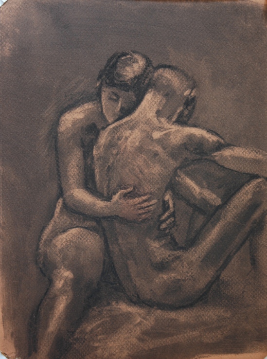
Large quickie of a pose
These are perfect examples of what I always TRY to do–get the shape and size correct, let my strokes suggest fingers if I am lucky. Below are some hands I had been working on the last two weeks–first are the “draft” ones, then the finished ones:

Detail, Week 1 of Pose

After second week, I’m not exactly proud because there is little improvement. Sometimes that happens too–I keep trying to find the magic, and I keep getting the pedestrian.
Take a look at yesterday’s hand:

29 Weeks
As I worked on her hand, I was consciously applying what I knew I was going to write about in the blog. We can only speculate whether that helped. I painted that hand at least five times, not changing anything really, just varying the contrast, the values. But I did that very same thing to the entire body.
This was a first-time model, recruited by one of our regulars when she learned that we value the opportunity to paint a pregnant woman. We have her for next Monday’s session too, but I think I am content with this effort and so plan to work on a portrait next week.
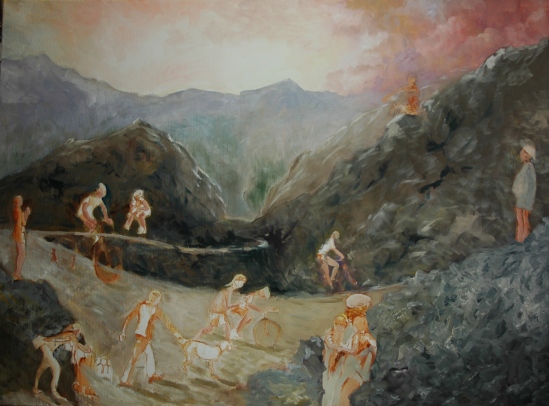
I set up the lighting for “29 Weeks” to create maximum contrast between the light hitting her directly and the shadows behind her. But even while planning to paint a “light and shadow” version, I was pondering whether I am more attuned to “local tone” painters, as one of my DVD experts, Quang Ho, terms it. Van Gogh, for instance. Van Gogh paints relatively flat colors, representing the actual color of the object without showing the effect of light or shadow. To separate elements one from another, he often outlines them in a dark line. To create texture and interest in large shapes, he makes patterns. No gradation, no atmospheric perspective. Here’s a good example:

A Meadow in the Mountains Le Mas de Saint-Paul 1889Paul (1889), by Van Gogh
Imitating Van Gogh gives me a instantaneous rush of pleasure–it could be the thick paint, the permission to abandon shading, the richness of color. Whatever, I feel good even when the painting turns out not so good. Achieving a quality result result after hours of laboring over the core shadows, the half tones, the reflected light, etc, etc, leaves me with a feeling of accomplishment, but no real “high”. As I painted “29 Weeks” I was thinking about that even as I painted light and shadow. Maybe, for next week, I should try the Van Gogh approach and see how it comes out. And see if it gives me a “high”.
Aline Lotter is currently exhibiting:
at the Hatfield Gallery and the East Colony Fine Art Gallery in Manchester (both are in Langer Place, 55 S. Commercial St., Manchester, NH); at the Bartlett Inn in Bartlett and the Bernerhof Inn in Glen; at the Red Jacket Inn in North Conway; at the law offices of Mesmer and Deleault at 41 Brook St in Manchester; at the Manchester office of Congresswoman Carol Shea Porter; two paintings are hanging at the Bedford Library as part of the Womens Caucus For Art exhibit “Summer Bounty”; a single painting is on view at the Radisson Hotel in Manchester for the summer; and at her studio by appointment (email: alotter@mac.com). You may also view paintings with prices and order prints at my Fine Art America page. If the painting you are interested in is not there, or if you prefer to bypass that experience, you may contact me using the private feedback form below. If you want to add a public comment to this blog, go to the bottom of this page where it says “Leave a Reply”, and enter your comment in that box. I love to get public comments, so don’t be shy!
.