Essay on Composing Pictures

(Almost) No pictures this week, but lots of words.  My two CF card readers both died on me, so I can’t transfer my camera photos to the computer.  Luckily, I had on my mind that I should write something about the workshop I took last month with Paul Ingbretson, on the subject of Composition . . . of paintings, of course, but I decided that the material applied equally well to photography.  So I use the word “picture” throughout the essay.  At the end, for purposes of illustration, I’ll include a painting that I corrected a few weeks ago at Paul’s recommendation.  Yesterday, Paul met with us again to see what, if anything, we had retained from the workshop, so this is a good time for me to review and reconstruct my thoughts on the subject of composition.

I have written this up not from the outline Paul gave us, not from the notes written up by a former student of his and handed out at the workshop, not even from the notes I produced myself (radical happening, that–I never take notes).  No, this is mostly a mergence, a convergence, of what I absorbed from what Paul was trying to get across plus a few elements from my own experiences.  I hope it makes sense and somewhere in the prose produces a lightbulb of understanding for someone, an understanding that had not previously existed.

Composition of Pictures in a Nutshell

(Thoughts after taking workshop on “Composition” with Paul Ingbretson)

 The composition of pictures involves the harmonization of elements with respect to:

Arrangement/placement of shapes/objects

Color (hue—red, blue and yellow) given to the shapes and the background

Value (light, dark, all gradations in between) given to the shapes and the background.


The goal of good composition is to achieve Unity AND Variety—and to help get across the idea or mood that the artist wants to express.  It is VARIETY that makes the picture interesting, but UNITY is necessary to create harmony, loveliness, and the chosen mood.

Beginning with your choice of a subject and your selection of elements to incorporate in your picture, you are making compositional decisions. What colors, for example, and why?


ARRANGEMENT

After choosing a subject, and after selecting the objects or elements (or shapes) that you wish to incorporate in that subject, your next task is to arrange those elements or objects so as to distribute them in the picture harmoniously and interestingly.   Your decisions will have to be informed by the colors and values of the objects. Therefore, you have to be thinking about all three major concepts—arrangement, color, value—at the same time.

[Arrangement choices while painting en plein air in a landscape do exist, albeit limited by reality]

Rules: Create overlaps; avoid tangents. Avoid same sizeness of objects or distances between them. Avoid boring!

Placement of the arranged object(s) within the picture frame  involves cropping the picture for best effect—should the center of interest be in the middle, up, down, right, left, etc.?   Consider zooming in, or out.

Subtopic: LINE

However, the most important effect of arranging  is the line or lines that will be created thereby—of the objects AND the values (see below). The dominant line or “thrust” may be symmetrical or asymmetrical, simple or complex, straight or curved; can form a geometrical shape like a triangle or circle, or can meander, like the letter “s”. The dominant line had better not be boring!  Subordinate or counterlines add interest as well.

[One of the few rules–to be broken at your own risk–is: Do not place an interesting element close to the edge of the picture where it might distract from the intended focal point.]

Rule:  For the sake of unity, patterns need to be repeated, but for the sake of variation,may not  be duplicated exactly.  Patterns need to harmonize with one another.


COLOR

The initial selection of subject and objects/elements already goes a long way toward determining a color scheme.   However, you will need to think about a dominant color, and make sure that the placement of that color will unify (harmonize) the picture.

[Outdoors, the dominant color is blue. We don’t “see” it because our eyes seek out the reds and yellows.]

Weaving or spotting of one color throughout the picture tends to unify the picture. Discordant colors, like discordant music, if used, can succeed only if they are well placed and mean something. Background color is critical to harmonize the picture and to set off the subject.

Although one primary color should dominate throughout the picture, variations on the other two primaries should be represented. A monotone is (usually) not very interesting. That is not to suggest that any of the colors need to be high in chroma. Subtlety can be more fascinating than stridency.

If a color is used only once in a picture, that object tends to stand out in importance. Even if subtle variations of the color are “smuggled” elsewhere in the picture, that singular object will remain the most important one in the picture.

Rule of threes: repeat a particular color three times (in three different places) and repeat pattern three times (but don’t duplicate!)

VALUES

The distribution of values in a picture creates abstract patterns that intrigue the mind of a viewer. The eye jumps to an area of high contrast, or to the lightest area in the picture.

Silhouettes are example of extreme values—light and dark with little mid values.

Spotting of values (lights or darks) may create or support lines.  Hence the compositional element of “Value” is actually a subtopic of Arrangements.  Perhaps everything is a subtopic of Arrangement and we circle back to the concept that composition means Arrangements–of shapes, lines, colors and values?


MOOD

The mood of a picture is the narrative that the artist wants to express or explore. All elements of composition must be geared to serve the mood.

The End.  For now.

The corrected painting I have to show you is an example of the importance of color and the rule of avoidance of a singular color.  You have seen this painting several times before, as I struggled with colors and values in an effort to “make it work”.  The basic layout was pleasing to me, so I could not figure out why I was not totally happy with the painting.  Paul told me why.  Here is the most recent but not final version of “Three Turrets”:

Three Turrets, v1.3

Three Turrets, v1.3

Here is the latest, corrected version:

Three Turrets, updated

Three Turrets, updated (from the porch of the Currier Museum’s art school)

Do you agree that the added patch of green in mid left harmonizes the painting with the previously singular patch at bottom right?

Aline Lotter is currently exhibiting:

at the Hatfield Gallery and the East Colony Fine Art Gallery in Manchester (both are in Langer Place, 55 S. Commercial St., Manchester, NH); at the Bartlett Inn in Bartlett and the Bernerhof Inn in Glen; at the Red Jacket Inn in North Conway; at the law offices of Mesmer and Deleault at 41 Brook St in Manchester; at the Manchester office of Congresswoman Carol Shea Porter; two paintings are hanging at the Bedford Library as part of the Womens Caucus For Art exhibit “Summer Bounty”;  a single painting is on view at the Radisson Hotel in Manchester for the summer; and at her studio by appointment (email: alotter@mac.com). You may also view paintings with prices and order prints at my Fine Art America page. If the painting you are interested in is not there, or if you prefer to bypass that experience, you may contact me using the private feedback form below. If you want to add a public comment to this blog, go to the bottom of this page where it says “Leave a Reply”, and enter your comment in that box. I love to get public comments, so don’t be shy!

.

Fast or Slow, Which Works Better for Me?

You could rightfully assume that when I turn up on the web after a longer-than-two-week hiatus, I’ll be accompanied by a raft of new paintings.  Sorry to disappoint.  Although many hours in the past 17 days have been spent on various kinds of art-related activities, painting actual pictures was only a smallish part of it.  One workshop with the accomplished portraitist Mary Minifie produced a single portrait (representing three days of labor), while another three-day one with Paul Ingbretson on composition produced nothing but horrible practice scribbles.  Even worse, last Monday’s session with our lovely preggie model was lackluster, the result not as appealing to me as my first painting of her.

One saving grace: as a small favor to me, my friend Arthur offered to sit for me to do his portrait, and I managed to turn that into a big favor.  Immediately upon viewing the painting after the first sitting, his mom declared herself a buyer.  And after the second sitting, my model asked me to do another one for him.  Although I wasn’t timing either session, I think the first sitting lasted about an hour and a half, and the second about an hour.  Hence:  24 hours on a Margaret produced with Minifie versus 2.5 hours spent on Arthur winging it on my own.  Both paintings are 11×14, so there was no size differential.  No surprise–Arthur’s portrait looks rough while Margaret’s looks delicate.

Arthur

Arthur

Margaret July 2014

Margaret July 2014

Mary Minifie started with the selection of clothing and background.  The goal was to enhance the beauty of our model’s skin tone, and also to create a pleasing composition, in which color plays a major part (a point that got made again in the second workshop).  That took one hour.  I thought then that it was an outlandish amount of time to spend on the selection of drapes to form a background, but looking back, I appreciate its importance.  My photograph of the painting, even when adjusted, may not convey the right color impressions over the internet, especially when the actual hue, value and intensity had been so carefully calibrated.  When you look at the completed painting, can you appreciate the rightness of the color of the background?  What about the color of her shirt?  What about that bit of white in her bodice?  The shirt, by the way, was painted with a lapis lazuli from Michael Harding that I found in a batch acquired through eBay.  So beautiful–the blue used by Vermeer, before ultramarine was invented.

The next big chunk of time was spent on Mary’s demo of, and our attempt to duplicate, the egg approach to portrait painting.  We first tried it on a small 5×7 panel, then on our big panel.  The basic idea:  paint an oval in the shape of the model’s head matching the tint of each area of the head and neck, gradually increasing the detail as we decreased the patch of skin being matched in paint.  In theory, the features start to emerge.  Attention is also given to her pearl earring, her red hair ornament, and her hair itself.  Margaret was much better at holding her pose than Arthur, of course.  In theory, the better painting should result from this approach.

However, I am happier with my portrait of Arthur.  It reminds me of a tour de force by Rose Frantzen titled “Portrait of Maquoketa”.  Maquoketa is the name of her home town in Iowa, to which she had returned after a period of trying to “make it” in the Big Apple.  She set out to paint all of the Maquoketa residents who were willing to sit.  You really should visit this page where the story and all of the portraits are kept.  In the meantime, enjoy this cover of her book, which contains all 180 of the portraits and a clever flip-book effect in the corners, whereby you can watch a painting in progress.

Frantzen book cover

Frantzen book cover

Frantzen’s method is called “alla prima” because the paintings are completed in one sitting without any kind of underpainting or academic preparation.  Alla prima (or almost alla prima in “Arthur”‘s case) suits me better than the classical approach mastered so well by Mary Minifie.  Alla prima is something I can do now, whereas the more academic method would take me years to master, and I don’t have that kind of time left to me, unfortunately.  Although I expect to live to be 100, I’m not sure I will be able to paint until 100.

Aline Lotter is currently exhibiting:

at the Hatfield Gallery and the East Colony Fine Art Gallery in Manchester (both are in Langer Place, 55 S. Commercial St., Manchester, NH); at the Bartlett Inn in Bartlett and the Bernerhof Inn in Glen; at the Red Jacket Inn in North Conway; at the law offices of Mesmer and Deleault at 41 Brook St in Manchester; at the Manchester office of Congresswoman Carol Shea Porter; two paintings are hanging at the Bedford Library as part of the Womens Caucus For Art exhibit “Summer Bounty”;  a single painting is on view at the Radisson Hotel in Manchester for the summer; and at her studio by appointment (email: alotter@mac.com). You may also view paintings with prices and order prints at my Fine Art America page. If the painting you are interested in is not there, or if you prefer to bypass that experience, you may contact me using the private feedback form below. If you want to add a public comment to this blog, go to the bottom of this page where it says “Leave a Reply”, and enter your comment in that box. I love to get public comments, so don’t be shy!

.

Aging

Well, it happened again.  I forgot to post Monday’s blog.  I was so pleased with myself Sunday for taking the photographs and uploading them to WordPress, that I must have subconsicously given myself credit for completing the job.  Or it’s age.  Twice in three weeks–not good!  Good thing I am wrapping up my law practice.

Yes, it’s official.  I will not be renewing my license to practice law in the state of New Hampshire at the end of our fiscal year.  As of July 1, my status will become “inactive”.  Of course it may take weeks after that to tend to my clients and sort through and dispose of the accumulations of 29 years.  Some of my clients I will continue to be able to serve (e.g., by preparing tax returns) but for those requiring the services of a member of the Bar, I will try to place them with new lawyers.  The tax clients will be the hardest to place–not many lawyers want to represent taxpayers in trouble with the IRS.  That’s because usually the trouble originated in some fault of the taxpayer–well, not “fault” exactly, but behavior.  When people get smacked down or just depressed, they can’t cope with taxes, and of course, to the IRS, it’s just another same old story.  Our system of income taxation confers upon the taxpayers great responsibility and great trust.  Alleviating that burden on the taxpayer is, in my opinion, the only decent argument in favor of a sales  or value added tax.  Thank God I won’t have to even think about this stuff in a few months (except, as I said before, a few tax return preparations).

So this week’s original topic was going to WIPs (works in progress),  WIP and RIP (rest in peace) are two possibilities existing simultaneously in a half-finished painting, like alternate universes.  RIP means I never return to finish the painting.  WIP is a hopeful designation.  Two unfinished paintings this week are, I hope, WIP and not RIP.

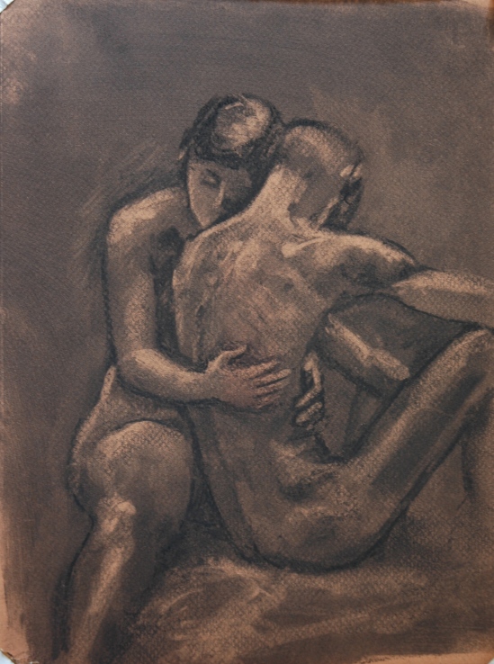
But let me show you first–three completed charcoal drawings from our Saturday Life Group.  I’m pretty psyched about them.  Our couple was back, and all of us were a little more at ease with each other and the whole concept of two entwined naked bodies.  For one 2-minute gesture pose, they even struck a kissing pose.  It dawned on me that I could not get more appropriate pieces for the McGowan Gallery‘s annual Valentine’s show,  “Love, Lust and Desire“, than these drawings.   And pieces in the show are limited in size to 8.5 by 11,  so when I decided to bring my 9×12 high-quality pastel paper to SLG that morning, Fate was with me.

I don’t quite remember (age again?) which poses were what length, but the range was 20 minutes to 50 minutes.

LL&D No. 1

LL&D No. 1

LL&D No. 2

LL&D No. 2

LL&D No. 3

LL&D No. 3

I started all three by smearing the paper with soft charcoal.  Then I deployed the kneaded eraser to bring out the lights.  The paper was not white, so I could have increased  the contrast by using white pastel, but for some reason, I felt that much contrast would be too intrusive.  Does that make any sense at all?

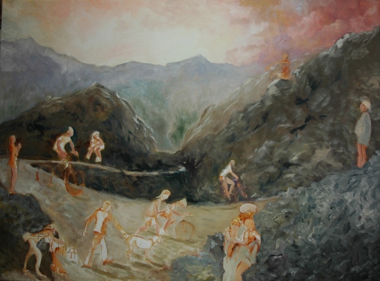
WIPs I have several, but the most important is my Mt. Washington Oeuvre.  I slapped some more paint on it, and it’s beginning to take shape.  I’m getting excited about it again,  as the background gets covered with paint.

Phase 3--Biking on Mt. Washington

Phase 3–Biking on Mt. Washington

I have to keep reminding myself that I conceptualized the mountains as semi-abstract.  I cannot allow myself to get hung up on painting realistic rocks.  For the figures, I need to resize them–the ones farther from the viewer need to shrink a bit.  I plan to refer to the original photo references for each figure, on my iPad if I can get it to stop  going to sleep.  Consistency in the direction of sunlight also needs some work.

The next work was a WIP yesterday, when I should have posted this entry, but when I got to Tuesday life group this morning, everyone else wanted to move on with a new pose.  So although I may need to tinker with shapes and values here and there, this is essentially a done deal.

Jon seated on stand wip

Jon seated on stand wip

By the way, I made up the background at home, thinking to get a head start on today’s session.  Head start, finish line, same thing almost.  One of my cohorts today commented that I had a nice touch with interiors, suggesting I should consider that as a specialty.  So watch out for that as a new theme, possibly.  I’m pretty opportunistic, like a leaf in a stream of water, just letting it carry me wherever.  So far, no interiors have presented themselves as likely candidates for painting subjects.  George Nick did some interiors that I admired greatly (many shown in his gallery of 2008-2010 paintings here), and Paul Ingbretson, just one floor below our studio, has an interior that would knock your socks off (see it here–called Warm and Cool).  And Van Gogh was very much into interiors.  Can you think of other examples?  Seems to me to be a pretty untapped seam.  Hope I’m not mixing metaphors there.

Aline Lotter is currently exhibiting:

at the Hatfield Gallery in Manchester (Langer Place, 55 S. Commercial St., Manchester, NH); at the Bartlett Inn in Bartlett; at the Red Jacket Inn in North Conway;  at Stella Blu American Tapas restaurant in Nashua; at her law offices at 41 Brook St in Manchester; and at her studio by appointment.