
The poster competition deadline was today. I submitted last week, after much fruitless agonizing. I’d been obsessing over the lettering issue. I was seesawing between disliking formal lettering and being horrified by small misalignments of hand lettering. Here is where I got to toward the end.
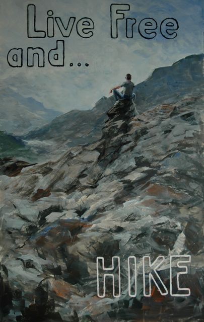
poster, next to last version
As you might notice, the word “and” leaves a lot to be desired. I just couldn’t leave it like that, which meant I had to paint it out yet again. In desperation, I went out and bought multiple sets of stencils and stickers, hoping one of them would solve my problem, but none did. Without really knowing where I was going, I started to paint out the latest version of “and” when I realized that you can still read the letters when they are partially obscured. Clouds, I thought. One of my followers had actully suggested that, and now I was ready for that solution. Which resulted in this:

poster–final version
Am I happy? No, I realized I was never going to please myself, and I had just better stop messing with it. So in it went. I cringe when I focus on the lettering at the top, and just hope I don’t get laughed out of a competition where most of the entrants know exactly what to do with lettering.
On a more upbeat note, the painting (or study) that I created Tuesday turned out really well. I think so, and Peter Clive, our mentor, said about it something to the effect that it was one of my best, and in addition, it showed feeling.
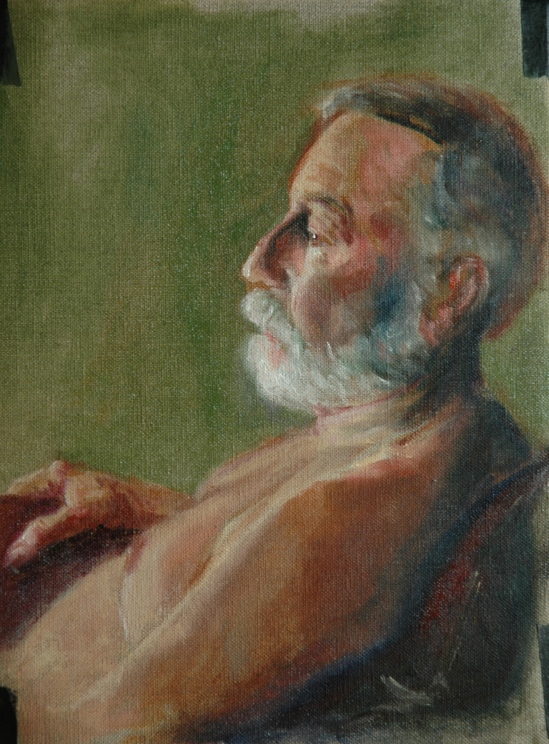
Fletch, in profile
Every day this week I am immersed in a workshop with Steven Assael at the NH Institute of Art. If I can ever get the photos from my phone onto my computer, I will post the progress pictures from his demo. All I can say for now–amazing. I think I have found a kindred spirit. Stay tuned for a shift in my style.
Aline Lotter is currently exhibiting:
at the Hatfield Gallery and the East Colony Fine Art Gallery in Manchester (Langer Place, 55 S. Commercial St., Manchester, NH); at the Kimball-Jenkins Gallery in Concord, NH; at the Bedford Library in Bedford; at the Bartlett Inn in Bartlett; at the Red Jacket Inn in North Conway; at Stella Blu , an American Tapas restaurant in Nashua; at the law offices of Mesmer and Deleault at 41 Brook St in Manchester; at the Norris Cotton Cancer Center in Manchester (part of the Healing with Art program); and at her studio by appointment. Two paintings are also hanging in the Manchester office of Congresswoman Carol Shea Porter.

Good Luck. I will be pulling for you.
Raymond Valliere Sr. umpirerv@aol.com
LikeLike
I do like the letters partially obscured by clouds … makes them loftier rather than “in your face”. Nice portrait of Fletch – especially the eye and, for some reason I can’t quite pinpoint, the mustache! but he looks sad!
LikeLike
Very, very nice of Fletch. Kudos. M.
LikeLike
Are the rocks in the final poster really lit up so much more than the darker ones in the next to last version? Or is that just the camera? I like the lighter one much better. The rocky mountain is so interesting. The Fletch profile is terrific. Eyes show contemplation of age…always a tinge of sadness with so many losses.
ellie freedman
LikeLike
The second photo was taken with more care, ii.e., more light. I glad you like it better. Fletch thinks his nose is not that large, but admits he hasn’t seen it from profile himself.
Sent from my iPad, Aline Lotter
LikeLike