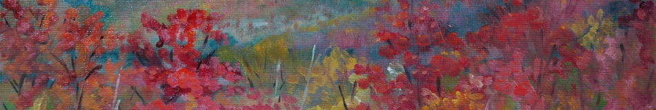
I painted a second layer on my Oscar Night piece entitled “Illustrating Heroic Effort”. I tackled it intending only to tinker with the background, but the figure jumped under my brush. Also, I thought I should let you know a little secret: that painting does not come in the horizontal shape that I shared with you last week. My composition required that horizontal format, but I didn’t want to use a large, expensive, stretched canvases for this short-term-gratification project, and I didn’t want to buy a custom frame for it. My solution was to center the action on a 12×16 canvas and paint black voids at top and bottom so that the illustrated part looks as if it is coming to you via TV, where the wide-screen movies are presented with black bands top and bottom.

Oscar Night phase 2
Here, for the sake of comparison, is phase 1:

Illustrating Heroic Effort
The biggest change that I have made to Version 2 is the darkened background. Peter Granucci has taught me that every well-designed painting is either mostly light, or mostly dark. I was having trouble deciding which way I wanted to go with this one. Version 1 is the mostly light version, with the dark accents (also necessary) being the shadow side of the figure. This version 2 is a mostly dark version, with the highlights (again necessary) being the lit side of the figure. However, the sky and ocean are also light. Too much light perhaps, for a mostly dark painting. I’m leaning toward returning to mostly light. I think the black voids on top and bottom go better with the higher key value scheme.
After painting this layer, I received belated but good advice from Cameron Bennett, who, as an illustrator himself (which I had forgotten because all the courses I took with him were for doing portraits), took an interest in my ruminations re illustration vs. Fine Art.
Oops! That term “Fine Art” beacons me down a detour that I eschewed last week but can no longer suppress (what? you never mixed a metaphor?): so many terms used in the field of art are terms that sound generalized but that have come down to us with meanings very specific. Fine Art is not art that is lovely or “fine” but something that is created to be sold in an art gallery or be exhibited in an art museum. A lot of it is not lovely. “Genre” usually would mean a “kind” or “category” of painting; instead, it refers to a specific subject matter (ordinary people and places, daily life) for painting. “Modern Art” doesn’t mean art that is modern, in the sense of being made today–not even in the sense of breaking away from classical traditions; Modern Art refers to a specific collection of nonrepresentational art made between 1900 and 1950, give or take. (“Nonrepresentational” means, at least as I am using it here, without attempt or desire to accurately represent reality.) “Contemporary Art” used to mean art that is made by living artists, but now it excludes representational art and includes dead artists, and is working its way toward meaning the nonrepresentational art of the period between 1950 and . . . ? I wonder if this sort of morphing of general terms into terms of art (pun slightly intended) occurs in other fields as well. I can’t think of any in the field of law.
Anyway, Cameron gave me some specific suggestions that I hope to implement before my annual Florida trip (next week). Mainly, the hands are not sufficiently suggestive of motion. It just looks like I can’t paint hands. (Maybe I should insert well-painted hands in a box in the corner so as to squelch that impression.) Version 2 might be a little better in this regard. The increased blurriness just happened when I painted the new background over the hands.
My other Work in Progress is actually no longer in progress, but I have the in-progress photo to show you where I was with it at midpoint. This was a two-session pose, so I chose a larger canvas (20×16) for it.

Soft Treatment wip
At this point, I was intending to paint the pattern on the coverlet and was also prepared to fuss quite a bit with the yellow drape.

Formalism with Becky
By the following week, I had lost interest in the coverlet and had become more concerned with unifying the color scheme. So I slashed ruthlessly at the drapings.
I never did get around to painting the left side of the (unstretched) canvas. I can cut away those two inches, but if I do, I’ll have to saw down a panel to mount it on and order a custom-sized frame for it. I’m not sure it’s worthy of that much respect. If only the facial expression hadn’t turned out to be so snarky!
Here’s how it would look as a 12×16:

Cropped Version
Strangely, I find I miss that slashed coverlet treatment, which probably demonstrates how schizoid I am between classical representation and modernistic suggestion-of-reality representation.
Thank you for listening to me work this all out. I see now that what I need to do is fix that snarky expression and then reevaluate the amount of respect due this painting.
Aline Lotter is currently exhibiting:
at the Hatfield Gallery and the East Colony Fine Art Gallery in Manchester (both are in Langer Place, 55 S. Commercial St., Manchester, NH); at the Gallery at 100 Market Street in Portsmouth; at the Bartlett Inn in Bartlett; at the Red Jacket Inn in North Conway; at the law offices of Mesmer and Deleault at 41 Brook St in Manchester; at the Manchester office of Congresswoman Carol Shea Porter; and at her studio by appointment (email: alotter@mac.com).
You may also view paintings with prices and order prints at my Fine Art America page. If the painting you are interested in is not there, or if you prefer to bypass that experience, you may contact me using this feedback form.


Hi, I made a comment in the feedback form for the Fineart America page by mistake. Never noticed that
one before. Sorry.
LikeLike
The Feedback form is new. I’m trying to act like an artist who has stuff for sale. It’s good that you tried that because I never got the feedback. Will have to investigate why.
LikeLike