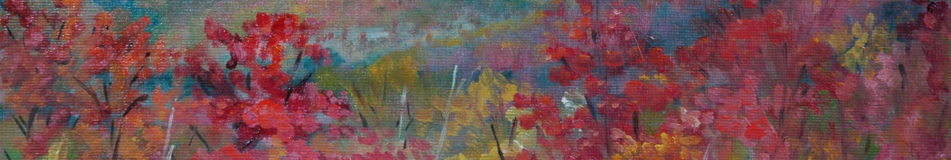
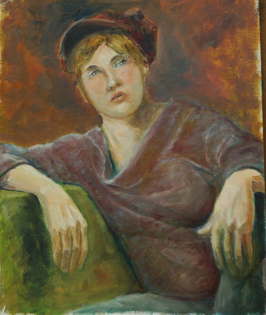
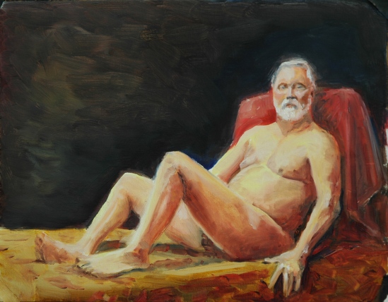
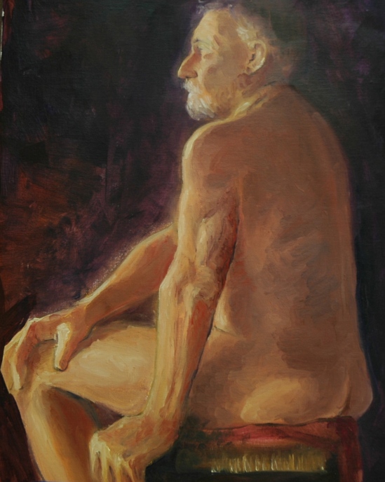
After a snow-impeded itinerary, I finally returned to the winter wonderland that is New Hampshire. Another snow storm yesterday has locked me at home. The city didn’t bother to plow my little stub of a street until it was sure it could build a barricade at the bottom of my driveway worthy of good ol’ New England complaining. Still, I don’t mind . . . didn’t want to go anywhere today anyway, not when I have the lovely task of reliving my adventures in Marco Island, through this retelling.
All thirteen of my Marco 2014 paintings are painted on 9 x 12 carton paper, acquired from Judson’s Guerrilla Painter art supplies. Two paintings are candidates for cropping, as you will see. The first 8 were posted last week, using photos taken with my phone or my iPad. Now that I have new versions taken with my Nikon Digital SLR, I will include them again. A few have endured improvements since last week.
I would love to hear from my followers which painting(s) are their favorites.

Marco 2014 No. 1
This first painting is still one of my own favorites.
Marco 2014 No. 2
I added the sky and make other changes as planned. I can see room for more improvement–punchier lights on the foreground objects.

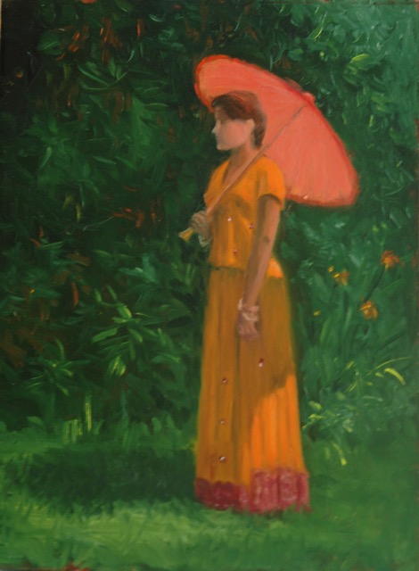
Marco 2014 No. 3 – The Beach
The quickest, simplest is the favorite of many people. I touched up the bird spots. Several had suggested making the spots into kites (the toy, not the bird), but I was concerned about bringing in that level of detail.
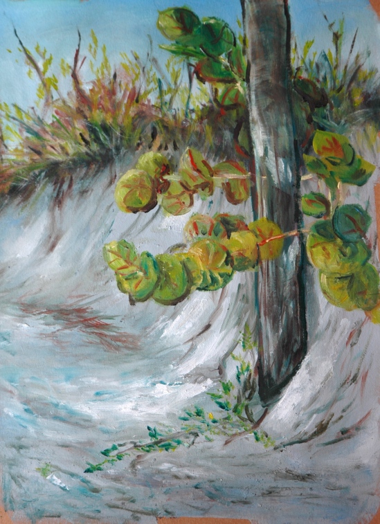
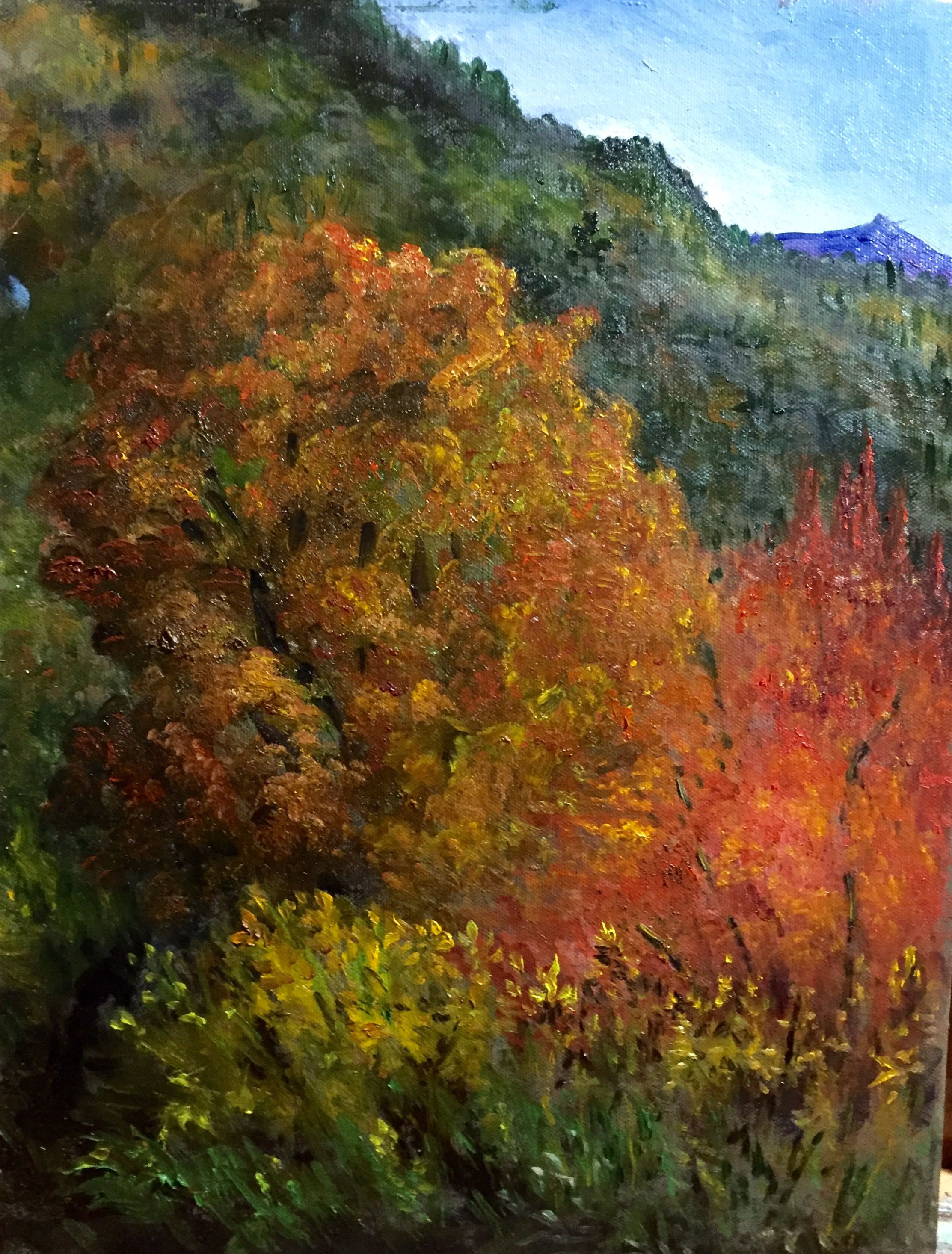
Marco 2014 No. 4 – Sea Grapes
Although I wanted to improve on the definition between light and shadow, I lacked the confidence to do anything about it.

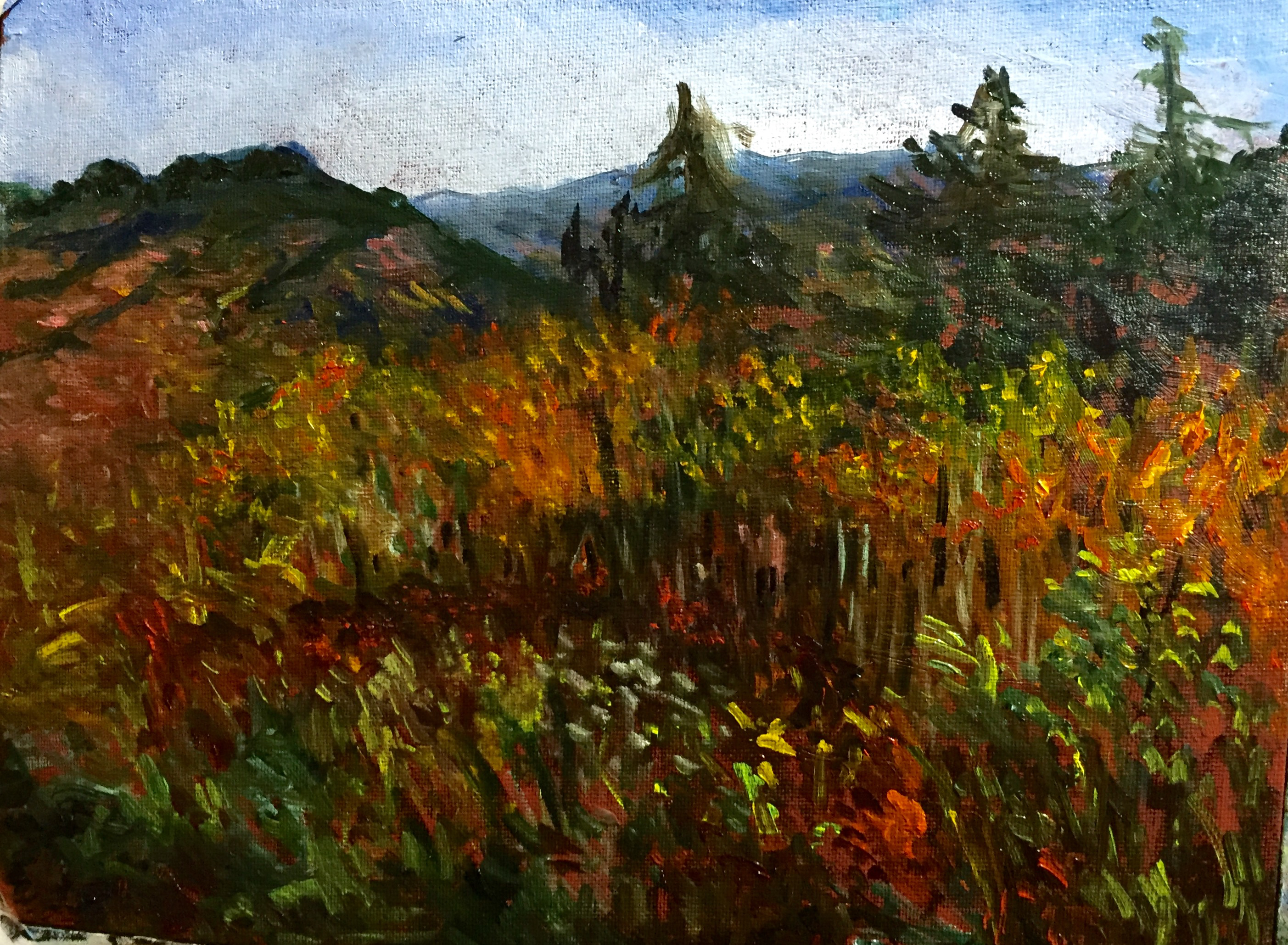
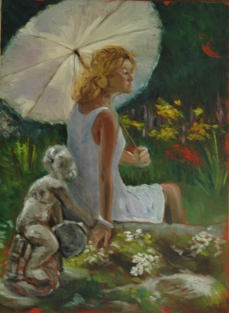
Marco 2014 No. 5
The only improvement I made to No. 5 is the color of the shadows on the building. Less green, more blue.
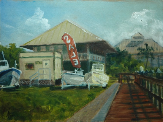
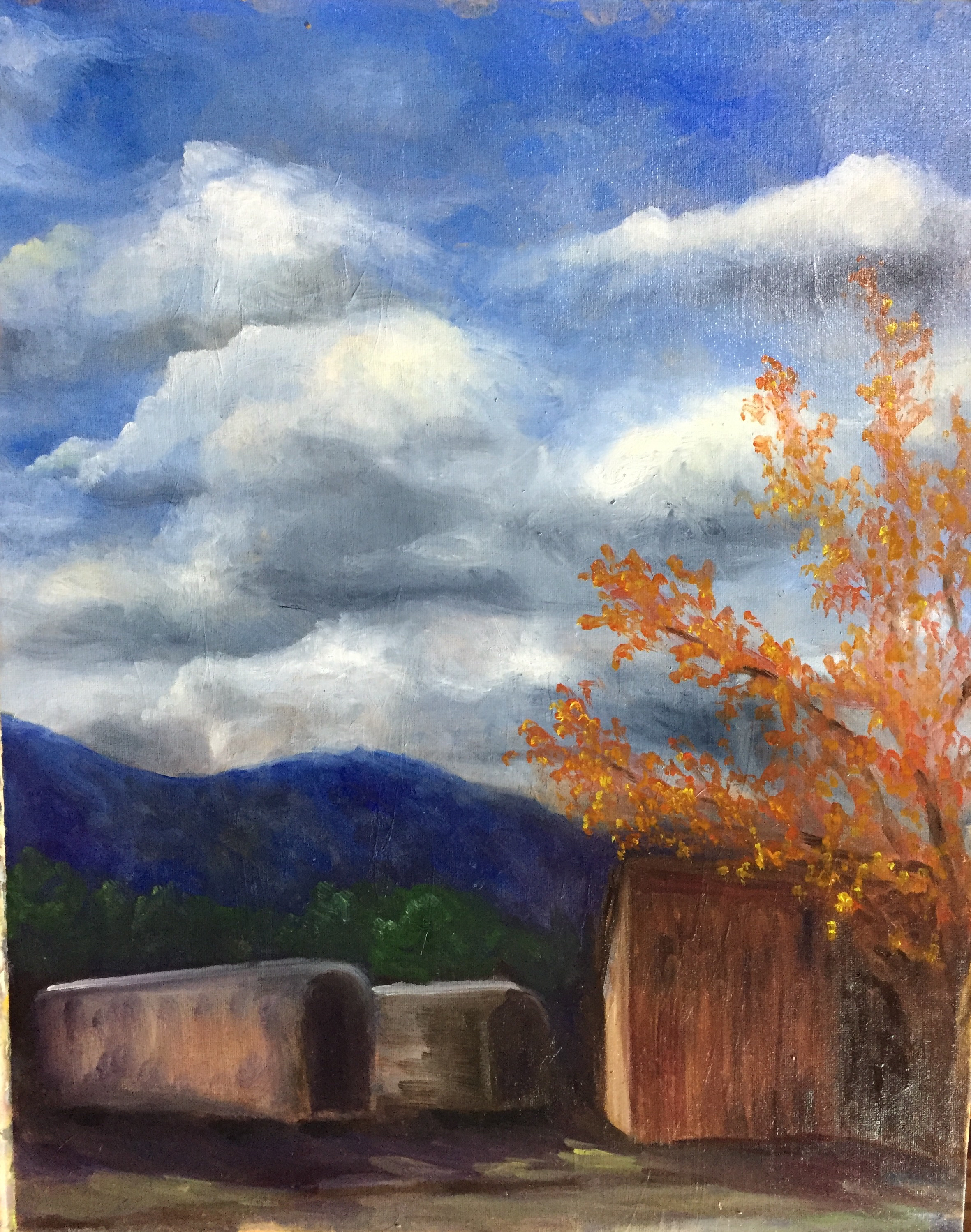
Marco 2014 No. 6–Calusa Boat Yard
No changes to this one. But when I posted it last week, I didn’t include any narrative, and it deserves a narrative. On my right, over the railing, is a roof covering a shelf-like area where successful fishermen (women don’t seem to be into that kind of thing) can clean their fish. There’s a water spigot and a tube into which the waste is shoved, which apparently drops the waste somewhere in the water underneath, where the waiting pelicans cannot access it. There is a prominently posted sign forbidding the feeding of the pelicans. But they hover nevertheless. Because mistakes are made. Sometimes a particularly motivated fish escapes the grasp of the fisherman and dives in the waiting maw of a pelican.
I was in that spot because of the shadow afforded by the roof. So I was kind of in the way, but not so much as would require me to move. One of the fisherman wanted this painting, but he was willing to pay only $100 for it. I felt it was worth at least $200. I hope he’s sorry now!
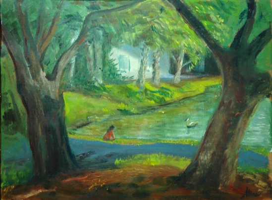
Marco 2014 No. 7–Pond with girl and goose
I defined the figure of the little girl to show her posture better. She was a real little girl, but she never sat for me on the bank like that. The Canadian goose was one of a pair cruising around with a pair of Muscovy ducks. The walkway pavement really was a purply black.

Marco 2014 No. 8–dog walkers’ park
I reworked this painting a lot. The bridge alone got about four repaintings. A figure went in, came out; the original dog came out, a new one came in. I was looking for something expressive, trying to channel Van Gogh. Here was the previous version.

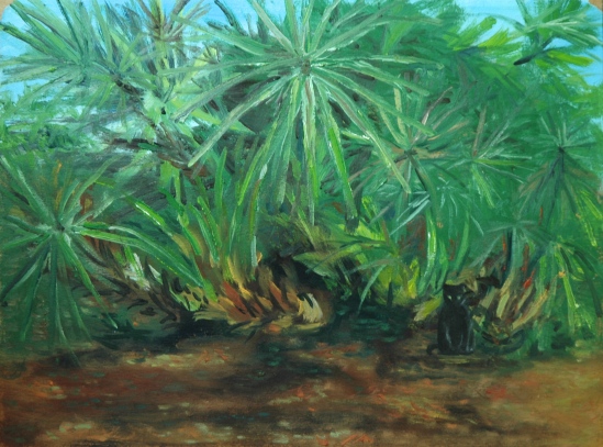
Marco 2014 No. 9
Mary lives on a golf course, of course. If you don’t live on either water or a golf course on Marco, you are doing something wrong. We reconnoitered the course but found nothing to inspire us to paint, but on our way back to her house, we both fell in love with this huge palm, catching light here and there, so that’s where I set up. It was close to the back door to her lanai (screened in terrace containing swimming pool–standard equipment in Florida). In the lanai, watching me closely, was her black cat, Tara. So I popped her in the painting. Jungle cat with green eyes.

Marco 2014 No. 10
Yet another park–the same where we had painted our picnic in the rain last year. Both Mary and I decided to paint the reflections in the lake. She draws in pencil, then paints in watercolor. (I had intended to take pictures of her paintings too, and share with you. But forgot until this minute. The fog of age.) Anyway, she takes a lot longer to complete a painting, what with all that drawing first. I was finished with mine, grousing about the difficulties (I have a list of them with respect to reflections), and was just diddling around with it when a huge flock of ducks swooped down and started swimming furiously around in circles. Whassup? I thought. A few of them climbed the bank over on the right, out of my frame, investigated, and returned to swimming in circles. Then arrived a man and woman laden with buckets. They dumped the contents of the buckets under the tree lately investigated by the scouter ducks, and a parade ensued. This was what the ducks were waiting for! Since I wasn’t doing anything important anyway, I stopped fussing over the ever-changing tree, grass and house reflections and changed up my pond to accommodate a representative grouping of circling ducks. Are the ducks too black? That’s how they appeared to me in that low light, silhouetted against the bright water.

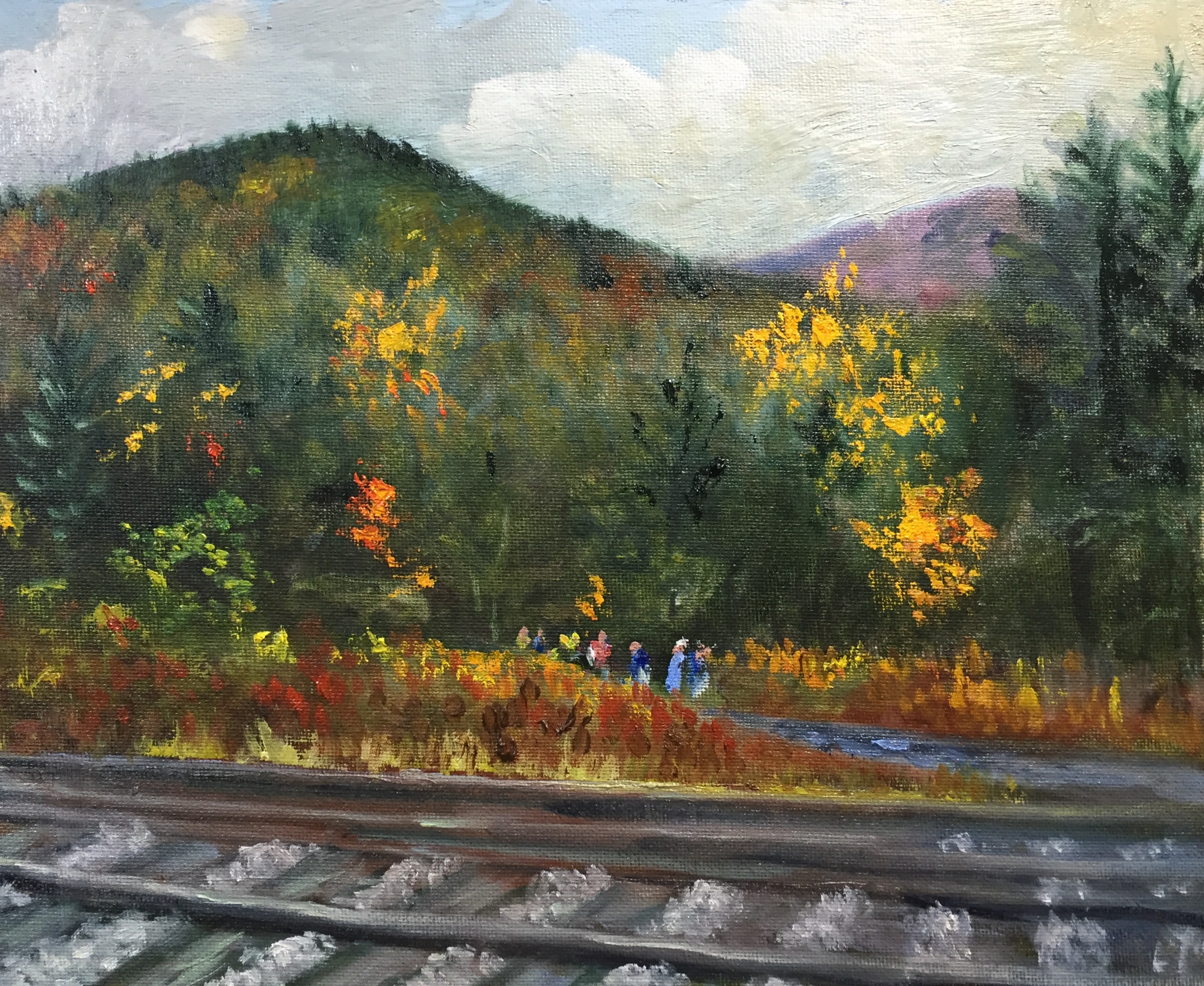
Marco 2014 No. 11
Flo joined us, down from Cape Coral, and the three of us caught up with that same group of outdoor painters who go out each Wednesday to paint together at specific locations. This week’s location, the Esplanade, includes fountains, retail establishments, boats (moored to the right in this view), and lots of people. Rich people. We spread out. I chose to paint the bar because I thought it was time that I tried something really difficult. I had my eye on the bank of liquor bottles in the background. I spent all day on this one painting, and much of that time was spent repainting the elements, trying to get them to work together. Perhaps I overdid it. Does it look stilted?

Marco 2014 No. 12 – Vanda orchid
Although our weather was warm and sunny all the time I was there, one day was extremely windy. The three of us decided the better part of valor was staying in the shelter of the lanai and painting Mary’s Vanda orchid. I tried to mix up the color of the orchid from my various reds and blues, but it just wasn’t working–not even close–, so I borrowed some Magenta from Flo and voila! That made me curious about magenta–why wouldn’t it mix from blue and red? Turns out it is special; because blue and red don’t mix past purple on the spectrum of color–they don’t meet on the color spectrum. A synthetic red called quinacridone makes possible the purply red known as magenta or fuchsia. I am adding Magenta back to my palette and bowing respectfully to all quinacridones.
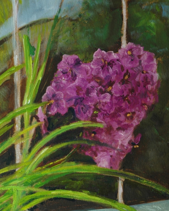
Marco 2014 No. 12 detail of orchid
Flo’s version of the orchid was more of a closeup, and just like a kid, when I saw her treatment, I decided I wanted that too, so here is my cropped version. Is it better than the one with roots in the foreground and swimming pool and palm tree in the background? By the way, I need to thank Deirdre Riley, who paints flowers awesomely; she advises what I call the big blob attack method of painting flowers, whereby you paint in the general shape of the entire arrangement, then pick out lights and darks to form the shapes of individual flowers. That approach stood me in good stead with this extraordinary plant with a single stem smothered with individual flowers.
Last, but certainly not least, here is the cut-down version that I prefer:
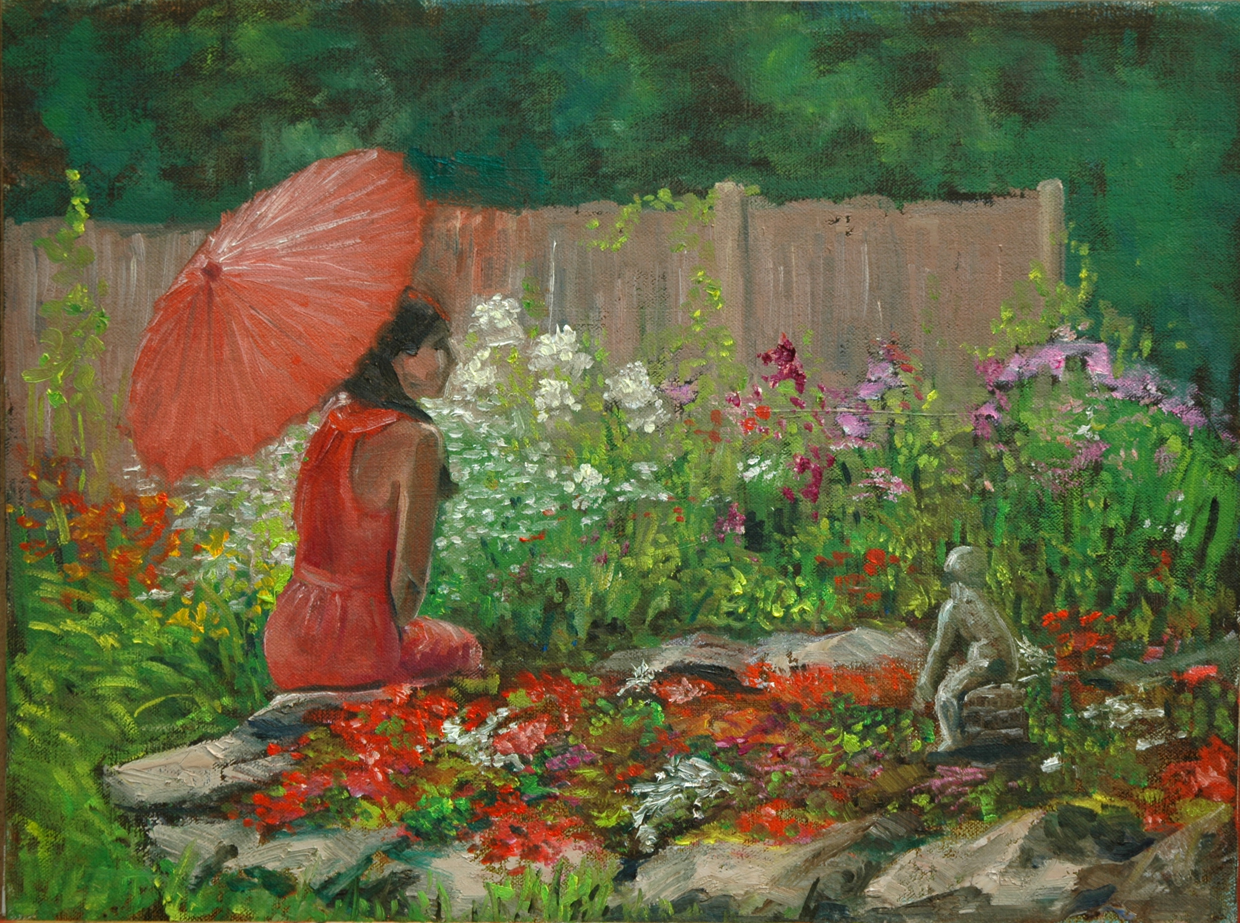
Marco 2014 No. 13 v.2 (6×12)
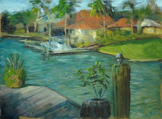
Before cropping, this is the painting:

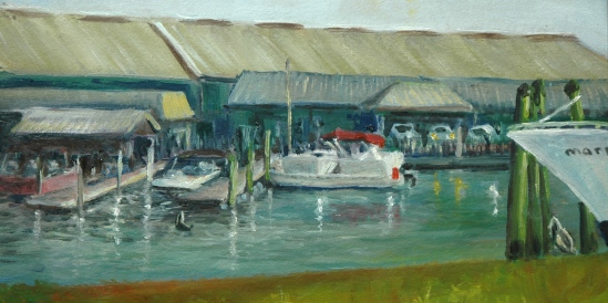
Marco 2014 No. 13 (9×12)
I haven’t actually cut it up yet, so if you think I am wrong to do so, please tell me now. Not later!
The location is the Rose Marina, where I have painted before, but this time we explored our way around the water to a residential neighborhood that has this view of the action. Notice there is a major bow sticking its nose in at the right. While I was painting, this ship, the Marco Island Princess, got underway with its passengers for a sunset cruise in the Gulf . . . analogous to a Mount Washington dinner cruise on Lake Winnepesaukee, but much smaller. The foreground is a grassy knoll that drops down to the water out of your view (and mine), which complicates your understanding of what is happening. That’s why I prefer the cropped version. Yes, there are a couple of pelicans in the painting.
Aline Lotter is currently exhibiting:
at the Hatfield Gallery and the East Colony Fine Art Gallery in Manchester (both are in Langer Place, 55 S. Commercial St., Manchester, NH); at the Gallery at 100 Market Street in Portsmouth; at the Bartlett Inn in Bartlett; at the Red Jacket Inn in North Conway; at the law offices of Mesmer and Deleault at 41 Brook St in Manchester; at the Manchester office of Congresswoman Carol Shea Porter; and at her studio by appointment (email: alotter@mac.com).
You may also view paintings with prices and order prints at my Fine Art America page. If the painting you are interested in is not there, or if you prefer to bypass that experience, you may contact me using this feedback form.