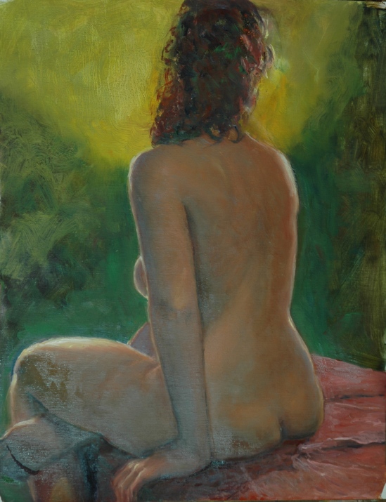
“Life”, in that painting from life is one matter; “Death” in that painting in a cemetery is another matter. A good balance. First, the studies of a living person: Becky again. Three of them. Done at the class I have been taking Tuesday nights at the Institute. Deirdre Riley is the instructor.

Large quickie of a pose
The first week our longest pose was a comparatively short one–perhaps 40 minutes. At the beginning of the course, one or two of the other students thought they preferred short poses, but now I think everyone is into the idea of the long pose and the possibility of achieving a polished drawing or painting. This coming Tuesday, with luck, we may get the first of a carryover pose, repeating a second Tuesday–upon which event my product will no longer be half-done. It’ll be seven-eighths done. (The reason I am not finishing even a sketch in the three hours is because I am using 20×16 pieces of canvas, instead of the usual 9×12 or 11×14.)
The second two poses were each for the entire duration of one class, or three hours less break times.

Pose No. 2

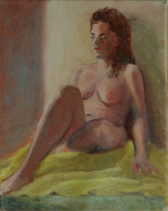
Almost Standing
I seem to be having trouble getting the length of Becky’s torso right. The first one, it looks too short; the second one, too long. But “Almost Standing” had potential, I thought.
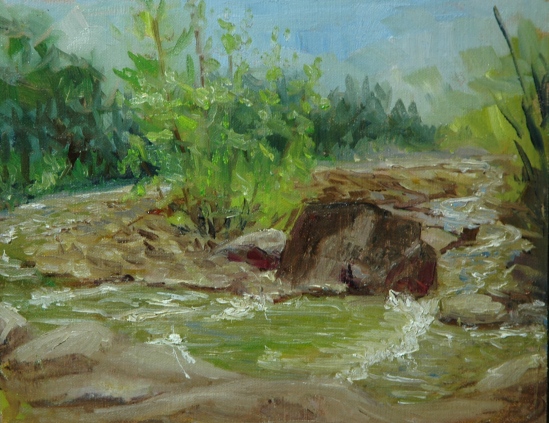
Saturday was a beautiful, if chilly day to work outside. I packed up my new Soltek easel for its first trip out into the field. Flo Parlangeli and I launched ourselves southward toward Lowell, Massachusetts in response to an invitation to paint in a garden cemetery there. The Lowell Cemetery is on the National Register of Historic Places. It was modeled after another famous cemetery, the Mt. Auburn, in Cambridge, Mass. The two of us were, apparently, the only New Hampshire artists there on Saturday. In fact, when we got there we were entirely alone and thought perhaps the event had been cancelled. But others showed up later, and I had two of them competing with me for the best take on the Ayer Lion. I fell in love with the Lion the minute I laid eyes on it. Hey, it’s a large putty-cat and you know how much I loves me my putty cats! The sad and dreamy expression on his face spoke to me. I hope I captured it in my painting.

The Sad Lion of Lowell
My second cemetery painting was inspired by the sight of profuse white flowers emerging from the shadows around a dark and mysterious crypt-structure. From my web search for May-blooming shrubs with white flowers, I have concluded that the genus of the plant is Spirea.

Spirea Fall (as in “water fall”)
In exactly one week, Sunday June 8, I will be finished cleaning up after the reception for my and Larry Donovan’s Featured Artists show at the East Colony Fine Art Gallery. The reception starts at two o’clock and ends at four or whenever people drift off. My paintings look better in person, so I hope lots of my followers will be able to view the exhibit and come to the party. If I have any scrap of presence of mind left, I will take photos and post them next week.
Aline Lotter is currently exhibiting:
at the Hatfield Gallery and the East Colony Fine Art Gallery in Manchester (both are in Langer Place, 55 S. Commercial St., Manchester, NH); at the Bartlett Inn in Bartlett and the Bernerhof Inn in Glen; at the Red Jacket Inn in North Conway; at the law offices of Mesmer and Deleault at 41 Brook St in Manchester; at the Manchester office of Congresswoman Carol Shea Porter; and at her studio by appointment (email: alotter@mac.com).
You may also view paintings with prices and order prints at my Fine Art America page. If the painting you are interested in is not there, or if you prefer to bypass that experience, you may contact me using the private feedback form below. If you want to add a public comment to this blog, go to the bottom of this page where it says “Leave a Reply”, and enter your comment in that box. I love to get public comments, so don’t be shy!
.