


In terms of number and variety, my output last week may seem disappointing–my figure workshop with Peter Granucci skips a week and last week was a skip week; then my portrait class with Cameron Bennett was taken up with critiques and a demonstration painting by Cameron; and finally our Saturday life group (SLG) was cancelled because our model was sick with the flu. However, the Sunday clothed-model group met as planned, and resulted in a piece that makes me happy. No, make that thrilled.

Profile of Sabrin
This is Sabrin, the same model that we had the last two weeks. The first week with Sabrine I painted a 3/4 portrait from a 3/4 view on the lighted side (see that week’s blog). The next week, I drew her in profile in charcoal (last week’s blog). This week, I found myself again on the side with a profile, but with an exciting new headdress and the full three hours to paint. I actually finished in about 2 and 1/2 hours. The panel was small–only 12×10.
Her headdress pattern comes from gold threads. I created the impression of a gold pattern by simply drawing through the wet paint with my “color shaper”, which is a rubber-tipped point. I used the same technique to create her earring. When the paint dries a little more, I will add some sparkle to the gold threads, her earring and the gold chain around her neck.
You might be able to see that I added cerulean blue to the highlights on her skin. The light bounced off her skin so brightly that it was hard to determine exactly what color it should be (never pure white! Lois Griffel’s voice echoes in my brain). I decided to use the blue of the sky, even though she was lit by a combination of natural light from the window and a spotlight from the same direction. The blue works, I think.
I have to confess I got the idea of using blue light from two sources–one is Peter Granucci who uses the blue light on rocks and other surfaces lit by the sun, and the other comes from a class at the Institute conducted in the same room where I take my portrait class with Cameron Bennett. The students left their works in progress in this room and their assignment was apparently to paint the lit surfaces of a human figure in a bright aqua blue. Sounds bizarre, right? But it was remarkably effective. My experiment with the same was much more subtle.
Last week, the piece I was happiest with was a painting of a portrait from a photo I did not take, indeed from a photo of a person who was a total stranger to me. How does the one compare to the other?

Contest Portrait, Final
I love both of them equally. I can’t come up with a way to measure the merit of the painting from life over the painting from a photo–even knowing intuitively that the former ought to be better than the latter. But maybe any judgment would be contaminated by one common attribute that helps them both–I didn’t care about getting the exact likeness of either one, which freed me to just paint beautiful, as I see beautiful.
Aline Lotter is currently exhibiting:
at the Gallery at 100 Market Street in Portsmouth; at the Sage Gallery in Manchester; at the Hatfield Gallery in Manchester; at the Bartlett Inn in Bartlett; at the Red Jacket Inn in North Conway; and at her studio by appointment.
Link to website: www.paintingsbyaline.com
“Splurge” seemed the right word, so I looked it up, and indeed, there is a secondary meaning that covers what I feel I have today: an extravagant display. Beginning with the figure workshop with Peter Granucci last Tuesday, through the class with Cameron Bennett, and and ending today with my last–no, my most recent–edits of the Sami and Noodles portrait, my week was full of figures and faces, most of them falling squarely under the category of portraiture. Oddly enough, my favorite of the week is the most unlikely candidate. I entered a contest to paint a portrait from a supplied photograph by Shan Peck–he is the photographer and the contest administrator and the juror. It’s not a big deal, just a fun thing to do, and it became a project to do in my class with Cameron. I can’t reproduce Shan’s photo here–he made a point of forbidding any use of it other than to paint the portrait–but you can link to it here.
Since we were encouraged to upload our works in progress, I snapped a few of those on my cell phone (had to figure that out first–what a banner week!).

WIP for contest
Contest Portrait, Final
Our Sunday model, Sabrin, was slated to keep the same post and dress as she had last week, so I went prepared to draw a charcoal portrait of her. She was very late in arriving, however, so another artist volunteered to sit for us. As a result, I came away with two charcoal portraits, one better than the other. The first did not capture a good likeness. If I had had the time, I hope I would have achieved a likeness. As it stands, I believe I exaggerated the size of her nose.

HH Profile
The profile of Sabrin came out well, I think, likeness or not. Her mouth was very interesting and challenging to capture.

Sabrin, in charcoal and profile
While we are on the subject of portraits, I took another crack at the portrait of Sami and Noodles. It’s harder to capture children, I think, because you have to keep a light touch. Their features are so delicate. For that very reason, though, painting portraits of children makes for terrific practice in making marks at the precisely correct spot to provoke a translation in the viewer’s brain that matches reality. Our eye/brain supplies so much of the information that an artist who tried to lay out all the information before you, especially in a child’s face, comes across as heavy-handed and awkward. As a result of trying to avoid heavy-handedness, I spent most of my time today painting out the details that I had so carefully laid in earlier. I may not be there yet, but at least I know where I want to be.

Sami and Noodles
I’m not done yet. Remember, I promised a “splurge”. Tuesday, Peter suggested that my last drawing was worthy of working up to a finished piece. I had that drawing pad with me Saturday when my car broke down, so I was able to pass the time waiting for the tow truck by working on that drawing. Never has such a usually tedious wait passed so delightfully.

Nude woman in chair
Wait, there’s more. Saturday morning (the regular Saturday life group) I completed two charcoal drawings with which I was happy. One of my favorite models–it’s remarkable how much difference a good model can make to the drawing. Last week’s was uninspiring. This week’s–well, it’s what keeps me going back.

R, reclining

R, seated, in blue and yellow
I think that’s it. Seven days, seven happy figure/portrait projects.
Aline Lotter is currently exhibiting:
at the Gallery at 100 Market Street in Portsmouth; at the Sage Gallery in Manchester; at the Hatfield Gallery in Manchester; at the Bartlett Inn in Bartlett; at the Red Jacket Inn in North Conway; and at her studio by appointment.
Link to website: www.paintingsbyaline.com

Sabrin, No. 1
My painting of Sabrin (pronounced Sabrine) is the result of one three-hour session with the model yesterday. It was quite the exercise in skin tones, and I am still not happy with the arm closer to us–it’s too gray. It’s so easy to tip over from a fresh color into mud, and I believe white is to blame most of the time. I must have painted her chest a dozen times trying to get the value and the color just right. While I labored over the skin color and her facial features, I succeeded in portraying the hands with my initial strokes. So I am leaving them alone. No finishing touches for them. I wish I could produce an entire painting with that kind of verve and bravura. Some day, perhaps.
Earlier in the week, I reported to Cameron Bennett at my contemporary portraits class with the two works I had done the previous Sunday (see previous blog). Got good marks on one and failing marks on the other. He didn’t like the quick head sketch one bit. Not one tiny bit. The other, the whole figure pose, was “charming”, but the head too small and the neck too long. I received orders to fix that. He gave me some really interesting suggestions on how to go about fixing a head that was already very good, just too small. The best one: take a photo of the original painting and use that to copy a larger version onto the original. I never would have thought of that. Here is that painting again, so you can see what we were talking about:

Adrienne in her tough guy outfit
He especially liked the feet, by the way, singling them out right away as a major contributor to the charm of the gesture. Yea! (I had started with the feet because they were my favorite feature of her pose.)
In other news from that class, I may have finished the reclining nude that I started last week. Her head is looking too small to me now, but it is farther away so maybe I can argue perspective. I labored over painting her face with just enough definition and would hate to have to start that over again. You might recall that this is one of the heads that Cameron did not like in the original charcoal version of it.

With about a half hour left in the class, I started on another translation from charcoal to oils, this time looking for some new aspect to try out, to make my work “contemporary”. I decided to paint the skin tones without white–or less white–and to isolate the red and yellow ochre ingredients. Red for the shadows. I ran out of time just at the point where I had wiped out the face in order to start it over, so what you will see below is truly a “work in progress”, not just an almost finished work needing a few tweaks here or there.

Study in Perylene Red and Yellow Ochre WIP
I also managed to put in a few hours this week tweaking older paintings. One that is nearing a finished state is my original portrait of Sammi and Noodles. I added yellow reflections in Noodles’ eyes, which gives away the origin of the image as a photograph. But so what?–the image just cried out for that yellow in just that place.

Sammi and Noodles No. 1, almost right
Aline Lotter is currently exhibiting:
at the Gallery at 100 Market Street in Portsmouth; at the Sage Gallery in Manchester; at the Hatfield Gallery in Manchester; at the Bartlett Inn in Bartlett; at the Red Jacket Inn in North Conway; at the McGowan Fine Art Gallery in Concord; and at her studio by appointment.
Link to website: www.paintingsbyaline.com

Adrienne in her tough guy outfit
It was a great week in terms of activity. Wednesday the Granucci workshop group met for 4 hours of live nude drawing. Thursday the Bennett class met for painting the contemporary portrait. Saturday the Saturday Life Group met for its usual three hours of live nude drawing. And Sunday I joined a new group that meets for three hours to paint or draw from a clothed model, who keeps one pose for the entire time.
Peter (Granucci) started us on shadows, and I am happy enough with my results to share with you for the first time some of my drawings from that workshop.

Two quick poses from Granucci workshop

Exercise in Shadowing
Thursday night, I took in my drawings from Saturday and Wednesday in order to choose one to use as a basis for painting. I narrowed it down to two: the more developed one above, and one from last week, the reclining figure. I was happy with both of the faces on these two, until I asked Cameron (Bennett) for advice on which to choose for my painting. He didn’t like the faces. I was so taken aback that I forgot to ask why. Anyway, together we chose the reclining figure to paint:

Translation into Oil
Our model on Saturday was the same person who was modeling for SLG the first time I joined. That was perhaps 4 years ago, and she hasn’t changed a bit. I have mentioned before how I just accept a bad angle and try to make the best of it. This week I tried, but I did not make the best of it.

Rear View

Extreme Foreshortening
In fact, I may have done better with the shorter poses, which were in pencil:

Series of poses from SLG:--5, 10, 20 minutes
Sunday morning I joined up with my friend Bea to go paint at Adrienne’s studio, the same studio where we meet for the Granucci workshop. Adrienne had arranged for a Sudanese model dressed in her native regalia, and Bea in particular was looking forward to painting the dark skin tones–she even prepared a special palette. But the Sudanese model never showed up–signals got crossed or were not even received, apparently. So Adrienne herself modeled for us, too upset to paint anyway, she said. She held the same pose for the entire three hours, with generous breaks every 20 minutes or so. I finished a small painting of her entire figure (the painting that leads off this post) and had a half hour to spare, so I started on a painting of her head. I was hoping that the limited time would push me to capture the essence with minimal strokes, a la Caroline Anderson (whom I have adopted as my muse, as recounted in earlier posts).
Alas, on my way home, the tape I had used to keep the full body portrait secured to its support came loose, and smeared the head portrait. In the course of repairing the head, I lost the freshness and simplicity of the original.

How to Sport a Fedora
The full body one was easy to repair, and I don’t think I lost anything essential to it.
So I am kind of down in the dumps at the end of a relatively productive week, which is probably why I couldn’t bring myself around to getting this post out on time.
Aline Lotter is currently exhibiting:
at the Gallery at 100 Market Street in Portsmouth; at the Sage Gallery in Manchester; at the Hatfield Gallery in Manchester; at the Bartlett Inn in Bartlett; at the Red Jacket Inn in North Conway; at the McGowan Fine Art Gallery in Concord; and at her studio by appointment.
Link to website: www.paintingsbyaline.com

Proud, in Color
I scored a few points in the contemporary portrait class Thursday, by painting from my own charcoal drawing titled “Proud”, which I featured in last week’s blog. Keeping it loose, in the spirit of Caroline Anderson, was what I was after here. I don’t know whether to call it a “work in progress” or an experiment. I suppose if I go back to it to correct my mistakes, it was a WIP. If I let it be and move on to another, it was an experiment. Overall, I am not unhappy with my progress in losing my edges. It takes a bit of acclimatizing. I will get to a point that I think looks pretty good, but then I think I can make it a little better, and in the course of trying to make it better, I make it worse. I’ll bet that sounds familiar to the artists reading this blog. And that’s how I ended up ruining the head. Sigh!
From Saturday Life Group, I could not decide which of two drawings I preferred to share with you, so I will share both.

Layabout
Layabout is a conventional, yet disturbing pose, which was hard to compose on the page. My favorite part is her head.

Twist of Limbs
In Twist of Limbs, I got more aggressive with my charcoal, and I was enjoying the result. However, you probably can’t see that her legs are crossed. There must be a word for a section of an image that contains all the action compacted into one small area. An area of concentrated complexity. I took it on as a challenge, which is probably why I attacked the image more aggressively than usual.
You may or may not care to know that I finally attacked my big Mount Washington Bike Race painting. I finished sketching in the major figures, leaving additional figures to the end where the composition may call for them, and I applied some paint, thinly.

Work in Progress
After finishing this sort of underpainting, my plan is to use this painting to experiment with some new techniques, lost edges and palette knife. Palette knife should be particularly useful in building the rocky surface of Mt. Washington.
Aline Lotter is currently exhibiting:
at the Gallery at 100 Market Street in Portsmouth; at the Sage Gallery in Manchester; at the Hatfield Gallery in Manchester; at the Bartlett Inn in Bartlett; at the Red Jacket Inn in North Conway; at the McGowan Fine Art Gallery in Concord; and at her studio by appointment.
Link to website: www.paintingsbyaline.com

Of all the works I labored over this week, the above detail from a charcoal drawing comes the closest to being an actual “portrait”. It looks like the model. In fact, the entire drawing could be called a portrait in that it not only looks like the model, but it conveys the model’s attitude, which I have called “Proud”:

Proud
If you are a regular reader of this blog, you already know that I am taking a course in contemporary portraiting at the NH Institute of Art, with Cameron Bennett. One of the points that he made in our first class was that anything representing the subject can qualify as a “portrait”–if that is what the artist intends. (One out-there example brought up by one of my smartypants classmates was Andy Warhol’s tomato soup cans. She/he said he practically lived on tomato soup; therefore the soup-can paintings could be considered self-portraits.)
So suddenly I feel free to call my anonymous figure paintings “portraits” too. I’m thinking of the studies I painted from the photos I took at the Mount Washington Bike Race, discussed and reproduced in several of my posts from last fall. As you will see below, I’m still working from those photographs, and I’m still trying to work more loosely. To that end, I have stuck printouts of Carolyn Anderson paintings all over my easel to help me remember how little I need in order to convey eyes, nose, etc. (Forget the mouth altogether.) All this fits splendidly into another theme or goal, which was urged upon me by various art teachers to whom I have paid good money to criticize and guide me. And that goal is to eliminate the detail. I was never quite sure which details I should eliminate, so now I am on track to eliminate all of them, so that should produce something like progress, eh?
Last week I was struggling with a portrait of Sammi and Noodles, which got way too detailed. (To see it, go back to last week’s post.) Thursday night, I went to class bearing that sorry effort, along with my photograph of Sammi, and my drawing from the week before. (All in last week’s blog.) But I (wisely, I think) decided to make a fresh start on a new painting of the same subject. Again I was seduced by the dog Noodles. (Maybe I should just give up and do nothing but pet portraits.) The depiction of Sammi was horrible. I can’t show you how horrible because I smeared it out even while Cameron and I were shaking our heads over it. He got into the spirit and started moving paint around with his fingers too, in random and varied directions, to show me how Carolyn Anderson would probably have attacked the painting. (I use the word “attacked” to convey both possible meanings.) Then at home yesterday I practiced on both versions of Sammi and Noodles, and here they are as they exist today, side by side:

No. 1, version 2

Sammi 2
xxxxxx
xxxxxxx
I’m not satisfied with either one, but don’t you agree that version 2 shows me moving in the desired direction? I decided it was time to move on and apply whatever I learned to another project. Here is the result:

Fans
I’m feeling good about this one. The paint is very thick and still very wet, which is why I could not get a decent photograph of it . . . also why the colors may be a little too muddy, but I’m not going to worry about that right now. The important thing is, I conveyed the gestures and attitudes of these three people without painting distinct features on them. My previous Mt. Washington studies (yes, this too is from that race) had started to become that kind of thing, what with the loosely painted crowds. Notice the crowd depictions above! Maybe too abstract? Hey, I’m feeling my way here.
But back to the portrait, the real thing, that I started you with today, the charcoal of “Proud”. My favorite thing from this week. I believe–I could be wrong, but I do believe–that there is no offending detail in that portrait. I am going to take it in to class this Thursday and see what Cameron has to say.
Aline Lotter is currently exhibiting:
at the Gallery at 100 Market Street in Portsmouth; at the Sage Gallery in Manchester; at the Hatfield Gallery in Manchester; at the Bartlett Inn in Bartlett; at the Red Jacket Inn in North Conway; and at her studio by appointment.
Link to website: www.paintingsbyaline.com

"This should have been easy"
Portrait of a young man resting on the handle of the shovel, contemplating the hole he has dug for himself. Why is he digging a hole for himself? Unimportant. Why is he nude? Hmmm. He’s in a nudist colony?
I struggle with the titles of my nudes. The models must adopt a pose that they can keep for 20 minute stretches (sometimes longer), so the figure is contemplative, dreaming, sleeping, reposing. . . well, you get the idea. One could simply title this one “Nude Male”, but that would not distinguish it from all the other nude males in the portfolio. One could number one’s nude males. Or one could come up with some witty thought superimposed on the model, which is what I attempted to do today. I was inspired by the captions attached to the animals photos that circulate the internet, which captions awe me with their inventiveness. I think, however, that it works better for cats and dogs than it does for a naked human being. The caption needs to acknowledge the nudity somehow, to make it work better for the nudes. Something like, “Only five more minutes and I can put on my pants.”
On this point Degas’s bathers had the advantage–their natural nudity, nakedness, did not have to be explained away. (By the way, that exhibit at the Boston Museum of Fine Arts will be closing February 2.)
Today’s nude was the pick of last Saturday’s life drawing session. Sunday I finished the reverse-painting-on-glass and delivered it to the owner, who was pleased. I also finished the Covered Bridge. In response to an excellent observation from one of my followers, I removed some offending slashes of white, which I guess I had intended to symbolize water laps. When you paint loose, the results can be brilliant, or when not so brilliant, just careless. An artist needs another, more objective eye to catch those things, and it doesn’t have to be another artist’s eye either. I always listen to a criticism and act on it, unless I am very sure of my own contrary view. (Many times, the stated objection does not actually identify the real problem–it could be something nearby that throws the viewer off.) In addition to making that and other various improvements to the body of the Covered Bridge painting, I painted the sides of the canvas in colors approximating the action going on the main canvas. The painting can now be hung without a frame, as a “gallery wrapped” painting. That is important to me, as the artist, because otherwise I would have to invest in a frame in order to exhibit the painting.

The rest of Sunday was devoted to another project: homework for my fifth (at least) course at the Institute with Cameron Bennett on portraits. But this time, something different–for him and us. We are trying to BE different, paint somehow “out of the box”, using as possible inspiration other contemporary portraitists who are painting in styles newly invented or at least newly applied. The only artist on the list supplied by Cameron whose name I even recognized was Chuck Close. I am not drawn to emulate his monumental portraits. The artist I am drawn to is Carolyn Anderson. Her portraits are so loose as to be almost not even there.

Detail from portrait by Carolyn Anderson
In class I tried to emulate Anderson in pencil, drawing a portrait from a photograph:

Drawing from photo of Sammi and Noodles
After drawing my careful image, I erased a lot of it so as to leave ghosts of the image. This exercise was the starting point of my painting effort yesterday, but yesterday I tried to be looser right from the get go. Nevertheless, when I reach the point where I thought everything was correctly placed, there was a lot of smudging and subtracting. Not enough! This is still a work in progress–don’t judge it too harshly, and remember what I am going for:

Sammi + Noodles portrait
This isn’t going to be easy! Especially for me, who has been accused of getting too hung up on the details. I love the details. It’s a mystery then, why I am so beguiled by Carolyn Anderson’s way of painting.
Aline Lotter is currently exhibiting:
at the Gallery at 100 Market Street in Portsmouth; at the Sage Gallery in Manchester; at the Hatfield Gallery in Manchester; at the Bartlett Inn in Bartlett; at the Red Jacket Inn in North Conway; and at her studio by appointment.
Link to website: www.paintingsbyaline.com
People are always urging artists to get out of their comfort zone. What exactly is wrong with a comfort zone, anyway? I wish I knew — I wish there was something that I could nail every time out. But there are certainly ways of making art that I am more comfortable with than others, and I’m not talking about the difference between painting in my studio or getting outside in zero degree weather. I am most comfortable painting and drawing in a representational way, in a traditional way, in oils, on a stretched canvas, panel, or in the case of the drawings, a pad of paper.
This week I have decided to go public with three new things that are out of my comfort zone. Two of the three are combined: (1) Painting on glass. (2) Painting with acrylic paint instead of oil, on said glass. The third: Painting symbolically, as opposed to realistically.
First, the reverse-painting-on-glass project. A client bought an old clock at auction that boasted a glass panel reverse-painted with a once-lovely bucolic landscape. The paint was peeling and flaking off the glass. Here is what it looks like :

original reverse-painted scene
He asked me to replicate, roughly, this scene freshly painted on a new pane of glass. I did some research, and discovered that you can use either oil or acrylic for reverse-glass painting, but acrylics are preferred because of the faster drying time. I already had some acrylic paint, which I use to tone canvases before painting with oils. (You can paint with oil over an acrylic base, but should not paint with acrylic over an oil base–for fear of the oil not having dried completely underneath–maybe that is what caused the above painting to start to crumble.) Except for the gold, which I have only in oil paint, I used my acrylics to make this loose reproduction:

painted side of reproduction
My client did not mind if I reversed the image, so I traced the image with black pen right onto the surface I intended to paint. I wanted the black markings to show up in the first layer.

Viewing side of reproduction
I need to work on the gold “frame” and plug up some holes, but basically this is it. The only way to change anything is to scrape off and start over.
My other uncomfortable project takes a bit more explanation. I belong to an organization called “Women’s Caucus for Art“. I am on the Board of Directions for the NH chapter, and also serve as Treasurer for the NH chapter. Every year the WCA organizes a number of funky exhibits. I have mentioned the 6×6 here, and I have participated in the annual “Flowers, Interpreted”, and my “Farmers Market” painting was juried into an exhibit on a theme of locally grown food. My offering for one called “Old Wives Tales” up at Plymouth State College did not make it, nor did my very first submission a few years ago to an exhibit of female nudes called “Go Figure”. When I saw the art selected, I better understood the meaning of the title.
Point is, they do some weird stuff that my rather sober, traditional take on on images does not fit into, comfortably. But good sport that I am, I keep trying. So here is this new one, called “On Target”. For this exhibit, one must use this as one’s inspiration:

The "On Target" inspiration piece
My first reaction was, “Huh?” That was my second and third reaction too. How on earth do I fit that thing into my way of being artistic? Coincidentally, I had recently watched a movie called “Vincent” by Paul Cox. Van Gogh is one of my favorite artists. The movie consists of Van Gogh’s words, written in letters to his brother, recited against images of his paintings and the countryside that he painted, and a few reenactments of his painting process. I was particularly affected by the reenactment of his painting of “Starry Night”. Suddenly, it came to me that the targets were very similar in shape (you know, round!) to stars, and that the circles around them were analogous to the auras that surrounded the stars in Starry Night. All I had to do was reverse the colors. I was inspired! So inspired that I jumped on it right away and spent all of yesterday on it:

Starry, Starry Night, under its inspiration
I am titling it “Starry, Starry Night” after the Don Maclean song, because that opening theme keeps running through my mind. As always, it may not be finished yet. Actually, it may be just my first stab at bringing this idea to fruition. Does it have enough merit to make it into the “On Target” exhibition? Stay tuned for word on that. But if satisfying the theme counts heavily, I think it should. What think you? Here is the large, in your face, version:

Starry, Starry Night
Aline Lotter is currently exhibiting:
at the Gallery at 100 Market Street in Portsmouth; at the Sage Gallery in Manchester; at the Hatfield Gallery in Manchester; at the Bartlett Inn in Bartlett; at the Red Jacket Inn in North Conway; and at her studio by appointment.
Link to website: www.paintingsbyaline.com

This is the last study for my large Mt. Washington Bike Race painting. I numbered it “4” but in fact it is 5 if you count the two portraits in the series. I have started on the big canvas, but the drawing is so rudimentary that I am saving it for a future post, when I hope I will have something of interest to display.
Meanwhile I would like to share with you a minor triumph–well, sort of a triumph and certainly a very minor one. Last Summer (can’t believe it has been that long ago) in the Portraits course I was taking with Cameron Bennett, he crushed me with the observation that an eye was too low on a copy of a Serov portrait that he had assigned us as homework. Here is a link to my report on that last effort. Last week I finally got around to correcting that flaw. I used a ruler. I laid the ruler under the eyes of the original, then under the eyes of my copy. I couldn’t find any discrepancy, yet I had to agree the there was something fishy about my eye. Of course, the color was wrong, but could that obvious flaw have create the misimpression that the eye was too high or low?

Original, by Valentin Serov

My copy of Serov portrait (A)

My copy, after retouching eye

Original Portrait by Valentin Serov
Finally, one more workshop piece, from our (NH Plein Air artists) most recent meeting of the Peter Granucci workshop series, which ironically, requires indoor practice from photographs. The subject this month was snow.

Snow Shadows

Above is a new and improved version of the Rockport Harbor painting from last week. I’m hoping you might be curious to see what can happen to a plein air painting after the artist gets to stare at it in the studio for a while. It all started when I decided that the shape of the red fish house was not quite right. Perspective errors are the worst–they haunt me forever unless I fix them. And once I dive into a painting to make one correction, chances are pretty good that I will find other ways to improve on a painting, even a painting that started out not so bad. (With a bad painting, I’m like a dog with a bone–I won’t give it up.) So, after correcting the shape of the fish house, I made the following changes:
Sky: horizon color–greener
Red fish house: adjusted values of lighted and shaded sides
Blue fish house: changed color of roof
Boats: added clean whites to sun-struck surfaces
Water: brought up reflections of boats, toned down reflection of red fish house
Stone abutments: eliminated highlights, contrast

Rockport Harbor WIP
After making those changes, I submitted the painting to Patrick McCay’s critical gaze in my EEE class, and, following his advice:
Foreground shrub: added darker shadows, to better compete with the dark in the middle boat
Middle boat: inserted lighter shadows into the deck , so that the boat stopped attracting the eye
Red fish house: grayed down the red on the fish house–to comport with aerial perspective rules.
I think it’s done now. Unless something else starts to bother me about it. But I am deep into more studies for the Mount Washington bike race painting and unlikely to give Rockport Harbor another going over.
Here are two Mt. Washington studies, one finished (maybe) and the other, not quite finished–hope you like them!

View of race with vista

At the Finish (WIP)
Aline Lotter is currently exhibiting:
at the Gallery at 100 Market Street in Portsmouth; at the Sage Gallery in Manchester; at the Hatfield Gallery in Manchester; at the Bartlett Inn in Bartlett; at the Red Jacket Inn in North Conway; and at her studio by appointment.
Link to website: www.paintingsbyaline.com

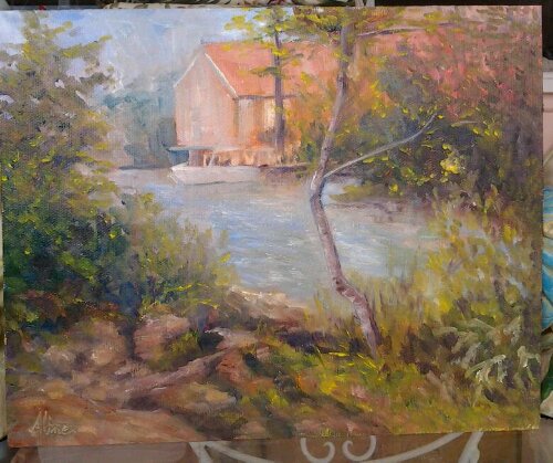
Rockport Harbor, November 2011
Last Monday, I took the day off to go painting, making a gift out of the chore of picking up an unsold painting at the Rockport Art Association in Massachusetts. Accompanying me were my friends, Jackie and Clint. We explored the entire downtown area before settling on a location across from the T Wharf where Clint and I had painting a month ago. It was a magnificent day, at least until the sun disappeared behind the buildings.
Drawn again by the fish house known as Motif No. 1, I also had Van Gogh in mind in my depiction of the drying shrub. At the start, the boats were necessary to the scene, but not necessarily the focus of the painting. But boats have a way of stealing your attention, of grabbing the eye. So I give up, and let it become a painting about the boats and not at all about the now-annoying drying shrub in the foreground.
A few days ago, I read another blog exhorting artists to keep all their older work so that they can see and appreciate the progress they are making. I keep pictures of most of my paintings, and the rendering of boats is particularly difficult. I searched everywhere to find the first boats I remember having painted; the only images I could find were embedded in an Excel file. (I used to keep track of all my paintings in an Excel file, but after 100, it got to be too cumbersome.) The struggle to find a way to include these two proofs of my early ineptitude has taken me all morning. I finally figured out that if I transfer each image from the Excel file to a Word file, then save the Word file as a web page, the images get converted to jpg images that I can import into iPhoto. Then I export the images from iPhoto to my desktop, from whence I can upload them into WordPress. Whew! Not sure the effort was worth it.
These two paintings were plein air, on Monhegan Island, during a workshop with Stan Moeller:

Monhegan Harbor from Fish Beach

Lobster boats, lobster pound
Kind of clunky, right? But not bad as a start. Bear in mind the damn things are constantly moving and changing their orientation as the tides move under them.
In my search through the archives, I stumbled upon three paintings from another Moeller workshop that also contained boats, earlier than the Monhegan boats by about two weeks:


These three are views from La Napoule on the Mediterranean coast of France. The boats in these three paintings are too distant, too small to qualify as boat paintings, but I thought they were worth including since they are the very first boats to appear in any painting by me.
Apparently, I went without boats of any kind for two years after that. The next grouping is two Rhode Island paintings, again plein air, that I painted in the summer of 2009:

Working Boats at Rest 8×10

Marina at Allen Harbor, Rhode Island 12×16
I was very pleased with these two paintings, which were done in the same afternoon from virtually the same spot. The conditions were uncomfortable–very windy, cold, I think, yet sunny. I just remember being miserable during the first painting and rushing to finish it. It’s not hard to see progress between the Monhegan boats and the Rhode Island boats.
Most of my boats are plein air experiences, but there is one prominent exception. I painted a large (for me, then) portrait of a waterfront in Portsmouth, New Hampshire, and toward the end, stuck in a boat to break up the waterline and add interest:

Portsmouth Waterfront 16×20
That is a real boat–it belongs to someone who lives in one of those buildings. This boat “portrait”, painted from a photo reference, undoubtedly helped me in depicting my favorite plein air boat, “High and Dry”, from 2011 below.
My Rhode Island successes had given me the courage to go for boats on my next trip to Florida; in 2010 I choose this orange catamaran.

Catamaran
The double hulls made this a complicated project. I was not thrilled with the resulting portrait. So I tried again with this one, looking for the magic I seemed to have found in Rhode Island:

Boat Slip
This painting is not about the boat in the background, but about the reflections in the water of the pilings. But it’s still a boat so it has to count for something. The boat is certainly better than the Monhegan boats–not as clunky. But I don’t love it the way I love my Rhode Island boats. Perhaps I have a bias in favor of working boats.
That Fall (2010) I painted my first New Hampshire boats, but in a way that the painting cannot be assigned a place the scale of good, better or best boats. These were impressions of boats from a distance, much like my La Napoule boats:

Sunset over Massabesic Lake
The point of this painting, obviously I guess, was the sunset. The boats are mere window dressing, silhouettes against the light. Around about the same time, I painted from a photograph taken in Ogunquit, Maine, the following scene:

Reflections
Another case of the boat being window dressing.
This brings me to the most recent predecessors of Rockport Harbor: two paintings from Florida in March of this year; and one from Wells Harbor in June.

One-story home with Boat

High and Dry (but still perky)

Wells Harbor
Of these three, only “High and Dry” is all about the boat. “High and Dry” is, in my opinion, my best boat ever, but it should be:– unlike all other boats, my model for this painting was perfectly stationary. It’s hard enough drawing or painting a moving object, much less one that demands a level of accuracy approaching portraiture.
Finally, Rockport:

Rockport Harbor, November 2011
Three boats of diminishing size to show perspective, of diminishing detail to show distance, a scene so perfectly matched to the beginning (Monhegan boats) that a comparison is easy. There has been progress! But wait–what about progress since Rhode Island boats? That is far from certain, to me at least.
Aline Lotter is currently exhibiting:
at the Gallery at 100 Market Street in Portsmouth; at the Sage Gallery in Manchester; at the Hatfield Gallery in Manchester; at the Bartlett Inn in Bartlett; at the Red Jacket Inn in North Conway; and at her studio by appointment.
Link to website: www.paintingsbyaline.com
Some weeks are so full of reportable stuff that I have trouble choosing my topic. Other weeks, I have trouble scaring up a single decent topic. I could save up half of the good-week stuff for a dull week, but who wants to plan for dull weeks? Not me. On the other hand, I don’t want to bore you either, and really now, wouldn’t you rather hear about struggles? This week I can report on a bit of a struggle and its accompanying triumph so that’s what I lead with.
Part I. Alpaca Love. You remember the alpaca farm/ranch from last month?

Alpaca Farm in North Conway
This was the plein air painting from the Bartlett weekend, to which, I announced, I would be adding an alpaca closeup. I had one good alpaca closeup, so I went with that, even though I’d have preferred the animal to be facing more towards the viewer. My closeup did not include the legs either, so I was winging it with regard to the posture and thickness and general shape of the legs.

Alpaca Farm v.2
Pretty awful, right?. I wouldn’t even show it to you before–I couldn’t let it sit out there as if finished when I was going to have to repaint the red alpaca closeup. First, I had to find a better reference photograph.
As it turned out, when I got around to searching my own photographs, I had plenty of good alpaca poses. Thanks to my powerful Nikon SLR camera, alpacas photographed in the way distance still gave me enough enlarged detail to paint a loveable blond alpaca in just the right pose, in just the right spot.

Alpaca Farm, v.3 (Final)
Part II: Supercyclists. Earlier this evening, I delivered two paintings to my son in celebration of his birthday. One of them you have seen already.

Andy as Supercyclist
It depicts him right after finishing the race up to the top of the Rockpile (Mt. Washington). Paint still wet on the second one delivered, is my painting of his friend Kori, from the same time, same place.

Whew!
I love the foreground in Kori’s painting. Strange that where the focus of the painting is the figure of the cyclist, what I love most is how I painted the ground. I would have liked to paint the face more expressively, but I didn’t really have room for that. The two paintings are each 12×9, so the faces are quite small. I wanted to get the likenesses as close as possible, so I had to be careful. Andy’s worked out better because I had only light and shadow anyway, but Kori’s nose, mouth, eyebrows had to fall in the exact correct places, and no smearing please.
My major painting plan, for which these two 12x9s have served as studies, is still on, but the faces in the big one are not going to get any bigger since the plan is to encompass the entire rockpile. I think I need to reuse this scene in a longer painting so as to include more of the shadow, and larger overall, so as to allow more of a slapdash face.
Part II: Lovely Nudes. Finally, for a change of pace, how about a collection of lovely nudes from Saturday Life Group? My best from two weeks ago, and all three from this week:

Arrangement of elbow and knee

Leg on Blue Draped Pillow

Right Side with bent elbow

The back from a left angle
I am wondering if I am getting too heavy-handed with the charcoal. The “Leg on Blue Draped Pillow” has more charm to it, I think, because I had the pose for only 20 minutes and had to keep a light touch. I would like to know if you agree. Or disagree. Either way, it was a good week. Here’s hoping for another one coming up!
Tomorrow (Monday) I pick up my painting from The Rockport (Mass.) Art Association. Unsold. They invited me to apply for membership, and I thought I would if my painting sold, but it didn’t, so I didn’t. A bit far to go for the sheer joy of exhibiting. Although I do hope to get in a plein air painting day tomorrow, which makes a trip worthwhile. Also tomorrow, paintings are being changed out at the Sage Gallery in Manchester, 70 Lowell Street. Please visit this new gallery.
My old website, with multiple painting galleries yet to be transferred to this WordPress location, can be accessed at this address: www.paintingsbyaline.com. Also there are all the images attached to earlier blog entries. Eventually I will move everything here, but it takes a lot of time.
. . . Snow woe? Weather woe? Maybe lack-of-power woe. “Power.” Have you ever thought about the usages of the word “power”. We use it to describe an attribute of people who attain positions where they can control the lives of others. Power is also an attribute of an individual who can control his/her own life. So why does “Power” also refer to electrical current to run lights, furnace, phone, internet, microwave, TV, DVD, and radio, to charge cell phones and Palm Pilots? Because without all those abilities, one is powerless.
Without power (in the technological sense) One is also cold, hungry, and sleepless. So I write this tale of powerlessness–obviously not from home–in a state of grogginess. For the first time in my life, I slept with a Great Dane. I invited her into bed with me when her “mom”, my granddaughter, bailed on us to go spend the night with a friend with “power”. Honey, the Great Dane, usually sleeps with Tabitha, my granddaughter. Tabitha thoughtfully lent us her comforter and Honey was dressed in a woolly sweater. I wore my thermally correct underwear and a snuggly fleece robe-type thing over that. We were warm enough. Well, I was warm enough. Honey was shivering and twitching all night, while I concentrated on hanging on to my share of the bed and waiting for the sun to rise.
Actually, I wasn’t all that hungry because I got to spend a wonderful 4 to 5 hours at a party with artists earlier in the day. Mill Brook Gallery in Concord held an opening for an exhibit that was enchanting in its originality and breadth. http://www.themillbrookgallery.com/ I had been invited by Patrick McCay, one of the featured artists, who is my EEE teacher. (EEE stands for Explore, Exploit, Express–in whatever medium, whatever style.) Two of his paintings already had red dots on them when we got there. “We” because I did not have the use of my car yesterday but got a ride with two other artists, Bea Bearden and David Wells. Through Bea and David I also found myself welcomed to a pot luck supper after the reception. What a pot luck supper it was! It deserves commemoration by publication of the entire amazing menu, but I cannot do it justice on the wing with descriptions like “quiche-type thing” and “rice and beans”. I didn’t go near the pies–no room for dessert.
So in truth I was warm enough and not hungry at all, and only sleepless now. Yesterday, before going off and partying, I used a few daylight hours to tinker with three paintings that I had started in EEE. The third one is my newest one, which you have not yet seen. In order to get enough light in which to photograph it, I brought it to the office with my camera. No tripod though, so it looks a little fuzzy.

Taking a Bow
As the cyclists arrive at the top, someone throws a gray blanket over their shoulders, which keeps them from getting too chilled after their sweaty exertion. The top of Mt. Washington is, even in August, likely to be a chilly place. Andy, who happens to be my son, appears to be wearing a ribbon of some sort, which I only noticed in the course of working on this painting. Will have to find out the significance of that.
The train car in the background is part of the Cog Railway.
In this painting, I believe I have become more of an impressionist, which is kind of what I have set out to do in the EEE class. My highest goal is to emulate Sargent and Sorolla, which to me means using the brush strokes expressively. I really enjoyed working on this painting. It is another of the studies for the larger work I am hoping to get to, the one of the whole top of the mountain with the crowds, the cyclists, and the mountain vistas.
Aline Lotter is currently exhibiting:
at the Gallery at 100 Market Street in Portsmouth; at the Sage Gallery in Manchester; at the Manchester Artists Association Gallery in Manchester; at the Bartlett Inn in Bartlett; at the Red Jacket Inn in North Conway; at the Rockport Art Association Gallery in Rockport, Massachusetts.
Link to website: www.paintingsbyaline.com
“It’s all in the details” — a statement considered wise when the subject matter is policy. What about when the subject is art? Recently, I visited an exhibit of Dutch and Flemish paintings from the 17th-18th century, wherein the details were really important. Before photography, paintings were valued as records; the tiniest of details were appreciated. But in this day and age, details can be a hindrance to artistic expression. Representation, as opposed to abstraction, is even looked down upon in some quarters. Abstraction is the ultimate in detail-elimination.
Only last week one of my followers commented, “Your drawings are magnificent. Great attention to detail. Superb!” Alas, his approval, to the extent based on my attention to detail, may be misplaced. I have to acknowledge a contrary judgment–that in general, attention to detail is not a good thing, and that in particular, my attention to detail is more of a handicap than an ornament to the quality of my output.
Which is just a long way of saying, I expend too much energy on details. At one point during the Red Chalk workshop, Rob Liberace asked me to dial back on the details–I was making a virtual skeleton out of our lean model. Referring to the portrait above, “Kitsch,” Cameron Bennett suggested last Thursday. Ouch!
Two experts within a short time identifying the same weakness–there must be something to it. How did I get to this pass? Certainly my plein air painting never permitted excessive detail. One theory–my speed in getting to a near-finished state leaves me all too ready to look for areas to refine. Instead of reexamining the broadest strokes to make sure those are as perfect as I can get them, I start on what I used to consider the next step–developing the details. Another theory–I am just not that good an artist.,
Take this week’s portrait from a live model, posted as the cover image for this blog. As soon as I caught Rebecca’s likeness and properly placed and sized all her features, I spent considerable time working on the details, or what I was then considering the nuances of her features–especially her mouth and eyes. It was at the end of that session that I got the “kitsch” remark. Ouch–that still hurts!
Here is the current portrait next to the earlier one done in black and white. Big improvement anyway. (But we had less time to work on the black and white, I think.)
At least when copying a work done by a master, I cannot be criticized for the sin of detail. The detail, or lack of it, comes already supplied. Here is this week’s homework assignment, from a self-portrait by 20th century Italian artist, Pietro Annigoni.
The whole point of copying, may I remind those of you who abhor the slavishness of copying, is to train the copyist’s eye. If I cannot see how my ear is different from the original’s ear, how can I expect to paint a good representation of a real, live ear? So there is the original, on the right, with my copy on the left. Sitting on my easel, my copy looked virtually perfect to me–I fantasized Cameron accusing me of tracing the image.
Here, not so perfect. A decent copy, but far from perfect. I gnash my teeth in frustration! How did the bloody head get so elongated in the original, with me not noticing? This is why artists resort to projecting drawings onto their canvases from photographs, a practice frowned on by purists, and one that certainly does nothing to train the eye. Fury it is that motivates them!
I hereby resign myself to getting beat up upon by Cameron this Thursday because there is no way I am repainting that ear. (In order to narrow the head, I would have to move the ear.)
But back to the topic–Death to Details. With this new anti-detail directive freshly absorbed, giving a nod to Peter Granucci here as well since he also has tried to wean me away from focusing on details when drawing from a live model, I took out a painting that had never satisfied me. This was a painting based on a drawing made with a live model. I had no details to refer to –the painting itself was several references removed from the original drawing since I had painted over it several times trying to find a version that pleased me. Could I solve this painting by eliminating even more details?
The only part of this painting that I liked was the hand and the drape at the bottom, so I felt free to mess with the rest of it. I tried muting the background. I changed the hairdo. I refreshed the skin tones and created large splashes of light. Finally, taking a cue from the hand that I did like, I outlined the figure in black. Suddenly, it looked interesting. I never use black ordinarily, so this was definitely weird. I scumbled (a technique for applying a glaze but with a dry brush) more black into the background and it got even better.
Ultimately the color, and maybe the contrast may save this painting. But my curiosity to obliterate detail is what motivated me to revisit this painting. Maybe that makes no logical sense, but hey, that’s left brain for you!
Meanwhile, and D, I’m talking to you, don’t praise my attention to detail. It’ll just make me squirm uncomfortably.
This blog started out over two years ago (!) with no particular angle on my painting adventures, but has begun to develop as a chronicle of my efforts to grow as an artist. So I have come up, finally, with a name for it: Painter’s Progress–playing on the phrase “Pilgrim’s Progress”, a religious tome from a time period when details in paintings were expected and desired.
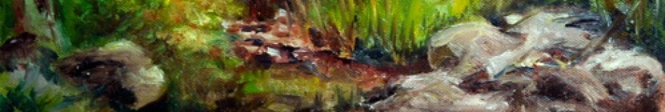
Next August, I plan to participate in a special exhibit at the Arnold Arboretum in Boston, of paintings painted au plein air by members of the New Hampshire Plein Air group at the Arboretum. We are trying to cover all four seasons of the year. So we had to do winter. On January 7, the first group of us (about six in number) descended upon the Arboretum with our usual gear, plus all those things designed to keep us from freezing to death. I staked out a spot on the Willow Path, which is just inside the main gate, not far from the bathrooms in the visitor center. At least I had a bit of a hike to get to this spot. Others who shall remain nameless set up their work stations in the parking lot.

Willow Path in Winter
After finishing the painting above, I had a little extra time, so I produced a 6 by 12 panorama of a nearby culvert, which may seem a little weird to you. I chose it to seize the opportunity to include a richly dark area in my composition. Contrast creates drama.

Culvert in the Arboretum
