This week’s obsession is a poster contest announced by our gem of a museum, the Currier Museum of Art, in Manchester. First, if you are not already familiar with New Hampshire’s notorious motto, here’s a little background.

“Live Free or Die.” The motto achieved its national notoriety after the NH legislature determined that it must be written on our license plates. Some uppity commie liberal type objected to having such an inflammatory statement attached to his personal motor vehicle, and sued all the way to the U.S. Supreme Court to get it removed. Well, that’s the story my memory came up with, but I know better than to trust my memory anymore, so I looked it up on Wikipedia, and it seems the offended motorist was a Jehovah’s Witness, who reacted not by suing but by covering up the “or Die” portion of the motto because death for a political cause was unacceptable in his religion, and the Supreme Court got involved because he was prosecuted under a criminal statute for defacing the license plate. His conviction was overturned under the First Amendment to the U. S. Constitution–the State could not force him to express a sentiment with which he did not agree.
Although that was something of a slap down, the motto remains on the license plate. I had to look to be sure.  New Hampshire does live by the motto: seat belts are not mandated for adults; helmets are not required of motorcyclists; soda cans do not come with a refundable deposit; and taxes, at least those that would reach a broad segment of the population, are abhorrent. Cigarettes, fireworks, gambling and liquor are encouraged. They generate revenue. When we say “free”, we don’t mean “tax-free”. For a comedic take on New Hampshire’s philosophy, see Juston McKinney’s YouTube analysis.
In defense of free living, New Hampshire was an early adopter of same-sex marriage, thereby proving it is an independent thinker. I believe there is also a law on the books to the effect that gun-toters must be allowed to enter courtrooms and legislative chambers with their guns on board. In that last case, the death resulting from living free may not be that of the free liver lover. So you see we have a lot of scope for comedy here.
Anyhoo, the Currier has a contest going for the best poster on the theme of “live free AND _______”—you fill in the blank. The idea is to describe or celebrate something wonderful about New Hampshire, where you may live free and also do some constructive things, things other than killing yourself on the highway.
I had an immediate super-brilliant idea and decided to compete, ignoring the fact that I have zero experience or training as a graphic artist. I ordered ten poster boards from Dick Blick, mostly because you can’t order just one. Extras would be good because I would surely mess up the first few attempts. Then I explored the internet for some hints on how to go about painting on poster board. There wasn’t much out there to help me, but I did learn that applying oil paints directly to the board would not be advisable.
Luckily, I keep some acrylic paints on hand, so I planned to paint a base of acrylic, which would seal the surface and prepare it for the eventual painting in oil. The base would coordinate with my background colors. Once I got going, very confidently since I thought I was still just painting the base, the whole thing just sprang to life. My first acrylic painting. I was stunned. And happy.
Then began the process of lettering. OMG. I proceeded with great care (and concern). Again I conceived a plan: The letters are to consist of their outlines only, because I wanted the background painting to show through. I drew the my letters freehand. I did not want mechanical-looking letters but I did some measuring. I cut them out with an Exacto knife. Not as easy as it sounds. Hard, in fact. I stuck them onto my poster with museum putty to see how they looked. I repositioned them. I redid “. . . and” to make that piece smaller than the “Live Free“. I outlined them using a pen. I painted around the outlines. The unevenness bothered me. I didn’t want it to look professional but I wasn’t going for sloppy either. I tried blurring/bleeding edges with my medium (I was using oil paints at this point). Kind of liked that. Wiped out the word “Free” because letters were too crowded together. Painted with acrylic paint over the wipe-out to create fresh, clean surface for next go ’round.
And that’s where I am. Today I am researching the kinds and uses of stencils, vinyl lettering etc. Should I give up on the outline plan? Guess I am going to have to show you in order to get any feedback.

The above is a close up or detail of the painting, showing paper letters positioned where I planned to outline them. I wished I knew how to make the letters look as if they were actually hanging in front of the poster.
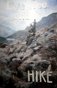
Above is the whole thing, with all of the letters positioned; I must have corrected “HIKE”‘s position before penning its outline in red ink.

Above is the state of the poster before I darkened the upper outlines and before I whitened the “HIKE” outline, and yes, before I got up in the middle of the night to remove the crowded letters forming “Free”. I like “HIKE” now, but am worried about “Live Free”. All of my options for stenciling or applying letters involve letting go of the open outline design. What do you think I should do?
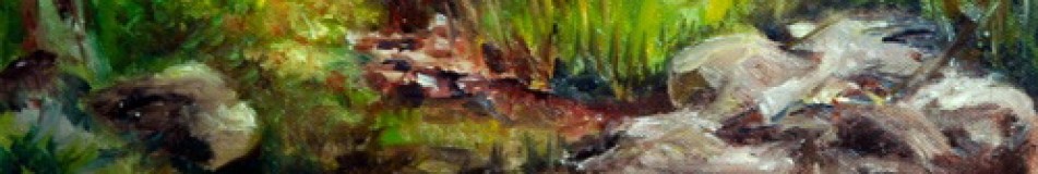
As for the subject image, if you have been reading for a while (over a year). you will recognize it from a 9×12 study that I did for a Patrick McCay course at the Institute called “Explore, Express, Exploit”. I published it in this blog from October 2011. Here is the original inspiration:

The Lone Looker (photo)
I am well and truly exploiting that image of the guy on the rock outcrop that I photographed at 2011’s bike race up Mount Washington, thus fulfilling the promise of that course.
Aline Lotter is currently exhibiting:
at the Hatfield Gallery and the East Colony Fine Art Gallery in Manchester (Langer Place, 55 S. Commercial St., Manchester, NH); at the Bartlett Inn in Bartlett; at the Red Jacket Inn in North Conway; at Stella Blu , an American Tapas restaurant in Nashua; at the law offices of Mesmer and Deleault at 41 Brook St in Manchester; at the Norris Cotton Cancer Center in Manchester (part of the Healing with Art program) and at her studio by appointment.

You can google “how to make shadowed letters” as one way to make them stand out, though at this stage, you may have gone too far beyond where they can be made shadowed. Here’s one Google hit: http://www.wikihow.com/Draw-Shadow-Effect-3D-Block-Letters
I like the painting! This poster looks good, keep going!
LikeLike
Thanks for the link. What a good researcher you are! But those letters were too heavy. Really not shadows but 3-d. But it got me thinking. I could paint a cast shadow on the painting that would fool the eye into perceiving the letters as floating slightly in front. But maybe that’s too gimmicky after all. Would settle for well executed letters that don’t look mechanical.
Sent from my iPad, Aline Lotter
LikeLike
Looking good! Possibly a winner!
You DO know how to make those letters appear as if they’re in front of the poster! They need to be hard edged with shadows darker than the painting and they need to be a warm color. Warmer is always closer – you know that! Even if you keep them almost white, if they’re a warm white against your cool sky they’ll definitely be in front of it.
One BIG problem thought … you were already painting in oils when you wiped out and then painted over it in acrylic? Oil over acrylic is OK, acrylic over oil is a no-no!
LikeLike
I know that, but I removed the oils first.
Sent from my iPad, Aline Lotter
LikeLike
I like it.
I like the state motto, the full quote, and using your painting to support a HIKE. You could use other paintings of yours to encourage one to SIT NAKED IN A GREEN CHAIR.
After I was discharged (’73) I came to NH and had a hard time finding a job. I wanted to get a vanity plate that said, “BROKE,” but I couldn’t afford the extra fee.
LikeLike
That’s pretty deep.
Sent from my iPad, Aline Lotter
LikeLike
Aline, good luck with your worthwhile project. It has a lot of merit. My personal feeling on the “Live Free or Die” would better be appreciated with, “Life Free and Enjoy Life.”
LikeLike
Thank you. Couldn’t go wrong with a motto that says “enjoy life”. Just what I am planning to now in my retirement!
LikeLike
Aline, I really like the poster. Re: the motto: It is a quote from General Stark to his soldiers fighting in our revolutionary war. I never understood why all my fellow liberals objected to the saying. It is a good revolutionary saying…like “Give me Liberty or give me Death” by Patrick Henry. Maybe we should all send it to the NSA these days to remind them of the First and Fourth Amendments to our Constitution. Maybe also send it to that Constitutional Law Professor, who happens to be my all-time favorite President, better than the other twelve I have lived through.
LikeLike
I think that the liberal aversion to this motto stems from its use to deplore any kind of government involvement in our lives–the nanny state, the welfare state, etc. Clean Air, anyone? But I agree with you–I am fond of the motto.
LikeLike
Great painting Aline. I would go crisp, clean and accurate with the lettering. that would retain the beauty of the painting as a separate layer. Life free or die sounds frightening to me. has overtones of killing rather than passive dying.
LikeLike