In the context of the highly publicized current national and international events, humanity may not deserve a ticker-tape parade. On the macro level, humanity has little to brag about. But in the micro scale, the artist’s scale, things of beauty can still be found. Three different nuggets have tumbled together in my brain to form this topic.
Nugget No. 1: Have you ever stopped to consider what goes into the creation of a magnificent work of music? I was listening to the broadcast of a Beethoven symphony last week when the enormity of the achievement struck me: first, humans had to invent and perfect and pass down instruments; then an individual human had to come up with an arrangement of notes to be played on the instruments all together, only to be achieved after many years of practicing and learning and experimenting; then humans had to learn how to play the instruments and then how to play the notes as arranged by the composer, which required many years of practicing and learning and experimenting; then it all had to be pulled together so that the individual musicians played a complex composition as if they were a single organism. To bring the glorious sound to me, there’s the recording technology, the broadcasting technology . . . . My mind boggled. One symphony is an enormous human achievement–but an achievement by individuals working alone and together, all of the pieces contributing to the magnificent end.
Nugget No. 2: For marketing purposes, I have lately been mulling over and over a catch phrase to use to describe my own artistic output. Seeker of beauty? Finder of beauty? I was looking for some way to express the idea that I paint stuff that exemplifies beauty of everyday life, perhaps small stuff that ordinarily gets overlooked. No messages, no “concept” other than beauty. Sure, I’m an environmentalist, a landscape painter, convinced that we are hurtling toward our own doom by destroying our atmosphere, but I have no urge to paint, say, an oil refinery as a villain. If I were to paint an oil refinery, it would be to discover the beauty of the shapes, lines, and values to be found there. I went back to the mission statement offered to me by Cameron Bennett where he used the phrase “preserving humanity”. I think he means preserving a record of humanity, since I do not know of a way for art to actually keep us safe. Is there a dark thought inherent in the idea that such record might one day be needed? No, I rejected such a gloomy interpretation. Perhaps the combination of “preserving humanity” and “discovering/revealing beauty” could be expressed as “celebrating humanity”?
Nugget No. 3: last night I attended the reception for a show of works by Peter Granucci. The show is called “Memorial to Lost Species”.
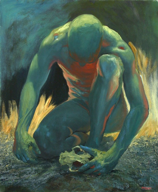
Peter Granucci, Alone in Grief
The drama and anguish exhibited in the above image is repeated in perhaps 20 paintings, all with a human figure and many with the skull of a nonhuman creature. Peter created frames for each piece, which extend the grittiness and turbulence of the backgrounds of the paintings. The captions on the paintings are pointed references to the losses of species, and the grief we, mankind, ought to be experiencing as a result– humanity grieving for the species destroyed, grieving for the world lost, grieving, ultimately, for its own viability. Peter certainly had a message, and he wasn’t satisfied with just one painting to convey that message. Before inspiration took him into this deep dark place, four years ago, he was like me, painting beauty. He celebrated the beauty of the female form. His drawings of the female form are simply exquisite. But when an emotion overtakes an artist, the output has to reflect it. Think Picasso’s “Guernica”. Now think Granucci’s “Memorial”. The show will be up for the rest of December at the Art Gallery in New England College, Henniker, New Hampshire.
So I am a little shaken by Peter’s message. And the events on the news. How can I thank about “celebrating” humanity when humanity does so much that is wrong?
Nevertheless, I share with you the last two weeks’ of Monday life painting:

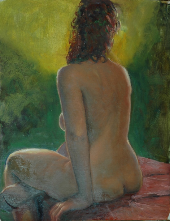
Better than Climbing Trees
The title is a reference to the fact that, after modeling for us in the morning, Robbie was off to climb trees in the process of cutting them down. That was the Monday before Thanksgiving, and that Wednesday we got hit with lots of wet, heavy snow that felled a lot trees over power lines–my family went without a Thanksgiving dinner this year. Just thinking, a little adumbration perhaps?
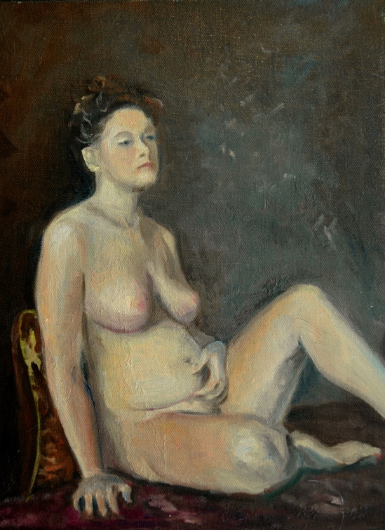
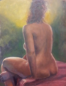
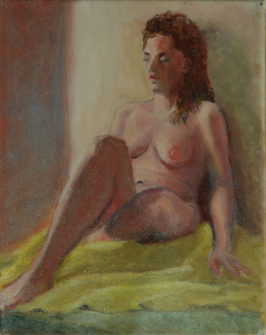
A Lovely Nude
We think this new model might be the answer to Rebecca’s “retirement” (have you missed Becky?). Interesting how she and Robbie are in almost identical poses, leaning against the wall.
If you remember my very large painting of a cat awakening from a nap (“Nap, Interrupted”) that I started last summer but shied away from finishing because I was afraid of the whiskers . . .
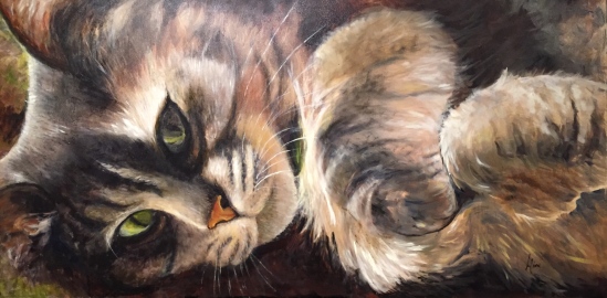
Nap, Interrupted
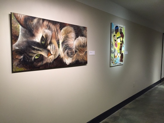
here she is with whiskers. I had to finish her because I promised her to the Currier Museum for the month of December. Here is how she looks on the wall of the Museum’s Community Gallery, on the lower level where the classrooms and auditorium are:
Aline Lotter is currently exhibiting:
at the Hatfield Gallery and the East Colony Fine Art Gallery in Manchester (both are in Langer Place, 55 S. Commercial St., Manchester, NH); at the Bartlett Inn in Bartlett; at the Red Jacket Inn in North Conway; at the Bernerhof Inn in Glen; at the New London Inn in New London; at the law offices of Mesmer and Deleault at 41 Brook St in Manchester; at the Norris Cotton Cancer Center in Manchester (but access is limited to patients and health care workers). And at the Currier Museum of Art, Manchester NH.
You may also view paintings with prices and order prints at my Fine Art America page. If the painting you are interested in is not there, or if you prefer to bypass that experience, you may contact me by email to alotter@mac.com.
If you want to add a public comment to this blog, go to the bottom of this page where it says “Leave a Reply”, and enter your comment in that box. I love to get public comments, so don’t be shy!


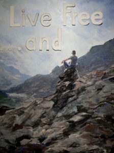
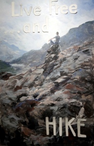
 New Hampshire does live by the motto: seat belts are not mandated for adults; helmets are not required of motorcyclists; soda cans do not come with a refundable deposit; and taxes, at least those that would reach a broad segment of the population, are abhorrent. Cigarettes, fireworks, gambling and liquor are encouraged. They generate revenue. When we say “free”, we don’t mean “tax-free”. For a comedic take on New Hampshire’s philosophy, see