Pussycats and Ignudi

Fur. Final

Fur. Final  20×16

I finally “finished” (I had to stop fussing with it because deadline to submit was Friday) Fur.  Note the size of the painting–it is much bigger than life.  I’m pleased with its furriness, and proud of the gold heart locket which I dreamed up without any help from a reference photo.  Now, cross your fingers in the hope that the juror for this exhibit, Eric Aho, isn’t a dogs-only lover, and isn’t allergic to cats (but I am, so that’s not determinative).

I don’t often create something specific in response to a call for art, but in the case of Purr,  oops, I meant Furr,  I like to think the Call for Art got me thinking, which led to the inspiration to paint this particular picture.  The title and theme is “LOVE”, and the juror is an abstract landscape artist whom I greatly admire, which made me stop and consider the possibilities.  The idea of Love led, of course, immediately to the idea of Cats, and thence to the idea of the fur that makes cats so lovable.  To tie more unmistakably into the exhibit theme(as if that mattered!), I included the heart locket.  The claw showing at bottom left is my acknowledgement of the unpredictable and imperious nature of Cat, whose soft furriness conceals a weapon to punish whoever fails to give proper respect.  All that thought, but the result is likely to be yet another canvas stashed away in a portfolio.   That doesn’t matter.  What matters is, I painted.  I submitted.  I tried.

Our model for Tuesday Life Group showed up armed with thumbnail reproductions of Michelangelo’s paintings on the ceiling of the Sistine Chapel, from which selection we were to choose a pose.  The pose we chose was one of the  twelve naked, male figures lounging in the corners of each of the three major sections.  Before going any further, I’d better show you the drawing that resulted:

After Michelangelo Ignudi

After Michelangelo Ignudi

We were puzzled by the wreath—an item I associated more with Roman emperors than with Christian iconography.  On a whim,  I included it in my drawing, and was pleased with the effect–it added interest and weight to the top of the page, but I didn’t believe that had been Michelangelo’s purpose in so adorning these particular figures.  So I was off to Wikipedia to find the explanation.  Turns out the wreaths are acorn wreaths, and the figures wearing the wreaths are called “Ignudi”.  And that’s it.  No more knowledge to be had.  There is a suggestion that they could be angels; angels don’t necessarily come equipped with wings.  As for what the Ignudi were doing in the corners, I bet they are purely decorative.  Those corners would have looked “naked” without the Ignudi.  According to Wikipedia, the painting of the Ignudi demonstrates, more than any other figures on the ceiling, Michelangelo’s mastery of anatomy and foreshortening and his enormous powers of invention.  So there you are–he was showing off.  Not so different from the reason I included the wreath in my drawing.

Aline Lotter is currently exhibiting:

at the Hatfield Gallery and the East Colony Fine Art Gallery in Manchester (both are in Langer Place, 55 S. Commercial St., Manchester, NH);  at the Gallery at 100 Market Street in Portsmouth;  at the Bartlett Inn in Bartlett; at the Red Jacket Inn in North Conway;  at the law offices of Mesmer and Deleault at 41 Brook St in Manchester; at the Manchester office of Congresswoman Carol Shea Porter;   and at her studio by appointment (email: alotter@mac.com).

Duality Continues

Before I get into certain issues involving the EEE class, check out these pretty decent likenesses I achieved  using charcoal on Mi-Tientes pastel paper.  First, from the Friday life group, here is Rebecca.

Portrait, Rebecca December 2013

Portrait, Rebecca December 2013 (12×9)

I truly cannot count the number of times I have tried to do a portrait of Rebecca, with varying degrees of success.  I posted a bunch of them in this blog (“A Month of Beckys”) about 7 months ago; over a year ago I included the very first one here in a blog titled simply “Becky”.  Despite the annoying texture of the pastel paper (I chose the more highly textured side by mistake),  the one I just completed is the best.  That’s encouraging since it means I am still improving and have not yet hit my limit, if there is one.

My other likeness attempt came as part of the Saturday Life Group’s meeting.  A popular male model whom we have not seen for many months was back in NH, and one pose gave me the opportunity to try for a likeness of his face.  Looks pretty accurate to me, but I may be biased.  Here are both of the longer poses from Saturday–the first one, as you will see, did not afford any view of the face–and I remembered to use the smoother side of the paper:

Mike No. 1

Mike No. 1

Mike No. 2

Mike No. 2

Drawing a man who is “ripped”, as they say, is a lot of fun, and just what we needed after so many months of rounded flesh.

Putting all that likeness stuff aside, we can get to the bigger issue: can Aline come up with a paintable abstract concept, and go on to paint it appealingly?  Jury is still out, but hope has not stopped springing.  The two that I am going to show you are both from the EEE class, of course.  Thursday was our last class.  Many of my classmates intend to take it again in the Spring.  I, however, am putting my money on the Master Portrait Workshop with Dan Thompson and don’t feel I can afford the luxury of taking two courses in a single semester.  But I stray from the main story:  the EEE class adjourned halfway through our allotted time at the Institute to regroup at Bea’s place, to eat, drink, be merry, and critique each other’s works.  First up was my now-familiar abstracted landscape evoking stained-glass windows and Monet.  Patrick stood by his initial eval, but my classmates objected strenuously to the light-colored wedge, which they felt was distracting.  Peter Clive was present as well, so I asked for his opinion.  He advised repeating the wedge shape in the lower right corner.  Classmates seemed happy with that solution.  Therefore, on Sunday, after having endured a few restless nights trying to make sense of that advice, I dutifully inserted Wedge Minor into the masterpiece (please hear that with ironic inflection).   This smaller echo remains  as unexplained as the original Wedge Major.  Fortunately, it being abstract, I didn’t have to justify it in terms of a representing a recognizable object.  Most important, the new element has to blend into the scene as if it had always been there.

DSC_0005

This is your first view of this piece as translated through my Nikon SLR, so this version looks better simply because of that.  I had the devil of a time getting an image without glare inasmuch as I had ladled on the paint and parts of the painting will reflect glare no matter where you set up the light sources.  My solution was to go with less light and increase “exposure” in the editing room.  Details got lost, however.  There are more of the red dots in the middle background, for instance.

My last EEE project, started Thursday after a lot of planning, is complicated.  Shiao-Ping Wang presented a program at the recent meeting of the Manchester Artists Association, a program that I had, as program director, requested of her.  “How do you translate an abstract concept into a work of art?”  She showed us how she did it, explaining how her love of water became represented by a specific shape that she repeated in many inventive ways.  A few days after that, I saw a call for art for an exhibit on the theme “Love”, to be juried by Eric Aho, an abstract landscape artist whom I admire. Here is a short video with Eric, which gives you an idea of what he does as an abstract landscape painter.  Because of the juror and because of Shaio Ping, I decided to make an abstract painting for the show, based on something I love, namely, cats.  And fur is what I particularly love about cats.  Patrick had shown me years ago his painting of white chickens using a brayer instead of a brush.  The breasts of those chickens looked unbelievably soft and downy.  So what I intend to make is a painting about cats, using furriness as the symbol and perhaps deploying a brayer in my quest for irresistible texture.  But yet another influence out of the Contemporary Gallery of the Currier Museum led me to plan a hidden image of a larger-than-life cat face in the background of my abstract, furry foreground.  So far, I have completed only that background.  I have to let it dry now, before attempting the more difficult task of layering on the furriness without totally obliterating the face.

Love and Fur wii (20x16)

Love and Fur WIP (20×16)

(By the way, as the party was breaking up, Patrick told me that I had all of the other aspects of art making under control–I just needed more help with the conceptual aspects–advice that suggests I should reconsider my decision to take the portrait workshop instead of another dose of EEE. )

Aline Lotter is currently exhibiting:

at the Hatfield Gallery and the East Colony Fine Art Gallery in Manchester (both are in Langer Place, 55 S. Commercial St., Manchester, NH);  at the Bartlett Inn in Bartlett; at the Red Jacket Inn in North Conway;  at the law offices of Mesmer and Deleault at 41 Brook St in Manchester; in the Community Gallery at the Currier Gallery in Manchester; at the Manchester office of Congresswoman Carol Shea Porter;  at the Studio 550 Art Center in Manchester NH, as part of the annual 6×6 show of the Womens Caucus for Art; and at her studio by appointment (email: alotter@mac.com).

Living Free in New Hampshire

This week’s obsession is a poster contest announced by our gem of a museum, the Currier Museum of Art, in Manchester.  First,  if you are not already familiar with New Hampshire’s notorious motto, here’s a little background.

State Emblem

“Live Free or Die.”  The motto achieved its national notoriety after the NH legislature determined that it must  be written on our license plates.  Some uppity commie liberal type objected to having such an inflammatory statement attached to his personal motor vehicle, and sued all the way to the U.S. Supreme Court to get it removed.  Well, that’s the story my memory came up with, but I know better than to trust my memory anymore, so I looked it up on Wikipedia, and it seems the offended motorist was a Jehovah’s Witness, who reacted not by suing but by covering up the “or Die” portion of the motto because death for a political cause was unacceptable in his religion, and the Supreme Court got involved because he was prosecuted under a criminal statute for defacing the license plate.   His conviction was overturned under the First Amendment to the U. S. Constitution–the State could not force him to express a sentiment with which he did not agree.

Although that was something of a slap down, the motto remains on the license plate.  I had to look to be sure.  NH licenseNew Hampshire does live by the motto:  seat belts are not mandated for adults; helmets are not required of motorcyclists; soda cans do not come with a refundable deposit; and taxes, at least those that would reach a broad segment of the population, are abhorrent.  Cigarettes, fireworks, gambling and liquor are encouraged.  They generate revenue.  When we say “free”, we don’t mean “tax-free”.  For a comedic take on New  Hampshire’s philosophy,  see Juston McKinney’s YouTube analysis.
In defense of free living, New Hampshire was an early adopter of same-sex marriage, thereby proving it is an independent thinker.  I believe there is also a law on the books to the effect that gun-toters must be allowed to enter courtrooms and legislative chambers with their guns on board.   In that last case, the death resulting from living free may not be that of the free liver lover.  So you see we have a lot of scope for comedy here.

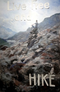
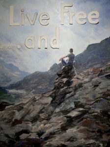
Anyhoo, the Currier  has a contest going for the best poster on the theme of “live free AND _______”—you fill in the blank.   The idea is to describe or celebrate something wonderful about New Hampshire, where you may live free and also do some constructive things, things other than killing yourself on the highway.

I had an immediate super-brilliant idea and decided to compete, ignoring the fact that I have zero experience or training as a graphic artist.  I ordered ten poster boards from Dick Blick, mostly because you can’t order just one.  Extras would be good because I would surely mess up the first few attempts.  Then I explored the internet for some  hints on how to go about painting on poster board.   There wasn’t much out there to help me, but I did learn that applying oil paints directly to the board would not be advisable.

Luckily, I keep some acrylic paints on hand, so I planned to paint a base of acrylic, which would seal the surface and prepare it for the eventual painting in oil.  The base would coordinate with my background colors.  Once I got going, very confidently since I thought I was still just painting the base, the whole thing just sprang to life.  My first acrylic painting.  I was stunned.  And happy.

Then began the process of lettering.  OMG.  I proceeded with great care (and concern).  Again I conceived a plan:  The letters are to consist of their outlines only, because I wanted the background painting to show through.  I drew the my letters freehand.  I did not want mechanical-looking letters but I did some measuring.  I cut them out with an Exacto knife.  Not as easy as it sounds.  Hard, in fact.  I stuck them  onto my poster with museum putty to see how they looked.  I repositioned them.  I redid  “. . . and” to make that piece smaller than the “Live Free“.  I outlined them using a pen.  I painted around the outlines.  The unevenness bothered me.  I didn’t want it to look professional but I wasn’t going for sloppy either.   I tried blurring/bleeding edges with my medium (I was using oil paints at this point).  Kind of liked that.  Wiped out the word “Free” because letters were too crowded together.  Painted with acrylic paint over the wipe-out to create fresh, clean surface for next go ’round.

And that’s where I am.  Today I am researching the kinds and uses of stencils, vinyl lettering etc.  Should I give up on the outline plan?  Guess I am going to have to show you in order to get any feedback.

Image 3

The above is a close up or detail of the painting, showing paper letters positioned where I planned to outline them.  I wished I knew how to make the letters look as if they were actually hanging in front of the poster.

Image 4

Above is the whole thing, with all of the letters positioned; I must have corrected “HIKE”‘s position  before penning its outline in red ink.

Image 2

Above is the state of the poster before I darkened the upper outlines and before I whitened the “HIKE” outline, and yes, before I got up in the middle of the night to remove the crowded letters forming “Free”.  I like “HIKE” now, but am worried about “Live Free”.  All of my options for stenciling or applying letters involve letting go of the open outline design.  What do you think I should do?

As for the subject image, if you have been reading for a while (over a year). you will recognize it from a 9×12 study that I did for a Patrick McCay course at the Institute called “Explore, Express, Exploit”.  I published it in this blog from October 2011.  Here is the original inspiration:

The Lone Looker

The Lone Looker (photo)

I am well and truly exploiting that image of the guy on the rock outcrop that I photographed at 2011’s bike race up Mount Washington, thus fulfilling the promise of that course.

Aline Lotter is currently exhibiting:

at the Hatfield Gallery and the East Colony Fine Art Gallery in Manchester (Langer Place, 55 S. Commercial St., Manchester, NH); at the Bartlett Inn in Bartlett; at the Red Jacket Inn in North Conway;  at Stella Blu , an American Tapas restaurant in Nashua; at the law offices of Mesmer and Deleault at 41 Brook St in Manchester; at the Norris Cotton Cancer Center in Manchester (part of the Healing with Art program) and at her studio by appointment.

Potpourri–Nudes, Landscapes, Almost Abstract

Sideways

Sideways (12×9)

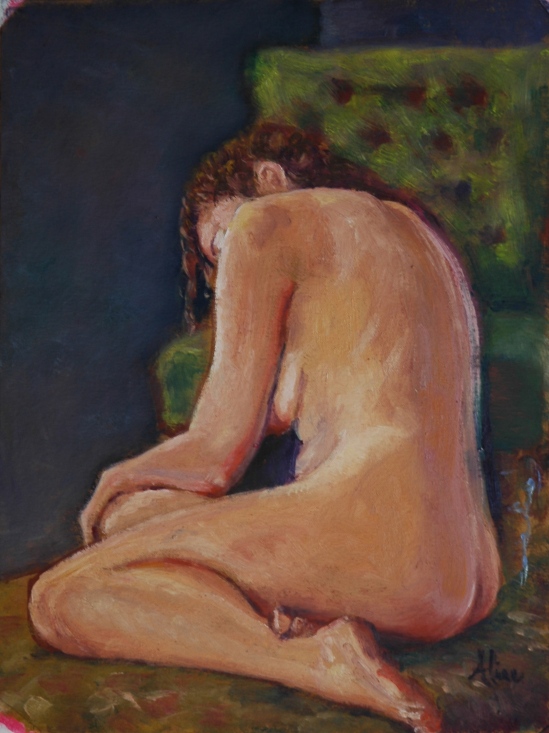
Once again I lead off with a nude.  I love my nudes.  This was today’s.  You probably recognize the model.  Our Saturday group got cancelled by the snowstorm and my painting from Tuesday is not finished, so it’s the only nude I have for you today.  (We have Tuesday’s model again this week, so I will finish that one up and post it before I leave for Florida for two weeks.)  I am not sure that I will be able to keep to my Monday blogging schedule while I am down in Florida, but I should be able to post photos of the paintings from time to time.

Today I finally noticed why I sometimes see shadows as orange.  When it’s cold in the studio, we used a space heater to keep our model comfortable.  The heater glows orange.  Her breast looked as if it were on fire yesterday.  That was the clue.  But it doesn’t explain other orange shadows, the ones on the other side from the heater.  Maybe it’s simply what I see, after having one cataract removed.  Can’t wait for the other one to go.

I also loves me some landscapes.  Without a Saturday Life Group session, I was unleashed to paint a landscape.  Ever since the Eric Aho exhibit, I’ve had this notion that I too could paint an abstract landscape if I simply gave myself permission .  Turns out, it’s not that easy.  I have, in the past, made paintings that look abstract–well, only two, to be exact.   One happened in a magical state of unconscious creativity (as seen in hindsight, of course), and the other’s subject matter was inherently abstract.  “Spirit Lake” is the former; the name I gave it may be a subconscious bow to the process that created it.  Click here to go to my web page showing Spirit Lake.

The inherently abstract one was a close up view of the mangrove swamp in the Ding Darling National Wildlife Preserve.

Mangroves, Ding Darling

Mangroves, Ding Darling

So Saturday I taped up a 16×20 piece of oil primed linen on a drawing board, and got out a volume of spectacular photographs by Tim Palmer, of some of the most spectacular scenery in existence.  I met Tim some years ago at a Sierra Club meeting, and told him I wanted to use his photographs as inspiration for paintings, and he gladly gave me permission to do so.  His book, titled “Luminous Mountains: The Sierra Nevada of California”, had been waiting patiently in my studio all these  years to be put into service.  I opened the book and did not get further than the frontispiece, a magical scene titled “Volunteer Mountain, Yosemite, at Sunset.”  I tried valiantly not to paint the photograph, but I’m sorry to report, my product is not very abstract.  Not abstract at all.

California Landscape

California Landscape

It’s also earthier, less magical, than the photograph.  Isn’t that strange?  I may try again, next time limiting my palette–no blues or greens allowed.

I also took the Saturday opportunity to modify, perhaps improve,  the frigid plein air paintings of a few weeks ago.  I actually made something of that first effort in the windy, subzero meadow off Route 302.

Mt. Washington from 302, No. 4

Mt. Washington from 302, No. 4

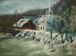
The scene of the Jackson church needed some cleaning up, and fresh whites (actually not pure white, but white with a tiny bit of yellow).  Compare:

Jackson Community Church, looking west, BEFORE

Jackson Community Church, looking west, BEFORE

Jackson, AFTER

Jackson, AFTER

The differences are perhaps too subtle to show up in this medium, same as a photograph can never do justice to a painting, unless it is printed as a giclee and there is nothing between you and the giclee print.  (No digital interface, e.g.)

Aline Lotter is currently exhibiting:

at the Hatfield Gallery in Manchester (Langer Place, 55 S. Commercial St., Manchester, NH); at the Bartlett Inn in Bartlett; at the Red Jacket Inn in North Conway;  at her law offices at 41 Brook St in Manchester; and at her studio by appointment.

In February, you can also view (and purchase–of course!) some of my paintings and drawings at the McGowan Gallery in Concord, NH, (“Love, Lust and Desire” is the theme) and my 6×6’s at the Artstream Gallery in Rochester, NH.

If you happen to be near Orlando, Florida on February 14, 15 or 16, or Tampa, Florida on March 7, 8, and 9, you could (and should) catch Nude Nite, happening with music and other entertainment at these locations, respectively: 639 W. Church St. (blue freestanding warehouse just East of I-4) in Orlando; and 3606 E. 4th Ave., in Tampa.  Hours are 6 pm to midnight.  (Nude NITE, after all)

Weary of nudes?

When Londonderry Arts Council decided to take the plunge and allow nude images to be exhibited at their annual “Art on the Common”, an outdoor art show to be visited by regular folk and their innocent, sheltered children, I threw caution to the winds and signed up.  In order to show my nudes, I had to mount and frame them.  Big effort, but more significantly, big expense.  After the one-day show, I had about 25 paintings of nudes, many of them in new frames purchased for the occasion.  What to do with all those riches?  Hang them up, of course.  I have one room in my house pretty much covered from ceiling to floor by artwork, most of it my artwork.  I took down all of my artwork, and replaced those pieces with my nudes.  When you walk into that room now, you are pretty much overwhelmed by the beauty of the naked body.  It’s a bit too much, even for me.  That room is where I host the weekly bridge game, and this week was the first time my bridge players had seen the room in its reborn splendor.  I allowed as how the display was too much, and was rewarded with this telling remark:  “I’d say you got that down — you don’t need to do any more.”

Need vs. want.  I am an addict.  I spend so much time in a week working on my little studies of nudes that I have not made a lot effort to get outside and paint landscapes, or put in some time on my large studio project.  Between my Saturday group, my Tuesday group, my Tuesday night class, my Friday morning workshop, and my Sunday group, I currently probably have more opportunities for life drawing and painting than practically anyone else has ever had since the beginning of modern times (by which I mean the 20th and 21st centuries).  The ability to admit this may be my first step back on the pathway to normalcy.  Or not.

I think I will take down most of the nudes gracing my walls, but I can’t stop myself when it comes to the drawing and painting part.

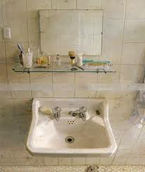
Sometimes I get distracted by the face.  The ability to paint or draw portraits is important to me.  I keep thinking that if I just keep trying, I will eventually learn how to capture the elusive likeness, and when that happens, only after that happens, I can start to apply some Art to the likeness.  And that thought has led me to another breakthrough insight into modern art, at least the kind of modern art which represents a depiction of something.  The depiction of something with paint or whatever other medium can range from photographic to practically abstract.  The purely photographic requires a great deal of skill and patience.  But it’s doable, given time, talent and determination.  The other end of the spectrum is largely inspirational.  The amazement it engenders in the beholder is something more rarefied than mere appreciation of skill.  That is not to say that both appreciations cannot be embodied in a single work of art.  Sargent, say.  Or my latest hero, Eric Aho, an abstract landscape artist.  Also, see  Antonio Lopez  Garcia , a realist of inspired genius.  Here is one of my favorite works by Garcia:

Sink and Mirror, by Antonio Lopez Garcia

An artist who creates amazing, inspired art is gifted with more than mere talent for drawing and painting.  He (or she) is gifted with genius.  I suppose it is my hope that somewhere hidden inside me is a spark of genius, if only I can find it.  And that’s why I can’t stop drawing and painting nudes.  It’s my pathway.  To destinations unknown.

So, speaking of which, here are SOME of the nudes of the past week, one of which is a portrait:

Figure in Charcoal

This young gentleman is a new, inexperienced model.  I hope we see him again.  In addition to the full figure above, I also drew a pretty accurate portrait, but forgot to photograph it.

Full figure in charcoal

I am starting to misremember when and where I painted what, but I’m pretty sure this charcoal drawing happened in the past week in Adrienne’s studio.  I just can’t figure out how I must have drawn this as well as the portrait below within the same three hours.  I would have skipped over this one but for the breast resting on the ottoman–does it perfectly evoke the soft tissue or could I have done it better?  Doubt is such a demon.

Becky portrait in charcoal

You all know Becky by now.  I thought this was an excellent likeness when I drew it, but now I think I have made her look just a little bit older than she is.

Relaxed

This is a colleague who models for us occasionally so as to defray his cost of participating as an artist.  Artists make the best models.

Long-stemmed rose

Our new long-limbed model.  Drove me crazy as I kept revisiting the question, is her leg (arm, foot, hand) really that long or have I exaggerated it?

Aline Lotter is currently exhibiting:

at the Hatfield Gallery in Manchester; at the Bartlett Inn in Bartlett; at the Red Jacket Inn in North Conway;  at the Pantano Gallery in the Shapiro Library at Southern NH University; at the Derry Public Library; at the law offices at 41 Brook St in Manchester; and at her studio by appointment.