I’ve done some good work over the past few months but I’ve been too lazy or something to produce a report. My mood is picking up now, since meeting with my doc and getting the thyroid replacement dose increased. Tellingly, much of the work I have done recently (last few months) has been prompted by a workshop. So thyroid correction notwithstanding, I worry about my low degree of self-motivation. There’s this nagging thought in the back of my mind, that age is taking its inevitable toll, and I’m not going to be able to reverse it. Not at all what I had planned for my golden years.
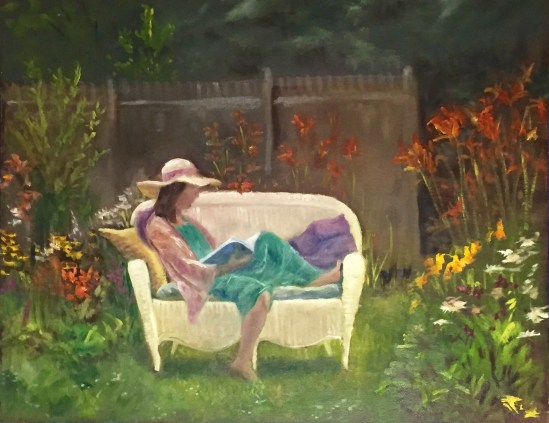
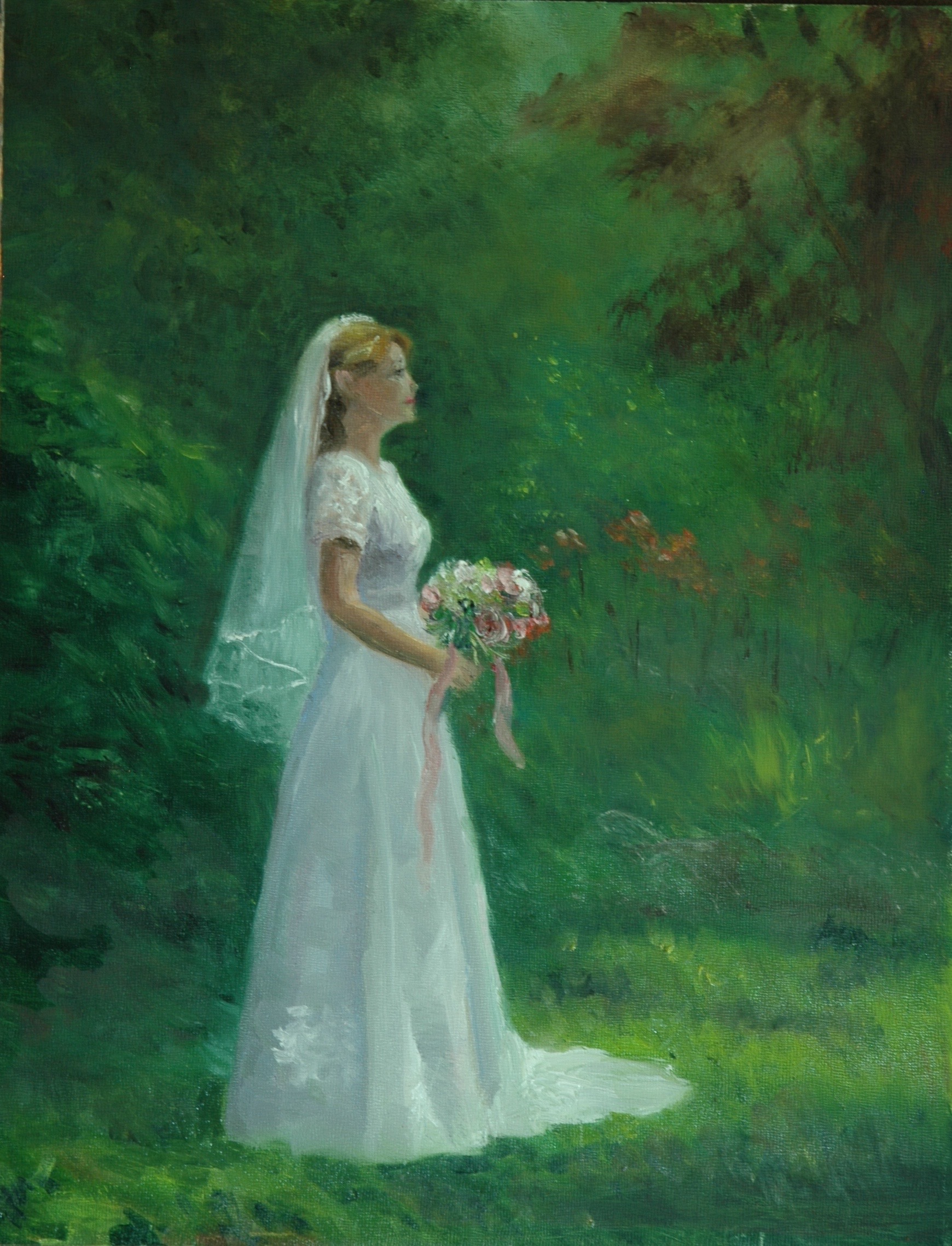
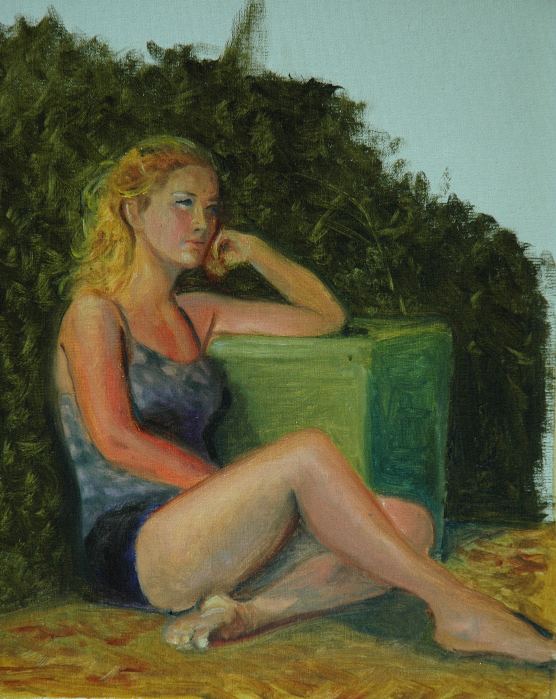
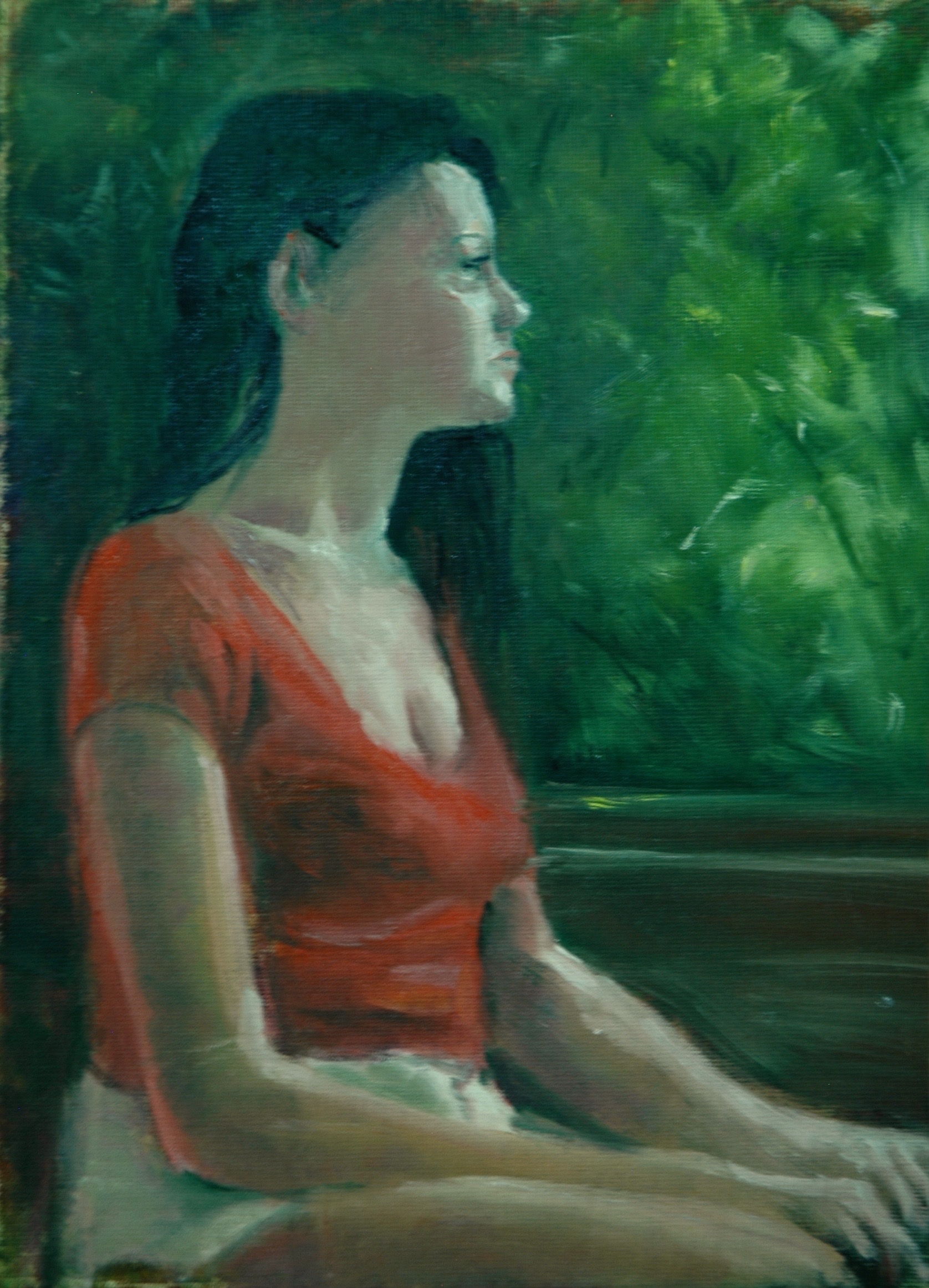
The work that I have produced has mostly been fast draws–2-3 hour pet portraits and plain air landscapes. But one is a two-afternoon Figure in the Garden, a 20×16 masterpiece. Another is a studio landscape from a Cape Cod photograph that I started last fall and left untouched on my easel all winter.
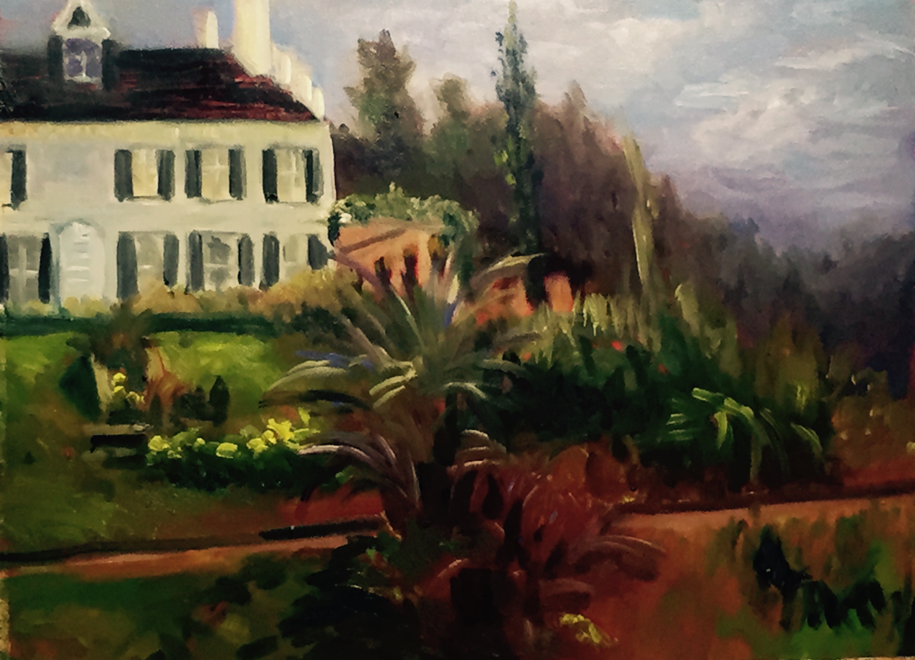
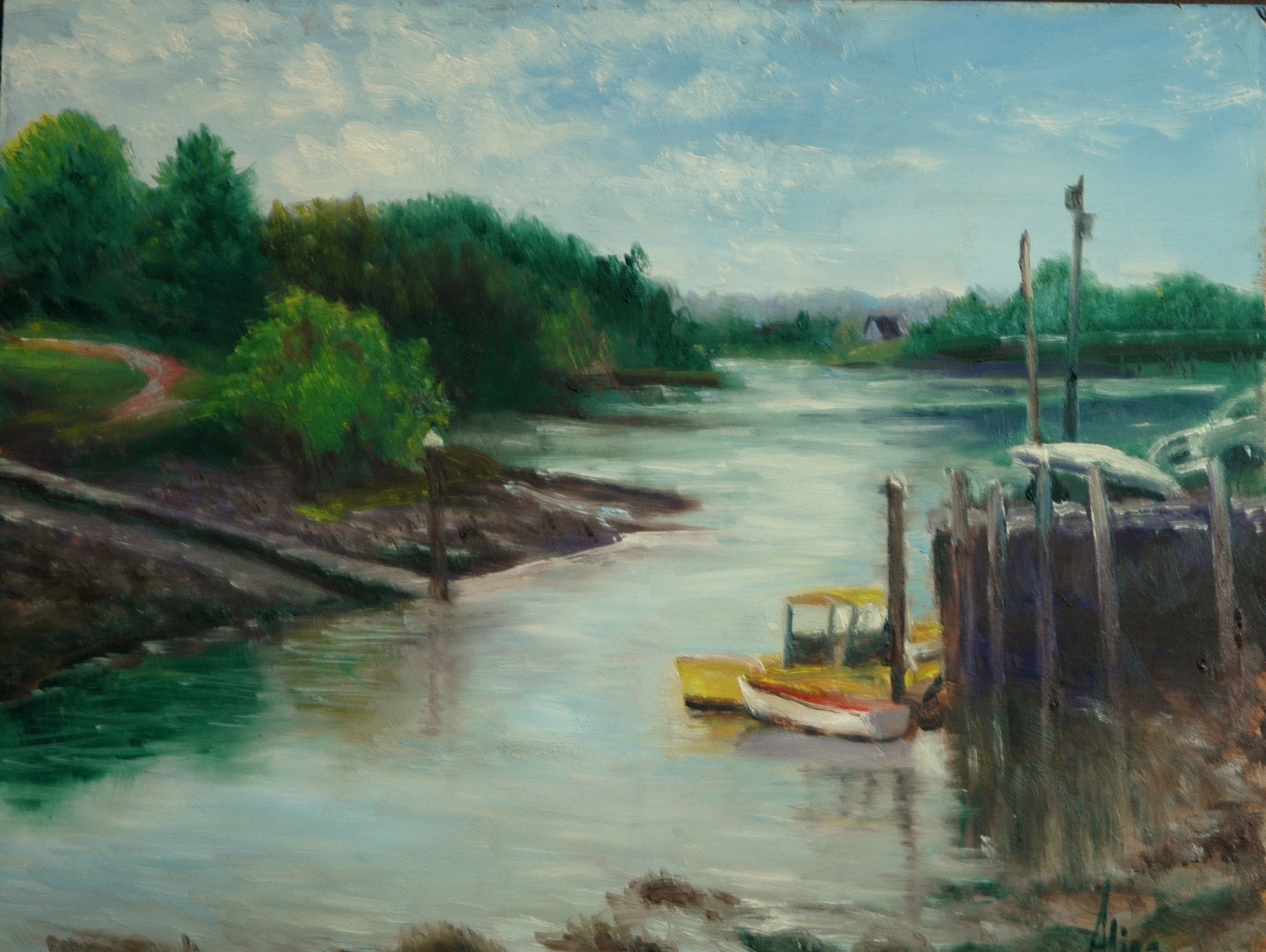
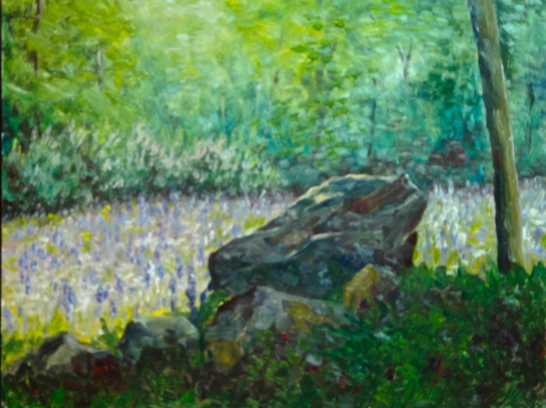
I will start with studio landscape that I can now claim “took me months to complete”. It’s the coast guard station at Race Point. I had painted a small version of the building en plein air, but I also took a photo of it that dramatized the late-afternoon clouds and sunlight. I used a 18×24 canvas, making this one of the largest landscapes I’ve ever wanted to paint. The inspiration came not from the building but from the sky. I felt totally in sync with Constable, who obsessed over his clouds. Looking it over now, I think I wanted* to make the building even smaller in relation to the sky. Perhaps I will have to do a third version.
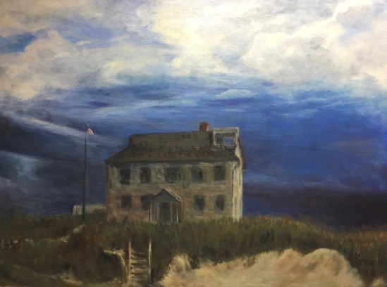
Coast Guard Station at Race Point
*Why didn’t I? The painting took over control.
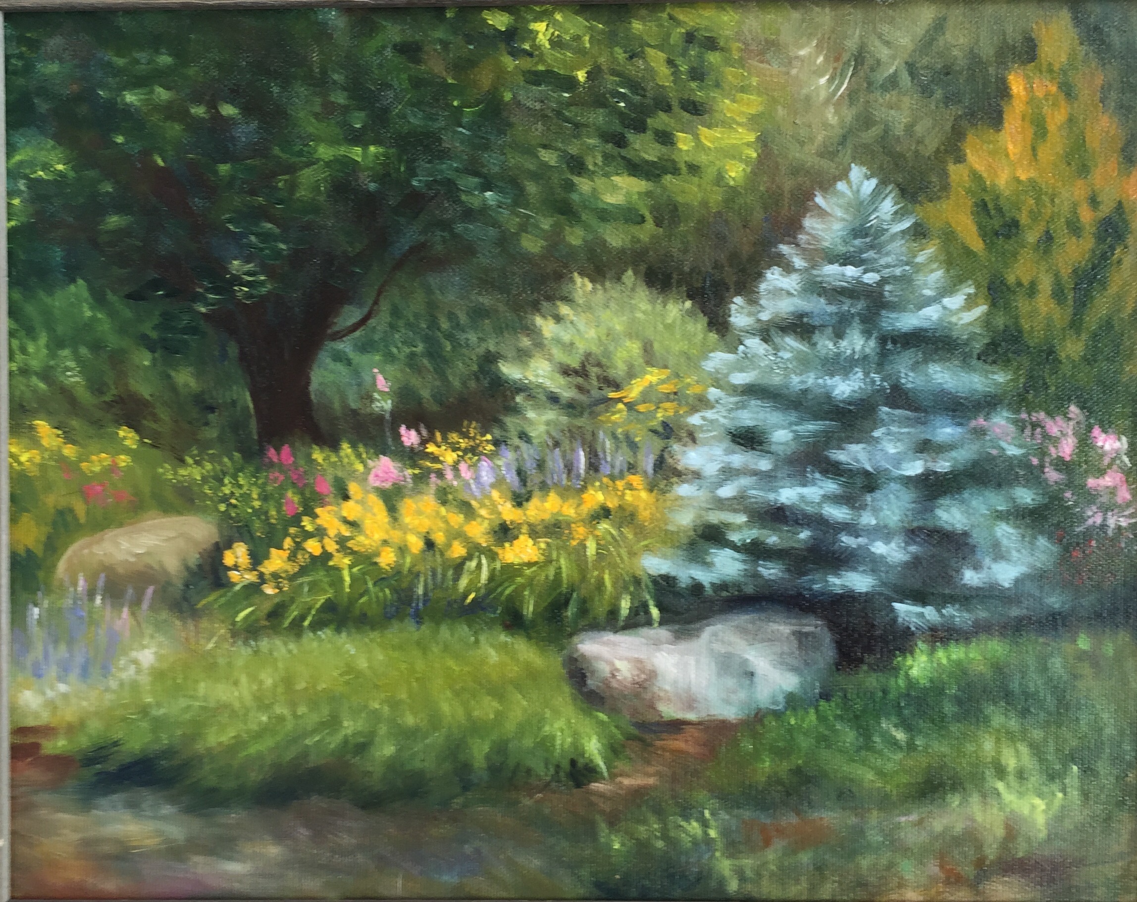
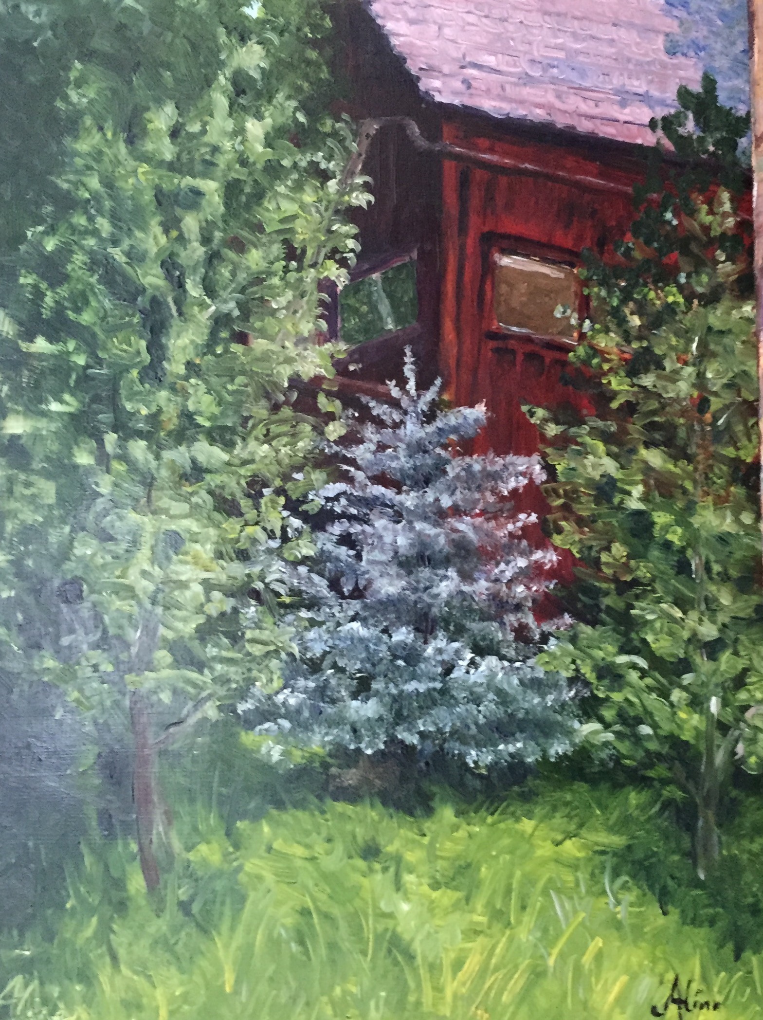
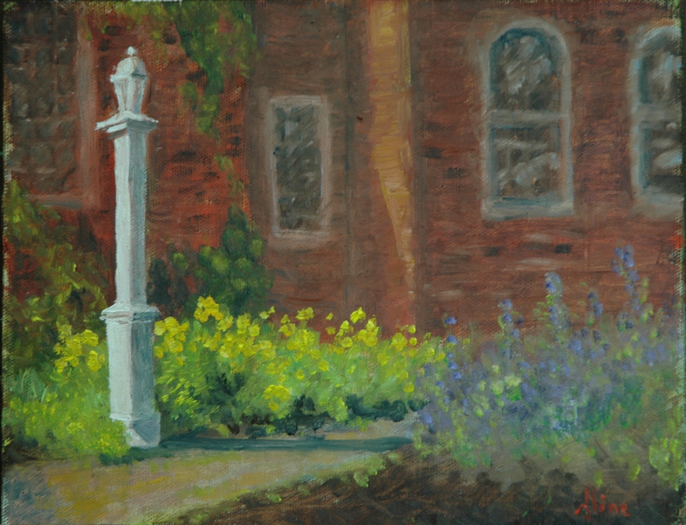
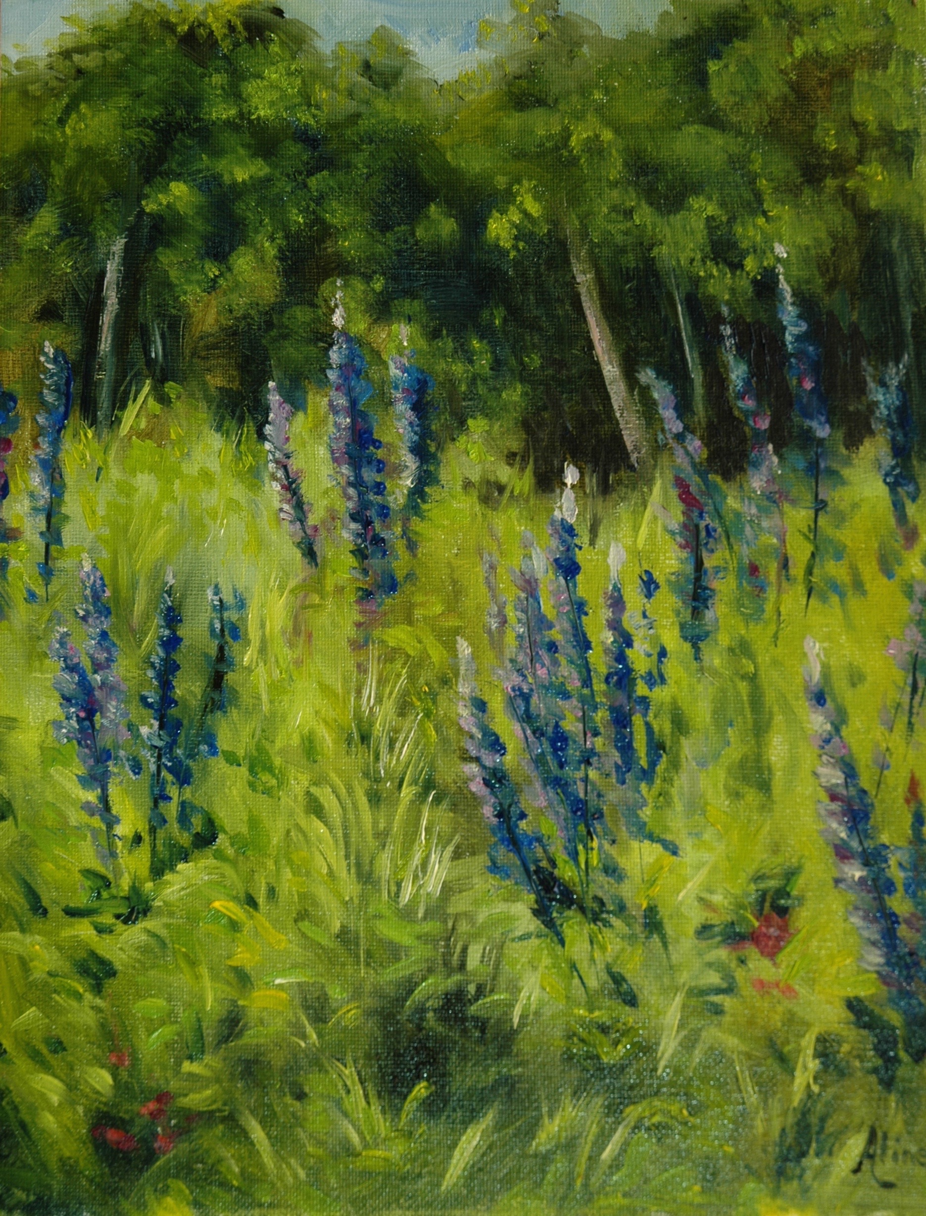
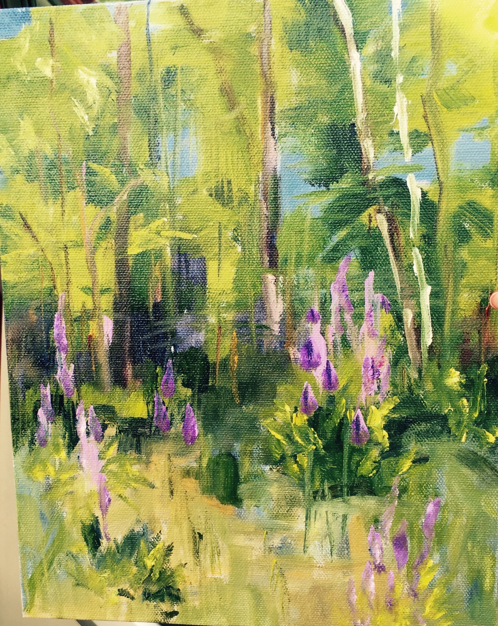
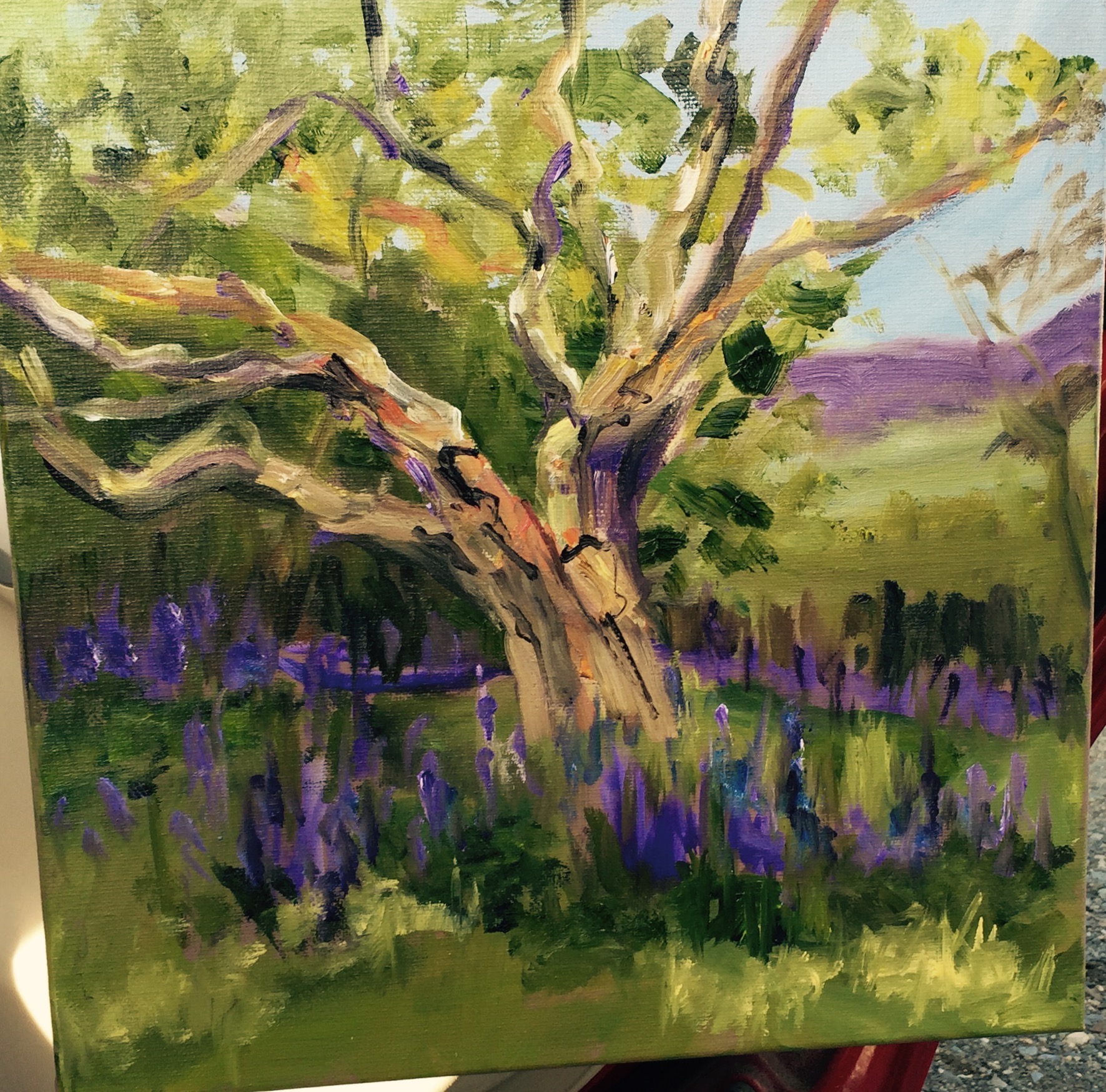
The other landscape that I am pleased to show you was my first plein air effort since last Fall. Our NH Plein Air group were invited to the grounds of Bedrock Gardens in Lee, NH.: Acres and acres of plantings of shrubs, trees and flowers; sculptures interpersed. With all that drama available, I chose to paint a field that was virtually featureless–just to get at the red roof in the distance.
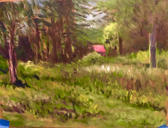
Red Roof at Bedrock Gardens
Sorry about the blue tape. I still have not mounted the painting onto a panel.
My next foray into paint was a 2-day workshop at the NH Institute of Art with a new, young instructor named Katie Swenson. Her specialty is animals and maybe that’s my specialty too. I actually didn’t believe anyone could teach me anything new about painting animals, but I knew that was a pretty arrogant assumption and one likely to be proved wrong. Whatever, I love to paint animals and this was sure to lift me out of my funk. Well, turns out that Katie is fabulous and the other students were like-minded and I hope those connections will bear fruit in the future. (She has a Facebook page but not a website–I don’t know how to link to FB.) As for the two days of the workshop, I started with Rocky, a dog belonging to my friend Jackie, and then I portrayed Freckles (my cat who was gone for seven years) in a pensive mood.

Rocky, in a moment of doubt

Freckles, in reverie
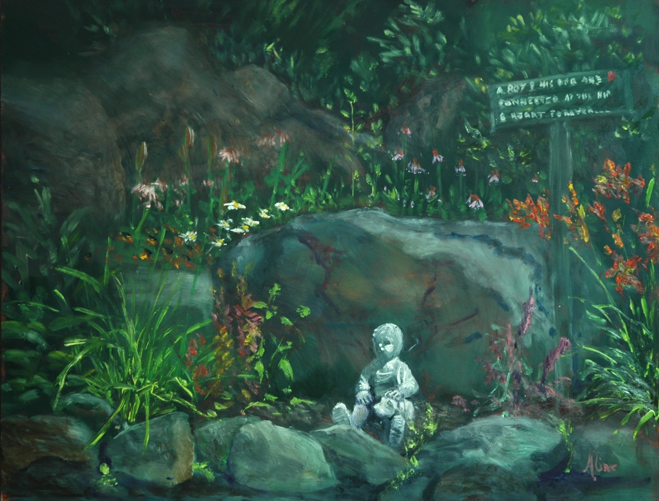
I’m going to save my Figure in the Garden for next week, when I should have another of the same kind ready to show. I don’t want to overload your senses. Hope you love the cat. Feel his woolly coat.
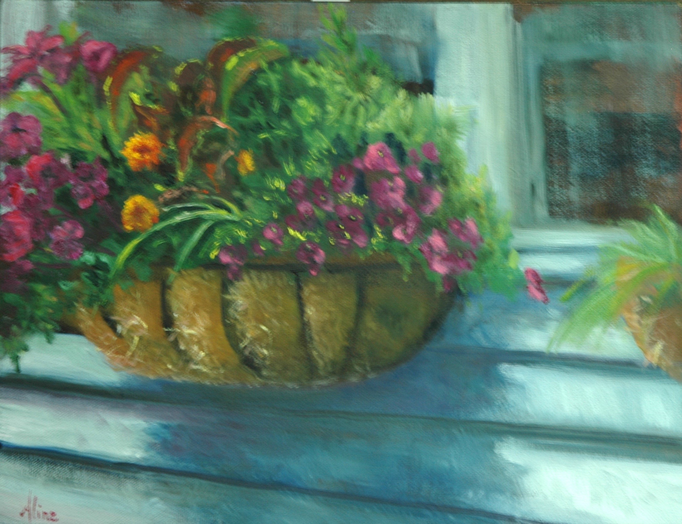
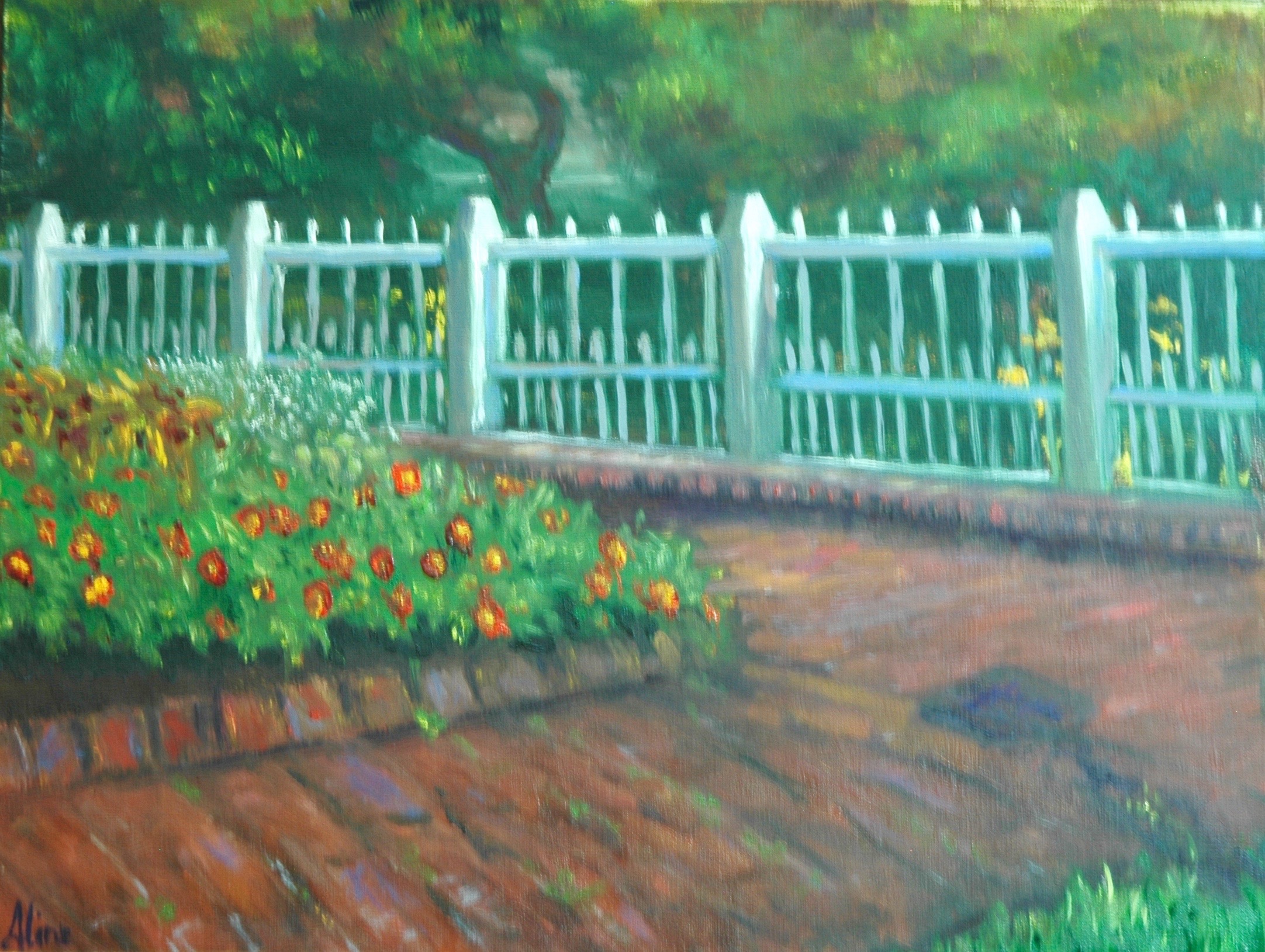
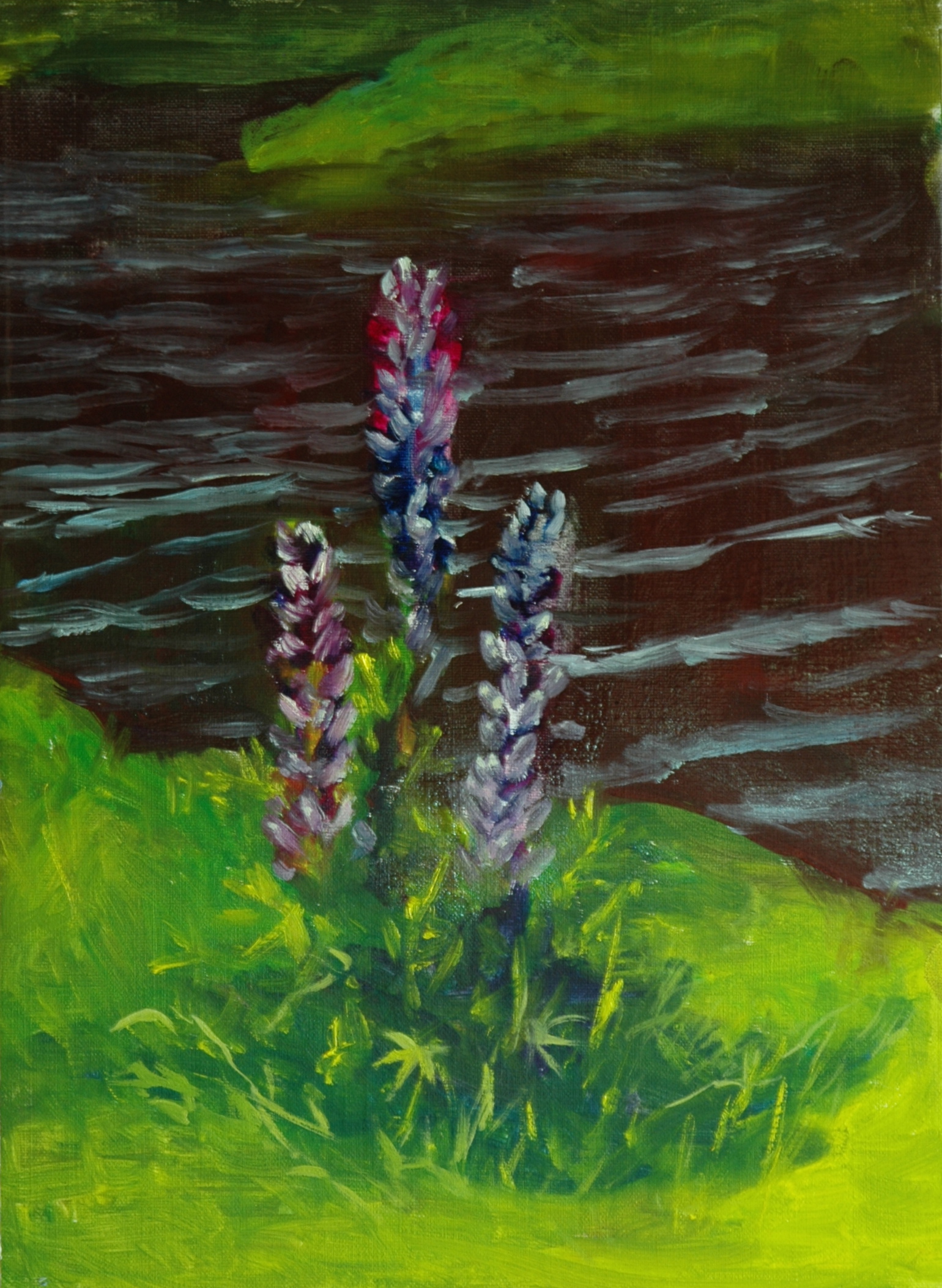
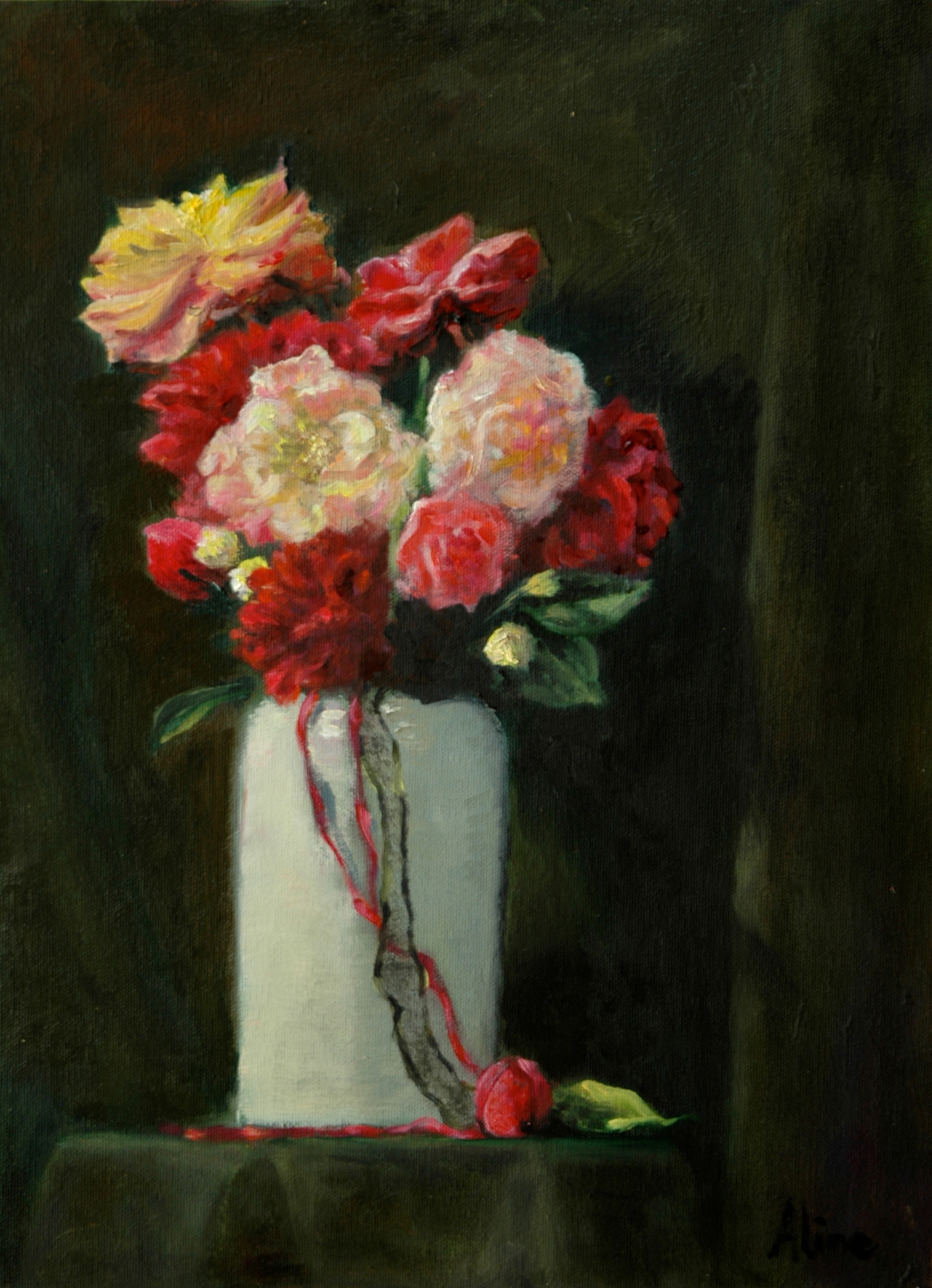
A bit of news: East Coast Colony had its 14th annual Petals to Paint at LaBelle Winery last week, and my painting got chosen by a brilliant designer, Jeanne Popielarz, who won the Peoples Choice vote. No actual prize but much glory! Here is my photo of the combo:

Creeping Shadows morph into delightful floral arrangement
Meanwhile, I have been pulling back from marketplaces. I closed my display at the NH Antiques Co-op. I have been showing paintings here and there (Armory in Somerville MA, Currier Museum in Manchester, Massabesic Audubon Center, Wolfeboro Library, Pease Library in Plymouth) through all the seasons, but there is nothing major going on. As usual, you may view paintings with prices and order prints, phone cases, pillows and the like at my Fine Art America pages, which are, like this blog, way overdue for updating. If the painting you are interested in is not there, or if you prefer to bypass that experience, you may contact me by email to alotter@mac.com.
If you want to add a public comment to this blog, go to the bottom of this page where it says “Leave a Reply”, and enter your comment in that box. I love to get public comments, so don’t be shy!