On Photographing Oil Paintings

I have, from time to time, complained about fog or glare appearing in my photographs of artwork.  I tried to eliminate glare by cutting down on lighting, but it didn’t always work.  The larger the painting, the harder it was to eliminate glare.  When I started, I didn’t have a lot to photograph so I would take the artwork outdoors to a spot where the lighting was indirect.  As I accumulated piles of panels to photograph, I wanted to be able to run through them relatively quickly–indoors and at night.  I would flood the studio with full-spectrum artificial light.  Instead of aiming lights at the artwork, I would bounce light off the ceiling, through a mirror, etc.  I thought the only solution was to avoid the light that rakes across the surface of a painting.  Yet my research on the internet kept producing advice to set up lamps aimed at 90 degrees from the artwork.

The result of my low lighting solution to glare was unsatisfactory color capture.  I started using my iPhone instead of my once expensive, leading edge digital SLR Nikon D70.  But all that is in the process of changing, since I attended a short workshop at the NH Institute of Art, conducted by the chairman of its Photograpy Department, Gary Samson.  I learned a new concept:  polarization.  I’m no scientist, as Republican climate-change skeptics are so fond of saying, so the explanation that follows may read like a Mother Goose tale to someone who actually understands the physics of light.

Rays of light have direction, and bounce off surfaces like oil paintings.  To polarize these bounces is to neutralize them, or counteract them, with filters that somehow deflect the bounces before they reach the camera.  You need a filter for the camera lens.   You also need filters between the light source and the art object.

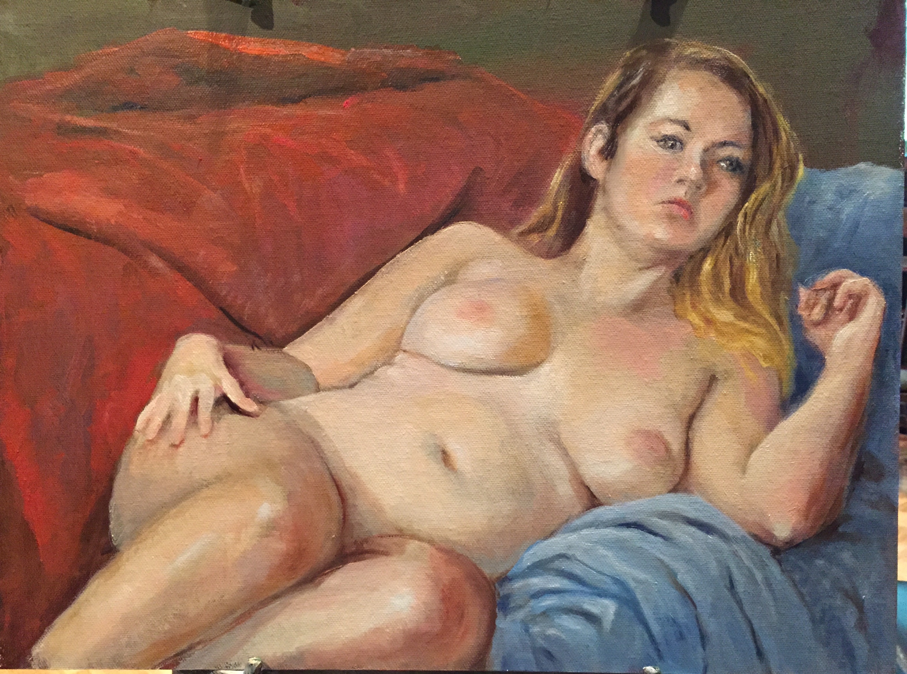
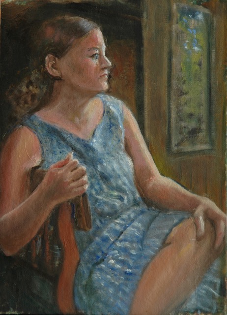
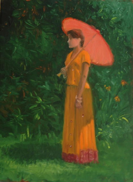
I started by acquiring a filtering lens for the Nikon, and rephotographing some recent works that had troubled me.  Despite the fact that I could not figure out exactly what I was supposed to see through my new circular filter, the photographs did improve.  Compare the original hazy image with the new polarized image.

John Brown as gardener

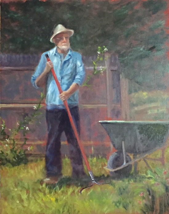
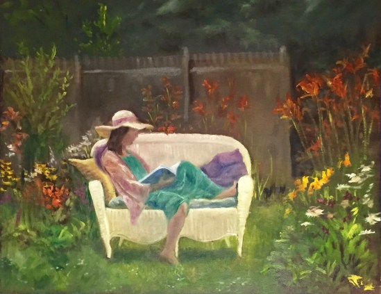
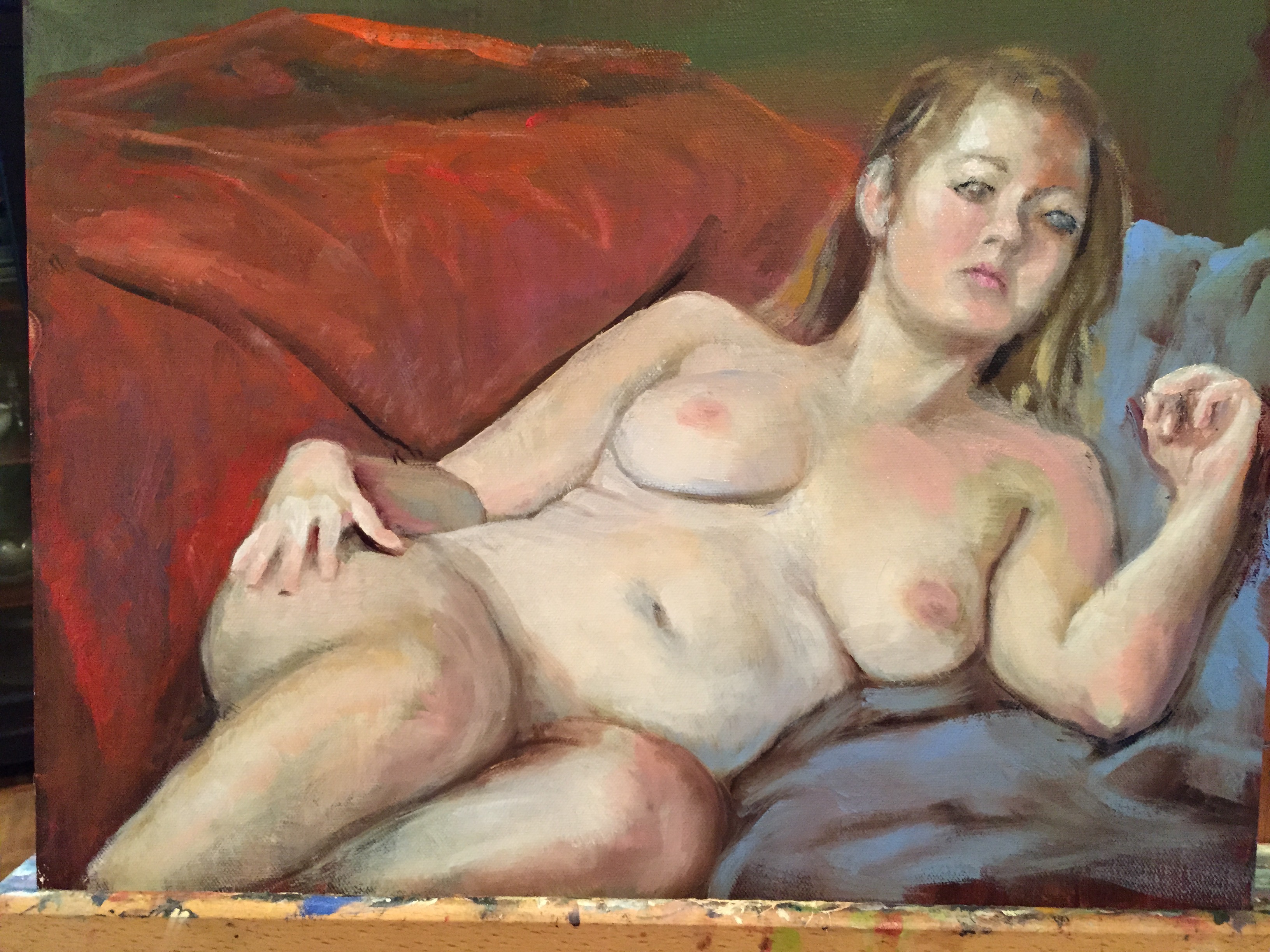
John Brown, posing as gardener or farmer (FOG FROM REFLECTED LIGHT)

john-the-gardener02854

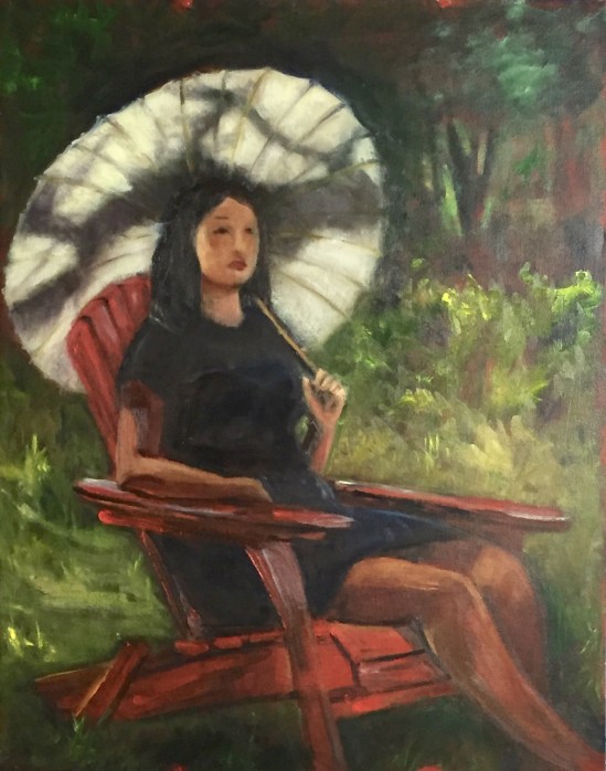
John the Gardener  (NO MORE FOG; COLOR ALSO MORE ACCURATE)

But then I tried to rephotograph a painting that I had varnished with a high gloss varnish.  I could not get rid of the glare.  So I rummaged around Amazon and then eBay until I found affordable gizmos to hang filters from the spotlights, and a large sheet of polarizing film from which to cut out sheets to hang from the gizmos.  I don’t think it mattered whether the film’s polarity was circular, as with the camera lens, or parallel.  Circularity was necessary for the camera so that the camera could still autofocus.  I take that on faith since I don’t understand it.

Alas, the filters for the spotlights did not solve the varnish issue.  I am so sad.

Two other advances in my photo technique have resulted from that workshop:  I set the Nikon to take the photos in RAW format.  That’s super-large format to accommodate enormous amounts of data for the purpose of manipulating the data in the finished version (jpeg) of the photo; and I bought a photo manipulating program better than “Photos”, which comes free with all my Apple devices.  Adobe Lightroom, about $145 from Amazon, compatible with Macs and IOS.  Headache!  Powerful software equals massive learning curve, and hey,  I hated learning how to operate the remote control on my DVR.

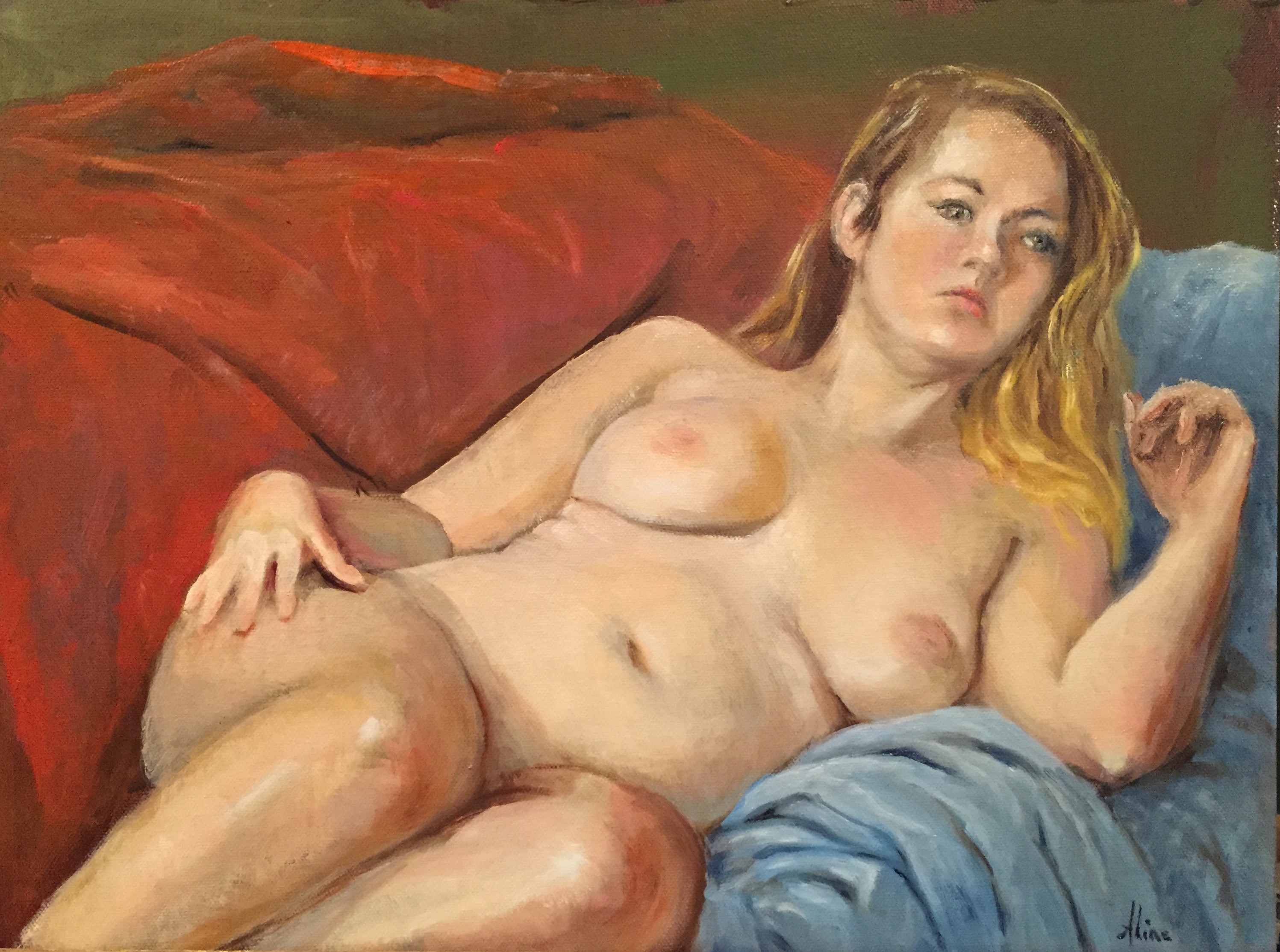
As a result of all this upheaval, my diligence with blogging faltered over the past couple of months.  I’m hoping that by the end of January, I’ll have all the bugs worked out.  Meanwhile, here is a decent photo of a 16×20 painting that I did over the summer–from a reference photo I took in my neighborhood.

02856-jpg

Russell Street Roofs

Reminder for folks in the Chesapeake Bay area: see two of my animal portraits at the Annmarie Sculpture Gardern and Art Center in Solomons, Maryland.   The exhibit’s theme is “Fur, Feathers, and Fins–Our Faithful Pets”.   It will run  through January 29.

Other places where you might catch a few of my paintings are:

  • NH Antiques Coop in Milford NH
  • Ellis River Art Gallery in Jackson NH  (in January 2017)
  • Bartlett Inn in Bartlett NH
  • Red Jacket Resort in North Conway NH
  • Bernerhof Inn in Glen NH
  • Mesmer & Deleault Law Firm in Manchester NH

As usual, you may view paintings with prices and order prints, phone cases, pillows and the like at my Fine Art America page. If the painting you are interested in is not there, or if you prefer to bypass that experience, you may contact me by email to alotter@mac.com.

If you want to add a public comment to this blog, go to the bottom of this page where it says “Leave a Reply”, and enter your comment in that box. I love to get public comments, so don’t be shy!

New Crop of “Figure in the Landscape”

For a third Summer in a row, I participated in the David Curtis offer of a model in his garden garnished with the light touches of his guidance and that of my fellow artists.  This year, we had July Sundays in addition to the August Sundays, plus an errant June Sunday to get us in the proper mindset.  We got rained out only once, giving me a total of eight Sundays, eight figures, eight paintings.   David’s home and garden is in Gloucester, an hour and a quarter drive from my home.  This year I had company on the trip.  I persuaded Cynthia Arieta to try it out; she prefers figurative painting too, and we met during Cameron Bennett’s Cornwall workshop a few summers ago.  She’s now as hooked as I am.

For models, we started with David’s wife Judy, dressed up as a Guitar-playing Gypsy.  This was the June Sunday.  The Rhododendrons were no longer in bloom, but David suggested I add blooms to the painting anyway, so of course, I did.

Judy with Guitar and Rhododendrons

Judy Curtis, wife of David Curtis, posing in their Gloucester garden

The order in which I painted the middle ones might not be accurate, but who cares about that, right?  I believe the second one was the Basketful of Flowers, featuring artist Marianne as our model.  For both of these first two paintings I used a 20×16 Raymar panel.  In the previous two summers, I had painted smaller, on 12×16 panels.  I had been easily able to complete those 12×16 paintings in the three hours allotted, so this year I thought I would challenge myself by going bigger.  As a result, the background of Basketful of Flowers was unfinished when I left that Sunday.  I worked on it at home and brought it back the next week for comments from the others.

2016-07-20 14.29.42

Basketful of Flowers

Not particularly happy with my first two paintings, I concluded that 20×16 was perhaps too large for me to complete in three hours, and I switched back to 12×16 for number three.  I call this one  Diamond Bracelet.  My titles are mostly hooks to remind me which painting I am talking about.  I could not use the dress color to identify this painting because, as you will see, another blue-green dress is coming up.

Diamond Bracelet

Diamond Bracelet

David objected to the downsizing idea:  As long as I was getting enough information on the larger canvas to finish at home, I should keep working in the 20×16 format.  Subsequently I also took pains to prepare the panels that I used with a dark ground.  Dark brown or rusty red were my usual choices for the ground color.  Without the pressure to cover up white grounds, I could get closer to completion each Sunday.  If I remember correctly, the ground for White Wicker Settee (number four) was close to black.

Reader on White Settee

White Wicker Settee

Our model, another artist,  for White Wicker furnished the settee herself and of course chose her costume.  David declares repeatedly, “Artists make the best models”, and surely their choices of accessories is a big component in their success.  He tried to recruit me to model next year, but I am reluctant to sacrifice my painting time.

Number five.  The next model is the daughter of one of us artists.  I had to fake the rhododendrons again.  From Gloucester to Manchester, we have been suffering from an extreme drought, and Judy Curtis, who is in charge of the garden, stands on principle in refusing to water her garden–ever.  So the rhododendron blooms would not be the only flowers we had to invent or exaggerate as the drought worsened over the summer.  Tablecloth and vase is the one of the eight that I am least satisfied with.

Reader at table with vase of flowers

Tablecloth and Vase

After the fact, I decided I should have filled the canvas with the figure instead of letting “figure in the landscape” govern my composition choices.  For future sessions, I resolved to get closer to the model and even, gasp, allow body parts to get cut off by the edge of the panel if necessary.  Meanwhile, David encouraged me to paint in the pattern on the tablecloth in order to create something interesting going on.  One of the most common praises he heaps upon me is that I “tell a story”.  I don’t really understand what he is talking about, but hope I can keep on doing it.

The next two paintings did not require me to cut off any limbs, but I did allow  major accessories to get cut off.  The first, George Martin, Painting (number six), started on a blackish ground.  Notice how his easel slides out of frame on the right?  The part I had the most trouble with was his eyeglasses.  The lenses caught quite a glare from the bright sun and sky above, but when I painted them like I saw them, it was too startling and distracting.

George Martin painting

George Martin, posing with his brush and easel

John Brown is a regular on Sundays and has posed in the past on Sundays when I could not be there.  I had envied the results I had seen, so was looking forward to his portrayal of Farmer John (number seven).  (Or should it be Gardener John?  Doesn’t have the right ring.)  I believe I can detect a red ground for this one.  His wheelbarrow leaves the frame on the right.  This painting was my favorite (and David’s favorite) up to that point, but there was one more week to go.  Could I top Farmer John?

John Brown as gardener

John Brown, posing as gardener or farmer

In this number eight, the last painting of the summer, the red adirondack chair makes its third appearance over the last two summers.  The model is engaged to marry David and Judy’s son.   Her names escapes me right now–so sorry.  But she also modeled for us last summer in a navy blue dress holding a red parasol–my least favorite painting from any of the summers.  So when she appeared again in navy blue, my heart sank.  I prepared myself for a disaster of a painting.  But surprise, Navy Blue with Red and White proved to be a winning combination!  And to celebrate, I cut off her feet!

Combining red chair with white parasol

Navy Blue, Red and White

A major contribution to the success of this painting is the shadow pattern on the parasol.  The sun and the tree gave me what I needed to tell that story, whereas the shadow pattern in Diamond Bracelet was, well, no pattern at all.  I may have to go back and fix that.

Reminder for folks in the Chesapeake Bay area, if any there are: see two of my animal portraits at the Annmarie Sculpture Gardern and Art Center in Solomons, Maryland.  Opening reception will be October 7, which I cannot attend.  Alas.  Maybe I will make it down there before the exhibit ends in late January.  The exhibit’s theme is “Fur, Feathers, and Fins–Our Faithful Pets”.   It will run from October 7 through January 29.

Other places where you can catch a few of my paintings are:

  • NH Antiques Coop in Milford NH
  • Ellis River Art Gallery in Jackson NH
  • Bartlett Inn in Bartlett NH
  • Red Jacket Resort in North Conway NH
  • Bernerhof Inn in Glen NH
  • Mesmer & Deleaut Law Firm in Manchester NH

As usual, you may view paintings with prices and order prints, phone cases, pillows and the like at my Fine Art America page. If the painting you are interested in is not there, or if you prefer to bypass that experience, you may contact me by email to alotter@mac.com.

If you want to add a public comment to this blog, go to the bottom of this page where it says “Leave a Reply”, and enter your comment in that box. I love to get public comments, so don’t be shy!

Fabulous!

Duveneck Reader

Duveneck Reader

“Fabulous” was David Curtis’ word for this painting, completed in his Gloucester garden as the last figure-in-the-landscape event.  As if to prove he was not using the word casually, he added that it was a “prize-winner” (or “award-winner”–same thing except some awards don’t come with any prize other than the glory).  I took that pronouncement as a challenge–I went home and entered it in the Artist Magazine competition for Artists Over Sixty.  Doesn’t that narrow the pool so as to benefit my odds?  On the other hand, artists who have been painting all their lives are pretty darn good by the time they attain the age of sixty, which hurts my chances.  If/when I get passed over, I get to tell David Curtis he has been overruled.

The title, “Duveneck Reader”, arises from the fact that the book her right hand is resting on is titled “Duveneck”.  It is an art book about the painter Duveneck, who was affiliated with the Boston Painters.  As such, he occupied a middle ground between academic painting and impressionistic painting–pretty much what I do too.  Anyway, David was so pleased that I included the book and actually thought he could read the word “Duveneck” on the spine of the book in my painting, that he might have been biased in his assessment of the overall quality of the painting.  Hence, I felt I had to include the name in the title of the painting.  (There’s not much logic involved in titling paintings.  Numbering them seems like a cop out to me, so if something just pops into my head, I accept that as a valid title.)

For the competition, I didn’t rely solely on the one painting.  As long as I am entering, I might as well include two more of my recent figures (at the cost of $20 per image).  I chose the Bridal Gown as one, and a nude that I have just completed after three Monday sessions.  The nude furnishes a good example of how very tiny adjustments can improve (I hope!) the overall effect of a painting.  First, here is the painting after the end of the first session:

After one session

After one session

I knew I was going to have two more sessions (each is three hours) with the model in this pose, so I concentrated on getting the proportions and angles correct, in other words, the drawing of the figure.  I could afford to leave the skin tones, facial features, hands, and drapes for another session.

After session two

After session two

After two sessions, the painting seemed almost complete.  Thinking back onto Steven Assael’s demonstration, however, I knew I could improve on the skin tones.

At the end of the third and final session, I had this.

After session three

After session three (try to ignore the shadows at top, from my easel)

My artist companions thought the hands were too small.  The size of the hands had been on my mind throughout as problem areas, and I had measured them against her face, taking into consideration the fact that she does have small hands, and at least one of them was extremely foreshortened in my eyes.  But I accepted the verdict of Laura and Nancy, so after they left the studio, I opened my palette back up and got to work enlarging the hands.

American Beauty (final)

American Beauty (final)

Nancy had suggested I just make the foreshortened hand wider.  I did so, and also blurred the left edge.  The other hand, which had been so difficult to render in the first place, now had to be re-rendered without help from the model’s presence.  Insane.  But the very fact that I had painted it dozens of times with her present enabled me to recreate a slightly larger version without her present.  I think it actually turned out better.

You might have noticed that I hardly touched the red drape after roughing it in the first week.  The shapes of the drapes changed drastically not only between weeks but also between poses–even during poses at one point.  During the second session, one of my cats became enamored of my model and the drapes.  He explored the possibilities and ended up carving out a napping spot behind her hip.  Wiser the following week, I locked all four cats up in my bedroom.

Bad Cat

Bad Cat

Aline Lotter is currently exhibiting:

At the Library Arts Center in Newport, NH;  at the Bartlett Inn in Bartlett;  at the Bernerhof Inn in Glen; at the Red Jacket Inn in North Conway;  at the Firefly American Bistro on 22 Concord Street, Manchester; and at the law offices of Mesmer and Deleault at 41 Brook St in Manchester.

As usual, you may view paintings with prices and order prints, iPhone cases and the like at my Fine Art America page. If the painting you are interested in is not there, or if you prefer to bypass that experience, you may contact me by email to alotter@mac.com.

If you want to add a public comment to this blog, go to the bottom of this page where it says “Leave a Reply”, and enter your comment in that box. I love to get public comments, so don’t be shy!

Dissatisfaction

Dissatisfaction seems to happen like depression–is it a result of some mysterious collision of hormones or synapses (I’m not a scientist!), or is it justified by perceived failure?  I am of course referring to my art.  I can look at a painting that I created and quite admire it if I pretend it’s not mine.  But knowing it is mine, and it is not completely successful in terms of what I had hoped to achieve, I am dissatisfied.  This is very discouraging.  The only way to escape discouragement is to find encouragement from the outside world.  The best encouragement–say the “ten” of encouragement–would be if multiple admirers were competing to purchase a painting.  A “one” on the encouragement scale would be sincere praise.  I don’t mean to devalue sincere praise, but let’s face it, like is not the same as love.

The search for encouragement is why artists exhibit and seek to sell their paintings.  (If they are looking to make a living, they teach, or pursue a career in illustration or graphic arts.)   I think encouragement is also a prime factor in artists taking workshops from other artists; sure, you go to learn, but what you hope to learn is how good you already are!  It’s as if we need a constant infusion of encouragement to keep us going.  I know there are hermit artists whose work sees the light of day only after they are gone (gone=dead or institutionalized), but I cannot imagine how they keep plugging away with little or no input from the outside world.  Such people must be so strong willed, propelled by such an inner vision, that they can only be compared to saints, as celebrated by the Catholic Church.  (I was brought up Catholic and was a pretty devout one until I got out in the Real World where, after two children, birth control became a necessity.)

All is this is a preamble to this week’s collection of recent paintings with which I am not satisfied, completely.  First, here is Margaret back again, after a three-session pose:

Margaret in Blue

Margaret in Blue

Three sessions is long enough to get it all right.  I had to repaint her leg and arm in the third session because I had the perspective so wrong that her leg looked as if, in the words of a fellow artist, it were coming out of her belly.  So it is correct.  But is it inspired?  After the first session, there was (I think) a freshness and spontaneity that is now lost.  How did Sargent manage to labor over his portraits and produce paintings that seem to have been painted casually albeit perfectly with the first stroke?

Two more figure in the landscape paintings have entered the world as the result of workshops in the garden of David Curtis in Gloucester.  First, the orange one:

Figure in Orange

Figure in Orange

She was holding a red parasol, the same  parasol that I painted last summer, but this time, we had sun flowing through it.  The two-piece dress is Indian, a saffron yellow-orange.  Do I have enough light?  No, it does not  pop like it should.  Is the green unrelenting?  Maybe, but it’s not the problem, is it?  Orange and green should produce quite an impact together.  Perhaps the figure should have been bigger.  So I resolve to go bigger with the next one:

Figures in White

Figures in White

This set up is similar to last summer’s red parasol.

Did you speak?

My angle on the figure is so similar, but this time I have more of the face.  Red has been replaced by white.  We are all thinking about Sorolla, who was especially admired for his whites.  The first impression of this painting is pretty good, I’m hoping, but I hate the little area where her right hand comes to rest.  And I wish the parasol sun dapples came across better.  Wish?  That’s what I’m reduced to, wishing it were better.  OMG!

That’s enough dissatisfaction for this week.  Last week, I enjoyed the highly encouraging turnout for my reception at the Firefly last week.  I didn’t count heads, but the place was full and I didn’t have any leftover food to take home.  Thank you, all who showed up and seemed to like it.  For those who didn’t quite get there Monday night, you can still view the paintings at Firefly before September 9, and I recommend you make a reservation to eat in the gallery room.  Their food is excellent!

This weekend there is an event in Essex, Massachusetts, that you should consider attending.  Saturday artists will be crawling all over the town making paintings, and Sunday these paintings will be displayed and offered for sale.  Essex Paint out and Auction Facebook page with all the details.  I am getting up extra early Saturday morning in order to drive down there and participate.

Aline Lotter is currently exhibiting:

At the Library Arts Center in Newport, NH;  at the Bartlett Inn in Bartlett;  at the Bernerhof Inn in Glen; at the Red Jacket Inn in North Conway;  at the Firefly American Bistro on 22 Concord Street, Manchester (reception August 3–5:30 to 7:30–all are welcome); and at the law offices of Mesmer and Deleault at 41 Brook St in Manchester.

As usual, you may view paintings with prices and order prints, iPhone cases and the like at my Fine Art America page. If the painting you are interested in is not there, or if you prefer to bypass that experience, you may contact me by email to alotter@mac.com.

If you want to add a public comment to this blog, go to the bottom of this page where it says “Leave a Reply”, and enter your comment in that box. I love to get public comments, so don’t be shy!

Continuing the Garden Binge

Encouraged by the success of the red parasol painting, I returned to the David Curtis garden in Gloucester two more times.  I have provisionally titled these two by the most prominent prop–a reflecting ball and a black kimono, respectively.

The reflecting ball was, to me, an annoyance, but I had to deal with it.

The Reflecting Ball

The Reflecting Ball

David advised us to paint portraits rather than a figure in the landscape, but as you can see, I ignored his advice.  Two weeks prior, I had already committed to painting that tree in the background.  Plus, the less real estate I needed for the reflecting ball, the better.  David praised (I think it was intended as praise) it as telling a story.   Why does mine tells a story and the others not?   A women in gypsy outfit gazing at a reflecting ball?  Must be a story in that, right?  The answer lies in the fact that I painted a figure in the landscape, not a portrait.  To tell a story, you have to back off a bit, gain some perspective.

Last Sunday we gathered around our model decked out in a black kimono and holding a fan.

The Black Kimono

The Black Kimono

This one I enjoyed a lot, almost as much as the red parasol.  It was allegedly the easiest of the Curtis Garden Series.  Certainly it presented nothing as complicated as that red parasol and cupid statuette;  the fan? –not even close.  Then why, when I could complete the Red Parasol with 15 minutes to spare, am I dissatisfied with Black Kimono?  Something about her right arm doesn’t look correct.

Yes, our model actually held that fan up for twenty minutes at a time (she braced the elbow against her side), but her feet would fall asleep.  Whenever the timer signaled her break, she would forget that fact about the feet, try to take a step, and collapse in the grass.  Gracefully.

We all enjoyed ourselves very, very much–including David, I guess — he invited us back next Sunday.  Since Bea is going out of town for Labor Day weekend, I shall have to drive down alone.

The Ultimate Opportunity in figure painting  occurred on Monday, when our life group left the studio to meet with our model in the Lessard garden.

The White Floppy Hat

The White Floppy Hat

We will meet again next week to work on the same pose.  I could almost call the painting finished, but it would be a pretty rough finish.  I think I can do better:  The head is slightly too large.  Some of the spots of light on her could be more delicious–meaning more contrast between light and shadow on her.

All three of these garden paintings demonstrate the benefit of using a dark (mostly burnt umber) ground.  I’ve been using previously painted-on panels, having sanded them down first.  The ground helps to hide the remnants of the original painting, which might otherwise be distracting.  The darkest ground provides the best cover, but my real reason for choosing a dark ground is the lovely foliage depth that occurs so effortlessly.  I can leave the ground showing behind her in the whole upper right section.

All that help, still not “finished”.  What magic took over when I painted Red Parasol?  And how do I get that magic back???

Aline Lotter is currently exhibiting:

at the Hatfield Gallery and the East Colony Fine Art Gallery in Manchester (both are in Langer Place, 55 S. Commercial St., Manchester, NH); at the Bartlett Inn in Bartlett and the Bernerhof Inn in Glen; at the Red Jacket Inn in North Conway; at the law offices of Mesmer and Deleault at 41 Brook St in Manchester; at the Manchester office of Congresswoman Carol Shea Porter;   a single painting is on view for one more week at the Radisson Hotel in Manchester; at the Norris Cotton Cancer Center in Manchester; and at her studio by appointment (email: alotter@mac.com). You may also view paintings with prices and order prints at my Fine Art America page. If the painting you are interested in is not there, or if you prefer to bypass that experience, you may contact me using the private feedback form below. If you want to add a public comment to this blog, go to the bottom of this page where it says “Leave a Reply”, and enter your comment in that box. I love to get public comments, so don’t be shy!

.


Garden Magic

I get so caught up in my narrative blog content that I always forget the marketing bits, where I would be announcing I got into this show or that, and sold this painting or that.  Such a waste of those small, ephemeral moments of triumph!  Meanwhile I’ve been moaning about failures.  Wallowing in failures.  I hereby resolve hereafter to “accentuate the  positive,” starting right now:

  • My painting of “Margaret and her Nook” has been published in an online mag called “Art and Beyond”; here is the link to the magazine; you will need to click forward to find my page.
  • 5 of my paintings were accepted in the “Healing with Art” exhibit at the Norris Cotton Cancer Center in Manchester.  (reception Tuesday Sept 9, 5:30-7:00)
  • My painting of “Fur” has found its forever home, after being on exhibit for only a few hours at the Bedford Library.
  • My painting of “Willow Path in Winter” has been accepted in the annual JPOS (Jamaica Pond Open Studios) exhibit at the Arnold Arboretum in Boston.   Reception Thursday Sept 18, 6-8.
  • My application to apply to the Copley Society in Boston has been accepted–allowing me to apply for Professional Artist Membership, which requires a long checklist of images and written materials that I need to produce before a January deadline.  Checklists?  No problem for a former tax lawyer.

Listing the good things maybe once a month will at least boost my spirits, even if it doesn’t have any noticeable effect on sales.  Sales are the ultimate boost in spirits.  Nothing says “I love your painting” quite like the handing over of real money in exchange for the painting.  One of my teachers had a standard reply to anyone who said “I love your painting”: . . . “It’s for sale.”  But we can’t all buy all the paintings we love.  I know that all too well.  So it’s OK to keep telling me when  you love my painting even if you can’t buy it.

So, down to the real business, that of creating beautiful paintings, maybe to sell.  I spent two afternoons last week in a garden full of little nooks and pathways and whimsey.  This garden is hidden behind an ordinary house in an ordinary neighborhood.  It was created by colleagues of mine, a photographer/painter-husband/wife combo–although credit for the garden has to go principally to the husband.  The wife, Dee Lessard, paints beautiful still lifes but has little experience with plein air painting (or gardening).  Her husband, Guy Lessard, was pretty pleased to find Dee and me at our easels in his garden, immortalizing  the beauty he had built.

Magic Garden No. 1

Magic Garden No. 1

If you follow the path marked by the stepping stones, into the darkness beyond,  you come upon a pool full of dappled sunlight and brilliant koi.  I longed to see (and paint) a figure leaning into her reflection here.  But saving that one for when I have a model, I chose this simple scene that melds so delightfully a  half dozen different plant varieties.  I completed this one in a two-hour afternoon, just before the skies opened up in buckets of water.

A few days later, we went back out, Dee to continue working on the one she had started and me to find another magical place.  No. 2 is to the right and down a slight slope from No. 1, looking back at another path to get to the koi pond.

Magic Garden No. 2

Magic Garden No. 2 (before adjustments)

The Fairy Chapel

The Fairy Chapel  (Magic Garden No. 2, after adjustments in color and value)

Guy rescued the little church birdhouse in an antique store with steeple intact.  But adverse elements had obliterated the steeple over time, so I was painting what could have been a New England meeting house when Guy came over and requested that I add the steeple.  I was only too happy to oblige.

For both garden paintings, I had started with a surface toned dark, mostly with burnt umber.  Very little of the toned surface still shows, but where it does, it enhances the contrast that makes a painting interesting.

Aline Lotter is currently exhibiting:

at the Hatfield Gallery and the East Colony Fine Art Gallery in Manchester (both are in Langer Place, 55 S. Commercial St., Manchester, NH); at the Bartlett Inn in Bartlett and the Bernerhof Inn in Glen; at the Red Jacket Inn in North Conway; at the law offices of Mesmer and Deleault at 41 Brook St in Manchester; at the Manchester office of Congresswoman Carol Shea Porter; two paintings are hanging at the Bedford Library as part of the Womens Caucus For Art exhibit “Summer Bounty”;  a single painting is on view at the Radisson Hotel in Manchester for the summer; and at her studio by appointment (email: alotter@mac.com). You may also view paintings with prices and order prints at my Fine Art America page. If the painting you are interested in is not there, or if you prefer to bypass that experience, you may contact me using the private feedback form below. If you want to add a public comment to this blog, go to the bottom of this page where it says “Leave a Reply”, and enter your comment in that box. I love to get public comments, so don’t be shy!

.

New (to me) Teacher: David Curtis

Yesterday Bea Bearden and I drove down to Gloucester, Massachusetts, to attend a plein-air-with-figure workshop in a garden attached to the home of David Curtis.  Although David, as we are encouraged to call him, is an anointed master painter (member of the Boston Guild of Artists), I had not been acquainted with him, his work, or his teaching before Friday, when I got the call from Bea and signed up for the workshop.  I feel extremely lucky to have got the opportunity.  For the past few years, I have not been signing up for plein air workshops (unless they involved the figure somehow).  I’ve taken so many plein air workshops in my short career as an artist, and done so many plein air paintings, that I had begun to feel I could not learn anything new.  (“Know it all” syndrome.)  Besides, it is the figure that I wanted to concentrate on now, so that’s where my workshop budget went.  However, in one casual Sunday afternoon (three hours) David Curtis conferred upon me new insights into plein air painting.  The kind of insights where you might say, oh, yeah, why didn’t I see that before!  Maybe you did see it, but I hadn’t, not consciously at least.

Here are my two favorite insights:

  • First:  On an overcast day (that’s what we had yesterday), the light comes from overhead, not at any angle.  Hence the tops of flowers, e.g., are catching the most light.  Duh! you say?  I know.  Obvious when you think about it.  But I had never thought about it before.
  • Second: Did you notice, in the Sargent exhibit at the Boston MFA a few months ago, that there were very few skies showing?  The absence of sky, usually the lightest element in a landscape painting, allows there to exist in the painting a different lightest object–one not at the top of the painting, which is, after all, a damn awkward place to suffer a focal point (unless you are focussing on clouds).  From this opportunity to create a lightest spot elsewhere on the canvas comes  the power to be unusual, to be dramatic,  to capture the viewer.  We all want to capture the viewer, and hang onto her.  Now we have a new tool–eliminate the sky as an element of the scene.

We were a group of nine students in Gloucester, all quite accomplished painters.  On the way home, Bea and I congratulated ourselves on the fact that we held our own in this company.  We will join them again for two more Sundays later in August, and I am so looking forward to it!

Due to the speed with which I work, my painting was completed within the three hours of the workshop.  Even better, it is one with which I am very happy.  The flowers gave me the opportunity to paint just the kind of landscape that I like best, and the lovely model with her coral dress and orange-red parasol were a feast for the eyes.  Thank God I brought my cadmium orange and cad red light.  And my perylene red and quinacridone magenta.  All were needed for the many reds and pinks in this painting.

Did you speak?

Did you speak?

I made sure that my angle on the stone cupid showed off his best side too.  Can you tell that the flowers inside the ring of granite stones are impatiens?  The dabbing technique to simulate flowers and leaves is something I adopted back when I was first studying landscapes with Stan Mueller, and he encouraged it.  It’s not something I can always work into landscapes vistas, and maybe that’s why I prefer not to do vistas.  I began this painting with a burnt umber ground, applied to cover up the Campobello Island seascape underneath.  (I’m getting more and more ruthless in my painting demolitions.)  The dark ground helped me speed toward completion.

Today I worked on another portrait of my daughter Nancy.  The Group (Monday Life Group) agreed that we wanted to paint the blue patterned kimono that she uses as a coverup between poses.  My parents had brought this kimono back to me from Japan in 1966 or thereabouts, and after five decades  it is finally coming into its own!  However, it was not possible to deal with the pattern in the time given to us.  Moreover, the wet blue paint did not allow for adding fresh whites and pinks where needed.  So this is a Work in Progress.

Nancy wearing a kimono

Nancy wearing a kimono

After the kimono dries, I will add the patterns using this photo I took with my phone.

Nancy in the blue kimono

Nancy in the blue kimono

I don’t know if I really missed the tilt of her head as much as the photo suggests, but someone did tell me recently (Paul Ingbretson, I believe) that we humans have a hard time overcoming an innate desire to untilt heads.  I have noticed as much in myself before, so I was trying extra hard this morning to counter that tendency.  Sigh!  Regarding the size of her irises, that was a deliberate decision to exaggerate them in order to get across how one perceives Nancy’s eyes.  They come across as large.

Last week Nancy had posed for us nude, but wearing quite a deep tan–from walking the dog, she claimed.  Her droopy eyelids of last week caused me to bring her a large iced coffee this morning in the hope that we not get the sleepy look again.

Nancy wearing a tan

Nancy wearing a tan

I almost want to hide this one from you, because I feel I butchered the nose.  Still, it’s interesting as a study of skin tones.

Aline Lotter is currently exhibiting:

at the Hatfield Gallery and the East Colony Fine Art Gallery in Manchester (both are in Langer Place, 55 S. Commercial St., Manchester, NH); at the Bartlett Inn in Bartlett and the Bernerhof Inn in Glen; at the Red Jacket Inn in North Conway; at the law offices of Mesmer and Deleault at 41 Brook St in Manchester; at the Manchester office of Congresswoman Carol Shea Porter; two paintings are hanging at the Bedford Library as part of the Womens Caucus For Art exhibit “Summer Bounty”;  a single painting is on view at the Radisson Hotel in Manchester for the summer; and at her studio by appointment (email: alotter@mac.com). You may also view paintings with prices and order prints at my Fine Art America page. If the painting you are interested in is not there, or if you prefer to bypass that experience, you may contact me using the private feedback form below. If you want to add a public comment to this blog, go to the bottom of this page where it says “Leave a Reply”, and enter your comment in that box. I love to get public comments, so don’t be shy!

.