I feel a little as if I have been running around without purpose, just answering one call after another to paint outdoors. But now, looking over my output, I see there must have been other things absorbing my time and attention. Nevertheless, you are not likely to want to see the entire three weeks’ of artworks, and I am in the happy position of picking my favorites to talk about. I have painted in Manchester, Goffstown, Newport, Portsmouth, Rye, and Newington, all of New Hampshire, plus Gloucester, Massachusetts. Here are the best of the lot:

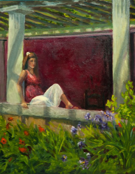
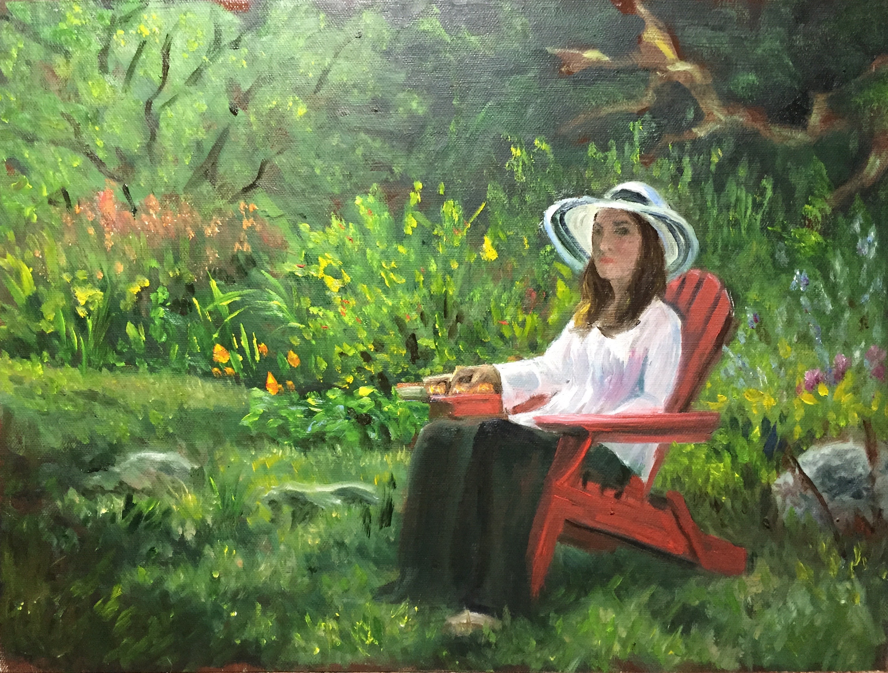
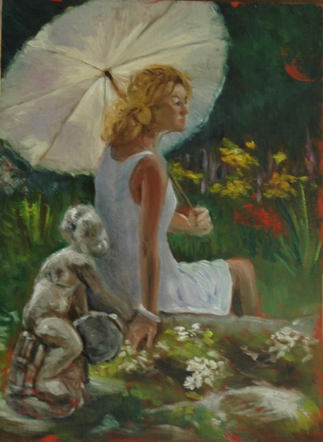
Uncanoonuc Garden
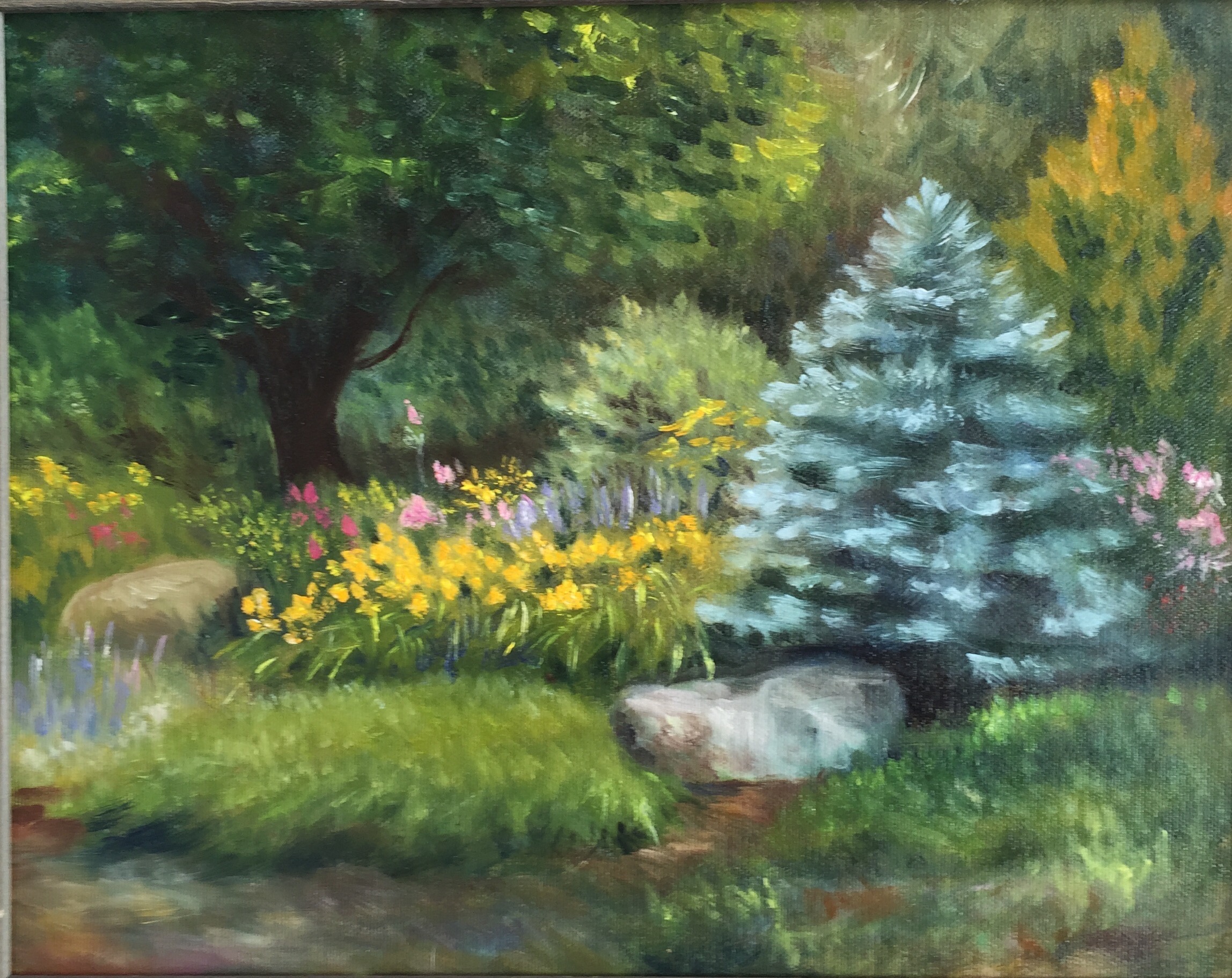
This location is on the side of a hill called Uncanoonuc. Actually, there are two hills by that name, next to each other, and even Wikipedia avers that they are “mountains” with impressive views of Manchester to the east, the Wapack range to the west, and on a good day, Boston to the south. From Manchester, the Uncanoonucs resemble the mounds of a woman’s breasts, and Uncanoonuc is a native American word meaning just that. One Uncanoonuc boasts a road upwards. Along the way is a retail plant nursery that has installed groupings of shrubs and flowers to show its customers how lovely is a good landscaping plan. The blue spruce caught my eye, in part because much earlier in my painting career, I had recreated another Little Blue Spruce.

Little Blue Spruce–Putney VT 2008
Well, I don’t think I can say my blue spruce technique has improved at all since 2008! The earlier blue spruce was growing at the studio of the “Putney Painters”, where I was taking a workshop with Albert Handell. Albert liked my spruce but thought I had crowded it too much with the other trees. I usually take the advice of masters to heart, but maybe 20 percent of the time, I stay true to my own original intent. I see his point, but I also admire the pluckiness of the baby spruce staking its own territorial claim under less than ideal circumstances. I’ll bet today it is crowding that building in the background.
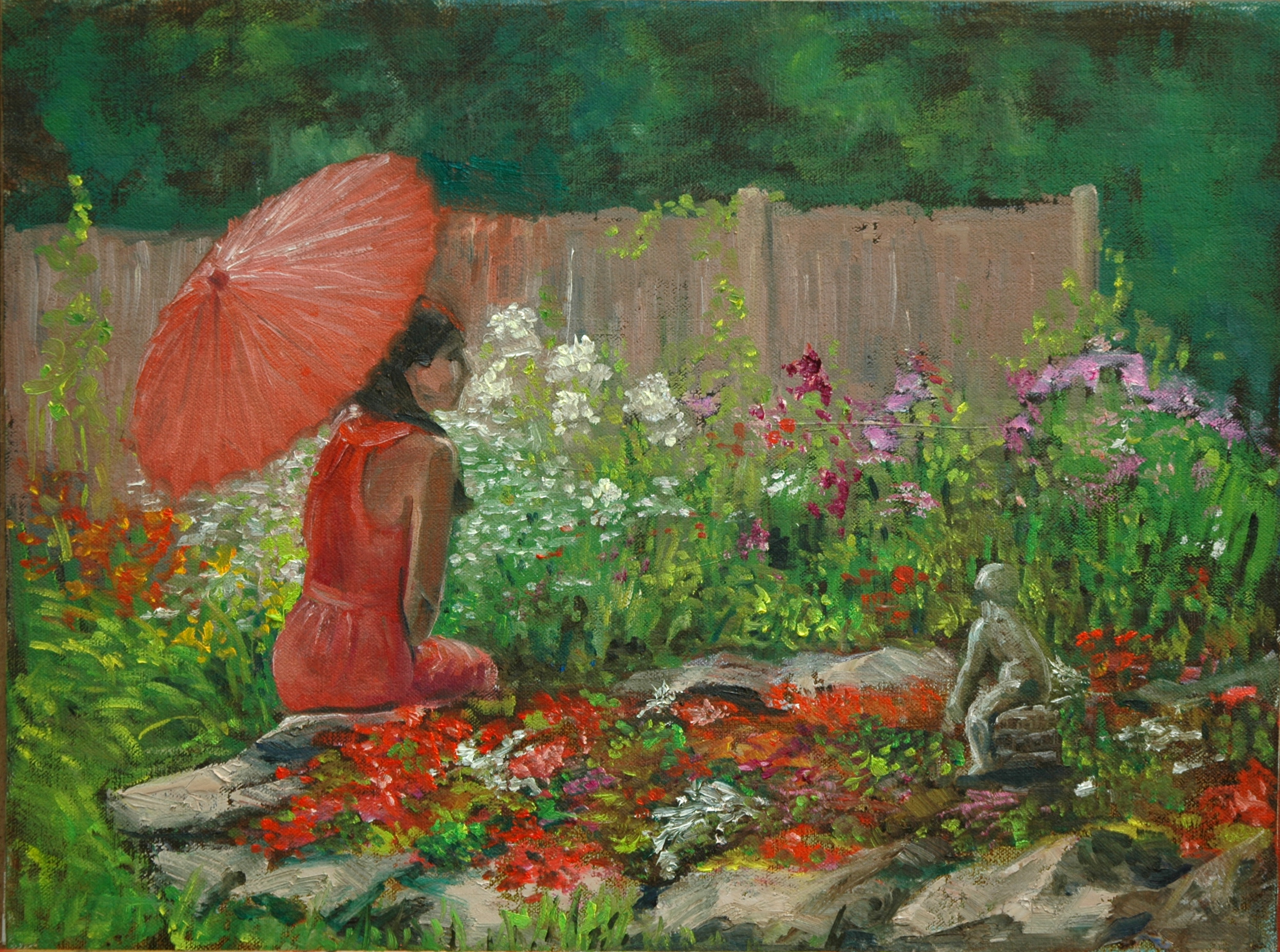
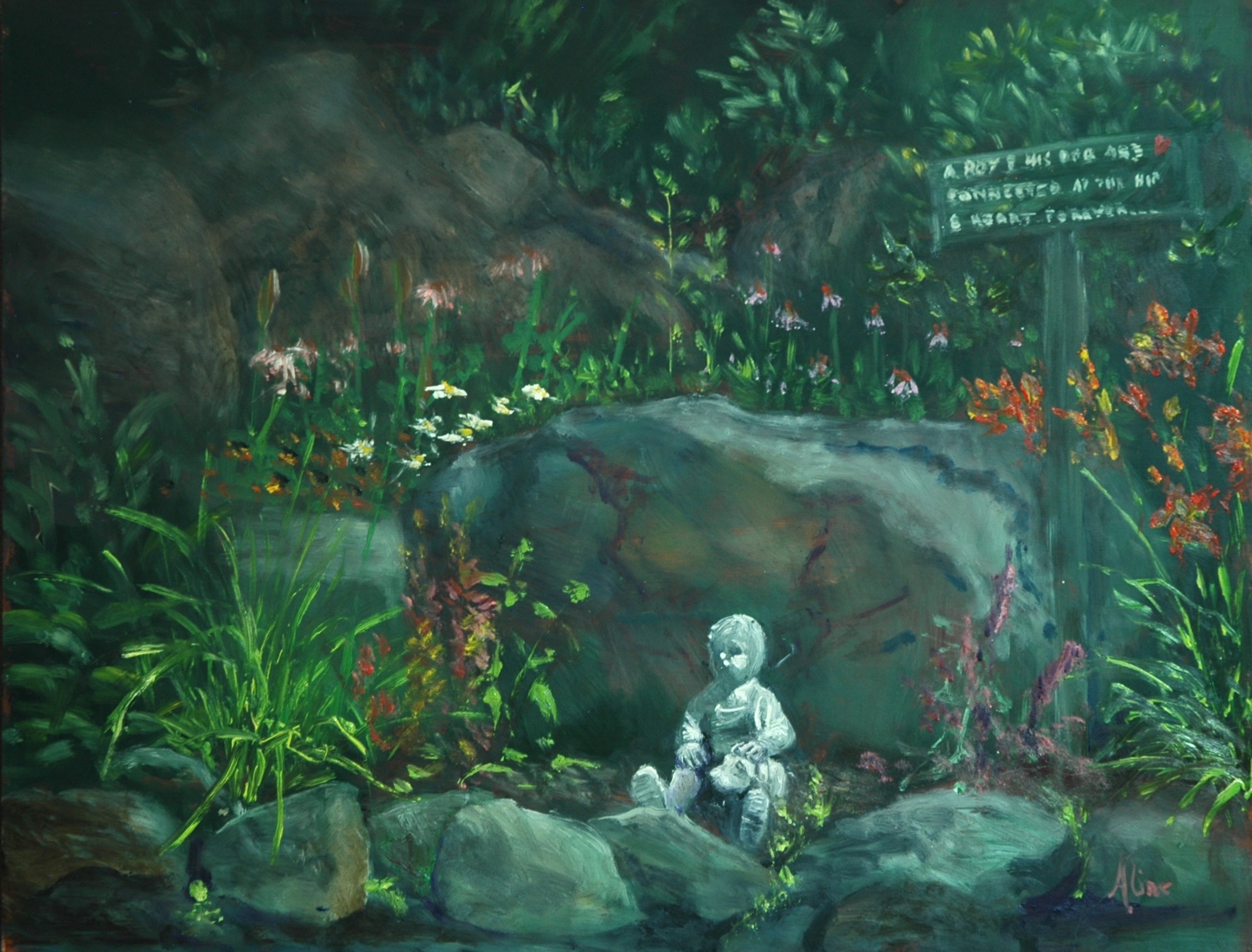
In Newport, in the course of delivering and picking up a painting for the regional show at the Library Arts Center, I got myself invited to participate in the Garden Tour, as a painter. They had about ten different gardens open for tour, each with different attributes. I told them I cared only about the flowers, not interested in mountain vistas or water features, so they sent me to the site of an abandoned gravel pit. The homeowners have been reclaiming the land patch by patch. As each load of topsoil was dumped into a pile, stuff got planted . I chose to paint the pile devoted to the memory of a beloved dog who had passed the year before.

A Boy and His Dog . . .
The message set forth on the rustic sign reads “A boy and his dog are joined at the hip and heart forever.” So instead of flowers, I found myself focusing on hardscape elements of rocks and sculpture, so easily is the artist’s intention waylaid. When I had finished A Boy, I made another stab at featuring flowers. I went in search of a floral closeup.

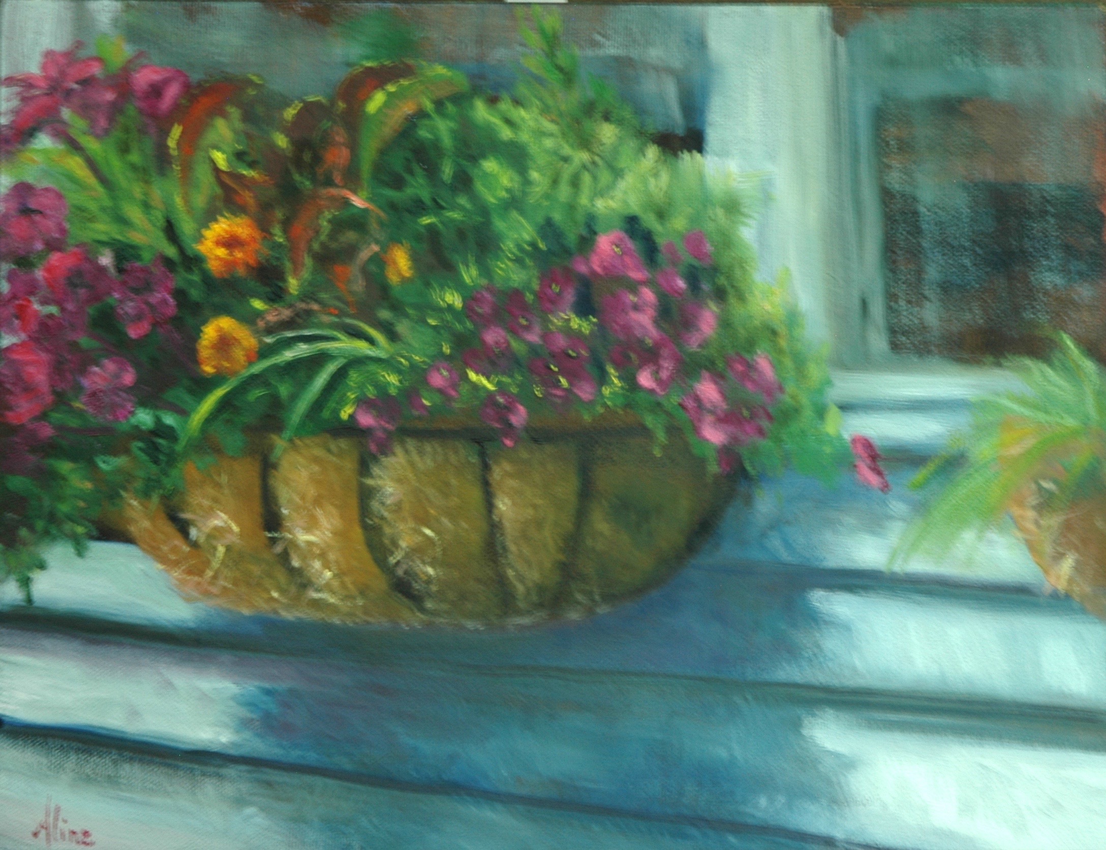
Flower Box
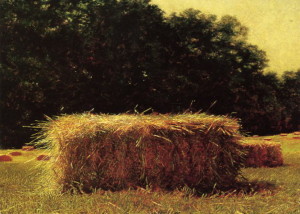
I knew I was doomed to fail at the task of matching the glowing fuchsia reds of the petunias, but set out to try anyway. The next day, after the paint had set up a little, I was able to add cleaner, brighter color here and there so as to convey the sense of color, even if the exact color remained elusive. The straw strands in the basket came mostly out of my head, or rather, out of my memory of my favorite painting by Jamie Wyeth–Hay Bale.

Isn’t that the most lovingly portrayed hay bale ever? A living, almost breathing, hay bale. Don’t you feel like you could stab it with a pitchfork right on your computer screen? Just imagine how it looks in person, as I saw it on the wall of the Boston Museum of Fine Arts last year.
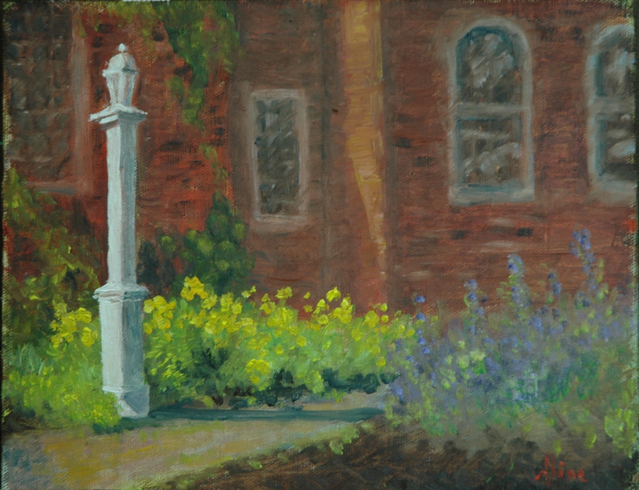
I have one more Exeter painting to show–it was painted “live” just before a lawn party at the Exeter Inn. I painted another during the lawn party, but I don’t love it so much.

Exeter Inn
I was pleased with the flowers in this painting, and I hoped my handling of flowers in the landscape might be improving.
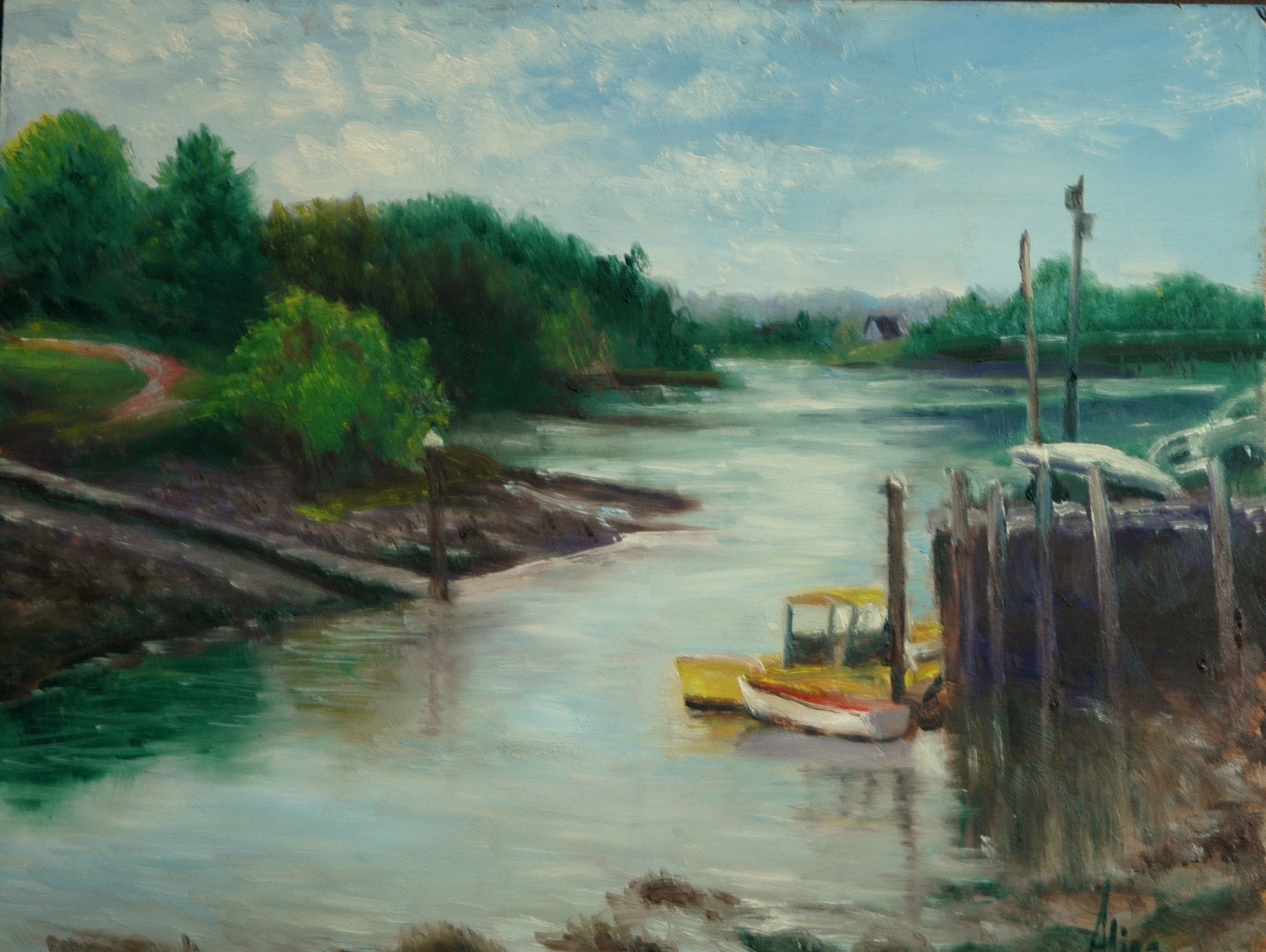
Portsmouth and its environs saw a lot of me the past few weeks. And I saw just the tiniest fraction of paintable spots, so rich is Portsmouth in architecture and marine attractions. I accumulated three favorites:

Inlet, Boat ramp
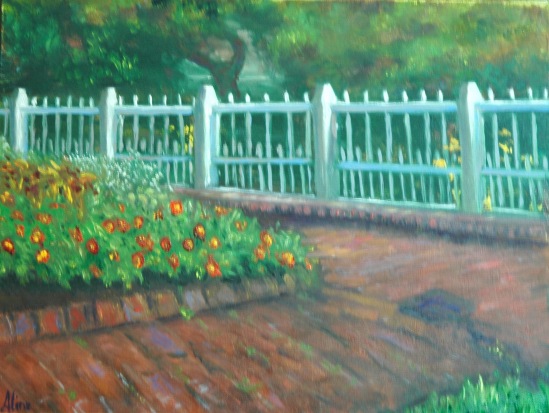
Entering Prescott Park
The Zinnias are perhaps too carefully depicted. Reality is my downfall.

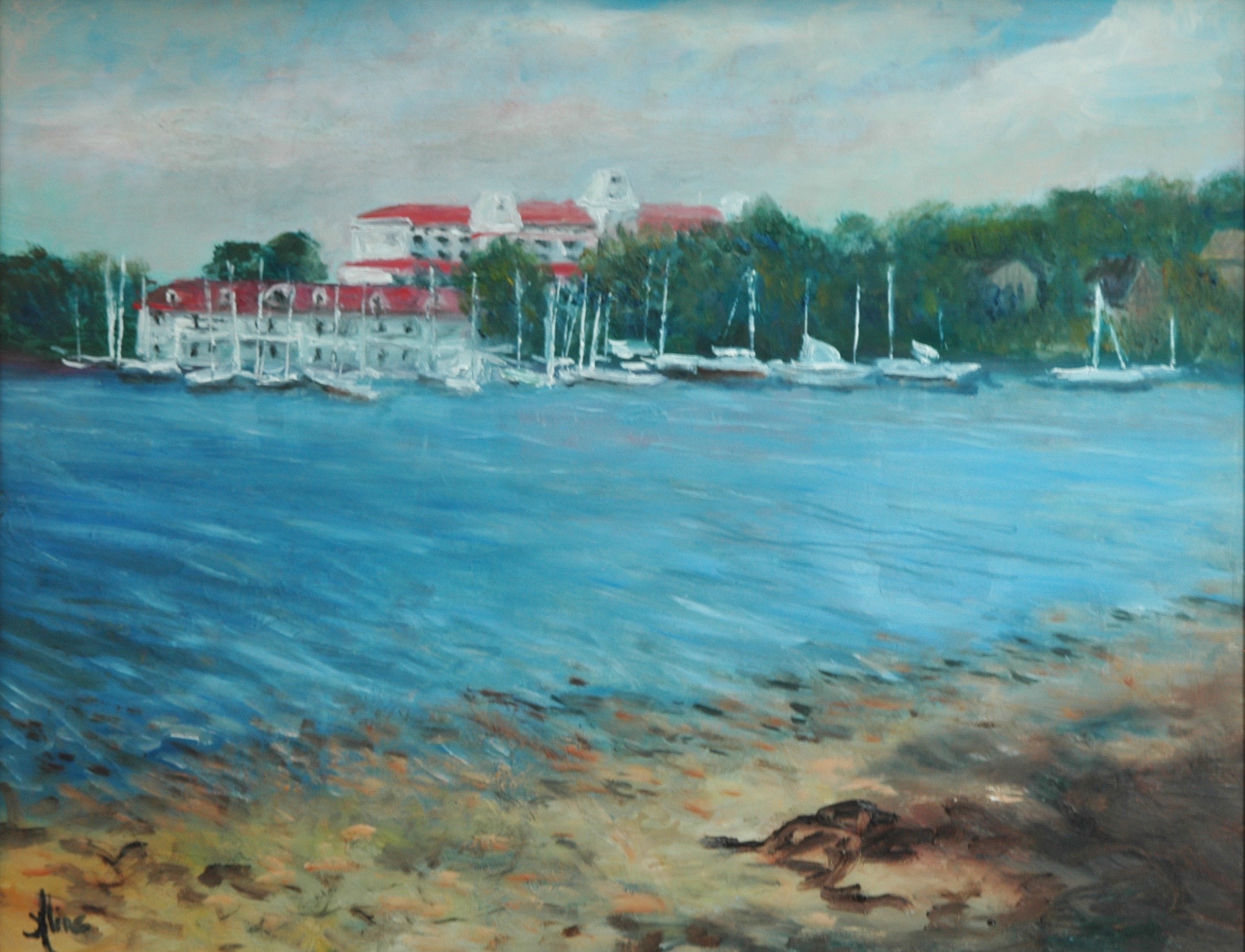
Wentworth by the Sea
The biggest challenge here was the shoreline–how to show the transparency of the water’s edge lapping on the rocky beach.
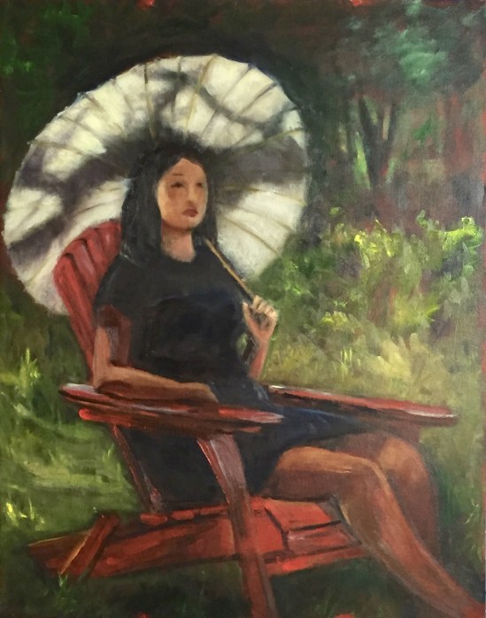
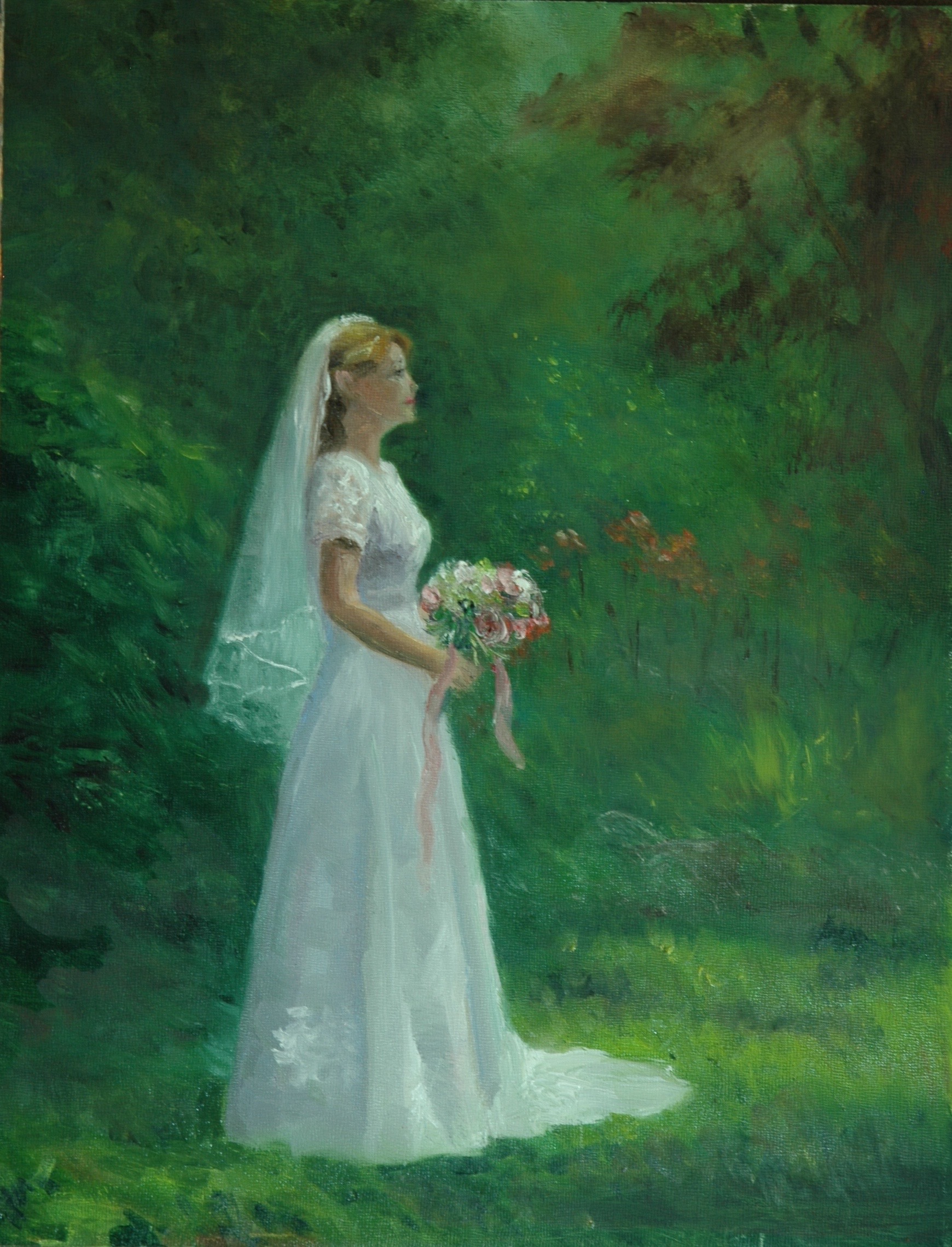
Again this year, David Curtis is giving his workshops on painting the figure in the landscape, in his garden. Our model was dressed as a bride:
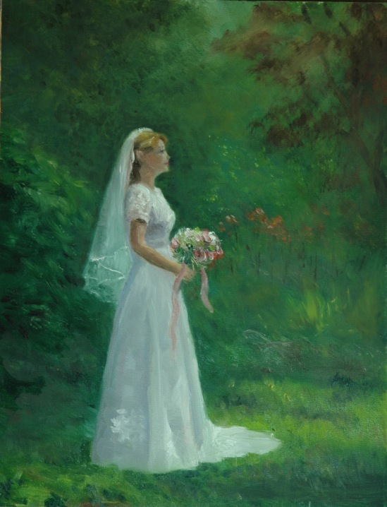
Bridal Portrait
I’m growing weary of green! Note that the landscape portion of this figure in the landscape is not much more than fuzzy suggestions of landscape. I felt it had to be thus.
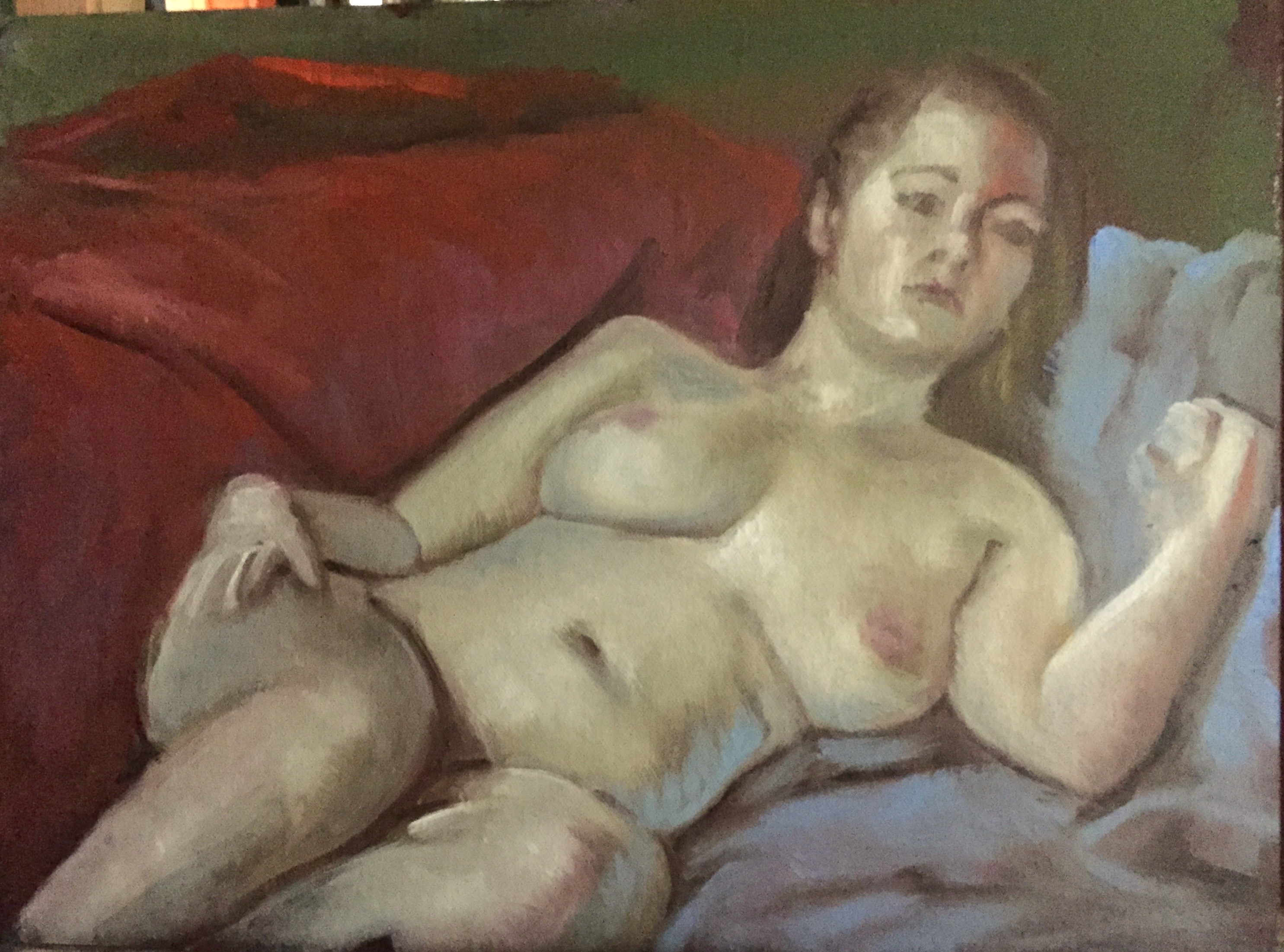
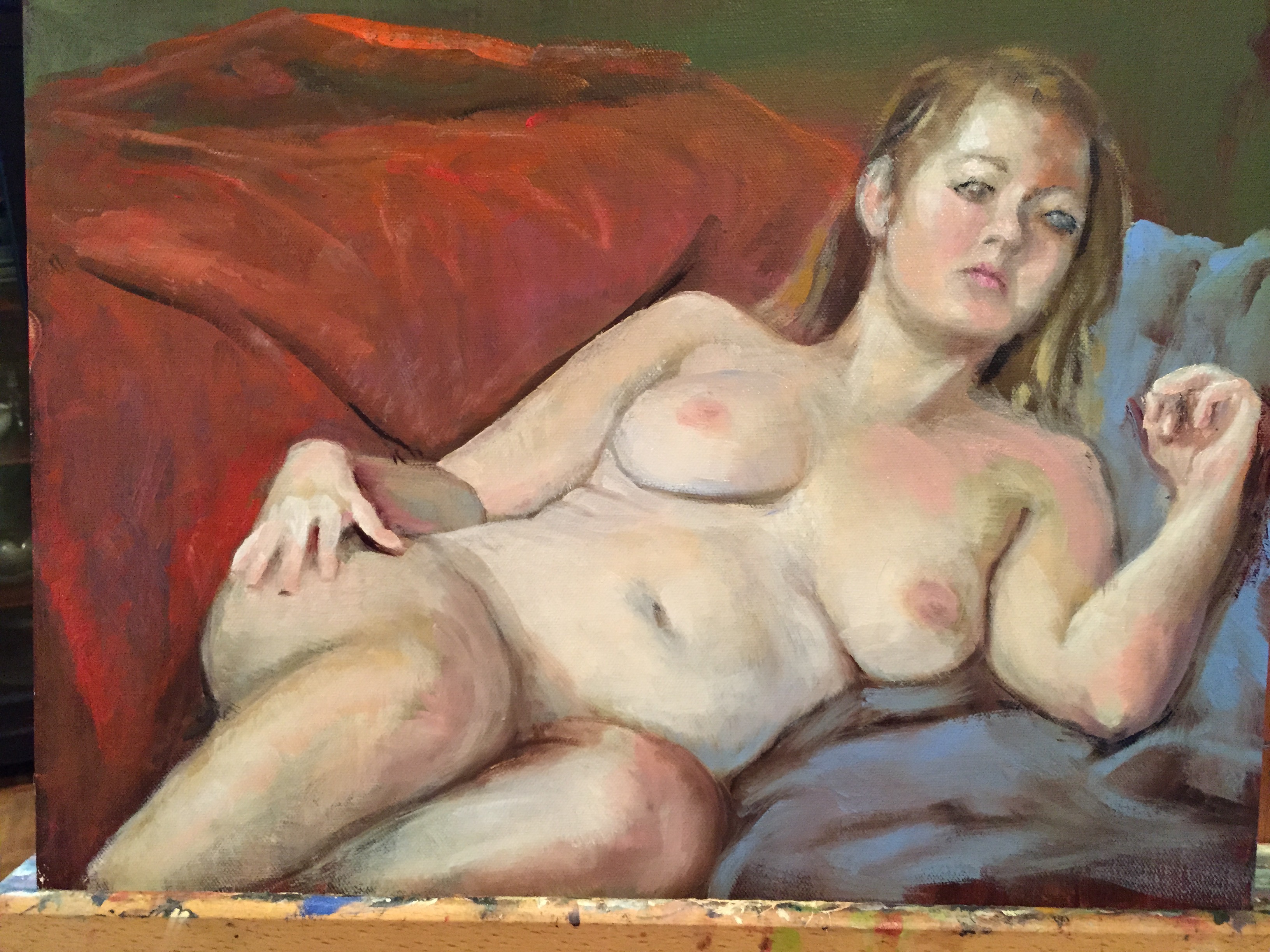
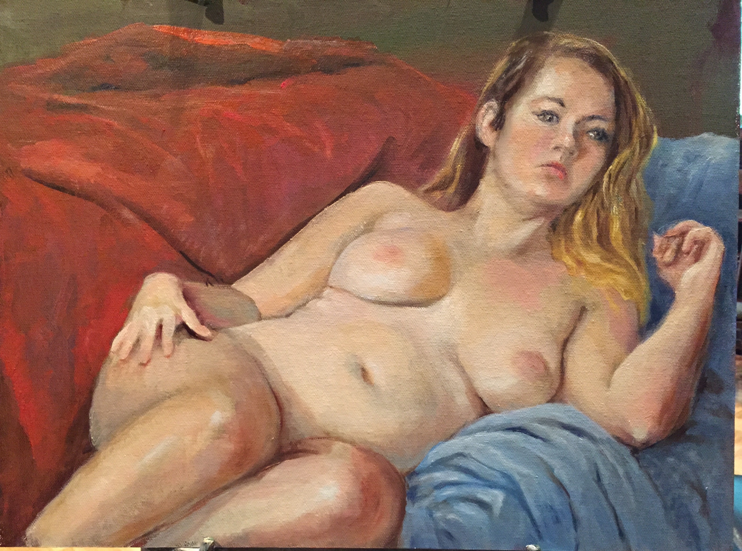
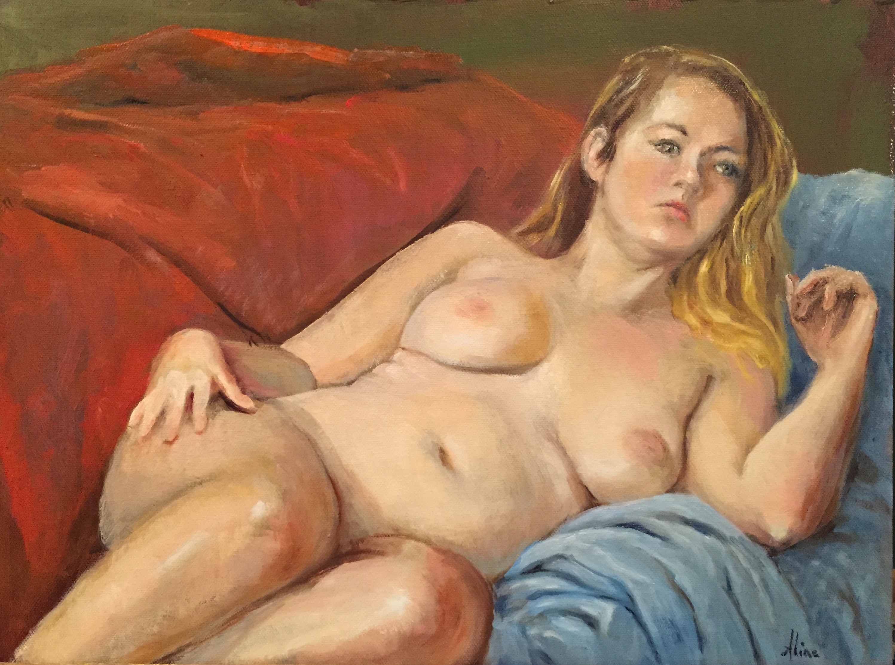
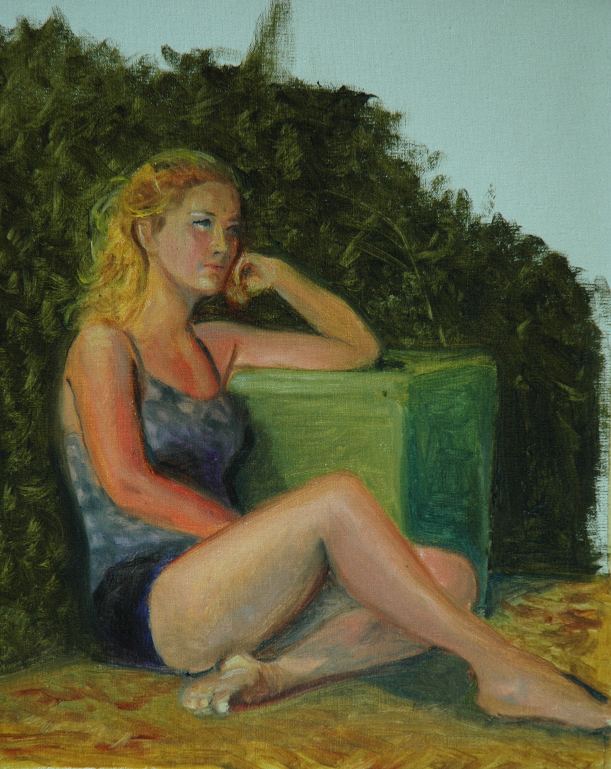
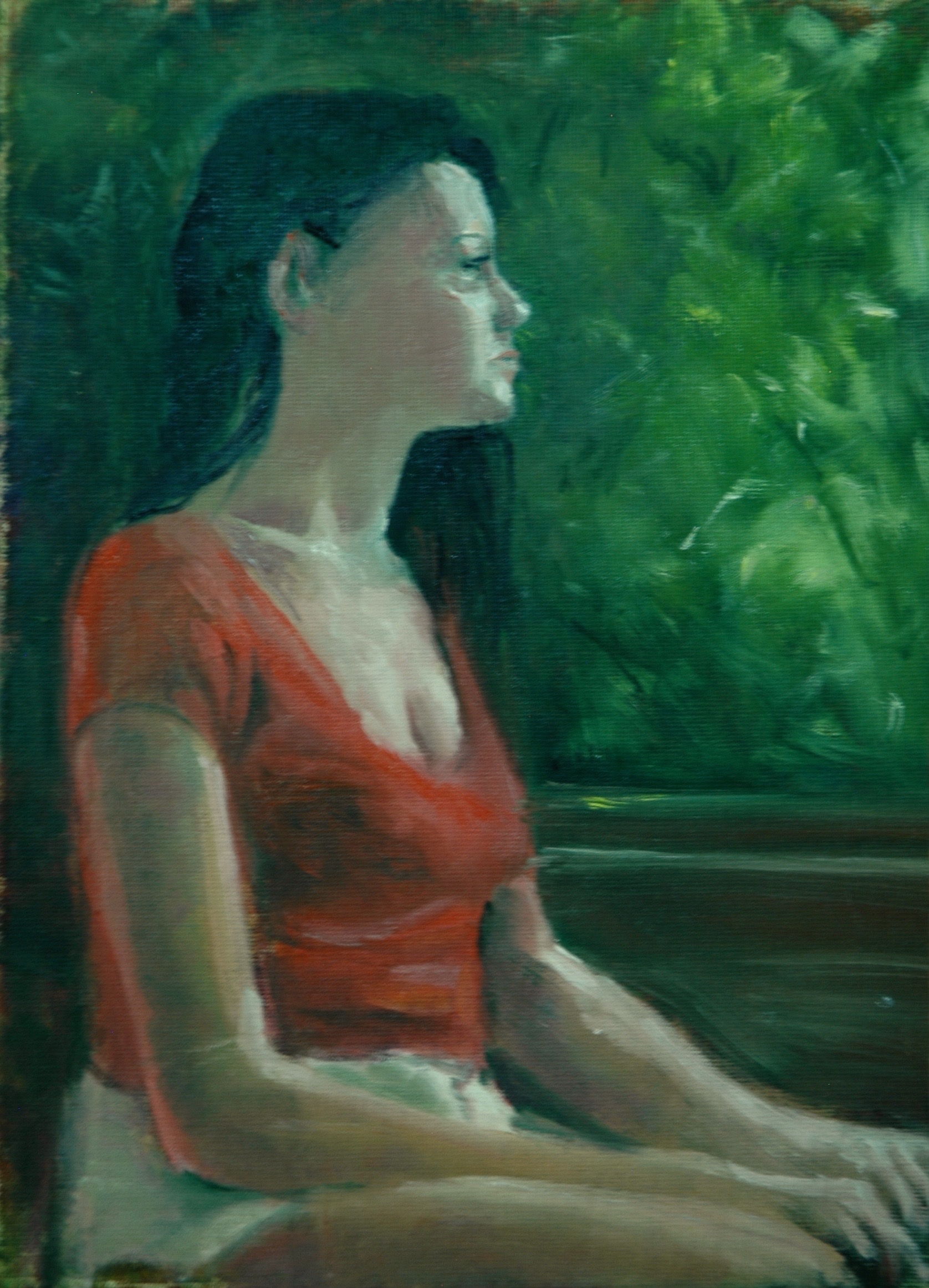
But not all work was done outdoors. Our Monday life group met twice:

Natalie 2

Sheridan
All in all, the lesson I have taken away from these three weeks of fairly intense painting is renewed awareness that I still suffer from a deficiency that has plagued me all along. I’m not “loose” (messy) enough. Is it that I’m so fast a painter that I end up wasting my time on “cleaning” and straightening and perfecting? For example, the windows behind the window box were never “finished” because, thank the lord, I realized I could not improve on their rough state. But examples of overpainting are too abundant. When will I ever learn?
Aline Lotter is currently exhibiting:
with the East Colony artists for the rest of July at 163 (167) Water Street, Exeter, NH; at the Bartlett Inn in Bartlett; at the Bernerhof Inn in Glen; at the Red Jacket Inn in North Conway; at the Firefly American Bistro on 22 Concord Street, Manchester (reception August 3); and at the law offices of Mesmer and Deleault at 41 Brook St in Manchester. Also, on July 23, from 5 to 8 p.m., the doors to all art galleries in Manchester are open and served by a old-time trolley. I am participating as a member of the Manchester Artists Association in a one-day exhibit at the Rines Center, on the Trolley route. It’s all free! See the Open Doors Trolley Night website for more information and a list of venues that have a show going on that night.
As usual, you may view paintings with prices and order prints, iPhone cases and the like at my Fine Art America page. If the painting you are interested in is not there, or if you prefer to bypass that experience, you may contact me by email to alotter@mac.com.
If you want to add a public comment to this blog, go to the bottom of this page where it says “Leave a Reply”, and enter your comment in that box. I love to get public comments, so don’t be shy!