She’s Back (More Margaret)

Margaret in a Twist

Margaret in a Twist

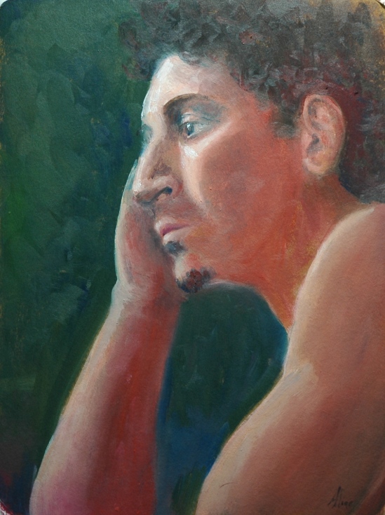
June is the month of Margaret, but since we are not meeting on Fridays, we’ll have only the four Tuesday sessions to try to capture her elusive likeness.  (Prior agonies were explored in this blog.) This profile isn’t too bad, but what I was concentrating on was the body–the subtle swellings and shadows that reveal bones and muscle and fat.  Not much fat on Margaret, but that just makes what is there all the more fascinating.  As usual, I enjoyed playing with the colors, exaggerating the warmth that I was seeing in the shadow side.  I see a few things (e.g., the way the chair back comes forward) that I would fix if I thought I’d be showing this anyone, but that’s unlikely to happen.  (I mean in person, not online.)

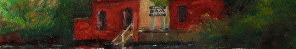
Saturday, a welcome change of pace:  I took the opportunity to join the NH Plein Air artists in the second annual paint out at the Forbes House Museum in Milton, Massachusetts.  Last year we had lots of sales (commission to benefit the Forbes  House), so we had some hopes for a repeat.  But this year, no bustling crowds.  My theory–everyone had graduations to attend.  Never mind–the weather was outstanding and we were doing what we love to do.  For painting subjects, with the Museum’s encouragement, we left the grounds of the Museum to seek out local water scenes.  My driving companion, Flo Parlangeli, has a connection to water that sets her heart to pounding.  I’m  sorry I didn’t think to take a photo of her painting and her two paintings.  She was painting them both at the same time–one on her easel and one in her lap.  Pretty peculiar, but it was all because she was working in acrylic paint, which dries fast.  The fast drying quality was something Flo was using to her advantage.  She’d let one dry and work on the other, then pick up the first and paint over the previous layer, then repeat with the second one.

Milton Landing

Milton Landing

This was my first one, which I spent about three hours on.  I placed it in an Art Cocoon and to make sure it didn’t flop out, I taped the corners.  But I was careless, and turned it upside down, and the panel did flop out of its bed.  As a result, I lost some of my crisp dark edges at the bottoms of the boats.  I had thick, white paint in those areas that just flattened and spread out over the edges.  I like to paint thick, wet into wet, although there is a limit to how much paint you can pile without losing control of the situation.  I was too close to losing control here even before the accident with the Cocoon.  This also illustrates why Flo was using the fast-drying acrylics.

So Flo was not going anywhere and I was finished with the boats.  I could have taken her car and driven to  another location.  Instead, I set up in a new spot nearby, in the lee of the boat ramp, where I was visited by a family of ducks.   Such as the joys of plein air painting, offsetting the distress caused by wind gusts that try to make off with  umbrella and anything attached to it (like your easel).

Covelet at Milton Landing

Covelet at Milton Landing

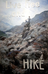
I thank you all for your feedback on last week’s project, the lettering for my Live Free poster.  I am still mulling over all the suggestions.   In the meantime, I have covered up “. . . and”.  Some objected to the ellipsis, but it was part of the original challenge–just in reverse order.  I decided to conform to the challenge more literally–when the paint dries, I will paint in letters for “and . . .”  When I complete the project, I will post the final version.  And if I have nothing more interesting to talk about, I will describe all the suggestions I received and reasons why I did or did not take them.

Aline Lotter is currently exhibiting:

at the Hatfield Gallery and the East Colony Fine Art Gallery in Manchester (Langer Place, 55 S. Commercial St., Manchester, NH); at the Bartlett Inn in Bartlett; at the Red Jacket Inn in North Conway;  at Stella Blu , an American Tapas restaurant in Nashua; at the law offices of Mesmer and Deleault at 41 Brook St in Manchester; at the Norris Cotton Cancer Center in Manchester (part of the Healing with Art program) and at her studio by appointment.  Two paintings are also hung somewhere in an office of Congresswoman Carol Shea Porter, probably the Manchester one.  Currently, the only location for viewing the nudes is at her studio.

Living Free in New Hampshire

This week’s obsession is a poster contest announced by our gem of a museum, the Currier Museum of Art, in Manchester.  First,  if you are not already familiar with New Hampshire’s notorious motto, here’s a little background.

State Emblem

“Live Free or Die.”  The motto achieved its national notoriety after the NH legislature determined that it must  be written on our license plates.  Some uppity commie liberal type objected to having such an inflammatory statement attached to his personal motor vehicle, and sued all the way to the U.S. Supreme Court to get it removed.  Well, that’s the story my memory came up with, but I know better than to trust my memory anymore, so I looked it up on Wikipedia, and it seems the offended motorist was a Jehovah’s Witness, who reacted not by suing but by covering up the “or Die” portion of the motto because death for a political cause was unacceptable in his religion, and the Supreme Court got involved because he was prosecuted under a criminal statute for defacing the license plate.   His conviction was overturned under the First Amendment to the U. S. Constitution–the State could not force him to express a sentiment with which he did not agree.

Although that was something of a slap down, the motto remains on the license plate.  I had to look to be sure.  NH licenseNew Hampshire does live by the motto:  seat belts are not mandated for adults; helmets are not required of motorcyclists; soda cans do not come with a refundable deposit; and taxes, at least those that would reach a broad segment of the population, are abhorrent.  Cigarettes, fireworks, gambling and liquor are encouraged.  They generate revenue.  When we say “free”, we don’t mean “tax-free”.  For a comedic take on New  Hampshire’s philosophy,  see Juston McKinney’s YouTube analysis.

In defense of free living, New Hampshire was an early adopter of same-sex marriage, thereby proving it is an independent thinker.  I believe there is also a law on the books to the effect that gun-toters must be allowed to enter courtrooms and legislative chambers with their guns on board.   In that last case, the death resulting from living free may not be that of the free liver lover.  So you see we have a lot of scope for comedy here.

Anyhoo, the Currier  has a contest going for the best poster on the theme of “live free AND _______”—you fill in the blank.   The idea is to describe or celebrate something wonderful about New Hampshire, where you may live free and also do some constructive things, things other than killing yourself on the highway.

I had an immediate super-brilliant idea and decided to compete, ignoring the fact that I have zero experience or training as a graphic artist.  I ordered ten poster boards from Dick Blick, mostly because you can’t order just one.  Extras would be good because I would surely mess up the first few attempts.  Then I explored the internet for some  hints on how to go about painting on poster board.   There wasn’t much out there to help me, but I did learn that applying oil paints directly to the board would not be advisable.

Luckily, I keep some acrylic paints on hand, so I planned to paint a base of acrylic, which would seal the surface and prepare it for the eventual painting in oil.  The base would coordinate with my background colors.  Once I got going, very confidently since I thought I was still just painting the base, the whole thing just sprang to life.  My first acrylic painting.  I was stunned.  And happy.

Then began the process of lettering.  OMG.  I proceeded with great care (and concern).  Again I conceived a plan:  The letters are to consist of their outlines only, because I wanted the background painting to show through.  I drew the my letters freehand.  I did not want mechanical-looking letters but I did some measuring.  I cut them out with an Exacto knife.  Not as easy as it sounds.  Hard, in fact.  I stuck them  onto my poster with museum putty to see how they looked.  I repositioned them.  I redid  “. . . and” to make that piece smaller than the “Live Free“.  I outlined them using a pen.  I painted around the outlines.  The unevenness bothered me.  I didn’t want it to look professional but I wasn’t going for sloppy either.   I tried blurring/bleeding edges with my medium (I was using oil paints at this point).  Kind of liked that.  Wiped out the word “Free” because letters were too crowded together.  Painted with acrylic paint over the wipe-out to create fresh, clean surface for next go ’round.

And that’s where I am.  Today I am researching the kinds and uses of stencils, vinyl lettering etc.  Should I give up on the outline plan?  Guess I am going to have to show you in order to get any feedback.

Image 3

The above is a close up or detail of the painting, showing paper letters positioned where I planned to outline them.  I wished I knew how to make the letters look as if they were actually hanging in front of the poster.

Image 4

Above is the whole thing, with all of the letters positioned; I must have corrected “HIKE”‘s position  before penning its outline in red ink.

Image 2

Above is the state of the poster before I darkened the upper outlines and before I whitened the “HIKE” outline, and yes, before I got up in the middle of the night to remove the crowded letters forming “Free”.  I like “HIKE” now, but am worried about “Live Free”.  All of my options for stenciling or applying letters involve letting go of the open outline design.  What do you think I should do?

As for the subject image, if you have been reading for a while (over a year). you will recognize it from a 9×12 study that I did for a Patrick McCay course at the Institute called “Explore, Express, Exploit”.  I published it in this blog from October 2011.  Here is the original inspiration:

The Lone Looker

The Lone Looker (photo)

I am well and truly exploiting that image of the guy on the rock outcrop that I photographed at 2011’s bike race up Mount Washington, thus fulfilling the promise of that course.

Aline Lotter is currently exhibiting:

at the Hatfield Gallery and the East Colony Fine Art Gallery in Manchester (Langer Place, 55 S. Commercial St., Manchester, NH); at the Bartlett Inn in Bartlett; at the Red Jacket Inn in North Conway;  at Stella Blu , an American Tapas restaurant in Nashua; at the law offices of Mesmer and Deleault at 41 Brook St in Manchester; at the Norris Cotton Cancer Center in Manchester (part of the Healing with Art program) and at her studio by appointment.

Portraits, by Zorn

Just one painting to talk about this week.  It’s a portrait.  One of my colleagues opined that it was the best thing she had seen me do.  She has a fine critical eye, so I was happy to hear that.  But later in the week, I was able to take in the special exhibit (titled, A European Artist Seduces America) at the Isabella Stewart Gardner Museum in Boston. The European artist was the Swede, Anders Zorn.  The exhibit includes many of his portraits.  Seeing them reminded me of how far I am from achieving the quality that I admire in Zorn’s work.  Reminded?  No, that word is way too mild.  It whacked me over the head!

First, for context, the result of my effort this week:

Face and Hand

Face and Hand

One of Zorn’s:

Martha Dana

Martha Dana

Many artists avoid dealing with the open mouth because depicting the teeth can look ridiculous.  Not a problem for Zorn, of course.  Look at that bow!  I would have labored over the thing; he just swipes a loaded brush, right, left, right and done.

Many of my nonartist friends, when I told them about the Zorn exhibit, said they had never heard of Zorn, which is completely understandable since I hadn’t either until I started painting back in 2005.  At that time, I was working on landscapes only, and Zorn’s name came up in the context of the limited palette that he had espoused.  “Limited palette” means just a few colors (hues), and the limited palette for which he was known consisted of cadmium red, ivory black, white and  yellow ocher.  Using those hues, he could even make gray look blue.  But while he did some spectacular impressionist landscapes, mostly as backdrops for nudes, his principal claim to fame is his portraits.  He rivaled Sargent, literally.  One of the portraits in the Gardner exhibit, according to the story accompanying it, was created in response to a challenge by the sitter’s husband to make a portrait of her that was better than the one Sargent had done.  I think it was this one.  Mrs--Bacon-small  
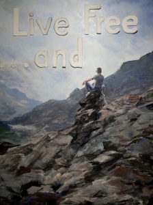
White gown, overhead view–both to mimic Sargent’s version.  I also think he probably met the challenge, but in the world of art, such comparisons are invidious.

So what is so great about Zorn?  In a word, his deftness.  He could describe a hand, a nose, a cheekbone with a few strokes, and when they was done, he let them be.  Or not–in one painting (the next one shown) large, rough strokes surround the figure, but the figure itself is soft and blended.  images

His nudes all tend to be smooth and soft, and are usually surrounded by an impressionistic landscape including water.  His water was much admired too.  Here’s a taste:

Opal

Opal

Here, in The Omnibus, is another example of his deft strokes–look at the hands:

1799

I think I may try to copy this painting.

The ability to convey much with very little definition is something I have admired in a contemporary artist, Carolyn Anderson (see descriptions of my struggles here and again here), and I wonder how much she has been influenced by Zorn.  His portrait of Gardner herself, in Venice, is considered a major tour de force, because of its liveliness, resulting in no small measure from the looseness and blurriness that also characterizes Anderson’s works:

DSC_0002 - Version 2

Her mouth is open, but you can hardly tell.  DSC_0002  
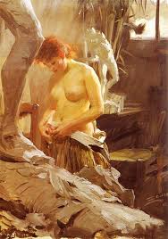
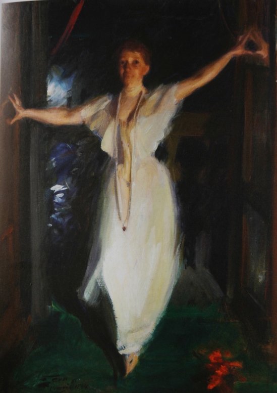
This painting should be an inspiration for all figure artists who desire to capture movement and spirit in a gesture.  I wonder if there is anything written anywhere about how Zorn put this painting together.  Clearly Isabella did not pose for more than a minute or two.

If you want to see more, here are two links that I found useful.  The Gardner Museum website.  The Complete Works of Anders Zorn.  I also found a review of the Gardner exhibit here, and an exposition of the Zorn limited palette here.

Aline Lotter is currently exhibiting:

at the Hatfield Gallery in Manchester (Langer Place, 55 S. Commercial St., Manchester, NH); at the Bartlett Inn in Bartlett; at the Red Jacket Inn in North Conway;  at her law offices at 41 Brook St in Manchester; and at her studio by appointment.

Through March 29, you can also view (and purchase–of course!) my 6×6’s at the Artstream Gallery in Rochester, NH.

Prepping for A Show of Nudes

You can’t wait until the last minute to prepare for a show. I started by ordering a modest number of new frames intended to accommodate my recent paintings of nudes on unstretched canvas, with the mixed results that I described in last week’s blog. This week, while waiting for the second order of frames to come in, I framed up what I could, and worked on those 12×16 canvases that needed paint to the edges. So far, I have nine “studies” from this spring and summer all framed and ready to pack, and five 20×16 more fully realized nudes framed and boxed. Three more 12×16 edge-painted studies and the five waiting on the new frames brings the total to 22. There is at least one portrait of a clothed model included in the collection, and I may bring along other recent figure or portrait paintings. I have to keep in mind that I may be doing this on my own.

Since of the nine studies I have framed there are two that you have not yet seen, I decided to photograph all nine in their frames. But first, the painting from yesterday, which cannot be framed yet:

Owning the Brown Leather Sofa


Now for the nine, in chronological order to the best of my memory:

Week One, Brown Leather Recliner Pose No. 1


This was one of my experiments with the palette knife, and the first of four paintings from the same pose. The second is waiting to be framed as a 12×16 after being painted to the edge. The third, a head portrait and another knife painting, may be left home. The fourth is one of the 20×16 framed and already boxed.

In the Artist’s Studio


This would have been my pride and joy, but I ruined it with a sloppy mount. Lesson learned. It will be on display but not for sale.

In the Artist’s Studio, No. 2


In this photograph you can judge the new frames that I ordered specially for my nude studies. They have a subtle scrolling that harks back to olden times, as befits paintings of nudes, ironically in our liberated age not often displayed. This painting is one of my resizing victims (from 11×16 down to 11×14).

In the Artist’s Studio, Green Drape


I wanted to crop this one, but could not sacrifice either the elbow or the foot, so I had to extend the green drape to the bottom edge. Note to future generations of art lovers: it would OK with me if you were to reframe this one with the bottom one inch cut off.

African Queen


This is the only one of the 22 that looks better in a black frame than in silver or gold.

New Angle on the Brown Leather Recliner

New Angle on the Brown Leather Recliner

Modern Odalisque


Another resizing victim.

untitled

In the Artist’s Studio, Green Hassock


Aline Lotter is currently exhibiting:

at the Hatfield Gallery in Manchester; at the Bartlett Inn in Bartlett; at the Red Jacket Inn in North Conway; at the Gallery at Red Gate Farm in Plymouth; at the Yoga Balance Studio in Manchester; at the law offices at 41 Brook St in Manchester; and at her studio by appointment.

And don’t forget: Saturday, June 8, Londonderry Art in the Common. (Rain date is June 9)