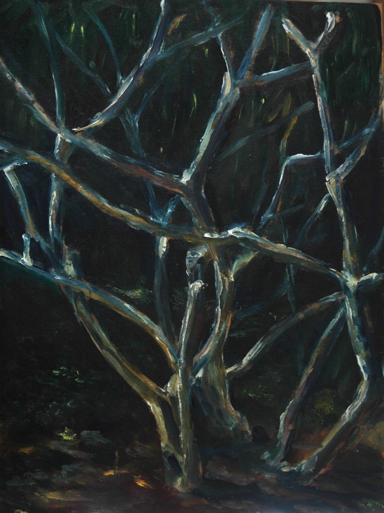
New Hampshire has a Seacoast region, a Lakes region, and countless quaint farms and towns, but to the rest of the world, New Hampshire means but one thing: the White Mountains. They do rather stand out, compared to all those other things. I believe “white” comes from the glimpse that early seafarers got of them, when covered by snow. Or perhaps it was the sun glinting off the granite.
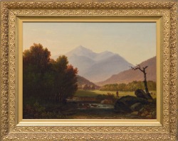
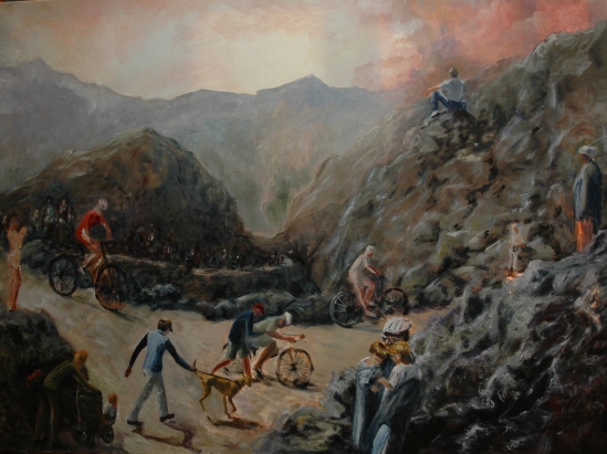
In any event, they became the subject of many 19th century paintings. Champney, Bierstadt, and dozens of others explored and painted the Whites. For a complete rundown, go to White Mountain Art. Right now there are two major exhibits of White Mountain paintings, one in Jackson and another in Plymouth. The former we have visited twice before. The latter is housed in a brand new Museum of the White Mountains on the campus of Plymouth State College. We stopped there to check it out on our way to Bartlett last Thursday. We came away with a map showing the coordinates of several locations, that is, the coordinates to the spot where the painter stood to paint or make his sketch (probably not many of the paintings were painted outdoors). My painting buddy, Sharon, aspires to paint like the Old Masters, and her enthusiasm led her to download a GPS app to her smartphone, and led both of us over hill and dale in search of the right spots. It was fun. Unfortunately, progress or tree growth interfered with many replications.
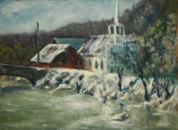
My plein air painting No. 1 is a covered bridge not far from Plymouth.

Smith Millenium Bridge
Friday, we got in two painting segments: the first was in the strawberry fields below Cathedral Ledge.
Strawberry Fields (Cathedral Ledge) (No.2)
Usually, my first painting is my best, I think because the inspirational tug is strongest with the first try. If you don’t count the covered bridge–it was on the way into the mountains, not quite there yet–this is the first. And it could be the best. But there are four more, and you might like one of them better.
Friday afternoon we went on our first expedition in search of Old Master painting spot: Mt. Adams as captured by Champney. The actual spot was right in the middle of the Auto Road up Mt. Washington, but we found a better one off to the side.

Mt. Adams (No. 3)
Mount-Adams-Benjamin-Champney-1852-24-x-30-inches
The snow-streaked mountain in the background of my painting is Mt. Jefferson, and on the far left is the beginning of Mt. Washington, which is a sprawling kind of mountain, lumping its way to the highest point in the Northeast. (Last January I had painted a view of this lumpy part of Mt. Washington on that misery-filled plein air weekend.)
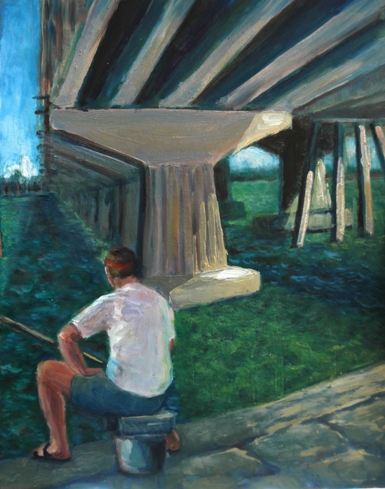
Saturday we found our own spots. The day before, on our way back to the Bartlett Inn from the Mt. Adams spot, a stream near the highway had caught our eye and so the next morning we went in search of it. Sharon sometimes ends up in my paintings, and I was particularly glad of the added interest her hat brought to the scene.

Roadside Painter (No. 4)
After a while, the noise of the traffic hurtling by next to us faded from consciousness and all we heard was the gurgling water.
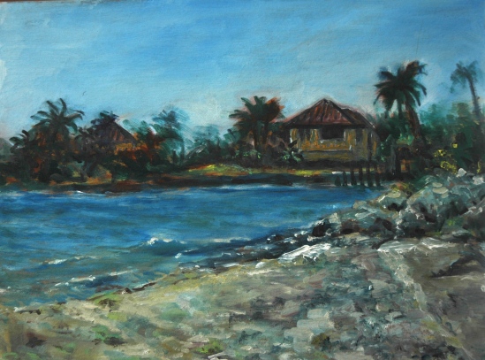
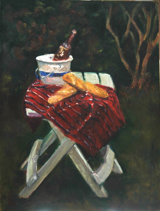
In the afternoon, Sharon introduced me to Echo Lake, at the foot of White Horse Ledge. It was an idyllic spot. Sandy beach, picnic benched (excellent to paint from–you can really spread out your stuff), lively visitors (and I don’t mean the black flies)–one of whom demonstrated the echo for the rest of us.

White Horse Ledge over Echo Lake (No. 5)
My painting had at one point a much more literal depiction of the ledge, but its very literalness bothered me, so I loaded up my palette knife and spread paint liberally. Perhaps something in between would have worked better. Supposedly there is an image of a horse, whitish maybe, delineated in the cracks of this ledge, but I sure couldn’t see it and I wasn’t about to fake it either.
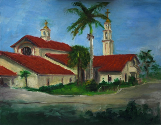
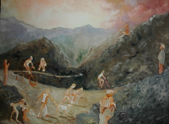
Sunday was a travel day, but we did get in one painting late in the day before heading back South. It was the product of another Champney search, this time in Sugar Hill. Mt. Lafayette is on the left and Cannon is on the right. Personally, I would call it another view of Franconia Notch.

I’d say this is about half done. The dark clouds arrived, threatening rain, before I even touched the sky. The sky had been a dull gray before that anyway. Cannon is a ski mountain, and I’m not sure I want to put the ski trails in. But why not? I don’t know. View is from Lovers Lane, in Sugar Hill.
All of my paintings on this trip were 9×12, except Roadside Painter which was 10×12. I figured I was out of plein air practice, and the smaller format would help me finish paintings. That was correct. Perhaps smaller will mean more salable too. Eventually, I plan to take them back to hang in Bartlett Inn.
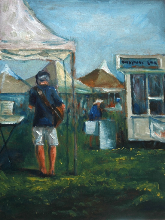
Or I may take them to the Beacon Hill Art Walk on June 2. I am trying to decide whether to take only figurative works, only landscapes, or the best of both. I’m sharing a tent with Bruce Jones, who does beautiful work in the style of Don Stone. I’m not sure I want mine compared to his.
Aline Lotter is currently exhibiting:
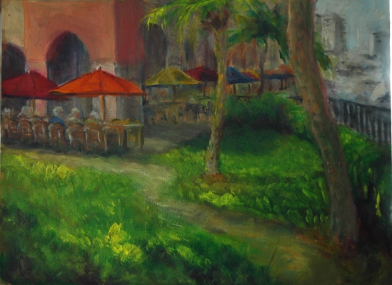
at the Hatfield Gallery in Manchester (Langer Place, 55 S. Commercial St., Manchester, NH); at the Bartlett Inn in Bartlett; at the Red Jacket Inn in North Conway; at Stella Blu , an American Tapas restaurant in Nashua; at her law offices at 41 Brook St in Manchester; at the Norris Cotton Cancer Center in Manchester (part of the Healing with Art program) and at her studio by appointment. Through May 30, nine of her Boston Arboretum paintings will be displayed at the Leach Library in Londonderry, NH. On Sunday, June 2, she will be participating in the Beacon Hill Art Walk, in Boston.


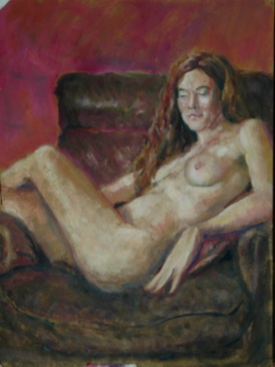

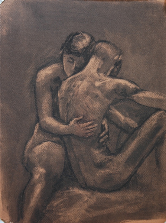


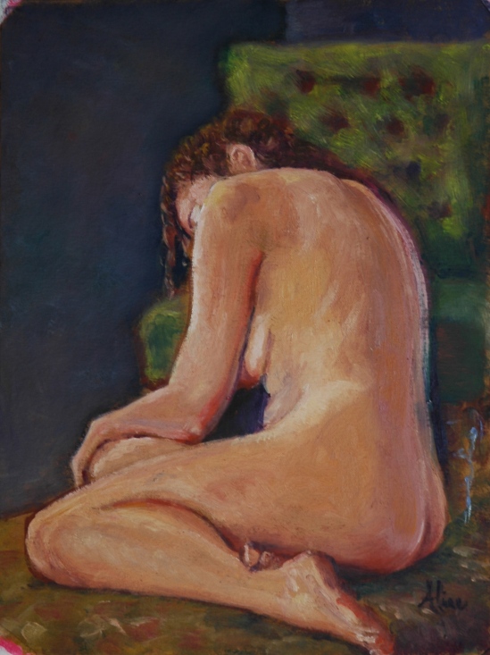
 White gown, overhead view–both to mimic Sargent’s version. I also think he probably met the challenge, but in the world of art, such comparisons are invidious.
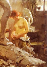
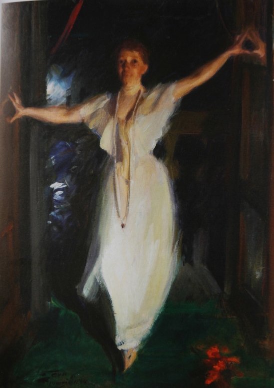
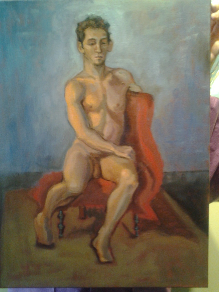
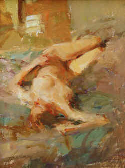
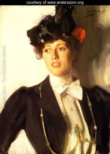
 This painting should be an inspiration for all figure artists who desire to capture movement and spirit in a gesture. I wonder if there is anything written anywhere about how Zorn put this painting together. Clearly Isabella did not pose for more than a minute or two.