Why is this man digging a hole, in the nude?

J's back, three-quarter.

"This should have been easy"

Portrait of a young man resting on the handle of the shovel, contemplating the hole he has dug for himself.  Why is he digging a hole for himself?  Unimportant.  Why is he nude?  Hmmm.  He’s in a nudist colony?

I struggle with the titles of my nudes.  The models must adopt a pose that they can keep for 20 minute stretches (sometimes longer), so the figure is contemplative, dreaming, sleeping, reposing. . . well, you get the idea.   One could simply title this one “Nude Male”, but that would not distinguish it from all the other nude males in the portfolio.  One could number one’s nude males.  Or one could come up with some witty thought superimposed on the model, which is what I attempted to do today.  I was inspired by the captions attached to the animals photos that circulate the internet, which captions awe me with their inventiveness.  I think, however, that it works better for cats and dogs than it does for  a naked human being.  The caption needs to acknowledge the nudity somehow, to make it work better for the nudes.  Something like, “Only five more minutes and I can put on my pants.”

On this point Degas’s bathers had the advantage–their natural nudity, nakedness, did not have to be explained away.  (By the way, that exhibit at the Boston Museum of Fine Arts will be closing February 2.)

Today’s nude was the pick of last Saturday’s life drawing session.  Sunday I finished the reverse-painting-on-glass and delivered it to the owner, who was pleased.  I also finished the Covered Bridge.  In response to an excellent observation from one of my followers, I removed some offending slashes of white, which I guess I had intended to symbolize water laps.  When you paint loose, the results can be brilliant,  or when not so brilliant, just careless.  An artist needs another, more objective eye to catch those things, and it  doesn’t have to be another artist’s eye either.  I always listen to a criticism and act on it, unless I am very sure of my own contrary view.  (Many times, the stated objection does not actually identify the real problem–it could be something nearby that throws the viewer off.)  In addition to making that and other various improvements to the body of the Covered Bridge painting, I painted the sides of the canvas in colors approximating the action going on the main canvas.  The painting can now be hung without a frame, as a “gallery wrapped” painting.  That is important to me, as the artist, because otherwise I would have to invest in a frame in order to exhibit the painting.

The rest of Sunday was devoted to another project:  homework for my fifth (at least) course at the Institute with Cameron Bennett on portraits.  But this time, something different–for him and us.  We are trying to BE different, paint somehow “out of the box”, using as possible inspiration other contemporary portraitists who are painting in styles newly invented or at least newly applied.  The only artist on the list supplied by Cameron whose name I even recognized was Chuck Close.  I am not drawn to emulate his monumental portraits.  The artist I am drawn to is Carolyn Anderson.  Her portraits are so loose as to be almost not even there.

Detail from portrait by Carolyn Anderson

In class I tried to emulate Anderson in pencil, drawing a portrait from a photograph:

Drawing from photo of Sammi and Noodles

After drawing my careful image, I erased a lot of it so as to leave ghosts of the image.  This exercise was the starting point of my painting effort yesterday, but yesterday I tried to be looser right from the get go.  Nevertheless, when I reach the point where I thought everything was correctly placed, there was a lot of smudging and subtracting.  Not enough!  This is still a work in progress–don’t judge it too harshly, and remember what I am going for:

Sammi + Noodles portrait

This isn’t going to be easy!  Especially for me, who has been accused of getting too hung up on the details.  I love the details.  It’s a mystery then, why I am so beguiled by Carolyn Anderson’s way of painting.

Aline Lotter is currently exhibiting:

at the Gallery at 100 Market Street in Portsmouth; at the Sage Gallery in Manchester; at the Hatfield Gallery in Manchester; at the Bartlett Inn in Bartlett; at the Red Jacket Inn in North Conway; and at her studio by appointment.

Link to website: www.paintingsbyaline.com

Out of the Comfort Zone

People are always urging artists to get out of their comfort zone.  What exactly is wrong with a comfort zone, anyway?  I wish I knew — I wish there was something  that I could nail every time out.   But there are certainly ways of making art that I am more comfortable with than others, and I’m not talking about the difference between painting in my studio or getting outside in zero degree weather.  I am most comfortable painting and drawing in a representational way, in a traditional way, in oils, on a stretched canvas, panel, or in the case of the drawings, a pad of paper.

This week I have decided to go public with three new things that are out of my comfort zone.  Two of the three are combined:  (1) Painting on glass.  (2) Painting with acrylic paint instead of oil, on said glass.  The third:  Painting symbolically, as opposed to realistically.

First, the reverse-painting-on-glass project.  A client bought an old clock at auction that boasted a glass panel reverse-painted with a once-lovely bucolic landscape.  The paint was peeling and  flaking off the glass.  Here is what it looks like :

original reverse-painted scene

He asked me to replicate, roughly, this scene freshly painted on a new pane of glass.  I did some research, and discovered that you can use either oil or acrylic for reverse-glass painting, but acrylics are preferred because of the faster drying time.  I already had some acrylic paint, which I use to tone canvases before painting with oils.  (You can paint with oil over an acrylic base, but should not paint with acrylic over an oil base–for fear of the oil not having dried completely underneath–maybe that is what caused the above painting to start to crumble.)  Except for the gold, which I have only in oil paint, I used my acrylics to make this loose reproduction:

painted side of reproduction

My client did not mind if I reversed the image, so I traced the image with black pen right onto the surface I intended to paint.  I wanted the black markings to show up  in the first layer.

Viewing side of reproduction

I need to work on the gold “frame” and plug up some holes, but basically this is it.  The only way to change anything is to scrape off and start over.

My other uncomfortable project takes a bit more explanation.  I belong to an organization called “Women’s Caucus for Art“.  I am on the Board of Directions for the NH chapter, and also serve as Treasurer for the NH chapter.   Every year the WCA organizes a number of funky exhibits.  I have mentioned the 6×6 here, and I have participated in the annual “Flowers, Interpreted”, and my “Farmers Market” painting was juried into an exhibit on a theme of locally grown food.  My offering for one called “Old Wives Tales” up at Plymouth State College did not make it, nor did my very first submission a few years ago to an exhibit of female nudes called “Go Figure”.   When I saw the art selected, I better understood the meaning of the title.

Point is, they do some weird stuff that my rather sober, traditional take on on images does not fit into, comfortably.  But good sport that I am, I keep trying.  So here is this new one, called “On Target”.  For this exhibit, one must use this as one’s inspiration:

The "On Target" inspiration piece

My first reaction was, “Huh?”  That was my second and third reaction too.  How on earth do I fit that thing into my way of being artistic?  Coincidentally, I had recently watched a movie called “Vincent” by Paul Cox.  Van Gogh is one of my favorite artists.  The movie consists of Van Gogh’s words, written in letters to his brother, recited against images of his paintings and the countryside that he painted, and a few reenactments of his painting process.  I was particularly affected by the reenactment of his painting of “Starry Night”.   Suddenly, it came to me that the targets were very similar in shape (you know, round!) to stars, and that the circles around them were analogous to the  auras that surrounded the stars in Starry Night.  All I had to do was reverse the colors.  I was inspired!  So inspired that I jumped on it right away and spent all of  yesterday on it:

Starry, Starry Night, under its inspiration

I am titling it “Starry, Starry Night” after the Don Maclean song, because that opening theme keeps running through my mind.   As always, it may not be finished yet.   Actually, it may be just my first stab at bringing this idea to fruition.  Does it have enough merit to make it into the “On Target” exhibition?  Stay tuned for word on that.  But if satisfying the theme counts heavily, I think it should.  What think you?  Here is the large, in your face, version:

Starry, Starry Night

Aline Lotter is currently exhibiting:

at the Gallery at 100 Market Street in Portsmouth; at the Sage Gallery in Manchester; at the Hatfield Gallery in Manchester; at the Bartlett Inn in Bartlett; at the Red Jacket Inn in North Conway; and at her studio by appointment.

Link to website: www.paintingsbyaline.com

From My Sketchbook: TV Heads. PART TWO

So that (Part One) was last year.  This year (meaning 2011 even though we are technically no longer in 2011), images were not  as dutifully labeled.  Where I can put a name to an image, either through recollection or recognition, I have done so.

This slideshow requires JavaScript.

You may have noticed that I stopped using a charcoal pencil midway through 2011, as an element in my effort to back off, go  soft, go slow, and lighten up.  Those seductive, dramatic darks in my earlier drawings probably gives them an unfair advantage in any comparison to graphite drawings.

I have a sketch of Harry Pearce from MI-5 in both collections.  I think the likeness is better in the earlier one, but the craftsmanship may be better in the later one–?

MI-5's Harry Pearce

——————————————————————————————————————————————————

On the other hand, I really admire the curve of his lips in the 2010 version.

I’m pretty happy with this group of four (wish I could have got Brandeis on the same sheet of paper):

Prohibition players (from Ken Burns' "Prohibition" part 2)

But are they really any better than, say, my Art Garfunkel?

Art Garfunkel

I wish I knew enough to be able to say for sure, one way or another.  Truth is, I haven’t a clue.  If doing it today I would have darkened the pupils of his eyes, but is that a significant difference?  Well, even if it is not all that significant, I guess I will take it.  If every year I find a better way to represent one face part, eventually I will get it all together.  Just have to live long enough!

Aline Lotter is currently exhibiting:

at the Gallery at 100 Market Street in Portsmouth; at the Sage Gallery in Manchester; at the Hatfield Gallery in Manchester; at the Bartlett Inn in Bartlett; at the Red Jacket Inn in North Conway; and at her studio by appointment.  And if you happen to eat at the Bedford Village Inn, check out the painting in the foyer.

Link to website: www.paintingsbyaline.com

From My Sketchbook: TV heads. PART ONE

I hereby confess that I am a TV junkie.  I know, I know–so lowbrow, so wasteful of time.  I really love movies too.  But every second while I am just sitting on the couch watching the TV screen, I feel guilty.  Sure, I could watch TV from the treadmill or the exercycle, but most of the time, upon pondering that option, I’ll agree that it’s something I really should  consider seriously . . . tomorrow.  Instead of watching TV at all, I could be, I should be painting or drawing or at least updating the records I used to keep of my paintings.

So, to assuage my guilt,  I keep sketchbook and pencils handy to the TV, in order to sketch from the TV screen.  In order to capture an image , I have to pause the program.  It does kind of interrupt the flow– so not something I can do when sharing the TV viewing with another human, but the dogs are perfectly OK with it.

I have collected some drawings from last year and this year, and boy, do I hope to discover that this year’s are better than last year’s!  Some nights (I mostly watch TV after sundown) I am on, others I am off; some nights nothing inspires me, other nights I am pausing the screen every five minutes.  As you will see, “Prohibition, Part 2” holds the record for number of images captured during a single program.  MI-5 is probably in second place.  But I started with ads.  My first screen captures were from an ad for an antidepressant.   They get right in your face, and the expressions are so mournful.  This one shows a blocking style that I was working on for a class at the time:

Face of a depressed man

For the rest of the year, I had permission to use shading.  Can you identify these faces without looking at the caption?

This slideshow requires JavaScript.

Depressed Man was not supposed to show up in that presentation, but I don’t know how to delete him without deleting  him from the library altogether.  I think the only way to do it is to start a new blog entry.

So I am going to divide this week’s blog into two parts, just to make viewing the images more palatable (using a slide show).  I am ending this half here.  For the second half, move on  to part  two.

Comments Off on From My Sketchbook: TV heads. PART ONE Posted in Drawings, Portraits

Major Opus Nears Completion

Last summer we went looking for Turkey Jim Covered Bridge in Campton, NH, in order to paint it, but could not find a good vantage point where we could set up our easels.  But a little exploration upriver yielded a good view of the bridge and its reflection in the water.  It was too far away to make for a happy plein air experience, but I snapped a photo and, more importantly, the image seared itself into my imagination.  I vowed to make a studio portrait of that bridge someday.  (My original draft of that immediately preceding sentence was more factual:–  I used the verb “planned” instead of “vowed”.  But “vowed” sounds so much more dramatic!)

So when I pulled out a large  canvas to start something on, the Turkey Jim covered bridge sprang to mind, and I printed out the photograph to help me get in the mood.  My experience with painting on larger canvases is, well, limited.  This one is, I believe, 30 by 40 inches.  My studio is only about 5 feet by 8 feet, so it’s a good thing that I don’t have to lay anything  flat to paint on it (as a watercolorist would like to do).

That was several months ago.  I worked on it off and on, as I found time.  Here is where I was before this weekend.

A Work in Progress

The Christmas holidays provided me with extra time off and this year I had no Christmas duties to fill that time with–the best gift I could wish for.  I spent two days on Turkey Jim, adding foliage and a certain special critter, one that I have seen in this part of New Hampshire, but not as often as I would like.

The heron (detail from Turkey Jim)

This great blue heron posed for my camera in balmy Florida, and  has now been transported to the chilly North.  Isn’t it extraordinary that this bird can thrive in both locations?  Probably it travels South in the Winter.  Hmmm.  Maybe this heron has actually summered in New Hampshire, and possibly descended from the one I met years ago at the base of Mount Pemigewasset.

After admiring my lovely heron for an afternoon (whilst dabbling with the foliage) I suddenly realized that the heron was not reflected in the water.  Thank you, gods of art, for letting me be the first to notice that!  My photo was enormously helpful–the heron was facing to the right instead of the left, so when taped the photo upside down next to the spot where I wanted the reflection, it kept me on track.  Reversing curves in a reflection is a little bit like trying to pat your head while drawing circles on your stomach.

A painting as large as this one (40″ by 30″)  is hard to photograph.  No matter how hard I try to line up the camera lens perfectly I still get a slightly skewed image.  Cropping hides the problem as long as there are not too many vertical or horizontal lines that need to be perfectly on the vertical or horizontal.  In the case of Turkey Jim, only the bridge needs to be perfectly horizontal.  The dilemma gave me an idea, however. In addition to photographing the whole painting, I captured  small sections of the painting, to test whether each could stand on its own as a decent work of art.  Here is a slideshow of each section as well as before and after versions of the entire painting:

This slideshow requires JavaScript.

By now, I hope, you are dying to examine the entire painting more closely!

The Whole Picture

Turkey Jim is close to being finished.  I will ponder it for a while, looking for trouble spots.  If you sight anything, please let me know.  Sharon–any elves or pixies pop out at you?

Aline Lotter is currently exhibiting:

at the Gallery at 100 Market Street in Portsmouth; at the Sage Gallery in Manchester; at the Hatfield Gallery in Manchester; at the Bartlett Inn in Bartlett; at the Red Jacket Inn in North Conway; and at her studio by appointment.  And if you happen to eat at the Bedford Village Inn, check out the painting in the foyer.

Link to website: www.paintingsbyaline.com

Three Hours of Life Drawing

I hesitated to expose an unedited display of everything I did in the course of a life drawing session–not all of it is worth going down in history–but I’ve got this blog to feed and I have done so little art this week that I am desperate.  First you have to agree not to sneer.  If you can’t promise that, you should refrain from going any further.

Our Saturday Life Group seldom varies from the following regimen:  five quick poses of one minute each, then a five-minute pose, then a ten-minute pose.  These total 20 minutes and earn a 5-minute break for the model.  Then a 20-minute pose.  In theory, at this point we have used up only 45 minutes of our three hours.  Over the next two hours and  15 minutes, we will typically ask for two different poses, broken up by breaks every twenty minutes.  The length of each “long” pose is usually between 40 and 50 minutes.  Once, maybe twice, since I have been a member, we got one longer pose over that two-hour period.  At that duration, I can start thinking about drapery and background, because I generally work  fast.   My Tuesday workshops with Peter Granucci are, more and more, informing my choices on Saturday morning, and one of things I am working on is speed.  Slowing down.  Getting it right in the beginning.

But one-minute poses don’t allow for getting much of anything right.  What you must do for a one-minute pose is quickly decide what you want to capture–the gesture, for example, is a good choice.  I had been using newsprint paper, both purchased and saved from packaging (one of my art suppliers uses crushed paper as packing material).  Peter frowns on using inferior paper for even the quick sketches–you should be practicing on the same quality of paper that you intend to use for your masterpiece.

So (coincidentally) this week, I decided to obey Peter, and left the newsprint at home.  Here are my five one-minute poses:

The first one, the one on the left, is my favorite.  I went for the delightful posture, and attacked it by first marking a few key points, then connecting them.  You can pretty much see those marks, which are slightly darker than the other marks.  After that pose, I pretty much fell apart and struggled to find my way.  But it doesn’t really matter–whatever comes of these exercises, they do warm you up, get you moving your arm and thinking in the  right mode.

Here is how far I got on the five-minute pose:

Getting it right entails measuring and lining up.  I do a  lot of that by eye, but sometimes I need to do some actual measuring and lining up using a straightedge.  For this one, I don’t remember using a tool.  I think I placed the forward foot in relation to the calf of the closer leg, but it doesn’t look correct now.  Instead of making sure that I got that relationship absolutely correct, I was busying myself with the more interesting light and shadows.  Aside from the mistake in foot placement, this drawing is not bad for five minutes, but it illustrates how haste makes waste, and why I must slow myself down even when I have only five minutes to complete the drawing.

Next up is a ten-minute pose, which seems wonderfully luxurious at this point in our sessions.  Usually I switch to charcoal at this point, but Saturday I decided to stick with the pencil because I must use it in Peter’s workshop.  Using a pencil forces me to slow down.  Because the pencil is so confining, I also chose to draw smaller, which led to two drawings on the same page–the ten and the twenty-minute poses:

With both of these, I tried really hard to slow down and get all the parts in the absolutely correct places.  These are OK, I think.

For the last two “long” poses, I gave myself permission to do my drawings in charcoal.  It seems weird to me now, but I used to be afraid of charcoal.  I can remember asking permission to start my first charcoals drawings with a pencil sketch.  Probably I was worried about being unable to erase, which is really silly because nothing could be easier than to obliterate a charcoal mark with a swipe of a finger.  But the best thing about charcoal is your ability to create shadows with a smear of a finger.  So much quicker than hatching with a pencil.

I like this one best.  We got two 20-minute poses and I was finished with the pose then, but some people wanted more, so she went back into it for another 7 minutes, and I used that time to create another version of her head.  She has a wonderful face to draw.

The final long pose was one I struggled with, which is a little strange because you would think this pose is easy:

I got hung up on her hand, and redrew it multiple times, and am still not happy with it.  But the bigger problem lies most likely in my beginning — too fast perhaps.  Looking at the pose now, I think she looks too uncomfortable.  Yes, she was leaning on her far-side arm, but her legs should look more relaxed.  I’m pretty sure I did the requisite measuring and checking, but something is not quite right.

After our session concluded, we went over to Joey’s house for the most wonderful party, to celebrate a great season of drawing.  We will start up again in January.

Aline Lotter is currently exhibiting:

at the Gallery at 100 Market Street in Portsmouth; at the Sage Gallery in Manchester; at the Hatfield Gallery in Manchester; at the Bartlett Inn in Bartlett; at the Red Jacket Inn in North Conway; and at her studio by appointment.  And if you happen to eat at the Bedford Village Inn, check out the painting in the foyer.

Link to website: www.paintingsbyaline.com

“I See Naked People”

“I see naked people” was adopted last year by my life drawing group (SLG, or Saturday Life Group) as its motto on the occasion of its 20th anniversary.  I didn’t get it at first.  It’s supposed to evoke the little boy’s shocking statement in the movie ” The Sixth Sense “:  “I see dead people”.   We had t-shirts made up with the slogan on the front and an outline of a nude figure on the back.  I wore mine fearlessly to Home Depot and the like, oblivious to the curious stares until someone would ask me about it.

Recently, as a result of several visits to an exhibit at the Boston Museum of Fine Arts, I came to realize that what we see in SLG isn’t naked people at all–we see nudes.  The MFA exhibit was the Nudes of Edgar Degas.  The best of his nudes are pastels of  nude women engaged in some kind of bathing activity with their backs turned to the viewer/artist.   One of the many innovations credited to Degas was this rendering of a person unclothed on purpose, that is, for a purpose of her own, rather than a person unclothed and posing for the benefit of an artist who wishes to draw or paint a nude figure.  The naked women by Degas were disturbing, therefore, stripped as they are of an artistic rationale.  Nakedness is shocking, nudity is art.  (If you think this is odd and hard to grasp in this day and age, consider the outrage that greeted Manet’s “Olympia”–she was depicted as a prostitute awaiting her customer, in a pose that had not shocked anybody when it was assumed by Venus, the goddess of love.  See the Wikipedia article here.)

Anyway, this week I am treating you to some nudes.  And what connects my nudes (albeit tenuously) to the foregoing two paragraphs is the word “people” in the SLG slogan.  Usually I don’t see naked or nude “people” because usually I only see one person/model at a time.   Models charge for modeling (clothed or not, but they get a little more for taking off the clothes), so it is  a luxury to have more than one model posing at  a time.  Especially since you can look at only one at a time, really.  I have trouble understanding why simultaneous multiple models would even be desirable– getting one figure right is challenge enough.  Be that as it may, I guess we had some extra money accumulated in the kitty, so one morning  a few weeks ago I went into SLG to find not one, not two, but THREE models undressing for our benefit!  Fortunately, I could not see all three of them well enough to incorporate all three into a single drawing.  Two was hard enough, thank you.

Double the Pleasure

We had two hours (less break time) to work this double pose.  Our third model took his pose on the other side, forming a kind of triangle.  Yes, he was a male.  Radical!

This past Saturday, we were back to the normal single model, suddenly seemingly so easy!

sketch, standing figure

seated figure

I remember complaining in the past about getting more than my fair share of back views, and although I still do seem to get a lot of backs, I’m not complaining anymore.  I have been humbled.  Backs are hard enough to do.  The challenge is to keep it simple even while suggesting the complexity of the bone and muscle structure beneath the skin.  I am still working all that out and thus may be faulted for overdoing the complexity thing.

While rooting around in my stacks of older drawings looking for something suitable to submit for an exhibit, I came across this one:

His Dreaming

Funny how a drawing I don’t even remember making could magically appear and rise to the top of my favorites.   I am fascinated to see how I used a light brown chalk to highlight his hair and applied those white strokes of light just as if I were as expert as, say, John Singer Sargent.  Yet I recall nothing of the process.  Probably it went fast, and was followed by something else that loomed larger in my mind.  I usually make a note of the length of pose and the date on my drawings, so I am able to confirm that it was a 40-minute pose, and it turns out I had to accompany my granddaughter to a court hearing right after the drawing session.  Yes, a court hearing could obliterate whatever came before it.

After patting myself on the back for the discovery of “His Dreaming”, I tore up many, many others that embarrass me now.  God forbid I should be subjected to the fate of Degas with  my inferior projects unearthed after my death and exhibited in a museum (I should be so lucky, but this is “My Dreaming”) alongside the good stuff, where pompously overinflated amateurs (like myself) can sniff and proclaim them to be worse than unremarkable.

That I am getting better is proved by the callousness with which I tossed my inferior stuff, and I think my progress can be attributed to the work I have been doing with Peter Granucci.  What we do in his figure workshop is all practice, practice, practice, so there’s not much to show off–yet.  He has promised that exhibit-worthy projects lie in our future.  (As if a venue could be found for an exhibit of nudes.  Naked people.  Oh, the horror.)

Aline Lotter is currently exhibiting:

at the Gallery at 100 Market Street in Portsmouth; at the Sage Gallery in Manchester; at the Hatfield Gallery in Manchester; at the Bartlett Inn in Bartlett; at the Red Jacket Inn in North Conway; and at her studio by appointment.

Link to website: www.paintingsbyaline.com

Studies, Ending, Beginning

This is the last study for my large Mt. Washington Bike Race painting.  I numbered it “4” but in fact it is 5 if you count the two portraits in the series.  I have started on the big canvas, but the drawing is so rudimentary that I am saving it for a future post, when I hope I will have something of interest to display.

Meanwhile I would like to share with you a minor triumph–well, sort of a triumph and certainly a very minor one.  Last Summer (can’t believe it has been that long ago) in the Portraits course I was taking with Cameron Bennett, he crushed me with the observation that an eye was too low on a copy of a Serov portrait that he had assigned us as homework.  Here is a link to my report on that last effort.  Last week I finally got around to correcting that flaw.  I used a ruler.  I laid the ruler under the eyes of the original, then under the eyes of my copy.  I couldn’t find any discrepancy, yet I had to agree the there was something fishy about my eye.  Of course, the color was wrong, but could that obvious flaw have create the misimpression that the eye was too high or low?

Original, by Valentin Serov      

My copy of Serov portrait (A)

My copy, after retouching eye

Original Portrait by Valentin Serov

Finally, one more workshop piece, from our (NH Plein Air artists) most recent meeting of the Peter Granucci workshop series, which ironically, requires indoor practice from photographs.  The subject this month was snow.


Snow Shadows

Improvements

DSC_3049

Above is a new and improved version of the Rockport Harbor painting from last week.  I’m hoping you might be curious to see what can happen to a plein air painting after the artist gets to stare at it in the studio for a while.  It all started when I decided that the shape of the red fish house was not quite right.  Perspective errors are the worst–they haunt me forever unless I fix them.  And once I dive into a painting to make one correction, chances are pretty good that I will find other ways to improve on a painting, even a painting that started out not so bad.   (With a bad painting, I’m like a dog with a bone–I won’t give it up.)  So, after correcting the shape of the fish house, I made the following changes:

Sky:  horizon color–greener

Red fish house: adjusted values of lighted and shaded sides

Blue fish house: changed color of  roof

Boats:  added clean whites to sun-struck surfaces

Water:  brought up reflections of boats, toned down reflection of red fish house

Stone abutments:  eliminated highlights, contrast

Rockport Harbor WIP

After making those changes, I submitted the painting to Patrick McCay’s critical gaze in my EEE class, and, following his advice:

Foreground shrub: added darker shadows, to better compete with the dark in the middle boat

Middle boat:  inserted lighter shadows into the deck , so that the boat stopped attracting the eye

Red fish house: grayed down the red on the fish house–to comport with aerial perspective rules.

I think it’s done now.  Unless something else starts to bother me about it. But I am deep into more studies for the Mount Washington bike race painting and unlikely to give Rockport Harbor another going over.

Here are two Mt. Washington studies, one finished (maybe) and the other, not quite finished–hope you like them!

View of race with vista

At the Finish (WIP)

Aline Lotter is currently exhibiting:

at the Gallery at 100 Market Street in Portsmouth; at the Sage Gallery in Manchester; at the Hatfield Gallery in Manchester; at the Bartlett Inn in Bartlett; at the Red Jacket Inn in North Conway; and at her studio by appointment.

Link to website:  www.paintingsbyaline.com

Boats

Rockport Harbor, November 2011

Last Monday, I took the day off to go painting, making a gift out of the  chore of picking up an unsold painting at the Rockport Art Association in Massachusetts.  Accompanying me were my friends, Jackie and Clint.  We explored the entire downtown area before settling on a location across from the T Wharf where Clint and I had painting a month ago.  It was a magnificent day, at least until the sun disappeared behind the buildings.

Drawn again by the fish house known as Motif No. 1, I also had Van Gogh in mind in my depiction of the drying shrub.  At the start, the boats were necessary to the scene, but not necessarily the focus of the painting.  But boats have a way of stealing your attention, of grabbing the eye.  So I give up, and let it become a painting about the boats and not at all about the now-annoying drying shrub in the foreground.

A few days ago, I read another blog exhorting artists to keep all their older work so that they can see and appreciate the progress they are making.   I keep pictures of most of my paintings, and the rendering of boats is particularly difficult.  I searched everywhere to find the first boats I remember having painted; the only images I could find were embedded in an Excel file.  (I used to keep track of all my paintings in an Excel file, but after 100, it got to be too cumbersome.)  The struggle to find a way to include these two proofs of my early ineptitude has taken me all morning.  I finally figured out that if I transfer each image from the Excel file to a Word file, then save the Word file as a web page, the images get converted to jpg images that I can import into iPhoto.  Then I export the images from iPhoto to my desktop, from whence I can upload them into WordPress.  Whew!  Not sure the effort was worth it.

These two paintings were plein air, on Monhegan Island, during a workshop with Stan Moeller:

Monhegan Harbor from Fish Beach

Lobster boats, lobster pound          

Kind of clunky, right?  But not bad as a start.  Bear in mind the damn things are constantly moving and changing their orientation as the tides move under them.

In my search through the archives, I stumbled upon three paintings from another Moeller workshop that also contained boats, earlier than the Monhegan boats by about two weeks:


These three are views from La Napoule on the Mediterranean coast of France.  The boats in these three paintings are too distant, too small to  qualify as boat paintings, but I thought they were worth including since they are the very first boats to appear in any painting by me.

Apparently, I went without boats of any kind for two years after that.  The next grouping is two Rhode Island paintings, again plein air, that I painted in the summer of 2009:

Working Boats at Rest 8×10          

Marina at Allen Harbor, Rhode Island  12×16

I was very pleased with these two paintings, which were done in the same afternoon from virtually the same spot.  The conditions were uncomfortable–very windy, cold, I think, yet sunny.  I just remember being miserable during the first painting  and rushing to finish it.   It’s not hard to see progress between the Monhegan boats and the Rhode Island boats.

Most of my boats are plein air experiences, but there is one prominent exception.  I painted a large (for me, then) portrait of a waterfront in Portsmouth, New Hampshire, and toward the end, stuck in a boat to break up the waterline and add interest:

Portsmouth Waterfront 16×20

That is a real boat–it belongs to someone who lives in one of those buildings. This boat “portrait”, painted from a photo reference, undoubtedly helped me in depicting my favorite plein air boat, “High and Dry”, from 2011 below.

My Rhode Island successes had given me the courage to go for boats on my next trip to  Florida; in 2010 I choose this orange catamaran.

Catamaran

The double hulls made this a complicated project. I was not  thrilled with the resulting portrait.  So I tried again with this one, looking for the magic I seemed to have found in Rhode Island:

Boat Slip

This painting is not about the boat in the background, but about the reflections in the water of the pilings.  But it’s still a boat so it has to count for something.  The boat is certainly better than the Monhegan boats–not as clunky.  But I don’t love it the way I love my Rhode Island boats.  Perhaps I have a bias in favor of working boats.

That Fall (2010) I painted my first New Hampshire boats, but in a way that the painting cannot be assigned a place the scale of good, better or best boats.  These were impressions of boats from a distance, much like my La Napoule boats:

Sunset over Massabesic Lake

The point of this painting, obviously I guess, was the sunset.  The boats are mere window dressing, silhouettes against the light.  Around about the same time, I painted from a photograph taken in Ogunquit, Maine, the following scene:

Reflections

Another case of the boat being window dressing.

This brings me to the most recent predecessors of Rockport Harbor:  two paintings from Florida in March of this year; and one from Wells Harbor in June.

One-story home with Boat

High and Dry (but still perky)

Wells Harbor

Of these three, only “High and Dry” is all about the boat.  “High and Dry” is, in my opinion,  my best boat ever, but it should be:– unlike all other boats, my model for this painting was perfectly stationary.  It’s hard enough drawing or painting a moving object, much less one that demands a level of accuracy approaching portraiture.

Finally, Rockport:

Rockport Harbor, November 2011

Three boats of diminishing size to show perspective, of diminishing detail to show distance, a scene so perfectly matched to the beginning (Monhegan boats) that a comparison is easy.  There has been progress!  But wait–what about progress since Rhode Island boats?  That is far from certain, to me at least.

Aline Lotter is currently exhibiting:

at the Gallery at 100 Market Street in Portsmouth; at the Sage Gallery in Manchester; at the Hatfield Gallery in Manchester; at the Bartlett Inn in Bartlett; at the Red Jacket Inn in North Conway; and at her studio by appointment.

Link to website:  www.paintingsbyaline.com

A Best Week

Some weeks are so full of reportable stuff that I have trouble choosing my topic.  Other weeks, I have trouble scaring up a single decent topic.  I could save up half of the good-week stuff for a dull week, but who wants to plan for dull weeks?  Not me.  On the other hand, I don’t want to bore you either, and really now, wouldn’t  you rather hear about struggles?  This week I can report on a bit of a struggle and its accompanying triumph so that’s what I lead with.

Part I.  Alpaca Love.  You remember the alpaca farm/ranch from last month?

Alpaca Farm v.1

Alpaca Farm in North Conway

This was the plein air painting from the Bartlett weekend, to which, I announced, I would be adding an alpaca closeup.  I had one good alpaca closeup, so I went with that, even though I’d have preferred the animal to be facing more towards the viewer.  My closeup did not include the legs either, so I was winging it with regard to the posture and thickness and general shape of the legs.

Alpaca Farm v.2

Alpaca Farm v.2

Pretty awful, right?.  I wouldn’t even show it to you before–I couldn’t let it sit out there as if finished when I was going to have to repaint the red alpaca closeup.  First, I had to find a better reference photograph.

As it turned out, when I got around to searching my own photographs, I had plenty of good alpaca poses.   Thanks to my powerful Nikon SLR camera, alpacas photographed in the way distance still gave me enough enlarged detail to paint a loveable blond alpaca in just the right pose, in just the right spot.

Alpaca Farm, v.3 (Final)

Part II:  Supercyclists. Earlier this evening, I delivered two paintings to my son in celebration of his birthday.  One of them  you have seen already.

Andy as Supercyclist

It depicts him right after finishing the race up to the top of the Rockpile (Mt. Washington).  Paint still wet on the second one delivered, is my painting of his friend Kori, from the same time, same place.

Whew!

I love the foreground in Kori’s painting.  Strange that where the focus of the painting is the figure of the cyclist, what I love most is how I painted the ground.  I would have liked to paint the face more expressively, but I didn’t really have room for that.  The two paintings are each 12×9, so the faces are quite small.  I wanted to get the likenesses as close as possible, so I had to be careful.  Andy’s worked out better because I had only light and shadow anyway, but Kori’s nose, mouth, eyebrows had to fall in the exact correct places, and no smearing please.

My major painting plan, for which these two 12x9s have served as studies, is still on, but the faces in the big one are not going to get any bigger since the plan is to encompass the entire rockpile.  I think I need to reuse this scene in a longer painting so as to include more of the shadow, and larger overall, so as to allow more of a slapdash face.

Part II:  Lovely Nudes.  Finally, for a change of pace, how about a collection of lovely nudes from Saturday Life Group?  My best from two weeks ago, and all three from this week:

Arrangement of elbow and knee   

Leg on Blue Draped Pillow

Right Side with bent elbow

The back from a left angle

I am wondering if I am getting too heavy-handed with the charcoal.  The “Leg on Blue Draped Pillow” has more charm to it, I think, because I had the pose for only 20 minutes and had to keep a light touch.  I would like to know if you agree.  Or disagree.  Either way, it was a good week.  Here’s hoping for another one coming up!

Tomorrow (Monday) I pick up my painting from The Rockport (Mass.) Art Association.  Unsold.  They invited me to apply for membership, and I thought I would if my painting sold, but it didn’t, so I didn’t.  A bit far to go for the sheer joy of exhibiting.  Although I do hope to get in a plein air painting day tomorrow, which makes a trip worthwhile.  Also tomorrow, paintings are being changed out at the Sage Gallery in Manchester, 70 Lowell Street.   Please visit this new gallery.

My old website, with multiple painting galleries yet to be transferred to this WordPress location, can be accessed at this address:  www.paintingsbyaline.com.  Also there are  all the images attached to earlier blog entries.  Eventually I will move everything here, but it takes a lot of time.

Never Try to Predict the Market

Last weekend was Open Doors New Hampshire as well as something called “ArtWalk” in Nashua and “Art in Action” in Londonderry.   If you had the energy (I didn’t), you could have spent all weekend touring artists’ studios and watching demonstrations by artists and crafts people.  As part of this pretty big deal, the NH Women’s Caucus for Art held its annual, tenth anniversary, 6×6 exhibit and sale as part of Nashua’s ArtWalk.  It was great timing for the WCA (of which I serve as Treasurer) because the visibility brought in lots of new membership applications.  Sales of our 6×6’s were brisk too– on Saturday.  I suspect, although I haven’t got proof positive, that the higher Saturday sales reflect the fact that our artists were buying each other’s works.  (No one appreciates your work as much as your own people do.)  See the incriminating photograph on the blog of Kathryn Antyr  of our president possibly red-dotting the panels that she wanted to take home.

Two weeks ago I made a prediction regarding  which of my panels would be the first to sell, and I got many, many responses (by email and by blog comment) from my readers who agreed with me.   I predicted that my first sale would be this image of the lounging alley cat, titled “At Home”.

At home

Au contraire.  My first sale was the “Snaggle-Toothed Cat”, Grace, the one I painted many months ago to amuse myself while gallery-sitting.

Snaggle-Toothed Cat

The Snaggle-Toothed Cat

Apparently one of the artists from a neighboring studio fell head over heels in love with the snaggle-toothed kitty.  I know from my own experience that when love happens, it happens.   There’s no explaining it.

The next to go was the portrait of my friend’s deceased akita, Nora.

Akita

I heard, in fact, that more than one person wanted to buy the Akita, but then they both thought the Akita was a polar bear.  I guess polar bears are popular. Coca-Cola knows what it is doing.

I had to get much of the above information on Sunday, after the fact, because on Saturday I was busy learning how to get luminosity in my paintings.  It was one of the series of single-topic landscape workshops, offered by Peter Granucci through the New Hampshire Plein Air group.  We began Saturday by studying paintings by masters such as Kensett, trying to figure out how they achieved luminosity, then we tried to achieve it in our own painting. Our first exercise was a new painting from a projected photograph:

Early morning

This exercise illustrates many of the attributes of a luminous painting–high key (meaning mostly very light); complementary colors (purples and yellows are the preferred set of complements); small areas of dark contrast; one lightest spot that seems to pour luminosity all over the scene.

Our second exercise was to  work on  one of our already “finished” paintings, trying to add more luminosity to it.  I chose to work on “Spectator, Mt. Washington Bike Race”:

Bike Race spectator on Mt. Washington

I had already been pretty happy with my Spectator, but Peter saw potential for more luminosity.  I lightened the background mountains, added the light source, and changed my white highlights to pale yellow.  The result:

Spectator

Is this better?  It looks darker rather than lighter.  Must be the lighting when I photographed it.,

Aline Lotter is currently exhibiting:

at the Gallery at 100 Market Street in Portsmouth; at the Sage Gallery in Manchester; at the Bartlett Inn in Bartlett; at the Red Jacket Inn in North Conway; at the Rockport Art Association Gallery in Rockport, Massachusetts.

[The Manchester Artists Association Gallery is now officially closed.  But the MAA itself is as active and vibrant as ever.]

Link to website:  www.paintingsbyaline.com

Tale of Woe

. . . Snow woe?  Weather woe?  Maybe lack-of-power woe.  “Power.”  Have you ever thought about the usages of the word “power”.  We use it to describe an attribute of people who attain positions where they can control the lives of others.  Power is also an attribute of an individual who can control his/her own life.  So why does  “Power” also refer to  electrical current to run lights, furnace, phone, internet, microwave, TV, DVD, and radio, to charge cell phones and Palm Pilots?  Because without all those abilities, one is powerless.

Without power (in the technological sense) One is also cold, hungry, and sleepless.  So I write this tale of powerlessness–obviously not from home–in a state of grogginess.  For the first time in my life, I slept with a Great Dane.   I invited her into bed with me when her “mom”, my granddaughter, bailed on us to go spend the night with a friend with “power”.  Honey, the Great Dane, usually sleeps with Tabitha, my granddaughter.  Tabitha thoughtfully lent us her comforter and Honey was dressed in a woolly sweater.  I wore my thermally correct underwear and a snuggly fleece robe-type thing over that.  We were warm enough.  Well, I was warm enough.  Honey was shivering and twitching all night, while I concentrated on hanging on to my share of the bed and waiting for the sun to rise.

Actually, I wasn’t all that hungry because I got to spend a wonderful 4 to 5 hours at a party with artists earlier in the day.  Mill Brook Gallery in Concord held an opening for an exhibit that was enchanting in its originality and breadth.  http://www.themillbrookgallery.com/  I had been invited by Patrick McCay, one of the featured artists, who is my EEE teacher.  (EEE stands for Explore, Exploit, Express–in whatever medium, whatever style.)  Two of his paintings already had red dots on them when we got there.  “We” because I did not have the use of my car yesterday but got a ride with two other artists, Bea Bearden and David Wells.  Through Bea and David I also found myself welcomed to a pot luck supper after the reception.  What a pot luck supper it was!  It deserves commemoration by publication of the entire amazing menu, but I cannot do it justice on the wing with descriptions like “quiche-type thing” and “rice and beans”.  I didn’t go near the pies–no room for dessert.

So in truth I was warm enough and not hungry at all, and only sleepless now.  Yesterday, before going off and partying, I used a few daylight hours to tinker with three paintings that I had started in EEE.  The third one is my newest one, which you have not yet seen.  In order to get enough light in which to photograph it, I brought it to the office with my camera.  No tripod though, so it looks a little fuzzy.

Taking a Bow

As the cyclists arrive at the top, someone throws a gray blanket over their shoulders, which keeps them from getting too chilled after their sweaty exertion.  The top of Mt. Washington is, even in August, likely to be a chilly place.  Andy, who happens to be my son, appears to be wearing a ribbon of some sort, which I only noticed in the course of working on this painting.  Will have to find out the significance of that.

The train car in the background is part of the  Cog Railway.

In this painting, I believe I have become more of an impressionist, which is kind of  what I have set out to do in the EEE class.  My highest goal is to emulate  Sargent and Sorolla, which to me means using the brush strokes expressively.  I really enjoyed working on this painting.  It is another of the studies for the larger work I am hoping to get to, the one of the whole top of the mountain with the crowds, the cyclists, and the mountain vistas.

Aline Lotter is currently exhibiting:

at the Gallery at 100 Market Street in Portsmouth; at the Sage Gallery in Manchester; at the Manchester Artists Association Gallery in Manchester; at the Bartlett Inn in Bartlett; at the Red Jacket Inn in North Conway; at the Rockport Art Association Gallery in Rockport, Massachusetts.

Link to website:  www.paintingsbyaline.com

Progress on the 6×6 paintings

At home

I just laid down my brushes and photographed the 6×6 plaques that I am painting for the upcoming Women’s Caucus for Art exhibit.  I “previewed” this project back in September and that was the last blog entry I was able to upload using my old iWeb program, so I’m feeling a little nervous about approaching the 6×6 subject matter again.  But I’m not superstitious, am I?  No.  Not at all.  So here goes:

WHERE AND WHEN:  The exhibit is to take place in the Chimera Gallery in the Picker Building at 99 Factory Street, Nashua.  It opens Saturday, November 5, at noon.  Saturday hours are noon to 5 o’clock.  It closes the next day, Sunday, at 4 o’clock.  The Sunday hours are noon to 4 o’clock.  The reception will take place Sunday, between 2 and 5.

These are unusual hours.  In years past, we have left the exhibit up for about a month, thinking to accommodate Christmas shoppers.  But almost all sales occurred during the reception, and people seem to be shopping for Christmas earlier and earlier each year.  (Pavlov’s dog experiment comes to mind as an explanation of this phenomenon.)

The exhibit is unusual in another respect:  Not only 2011 plaques will be exhibited and offered for sale ($66 each), but also plaques from years past–a retrospective of sorts.   This being my third year as a member of the organization, I will be exhibiting 12 plaques.  My 2009 four consisted of Lotus Studies, which has become a stand-alone piece, as I discussed in the September blog.  You can revisit the earlier blog here.   You can also inspect the condition of the new pieces as works in progress.  Today they may still be works in progress, but progress has been made, and only a few tinkering details remain.  I hope!  But first, I will show you the three brand new images, then follow up with three from before, as improved.

Noodles, a Cockapoo-Poodle

I met Noodles last week in Bartlett.  He belongs to Sami, the innkeepers’ daughter.  Noodles is still a puppy.  A sweeter dog cannot be imagined.

Alpaca Love

Why this title?  Impulse, inspired by the expressive face, which seems to be regarding a beloved.   I painted this portrait from the same photograph that I am using to insert an alpaca close-up in my Alpaca Ranch painting.  (See last week’s blog.)  I painted this on a plaque from 2010, on top of the original painting.  You can see a ghost of the 2010 image in the shadows.   Obviously, I didn’t like the 2010 painting and am very glad of the opportunity to obliterate it.

At Home

This is our Great Dane, Honey,  getting comfy on the sofa.  The strong desire of Great Danes to seek comfort is well-known.  The white spots in the photo are light reflecting off globs of wet paint.  This image also conceals an old one that I will not miss.  (Two more of the 2010 reborn plaques are shown in the September blog.)

Red-Breasted Plover

The Plover was featured in the previous blog. I made refinements, not changes:  The canopy on which he stands sinks a little more under his weight, which I hope explains what kind of a surface it is.  The red reflection on his breast is a little more intense.  The feathers have been touched up.  A light reflection has been added to his eye.

Poser

Another one from the previous post, with no changes to the Snowy Egret’s persona, but I did insert the words taken from a Wallace Stevens poem “. . . the feathers flare And bluster in the wind. . .” because they describe what is happening.  I wouldn’t want anyone to think the bird looks like this all the time.  I’m thinking I should add to the blustering plumage on the right side of the image.

At home

This is Sundance, a former resident of my household.  Despire his appropriation of my bed in this picture, he now prefers to be on his own.  Of the works in progress, this painting received the most of my attention.  His posture was unexplained before.  Now that  you can see he is slumbering away, sunken in pillows, I think this image is very appealing.  I am betting that if any of my plaques sell, this will be the first one to go.  (Going by my own weakness for cat images.)

Aline Lotter is currently exhibiting:

at the Gallery at 100 Market Street in Portsmouth; at the Sage Gallery in Manchester; at the Manchester Artists Association Gallery in Manchester; at the Bartlett Inn in Bartlett; at the Rockport Art Association Gallery in Rockport, Massachusetts.

Link to website:  www.paintingsbyaline.com

Bartlett, October 2011

Bike Race spectator on Mt. Washington

In my EEE class last week, I painted one of my studies for the Mt. Washington Bike Race painting, and since it is my favorite painting for the week, I start with it.  The official title is “On the Top of the Rockpile”.  Mt. Washington is, for those of you not from New Hampshire, referred to affectionately as the Rockpile because above treeline, it seems to be nothing more than pile of rocks–quite a few of them loose rocks, which makes the going tough for hikers.  Here at the tip top, the boulders are more civilized.  I painted this painting on a 9×12 art panel that had been first painted with an acrylic cadmium yellow.  You can see some yellow peeking through a thumb print and some smears in the upper right corner.  I had dropped the painting, face-down, on a cat-and-dog-fur loaded carpet when I got home after class.  The figure escaped undamaged, and the rocks conceal any hairy texture (is the painting now “mixed media”?), but I tried to wipe the sky clean of fur and dirt.

The biannual trip to Bartlett for the artists’ getaway fell on last weekend.  “Fell” seems appropriate because the weather was pretty darn awful.  We could not visit the Rockpile, or any other tempting peak.  In fact, another guest at the Bartlett Inn reported that the Cog Railroad on Saturday started up Mt. Washington but had to back down because of the high winds.  Most of us painters sat out Thursday altogether; painted under a roof Friday (pavillion at Swift River Lower Falls), managed to get a few windy hours in before rain started on Saturday, and finally got a rain-free, partially sunny day on the appropriately named Sunday.  I usually come home with 5 or  6 paintings from a Bartlett weekend.  This time, only three:

Lower Falls

Mt. Washington Valley with Moat Mt. and cornfield

The view above is from the lawn of the Red Jacket Inn.  The painting will be exhibited at the Red Jacket once it is finished and framed.

Alpaca Farm in North Conway

I got out my big Beauport easel and a 16×20 panel for the alpaca farm.  I intend to add a close up of an alpaca, using one of my photographs.  Here is one of my models:

Head Shot

I had to minimize the shadows with my photo editing program (iPhoto) in order to see her amazing face.  She came up fairly close to me several times, but each time I could not get my camera in focus quickly enough to get the straight on gaze that I would love to have in the painting.

Not all of the alpacas were this lovely chestnut color.  I love that red shade because the edges generate such a warm glow.

Gray Alpaca

White Alpaca

Here are two others, who were not disposed to come so close to me.  They are shown galloping toward their owner at the back of the barn, who called them in by shouting “Ladies!”  At all other times, their muzzles are buried in the delicious grass.

Aline Lotter is currently exhibiting:

at the Gallery at 100 Market Street in Portsmouth; at the Sage Gallery in Manchester; at the Manchester Artists Association Gallery in Manchester; at the Bartlett Inn in Bartlett; at the Rockport Art Association Gallery in Rockport, Massachusetts.

Link to website:  www.paintingsbyaline.com

Brave New World

The title of this post has nothing to do with any art that I am sharing with you.   It refers to my destination after Apple’s iWeb stopping publishing updates to my Blog.   OK, I’m not going to complain anymore.  I’m just going to get on with it.

I have lots of art to share: a backlog of nudes, my own “Motif No. 1”, sketches from the Mt. Washington Bike Race, and progress in my class with Patrick McCay.

Let’s start with Motif No. 1:  Every artist should have a version of this red building, which came to be known as “Motif No. 1” because every artist painting in Rockport, Massachusetts, did have a version of this building.   (Google it!)  I painted mine yesterday from the “T Wharf”.  I debated whether to include the pirate ship–thought it might be too much detail.  But I liked the two masts and decided I could handle it.  But the pirate ship kept leaving.  I think they were selling rides.  I would look up to check a detail, and it would have vanished, only to return an hour later.

I was in Rockport to attend the reception for the New England Invitational exhibit at the Rockport Art Association Gallery.   Wonderful, large gallery, great reception food, with wine and champagne.  Much more elegant than I am accustomed to.  On the other hand, they were interested in my name tag, which I bought years ago for Manchester Art Association receptions.  It identifies me as an exhibiting artist.  Apparently, no one has thought of doing that before, but it was definitely useful.  It caused the director to stop and shake hands with me, which I am sure she never would have done but for knowing who I was.

Another plein air enthusiast accompanied me to Rockport and to the reception.  In fact, but for Clinton Swank and his car, I would not have been able to get to Rockport at all.  Clinton is a young 20-something painter, absorbing knowledge and experience like a sponge.  He did not know about Motif No. 1 and chose to paint another scene from the T Wharf even after I told him about Motif No. 1.

The McCay class is called “Explore, Exploit, Express”, maybe not in that order.   In the future I will refer to it as the EEE class.  This week my project was to repaint the first Bedford Farmers’ Market scene, the one with the multi-colored umbrella, but to paint it as if I had only ten minutes to get it down.  It was a mess.  But Patrick advised me to blur all the edges and then come back in with fresh strokes of highlights.  I gave that a try, and there is where it stands as of today:This one is headed back to class for more help Wednesday, but already everyone who has seen both versions has preferred this version to the original.  To view the original, click on the link below.  http://web.mac.com/alotter/Paintings_by_Aline/Index_to_Painting_Albums/Pages/Newest_Additions.html

My long range project still involves the Mt. Washington Bike Race.  Here are two pages of vignettes that I hope to piece together in a large painting: 

Before working on the Big Picture, however, I will paint studies from these sketches.  It is my intent, my goal, to keep the brushstrokes loose and fresh.

SLG, or Saturday Life Group, has met four times already!  In years past, we would just be getting started in October, but since we meet in a classroom at the Institute (NH Institute of Art), we are subject to the Institute’s calendar, which means there are some Saturdays when we cannot meet there–when prospective students are invited for tours of the campus, for instance.  We used to be required to stop working and cover up our model to let groups of impressionable youths come in and inspect our goings on.  So instead of suffering such interruptions, we start the season a few weeks earlier.  

Here are my best drawings from the past four weeks:

A 6×6 painting for $66

6 inches by 6 inches has recently become a popular size for two-dimensional art pieces because they are affordable and are highly collectible. But for the past ten years, every year, the New Hampshire chapter of the Women’s Caucus for Art has been organizing a member exhibit consisting only of 6×6 plaques prepared specifically for that purpose, and for that year. The price for each plaque is $66. Every media imaginable is represented. The plaques can even be used to create 3-D artworks as long as they can still be hung vertically.

My Lotus Studies series of four were created for the WCA event in 2009, and when none of them were sold, I combined them into this piece:

Lotus Studies

As this unit, Lotus Studies has been exhibited three times–once at the 2010 WCA “Flowers Interpreted” exhibit (another annual event), then at the Gallery at 100 Market Street in Portsmouth, and finally this spring at the Manchester Artists Association Gallery, where it won the Best in Show award. Though much admired in all these locations, it is unaccountably still available for purchase.

For this year’s 6×6 exhibit, I have decided to feature critters. I led off my blog (up above) with a half-finished study of that most endearing of critters, a sleeping cat. I’m going to call it “At Home”. Ironically, my model is Sundance, a rough, tough rescued cat who ultimately chose to rough it in the neighborhood. He relies on other suckers in the neighborhood to feed him regularly and suns himself on my deck occasionally. So although he looks really “at home” in this painting, he is dreaming anarchy (on my bed, by the way).

I have two other of my critter plaques started:

I need help with the Snowy Egret. There is a lot of empty space on the left of the plaque, which I intend to fill with written words. Poetic words. I am not a reader of poetry, so I don’t have any useful couplets filed away in my brain, but maybe one of my readers does.

This one I propose to title “Red Breasted Plover”. There is of course no such thing as a red breasted plover (this one is, I think, a black breasted plover in winter plumage). The red breast here is a reflection of the red canopy. Is that obvious enough to explain the title? Or will people think “red breasted plover” is a real species?

If you have been with me for a while, you might remember the Egret and the Plover from my trip to Florida in 2010, the year I deployed the zoom lens to such good effect. If not, you can see them here. Nineteen months later I finally got around to painting these birds!

The WCA 6×6 exhibit this tenth anniversary year will include the 6×6’s from prior years, so I guess my lotuses get out and about for the fifth time. The place of the exhibit will be in Nashua, and the length of the exhibit will be only 2, perhaps 3, days in November. A short, almost “pop up” type exhibit may generate more concentrated interest, and exhibit spaces that we couldn’t consider for a month-long exhibit become feasible. I will post more information about the exhibit when the date draws near.

Since this year we are including past works (retrospective), I will probably offer two that I recently painted on 2010 plaques, covering up what I did last year. (I hated what I painted on last year’s plaques so I didn’t submit them to the exhibit. Lack of inspiration results in worthless artwork.) You may remember these recent portraits from a previous blog entry:

A Blond Akita A Snaggle-tooth Cat
For more about the cat, search “Grace”. I adopted her last year.

I was going to post some pictures of drawings from our Saturday Life Group, but I think this is enough for now. Next week I am sure to have lots to talk about, because I will be attending a workshop with Stan Moeller, the guy who opened up the door to landscape painting for me back in the Fall of 2005. The subject of this workshop is near and dear to my heart:–how to paint people into your plein air landscapes. I have been practicing that very thing in anticipation of this workshop, and now I will learn the real scoop. . . . fingers crossed, that there is a real scoop to be had!

IPAP weekend

IPAP stands for International Plein Air Painters, and every year in September, IPAP, the organization, calls on the painters to get outside on a particular weekend and paint. Our local organization, the NH Plein Air group, or guys, or whatever, responded to the call. It is our tradition to select three different locations over the weekend (weekend for painters generally includes Friday). So while in other parts of the world, I imagine painters piling up at their glamorous locations, we spread it around New Hampshire.

I participated on the first two days of our event. Friday we painted at Twin Bridge Park in Merrimack. It’s one of those places that you would never notice unless you got out of the car and explored. From the parking lot, you take a trail down toward a baseball field and playground, but then veer off into the woods, and descend farther, following the sound of rushing water, to a trail alongside Baboosic Brook. Due to the recent storms, the Brook was a torrent.

My chosen scene, featuring Sharon Allen behind the tree.

Because of last week’s workshop on layering water, for my second painting I chose this scene:

The water was moving very slowly over the flat rock in the foreground, which just happened to be catching beams of sunlight. The light enables you to see the shapes and shadows formed by the rock’s submerged surface, the ripples catch the blue of the sky, there’s foam, there’s vegetation, there’s unsubmerged rock. There’s not enough time! I had only an hour to work on this painting, so I kept my rendition of this scene abstract:

I like this painting for what it is, but I would like to paint another version from my photograph, to see if I can better capture the effect of the light and seeing-throughness, to coin a phrase. (Probably “transparency” is the synonym, but that word has secondary meanings and who needs that?)

Saturday morning I could not give up the new year’s first meeting of the Saturday Life Group, so I was not at the appointed IPAP location until the afternoon. We painted in the most northerly end of the Amoskeag Millyards in Manchester. Old mills, because of their locations on waterways, near falls, offer a large range of subject matter. It was my idea to paint there, but turnout was disappointing. I guess most plein air painters prefer natural landscapes over the man-made ones. I, on the other hand, even welcome the odd vehicle into my paintings from time to time:

The building in the foreground is occupied by a restaurant (Fratello’s–good Italian fare). All of the buildings in the Millyard have been repurposed of course–there is no milling going on there. In another one of them, at the southern end of the city, is the artist’s studio where we have our figure drawing on Tuesdays.

NEWS FLASH! A new fine art gallery is opening in the arts and cultural neighborhood of Manchester, 70 Lowell Street, just down Lowell Street from the new building of the NH Institute of Art. Called the “Sage Gallery . . . . a Fine Art and Metaphysical Meeting Place” (how quixotic is that!), it is owned and operated by the former director of the Manchester Artists Association Gallery, Janice Donnelly. I have seen the space and it is terrific, and of course the location is also terrific, not to mention the director–yes, also terrific. Yes, I will be exhibiting there. I think the hours are generally 11 to 4. If you can, please stop by and encourage Janice’s courageous venture.

Layering Water

This week I was almost a full-time artist. Tuesday, I attended a figure workshop in the morning and painted at the Bedford Farmers’ Market in the afternoon:

Friday I tended Gallery (Manchester Artists Association) and passed my time by painting a sunset with reflections in puddles, thinking to prepare myself for Saturday:

Saturday I attended another one of our periodic single-issue-landscape workshops with Peter Granucci; the topic of the day was handling see-through water, that is, water shallow enough to allow you to see to the bottom. More about that later.

Sunday Sharon and I met up with other NH Plein Air artists at the Fruitlands Museum in Harvard, Massachusetts. Our mission was to paint, but we also visited the art musuem on the grounds. On exhibit from their permanent collection were paintings by the Hudson River painters; on special exhibit were paintings by New England impressionists from the turn of the century. Only one name was familiar to me–Childe Hassam. My favorite of the heretofore unknown impressionists was a guy called Clifford Grear Alexander. I googled him, but other than his dates (1870-1954), no biographical information is available. Both Sharon and I were struck by the fact that many, if not most, of the paintings in these two exhibits were of New Hampshire scenes.

Farm House at the Fruitlands Museum, 11×14; when I got bored by this painting, I applied high contrast outlines to see the effect. I like it.

Meadow at the Fruitlands Museum, 11×14.

Monday, today, I put more time in on the Meadow because I had only one hour’s work into it on location. One of the docents had told me she saw a doe with two fawns at the tree line, so I added them to the scene. I wish I had a better grasp of deer anatomy, but people keep referring to our Great Dane as a deer, so I put her in the painting, hoping she passes as a deer from a distance.

The title of this blog, “Layering Water”, comes from the Saturday workshop. The point of the workshop was to learn to see all the layers created by water, and then, armed with that understanding, represent them in a painting. There is the reflection on the water, which requires that the water be relatively still. There is the surface at the bottom of the water, which requires either no reflections, or that any reflected object be in shadow–you cannot see through a reflection if the reflection is lit. If you can see the bottom rocks, mud and whatever, you need to note color changes and value changes but much more subtly than if the water was not present to obscure the view. Sometimes it’s hard to decide whether you are looking at a reflection or at something that exists under the water, especially if your reference has no context. Peter started us off with photographic examples that made our heads spin. Then we worked on two assignments. Here are my results:

The assignment on the left was relatively straightforward. Below, on the left,  is a closeup of one of shadows formed by the submerged rocks.  The closeup on the right is reflected grass–note that the reflection is darker because the underside of the blade of grass is not lit by the sun.


The second photograph was hard to deciper.  We believe that the lighter shape at the top may be an overhanging rock. The middle section is supposed to represent a partially submerged rock extending toward a fully submerged ledge. Why is the water line so dark? I still don’t know what to make of the dark shape between the overhanging ledge and the submerged ledge, but in the middle of it is another rocky shape that suggests the whole dark piece is a shadow cast by — something outside our view, or the overhanging ledge? Peter wouldn’t say. He took the photo but maybe he couldn’t remember, or maybe he just enjoys torturing us.

Views from the Top of Mt. Prospect

Last week I teased you with photographs of the scenes I painted from the Weeks State Park location but not the paintings I worked on there. This week I am making up for my laziness by posting those two paintings as well as two paintings that I started on location at the Bedford Farmers Market.

First, the painting above shows the view from the Weeks house toward Vermont, a northwesterly direction. One of the locals told me that the pond just visible was the Martin Meadow Pond, but I am sure he was wrong about that. My little sliver of a water feature does not even get named on Google maps, while the Martin Meadow Pond is much larger, and is visible from another break in the trees to my left. What attracted me to this view was the little taste of a vista, enclosed by the foreground of foliage. It was a difficult position to manage because I did not feel free to take up the whole path with my easel. That’s always a consideration for a plein air painter–keeping out of the way of the folk who are there for the same view you want to paint. From time to time, the park ranger would wander by to check on my progress. What he would see was pretty much a mess–big smears of muddy colors–until close to the finish, when I cleaned up the edges, hit the shapes with some brighter colors, and refined the details. When he arrived at that point, he was blown away–couldn’t believe it! “Wow!”

Wow is always a good word to use to compliment a painter.

The second Weeks painting was on a much larger panel, 20 x 16, I was already tired, and frankly a bit bored by my choice of subject matter–the tower. There was no reason to continue working on it at home, except that front page article in the Concord Monitor, posted in last week’s blog. So I worked on it yesterday:

On to the next subject–Farmers Market in Bedford. My friend and fellow painter, Suzanne Whittaker, lives in Bedford and was asked to be an attraction at the Market by painting there. She sets up a tent every Tuesday afternoon, 3 to 6, and paints a still life. Other artists join her when they can. My joining her depends on my getting the use of my car on a Tuesday afternoon, which so far I have been able to do twice. Instead of painting her still life, I try to paint a piece of the market scene. Of course, nobody stays motionless long enough for me to capture their image, but I can get the structures and add anonymous figures suggested by the real people. As you will see, I go for colorful stuff:

The Bread Seller, 14×11

The Apple Hill Stand

The guy in the baseball cap noticed me looking his way a lot, so he came over afterward to see what I was doing. Most of my admirers were the children. They always asked the price, bless their uninhibited souls. They always want to buy, and are so disappointed when they can’t afford the price. One of these days I may just bring paintings to give to them. Better than dying with hundreds of paintings that my children will have to dispose of.

Dogs are welcome at the Farmers Market, so I have been taking Justice with me. He is a shy dog, particularly fearful with new men. But he seemed to enjoy our first day at the market, and never barked once. Things were different last week. We were closer to the traffic, hence to the other dogs. But that wasn’t the worst of it. A drum circle came to use Sue’s tent about one hour before closing time. I couldn’t reposition myself at that point, two hours into my painting, so they closed in behind me. Poor Justice huddled under my chair for that hour, frantic to get away but pinned in place by the leash I had him on. So when Mr. Apple Hill came over to check us out, after the drumming had ceased, Justice greeted him like a long lost friend. So funny. So there are worse things than strange men. . . much worse! And then it got pretty good–the vendor next to us sells homemade gourmet treats for cats and dogs, and gave Justice her leftover samples to take home.

So far it is looking good for us to return to the Farmers Market in Bedford tomorrow–if you want to see us there, the Market is located just off Wallace Road in the Benedictine Park.

Making News

The photograph above is one taken by John Tully of the Concord Monitor last Thursday. It led a story by Laura McCrystal on White Mountain painters, then and now. That’s me at the easel, on top of Mount Prospect in Lancaster, NH. Ironically, I had pretty much decided to wipe out that painting, but now that it has been immortalized in print, I may try to rescue it.

How did the Concord Monitor reporter and photographer and I happen to come together at the top of Mt. Prospect in Lancaster? A meeting between the reporter and Sharon Allen, our intrepid leader of the NH Plein Air artists was arranged beforehand, and I just tagged along. It’s a long drive to Lancaster. The article is part of the publicity for the Weeks Act centennial, which I have been mentioning each week in my blog. Mt. Prospect is the site of the Weeks house, now part of the Weeks State Park.

When Sharon and I arrived at the top of Mt. Prospect about 1 p.m., this view toward Vermont was the one that caught my eye. I am very pleased with the resulting painting, but have not yet photographed it for you.

The larger painting that I was working on at 5 p.m. when the photographer arrived is this scene:

Why no photos of the paintings? I apologize. I was so wiped out by what I did Saturday, that I forgot to take care of blog business on Sunday. What was so exhausting on Saturday? How about getting up at 3:30 a.m. to drive up to Mount Washington to watch my son finish the bike race to the top–in the excellent time of 1:11:xx? (xx because seconds don’t register with me.) Here is a photo of him nearing the finish line.

The Mt. Washington race is going to be the subject of my next large complex peopled painting, the second after the Farmers Market painting. I have it all planned out: First I have to compose the course at the top, catching the sinuous curves (is that redundant?) and the distinctive staircase between the summit and the parking areas. At various point on the course I will place some cyclists. Then I will create vignettes of spectators and officials, children and dogs, sketching each group individually. I will position the vignettes on my course. I will draw the entire composition out on paper first, as I learned to do at the Sean Beavers figure painting workshop, then trace it onto my canvas. I can’t wait to get started. It will take months to complete.

At Last! A Good Plein Air Day

Last week, I told you about the Eight Days of Weeks, National Forest celebration, that we NH Plein Air artists turned out for. This week, on Saturday, our numbers at the Flume hub were reduced to just Sharon and me but we celebrated the Weeks Centennial with personal highs–two paintings each that we were happy with. Above is the covered bridge over the Pemigewasset River on the grounds of The Flume. We got a lot of traffic going by, and it was fun interacting with the visitors. By the time we got hungry, the paintings were done. I took this photograph while we were packing up, just in case the painting got bought at the wet painting sale, but of course, no one showed up for the wet painting sale. Late last night in my studio, I took photographs of my entire week’s worth of artworks; I use articifial “full-sprectrum” light that I thought produced images that are good enough. However, the images of the bridge were not nearly as good as the one I took in the field. Makes me think I should stop trying to photograph my painting indoors.

After hanging around for the wet painting sale that wasn’t, Sharon and I headed farther north to enjoy the late afternoon light on Profile Lake, which lies below Cannon Mountain, right in Franconia Notch.

That high point, Sharon tells me, is something called “Eagle Cliff”, but I couldn’t see the eagle in it. Perhaps it has lost crucial parts. Sharon could still see an eagle, but Sharon sees images in just about anything–a habit somewhat annoying to artists whose clouds and rocks are the subject of her scrutiny.

Sunday we found ourselves together again at a Peter Granucci workshop in Londonderry at the studio of Elaine Farmer. The subject of this workshop was wet-surface reflections, including sand and pavements. We also got into the combination of reflection over what might be visible underneath the water.

This is my copy of a detail from a painting by Alfred Thompson Bricher, a White Mountain painter born in Portsmouth, NH. The painting that we copied is called “Time and Tide.”

This one was painted from a photograph. My photograph here is pretty awful–colors are off, but I think you get the idea.

Last Thursday was my last class with Cameron Bennett for a while. He had read my blogs and seemed much less critical of my efforts, but that may be my imagination–as I progress to becoming more critical myself, it may seem to me that he is overlooking egregious errors. Here is Rebecca again, from the other side:

This too was painted in the direct painting method that I used for the homework as described in last week’s blog.

And here is my final effort on that Valentin Serov copy (I erred last week when I identified the Russian portrait artist as “Kerov”):

I worked on this even after the last class last week, trying to get the right eye placed correctly. I had already put hours and hours into that eye, and considered devoting the whole blog this week to the Mystery of the Traveling Eye. I might revisit this topic when I have a better handle on it. If that ever happens! Right now I am so disgusted that I ‘m not even giving you a chance to compare my final (for now) copy to the original.

So it has been a full week for me, and thus wonderful.

More about Portraiting

Above is the final version of my copy of the Annigoni self-portrait. This is what I had to show the class and the Critic Supreme, Cameron Bennett. I wish I could remember his exact words, but they were more complimentary than usual, and he concluded by saying I should post it on my blog. I had to confess that not only had I already having done so, but I also solicited suggestions, which I took, on things to fix.

But not everything got fixed, because after the compliments, he and my classmates proceeded to tear it apart. Here, for the sake of comparison, are both new and old versions of my copy, against the original, which is in the middle:

He rejected my own observation about the face being too wide; that was an illusion caused by the ear being too low. Also the nose was too tipped up, the nostril shadow not extended enough, and the eyes too wide open. Each issue is a matter of millimeters. Millimeters matter. If there were something smaller than a millimeter, it too would matter.

That exercise entailed the drawing of the portrait before the painting of it. Once you have labored over a drawing, the painting phase becomes semi-automatic. As long as you get the colors right, and stay within the lines you have drawn, the portrait comes out okay. This week our assignment is to copy a portrait by a Russian painter (Valentin Serov, one of the greatest Russian portraitists of his time, according to this website) using the “direct painting” method. Skip the drawing. You start by painting an oval for the head. After the outside shape has been refined, you may begin to suggest features within that shape using midtones and shadows. Here is where I was with my copy last night–original is the one on the right:

This morning I corrected the eyebrow on the right; it was arching a little too far to the right. There’s something not quite right with that eye, but I’m not sure whether it is the size or the shape, or both. The iris just seems to be popping out of her head. Perhaps I need to narrow the entire head.

Saturday I finally got outside for a little plein air painting. I joined other members of the NH Plein Air group to help celebrate “Eight Days of Weeks.” A NH native, John Weeks, was instrumental in the passage of the Weeks Act 100 years ago, without which we would have no national forests. So each Saturday during the month of August, we are organizing painting forays to northern New Hampshire, which is dominated by the White Mountains National Forest. For this first Saturday, we were determined to get an early start so as to paint the Turkey Jim Covered Bridge in Campton in the morning, then move to the Forest center in Lincoln for the afternoon. At three o’clock we would then have two wet paintings to offer for sale at the center.

Alas, we couldn’t find Turkey Jim Covered Bridge. This is a bridge now closed to vehicular traffic but looking delightfully paintable in its disrepair–from photographs. Mapquest led us to a point near its western terminus, but we didn’t know that and even if we had, we would have had to climb fences. (Not feasible with painting gear.) Then first one then another “native” gave us bad directions. When we finally found the correct road with the help of a third native , it led us to a field bursting at the seams with RVs, waiting for a bluegrass festival to begin. We managed to talk our way through the field to the other side where our bridge awaited, without buying tickets to the concert. Our reward for all this extra effort and lost time? No good place to set up easels. The only good view of the bridge was from the middle of the stream.

So off to Plan B, Otter Rocks on the Kancamagus Highway, in the White Mountains National Forest east of Lincoln, NH. We picked up lunch in Lincoln and arrived at Otter Rocks about 11 a.m. to find a picnic table waiting for us at a particularly good vantage point for painting the rocks. I ate my sandwich and started painting without changing position.

Otter Rocks was brimming with families Saturday, plus one really interesting dog. I wish I could have included the dog in my painting, but getting those two figures in there was effort enough. I waited until I had most of my painting completed before even considering figures. The painting was thick with paint by then. I focussed for a second on an appealing father-daughter pair and tried to freeze that image in my brain. By the time I had scraped away excess paint to make room for my figures, the father had stood up and I was on my own. Apart from the original gesture, my figures bear no resemblance to the real people who inspired them.

In September, I am taking yet another Master Class workshop, this one with Stan Moeller; he promises to teach us how to people a landscape en plein air. It is definitely something at which he excels. Check out his paintings here. I sure hope he has some tricks to teach us. I was fortunate to have taken landscape painting with Stan at the Institute when I began to paint in 2005. He wasn’t including figures much then. Now he paints hardly anything in which a figure is not the focal point. I want to do the same.

Oh yes–the Rest of the Story. No one came to the wet painting sale. But we shall try again next week because the Flume is scheduled as the site of the next wet painting sale. If we can get into the Flume to paint, chances are better that some visitors will turn into art collectors. The Northern Arts Alliance and other Eight Days of Weeks organizations are to receive a 30% commission on all wet painting sales, although they will have done little to earn that. We had to fashion our own price labels out of scrap paper and prop up our paintings against a fence. Maybe they didn’t expect us to actually show up. Now they know. Crazy artists!

Details (Death to)

“It’s all in the details” — a statement considered wise when the subject matter is policy. What about when the subject is art? Recently, I visited an exhibit of Dutch and Flemish paintings from the 17th-18th century, wherein the details were really important. Before photography, paintings were valued as records; the tiniest of details were appreciated. But in this day and age, details can be a hindrance to artistic expression. Representation, as opposed to abstraction, is even looked down upon in some quarters. Abstraction is the ultimate in detail-elimination.

Only last week one of my followers commented, “Your drawings are magnificent.  Great attention to detail.  Superb!”  Alas, his approval, to the extent based on my attention to detail, may be misplaced. I have to acknowledge a contrary judgment–that in general, attention to detail is not a good thing, and that in particular, my attention to detail is more of a handicap than an ornament to the quality of my output.

Which is just a long way of saying, I expend too much energy on details.  At one point during the Red Chalk workshop, Rob Liberace asked me to dial back on the details–I was making a virtual skeleton out of our lean model.  Referring to the portrait above, “Kitsch,”  Cameron Bennett suggested last Thursday.  Ouch!

Two experts within a short time identifying the same weakness–there must be something to it.  How did I get to this pass?  Certainly my plein air painting never permitted excessive detail.  One theory–my speed in getting to a near-finished state leaves me all too ready to look for areas to refine.  Instead of reexamining the broadest strokes to make sure those are as perfect as I can get them, I start on what I used to consider the next step–developing the details.  Another theory–I am just not that good an artist.,

Take this week’s portrait from a live model, posted as the cover image for this blog.  As soon as I caught Rebecca’s likeness and properly placed and sized all her features, I spent considerable time working on the details, or what I was then considering the nuances of her features–especially her mouth and eyes.  It was at the end of that session that I got the “kitsch” remark. Ouch–that still hurts!
Here is the current portrait next to the earlier one done in black and white. Big improvement anyway. (But we had less time to work on the black and white, I think.)

At least when copying a work done by a master, I cannot be criticized for the sin of detail. The detail, or lack of it, comes already supplied. Here is this week’s homework assignment, from a self-portrait by 20th century Italian artist, Pietro Annigoni.

The whole point of copying, may I remind those of you who abhor the slavishness of copying, is to train the copyist’s eye. If I cannot see how my ear is different from the original’s ear, how can I expect to paint a good representation of a real, live ear? So there is the original, on the right, with my copy on the left. Sitting on my easel, my copy looked virtually perfect to me–I fantasized Cameron accusing me of tracing the image.

Here, not so perfect. A decent copy, but far from perfect. I gnash my teeth in frustration! How did the bloody head get so elongated in the original, with me not noticing? This is why artists resort to projecting drawings onto their canvases from photographs, a practice frowned on by purists, and one that certainly does nothing to train the eye. Fury it is that motivates them!

I hereby resign myself to getting beat up upon by Cameron this Thursday because there is no way I am repainting that ear. (In order to narrow the head, I would have to move the ear.)

But back to the topic–Death to Details. With this new anti-detail directive freshly absorbed, giving a nod to Peter Granucci here as well since he also has tried to wean me away from focusing on details when drawing from a live model, I took out a painting that had never satisfied me.  This was a painting based on a drawing made with a live model.  I had no details to refer to –the painting itself was several references removed from the original drawing since I had painted over it several times trying to find a version that pleased me. Could I solve this painting by eliminating even more details?

The only part of this painting that I liked was the hand and the drape at the bottom, so I felt free to mess with the rest of it.  I tried muting the background.  I changed the hairdo.  I refreshed the skin tones and created large splashes of light. Finally, taking a cue from the hand that I did like, I outlined the figure in black.  Suddenly, it looked interesting.  I never use black ordinarily, so this was definitely weird.  I scumbled (a technique for applying a glaze but with a dry brush) more black into the background and it got even better.

Ultimately the color, and maybe the contrast may save this painting.  But my curiosity to obliterate detail is what motivated me to revisit this painting.  Maybe that makes no logical sense, but hey, that’s left brain for you!

Meanwhile, and D, I’m talking to you, don’t praise my attention to detail.  It’ll just make me squirm uncomfortably.

This blog started out over two years ago (!) with no particular angle on my painting adventures, but has begun to develop as a chronicle of my efforts to grow as an artist. So I have come up, finally, with a name for it: Painter’s Progress–playing on the phrase “Pilgrim’s Progress”, a religious tome from a time period when details in paintings were expected and desired.

Red Chalk Drawings

I lead off today with my last red chalk drawing done in the course of last week’s workshop with Rob Liberace, “Drawing the Figure in Red Chalk”. He thought this drawing was my best from the three days, and who am I to argue with the Master. The workshop was a fabulous experience. The “students” included Sean Beavers, who was my instructor just a few weeks ago, and Larry Christian, who was my first figure drawing instructor at the Institute in 2006. I suspect that many of the faces who were unknown to me belonged to other long-established professionals as well.

The red chalk is not actually red chalk, but rather any soft red drawing material that simulates the red chalk used by the old masters. We deployed pencils and pastels of various properties, but the principal difference was softness. The harder pencil drawings work better on a smaller scale; detail is easier with a pencil while covering a large sheet with pencil is not fun. So conversely the larger the sheet you want to use, the softer is the material you choose. Obvious that should have been, yet a revelation to me.

I started with the harder stuff:

Young Woman in Red Chalk, about 18×18

With a few leftover minutes on that pose, I drew her whole figure in miniature, showing her slump so much better:

18×9

My output for Day 1 was perhaps suppressed due to my confusion about the paper. Based on information received with our materials list, I had pretreated sheets of paper with dilute amber shellac–on the wrong side. Drawing paper comes with two different surfaces–one side is rough, the other is smooth. I should have used the smooth side, not the rough side. No way to know. Then it turned out that when using the softer materials, you don’t need to treat the surface of the paper after all. Fortunately, I had some extra paper at home, and I came back on Day 2 armed with every possible configuration of treated and untreated sides.

For both Day 2 and Day 3 we had the same model, an 80-year-old guy whose body was so lean that he was practically a textbook on anatomy.

This was my best likeness of our model. Here I was using the softer pencils and little bit of the pastel stick. The duration of this pose was only an hour.

The next one was for the entire afternoon of Day 2:

When I was only halfway through,m Rob Liberace sat down and made almost imperceptible improvements to the face. Far be it from me to cover up Rob’s marks with my own improvements, hence the slightly kooky face.

Day 3 we had the same pose all day, but I was finished with my particular angle by lunchtime:

In the afternoon, I was able to move to a spot on the other side of the room. I went back to using the harder pencils:

Why was this one the favorite of Rob Liberace? He advocates using what I can only call “squirrely” lines, and in this drawing, I tried extra hard to make sure I had no straight lines. He also particularly loved the foot.

Here is a copy of one of his drawings, which shows pretty clearly what he was looking for.

The link I gave you at the top of this page should lead you to this image, and from there you can find others of his figure drawings.

It’s pretty humbling for me to see his and mine next to each other.

Profiles

Surprise! Monday blog is a day early because tomorrow I am over my head with exciting engagements that leave me no time to blog: First, workshop with Robert Liberace learning how to draw figures in red chalk as was done by the Old Masters, and we’re talking OLD old masters–Da Vinci, for example. Then Monday afternoon and evening my bridge group–our three Manchester members anyway–is heading out to Baboosic Lake for an unusually festive visit with Jackie, our Merrimack player–she’s making chili for us and taking us for a boat ride on the Lake in addition to our usually austere bridge playing.

The theme today is “profiles” because yesterday Peter Granucci had us anatomizing waves, which I am stretching to mean profiling waves, while earlier in the week, and the week before, in my Portraits class with Cameron Bennett, we started out with profiles. Cameron seems to think profiles are easier than other angles of the head. For him, maybe.

Profile #1 is a grisaille (black and white) copy of a Jacob Collins head, which we started in class and are supposed to be finishing up as homework over a two-week period.

I trust that by combining the photo original with my copy, I will meet the “fair use” exception to the copyright rules. Sorry about the glare on the wet paint. I had to blast the light from the front in order to keep the sunlit background from shining through and obliterating what I am trying to show you. Both this project and the next one are taped high up in my window where I can stare at them from time to time and where neither cat can rub up against them. Fur on a painting is not, I have found, a desirable quality.

As additional homework over the same two weeks, we had to find ourselves a profile by a master to paint, again in grisaille. I made the immediately obvious choice of Madame X, by John Singer Sargent, which in the original is pretty darn close to black and white anyway.

I can see that neither copy is perfect yet, but pinpointing the reason becomes harder and harder as I eliminate the more obvious defects. Every day, I notice something to fix. Madame X’s nose has been a nightmare. Such a unique nose but so very subtly unique that it cannot be captured casually. I knew it would be hard when I chose it.

Last Thursday, we painted, still in grisaille, from a live model:

I believe I caught a likeness, albeit not a perfect one. It is a challenge when you have only two hours minus breaks to work with the model. Mine was one of the more complete-looking efforts in the class, but a likeness must come before completeness.

At least I’m fast, which gives me more time to capture the likeness–more time to make mistakes and correct them. I am thinking that all the mistakes are necessary markers, milestones to progression. I SHALL get that nose on Madame X right by the end of the week!

Meanwhile, waves. Waves are not easy by any means, but let’s face it–you get a lot of latitude on the details as long as you get the elements right. So practicing how to paint waves Saturday with Peter Granucci and my plein air painter friends was a joyful experience. I learned the terms to apply to a wave: “base” “ridge” “eye” and, most interesting, the “dump”. The dump is the part of the wave that is crashing over. The eye is the thinnest part, illuminated by light, which I find the most magical element. The rock doesn’t really fit the theme, but Peter gave us a rock to work on at the end–dessert.

I taped all of my Saturday paintings to a hardboard to see how I might be able to fit all four into one frame. All of these were painted on canvas pads; to get three of them home, I simply closed the cover on them, which is why the thickest paint has that funny texture. (The fourth one fit into one of my “Art Cocoons”.)

I don’t quite know what to do with these four paintings of nonuniform sizes and needing mounting on something harder than air. The hardboard is one possibility. Maybe I shouldn’t try to get all four into one frame. I’m open to ideas–and offers.

Animal Portraits

“Portaits” might be slightly aggrandizing. Painting likenesses of animals is a lot of fun and not nearly as demanding as painting a portrait of a human being. That scruffy little pup above is “Justice”, with whom I share living quarters and who is my best TV-viewing buddy. He actually belongs to my granddaughter, but I feed him, let him out in the yard morning and night, and take him to the Gallery when I am sitting there. He barks at the visitors but so far, no one seems to mind. Art lovers are, for the most part, animal lovers too.

So last Saturday a week ago, when I was gallery-sitting, I painted three new animal portraits; the Justice above, on 11×14 panel, and two small ones on 6×6 blocks.

First was Grace, my crooked-jawed sweetheart who likes to squint at me. Her life apparently started out pretty hard, but I swooped into the Manchester Animal Shelter the very day she arrived there–back in August of 2010, and she has finally come to believe that my home is her home. When I paint, she comes up to me, reaches up on her hind legs, pats at my leg and speaks in her inimitable cat language, asking what am I doing and why.

So despite her tomboy appearance, she is the sweetest cat in the household. (Her only competition is the white goddess cat Isis, of whom I have spoken and painted before.)

My second 6×6 features Nora, an akita that belonged to an artist friend but who died a few months ago. I only met her once. She was unbelievably plush.

While these are paintings inspired by the animals, a few months ago I finished a true portrait. I never met this fellow but had a selection of photographs to use as a reference. I spent many hours on him:

Maximillian, from the point of view of the mouse.

After putting my animals aside, I worked on a few problem paintings, one of which is the Wells Harbor tarp painting from only a few weeks ago. I am now totally happy with it:

The big fixes were to the doors of the red shed and to the background edifices, but I spruced up the little things too, “finishing” in the best sense of that word. For the sake of comparison, here is the previous version:

With all the fixin’s and trimmings applied to make this painting more presentable, I never messed with the tarp except to increase the contrast between light and shadow. The tarp was pretty much “premier coup” or done at the first stroke. It works like that sometimes. Other times, I can do over five times before I get it right.

Anatomy of a Workshop

Five solid days of intense concentration on the drawing and painting of the human figure left me dazed throughout the following weekend. Only today do I begin to feel that I have returned to earth. The image above is the last piece that I worked on, and , I believe, represents my best work for the week, which is a Good Thing as it means I profited from the processes that preceded it.

The workshop was superbly taught by Sean Beavers at the NH Institute of Art. Sean was a terrific resource, imparting a prodigious amount of information about methodology, tools, techniques. The workshop was structured around two models, Levy and Margaret. Dark-skinned Levy took a standing pose, under a spotlight, and held that pose, with breaks of course, for the three hours of each morning. Ivory-skinned Margaret held her seated pose for the three afternoon hours, lit only by the light from the north-facing windows. Those of us on the south side of the room had trouble seeing what we were working on, so Sean arranged small spotlights to hit the wall behind us, which cast reflected light onto our easels.

Fifteen hours for one pose was an unheard-of luxury for most of us, I’m sure. Some members of the class moved around the room during the week in order to get a different perspective on a pose, while others worked a single piece for the entire fifteen hours of a pose. I produced two final pieces for each pose, but chose to work from a single spot for all four images.

Our process was something totally new to me: first we had to produce a drawing on cheap paper that was perfect enough to warrant transfer, then transfer by tracing through graphite paper onto the final paper or canvas. This process allows the artist to crop the image and alter its placement on the canvas. Here are my first two drawings:

I used a magenta pencil to trace each drawing onto the graphite paper so that I could see where I had already traced and where I still needed to trace. That treatment kind of ruins the drawing as a completed work on its own–it becomes only a way station to the final masterpiece.

I ran into trouble with the size of my drawing of Levy. When drawing, I like to fill the sheet with my subject. But my drawing pad was 24 inches high, while all of my canvas panels were 20×16. I could not accept the idea of cropping off his head or his feet, so I managed to squeeze him onto the panel with millimeters to spare. He’s about to step right out of the frame. Here are 2 images of the painting, one intermediate and one final:

The principal, perhaps only, difference between the two is the warmth in the shadow areas. For the final version, I “blued” the shadows on his body and the cast shadow behind him. Note that I placed him well to the right of the panel, giving plenty of room for his shadow, and plenty of space for him to be gazing into. I’m really pleased about that, and his toeing the edge of the picture is kind of growing on me too.

After declaring that painting finished, I decided to do a portrait of Levy. Originally, I hoped to turn it into a painting. Then I thought perhaps a charcoal drawing would be fun. In the end, I simply worked the drawing to death on my pad. Here is my start and my finish:

My first work featuring Margaret took me three days. The second one took only two days. Here is the first:

From drawing to canvas panel did not require much repositioning. I had plenty of room to keep all her toes and fingers intact.

The second pose started out with thoughts of portrait, but somehow grew beyond portrait to a half figure (I think that’s what it’s called). Here is the drawing, then my first blocking in of the painting:

And here, for your convenience and, I hope, enjoyment, is an image of the final painting again:

I love how her skin shimmers against the antique background light and shadow. Funny thing–now for the first time I notice the tan lines running up her shoulders, which somehow got automatically transferred from my eyes to the canvas without passing through my brain.

Calling up a phrase from the sixties (fifties?), that was the week that was. I wish I could live all my days being exhausted and used up like that. If you are interesting in examining these images a little closer up, you can do so on the Newest Additions page.

Saving Wells Harbor

Today’s blog follows up on the story of last week’s plein air adventures in Wells Harbor, Maine.  Nobody spoke up for my first start, which I had abandoned after the evil umbrella attacks.  Silly of me to expect anyone to dispute that the first painting was a “wipe out” (meaning, the paint should be wiped off so that the panel may be reused for a better painting).  If the artist who had been originally inspired to paint a scene can’t defend it, who could?  

Just to remind you, here is the original half-baked painting:

I felt a little tug on my heart from this sad little guy.  Wasn’t its fault that I couldn’t cope with the evil umbrella.  The composition was good, and that’s the most important element.  To try an salvage the painting, I had to invest only my time and a little paint, and even if the effort were to fail, I would learn something.   

I redrew the structural elements and played with the colors of the water in the foreground and the foliage in the background.  I added interesting details, such as the lettering on the banner on the ramp.  The salvaged version may need more work, but I am pleased enough with the progress. 

I also worked on the second painting, the one I hoped would be salvageable.  Here is how it looks today:

Here is the half-baked version:

(The tarp color was not changed–the light in which I photographed the painting changed.)  

The improvement to the second painting is not as dramatic because the painting did not start out as hopeless as the first one.  Some remaining rough spots should be simple to fix–I don’t like the doors much, and I think I might be able to improve on the way I suggest distant buildings in the background.

Meanwhile, for this whole week, I am taking a figure workshop with Sean Beaver at the NH Institute of Art–from 9 to 4:30 Monday through Friday, it leaves me little time to do anything else.  I am in heaven!  Next week you will be hearing about that in great detail.

Why NOT paint outdoors?

In the past week, I twice took off from work in order to go on a plein air painting expedition. Last Wednesday, Flo (Florence Parlangeli) and I went lupine hunting out West (Peterborough, Jaffrey). In northern NH (Sugar Hill) the natives plant lupines in every field and roadside shoulder and fence post in order to lure visitors to their Lupine Festival. But western NH natives apparently have no use for the mostly blue flower. Fortunately, we had a tip that there was a fabulous field of lupines behind an artist-friendly private home in Troy. Our hosts welcomed two complete strangers onto their beautifully landscaped property. The only hardship we endured was the annoying flies. Not the little black flies, known for their propensity for invading bodily cavities, but some large flesh-eating ones. One hardship is not enough to discourage a plein air painter.

I am pleased with the picture above. I could have chosen another angle on that field, one with Mount Monadnack in the background, but I was struck by the drama of the foreground shadows acting as a threshold to the scene beyond.

I have never been satisfied with the color of my lupines in paint, but got a clue from Michael Chesley Johnson in his recent blog on painting lupines in New Brunswick: when the blue of the flowers is applied to a surface of wet paint, the blue sinks into the paint underneath, muddying the blue; so the painter must go back after the oil paint has set up a little bit, with fresh blues to represent the glorious blue of the real life flowers. This I did, and I also blended in a tiny portion of a rose color that I don’t take outdoors with me, to achieve the purply blue lupines.

OK, so that was Wednesday. Yesterday, Monday, (sorry about being a day late with the blog if you were waiting for it with bated breath but now you know why, and it is a good excuse, right?) we took advantage of a beautiful day and an invitation from the newly organized southern Maine plein air artists to paint at Wells Harbor in Maine. I set up my big Gloucester-type easel and my big umbrella in a sandy area that was also very rocky. The wind was stiff. The umbrella would not stay put in the sandy soil, so eventually I lashed it to the easel with a bungie cord. I proceeded to work on the following painting, which is a view of Wells Harbor from across a considerable expanse of water.

My point of view was dead on straight at the buildings, which simplified the composition of a complicated collection of objects. Here is a photograph of the scene:

The panorama format as in the photo would have suited me much better, but all I had with me were squarish panels, so I limited my subject to what would fit. But composition was the least of my problems. As I mentioned before, it was windy. My umbrella had blown away twice before I lashed it to the easel.

Why all this concern over an umbrella? If I paint in the sun, the paint colors look much more vivid than they will indoors. I learned the hard way that I have to shade my palette and my painting in order to see how my work will look when it is exhibited indoors. Other painters may learn to compensate, but I just use an umbrella if I can, or turn my easel and palette away from the sun if I can’t get them in shade any other way–which means me facing into the sun. But when the sun is overhead, as it was yesterday, it is hard to find any spot where it is not shining on the painting or the palette.

“Shade Buddy” is the name given to my umbrella by its manufacturer. “Evil” is the name conferred by me after the second assault. In its first assault, it leapt over the easel striking me in the shoulder as I devoted all my attention to protecting the painting, easel and palette. I forgave, and reattached it to the easel, tightening the bungie cord so that the assemblage could not travel up the easel leg again, and got back to work. Evil umbrella was still Shade Buddy, innocent victim of windy gust. The painting required a few repairs, but no big deal. (The ultimate disaster would be a painting falling face down in the sand.)

The second assault almost had the ultimate result. I can’t even remember how it happened, it happened so fast, but the umbrella attacked me again and everything, including the painting, went flying. Not the palette–it was clamped down to the easel, which met its hype for stability by not budging. (This is a snapshot of my easel the first time I used it.) Even the open jar of turpentine was unspilled. I cursed the umbrella and gave it its new name, Evil. I closed it up and managed to maneuver the painting’s position so that no sunlight fell on it, but my heart was heavy and I gave up shortly after repairing the smears and scratches inflicted by the brutal bumbershoot. (To the painting, not to me–although I expected to suffer some aftereffects, bruising, etc., but so far, I’m okay.)

But the day was not yet over. Our whole crew (Sharon Allen, Barbara Busenback and Catherine Weeks) found our way with some difficulty to that spot across the bay or whatever I was painting, and there we all started over. I found some serious shade and plunked myself and my gear down where the sun could not get to me, and prepared to paint the only scene that presented itself:

You can make a good painting out of anything. Given half a chance, that is. It was cold in that shady spot, and it afford zero shelter from the wind that blew through there like a freight train. I have painted in adverse conditions before, once in conditions very like these, and in a similar marine environment. That time I had to cope with a fierce wind, the cold, plus some sunlight issues that had virtually forced the scene I was to paint, and that painting turned out really well. Here is that successful one:

“Working Boats at Rest” 8×10 2009 (Rhode Island)

But the wind in Wells Harbor was something else again. I had switched to using my pochade box as an easel–it takes up less of a foot print and just seemed easier to deal with overall. The box sits on a tripod that I anchor with a stone bag and my SLR camera. The painting is secured to the lid of the box, and the lid is stabilized against the wind with pins, one on each side, that fit into holes drilled into the lid and box. (This is Steve Sauter’s “All in One” easel.) The wind shook the box so much that each of the pins worked their way out of the holes and fell to the deck. I, of course, was aware that the painting was shaking. Every time I tried to apply some paint, the paint would end up not exactly where I had planned for it to end up. However, I did not notice my first pin go missing, and happened to see the second go flying just in time to catch the lid and keep it from slamming down into the palette. Well, I was cold and miserable anyway, so I was ready to write off the day as just one of those days when the painting does not make my heart sing.

Here is that second effort:

I’m thinking this one is salvageable if only for the blowing tarp, but that the first one may be a candidate for wiping out or painting over. I’d like to hear from you if you think I should salvage the first one.

Think of my story if, the next time you see a plein air artist, you are tempted to coo, “Oh, this must be SOooo relaxing!”

P.S. Barbara just emailed me a photo of me at early stages, just getting set up, before any umbrella shenanigans.

Looks so peaceful, doesn’t it? Soooo relaxing!

Comments Off on Why NOT paint outdoors? Posted in Uncategorized

O Misery!

I have not painted one bit this week. I had two full days of painting on my schedule. Saturday I had gallery-sitting duty at the Manchester Artists Association Gallery in Manchester, and I usually produce at least two paintings during an all-day stint like that. Sunday was to be plein air painting on the coast of Maine. But Thursday morning one of my eyes decided this would be a good time to act up. Itching, swelling, streaming with tears–I assumed the cause was the pollen in the air, especially when air conditioning seemed to provide some relief. At first. This morning, I was desperate enough to seek medical attention, and my doctor said the cause was neither my allergies nor an infection but my immune system reacting to the normal bacteria that inhabit my eye. I am now on steroids. That sounds so au courant. I’m peeking at the computer screen through one bleary eye.

Anyway, instead of painting Saturday and Sunday, I busied myself Saturday doing figure exercises and Sunday visiting the Currier Museum for the last day of the Jon Brooks exhibit. The weather was not so great anyway for painting outside on Sunday. The Currier has a couple of paintings by Martin Johnson Heade, the artist whose storm we copied last week. Also on display are examples of Cropsey, Bierstadt, Cole and Church, all prominent landscape painters of the 19th century, being featured on a PBS series called “Landscapes in Time”. That was my landscape “fix” for the week.

An artist’s blog without pictures is like a burger without the meat. A photo of the offending eye would be too horrific and hardly artistic. So this morning I snapped some photos of the figure drawing exercises that I produced during the workshop last Tuesday morning (eye still healthy then) and the ones extracted from my Saturday at the Gallery (with only one good eye).

At Workshop, from live model, 2 of the better ones.

What Peter is teaching is a kind of a universality. He starts us out with bean-shaped torsos and pelvises and we must observe how they connect as the body twists and turns. The process for me has become a kind of fumbling around, looking for universal truths, almost a formula for depicting movement. The fundamental idea is this: If the artist can acquire a broad knowledge base of anatomy and figure dynamics, and then apply that knowledge automatically, he/she has more time/room to figure out and portray the idiosyncracies of a particular human.

So in copying the figures from the anatomy book (Bridgman), I would apply the bean shapes first, and build from there.

As I worked through the examples, I think I started to feel the energy of the poses.

Speaking of the Gallery–I had NO visitors all day, from 10 until 4. It was raining all day, so nobody was gardening or boating or washing the car. Nope, everyone was inside watching TV or something when they could have been out and about enjoying some great artwork and supporting their local artists who only want a little bit of encouragement to keep on painting. Or sculpting. I’m really sad that the Gallery does not get more support from the community, and worried that its days are numbered. Without the traffic, artists won’t care to exhibit there, and without the artists to exhibit there, the Gallery will have to close.

So wherever you live, get out and visit your local galleries. “Starving” artists everywhere are starving for attention.

Weather

Stormy or sunny, weather is always interesting. It represents that potential for the unexpected. A tornado threatened southern NH last week, but got hung up in western Massachusetts instead. Then we had days IN A ROW of perfect June weather. Well, maybe a little breezy, but I’ll take it. The painting above–still wet– was painted indoors on one of those lovely June days, at a workshop with Peter Granucci on the subject of painting stormy weather.

I have seeing a lot of Peter these days: I organized a figure drawing workshop for a small group of us to take from Peter. Organizing a workshop means getting a certain number of interested people to come together at a specific time on a specific day. Organizing is not a favorite thing to do, but it has been SO worth it. We got started last week, and will continue on a week-to-week basis as long as we can get five or six people committed to attending. So far, it is happening Tuesday mornings.

Then Saturdays, once a month, I take a full-day workshop with Peter on a single aspect or theme of painting landscapes. June’s theme was stormy weather. First, we copied from an old master, then we painted from a photograph, adding the drama in emulation of the master’s painting. Here is my copy of the Master’s (Martin Johnson Heade) version of a coming storm:

From Heade and other examples, we learned to hype the contrast and include some bright spots. In a few hours I tossed off the sketch just above, imitating a huge painting that took Heade weeks, perhaps months, to complete.

Thunderstorm on Narragansett Bay by M.J. Heade

Then I applied those lessons to my painting with the telephone poles. If you have been following me, you might remember that I love telephones poles and wires. I’m pretty happy with my telephone poles as substitutes for sailboats.

In other news, it cost me an arm and a leg to ship Cat Contemplating Winter to California for that “Tell me a Story” exhibit. Now I am hoping it does sell so that I don’t have to pay to have it shipped back. My train engine “501” is now gracing the home page of the fan page to which I tried to refer my readers, but I garbled the address. Here is the right link: http://www.newenglandrailfan.com/ After distributing that image of my 501 painting, I made a few changes to the tender. You will probably not notice them, but for the sake of posterity, here is what that painting looks like today:

Over the Memorial Day weekend, I also touched up a few paintings from the Bartlett weekend and from the George Nick workshop. You can find them on the page titled “Newest Additions”, if you have time to inspect.

Tell Me a Story

“Tell me a story” is the theme of an exhibit to be presented by a gallery in southern California. The idea is for the artist to write a 100-word (or fewer) story to go with the submitted painting. I was intrigued, and immediately thought of the painting above, which I titled “Totem”. You may or may not remember that I painted it last summer, on the coast of Rhode Island. (Visit that blog here.) In that rocky cove, there were many cairns arranged, but none so artfully as the one in the painting. No one knew who made the cairns, or what their purpose was. The cove was private property and practically inaccessible. However, on more than one occasion, a kayaker had been observed paddling past the cove, and I conceived the theory that when the cove was deserted, he paddled in and built cairns just for the mystery of it. For the story competition, though, I wanted more pathos. I imagined a lonely child distracting himself with building cairns as high as possible, but failing. The kayaker observes, empathizes. The child stops coming. The kayaker learns that the child has died. The kayaker builds the perfect, elegant cairn in memoriam.

I considered my chances of being selected for the California exhibit to be next to nil, but on the other hand, I could bring some writing skills to the project, which might give me an edge over right-brain specialists. I spent weeks working on my “story”–it had to be poignant, mysterious, poetic, and 100 words or less. Do you know how few words 100 is? I despaired. I let the normal deadline pass. But at the very last minute of the extended deadline (you pay higher entry fee), I reconsidered, and pulled together something with exactly 100 words, but lacking in content. The child’s death, and the kayaker’s involvement, is barely implied:

Rocky beach, isolated surf-scoured cove — nearly impossible to access by land. By sea, a kayaker paddles past.

One summer, a child is seen there every day, working, playing in the rocks. Day after day, he piles stones into elegant towers that tumble before the overpowering winds and waves.

Then he stopped coming.

Yet one day there arose a stack of three stones on a boulder, so perfectly fitted that they settled into their base as if grown there, oblivious of wind and waves, an anonymous tribute to fugacious striving, a totem to the beauty of a child and nature.

My use of the word “fugacious” probably sealed its doom, but I couldn’t resist.

But here’s the really funny part of THIS story. I submitted another painting at that last minute because a friend had recently admired it, and I could submit two paintings for the same entry fee. Here is the second painting:

Cat Contemplating Winter, 12×36. (“Casey” for short)

And Remember how poetic I wanted to be? Here is the cat story that I whipped out in two minutes:

Casey the cat was an outdoor cat. He liked to play in the grass and the flowers. He liked to play in the leaves. He does not like to play in the snow, or the wet, recently plowed streets. What to do?

Of course you already have guessed the end of THIS story. Casey got in the exhibit and Totem did not. Now I have to pack him up and ship him to Monrovia California (Segil Fine Art Gallery, if you are going to be in the neighborhood), and OMG, what if he sells? I am going to get a professional photograph taken of him for the purpose of making giclee prints, just in case.

This is the third honor for this particular painting: it won second best in one of the Manchester Artist Association Gallery shows, and it was reproduced in the Winter issue of NH Bar Journal in January. (They requested a snow painting for the cover (chose one of Franconia Notch), but couldn’t resist adding Casey at the bottom of the Contents page.)

Casey himself has abandoned us and adopted another home in the neighborhood with more cats and no dogs. He visits, but does not come inside anymore. Our feelings are hurt, which is why I put a price on his painting.

Anyway, the moral of this whole experience: keep it simple, stupid!

Finishing Bartlett

Above you see completed, the painting that got rained out last week. Clearly, I cannot call this a plein air painting anymore! While gallery sitting on Friday, I spent five hours on the engine itself, and Saturday after my granddaughter opined that the background was too loose by comparison to the engine, another couple of (annoyed) hours on the trees in the background.

Because the tracks converge on the roundhouse, I’m wondering if I need to offer an explanation of that by putting a reference to the roundhouse in my title.

This engine–the 501–by the way, has a fan website of its own, I discovered, where I found this photo:

I was looking for photographs of any steam engine clad in its insulating “jacket” because I met the young man who acts as the 501’s caretaker, and he had talked as if the 501’s jacket was out for repairs, and would be back on the engine soon. Perhaps I misunderstood him–in the photo above, the 501 is not wearing a jacket, but perhaps it was posing without jacket for the sake of the photograph.

In my web search, I did stumble on one explanation of why old engines are always pictured without their jackets. The jackets were made of materials (asbestos?) that deteriorated much more quickly than the metal that forms the boiler.

Saturday and Sunday I worked on my other large Bartlett painting. Not sure whether to call it a studio painting too–I did work on it en plein air for two consecutive evenings. Moreover, although I had a photo to refer to, few of the decisions I made in the studio were based on that photo. The painting is a view of the Bartlett Inn from the side, with one of its cabins intruding from the right.

My granddaughter did not have any helpful criticisms for this painting, which is kind of nervous-making. I use her to spot the glaring anomalies, jarring errors, etc.

In other news, I finally completed my portrait of Maximillian, who lives with Jane. I held off declaring it finished for many weeks because I was concerned about the eyes, but now I am happy, and here he is in all his glory:

Yes, his paw IS that large.

Artists’ Getaway

Twice a year, a few plein air artists answer the call to “get away” from their humdrum winter lives and congregate at the Bartlett Inn in Bartlett, NH. The Spring Getaway occurs just when the outdoor temperature has risen to a point where standing outside for long hours of painting becomes more or less bearable, if you don’t mind the black flies and ticks. The spring weather is undependable though. We started this year on Thursday, which was a beautiful day, as was Friday. But Saturday threatened rain all day, and Sunday delivered on the threat.

I did some good things, which I will show you, but my Saturday disappointment is overshadowing all else right now. You see, I had looked forward to spending the whole day in one spot, working on a 16 x 20 panel, because the forecast was cloudy all day but no rain until later in the day. Clouds meant no shifting light and shadows, which created the possibility of painting one scene for more than two hours. Here is what my spot looked like when I reconnoitered the North Conway Scenic Train Station:

This photo shows the Round House pit exposed in the foreground and various cars and engines strewn about behind the train station. You can see the roof of the train station above the car on the left. Concealed behind the car on the right is a black steam locomotive that I fell in love with as soon as I laid eyes on it. Also note the clouds in the sky. Solid, but not threatening.

Happy as a clam, I set up my big Beauport easel in a spot smack in the middle of the upper photograph of the train yard and station, and got to work sketching this lovely machine with thinned out paint.

That sketch is the cover shot above, because that is as far as I got. After about a half hour, just as I got to mapping out the darkest darks, drops of water started falling. I packed away the painting and the easel and sat down to wait it out, but one of the train engineers came out to commiserate with me, and said his GPS showed the rain clouds blanketing us without any break. So I checked in with my two companions, Sharon and Sandy, who had set up to paint the front of the North Conway station. They were giving up too. We went back to the Inn, where we puttered around touching up the previous days’ paintings. The real rain did hold off until later that evening, however. We should have stood our ground at the station.

Sharon and I were staying on either sides of a duplex cabin with a roomy porch, big enough for three of us to set up easels–not my big Beauport easel, but my smaller pochade box-on-a-tripod. A piece of our cabin is in the foreground of my other 20 x 16 adventure, a view of the Inn from a point in front of our cabin:

I worked on this painting Thursday and Friday evenings, while my companions went out for dinner. The Inn serves wonderful full breakfasts, but no other meals. I played the role of Starving Artist, dedicated to my craft.

Three smaller paintings have come home in more complete condition:

Mount Chocorua. 11×14. We stopped there on our way up North. It was a boring landscape until I got to it Saturday on the porch with my dioxanine purple. Maybe I went too far? This is one that will stay in my studio until I decide whether or not to tame that purple with blue.

Fourth Iron. 14×11 Friday morning. The title refers to the identification used for this railroad bridge, located off Route 302 between Bartlett and Crawford Notch. To keep the sun off my panel and palette, I had to face into the sun with my back turned to the bridge. (I learned years ago that when you allow the sun to light your workspace, you end up with a too dark painting.)

Silver Cascade. 12×6. Friday afternoon. This waterfall is close to the Crawford Notch depot train station, but a little south on Route 302. We set up our easels in a large parking lot across the highway; the ground was anything but level. Because of the angle of the sun, I ended up facing out to the right of the scene, with my easel to my right, one leg uphill and the other downhill. After an hour of that, my body was screaming for mercy. I worked on this one again Saturday afternoon. The water cascades needed more nuance, but that dioxanine purple seems to have taken over again. The photo is blurry because I did not use a tripod to take the picture. Sorry about that. When these paintings are closer to perfect, I will retake the photos and post them on my website.

Painting with George Nick

Friday through Sunday I participated in a Master Class with George Nick at the Currier Museum of Art, allegedly the first 3-day Master Class produced by the Currier. Given that the subject of the class was plein air painting, a one-day class would be hard to conduct–plein air painters spread out all over the allowed territory, which means that the instructor spends a fair amount of time just walking between locations. (I don’t know why an instructor couldn’t ask all the painters to paint the same subject, but suspect it is because part of the whole mystique of painting en plein air is the selection of subject matter, responding to the inspiration afforded by being outdoors.)

Indeed, I saw Mr. Nick at my easel only once for the first painting, twice for the second painting, once for the third painting, not at all for the fourth, and once for the fifth and last. But, in addition to being a terrific artist, he is a professional teacher, marvelously deft at giving encouragement while spotlighting the most important thing that the student needs to work on. For me, that thing seems to be detail. Less of. That is, I need to focus less on detail and more on the big shapes. Simplify? That sounds easy enough.

The “cover” photo above is George Nick holding the painting that he completed Sunday morning, not as a demo (“I don’t do demos”, he said) but as a contribution to our experience. His painting may sell for $10,000. Why on earth would he want to spend any of his time teaching?

In chronological order, here is my production, before the corrections I now see are desirable: Friday we only had a half day of painting, in Webster Park near the Currier, and I found a tree that inspired me:

It has been simplified.

Saturday morning I headed straight for the front of the museum, prepared to jostle for a good angle on the sculpture, but it turned out that all weekend, no one else chose to paint the sculpture:

At home that night, I reduced the literalness of the reflections in the windows, and found some orange paint to rectify a problem I had trying to mix a hot orange from cadmium red and azo yellow. The azo (M. Graham) was semi-transparent, the white was opaque, and I just could not get a brilliant orange using them. (But I left the detail in the roofing, which he had criticized.)

Saturday afternoon, it rained, so we deployed to the covered porches on the back of the Art Center building, one to each floor. I chose the highest and looked down on the original art center building that now serves as administrative offices:

The detail in this painting that drew Mr. Nick’s complaint was the variation in color on the clapboards of the building. He assumed I was trying to suggest the clapboards, but I wasn’t; I was just trying to make that flat expanse of color more interesting. He didn’t sound that definite about it, so I left the variations in for now. He said nothing about the purple sidewalks, or the carefully plumbed perspective. If you check out Mr. Nick’s paintings at the website link I gave you above, you may notice that he deliberately skews perspective, or so it seemed to me. But now I can also see, comparing my photo to my painting, that perspective here required more than vanishing points on a straight horizontal line. By studying George Nick’s own works and this photograph taken from above the horizon, I may have learned more than I did from my direct contact with him.

Sunday morning I returned to that porch even though the sun was out, in order to capture these roofs (Archbishop’s residence, St. Hedwig’s Church, and the Currier admin building, in order of distance:

This painting received no criticism, but I think I should straighten the lower edge of the red roof.

Finally, Sunday afternoon, with rain threatening again, I set up on the sidewalk next to the museum to paint this lovely peach-yellow and lavender Victorian house:

At the critique of my last two paintings, the word “detail” was not mentioned, so I may have improved. What I do have to fix are the trees in the background of the Victorian house. I had tried to employ a new technique taught by Peter Granucci involving the cutting in of sky holes in order to reveal the structure of the tree. I still suck at that, and Mr. Nick zeroed right in on their deficiencies. But he said my handling of the white blossoming trees in the foreground was “masterful.” Wow! I shall dine on that for a month. He also commented on the purple roofs, but not necessarily in a negative way.

Before leaving us, Mr. Nick gave us a tour of the customized vehicle that he uses to paint in comfort (and in private) through nasty weather conditions:

The roof was raised and an extra tall window installed to allow more light; the walls and ceilings were insulated to keep warmth in. Inside he can paint on a canvas as large as 40” by 40”. Pretty nice setup. I will definitely emulate him as soon as I get $10,000 for one of my paintings. I will furnish it with a step stool to help in the getting up and down.

Comments Off on Painting with George Nick Posted in Uncategorized

How Size Matters

Above is a smallish self-portrait in pencil. I don’t know how accurate a true representation it is. I drew in each feature as I would draw a collection of objects for a still life. Peter says the eyes are too high. Sheryl says the lower jaw is too narrow. Others have in effect agreed with both, saying the face is too long. So I hit upon the cheat of uploading it into the space above, then squeezing the vertical just a little to shorten and fatten the face. Now it may look exactly like me. Below is the drawing before being manipulated:

This being my fourth attempt at a self-portrait, I wanted to blunt the usual criticism that I make myself look too stern, so I tucked in a small smile at the corner of the lips. It was hard not to feel absurd, smiling the tiny smile into a mirror at yourself. But I think it worked. . . maybe. Fewer severity complaints have been received.

The size of this drawing is smaller than my other drawings–it measures at most 9 x 12. Although many of my oil-painted landscapes are that small, I normally draw on sheets that are 11×17 or larger. Thursday was my last Drawing with Color class, and I was feeling lazy and so chose to draw with pencil only, in black and white, in the same sketchbook that I used for the portrait. Small. Our model held the same pose for almost two hours (with breaks, of course). The combination of smaller size with longer pose resulted in a pretty accurate drawing:

All of this resulted in my newest insight: if the artist can’t be stepping back from her easel before making each mark on it, she might be better off working on smaller images so that she can better see what she is doing. “Duh!” I can hear you saying, “Why isn’t that obvious?” Perhaps I can explain it better, by analogy to a computer solitaire card game (“Eight Off”) that I became addicted to decades ago. When I later got a Palm Pilot, I moved heaven and earth to get the same game loaded onto the Palm, which has, as you probably know, a much smaller screen than any computer monitor. Suddenly it seemed as if I got smarter. But it was the game getting easier for me because the smaller screen enabled me to evaluate my possible moves in one scan. On the big computer monitor, my eye would take in a section of the screen, then have to move to another, which meant that I had to retain the first scan in my memory in order to meld the two pieces of information.

So if the artist must get far enough away to see her painting or drawing in a single scan, the larger the work, the farther the artist must back off. This is one reason for the long brush handles, but you can’t paint with handles that would be long enough to allow you to sit throughout painting a large portrait or landscape. John Singer Sargent, it has been reported, would step back after every brushstroke to examine its effect on the whole. He was a genius and every brushstroke of his probably had an effect on the whole.

Fortunately, my brushstrokes carry less freight. I say fortunately, because I prefer to sit while drawing and painting. My back hurts when I stand for long periods. If I am sitting, however, stepping back to view my painting involves getting up and moving around the thing I was sitting on (except at home where I can push off with my chair on wheels). This is not something I am inclined to do after very brushstroke! Frankly, I don’t know how I have been able to do as well as I have with the big drawings. Luck, I guess.

You would think that after this discussion, the answer for me would be to stick to drawing and painting small. An added bonus: small is easier and cheaper to frame. But no. I am glad to have this perspective on the advantages of going small, but I cannot give up going big, because big has its rewards too.

If smaller works better for getting the big picture down accurately, larger works better for small distinctions and intricate details. Sometimes you just don’t have room to make your point because everything is so darn small.

Fingernails, for example. Not that I care particularly about fingernails, but you can see their potential in the drawing on the right, which was the bigger one, whereas in the smaller one (a detail from the pose above), fingernails would have been ridiculous.

Truth be told, I’m not yet aware of all the reasons why I need to continue drawing and painting larger. Those insights are in my future, I hope. But in the meantime, I am resolved to sit less and move more, which is better for me anyway, back be damned!

Last Saturday

Our Saturday Life Group met for the last time until September. Everyone seems to greet this reality with regret, but few of us try to continue the drawing through the summer. Summer weekends are for getting out of town, I guess, and summer weekdays for a lot of folks are disrupted by work schedules and kids at home. Since we ended with a male model, and one of my favorites, I am able to even the gender imbalance created by posting two weeks in a row of female nudes.

The one above is yet another back, and by now I should be getting good at backs. Backs are easier, even when they are unexpectedly populated by rib cages. Fronts always present the critical placement problem of exactly where the belly button goes. It is never where I first want to place it. Placement of the belly button just might rank up there in difficulty with placement of the nose on a face.

Luckily, our second long pose (about 50 minutes) also spared me the belly button problem:

In this pose I discovered a tiny light effect that I wanted to play up. Can you see it before I tell you?

During this pose, I noticed (for the first time) that light was reflecting off the white stripes of the material under the model. This reflected light shows up in only one area–that of his upper arm. Now that I have seen this effect once, I will be looking for it everywhere.

Friday I was gallery sitting, and I passed the time by drawing a self-portrait in colored pencil, then painting from a photo of a white birches in an autumnal forest. I forgot to photograph the self-portrait, so I will save that one for next week. And I am feeling insecure about the birches because I cannot detect a uniform light source and I am worried that they look too flat as a result:

The birches being white, they are bouncing light off each other, and there is no sunlight to clarify matters. So we have shadows here and there, but no form-shaping shadow side. Do the birches look pasted on?

I was delighted, however, by another discovery. My reference photograph shows the bright red leaves in the background as almost a red cut-out. I was struggling to get some sense of depth and form by adding shadows, adding white and yellow to the red. Then I looked at this huge pile of lavender on my palette, which I had been using for the birches, and decided to dab a little lavender into the red:

OMG! This is what the impressionists were all about, this is what Stan Moeller pointed out to me five years ago, this is what Lois Griffel was talking about two years ago. I finally got it! Intellectually I knew about juxtaposing two colors to get them to vibrate (see also “The Color of Snow” blog wherein Stapleton Kearns instructed that method to get a vibrating white), but until I came upon it independently, it was just theory. Now I think I have made it mine. Well, not really “mine”, but something I might remember to try the next time I need to break up a flat area.

More Naked Ladies

Why? You may ask. Enough with the nudes! Hey, I have not been outside to paint landscapes since early March, when I was painting in Florida, so my non-nude output is pretty much limited to my retouchings of those Florida plein air paintings.

My class with Peter Clive at the Institute on “drawing with color”, on the other hand, has become “drawing [model’s name omitted for sake of her privacy] in color”, and last Saturday I joined the Saturday Life Group after a month’s hiatus (partly because of my conflicts and partly because the Institute shut us down twice because it was hosting Open Houses for prospective students)–yes, we have been doing the SLG at the Institute for two years now–much nicer space that what we had been used to.

Plus, I got to rummaging among my recent drawings and I uncovered some overlooked ones that deserved more respect. Let no halfway decent drawing go unsung, I say! I therefore give you a trio of drawing-with-color nudes, in what I believe is their chronological order:

Colored Pencil; the disembodied foot at the bottom is the continuation of the leg that disappears off stage right. The Masters would do stuff like that, Peter advised, so I should too. So I did–just to prove, like the Masters, I can draw a foot, and the fact that the foot didn’t make it into the drawing proper had nothing to do with any reluctance to draw it. (To fully appreciate this, you need to know that figure artists are always joking about wanting to avoid hands, feet, even faces in their drawings.)

Cretacolor colored charcoal (chalk); this one is influenced by a neo-classicist Picasso drawing that I think I remember. Wish I could show you, but when I tried to find it on the internet, the closest I could get was his “Woman in White”, a mixed media painting. The one I picture is a profile outlined in dark red with blue somewhere in the drawing–either in background or on clothing.

Cretacolor chalk: The new thing here is the layering. Previously I would apply blue in the shadows, pink as a midtone, and white or yellow as the highlights, more or less, give or take. Here, every color is a little bit combined, although in different degrees. The layering makes for a richer looking image, which I like a lot.

This is a portrait of me done by Peter Clive in the Drawing with Color class. Our model had failed to show up, and Peter likes to start out with a demo, so I volunteered to act as model until we got a real one delivered. Is this what I look like? For more examples of Peter’s artwork, go to this NH Institute of Art web page.

One more from Saturday, a quickie pose (20 minutes) — I just love the attitude (this model is the same one I called energetic in last week’s blog):

This model also posed for the lead off or cover image above. The cover image represents a one-hour pose.

I think that the reason figure drawing, especially nude figure drawing, is so highly prized as a regime to improve drawing skills is the need to see and apply subtle value shifts. I can see areas where I should have been more subtle, even in the one-hour pose, but that’s OK. Perfection is not expected. It is to be sought, but not expected.

The Female Nude

In my admittedly inexpert opinion, female nudes are more challenging to draw than are male nudes. Men display more muscles, which provides a good road map. Women are softly curved, giving importance to their outlines. The slightest variation of tone within those outlines is meaningful, and can be beautiful. Perhaps it is for this reason that the female nude has been a favored painting subject throughout history. Feminists of today may take the view that female nudes were popular merely because the artists were males and the males just like to look at female nudes. I can’t dispute that, but I don’t really see anything wrong with it either. (What was and perhaps still is wrong was the squelching of artistic endeavors by women.)

I have led off with one of my last year’s nudes because it is a sweet one. Not much else to say about it, really. I don’t often get the gift of such a straightforward pose. Below is a more adventurous variation, with the same model.

Here I was enjoying the shadows cast on and by the body, which provide desirable drama. I’ll bet the sweet one would beat out the dramatic one in an auction though.

Playfulness is something you don’t often get, but here is a model that excels in that quality:

That pose lasted for only ten minutes, about as long as you can hope to get a pose with some energy in it. Even the next one below, which didn’t require any extreme twists, was probably hard on the fingers that had to grip her side so tightly.

Although I made an effort to portray her gripping deep into the fat, I did a better job portraying the back and buttocks–this is what I meant above when I suggested that the subtle tonal variations within the feminine shape were what made the female nude so beautiful. Scroll up until the hand is just out of sight and you will see what I mean. I should take scissors to this one.

Last week I mentioned losing a drawing right out of my portfolio. When I went back into that portfolio again this week, minus the urgency that had gripped me before, I found it right away. It is from my Drawing with Color class:

I do not like it as much as I remembered, so I added the black outlines where you see them. Some of the shading and coloring is nice, but I prefer it with the black outlines. My problem may be with the color of the paper–not enough contrast with the colors chosen for the figure.

During this week’s class I added a few more passable nudes, but I still believe that my SLG nudes are, on the whole, more interesting. (This has nothing to do with any input from the drawing class teacher, who pretty much leaves me alone until the end.) Here’s an exception, which sadly goes unfinished because I thought we were going to have 20 minutes for the pose and we got only ten:

I do like backs. What I particularly like about this one is how it emerges from the paper as a collection of light and shadow. The outline still reigns supreme.

Last one–my most recent nude, from the drawing class– but I left out the color. The color was becoming a distraction, I feared, so I returned to basics in an effort to produce a better example for you.

I loved the paper, contributed by the teacher–98 pounds in weight instead of the 60 I was used to. (Weight of paper is measured in pounds per 500 sheets sized 20 by 26 inches–I just had to look that up.) The charcoal seems to lie more lightly upon its laid (textured) surface, making adjustments easy, yet the paper allows intensely deep applications of blackest black as well. Who knew? I am now shopping for more of it, and not feeling at all bad about having already invested in 1,000 sheets of the 60 lb. paper since I can now use up the 60 lb. as if it were newsprint. I’ll bet the newsprint pads don’t even bother with stating weights.

I hope you enjoyed the lovely nudes, and got enough of them for a while.

This Thursday (April 14) night from 5 until 8 is Open Doors Manchester, aka Trolley Night, one of only three this year, so don’t miss it. Make two of your stops the Manchester Artists Association (MAA) Gallery 1528 Elm St (on the corner of Elm and Brook Streets) and the Framers Market at 1301 Elm Street, and look for my paintings: The Totem and Sunburst over Cathedral Ledge at MAA, and the Farmers Market at the Framers Market. For my previous discussion the Farmers Market painting, go here. (Unless you get there early, you won’t see me because Thursday is the night I have that drawing class.)

More Fun with Nudes (Males only)

One of my blog followers admitted that he just skims through most of my blogs because he doesn’t care much for landscapes. Nudes, on the other hand, are more interesting. Me too. And I do have a backlog of photos taken of my drawings from the Saturday Life Group and its offshoot, the smaller Tuesday group. I have not taken any photos of the ones from the Thursday night drawing class yet. (You may remember that we started out with still lifes in this “Drawing with Color” class, but several weeks ago, switched to drawing a nude model.)

Not many of the Thursday nudes are worthy, but I thought I finally had a good one at the end of last Thursday’s class, and guess what! I lost it! I remember stuffing it in my portfolio, thinking this kind of treatment can’t be good for it. But when I looked in the portfolio for it Friday, it was gone. I am baffled. Fortunately, I’ve got enough other material to put together a blog entry.

I need a theme. Can’t think of one. Let’s go with gender: this week male nudes; next week, female, with fingers crossed and a prayer to St. Anthony that the missing female from last week will miraculously show up in the meantime. Not that I believe in miracles.

Above, the “cover” shot, is one of my Tuesday group products–basically a portrait of our organizer/model, who took this one home with him. It was a pretty decent likeness, although he doesn’t really look that old. The photo is grainy because he had to send it to me by email. (I don’t take a camera to life drawing sessions.) I like it not just for the likeness, which pleased me enormously, but also for the hands. I am always trying to improve my hands, so to speak. See my blog in October on A Show of Hands.

This one is from February, a straight-at-you pose that is a challenge to make interesting. I prefer more foreshortening. Maybe that’s my cop-out. I’ll explain: accuracy in drawing a nude is so very, very challenging that translating the pose into Art becomes almost an afterthought. That’s true with or without foreshortening. But with extreme or unusual foreshortening, I may be hoping for a substitute for artistry. Like this one:

I can tell by its roughness that this was a short pose–ten or twenty minutes. I only had time to get in what I thought was most important. You can see I assigned no importance to the far arm and hand, but I liked the toes a lot. (That’s just not normal!)

This one is from last May and is an example of foreshortening the body out of the picture altogether. I was trying out some new pencils, I think. The foreshortening of the right upper arm doesn’t read as foreshortened, and I don’t know why.

As you might be able to see, this one goes back to October 2009. Ordinarily I don’t like the use of the staff, but this time it improves the composition by creating a verticality to offset the horizontality. I have this one taped to my closet door, a place of honor.

A little funky, don’t you think? Maybe I have departed from accuracy here in order to express some creativity? Obviously, I chose to use my time differently–instead of depicting the muscles more expertly, I diverted to putting in some color and background tones. What was up with that? I can only speculate. It is a fact that great nude art does not necessarily include elaborate muscle modeling. Not that I’m saying this is great art. Maybe a start, though. The hand is particularly good.

Such a simple pose–how to make it interesting? I concentrated on the elbow. That’s maybe my best elbow yet. See how simply it is expressed. Almost Sargent-like.

Last one: Another pole made riveting by the shadow it casts. Cast shadows can be the best part of a nude drawing–shadows cast on the body or by the body. This drawing is also another example of leaving the body relatively undefined while concentrating of the development of the accessories. Artist in charge.

I think I have learned a lot about myself in the course of writing this entry. Thank you for reading it, which gives me the incentive to do this kind of retro-intro-spection.

Comments Off on More Fun with Nudes (Males only) Posted in Uncategorized

Collection of Loose Ends

I feel as if this past week were a week of breath-catching, art-wise. I did nothing significant. I got no rush from completing a drawing or painting the makes my heart sing, or at least hum a little. Even so I do have some new stuff to show you. Many blog-weeks, you will not get to see everything I might have going on, because I try to stay on topic. But today is another “odds and ends” kind of day, wherein I pull in all those loose off-topic strands .

First and foremost, congrats to all of you who thought my painting “Farmers Market” was worthy–it has been accepted into a small exhibit sponsored by the Women’s Caucus for Art, juried by the gallery owner where the exhibit will be shown. “Dig It” is the name of the exhibit, and locally grown (art or food) is the theme. (I also submitted my Marco Island “Banana Tree” of which I am so fond, but it was rejected!!) Here is the where and when of this exhibit in case you are moved to visit it: Framers Market, 1301 Elm St., Manchester; hours Tues-Fri, 9:30 a.m.-6:00 p.m and Saturday 9:30 a.m. – 4:00 p.m. Framers Market participates in Manchester’s Trolley Nights, so the artists’ reception for Dig It will coincide with Trolley Night: April 14 (Thursday) from 5 p.m. through 8 p.m.

I also have two plein air pieces (“Totem” from Narragansett, Rhode Island and “Sunburst over Cathedral Ledge,” from North Conway) showing at the Manchester Artists Gallery, right up Elm Street (1528 Elm) from the Framers Gallery. MAA Gallery is also on the Trolley map, as is Art 3, conveniently tucked away behind the MAA Gallery on W. Brook Street. Art 3 is always generous with the wine. At the other end of the Trolley route are East Colony and Hatfield’s, both in the Langer building. In the middle of the Trolley route is the City Hall exhibit and many others. If you haven’t tried a Trolley Night in Manchester, you really should. You will need the whole three hours. The official name for Trolley Night is “Open Doors Manchester”. Unfortunately, my own enjoyment of this Trolley Night will be cut short at six p.m. by that drawing class that I am taking at the Institute.

I mentioned before that I had M. Graham paints shipped to me in Florida and that I had liked them. So much did I like them that last week I wrote to the manufacturer to find out why their paint dries glossy, as if varnished. The oil used to bind the pigment is walnut oil, instead of linseed. I thought perhaps that was the secret. After a couple of emails back and forth, I learned that the M. Graham paints are more free-flowing (which also might have caused me to think my panels were slippery), and thus need less thinning. Solvents, says M. Graham spokesperson, have a dulling effect. I try to use my solvent only to clean brushes anyway, but in Florida I may have stuck to that rule more faithfully than usual. Anyway, at this point I am so enamored of the brand that I don’t want to go back and use up my old paint, which is a considerable amount. I can’t be that profligate, so the only solution is to paint up a storm to use up the old stuff as fast as possible.

Here are two more paintings from Sierra Club calendars, painted while gallery-sitting a month ago:

Amber Waves Trillium Forest

And a still life that got lost:

Carved Eagle with Candlesticks (colored pencil)

“Carved Eagle” is from my drawing class, one of the earliest ones. I contributed the candlesticks for this setup. The same eagle-object was included in a more recent drawing posted here. I have been using colored chalk more than the pencil lately, and we have had a live model to draw instead of the crazy objects. Funny thing, as experienced and, do I dare claim “competent”?, as I am at drawing the nude figure at Saturday Life Group, nothing I have done of the model in this class has pleased me, whether in pencil or chalk. I kept none of my efforts and have no photos of them. Take my word, they were uninspired.

Finally, two of my Marco Island paintings have been “fixed”, starting with the Thai Pavilion’s better background tree and lights on the bamboo and roof supports. You can get an idea of what I mean about the glossy paint in the upper right section. No matter how I tried to keep the glare off Thai Pavilion before photographing it, I still got some shine. You can clearly see how I got the shapes of the bamboo by cutting in with the sky color. That is dry paint.

Thai Pavilion

San Marco-AFTER San Marco–BEFORE

San Marco Catholic Church was the site of the sudden fierce thunderstorm that overtook me at my easel. (Go here for original story.) Beside changing the color of the sky, I corrected perspective and added adornments. It’s better now, don’t you think? (No shine here, possibly because in changing the color of the sky, I switched from M. Graham Ultramarine Blue to someone else’s Cerulean Blue.)

I still have not photographed the ninth painting on Marco–I keep forgetting about it, poor stepchild that it is. Plus I had sworn not to post it until I had fixed its problems, but the problems don’t look so important to me now–I would be willing to show you. My current attitude is, it may not be worth my time working over this painting to make it perfect. Am I getting to the point of my artist’s life when not every painting must be worked over to perfection? What’s up with that?

Comments Off on Collection of Loose Ends Posted in Uncategorized

Farmers’ Market

I started the above painting months ago, and even discussed it in my Blog for December 28 and again on January 10. The photo references were taken last year on Marco Island and it has taken me this long to complete the project. Every week or so I would fuss a bit with it. Here is a record of my progress:

December 28 January 2

January 3 January 24

February 1 February 14-tents colored

February 21–tree added

The sides are deep, about 1 and a half inches, and the staples are on the back of the stretchers instead of the sides. That makes this piece “gallery-wrapped” and able to be hung without a frame. Catch is, the painting is supposed to continue around all four sides too, so at the end, I had that task to perform. Here is what one side–the bottom side–looks like. (Look to the left of the photo.) I deliberately made the sides out of focus.
.
I have not decided whether I like this painting or not. It reminds me of my childhood art–in grade school I won an award from the Scholastic something or other competition for a painting of cotton pickers, whom I depicted without burdening myself with historical references or pretense at authenticity. In the foreground I had one female figure sitting relaxed under a tree with a child–a theme echoed by the central figure in the Farmers Market.

If this painting has any merit, it may be in the drawing of the figures, which I do think are sprightly. My friends Mary and Jo Ellen may even recognize themselves in the crowd. But I did not do as I intended–I had intended to paint the crowd much more impressionistically, summoning up the images in the viewer’s mind with the merest suggestions of bodies in motion. Instead, as you can see, I painted them so carefully that the people may even recognize themselves.

Part, or perhaps most, of the fault lies in the amount of care and time I took to produce this completed painting. I spent hardly any time on the buildings, and I feel good about them. But the very ground under my peoples’ feet became a huge problem for me. Because my photo references were all over the place, I tried to apply logic to establish a consistent pattern of light and shade. The question of how much shadowing and at what angle tormented me. The need to consult my logical (left side) brain in order to perform an artistic (right brain) task may have deprived me of the freedom and spontaneity to just splash and smear the people onto the canvas. Sigh. I just hope the painting has some merit notwithstanding the left brain involvement.

Another issue that gave me trouble was the four umbrellas. I have been watching the webinars given by Johannes Vloothuis, and took to heart advice that triangles are bad, bad, bad! But you can’t draw tents without using the triangular form. Plus, my white tents were boring, boring, boring! If “boring” had only meant “unnoticeable”, that would have been all right. But my white tents were both boring AND noticeable, so I colored them. A friend (Stef–thank you!) suggested stripes, so one of them acquired yellow stripes. I grew a new tree to cast shadows on another.

The triangle at bottom left, though technically risky, I left in because it keys the motif of the whole scene and besides, was the only opportunity to include closeups of the luscious veggies that I had photographed.

Perhaps I should start over, repainting the scene on a new canvas without using any photo references. A noble experiment. Don’t expect anything like that until this time next year.

Marco Island and Naples

I caught the 6 a.m. flight out of the snow-blanketed, shivery northeastern part of this country on Friday morning, March 4, and returned after midnight Saturday March 12 to a wet but cleared driveway, lined with half-piles of dirty snow. Seven and a half of the eight days in between I enjoyed sparkling sunshiny southwestern Florida–Marco Island to be exact. Eight days, nine paintings.

Mary and I wasted little time getting our easels out after reaching her home on Marco Island. She suggested subjects around the perimeter of her house that had attracted her painter’s eye, and mentioned that her painting of the banana tree had won a prize. “Sold!” I exclaimed in jest, “I too want a prize-winning painting!” Here is a photo of the plant that I chose for my prize-winning painting:

I had ordered a box of paints and panels shipped to Mary’s address from one of the mail order internet suppliers–gessoed art panels and M. Graham oils in blue ultramarine, cadmium red and azo yellow, plus diozinine purple (my substitute for black), and a titanium white with alkyd for its faster drying. I had never used either these panels nor this brand of paint before. The panels were slippery compared to canvas. This effect seemed to increase as time passed, perhaps due to a drying of the paint? To overcome the slipperiness of the panel surface, I was loading my brush with extra paint. Not Van Gogh thick, but almost that thick. The paint was wonderfully creamy–yummy, really. Because I had only primary colors, I found myself doing more mixing. At one point, the entire painting seemed to be in various shades of mud.

I almost panicked, but then I reminded myself that I was in sunny Florida, having fun and damn it, this was going to be a prize-winning painting. So I took a page from the Van Gogh bag of tricks (I was already in Van Gogh mode with the thick paint) and added dark purple outlines for drama, hit a few spots with purer color, and the whole thing came together beautifully. In my humble opinion, the Banana Tree is my best work of the week, totally deserving of this prize from me at least, but then none of the others are quite finished.

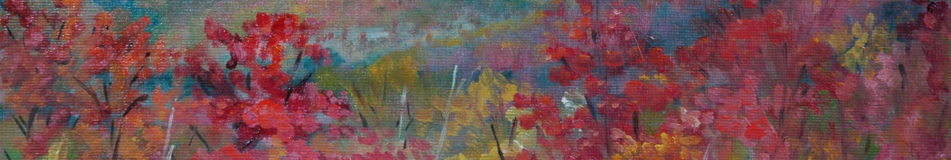
My next painting, on Saturday, was also in Mary’s back yard. Two Royal Palms growing together like this was unusual and, I thought, lovely:

About the only thing I want to change in this painting is that little tower of foliage on the shrub in the background. I find it distracting and unnecessary. The paint was so thick on the leaves of the little tree next to the Royal Palms that it was still wet a week later when I packed it to come home. I haven’t had the courage to check up on it. (All of these photographs were taken before I left Florida.) Notice the sea to the horizon–the Gulf of Mexico. What a prime location!

The next day (Sunday) we went to an area or town called “Goodland”–a fishing village of small cottages and trailers, restaurants and boating stuff–acres of boat storage five stories high, boat launching areas, creeping gentrification, and wild bars (so they say). Bars as in cocktails. That’s a lot of interesting man-made material for a painting, but I couldn’t wean myself entirely from nature, so it is a combination:

The Banyan Tree. These trees drop tendrils from their adult branches and the tendrils become roots, creating quite a remarkable abstract sculpture. Two years ago, I had painted a banyan tree in Boca Grande, but considered that no reason not to try again. In the background I suggest detail but do not provide any. The one thing I want to fix on this painting is the palm tree in the midground. I should either remove it altogether, or make it less defined, less hard-edged. What you also see in the midground is a smallish marina with boats, and in the background, two-story houses not typical of Goodland’s homes.

Actually, the Banyan Tree took two days because we were chased off by threatening clouds on Sunday. Sunday was what Mary calls a “silvery” day, meaning cloudy, with subdued shadows. Monday was different–full of bright sunlight and prominent shadows. If my painting looks a little schizo, that’s why.

After Monday morning painting, we had lunch at the “Little Bar” restaurant, the only eating establishment on Goodland open for business on Mondays, after which we went off to find a more typical dwelling to paint:

“One-story House on Canal” I can’t find my reference photo, although I know I took one. I know because I remember returning my camera to the car before setting up my easel. And I’m sure of the camera being in the car because during the painting of this picture, a young cormorant was fighting with a fish, trying to get the darn thing down his too-small gullet. The struggle went on and on, and I longed for the camera, but knew if I made a move in any direction, the cormorant would carry his fish off to a new location. Life is full of regrets.

Anyway, I am going to have to study my photo to fix the architecture of this little house on the canal, because what I saw (and painted) does not make sense to me now. However, I am pleased with the light passing through the lattice somewhere in the entrance, and the light reflections from the water onto the boat. The boat–again painted as I saw it but my eyesight isn’t that great anymore–the seat back is flipped the wrong way, isn’t it? Must be flippable like that so someone could sit there while repairing the motor? Anyway, I believe that boat needs a person in it, and that is what I would most like to fix in this painting.

Tuesday: a friend of Mary’s invited me to go with her to the Naples Botanical Garden. Artists are welcome to paint in the Garden only on Tuesdays until noon, and Mary had an appointment that kept her from going with us. With all the choice plants (hibiscus to die for!) around Mary’s house to paint, I felt no need to focus on flowers. In the Asian Garden, there was an impressive bamboo collection, and behind a species known as black bamboo, stood an attractive Thai pavilion. Here is a reference photo and my painting:

I want to work on the bamboo a little more, lighting the side hit by the sun, and figure out a better way to resolve the hill on the left. You notice, I suppose, that I overstated the presence of a body of water. I like to paint water, so shoot me.

Tuesday afternoon, Mary and I went off to paint on the Esplanade, in part because Annie’s Ice Cream is close by. We lazily set up on a bench in the plaza near the bar, which was celebrating Mardi Gras. We diligently ignored all the shenanigans and stuck to our painting. Here is a reference photo, partial at best, and the painting I chose to create:

I never intended to match up frond to shadow of frond, but perhaps I went too far in ignoring reality. This painting may not be fixable–I like it better in person, so maybe it just doesn’t photograph well. The ice cream (peanut butter fudge) was good.

Wednesday: Mary had mentioned how long she had been eyeing a working boat up on blocks next to the Little Bar where we had take lunch on Monday, and I agreed that it would make an interesting subject. So back we went to Goodland to paint the boat “high and dry”, which has become the title of my painting.

This is my second favorite from the week, after the Banana Tree. Not until comparing painting to photo did I see how upturned and perky I painted my boat. I should change the name to “High and Dry but Still Perky.” But there are a couple of things I want to change. Under the boat in the center of the painting I originally had yellow like the color of the brush on the right. I covered the yellow with blue green paint to push it into the background, but now I think I should have left it yellow, to show how high this boat is off the ground. I also worry a little about how the narrow roof lip can cast such a wide shadow, but the reference photo backs me up on that point.

Thursday: I am down to two days left, since my plane back North leaves Friday at 7:15 p.m. The weather forecast says “showers” and seems to suggest “scattered” as well. Mary has another appointment to go to, so she drives me to the Catholic Church that she attends, where I will be safe to paint alone. The church is architecturally worth painting. I find an angle I like and get set up. I have the shapes outlined and am just noticing how sharply the sun and shadow planes are contrasted, when rain and darkness and wind descend upon me from my rear. Without notice of this impending hurricane, I could do nothing but hang onto my easel for dear life. Somehow I managed to get off these photos, probably when I realized I had to get the camera into a more protected spot.

So I’m thinking, a storm that moved in that fast will leave just as fast, the sun will come out and dry me off, so I will just wait it out. But then the thunder started. I somehow found a way to pack up enough to move (two trips) to the shelter of the church. Soaked to the skin I was. The only damage to my equipment was to the paper towels, which were mush. The sun never did come out and dry me up, at least not until hours later. I worked on the painting from memory:

Now that I have had a chance to compare the painting to the reference photo, I am astonished to see for the first time there is a strip of windows under that higher eave. I did not consciously omit them. I just omitted them.

The railing in the lower cupola is just a detail that did not make it to the initial drawing. I want to add it to the painting. The left side of the tower needs to be widened. Not sure whether to add the decorative molding.

Although this has nothing to do with painting, I have to report an outstanding concert experience Thursday night at “The Phil” (Philharmonic Center for the Arts) in Naples. Leon Fleisher, super pianist. Super venue. Only a very wealthy and culturally sophisticated community could support such a luxurious structure and vibrant institution. I’m thinking no wonder so many people move here to retire, and maybe not such a bad idea, hurricanes notwithstanding.

Friday. Last day. Mary asked me if there was anything I wanted to paint, and I requested a bridge over a canal. She found me one.

But since I took all my painting photos Thursday afternoon (in the lovely post-storm light), and I have had no time since getting home (long story) to photograph my start on the canal bridge, I cannot show you what a rotten job I did on the bridge, and you can be sure that I will be fixing what can be fixed before I post it. Suffice to say that it looks like a foot bridge, not a car bridge, and I got the perspective wrong on the dock. But the foliage and buildings look great!

Hope you enjoyed this maybe-too-long post. I just had to record it all for the sake of my own memory. It was a great week. Thank you Mary!

Comments Off on Marco Island and Naples Posted in Uncategorized

Newmarket

Newmarket, New Hampshire is a little town tucked away in the space between Manchester and Portsmouth, between Maine and Route 101. You don’t stumble into it on the way to somewhere else, at least I haven’t. You discover it only when it is your destination. It became a destination for me when I joined the NH Plein Air artists group. In fact, Newmarket was my first outing with that group. Four of us painted on the far side of the Lamprey River, looking back at the town. In these two of my earliest plein air paintings, I first labored over an old mill building and then the dam and bridges. I have learned a lot about painting both indoors and out since I did these, but they are still representative scenes from Newmarket:

Pretty primitive, but thank goodness I can see that now. I must be improving.

Yes, New Hampshire is blanketed with adorable little towns, but Newmarket is evolving into something of an art magnet. Artists are settling there. A new art supply store located there. Annual Old Home Days produce artists’ easels set up on sidewalks and riverside locations, accompanied by the artists themselves, painting en plein air. Two art galleries–Ampersand and Cornerstone–vie for attention. The Lamprey Arts and Culture Alliance (LACA) is based in Newmarket.

So when I was invited by Christopher Volpe to submit plein air pieces for a collective exhibit at the Cornerstone, I jumped at the opportunity. I had met Chris at last year’s Canterbury Shaker Village paint out, and greatly admired the beauty and simplicity of his work. Upshot: I have three pieces in the plein air show that begins March 12 and ends April 7. The reception will be March 12, a Saturday, between 4 and 7. I’m not sure I can be present at the reception because that same day I will be in Boston with an old friend from Germany–but maybe she will agree to visit Newmarket after I give her my sales talk.

The three pieces included in the exhibit are the Sawmill that headlines my blog, the snow scene that opens this entry, and the painting below, which depicts a suspension bridge on Davis Path, in the White Mountains near Crawford Notch.

You probably remember the snow scene from my recent blog on the snow camp.

I am posting this blog entry in advance of the usual Monday schedule because tomorrow I fly down to Florida for my third annual visit with Mary Crawford Reining, fellow plein air painter, who lives on Marco Island. Last year I discovered how to use my telephoto lens and returned with some fabulous pictures of birds. See them here and here. The long lens will travel with me yet again and I hope to return home with not only fabulous photographs but a few good plein air paintings as well.

Fun with Teapots

A while back I posted a blog entry called “Fun with Nudes”, which was delightedly received by my cohorts at the Saturday Life Group, whose motto is “I see naked people”. Teapots may not have quite the same resonance, but they are shapely. These drawings are from the NHIA class that I am taking with Peter Clive. And it really IS fun to capture the lights, reflections, shapeliness of random life objects deposited on a table with no special organization or composition. We students are spread on all sides of the table, and whatever object lands in front is pretty much what we get to draw. The one above, “Teapots against Black”, was the last one I drew and it was done very quickly. My original effort is below.

Before I started the black one, Peter Clive had suggested to me that I fill in this background with black, and I think now that would have been a good thing to do, so please imagine this one against a black background. The title will have to be “Teapots with Eagle.”

A brass horse has found its way to the table for three weeks running. I avoided it last week, but here he is from the previous two weeks.

“Brass Horse” and “Brass Horse and Mask”, respectively.

Still life has has always conjured up for me images of fruits and flowers and their containers. I have collected a fair number of fruit and flower paintings by other artists. (One of my favorites is Jelaine Faunce from Nevada.) I have never yearned to paint fruits myself, maybe because the challenge they seem to pose is the realism of the rendering–not my cup of tea. But drawing these crazy ill-composed unrelated objects with colored pencils, crayons, charcoal, inks, etc. without rules, rhymes or reasons has just been a blast.

Next week, the class will be drawing from a live person, so this may be the end of my flirtation with Still Life as a subject matter.

Just to keep them all together, here are the pieces Still Life No. 1 and No. 2 that I posted in a previous blog entry. No. 1 is a painting, not a drawing, and actually predates (I think) the beginning of the drawing class.

That suitcase has found its way into the last drawing, with which I opened this entry, the one on black background. Full circle.

Catching a Wave

Last week I brought up the subject of painting from photographs taken by someone other than the artist. I subscribe to the generally accepted principle that, given a choice, first paint from life, then paint from your own photograph, and lastly paint from the photograph of another only with permission from the photographer.

Painting from photographs, even those you took yourself, can be dangerously stultifying for an artist, but no less an authority than Albert Handell gave me permission to do so after viewing two of mine, which he admired. (Light in the Forest and The Greening of the Forest in May). Nevertheless, some of my personal favorites are ones that I painted en plein air (outside and from life, sort of) and alla prima (all at once without tinkering later in the studio). But sometimes I fall in love with a photograph, and seek permission to paint from it. You can find some examples of that in my album pages “Studio–New Hampshire” and “Eclectic Mix”. But other times, I don’t have enough information or time to get permission, which is what happens when I getting ready for a sitting stint at the Manchester Artists Association Gallery.

I’m no better than the average bear at getting my act together, so most Saturday mornings I am packing my drawing materials for SLG (Saturday Life Group), which runs from 9:30 to 12:30, and my oils for an afternoon of gallery sitting from 1:00 to 4:00. Obviously, a lunch has to be packed too. No time to print out any new photographs to paint from, or contact any photographers for permission to use theirs. So like last week, this week I popped a selection of favorite pages from old Sierra Club calendars in my oil painting backpack.

So that’s my excuse for painting the wave. When you think about it, no wave can really be painted from life. The shapes change too fast. Worse than trying to paint a sunset. I have painted surf en plein air (Rhode Island), and got a lovely feeling or impression of it, but when it comes to anatomizing a wave, you have to have a photograph of it. Once you have painted maybe a hundred waves, you can probably construct one out of your imagination, but this is my first closely observed wave.

As far as the copyright is concerned, I’m hoping that my use of the photograph qualified as “fair use” for educational purposes or that my years of service to the Sierra Club will count for something!

At the Gallery, I could only spend an hour on the wave because I needed to let the thick paint dry a little so that I could more successfully smudge it. Yesterday I spent probably another hour smudging.

But meanwhile, back at the Gallery on Saturday, I had another two hours to kill. I always bring at least two canvases (two 11 x 14’s fit in my pochade box), so I brought out some drawings from SLG. I don’t try this often, in part because the exhibit opportunities for a nude painting, (shorthand for “painting of a nude person”) are few. The general public, it appears, are not ready to see nude paintings in a public space unless the public space is a museum. I had a couple–from two different mornings, so two different models–to choose from:

Here is the resulting painting–I choose the easiest one.

Painting from Photographs–or not

I belong to an organization, The Women’s Caucus for Art, which puts on a number of exhibitions during the year, and one called “Flowers Interpreted” is coming up. Since I don’t usually interpret flowers per se, I was happy to find inspiration from a Sierra Club calendar closeup of a field of poppies and coreopsis. Painting from someone else’s photograph is a serious deviation from “best practices”, and not just because of copyright implications. But inspiration cannot be denied.

Speaking of copyright infringements: There is a school of thought that holds that artists may safely (i.e., legally) paint from others’ photographs of nature because the photographer did nothing to set up the photograph–he or she just recorded it. I’m not sure how distinguishable that would be from the AP news photo of Barack Obama that inspired Shepard Fairey’s iconic image (“Hope” poster, buttons, etc), which became the basis of a celebrated lawsuit. The AP argued that Fairey “copied all of the original, creative expression in the photograph.” Fairey argued that his use of the photograph constituted “fair use”–a copyright concept that permits the quotation of written expression. The AP and Fairey settled their dispute, so we will never have a court ruling on that matter but if Fairey did more than take inspiration from the photo, if he actually used the photograph to digitally manipulate it and transform it into his poster image, it seems to me very, very distinguishable from an artist looking at a photograph to inform the way he/she depicts the same subject matter in a painting. One of the AP statements suggests that digital manipulation is exactly how Fairey created his image. (Some artists project a photograph onto their canvases and trace the image instead of trying to draw the image–this to me seems closer to digital manipulation and therefore closer to copyright infringement.) (Reminder and disclaimer: I am a tax lawyer, not an intellectual property lawyer. But I am well trained in logic.)

In an excess of caution, however, I made changes to the contours of the hills presented by the Sierra Club calendar photograph.

Another painting that I worked on last week was painted entirely out of my head, with not a single photograph reference to help me out. As a result, I am a little nervous about its accuracy. Here is that painting:

I woke up a few weeks ago about 2 or 3 a.m., to see a snowy landscape out my window that was lighted up by a pink sky! No, NOT SKY–the snow must have been falling from such low-hanging clouds that the reflection of the city lights were amplified overhead. Each falling snowflake would also be reflecting light from the clouds.

I wanted to record this phenomenon in a painting, but not enough to get up out of bed and paint it in the moment. (Regrets.) So I had to do it from memory, which meant that I had to reason out all those important choices that I usually only have to observe. Shadows or no shadows? Should the pink of the low-hanging clouds be reflected in the snow on the ground? How light, exactly, was it?

I am looking forward to our next overnight snowstorm so that I can check on all such issues. Maybe I will haul out the paint and do it right this time.

Comments Off on Painting from Photographs–or not Posted in Uncategorized

Visit my studio

Today I have a number of paintings in progress and a few revisited paintings, but nothing new and finished. So I was casting about for a fresh story line. I’ve already done the idea of makeovers and the WIPs, and I don’t want to bore anyone, especially you, with the same painting over and over with small refinements that the photographs perhaps don’t capture. So today I thought you might like to see what my tiny studio looks like with multiple projects underway at once.

Starting from the left of the above photograph, which I took this morning just before going to work: Upside down on the drafting table you see the Farmers Market painting. I have pretty much finished the painting, but have to paint around the edges of this “gallery-wrapped” canvas so that I do not have to frame it. I started with the bottom edge, and am waiting for that edge to dry before tackling the other three edges.

Behind the lamp is a portrait I painted in 1964 of my two children, as a Christmas gift to my parents. It was the last painting I painted until I started to paint landscapes in 2005. My daughter Nancy was then almost two years old and my son Andy only a month old. The lamp contains a special bulb that gives off daylight spectrums, or some such thing. The daylight from the right is coming from the North, which is what artists want in a studio because it does not change as the sun travels across the sky from morning to night. But my north light is obstructed by the hemlocks growing outside my window. Since I am a certified treehugger (volunteer for Sierra Club), no tree removal is planned.

On the window sill are three paintings , two that I began Saturday while gallery sitting at the Manchester Artists Association Gallery. The one on the left was inspired by a Sierra Club calendar photo of a field of California poppies. The one in the middle you might recognize as one of my recent snow camp paintings, still drying on the sill. The one on the right was inspired by my awakening during last week’s snow storm to look outside and see the sky all pink. Behind the shelf unit, you may detect other paintings in waiting. These are older ones I am not satisfied with, yet. Someday I may figure out what they need and move them out for public viewing.

Under the window is my backpack and my art cart, two ways to deliver the gear to an outdoor painting spot. The cart has been handy for getting gear to a class, but the backpack works better for traversing unpaved surfaces. The floor lamp delivers wide spectrum light to supplement the north light. Also important to note are the camera on tripod, which I use for photographing final versions of paintings when I want a really good image, and my bright blue chair that allows me to scoot around the space and get some distance from whatever I am working on at the easel.

The space is too small, however, to allow for enough distance when I am painting on a 24 x 48 canvas, as I am right now. Below is a shot of the other side of my studio space, showing the easel, the palette on tripod (which I also use for plein air painting), and the current painting in progress. In the background, on my closet door, you can see three nude drawings from Saturday Life Group, which got tacked to the door last year and have never been replaced. The still life on the wall to the left is by Nevada artist Jelaine Faunce. The TV on the right was intended for displaying my digital photographs for use as painting references, but I still haven’t worked out the kinks.

In the back you can see a sliver of my bedroom, from which this space has been carved. The studio space originally was a separate bedroom, but by the time I moved in, the two rooms had merged into one huge room with windows on three sides. My Chickering grand piano had occupied this space until I recognized that art was my priority and I sold the piano, which had been mine since I was ten years old. Sometimes you just have to let go.

The studio is now separated from the bedroom space by these racks of storage:

Top Shelf Bottom Shelf

On the top shelf I keep large canvases, a few framed charcoal drawings, and an assortment of the wet panel carriers (“Art Cocoons”) invented by fellow artist, Patricia LaBrecque of Goffstown. On the bottom shelf are many panels ranging up to 16×20 in size. That red object is the back of a homemade doll house that I now use for art library storage. I have so many books describing how to paint this and draw that–if I could have only read and absorbed all of them, I could have become a great artist. A knowledgeable one, anyway.

In front of the bottom shelf you get a glimpse of the rolling caddy with brushes and media (oils and solvents) on the top. I can also set a cup of hot tea there and so far have not tried to clean my brushes in it, but once I enter the painting “zone”, I always forget about the hot tea until it has got cold.

Only one more angle remains. It looks pretty sloppy. Two sets of shelves hold backup brushes, watercolor supplies, sketchbooks galore, a binder with data about my first 100 paintings (I gave up the tracking effort after that) and lots of paint tubes. Behind the farthest unit is a covered litter box and assorted supplies. Yes, I have to share my limited studio space with the cats. The sneakers don’t belong here at all! They have probably been sitting there for weeks, unnoticed. What with the snow, I have been living in my snuggly Emu boots except when I have to don the special Snow Camp boots.

One last view is necessary to round out the picture–

The easel way in the background is used for drying paintings (the other snow painting right now) or for examining artworks that are under review. Moving forward, the light that I use to supplement the obstructed north light is another one of those all spectrum lights that is suppose to mimic daylight. I have to angle it just right to avoid having it create a glare on my painting. Beneath the light, hanging on the big rack of canvases that I showed you before, is a dandy thing with pockets to hold tubes of paint and other things. The waste basket at the bottom is important too–I have to use a lot of paper towels in the course of painting.

So there you have it. Thanks for visiting!

Snow Camp Update–The Color of Snow

Nature give me the gift of a Snow Day yesterday, and I used it to make improvements to my Snow Camp paintings. The paint was still malleable–a benefit usually denied to me because of my work schedule.

I am leading off with a close up of the first painting to help you detect the opalescent color of the snow. One of the Big Insights of the weekend was Stape’s insistance that we portray the ineffable quality of the color of snow. (“Ineffable” = incapable of being described in words.) After struggling with the concept, I would like to suggest that snow is also incapable of being depicted with paint.

But there is some science behind Stape’s opalescent idea. White, I am told, contains all colors, and thus reflects all colors back to our eyes. So Stape’s method does make sense. He asked us to lay down very pale shades of the three pure primary colors (red, blue, yellow) next to each other. The result should be a vibration of color that would come close to the true color of snow. This Big Insight was revealed to us on Day Two. I applied it to my painting of that day, but the result was a little disappointing. The snow just looked lumpy. Yesterday, however, I worked it over, lightening the colors and blending them slightly– without mixing them together (mixing would have meant death to vibrancy, as the mix would have produced gray). (Why mixing three primary colors does not produce white instead of gray is one of those mysteries like time being a fourth dimension–which I take on faith.) Here is the painting in its entirety, Day Two version against yesterday’s version:

I can’t really see it here either. You may have to trust me when I say that, in person, the effect is worth having. Here’s another closeup:

I tinkered with some other features of this painting while I was at it–of course.

The Day Three painting also had an issue with the color of snow. I mentioned yesterday–no, that was Tuesday (yesterday was the day when time stood still)–about the sun lighting up the vertical planes, which had the effect of showing the horizontal surface as if in a bit of a shadow. To appreciate the enormity of my observation, you have to have read John Carlson’s book on painting landscapes. His famous analysis holds that the sky is the lightest element (barring snow) in a painting because it is the source of light; the next lightest surface is the horizontal surface because the light from the sky hits it directly; the darkest areas are the verticals (they get the most indirect light) and in between light and dark are the slopes. All rules have exceptions, of course, and when the sun lies low in the sky, it will override the above scheme to make the lightest surface that which it hits most directly–verticals! What fun!

So here is the before and after:

Perhaps you need a close up?

The puzzlement for me was HOW to show the brightest white of the snow when all those vertical planes were facing away for me. Answer: Backlight. Cheat.

As long as we are on the subject of lit vertical elements, here is one of my early paintings which a few years ago won a place in the New England Biennial exhibit at the NH Institute of Art.

When I look back at my previous works, I am sometimes awed by the fact that I was able to produce some good paintings before I knew as much as I now know, or now think I know. Maybe knowing stuff is not the key. But knowing more about painting snow is for sure going to change my style vis a vis snow. Naivete begone! Now, what am I to do with all those old paintings of snow in shades of gray or blue?

Comments Off on Snow Camp Update–The Color of Snow Posted in Uncategorized