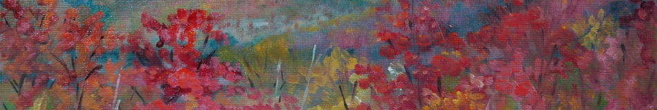

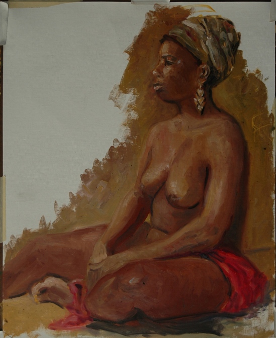
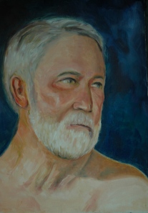
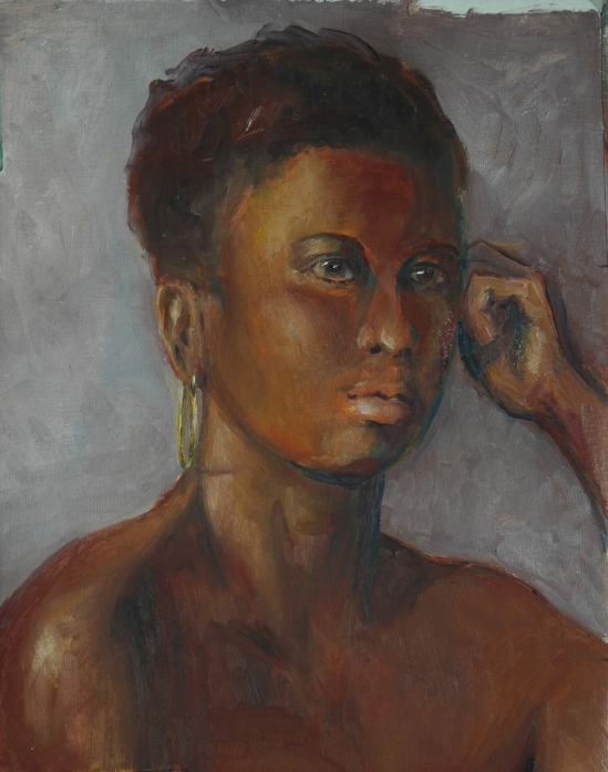
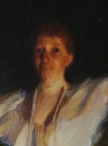
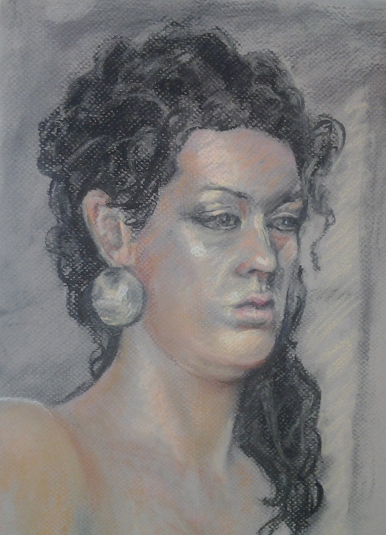
Detail from Portrait of Grace
The “Joy of Finishing” was my first thought for the title to this posting, but “Completion” is better. And not just because “completion” brings with it fewer double entendres. You could “finish” or come to an end of a project without being satisfied with it. “Completion” connotes a goal achieved. I could go further in this amusing wordplay by comparing “accomplished” as in “mission accomplished”, but that could get raw.
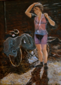
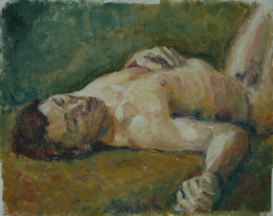
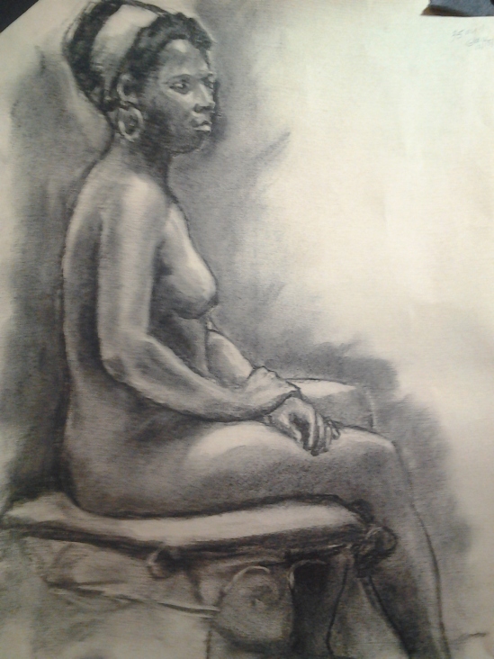
This week, therefore, I celebrate three completions. Last week you saw the intermediate stages of two of them, so you have some idea of what to expect. Above is the detail from the bigger one. I said I wanted to make the background from the colors of the headscarf and whaddya know–I did!

Portrait of Grace
Grace did not realize we wanted to repeat the pose from last week, so she arrived with a different scarf, wearing different earrings, and carrying a different drape. Just as well–three elements were thus eliminated that I might have spent valuable time on.
This is a pretty good likeness of Grace, but of course, profiles are so much easier than 3/4 or full facial views. Have I mentioned that before? I hate to repeat myself, especially when the point is obvious when you think about it: matching up eyes, eyebrows, lids, etc., etc., especially in the 3/4 view where the shadows make them look different, is really, really tricky. Also, faces are not symmetrical, so too much matchy-matchy would be wrong. Given all that, trying to figure out where the eye on the left should be higher or the one on the right should be lower can give me headache sometimes. No, all the time.
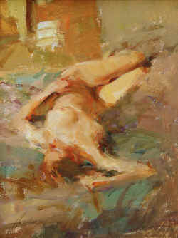
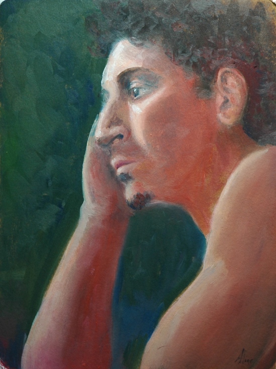
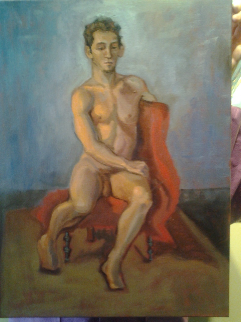
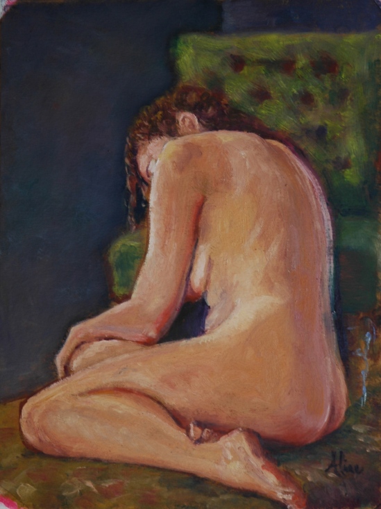
The other just-short-of-finished figure from last week came out OK. I think I messed around a little with the face, to no good purpose, but the main focus was the hand. Now shorter, narrower, and with a hint of finger structure, this hand no longer detracts from the painting as a whole.

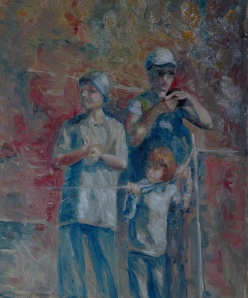
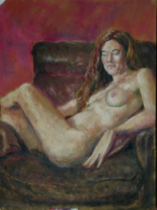
Figure Study (M on BLS)
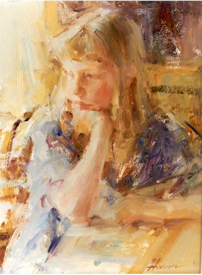
However, the face is not that of Margaret, so I moved in closer, metaphorically, on a second sheet of canvas:

Portrait of Margaret
Still not Margaret. If I had had more time, I would have lengthened the nose perhaps. Or shortened it. But it’s hard to say what exactly is wrong. Peter Clive said, “Margaret is elusive.” I called her “sneaky”. (Which I think she appreciated.) Likeness or not, this painting came out well. What do you think of the background? I was thinking of light through thick green glass, but chose not to take that concept all the way–it was just my inspiration.
You might notice that the head is tilted differently in the second attempt. It’s just impossible to keep a head from moving. If I were alone, and were painting a portrait, I could keep telling the model how to adjust her attitude, but when painting the entire figure, there is so much to keep aligned that you tend not to trust your opinion about where the head should be–especially if changing it might decimate a colleague who thought he had it right. (I apologize for the long sentence but couldn’t find a spot to break it up.) Still and all, frustrating as it is, I would not trade it for drawing from a plaster cast of a head, illuminated by a steady, never varying spotlight. The harder it is, the more ways we learn. I hope. I sure hope so.
Aline Lotter is currently exhibiting:
at the Hatfield Gallery in Manchester (Langer Place, 55 S. Commercial St., Manchester, NH); at the Bartlett Inn in Bartlett; at the Red Jacket Inn in North Conway; at Stella Blu , an American Tapas restaurant in Nashua; at her law offices at 41 Brook St in Manchester; and at her studio by appointment. Beginning May 1 through May 30, nine of her Boston Arboretum paintings will be displayed at the Leach Library in Londonderry, NH. On Saturday and Sunday May 4-5, she will be exhibiting and demonstrating at the Londonderry annual event “Art in Action”; the location of Art in Action will be the large farmstand operated by Mack’s Apples, 230 Mammoth Road in Londonderry.


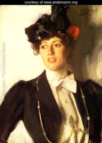
 White gown, overhead view–both to mimic Sargent’s version. I also think he probably met the challenge, but in the world of art, such comparisons are invidious.
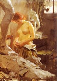

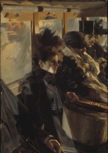
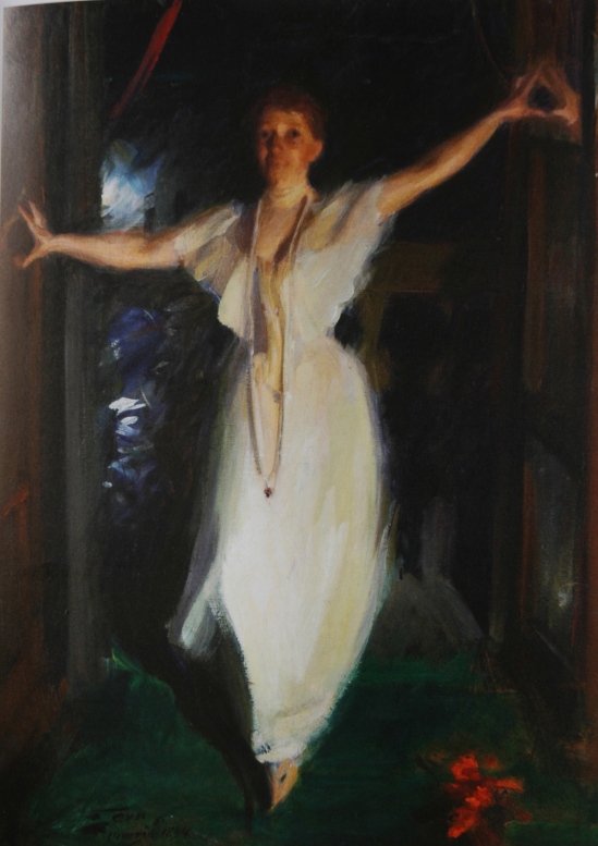
 This painting should be an inspiration for all figure artists who desire to capture movement and spirit in a gesture. I wonder if there is anything written anywhere about how Zorn put this painting together. Clearly Isabella did not pose for more than a minute or two.


")
")


")


