
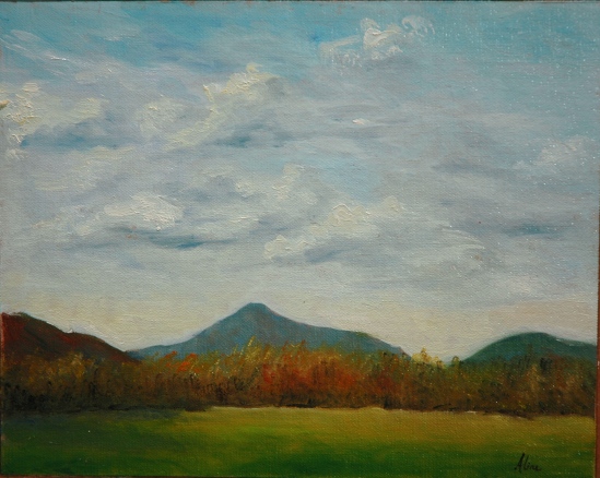
I am still trying to paint an abstract landscape in the EEE class, but the current effort is kind of a mess and I left it behind to dry in the classroom. Fresh eyes this Thursday will, I hope, inspire me with what to do to make it something I can be proud of.
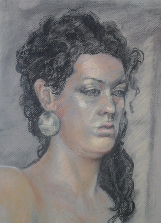
Meanwhile, I’ve been working hard on the figurative side of representational art. Some nude, some clothed, some full figure, some portrait. I am happier with the the painted ones, but I’ll start you off with the drawings –selected drawings. Some of them are disappointing and I don’t want the world to see how uninspired I can be. Here’s my favorite:

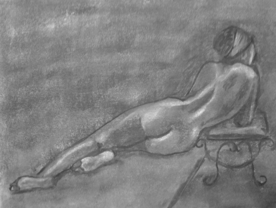
Map of the Back
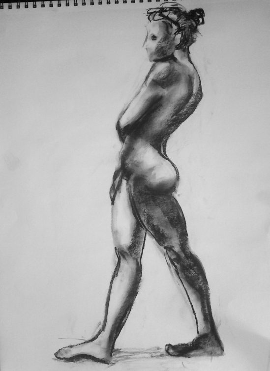
Graphite, charcoal pencil and charcoal on drawing paper–not an ideal combination. I was feeling my way with the media. But I like the result moderately well. The next pose was a standing one, with the model’s head silhouetted against the bright window. Hard to see well enough to represent. I tried, but am sparing you the result. We (the Saturday Life Group which meets at the NH Institute of Art) are now drawing in a studio with side windows, instead of the studio with the overhead skylight. I prefer the side light, but it’s hard to take when it’s in your face.

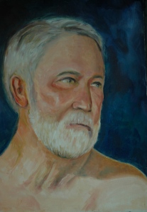
Grumpy takes a cup of tea
“Grumpy” because he prefers to pose in the nude plus he can’t really enjoy that tea while posing. We promise not to make him keep his clothes on again.

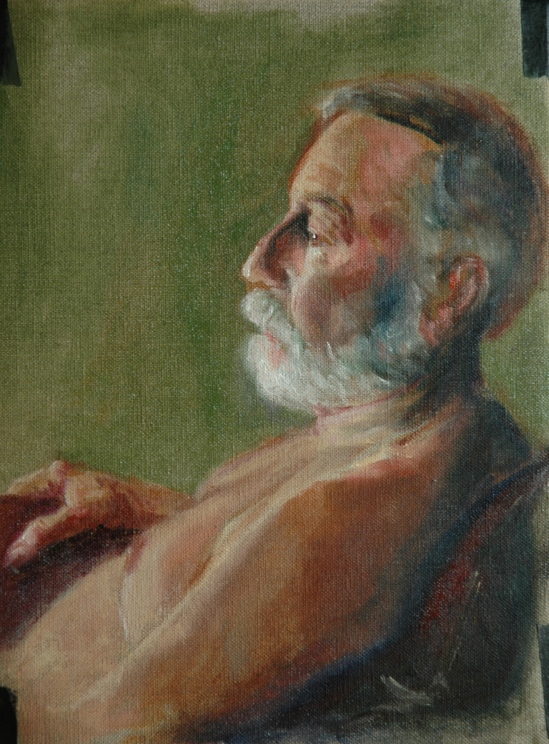
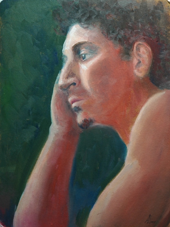
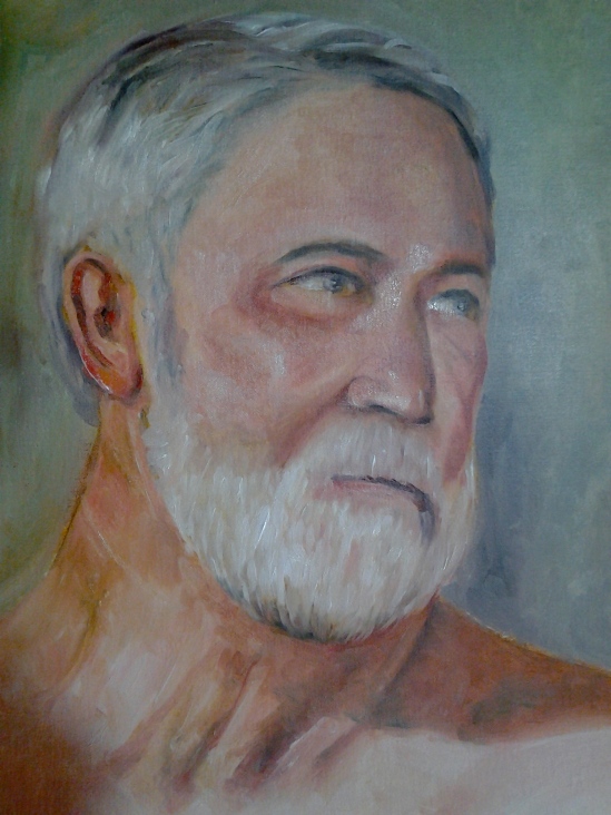
Dennis in his clothes
It was cold in the studio that day, so we had to let Dennis stay dressed. He was happy about that.

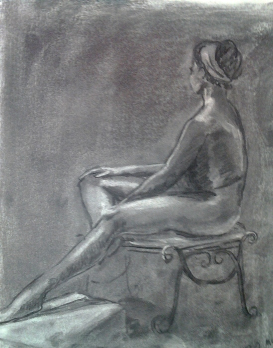
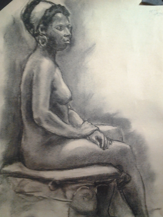
Map of a different back
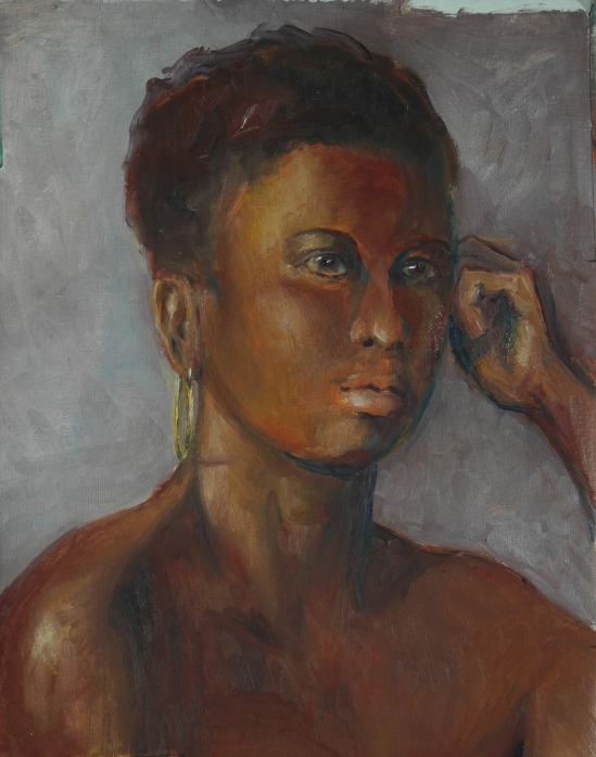
Mike is a new to us, relocated here temporarily from California. He’s a real pro, when it comes to modeling–comfortable and inventive with his props, like the pole and the “stool” he was sitting on. For the next pose, I chose to draw a portrait of him:

Portrait of Mike D.
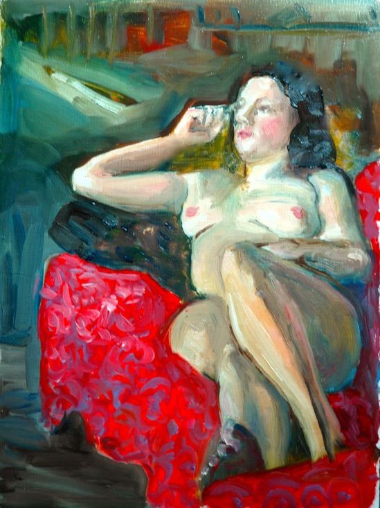
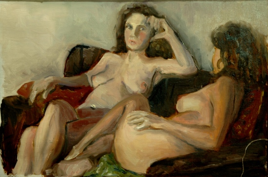
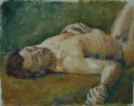
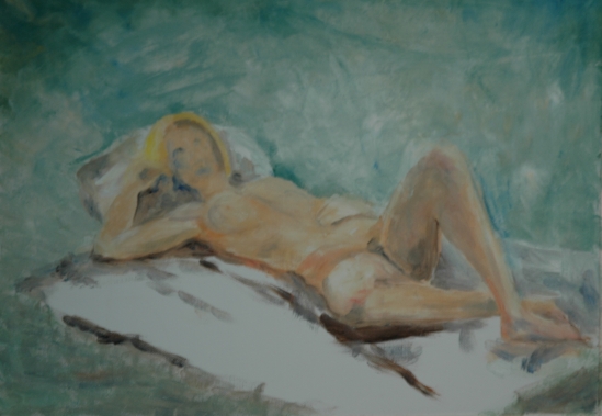
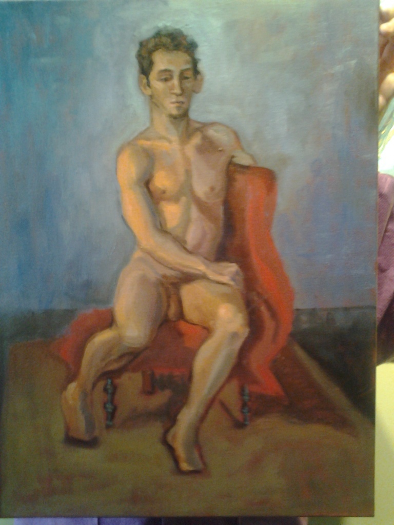
At last, we’ve reached the paintings! There are two of them, both painted in the workshop studio behind East Colony Fine Art’s gallery. The challenge again is the lighting, but not from windows–either there’s too much fluorescent overhead, or you can’t see what you are doing. We are wising up and bringing task lights that clip on easels, or hang around artists’ necks.

Leaning against the wall

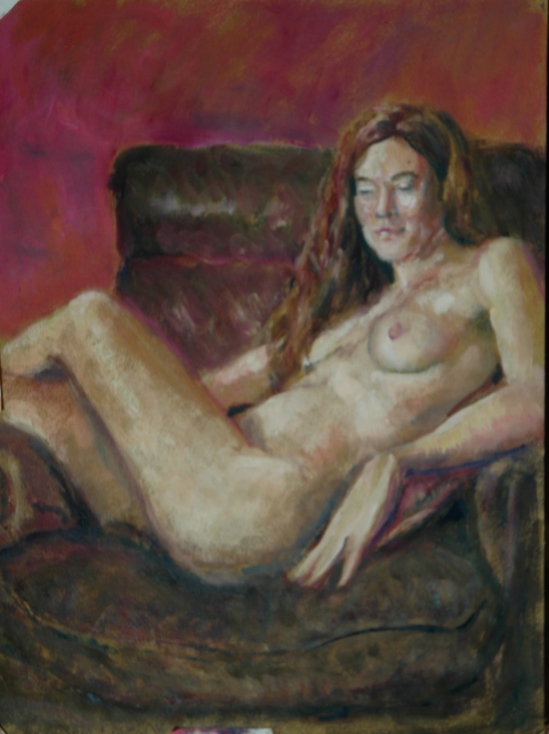
Challenging circulation
Well, that’s a stupid name for a painting. Sigh. Yes. Do you know how hard it is to distinguish one nude (painting) from another by its title? So many nudes, so many standing, so many sitting, so many reclining. Then you try identifying by the color of the drape. So many blues, so many reds, so many yellows, etc., etc. The major distinguishing feature of the last painting was the fact that Margaret’s leg kept falling asleep. Of course it did–what else could we have expected? But that became my idea for a title.
The first one is of a new model and I’m not sure she would be comfortable with being identified by name, which makes titling the painting even harder. The elements of this painting just came together so beautifully, and I quit working on it before I spoiled it. Always a good thing.
Both paintings were done in oil, on the brown carton paper sold by Judson’s Fine Art Outfitters, with very little medium. Does it appear to you as if I were working in pastels, not oils? I think it’s that combination of the dry paper with the unmodified paint. The paint drags across the surface of the paper. When you stop to think about it, that’s what pastels are: pigments without the oil binder. So when the paper soaks up the oil and leaves the pigment sitting on top, you get the pastel effect.
Aline Lotter is currently exhibiting:
at the Hatfield Gallery and the East Colony Fine Art Gallery in Manchester (both are in Langer Place, 55 S. Commercial St., Manchester, NH); at the Bartlett Inn in Bartlett; at the Red Jacket Inn in North Conway; at the law offices of Mesmer and Deleault at 41 Brook St in Manchester; in the Community Gallery at the Currier Gallery in Manchester; at the Manchester office of Congresswoman Carol Shea Porter; at the Studio 550 Art Center in Manchester NH, as part of the annual 6×6 show of the Womens Caucus for Art; and at her studio by appointment (email: alotter@mac.com).


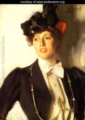
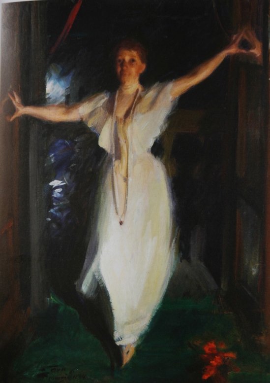
 White gown, overhead view–both to mimic Sargent’s version. I also think he probably met the challenge, but in the world of art, such comparisons are invidious.
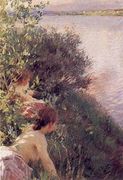
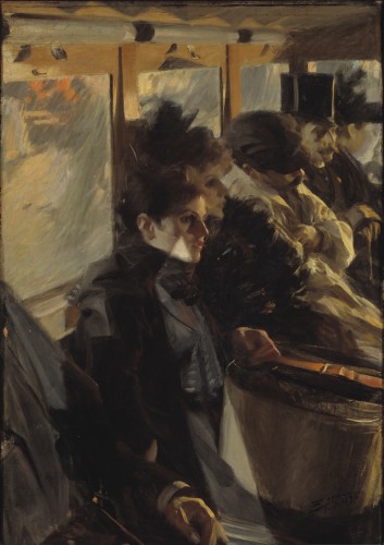
 This painting should be an inspiration for all figure artists who desire to capture movement and spirit in a gesture. I wonder if there is anything written anywhere about how Zorn put this painting together. Clearly Isabella did not pose for more than a minute or two.


")


