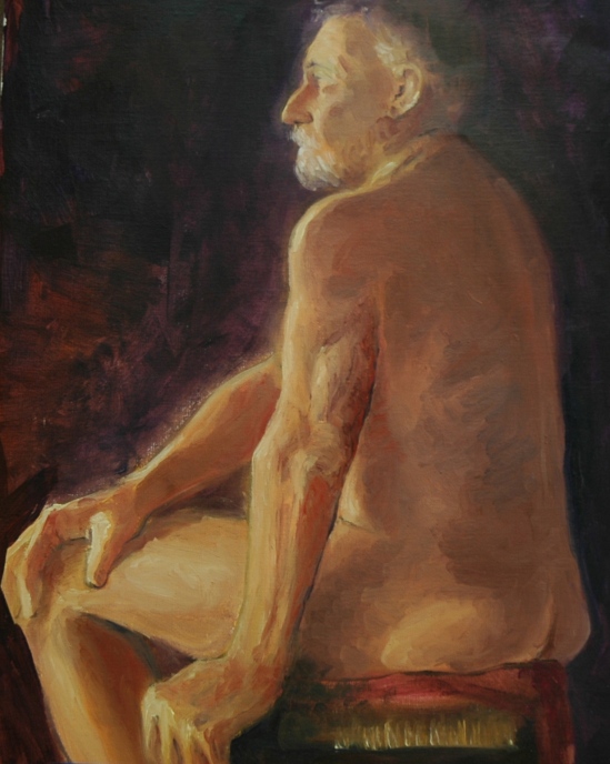
(Almost) No pictures this week, but lots of words. My two CF card readers both died on me, so I can’t transfer my camera photos to the computer. Luckily, I had on my mind that I should write something about the workshop I took last month with Paul Ingbretson, on the subject of Composition . . . of paintings, of course, but I decided that the material applied equally well to photography. So I use the word “picture” throughout the essay. At the end, for purposes of illustration, I’ll include a painting that I corrected a few weeks ago at Paul’s recommendation. Yesterday, Paul met with us again to see what, if anything, we had retained from the workshop, so this is a good time for me to review and reconstruct my thoughts on the subject of composition.
I have written this up not from the outline Paul gave us, not from the notes written up by a former student of his and handed out at the workshop, not even from the notes I produced myself (radical happening, that–I never take notes). No, this is mostly a mergence, a convergence, of what I absorbed from what Paul was trying to get across plus a few elements from my own experiences. I hope it makes sense and somewhere in the prose produces a lightbulb of understanding for someone, an understanding that had not previously existed.
Composition of Pictures in a Nutshell
(Thoughts after taking workshop on “Composition” with Paul Ingbretson)
The composition of pictures involves the harmonization of elements with respect to:
Arrangement/placement of shapes/objects
Color (hue—red, blue and yellow) given to the shapes and the background
Value (light, dark, all gradations in between) given to the shapes and the background.
The goal of good composition is to achieve Unity AND Variety—and to help get across the idea or mood that the artist wants to express. It is VARIETY that makes the picture interesting, but UNITY is necessary to create harmony, loveliness, and the chosen mood.
Beginning with your choice of a subject and your selection of elements to incorporate in your picture, you are making compositional decisions. What colors, for example, and why?
ARRANGEMENT
After choosing a subject, and after selecting the objects or elements (or shapes) that you wish to incorporate in that subject, your next task is to arrange those elements or objects so as to distribute them in the picture harmoniously and interestingly. Your decisions will have to be informed by the colors and values of the objects. Therefore, you have to be thinking about all three major concepts—arrangement, color, value—at the same time.
[Arrangement choices while painting en plein air in a landscape do exist, albeit limited by reality]
Rules: Create overlaps; avoid tangents. Avoid same sizeness of objects or distances between them. Avoid boring!
Placement of the arranged object(s) within the picture frame involves cropping the picture for best effect—should the center of interest be in the middle, up, down, right, left, etc.? Consider zooming in, or out.
Subtopic: LINE
However, the most important effect of arranging is the line or lines that will be created thereby—of the objects AND the values (see below). The dominant line or “thrust” may be symmetrical or asymmetrical, simple or complex, straight or curved; can form a geometrical shape like a triangle or circle, or can meander, like the letter “s”. The dominant line had better not be boring! Subordinate or counterlines add interest as well.
[One of the few rules–to be broken at your own risk–is: Do not place an interesting element close to the edge of the picture where it might distract from the intended focal point.]
Rule: For the sake of unity, patterns need to be repeated, but for the sake of variation,may not be duplicated exactly. Patterns need to harmonize with one another.
COLOR
The initial selection of subject and objects/elements already goes a long way toward determining a color scheme. However, you will need to think about a dominant color, and make sure that the placement of that color will unify (harmonize) the picture.
[Outdoors, the dominant color is blue. We don’t “see” it because our eyes seek out the reds and yellows.]
Weaving or spotting of one color throughout the picture tends to unify the picture. Discordant colors, like discordant music, if used, can succeed only if they are well placed and mean something. Background color is critical to harmonize the picture and to set off the subject.
Although one primary color should dominate throughout the picture, variations on the other two primaries should be represented. A monotone is (usually) not very interesting. That is not to suggest that any of the colors need to be high in chroma. Subtlety can be more fascinating than stridency.
If a color is used only once in a picture, that object tends to stand out in importance. Even if subtle variations of the color are “smuggled” elsewhere in the picture, that singular object will remain the most important one in the picture.
Rule of threes: repeat a particular color three times (in three different places) and repeat pattern three times (but don’t duplicate!)
VALUES
The distribution of values in a picture creates abstract patterns that intrigue the mind of a viewer. The eye jumps to an area of high contrast, or to the lightest area in the picture.
Silhouettes are example of extreme values—light and dark with little mid values.
Spotting of values (lights or darks) may create or support lines. Hence the compositional element of “Value” is actually a subtopic of Arrangements. Perhaps everything is a subtopic of Arrangement and we circle back to the concept that composition means Arrangements–of shapes, lines, colors and values?
MOOD
The mood of a picture is the narrative that the artist wants to express or explore. All elements of composition must be geared to serve the mood.
The End. For now.
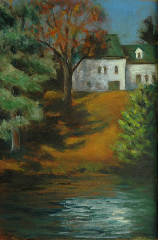
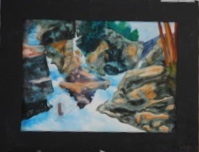
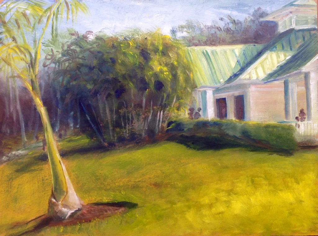
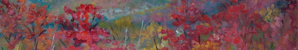
The corrected painting I have to show you is an example of the importance of color and the rule of avoidance of a singular color. You have seen this painting several times before, as I struggled with colors and values in an effort to “make it work”. The basic layout was pleasing to me, so I could not figure out why I was not totally happy with the painting. Paul told me why. Here is the most recent but not final version of “Three Turrets”:

Three Turrets, v1.3
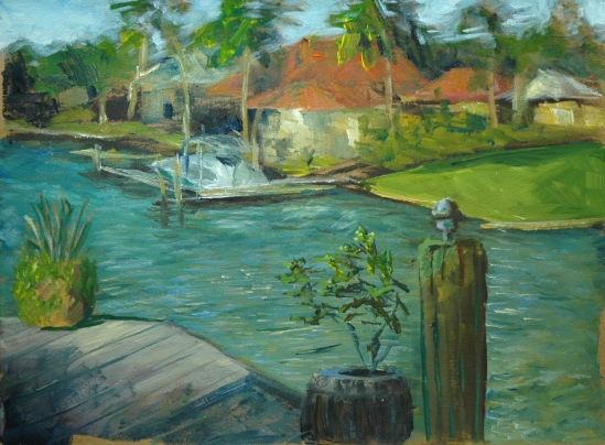
Here is the latest, corrected version:

Three Turrets, updated (from the porch of the Currier Museum’s art school)
Do you agree that the added patch of green in mid left harmonizes the painting with the previously singular patch at bottom right?
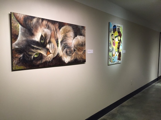
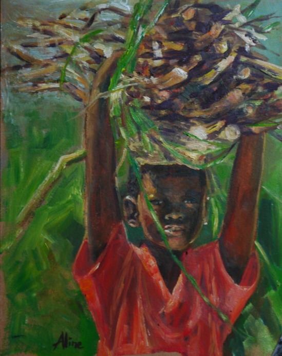
Aline Lotter is currently exhibiting:
at the Hatfield Gallery and the East Colony Fine Art Gallery in Manchester (both are in Langer Place, 55 S. Commercial St., Manchester, NH); at the Bartlett Inn in Bartlett and the Bernerhof Inn in Glen; at the Red Jacket Inn in North Conway; at the law offices of Mesmer and Deleault at 41 Brook St in Manchester; at the Manchester office of Congresswoman Carol Shea Porter; two paintings are hanging at the Bedford Library as part of the Womens Caucus For Art exhibit “Summer Bounty”; a single painting is on view at the Radisson Hotel in Manchester for the summer; and at her studio by appointment (email: alotter@mac.com). You may also view paintings with prices and order prints at my Fine Art America page. If the painting you are interested in is not there, or if you prefer to bypass that experience, you may contact me using the private feedback form below. If you want to add a public comment to this blog, go to the bottom of this page where it says “Leave a Reply”, and enter your comment in that box. I love to get public comments, so don’t be shy!
.


 Pencil